Create a FREE Account
Instant access to 1,000+ real slides from top companies like McKinsey, BCG, Goldman Sachs, Google and many more!
First Name
Last Name
Email
Password
I agree to all
Terms & Privacy Policy
Thank you! Your submission has been received!
Oops! Something went wrong while submitting the form.
Have an account?
Sign in
Library
Templates
Courses
Pricing
My Account
My Slides
My Templates
✦ AI
AI Prompt Library
AI Search
Sign in
Start Here
Logout
My Saved Slides
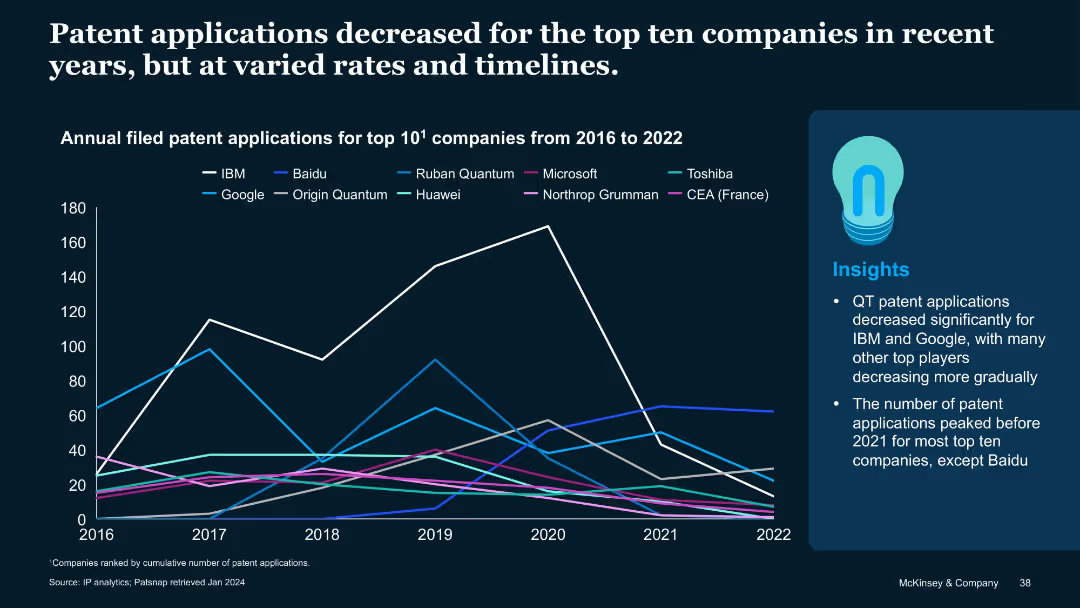
Another line chart like previous, but for patent applications from 2016–2022. Top 10 firms including Baidu, Origin Quantum etc.
Performance Metrics and KPIs
Technology & Software
Tracks filing behavior for top QT firms from 2016–2022. Most peaked pre-2021 and declined after. Baidu is an exception, continuing to rise. Google and IBM saw the sharpest declines. Indicates shifting strategies or R&D reallocations.
patent applications, QT companies, IBM, Baidu, filing trends, R&D, IP filings
Mixed Chart
McKinsey
Saved
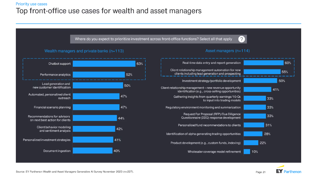
The slide features two sets of horizontal bar charts: one for wealth managers and private banks, and another for asset managers. These charts illustrate the top front-office use cases for investment priorities.
Operational Efficiency
Financial Services
This slide outlines priority front-office use cases for wealth managers, private banks, and asset managers, highlighting the key areas where investment is expected to focus in the near future.
front-office, investment, use cases, financial services, wealth managers, asset managers, bar charts, priorities
Multiple Chart
EY
Saved
This slide is a complex column chart showing sales analysis with additional textual elements and a legend. The main feature is a series of three column charts comparing Q3 2022 and Q3 2023 figures, adjusting for currency effects. The background is light with a geometric pattern, and there's a company logo at the bottom. Annotations and color differentiation provide clarity on the data variations.
Financial Performance
Transportation & Logistics
The slide presents a financial performance comparison of tire and non-tire business sales between two quarters, highlighting the impact of currency fluctuations on total sales. It can be used to discuss strategic financial planning and market performance insights.
sales, analysis, Q3, currency, non-tire, tire business, performance, financial planning, comparison
Single Chart
Morgan Stanley
Saved
Slide includes column charts showing targets versus actual sales for different electric vehicle categories, annotated with key insights and comparisons.
Performance Metrics and KPIs
Transportation & Logistics
Analyzes the discrepancy between planned and actual sales of electric vehicles under the FAME-II scheme, discussing implications for industry and policy adjustments.
electric vehicles, FAME-II, sales targets, actual sales, industry analysis, policy impact, market analysis
Mixed Chart
PwC/Strategy&
Saved
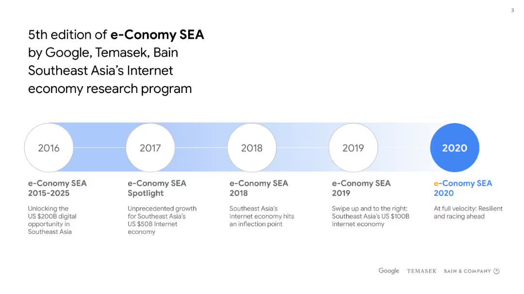
This slide has a horizontal timeline with circular nodes for the years 2016 to 2020, highlighting the progression of the e-Conomy SEA editions. The 2020 node is emphasized with a larger, filled circle. The title and subtitle are at the top, and there's a sponsors' logo section at the bottom.
Market Analysis and Trends
Technology & Software
The slide outlines the annual milestones of the e-Conomy SEA research program from 2015 to 2020, indicating growth and evolution in Southeast Asia's internet economy, supported by Google, Temasek, and Bain & Company.
e-Conomy, SEA, Google, Temasek, Bain & Company, Internet economy, Southeast Asia, research program, timeline
Pillar
Bain
Saved
Matrix chart showing the dynamics of occupations due to automation, with job losses and gains across various sectors like transport, healthcare, and construction.
Market Analysis and Trends
Technology & Software
This slide analyzes the structural changes in the labor market due to automation, robotics, and AI. It presents a matrix of job dynamics, highlighting which sectors are likely to experience job losses or gains, and emphasizes the transformative impact of technology on employment.
Labor Market, Automation, Robotics, Job Dynamics
Table
Roland Berger
Saved
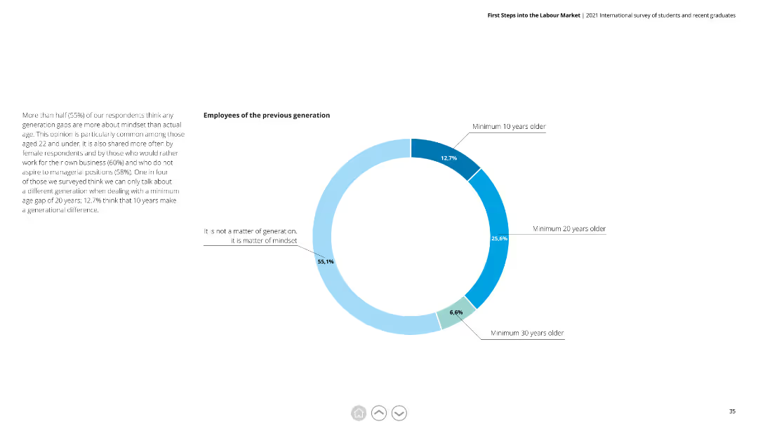
Donut chart showing opinions on generational differences among employees, with detailed text discussing the impact of mindset over age.
Human Resources and Talent Management
Education & Training
This slide examines views on generational differences in the workplace, noting that mindset is seen as more important than age, especially among younger employees.
generational differences, mindset, workplace diversity, age gap, young employees
Mixed Chart
Deloitte
Saved
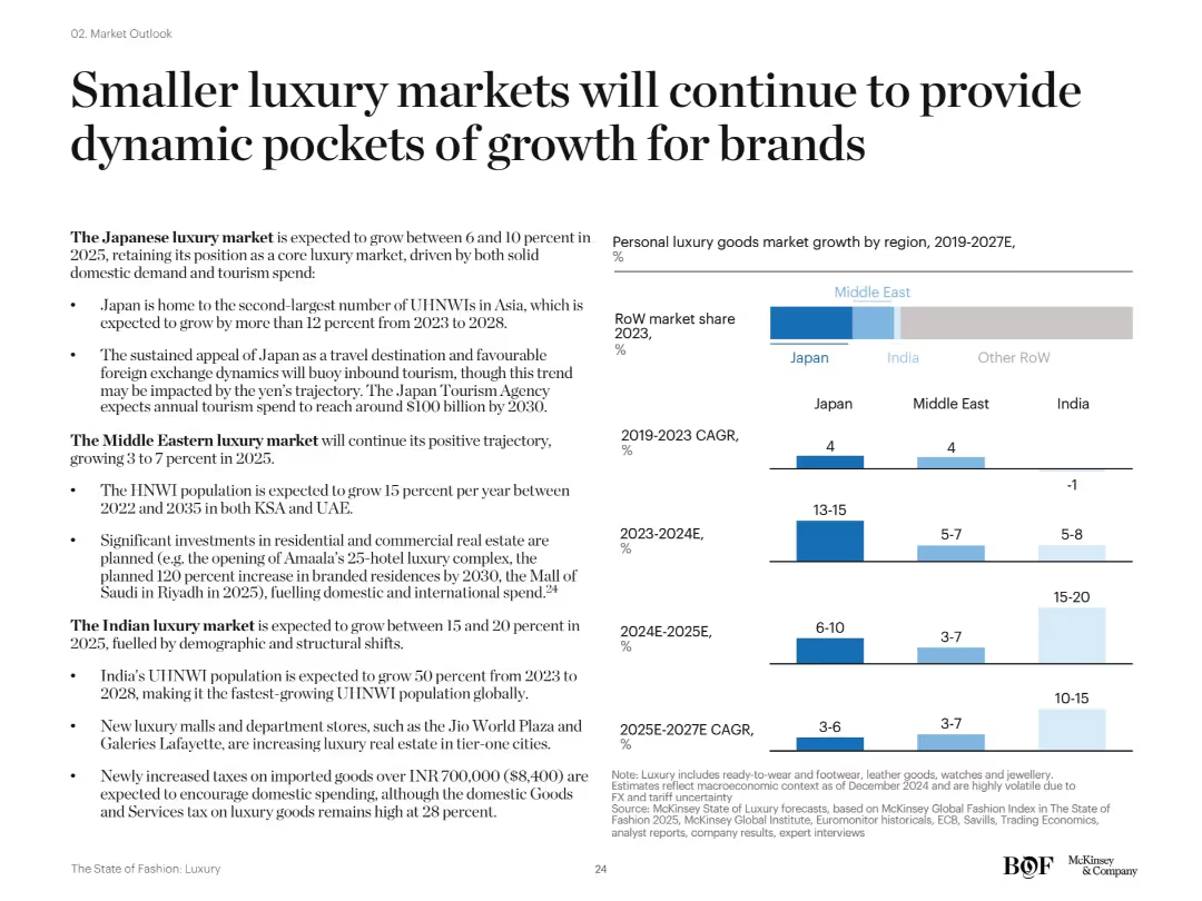
Text-heavy slide with three vertical bar graphs showing past and projected CAGR for Japan, Middle East, and India. Also features a horizontal bar indicating 2023 RoW market share.
Market Analysis and Trends
Consumer Goods
The slide highlights growth potential in smaller markets like Japan, the Middle East, and India. Japan's appeal as a travel destination, real estate investments in the Middle East, and India's expanding UHNW population are noted as major contributors to sustained market expansion through 2027.
Japan, Middle East, India, emerging markets, UHNW growth, CAGR, regional luxury
Multiple Chart
McKinsey
Saved
The slide features two column charts comparing the number and proceeds of IPOs across various sectors for Q1 2023 and Q1 2022. Colors differentiate the years, with specific focus on technology and energy sectors.
Market Analysis and Trends
Financial Services
The slide presents a comparison of IPO activities across different sectors in Q1 2023 versus Q1 2022, highlighting the dominance of the energy sector in proceeds despite fewer deals.
IPOs, sectors, technology, energy, Q1 2023, column charts, market trends, financial services, comparison, proceeds
Multiple Chart
EY
Saved
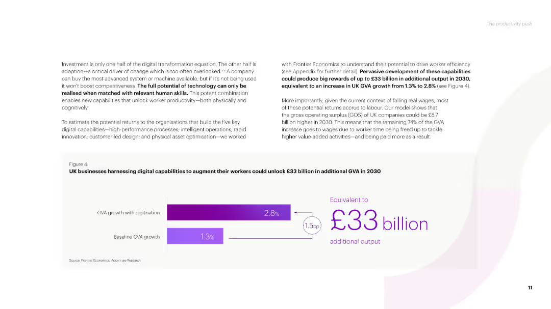
A text-heavy slide with a title and several paragraphs discussing the potential of technology for business growth. Includes a column chart showing GVA growth with digitization versus baseline GVA growth in the UK.
Strategic Planning
Technology & Software
The slide emphasizes the importance of digital capabilities for business productivity, projecting significant additional GVA growth for UK businesses by 2030 through the adoption of technology.
technology potential, digital capabilities, GVA growth, UK businesses, productivity
Mixed Chart
Accenture
Saved
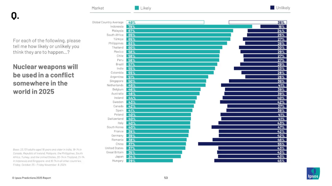
Horizontal bar chart by country; teal = “Likely”, navy = “Unlikely”; global average at top
Risk Assessment and Management
Government & Public Sector
This slide presents public opinion on the likelihood of nuclear weapon use in conflict by 2025. Indonesia and Malaysia show highest concern, with a global average of 49% expecting it likely.
nuclear weapons, conflict, world risk, public opinion, prediction, Ipsos, global security, 2025
Mixed Chart
IPSOS
Saved
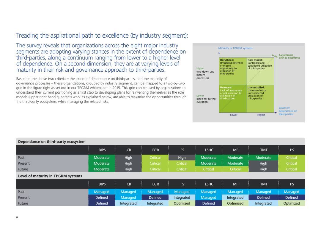
The slide includes a text description of organizational stances on third-party dependence and governance maturity, accompanied by a grid and charts illustrating these aspects across different industry segments.
Strategic Planning
Professional Services
This slide examines how organizations in various industry segments are adopting different stances on third-party dependence and governance. It maps these stances on a grid and provides insights into current and future trends in third-party risk and governance maturity.
third-party dependence, governance, industry segments, strategic planning, professional services, risk management, maturity levels
Table
Deloitte
Saved
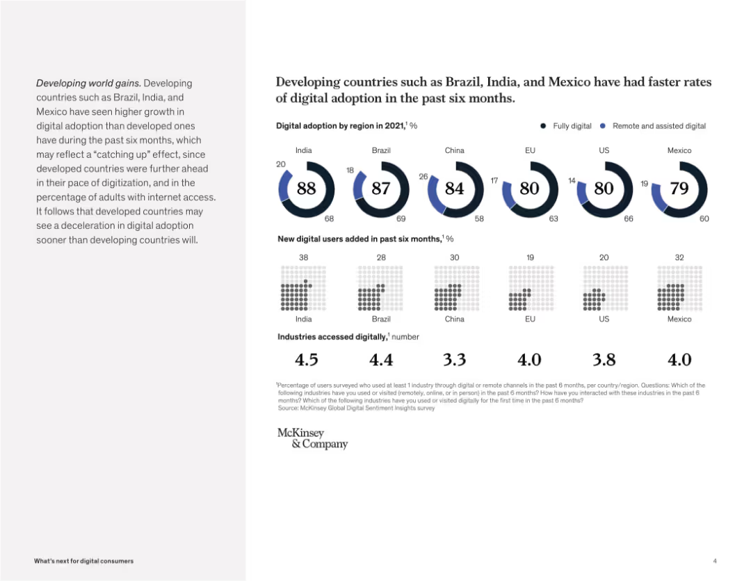
Circular progress charts and grids display digital adoption levels, new digital users, and industries accessed across countries.
Industry Overview
Telecommunications
The slide compares digital adoption across developed and developing countries, showing that emerging markets like India and Brazil are growing faster in adoption and new user generation, though this may be a catch-up effect.
digital adoption, emerging markets, Brazil, India, Mexico, remote access, industry engagement, technology growth, McKinsey
Multiple Chart
McKinsey
Saved
Features a vertical column chart depicting liquidity coverage ratio and a text box outlining liquidity management strategies and goals.
Risk Assessment and Management
Financial Services
Discusses UBS Group AG's liquidity coverage ratio, efficiency, safety, and strategies to meet stringent Swiss liquidity requirements.
UBS, liquidity, coverage ratio, efficiency, safety, funding, management, requirements, Swiss
Mixed Chart
UBS
Saved
Multiple column charts and numerical data presenting financial results, turnover rates, and operational efficiencies, emphasizing the firm's growth and stability.
Strategic Planning
Professional Services
This slide reviews the financial and operational highlights of a consultancy firm, showing areas of growth, stability in staff turnover, and strategic outsourcing.
financial review, turnover, growth, bar chart
Multiple Chart
PwC/Strategy&
Saved
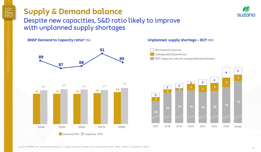
Left side includes a line and bar chart of BHKP demand-to-capacity ratio; right shows a bar graph of unplanned shortages. Clean, data-centric style.
Market Analysis and Trends
Industrial & Manufacturing
Despite new capacities, Suzano forecasts BHKP demand-to-capacity ratios to remain stable due to unplanned supply shortages. The slide shows consistent unexpected downtimes and closures helping balance the market.
supply-demand, BHKP, capacity, Suzano, unplanned downtimes, closures, pulp market
Multiple Chart
Goldman Sachs
Saved
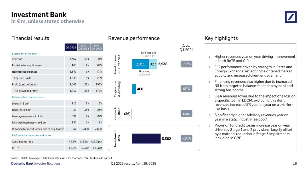
Similar layout as 18341: financials, revenue bar charts by segments, and key highlights.
Financial Performance
Financial Services
Q1 2025 financials for the Investment Bank show strong year-on-year revenue growth (+10%), improved RoTE (18%), and higher profit before tax (€1.55B). Key growth in Fixed Income & Currencies segment, while Origination & Advisory declined.
investment bank, fixed income, advisory, revenue growth, RoTE, credit loss, Q1 2025, client engagement
Mixed Chart
Deutsche Bank
Saved
The slide features a two-dimensional matrix with companies plotted based on their analyst and customer scores. It's divided into zones like "Solution Leader" and "Value Leader". Each company is represented by a circle, with varying sizes indicating the company's positioning strength. The graph is overlaid with a red outline grouping certain companies as leaders.
Market Analysis and Trends
Technology & Software
This slide illustrates the competitive landscape in the Contract Lifecycle Management (CLM) industry as of Q3, 2018. It categorizes companies into different leadership zones based on performance metrics like customer and analyst scores, helping to analyze market trends and company positions.
CLM, market analysis, leadership, performance metrics, companies, competitive landscape, 2018, technology
Single Chart
Kearney
Saved
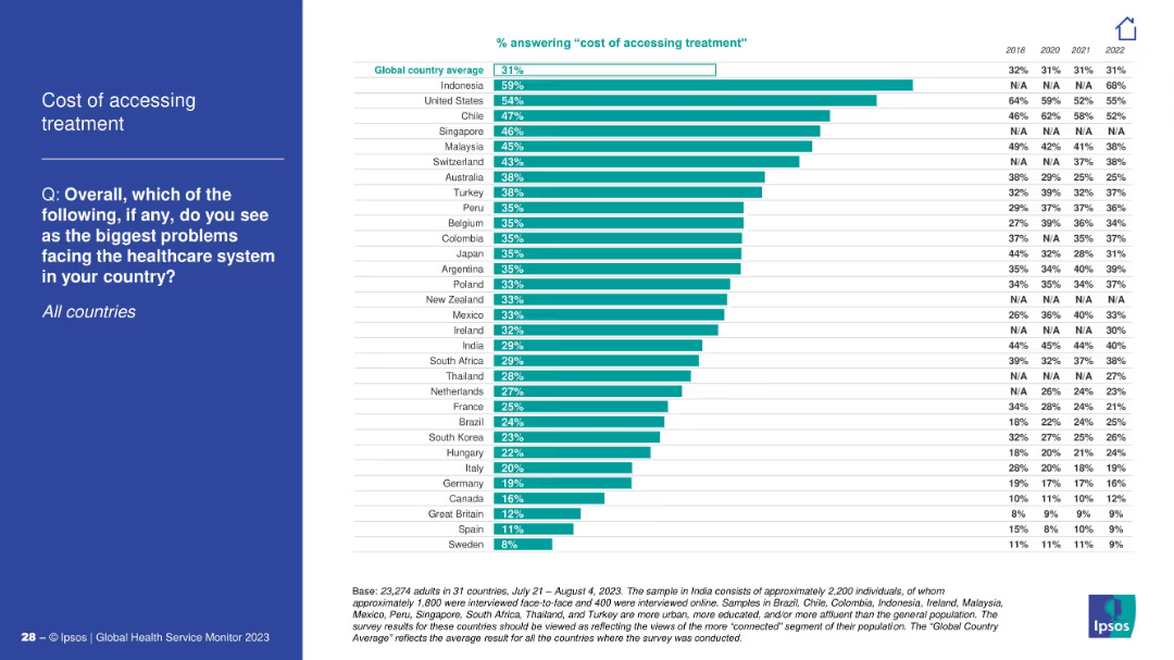
Bar chart by country; ranked by percentage; blue left panel with title/question.
Market Analysis and Trends
Healthcare & Pharmaceuticals
This slide shows the percentage of people in each country identifying treatment cost as a major issue. Indonesia and the U.S. lead the list. Historical data from 2018–2022 is shown alongside each country.
treatment cost, affordability, access, global data
Mixed Chart
IPSOS
Saved
Features a timeline and a column chart, visually representing sales growth across recent quarters.
Market Analysis and Trends
Consumer Goods
Showcases the accelerated growth in like-for-like sales over recent periods, highlighting the company's strong market performance.
sales growth, cosmetics, market trends, quarterly growth, performance
Single Chart
Deutsche Bank
Saved
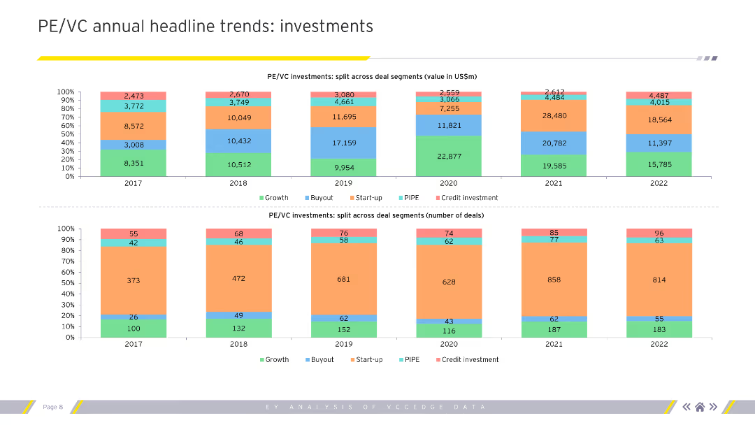
Column charts showing PE/VC investment splits by value and number of deals across deal segments for 2017-2022.
Investment Analysis
Financial Services
Analyzes annual trends in private equity and venture capital investments, focusing on value and number of deals.
PE/VC, investments, trends, deals, growth
Multiple Chart
EY
Saved
Two column charts detailing sources of return for global equities and global valuations, including EPS, multiples, and dividends for various regions.
Investment Analysis
Financial Services
This slide provides an analysis of the sources of return and valuation metrics for global equities, comparing performance across different regions and indicators.
global equities, return sources, valuations, EPS, multiples, dividends
Multiple Chart
JP Morgan
Saved
The slide uses a mix of text, checklists, and a column chart to illustrate current capabilities and growth. Colors include blues and an accent of gray.
Financial Performance
Financial Services
Demonstrates the firm's current FX payments capabilities and future growth opportunities through market partnerships.
FX payments, market growth, partnerships, corporate payments, financial services, FX-as-a-Service, global mass pay
Mixed Chart
JP Morgan
Saved
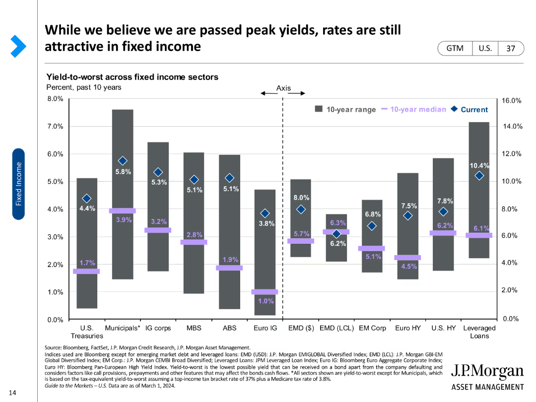
A column chart comparing yield-to-worst across various fixed income sectors, marked with current rates and historical medians.
Investment Analysis
Financial Services
Reviews yield-to-worst metrics across different fixed income sectors, highlighting investment attractiveness in the current market.
Fixed income, yield-to-worst, investment, bonds, sectors, median, current rates, attractiveness, analysis
Single Chart
JP Morgan
Saved
Multi-panel comparison, various aspects of CAI solutions
Strategic Planning
Professional Services
Guides decision-making in CAI implementation
CAI, platform, user experience, analytics
Table
Deloitte
Saved
Previous
Next
If nothing, comes up, please save your slides first
Create a FREE account to continue browsing
Receive Instant Access to 1,000+ slides from companies like McKinsey, Google, and Goldman Sachs
First Name
Last Name
Email
Password
I agree to all
Terms & Privacy Policy
Thank you! Your submission has been received!
Oops! Something went wrong while submitting the form.
Have an account?
Sign in
Column Chart
Heatmap
Chevron
Org Chart
Infographic
Callouts
Timeline
List
Graphic
Picture
Process Flow
Diagram
Paragraph
Map
Table
Framework
Subtitle
Takeaway Box
Icon
Other Chart
Radar Chart
Waterfall Chart
Mekko Chart
Pie Chart
Scatter Plot
Line Chart
Bar chart
Bullet points