Create a FREE Account
Instant access to 1,000+ real slides from top companies like McKinsey, BCG, Goldman Sachs, Google and many more!
First Name
Last Name
Email
Password
I agree to all
Terms & Privacy Policy
Thank you! Your submission has been received!
Oops! Something went wrong while submitting the form.
Have an account?
Sign in
Library
Templates
Courses
Pricing
My Account
My Slides
My Templates
✦ AI
AI Prompt Library
AI Search
Sign in
Start Here
Logout
My Saved Slides
The slide features a line chart showing Central Bank Policy Rates and another chart showing Market Expectations for Future Central Bank Rates. Colors vary for different banks.
Market Analysis and Trends
Financial Services
The slide presents current, past, and expected future central bank rates for U.S. Federal Reserve, BOE, BOJ, and ECB, providing a comprehensive monetary policy overview.
Central Bank Rates, Monetary Policy, BOE, BOJ, ECB, U.S. Federal Reserve
Multiple Chart
Morgan Stanley
Saved
This slide portrays a comparative column chart showing growth over several time points in different financial sectors such as mortgages and business loans. A gray and blue color scheme is used for visual clarity, with labels and axes clearly marking the data.
Financial Performance
Financial Services
It analyzes the growth across various portfolios within the Banking and Financial Services sector, focusing on mortgages, deposits, and loans, suitable for evaluating financial growth and portfolio management within a banking context.
financial services, growth, banking, portfolio, mortgages, deposits, loans, financial analysis, column chart
Multiple Chart
Goldman Sachs
Saved
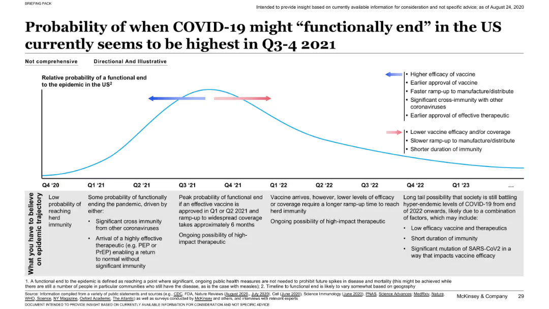
Line chart with a curve representing relative probability over time; annotated with influencing factors; timeline spans Q4 2020 to Q1 2023.
Strategic Planning
Healthcare & Pharmaceuticals
Estimates peak probability for functional end of the pandemic in Q3–Q4 2021, influenced by vaccine efficacy, speed of distribution, and therapeutic developments. Scenarios for faster or slower progress are annotated.
COVID-19, pandemic end, vaccine, immunity, timeline, probability
Mixed Chart
McKinsey
Saved
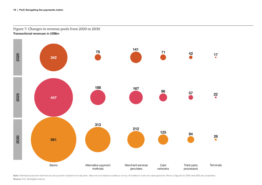
Bubble chart comparing changes in transactional revenues across various payment sectors from 2020 to 2030.
Financial Performance
Financial Services
The slide analyzes the changes in revenue pools within different payment sectors, projecting significant shifts by 2030.
revenue, pools, transactional, changes, payment sectors, 2020, 2030, projections
Multiple Chart
PwC/Strategy&
Saved
Features a detailed table comparing various countries with symbols indicating the presence or absence of incentives and disincentives like carbon taxes and renewable tariffs, accompanied by flags of the nations.
Market Analysis and Trends
Environmental Services & Sustainability
Discusses the necessity for stronger incentives or penalties to promote the adoption of green solutions across different nations, highlighting disparities in government actions and the effectiveness of existing policies.
incentives, penalties, green solutions, policy evaluation
Table
Bain
Saved
A bar chart listing various measures companies have taken to address the energy crisis, with highlighted percentages and an explanatory text box.
Risk Assessment and Management
Financial Services
The slide details the impact of the energy crisis on business investments and lists the measures companies have implemented to mitigate these effects.
energy crisis, investment, business measures, Europe
Mixed Chart
EY
Saved
This slide includes pie charts for 2019, 2020, and 2021 showing the distribution of podcast ad revenue by pricing model, particularly focusing on CPM (Cost per Thousand).
Financial Performance
Media & Entertainment
Analyzes the trend towards CPM pricing models in podcasting, aligning it with other digital media practices.
Podcast, CPM, Pricing, Trends
Multiple Chart
PwC/Strategy&
Saved
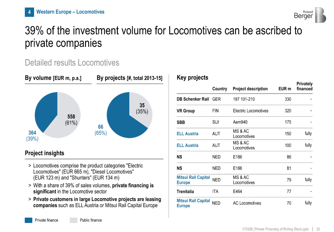
Pie charts (volume/projects), project list, highlights private leasing model
Product and Service Analysis
Transportation & Logistics
Locomotives have a high private financing share (39%), especially through leasing models with firms like ELL Austria and Mitsui Rail Capital Europe. Many projects fully privately financed.
locomotives, private leasing, rolling stock, ELL Austria, Mitsui, Europe, rail, investment
Mixed Chart
Roland Berger
Saved
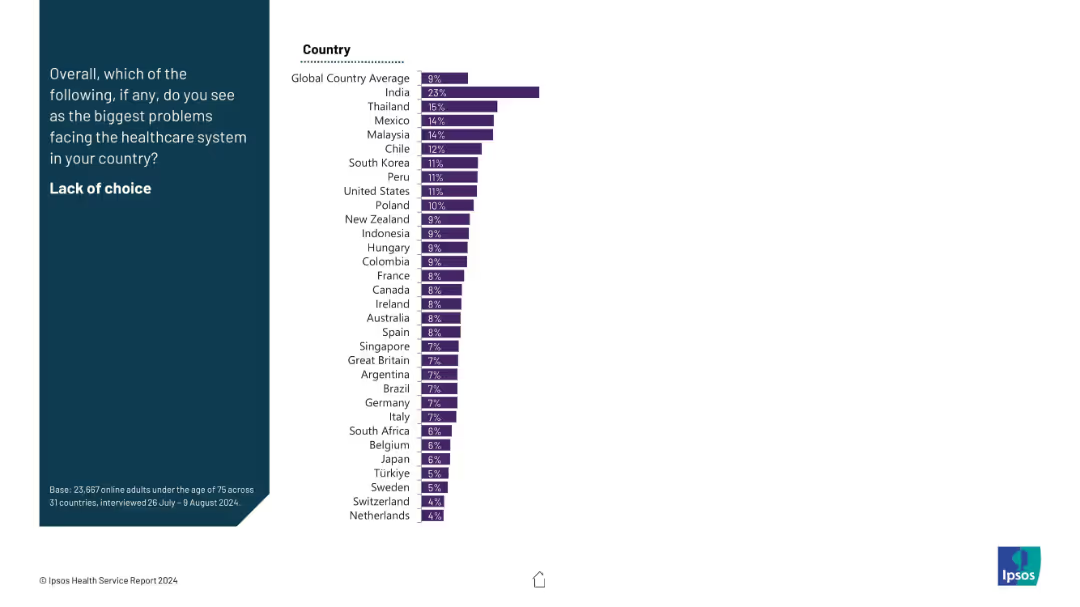
Simple bar chart layout showing single percentages by country on the right; title and prompt on dark blue background to the left.
Risk Assessment and Management
Healthcare & Pharmaceuticals
This slide identifies concern levels about lack of healthcare choices by country. India leads with 23%, well above the global average of 9%. Most countries show low concern.
healthcare choice, patient options, access, healthcare freedom, country comparison, public sentiment
Mixed Chart
IPSOS
Saved
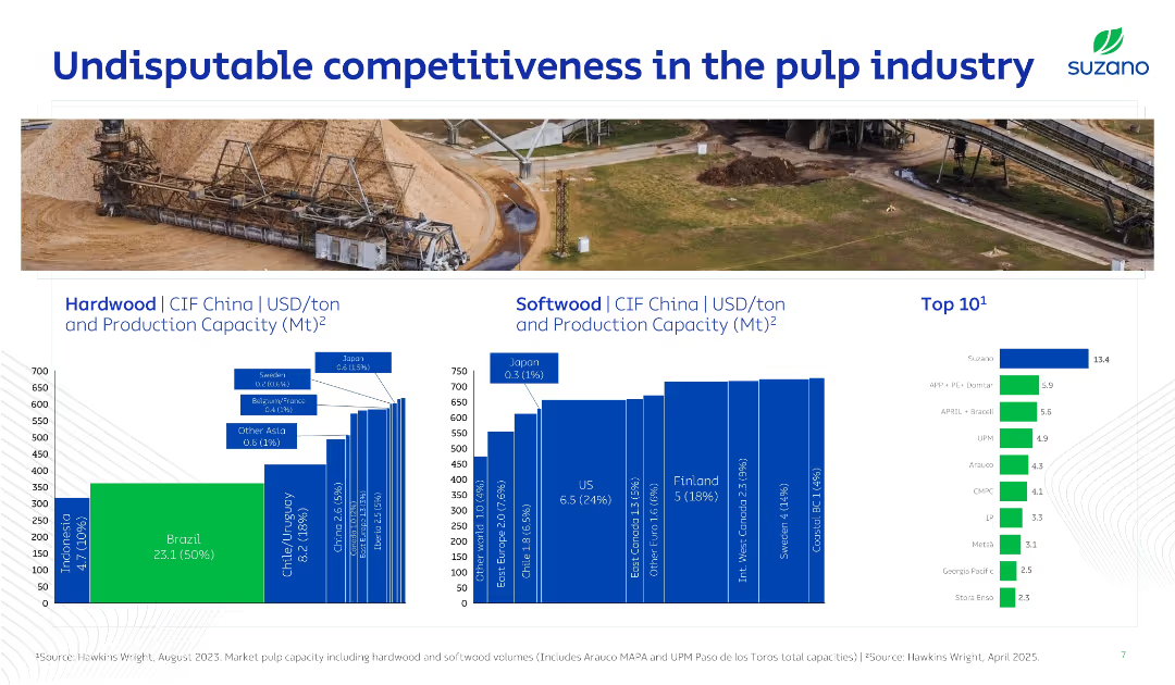
Slide with a mix of infographic and bar charts showing production capacities and costs by region for hardwood and softwood, along with top global producers. Uses rich visual context with a background image of pulp processing.
Competitive Landscape
Industrial & Manufacturing
Highlights Brazil’s cost leadership and large share in global pulp production. Shows regional cost benchmarks and Suzano’s dominant position (13.4 Mt). A visual and data-driven case for Suzano’s global competitiveness.
pulp, Suzano, cost leadership, hardwood, softwood, CIF China, global
Multiple Chart
Goldman Sachs
Saved
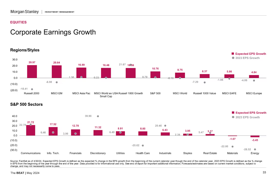
Two sets of column charts showing expected EPS growth for various regions/styles and S&P 500 sectors. The slide is divided into different categories for comparison.
Financial Performance
Financial Services
This slide presents an analysis of corporate earnings growth, with expected EPS growth data segmented by regions/styles and S&P 500 sectors, providing insights into financial performance.
earnings, growth, EPS, sectors, regions
Multiple Chart
Morgan Stanley
Saved
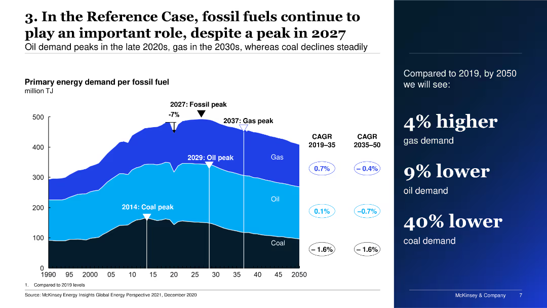
The slide features a multi-layered area chart depicting primary energy demand per fossil fuel over time, alongside key dates for peaks in coal, oil, and gas demand.
Market Analysis and Trends
Energy & Utilities
The slide shows the projected primary energy demand for fossil fuels, highlighting peak periods for coal, oil, and gas, and compares expected demand changes from 2019 to 2050.
Energy, fossil fuels, demand, projections, trends
Mixed Chart
McKinsey
Saved
Contains bulleted lists, icons, small text, two columns
Industry Overview
Technology & Software
Explains benefits of CAI in customer service
CAI, customer service, ML models, CSAT
Header Vertical
Deloitte
Saved
Left panel with title, global average, and methodology in blue; right side is a horizontal bar chart showing country-level agreement percentages (agree/neutral/don't know/disagree) with 5-year historical trend data on right.
Market Analysis and Trends
Government & Public Sector
This slide shows public sentiment across countries on the belief that their economies are structured to favor the rich and powerful. It includes current (2023) agreement levels along with historical data from 2016 to 2022, and a global average of 67% agreement. The data reflect a strong perception of economic inequality and favoritism globally.
economy, inequality, power, perception, public opinion, Ipsos, survey, global, fairness, trend
Mixed Chart
IPSOS
Saved
Contains two sets of dual column charts for U.S. and European high-yield credit, showing trends in gross leverage and interest coverage over a decade.
Risk Assessment and Management
Financial Services
Slide compares the U.S. and European high-yield credit markets, focusing on gross leverage and interest coverage decline. Aimed at risk assessment in credit markets.
high-yield, credit, US, Europe, risk, leverage, interest, coverage, market, fundamentals
Multiple Chart
Morgan Stanley
Saved
Horizontal bar chart ranking countries by perceived importance of inequality as a national issue.
Market Analysis and Trends
Government & Public Sector
This slide displays how important inequality is perceived compared to other national problems across different countries. It shows global averages and country-level responses, highlighting significant cross-country variation.
inequality, importance, perception, countries, comparison, public opinion, global index
Mixed Chart
IPSOS
Saved
This slide contains a bar graph showing weighted average year-to-date local currency shareholder returns by industry, with varying bar widths representing market cap sizes. It has a clear title, a source line, and annotations for data points.
Market Analysis and Trends
Financial Services
The slide presents market capitalization trends across various industries, indicating a decline with varying degrees. It serves to compare sectors and provide insights into the economic impact on market values.
Market capitalization, Industry comparison, Shareholder returns, Economic trends, Data analysis
Single Chart
McKinsey
Saved
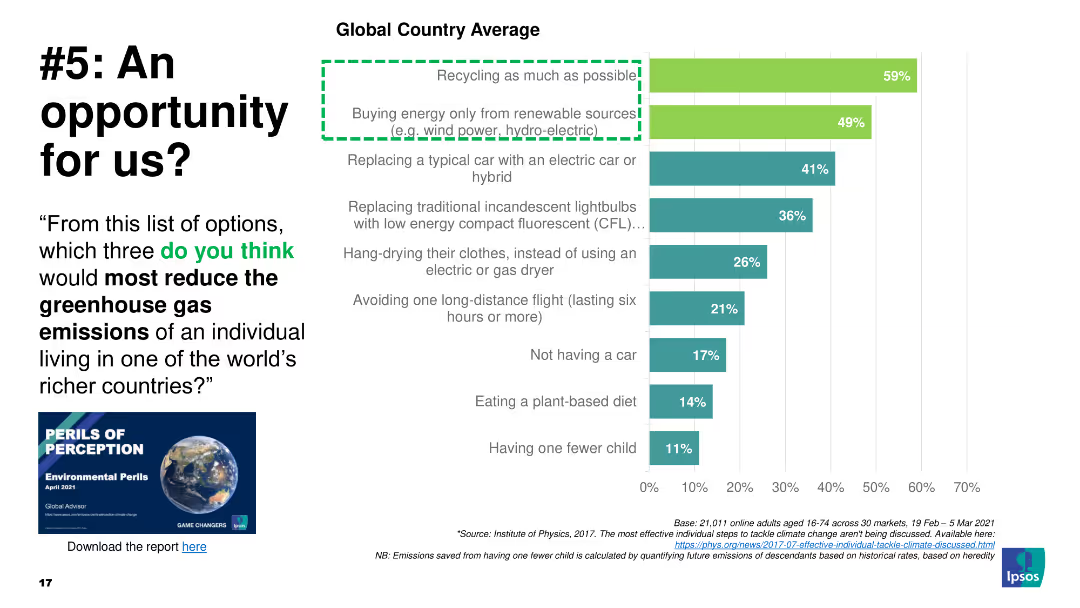
Column chart of actions to reduce greenhouse gas emissions, highlighting recycling and renewable energy
Market Analysis and Trends
Environmental Services & Sustainability
The slide asks which actions most reduce greenhouse gases, with recycling and renewables as top choices
greenhouse gas, emissions, recycling, energy, actions
Mixed Chart
IPSOS
Saved
Features three pie charts detailing the growing familiarity with the metaverse, accompanied by a photograph of a woman using VR gear.
Market Analysis and Trends
Telecommunications
Discusses increasing public knowledge and interest in the metaverse, reflecting broader trends in technology engagement.
metaverse, technology adoption, VR, public knowledge, market trends
Multiple Chart
Deloitte
Saved
Slide lists key topics from open-ended survey questions, divided into 'most excited about' and 'most concerned about' with associated icons.
Market Analysis and Trends
Financial Services
Summarizes main points of interest and concern among underwriters about the future of their industry, particularly focusing on AI and technology.
underwriting, technology, AI, excitement, concerns, future, industry insights
Boxed
Accenture
Saved
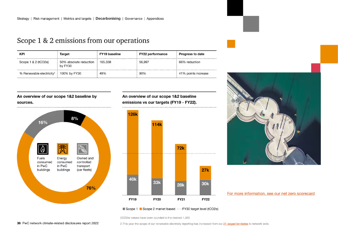
The slide includes column charts and a circular graph detailing the breakdown and reduction of Scope 1 & 2 emissions, and progress towards renewable electricity.
Strategic Planning
Energy & Utilities
The slide outlines Scope 1 & 2 emissions reduction progress, highlighting a 66% reduction target and the increase in renewable electricity usage to 90%.
scope 1, scope 2, emissions, renewable electricity, targets, operations, progress
Multiple Chart
PwC/Strategy&
Saved
The slide combines a column chart with an upward trend for three quarters, an accompanying high-quality image of a car, and bullet points outlining key facts about the company's offer in lighting. The visual focus is balanced between the chart and the image, with both elements prominently displayed against a clean white background. The text is concise, using bold fonts for emphasis.
Product and Service Analysis
Industrial & Manufacturing
This slide highlights the company's significant order book in lighting, emphasizing orders from major automotive OEMs and production across regions. It discusses new orders and projects future revenue targets. This visual and textual combination effectively conveys the company's capabilities in lighting and its market relevance, likely aimed at investors or partners.
Lighting, Order Book, OEMs, Production, Growth, Revenue Targets, Column Chart, Automotive, Market Relevance, Forecast
Mixed Chart
Goldman Sachs
Saved
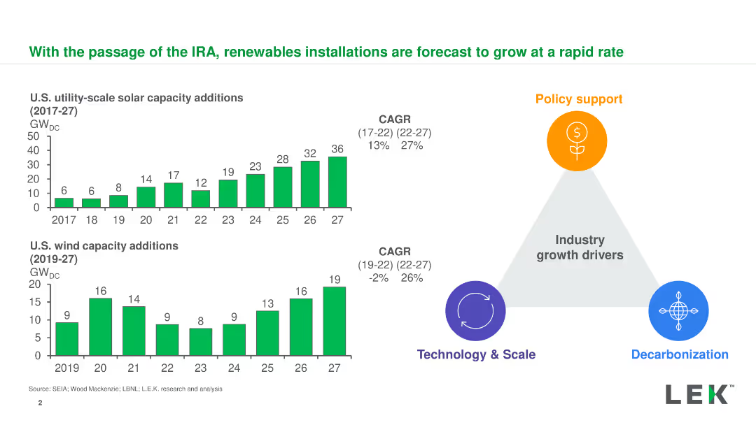
Column charts showing solar and wind capacity additions, with a diagram highlighting growth drivers
Market Analysis and Trends
Energy & Utilities
Forecasts the growth of renewable installations in the U.S. driven by the IRA, focusing on solar and wind energy
renewables, IRA, solar capacity, wind capacity, growth forecast
Multiple Chart
LEK
Saved
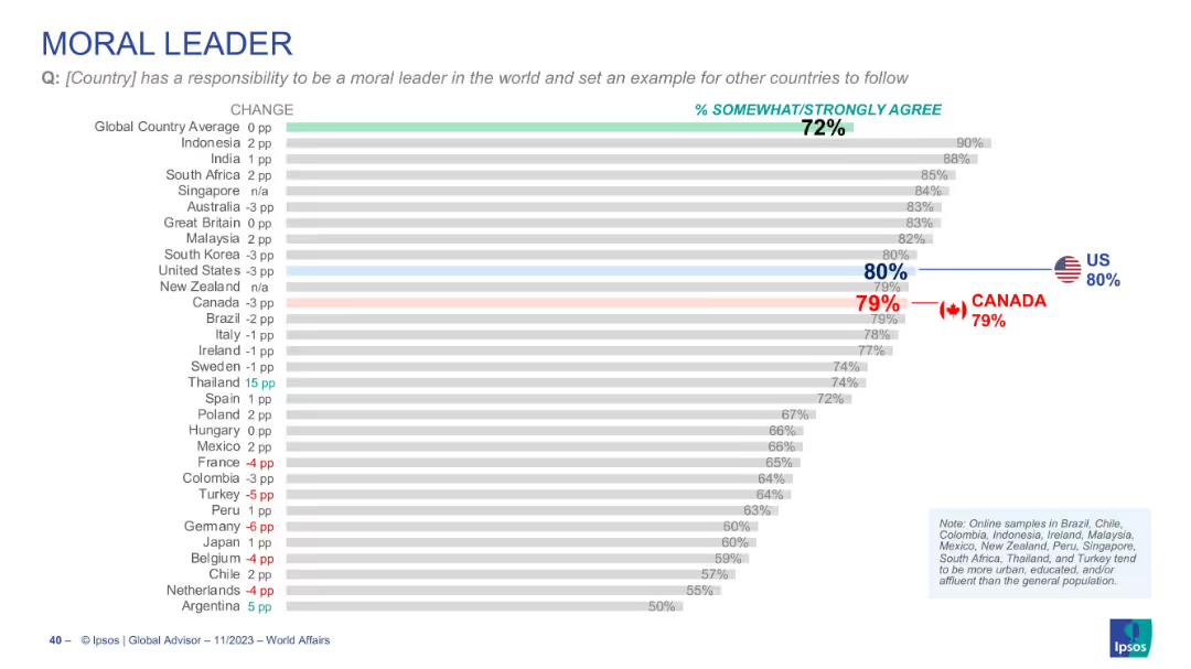
Horizontal chart showing country views on moral leadership, with % agreement, Canada at 79%
Strategic Planning
Government & Public Sector
Evaluates the perception that a country should serve as a moral leader. Canada and U.S. score similarly (79% and 80% respectively), both above global average (72%).
moral leadership, international ethics, national role, diplomacy, Canada, US, public responsibility
Single Chart
IPSOS
Saved
Diagram of SP platform showing different functions like product development, trading, and risk management, with related text boxes.
Product and Service Analysis
Financial Services
Overview of the Securitized Products platform, highlighting its integrated approach to product development, trading, and risk management.
SP platform, product development, trading, risk management, integrated approach
Mixed Chart
Credit Suisse
Saved
Previous
Next
If nothing, comes up, please save your slides first
Create a FREE account to continue browsing
Receive Instant Access to 1,000+ slides from companies like McKinsey, Google, and Goldman Sachs
First Name
Last Name
Email
Password
I agree to all
Terms & Privacy Policy
Thank you! Your submission has been received!
Oops! Something went wrong while submitting the form.
Have an account?
Sign in
Column Chart
Heatmap
Chevron
Org Chart
Infographic
Callouts
Timeline
List
Graphic
Picture
Process Flow
Diagram
Paragraph
Map
Table
Framework
Subtitle
Takeaway Box
Icon
Other Chart
Radar Chart
Waterfall Chart
Mekko Chart
Pie Chart
Scatter Plot
Line Chart
Bar chart
Bullet points