Create a FREE Account
Instant access to 1,000+ real slides from top companies like McKinsey, BCG, Goldman Sachs, Google and many more!
First Name
Last Name
Email
Password
I agree to all
Terms & Privacy Policy
Thank you! Your submission has been received!
Oops! Something went wrong while submitting the form.
Have an account?
Sign in
Library
Templates
Courses
Pricing
My Account
My Slides
My Templates
✦ AI
AI Prompt Library
AI Search
Sign in
Start Here
Logout
My Saved Slides
Two column charts depicting the number of large-scale CCUS projects and total capture capacity (Mtpa).
Market Analysis and Trends
Energy & Utilities
Shows the expected increase in CCUS projects and capacity by 2030, indicating significant industry growth.
CCUS, capacity, projects, energy, growth, trends
Multiple Chart
Kearney
Saved
Slide includes multiple data presentations: column charts, bar charts, and a line graph comparing income and inflation.
Risk Assessment and Management
Financial Services
Monitors consumers' financial health through median balance levels, cash buffers, and income growth relative to inflation.
consumer health, balance sheets, cash buffers, income growth, inflation, JPMorgan Chase & Co, financial stability
Multiple Chart
JP Morgan
Saved
The slide features horizontal bar charts showing male and female workforce representation at various levels for FY2022 and 2021.
Human Resources and Talent Management
Professional Services
This slide compares the gender distribution of Deloitte USI's workforce across different levels from junior staff to director between FY2022 and 2021.
workforce, gender representation, Deloitte, levels, comparison, FY2022, FY2021, bar chart
Multiple Chart
Deloitte
Saved
The slide features a mix of text and bullet points, organized into sections with icons, summarizing the decline in demand for Chinese suppliers and the rise in opportunities for others.
Strategic Planning
Healthcare & Pharmaceuticals
The slide discusses the opportunities and challenges for pharmaceutical companies due to the US BIOSECURE Act, focusing on supply chain resilience and the potential shift from China.
BIOSECURE Act, supply chain, opportunities, challenges, pharma
Table
LEK
Saved
Split layout: Left side shows a table comparing integration across 5 carriers (columns: traffic, rates, binding); right side shows a bar & line chart.
Performance Metrics and KPIs
Financial Services
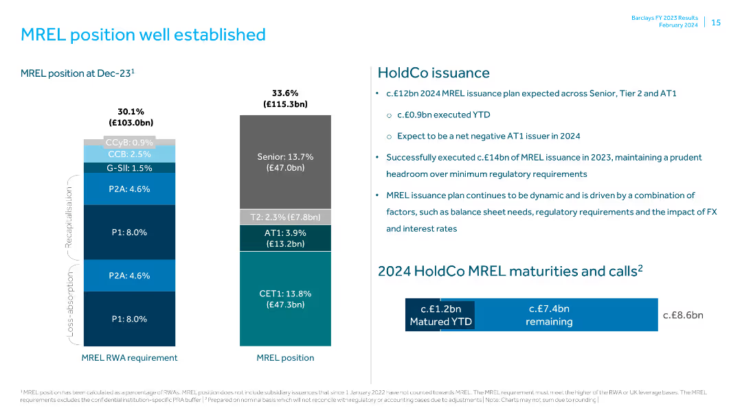
The slide highlights integration progress with top insurance carriers and correlates it with policy and revenue growth. It reports a 170% increase in revenue and 200% policy growth from Q1 FY23 to Q4 FY24, underscoring product innovation impact.
insurance, integration, carriers, policy growth, revenue, FY24, traffic
Mixed Chart
Barclays
Saved
Two charts: government bond yields (left), USD and Yuan index (right); consistent color-coding and annotations.
Investment Analysis
Financial Services
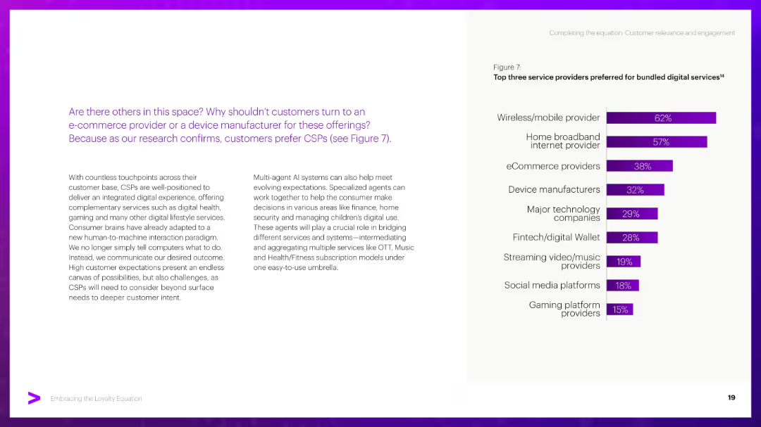
This slide reviews long-term bond yield trends and USD exchange rates, noting elevated yields and a strengthening dollar driven by monetary policy and tariffs. Japan’s divergence is also shown.
Bond yields, USD, Yuan, interest rates, inflation, tariffs, global economy
Multiple Chart
Accenture
Saved
Vertical logic tree layout in grayscale and blue, progressing through 3 assessment steps. Boxes contain decision questions and flow to "Yes"/"No" outcomes. Blue highlights indicate enabling status.
Customer and Market Segmentation
Financial Services
Provides a decision framework to classify PortCos as Decarbonisation Enablers based on taxonomy alignment, climate contribution, and revenue thresholds. This structured logic is used to guide investment decisions or categorize assets according to their role in supporting the net-zero transition.
decarbonisation enabler, emissions, climate, taxonomy, classification, PortCo, investment criteria
Uncategorized
Bain
Saved
Contains bar graphs showing the levelized cost of energy for solar, onshore and offshore wind, and nuclear power with and without tax credits, illustrating significant cost reductions due to fiscal incentives.
Market Analysis and Trends
Energy & Utilities
Examines how full application of tax credits could reduce the costs associated with generating energy from various renewable sources, emphasizing the financial benefits of government incentives.
renewable energy, cost reduction, tax credits, solar, wind, nuclear
Single Chart
BCG
Saved
This slide contains two line charts. The first chart shows nominal 10-year government bond yields over time for various regions. The second chart shows real global government bond yields over time.
Financial Performance
Financial Services
The slide provides an analysis of nominal and real global government bond yields, offering insights into financial performance and trends.
global, government, bond yields, nominal, real, financial performance, analysis
Multiple Chart
JP Morgan
Saved
Waterfall chart showing sources and uses of cash; bar segments connected by dotted lines; blue/red emphasis
Corporate Finance and Valuation
Financial Services
Illustrates a detailed breakdown of funding sources (cash, operations, bonds, loans) and uses (repayments, capex, dividends) in 1H 2024. Highlights US$5.5B liquidity and strong cash flow management practices.
funding, liquidity, capex, bond repayment, debt, aviation finance, sources of cash, capital management
Mixed Chart
Goldman Sachs
Saved
A data-rich slide with multiple bar graphs representing regional economic impacts. The slide is text-heavy with key statistics highlighted.
Technology and Digital Transformation
Government & Public Sector
Focuses on the economic contribution of the Tempest programme to various UK regions, presenting data and graphs on regional impact and productivity.
Tempest, economic contribution, UK, regions, impact, productivity, data
Multiple Chart
PwC/Strategy&
Saved
Features text with a bar chart showing the acceleration of net zero commitments from different organizations and countries between 2020 and 2021.
Strategic Planning
Environmental Services & Sustainability
Discusses the acceleration of decarbonization commitments by governments and businesses, highlighting the significant increase in net zero targets within a year.
Net zero, commitment, government, business, decarbonization, target, emissions, sustainability
Multiple Chart
EY
Saved
Column chart showing projected global capital expenditure by low-carbon technology in US$ from 2025 to 2050.
Investment Analysis
Energy & Utilities
This slide discusses how investment in low-carbon technology will increase, emphasizing the need for annual investments to scale up financial resources.
Low-carbon, technology, investment, capital, expenditure, energy systems, global, growth, infrastructure, renewable
Mixed Chart
EY
Saved
Left panel with title and description in white on blue. Right panel is a horizontal bar chart comparing "Trustworthy" vs. "Untrustworthy" by country.
Market Analysis and Trends
Media & Entertainment
The slide shows public trust levels in pollsters across countries based on Ipsos' 2023 global survey. It compares ratings on a 1–5 scale, highlighting notable disparities.
trust, pollsters, perception, global, country, Ipsos, bar chart, opinion, media, rating
Mixed Chart
IPSOS
Saved
Two column charts showing growth in client relationships from 2020 to 2023 and drivers of client relationship growth on the right.
Sales and Business Development
Financial Services
Details the various sources and strategies Morgan Stanley uses to grow client relationships, showing historical growth and future projections.
Morgan Stanley, client relationships, growth, strategy, sources
Mixed Chart
Morgan Stanley
Saved
Infographic showing six automation stages with bullet lists of required features for each. Timeline divided into "Today", "Pending", and "Future".
Technology and Digital Transformation
Transportation & Logistics
The slide details the technological requirements needed at each SAE automation stage, focusing on the increasing complexity and integration of vehicle systems.
automation stages, truck features, control systems, technology evolution, vehicle sensors, SAE roadmap, intelligent transport
Linear Flow
Roland Berger
Saved
The slide uses a bubble chart to depict the emission intensity of metals manufacturing across various countries, with a clean and informative layout.
Market Analysis and Trends
Industrial & Manufacturing
This slide presents an analysis of emission intensity in the metals manufacturing industry, comparing scope 1 and upstream emissions across different countries.
Emission intensity, metals manufacturing, industry analysis, country comparison, environmental impact, sustainability, bubble chart, data visualization
Mixed Chart
Accenture
Saved
Title and text left-aligned; vertical bar chart at right comparing 2022 and 2023 percentages for executive roles
Human Resources and Talent Management
Technology & Software
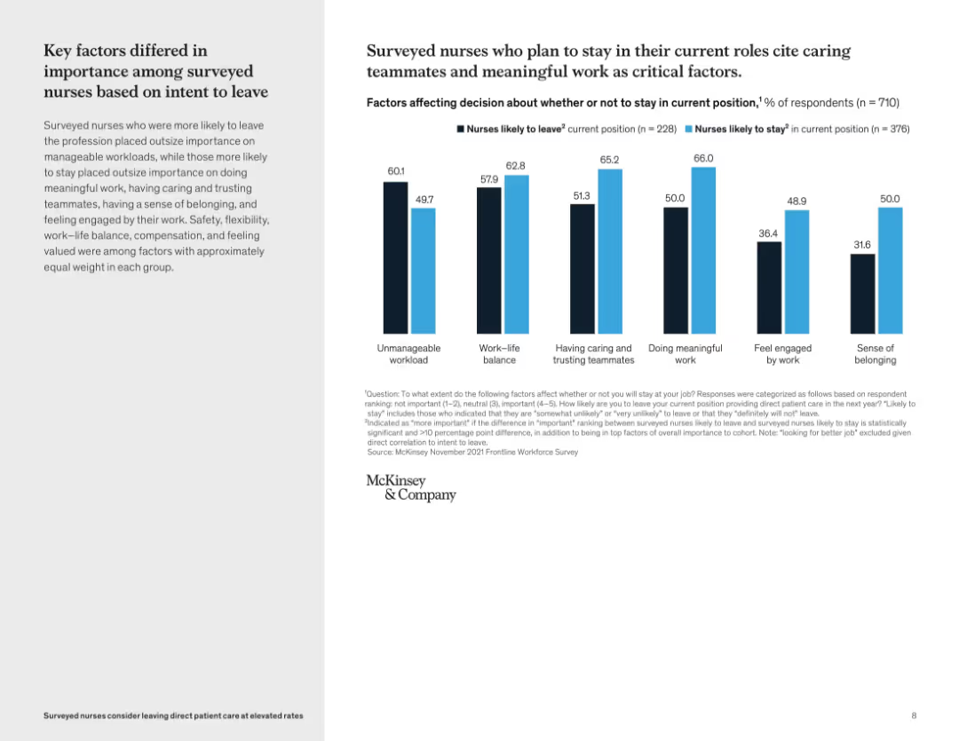
The slide presents data on executive hiring trends in tech firms for 2022 and 2023. CEO was the most common executive role, though its share dropped from 33.5% to 28.3%. CTO and Managing Director follow. There’s also a rise in roles like COO and CSO, reflecting changes in tech firm leadership needs and operational focus.
executive hiring, CEO, CTO, talent trends, leadership, tech companies, 2023, HR, management, CXO roles
Mixed Chart
Barclays
Saved
Compares the reasons customers prefer online vs. offline shopping through bar charts and explores potential future trends like the use of Gen AI in the Metaverse for shopping experiences.
Market Analysis and Trends
Retail & E-commerce
Highlights the evolving nature of shopping experiences and consumer preferences between online and offline channels, emphasizing the impact of technological advancements on retail strategies.
shopping experience, online, offline, Gen AI, Metaverse, retail
Multiple Chart
Bain
Saved
Left-aligned text; pie chart on right on beige background with color-coded legend for business stages
Strategic Planning
Technology & Software
The slide categorizes actively hiring tech firms by their growth stage. Venture-stage companies represent the largest share at 31.3%, followed by growth (25.5%), seed (22.3%), and established (20.9%). The content explains why venture-stage companies lead and notes the implications of early-stage firms actively recruiting despite resource limitations.
venture-stage, startup, seed, established companies, hiring stages, tech company evolution, recruitment phase, market penetration
Mixed Chart
Barclays
Saved
Horizontal bar chart segmented by social grade (ABC1 vs C2DE) on various societal issues.
Customer and Market Segmentation
Government & Public Sector
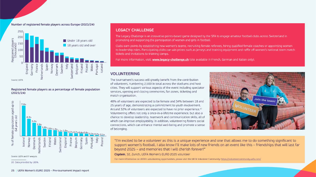
This slide explores differences in public issue priorities based on social class. Higher social grades (ABC1) rate the economy as most important, while lower grades (C2DE) are more concerned with housing, immigration, and healthcare.
social class, economy, housing, Ipsos, segmentation, concerns
Mixed Chart
IPSOS
Saved
Column chart showing digital discovery rates for OTT, movie studios, and LTV, with a narrative section on prevailing views and consumer reality.
Market Analysis and Trends
Media & Entertainment
This slide discusses the rise of digital discovery in LTV, OTT, and movie studios, highlighting the increasing influence of digital channels on content discovery.
digital, discovery, LTV, OTT, movie studios
Mixed Chart
BCG
Saved
This slide includes two column charts. The first chart shows the contribution of the largest seven 'tech' stocks to the S&P 500. The second chart displays the contribution of the 'magnificent 7' stocks to S&P 500 return.
Competitive Landscape
Financial Services
The slide provides insights into the market concentration and impact of major tech stocks on the S&P 500, aiding in competitive landscape analysis.
equity, market concentration, tech stocks, S&P 500, market impact, analysis
Multiple Chart
JP Morgan
Saved
Vertical bar chart showing % of people who know which products/services use AI, by country and demographics.
Industry Overview
Artificial Intelligence
This slide measures familiarity with AI-powered products and services. It ranks countries by agreement and shows demographic patterns by gender, generation, income, and education, revealing significant differences in functional AI literacy.
AI products, awareness, demographics, Ipsos, product use, literacy, global view, services
Multiple Chart
IPSOS
Saved
The slide features multiple horizontal bar charts detailing the impact of various factors on underwriters over the past 5-10 years. Each bar represents a different impact level (from negative to positive) with corresponding percentages. The bars are color-coded and labeled, providing clear visual differentiation.
Risk Assessment and Management
Financial Services
This slide analyzes the various factors impacting underwriters in the financial industry, highlighting areas such as new platforms, automation, and offshoring. It shows significant positive impacts from new technological tools and some negative effects from offshoring, useful for assessing operational and strategic changes in underwriting practices.
underwriting, technology, automation, offshoring, impact, financial services, risk management
Mixed Chart
Accenture
Saved
Previous
Next
If nothing, comes up, please save your slides first
Create a FREE account to continue browsing
Receive Instant Access to 1,000+ slides from companies like McKinsey, Google, and Goldman Sachs
First Name
Last Name
Email
Password
I agree to all
Terms & Privacy Policy
Thank you! Your submission has been received!
Oops! Something went wrong while submitting the form.
Have an account?
Sign in
Column Chart
Heatmap
Chevron
Org Chart
Infographic
Callouts
Timeline
List
Graphic
Picture
Process Flow
Diagram
Paragraph
Map
Table
Framework
Subtitle
Takeaway Box
Icon
Other Chart
Radar Chart
Waterfall Chart
Mekko Chart
Pie Chart
Scatter Plot
Line Chart
Bar chart
Bullet points