My Account
My Slides
Search by Category
Companies
Slide Type
Use Case
Industry
Pricing
Templates
View All Templates
Download Template Slides
✦ AI
AI Prompt Library
AI Search
Feedback
Login
Logout
Get Started
Browse all Slides
Browse all Slides
Create a FREE Account
Instant access to 1,000+ real slides from top companies like McKinsey, BCG, Goldman Sachs, Google and many more!
First Name
Last Name
Email
Password
I agree to all
Terms & Privacy Policy
Thank you! Your submission has been received!
Oops! Something went wrong while submitting the form.
Have an account?
Sign in
Saved Slides
The slide contains a blue column chart showing the monthly active user growth of Telemedicine platforms, indexed to January 2020. It has a source citation and a simple title header in red.
Client Case Studies
Healthcare & Pharmaceuticals
This slide demonstrates the significant growth and user retention of HealthTech platforms post-lockdown, with usage data indexed to pre-COVID-19 levels, signifying lasting impacts on health technology adoption.
HealthTech, Growth, User Retention, Telemedicine, Platforms, COVID-19, Lockdown, Adoption, Technology, Data
Single Chart
Bain
Saved
The slide has a green and white color scheme and presents a matrix showing reasons against repairing different types of e-waste. It uses red and orange circles to indicate various reasons such as cost, lack of repair options, and effort, across items like washing machines and mobile phones.
Market Analysis and Trends
Environmental Services & Sustainability
This slide outlines solvable reasons why people avoid repairing e-waste items, such as high costs and lack of repair options. It uses a matrix to show the prevalence of each reason for different items, advocating for solutions to these barriers.
repair, e-waste, barriers, reasons, solutions
Table
Oliver Wyman
Saved
Multi-chart layout: pie charts, bar chart, and detailed text box on left.
Risk Assessment and Management
Financial Services
Provides an in-depth view of Deutsche Bank’s €35bn CRE loan portfolio, detailing risk categorization, geographic and sectoral exposure, and stress testing. Key stats include €28bn in higher risk loans, 64% LTV average, and €861m in cumulative CLPs. US CRE exposure and quarterly CLPs are visualized, emphasizing loan stress testing and sector distribution.
commercial real estate, CRE, loan stress test, US office, CLP, loan risk, loan-to-value, Deutsche Bank, Q1 2025, sector exposure
Multiple Chart
Deutsche Bank
Saved
The slide includes two column charts showing economic revenue growth in Q1, Q2, and Q3 of 2022 and 2023. There are bullet points on the right side detailing the reported growth, impact of acquisitions, and growth in industries and modules.
Financial Performance
Financial Services
The slide reports Plastic Omnium’s economic revenue growth in Q3 2023, highlighting a 6.5% increase. It details the impact of currency devaluation, acquisitions, and sector-specific growth in industries and modules. The focus is on financial performance and growth metrics.
Organic growth, revenue, Q3 2023, financial performance, acquisitions, industry growth, module growth, economic revenue, currency impact, growth metrics
Mixed Chart
Goldman Sachs
Saved
Line graph with country-specific trends from 2016–2023 showing agreement that “[Country] is in decline”; left panel with text and methodology.
Market Analysis and Trends
Government & Public Sector
Tracks beliefs about national decline over time; South Africa and Great Britain show recent increases, while Mexico and APAC show declines.
decline, national sentiment, trends, Ipsos, global comparison, longitudinal
Mixed Chart
IPSOS
Saved
Similar to the previous slide, this one is divided into five sections, each with a percentage and icon. It summarizes findings related to growth experiences, delayed payments, reliance on online resources, and the impact of AI and IoT on business growth.
Market Analysis and Trends
Professional Services
The slide continues the presentation of survey findings from MSMEs in Nigeria, focusing on growth experiences, the impact of delayed payments, reliance on digital resources, and future technological impacts on business growth. It highlights key statistics and provides a detailed overview of current and future challenges.
survey findings, MSMEs, Nigeria, business growth, delayed payments, technology impact
Multiple Chart
PwC/Strategy&
Saved
Features a detailed circular diagram looking like a pie chart and text describing various trends within the FoodTech industry.
Investment Analysis
Agriculture & Food Production
Maps the FoodTech ecosystem according to key trends, showing how different players are aligned with these trends.
FoodTech, ecosystem, trends, mapping, alignment
Diagram
Accenture
Saved
Timeline of AI achievements from 2020 to 2050, including tasks like telephone banking, writing a high school essay, and generating a top 40 pop song.
Technology and Digital Transformation
Technology & Software
The slide outlines the projected advancements in AI capabilities over the next few decades. It predicts significant milestones in AI performance, highlighting the increasing complexity and ambition of tasks that intelligent machines will be able to accomplish, potentially surpassing human capabilities.
AI Capabilities, Timeline, Intelligent Machines
Linear Flow
Roland Berger
Saved
Displays a column chart showing the gap between male and female labor force participation rates across OECD countries from 2000 to 2017. The slide includes detailed annotations and visual comparisons.
Market Analysis and Trends
Government & Public Sector
Discusses the gap between male and female labor force participation rates across OECD countries, highlighting the reductions in the gap over time, with specific improvements in Luxembourg and Mexico.
gender participation gap, OECD, labor force, Luxembourg, Mexico
Single Chart
PwC/Strategy&
Saved
Stacked bar chart with segments labeled by revenue sources from 2019–2024. Color-coded by segment.
Financial Performance
Financial Services
Demonstrates stable investment bank revenue sources (fees, intermediation, financing) across 6 years. Shows relative share of Global Markets and Banking Fees across peer groups. Highlights consistent revenue contributions and peer comparisons.
investment bank, fees, financing, intermediation, peer comparison, revenue stability
Single Chart
Barclays
Saved
The slide includes a vertical column chart showing the percentage of income/profits taken up by taxes/levies. An image of a man with a tablet is on the right side.
Financial Performance
Financial Services
It discusses the percentage of income or profits that businesses allocate to taxes and levies, with 49% of SMEs paying between 20-40%. It also highlights the impact of local government charges on overall tax compliance.
Taxes, Income, Profits, Business, PwC
Mixed Chart
PwC/Strategy&
Saved
This slide presents a single column chart tracking the revenues from FICC intermediation over several years. The visual is clear with bold labeling for each year, and a consistent blue color scheme representing data. The simplicity of the design aids in focusing on the trend of revenue durability.
Sales and Business Development
Financial Services
Assesses the stability of revenues in Global Banking & Markets, highlighting the trends in FICC intermediation, suitable for discussions on financial stability and long-term revenue planning.
FICC, revenue stability, long-term trend
Single Chart
Goldman Sachs
Saved
Stages of a loyalty program's maturity with descriptive milestones.
Strategic Planning
Professional Services
Outlines a detailed roadmap for setting up a loyalty program, from nascent stages to pioneering, highlighting necessary steps and metrics to track.
loyalty, roadmap, maturity, program, stages
Table
BCG
Saved
Slide outlines future strategies with bullet points and icons representing analytics, execution, and client experience enhancements.
Strategic Planning
Financial Services
Focuses on JP Morgan's strategic investments to meet client needs through advanced analytics, improved execution tools, and client experience.
strategies, analytics, execution, client experience
Pillar
JP Morgan
Saved
Multiple bar and line charts comparing manufacturing, services, and composite PMIs across countries. Callouts highlight US rebound and EU slowdown.
Performance Metrics and KPIs
Industrial & Manufacturing
This slide provides a snapshot of economic activity across key regions, highlighting contraction in manufacturing but resilience in the services sector, especially in the Euro area and US. Composite PMI trends indicate mixed outlooks.
PMI, manufacturing, services, economic activity, US, EU, survey
Multiple Chart
Accenture
Saved
It has a mix of column charts, a line chart, and text sections. The color red is used to accentuate key figures and headers. Charts are labeled for clarity.
Market Analysis and Trends
Industrial & Manufacturing
Displays the growing revenues and profitability in the Defence Electronics & Security sector, with historical data from 2018 to 2021 and future outlooks based on orders and EBITA.
defence, electronics, security, orders, revenues, EBITA, profitability improvement, financial outlook
Multiple Chart
Goldman Sachs
Saved
Horizontal bar chart of countries’ agreement that developed countries should do more to combat climate change. Shows agreement levels and year-over-year change.
Strategic Planning
Environmental Services & Sustainability
This slide highlights global demand for developed nations to increase their efforts in fighting climate change. Agreement is especially high in China, Peru, and Colombia, indicating a sense of unmet responsibility by wealthier countries.
climate action, developed nations, global responsibility, public sentiment, environmental urgency, international pressure, Ipsos, Earth Day
Mixed Chart
IPSOS
Saved
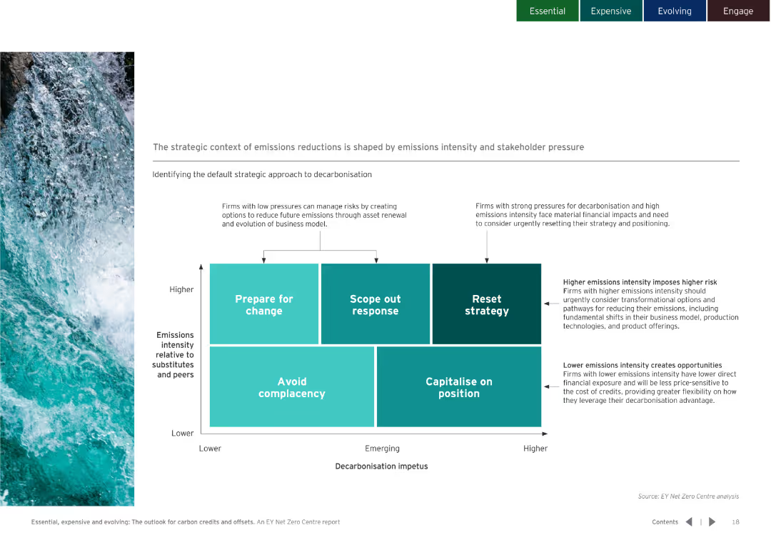
Three-dimensional block diagram comparing different decarbonisation scenarios and strategies. Clear color-coded sections for easy understanding.
Strategic Planning
Environmental Services & Sustainability
Models four scenarios for carbon market outcomes up to 2050. Details the potential impacts and design criteria for each scenario.
carbon market, future scenarios, decarbonisation
Diagram
EY
Saved
The slide includes a line chart showing the trend in German company bankruptcies and a column chart on credit standards and demand. Commentary and implications for corporates are provided.
Risk Assessment and Management
Financial Services
The slide analyzes the rise in business insolvencies and tightening credit standards in Germany. It discusses the implications for corporate borrowing and financial stability.
insolvencies, credit standards, Germany, financial stability, corporate risk
Multiple Chart
Accenture
Saved
The slide includes a column chart showing leverage ratios, debt service coverage, and equity contribution over different periods.
Risk Assessment and Management
Financial Services
The slide discusses concerns in credit markets, including rising interest rates and leverage multiples, along with mitigants like a strong economy.
credit markets, concerns, leverage ratio, debt service, equity contribution, interest rates, mitigants, trends
Multiple Chart
Credit Suisse
Saved
This slide features text and a pie chart illustrating preferences for digital payment channels. The visual elements are informative and well-organized.
Technology and Digital Transformation
Telecommunications
The slide examines the shift towards digital payments during COVID-19, focusing on consumer preferences and the impact on telecom operators.
digital payments, COVID-19, consumer preferences, telecom, mobile wallets, internet banking, cashless economy, digital channels
Mixed Chart
EY
Saved
A column chart displays the order intake from 2018 to 2021, with a blue gradient. The slide includes red text boxes with bullet points on strategic outlook and future projections.
Sales and Business Development
Industrial & Manufacturing
It displays a positive trend in order intake, with strategic notes on market positioning and future expectations. This is likely used in sales meetings or investor briefings to demonstrate sales momentum and business growth.
Order Intake, Sales Trend, Strategic Outlook, Aerospace, Defense
Mixed Chart
Goldman Sachs
Saved
Column chart and pie chart showing impact of Covid-19 on 2021 revenues and future investments in the F&L industry. Most impact is between 0-20%, with 97% continuing investment.
Financial Performance
Financial Services
Despite negative revenue impact, majority of investors plan to continue investing in F&L industry. Revenue impact is mostly below 20%, with future investments unaffected.
Covid-19, revenue impact, future investments, investor confidence, financial outlook
Multiple Chart
Deloitte
Saved
The slide presents a column chart at the bottom with data from three different years, comparing Clorox's employee engagement levels to industry standards, using blue shades for different years and green for benchmarks. The design is clear and straightforward.
Human Resources and Talent Management
Professional Services
Discusses Clorox's employee engagement scores relative to fast-moving consumer goods companies and high-performing global companies, showing a trend of improvement and superior performance. Useful for HR presentations and management reviews.
employee engagement, HR management, Clorox, industry comparison
Mixed Chart
Barclays
Saved
The slide features two bar charts comparing loan and deposit figures across multiple quarters.
Financial Performance
Financial Services
Examines year-on-year and quarter-on-quarter changes in loan and deposit volumes within the bank's various divisions, providing insights into lending trends and deposit fluctuations.
loan development, deposit growth, banking, trends
Multiple Chart
Deutsche Bank
Saved
Previous
Next
If nothing, comes up, please save your slides first
Create a FREE account to continue browsing
Receive Instant Access to 1,000+ slides from companies like McKinsey, Google, and Goldman Sachs
First Name
Last Name
Email
Password
I agree to all
Terms & Privacy Policy
Thank you! Your submission has been received!
Oops! Something went wrong while submitting the form.
Have an account?
Sign in
Column Chart
Heatmap
Chevron
Org Chart
Infographic
Callouts
Timeline
List
Graphic
Picture
Process Flow
Diagram
Paragraph
Map
Table
Framework
Subtitle
Takeaway Box
Icon
Other Chart
Radar Chart
Waterfall Chart
Mekko Chart
Pie Chart
Scatter Plot
Line Chart
Bar chart
Bullet points