Create a FREE Account
Instant access to 1,000+ real slides from top companies like McKinsey, BCG, Goldman Sachs, Google and many more!
First Name
Last Name
Email
Password
I agree to all
Terms & Privacy Policy
Thank you! Your submission has been received!
Oops! Something went wrong while submitting the form.
Have an account?
Sign in
Library
Templates
Courses
Pricing
My Account
My Slides
My Templates
✦ AI
AI Prompt Library
AI Search
Sign in
Start Here
Logout
My Saved Slides
Two charts: a bubble chart comparing urbanization rate with GDP per capita across countries, and a line chart showing the share of global real GDP over time by region.
Market Analysis and Trends
Financial Services
This slide explores the structural dynamics of emerging markets, with a focus on urbanization, GDP per capita, and regional contributions to global GDP. Used for economic analysis and strategic planning in emerging markets.
Emerging markets, GDP, urbanization, global
Multiple Chart
JP Morgan
Saved
Combination of text, bar charts, and dot plots. The slide evaluates the accuracy of cash forecasting over different time horizons and identifies the main hurdles to improving forecasting accuracy.
Financial Performance
Financial Services
This slide analyzes the accuracy of cash forecasting within organizations over various time horizons and identifies key obstacles to improving this accuracy, such as poor data quality and lack of effective tools.
Cash, Forecasting, Accuracy, Hurdles, Improvement
Multiple Chart
Deloitte
Saved
This slide discusses various asset classes within the green economy, using background images and concise text to highlight key areas like solar and wind energy, and electric mobility.
Investment Analysis
Energy & Utilities
Explores deep dives into investor activities in Southeast Asia, identifying significant investment opportunities and challenges in sectors like renewable energy and electric mobility, emphasizing the potential for growth and the need for enhanced infrastructure and policies.
renewable energy, investments, Southeast Asia, electric mobility
Text Only
Bain
Saved
Dual bar charts comparing actual vs. required CET1 and leverage ratios
Regulatory and Compliance
Financial Services
Shows how Barclays’ CET1 capital ratio (12.5%) and UK leverage ratio (5.9%) exceed regulatory minimums. Helps illustrate compliance strength, capital buffers, and the institution’s financial resilience against regulatory thresholds.
CET1, Leverage Ratio, Regulation, Capital Buffer, Compliance, Barclays, Financial Safety, Ratios
Multiple Chart
Barclays
Saved
The slide features a quadrant chart categorizing industry segments by near-term and long-term outlooks. Text boxes describe each segment.
Market Analysis and Trends
Environmental Services & Sustainability
The slide analyzes the near-term and long-term performance outlook of various industry segments related to environmental services.
Environmental, outlook, restoration, consulting, recycling, services, near-term, long-term, industry, response
Header Vertical
LEK
Saved
Side-by-side bar charts with color-coded segments, image on the left of industrial crane and paper stacks. Corporate blue and green branding with clear labeling.
Performance Metrics and KPIs
Industrial & Manufacturing
This slide presents segmented data on paper production, fiber consumption, and pulp types. It includes visual breakdowns by categories such as packaging, tissue, and virgin pulp, providing insight into the industry's resource allocation.
pulp, paper, packaging, fiber, tissue, virgin, recycled, production, market, integration
Single Chart
Goldman Sachs
Saved
Left side explains improvement across tech categories; right side features a vertical progress bar chart. Far right has a bold statistic highlight.
Technology and Digital Transformation
Technology & Software
Organizations are maturing across tech categories, especially XaaS and data/analytics. Chart shows progress from 2023 to 2024 in four key tech areas. Notes ASPAC is leading in proactive implementation. Calls out 86% prioritizing XaaS for agility and cost savings.
XaaS, cloud, strategy evolution, tech maturity, AI, cybersecurity
Mixed Chart
KPMG
Saved
Features a circular diagram centered around "Consumer Banking" with associated sectors and icons, as well as a bar chart for statistical representation.
Industry Overview
Financial Services
Outlines the cross-product engagement of consumer banking customers, showcasing the interconnectivity of different banking services and their contribution to the firm's value.
consumer banking, cross-product, engagement, financial services, business banking, wealth management, home lending, credit card, customer relationships
Diagram
JP Morgan
Saved
A series of comparative column charts depicting the primary reasons consumers shop online across different product categories, such as price, quality, and convenience, with percentage breakdowns for each category.
Market Analysis and Trends
Retail & E-commerce
The slide examines the main reasons for online shopping, focusing on factors like price, quality, and convenience across various product categories, based on consumer survey responses.
online shopping, consumer reasons, price, quality, convenience, product categories
Multiple Chart
PwC/Strategy&
Saved
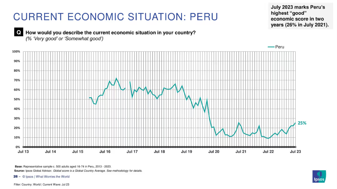
Black line graph with time axis from 2008 to 2025; notable spikes in 2009 (Swine flu) and 2020–2021.
Market Analysis and Trends
Healthcare & Pharmaceuticals
Tracks public concern over pandemics, with a dramatic peak in April 2020 during COVID-19. Smaller peaks correspond to Ebola and swine flu. Concern plummets post-2022.
COVID-19, pandemic, healthcare, public opinion, Ipsos, H1N1, Ebola, virus, disease, health concern
Single Chart
IPSOS
Saved
Data visualization slide showing the population of Southeast Asian countries, with a simple map and corresponding data points.
Market Analysis and Trends
Technology & Software
Presents demographic data relevant to the e-Conomy SEA report, such as the population figures of countries in Southeast Asia.
e-Conomy SEA, demographics, Southeast Asia, population, country data, market analysis
Uncategorized
Bain
Saved
This slide contains a scatter plot with various consumer profiles categorized by generation and nationality. It includes icons and images representing each category, along with labeled axes.
Market Analysis and Trends
Consumer Goods
The slide explores different consumer segments based on age and nationality, highlighting the importance of Megacitier and Rich Upstarter for growth, and Absolute Luxurer in mature markets.
consumer segments, scatter plot, nationality, generation, market analysis
Diagram
BCG
Saved
Bar chart with stacked economic impact contributions and bullet-point summary below
Investment Analysis
Media & Entertainment
Shows Texas generated $100.4M economic impact from the ICC T20 event. Key spend categories include accommodation, F&B, travel. Future tourism impact noted.
ICC, T20, Texas, economic impact, tourism, accommodation, F&B, Nielsen, sports economy, event analysis
Mixed Chart
Nielsen
Saved
Contains a column chart showing the reliance on marketing for creative ideas in high-growth companies, with text suggesting strategies to encourage creativity.
Strategic Planning
Professional Services
This slide discusses strategies for CMOs to foster creativity in their organizations, emphasizing the role of marketing in generating creative ideas in high-growth companies.
creativity, strategies, CMOs, professional services, marketing
Mixed Chart
Deloitte
Saved
The slide includes two line charts showing average spreads and annual default rates for different types of corporate bonds and loans.
Market Analysis and Trends
Financial Services
This slide gives an update on the corporate bond market, showing the average spreads and default rates, helping investors understand market conditions.
Corporate Bonds, Market Update, Spreads, Default Rates, Investments
Multiple Chart
Morgan Stanley
Saved
Column chart and tables showing diverse and granular portfolio with balances. Includes risk ratings and highlights key points. Uses green for emphasis.
Financial Performance
Financial Services
This slide provides an overview of the commercial credit portfolio, highlighting diversification, balances, and risk ratings. It emphasizes disciplined capital allocation.
commercial credit, portfolio, diversification, balances, risk
Mixed Chart
Barclays
Saved
Three-column layout: main narrative on the left, challenges explained in the center, and a chart with barrier percentages on the right. Purple bar chart used again.
Risk Assessment and Management
Government & Public Sector
Explains key challenges faced by defense startups such as security clearance issues, lack of funding, and weak supply chains. These issues are illustrated with statistics and contextual industry examples (e.g., DARPA and European support programs).
barriers, startups, supply chain, security clearance, funding
Mixed Chart
Accenture
Saved
Heatmap showing monthly changes across six economic indicators from 2020–2025. The bottom bar graph summarizes 6-month percentage changes for each variable. Uses color coding (red, yellow, green) to indicate strength/weakness.
Risk Assessment and Management
Financial Services
Analyzes variables used by the NBER to determine U.S. recessions, such as employment, income, and industrial production. The slide helps assess economic health via color-coded trends and highlights relatively strong wholesale and industrial indicators.
recession, NBER, employment, production, consumer spending, income, indicators, heatmap, risk, economic decline
Multiple Chart
JP Morgan
Saved
Similar to previous; shows responses to knowing someone bisexual; bar chart with country comparisons.
Market Analysis and Trends
Government & Public Sector
The chart shows the proportion of people in different countries who know someone bisexual. Brazil and South Africa top the list, while Japan and South Korea are at the bottom.
bisexual, relationships, awareness, LGBT+, countries, visibility
Mixed Chart
IPSOS
Saved
Dual bar charts comparing FDI inflows across time periods; color-coded by region; CAGR on the side
Investment Analysis
Financial Services
The slide shows how Asia-Pacific accounts for a steady 40% of FDI into SEA, highlighting the roles of China, Japan, and intra-ASEAN flows in shaping investments in infrastructure, energy, and technology.
FDI, infrastructure, SEA, China, Japan, ASEAN, investment, technology
Single Chart
Bain
Saved
The slide contains a chart comparing France's position in 2011 and 2021 on various criteria, showing improvements and deteriorations over time.
Strategic Planning
Education & Training
This slide highlights the changes in France's strengths and weaknesses over the past decade, with improvements in key assets and ongoing challenges.
Historical comparison, Strengths, Weaknesses, Education, Training
Mixed Chart
Bain
Saved
Contains a series of column charts indicating trends in total revenues, adjusted EBITDA, and net leverage over several years. Each graph uses blue bars of varying heights to represent values, with key figures highlighted for emphasis.
Financial Performance
Financial Services
The slide summarizes financial performance trends over time, displaying revenue, EBITDA, and leverage. It's designed for financial analysis and discussions around fiscal management and operational efficiency in a corporate setting.
financial performance, EBITDA, leverage, operational efficiency
Multiple Chart
Goldman Sachs
Saved
Vertical bar chart ranking countries and demographics by expected AI improvement in entertainment options, such as video and books.
Market Analysis and Trends
Artificial Intelligence
The slide illustrates public opinion on AI's positive influence on entertainment. Peru and Indonesia lead optimism, while Gen Z is most hopeful among demographic groups.
AI, entertainment, TV, movies, music, optimism, perception, demographic comparison, Ipsos
Multiple Chart
IPSOS
Saved
Bar and line charts showing SME GVA from 2008–2022, segment breakdowns, and growth rate comparisons by country; bullet points summarize insights.
Performance Metrics and KPIs
Financial Services
The slide emphasizes the Netherlands' high and accelerating SME output growth, especially in the Micro segment. It compares GVA by SME size and country, showing NL’s top performance in CAGR from 2017–2022.
SME GVA, NL, growth, micro segment, performance, CAGR, EU
Multiple Chart
Oliver Wyman
Saved
The slide displays a pyramid diagram representing the tiered service approach, and bar charts that quantify the firm's market opportunity. The layout is straightforward with a mix of graphics and bullet points.
Corporate Finance and Valuation
Financial Services
Illustrating Ayco's role in providing integrated corporate client services, the slide highlights the scope of Ayco's reach in the market and outlines its full-service offerings across corporate hierarchies.
Ayco, corporate clients, financial planning, market reach
Framework
Goldman Sachs
Saved
Previous
Next
If nothing, comes up, please save your slides first
Create a FREE account to continue browsing
Receive Instant Access to 1,000+ slides from companies like McKinsey, Google, and Goldman Sachs
First Name
Last Name
Email
Password
I agree to all
Terms & Privacy Policy
Thank you! Your submission has been received!
Oops! Something went wrong while submitting the form.
Have an account?
Sign in
Column Chart
Heatmap
Chevron
Org Chart
Infographic
Callouts
Timeline
List
Graphic
Picture
Process Flow
Diagram
Paragraph
Map
Table
Framework
Subtitle
Takeaway Box
Icon
Other Chart
Radar Chart
Waterfall Chart
Mekko Chart
Pie Chart
Scatter Plot
Line Chart
Bar chart
Bullet points