Create a FREE Account
Instant access to 1,000+ real slides from top companies like McKinsey, BCG, Goldman Sachs, Google and many more!
First Name
Last Name
Email
Password
I agree to all
Terms & Privacy Policy
Thank you! Your submission has been received!
Oops! Something went wrong while submitting the form.
Have an account?
Sign in
Library
Templates
Courses
Pricing
My Account
My Slides
My Templates
✦ AI
AI Prompt Library
AI Search
Sign in
Start Here
Logout
My Saved Slides
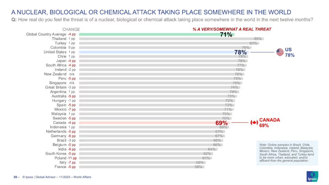
Bar chart ranking countries by concern over such attacks occurring globally; threat perception shown on the right; Canada and US again highlighted.
Risk Assessment and Management
Government & Public Sector
This slide illustrates the public’s view on the likelihood of a nuclear, biological, or chemical (NBC) attack somewhere in the world over the next year. The global average perceived threat is 71%, with 78% of Americans and 69% of Canadians regarding it as a real threat. The slide visualizes concern levels on global catastrophic risks.
NBC attack, public concern, global threats, terrorism, weapons, survey, perception, USA, Canada, Ipsos
Single Chart
IPSOS
Saved
The slide presents a column chart and bullet points of textual information. The chart depicts yearly revenue from 2019 to 2027 with bars in red, and the highest peak projected for 2027. It includes annotations such as CAGR percentage. The layout is split between the chart and text, which discusses impacts of COVID-19 on cinema, specific local films, and a Sci-fi drama’s earnings.
Market Analysis and Trends
Media & Entertainment
This slide analyzes the recovery and growth projections of the cinema industry in Hong Kong, highlighting impacts of COVID-19, local film market share, and revenue metrics. It's useful for presenting market recovery scenarios and future revenue estimations.
cinema, Hong Kong, COVID-19, revenue growth, local films, Sci-fi drama, market analysis, 2027 projections
Mixed Chart
PwC/Strategy&
Saved
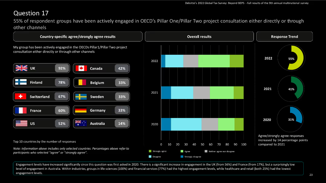
The slide contains bar charts for country-specific results and a column chart for overall results, with a donut chart for response trends.
Risk Assessment and Management
Financial Services
The slide displays survey findings on engagement in OECD’s Pillar One/Pillar Two project consultations. It includes country-specific and overall responses, highlighting trends from 2020 to 2022.
OECD, Pillar One, Pillar Two, engagement, survey
Multiple Chart
Deloitte
Saved
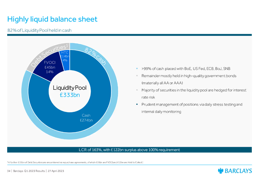
The slide contains a pie chart detailing the composition of the liquidity pool and bullet points explaining liquidity management strategies.
Financial Performance
Financial Services
This slide highlights the liquidity position, focusing on the composition and management of the liquidity pool, showing a high percentage of cash and prudent management practices to ensure financial stability.
liquidity, balance sheet, cash, management, stability
Mixed Chart
Barclays
Saved
The slide has a comparative layout with text boxes and percentages, including a horizontal flowchart depicting various stages.
Strategic Planning
Financial Services
The slide outlines the partnership between IBCM and GM in delivering leveraged finance services, showing coverage areas and their contributions to revenues.
leveraged finance, partnership, IBCM, GM, revenues, contributions, global markets, strategy, sponsors, coverage
Linear Flow
Credit Suisse
Saved
The slide features bar charts showing operating expenses and total RWA from 2Q23 to 4Q23, with text detailing actions for cost reduction, capital release, and protecting customer franchise. Ambitions for PBT and RWA by 2026 are also listed.
Risk Assessment and Management
Financial Services
The slide outlines strategies for reducing costs and releasing capital in non-core and legacy sectors. It includes data on operating expenses, RWA, and strategic actions to achieve these goals. This slide can be used to communicate cost management and capital release strategies in non-core and legacy areas.
cost reduction, capital release, operating expenses, strategic actions, non-core
Multiple Chart
UBS
Saved
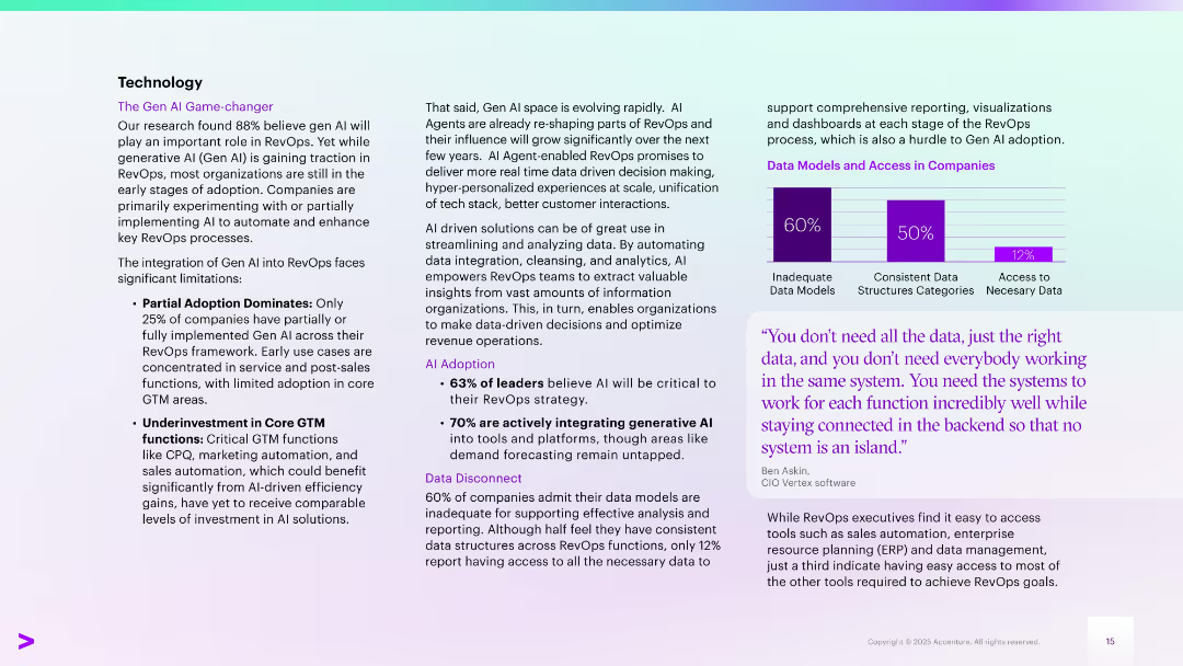
Two-column layout with bullet points on the left and highlighted stats and charts on the right. Includes a purple bar chart and a quote box. Uses purple and teal gradients.
Technology and Digital Transformation
Technology & Software
Discusses Gen AI adoption in RevOps, noting early-stage use, limited adoption in core GTM areas, and investment gaps. Highlights the growing role of AI agents and data integration issues. Features statistics on AI adoption and access to data, with a quote emphasizing the importance of system integration.
Gen AI, RevOps, automation, data models, AI adoption, GTM, integration
Mixed Chart
Accenture
Saved
Presents column charts tracking revenue and productivity growth alongside strategic highlights about Serasa's market position in Brazil.
Market Analysis and Trends
Financial Services
Details the growth of the Serasa platform in Brazil, highlighting its financial success and strategic position within the market as a comprehensive consumer financial platform.
Serasa, Brazil, financial growth, market analysis, consumer finance
Multiple Chart
Barclays
Saved
Infographic showing the process of realizing productivity gains through technology, involving respondent access, survey, and analysis & reporting, with mentions of Askia and Infotools platforms.
Operational Efficiency
Technology & Software
The slide outlines the workflow for improving productivity using technology, highlighting key platforms and stages such as respondent access, survey process, and data analysis & reporting.
productivity, technology, workflow, respondent access, survey process
Diagram
IPSOS
Saved
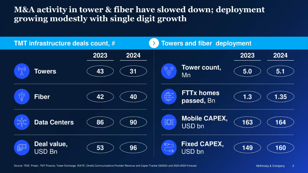
Split-table layout with deal counts on left and deployment metrics on right; icons used
Mergers and Acquisitions
Telecommunications
Reports on declining M&A activity in towers and fiber between 2023–2024, despite modest infrastructure growth; contrasts deal count and value with operational metrics like CAPEX and homes passed.
telecom M&A, towers, fiber, deployment, capex, infrastructure, 2024 outlook, deal value
Table
McKinsey
Saved
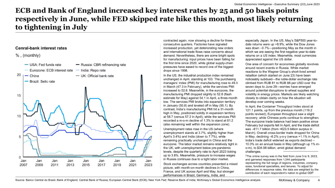
Line chart comparing central bank interest rates across major economies (USA, Eurozone, UK, India, etc.) over time, with text commentary.
Regulatory and Compliance
Financial Services
This slide outlines the recent interest rate decisions by central banks, highlighting increases by the ECB and Bank of England, while the Fed held steady. It provides context on manufacturing trends, unemployment, and global geopolitical factors affecting economic outlooks and exchange rate stability.
central banks, interest rates, ECB, Fed, monetary policy, inflation, regulation, macroeconomics, global risk, exchange rates
Mixed Chart
McKinsey
Saved
The slide features a simple, dark background with a large, centered column chart showing underwriting revenues over several years.
Financial Performance
Financial Services
This slide presents a trend analysis of underwriting revenues in the Global Banking & Markets sector, using a column chart to show changes over time.
banking, markets, revenue, trend, underwriting
Single Chart
Goldman Sachs
Saved
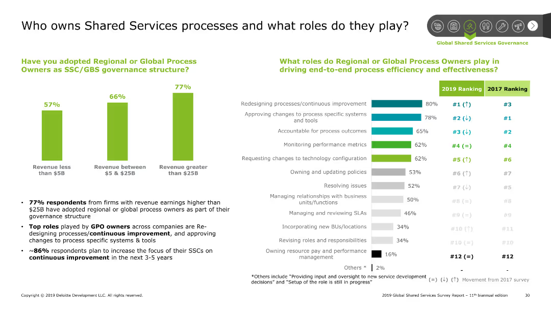
The slide has a column chart and bar chart. The column chart shows the adoption of process owners by revenue, and the bar chart shows roles by rank.
Human Resources and Talent Management
Professional Services
This slide discusses the ownership of shared services processes and the roles of global process owners. It highlights the adoption rate by company size and key roles.
Shared Services, processes, roles, governance, adoption
Multiple Chart
Deloitte
Saved
The slide includes a strategy diagram with four main actions, priority-actions listed below, and text summarizing the need for national strategy and its components.
Strategic Planning
Transportation & Logistics
It details the strategic actions and priorities for improving the national freight and supply chain, highlighting efficiency, planning, and investment needs.
Strategy, freight, supply chain, national, planning, investment, efficiency, priorities, components
Diagram
LEK
Saved
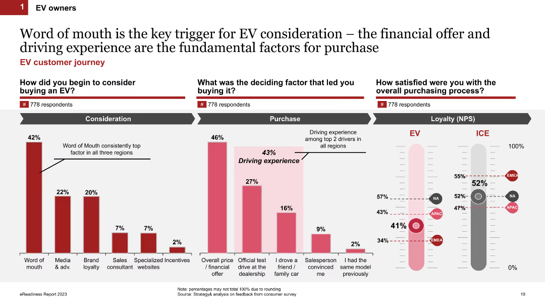
Three sections: column charts on factors triggering EV consideration, deciding factors, and satisfaction levels (NPS) comparing EV to ICE vehicle owners.
Market Analysis and Trends
Transportation & Logistics
Discusses the influence of word-of-mouth on EV purchase consideration, key decision factors, and loyalty (NPS) differences between EV and ICE vehicle owners.
word of mouth, purchase consideration, loyalty, NPS, EV owners
Multiple Chart
PwC/Strategy&
Saved
A complex visual with text blocks and a large pie chart detailing the distribution of investments in resiliency across sectors like automation and digitization.
Strategic Planning
Industrial & Manufacturing
The slide provides an analysis of the overall investment strategy by companies to enhance resilience, highlighting how funds are allocated across various activities such as resourcing, industrial automation, and digitization.
investment, strategy, resilience, automation, business analysis
Mixed Chart
Accenture
Saved
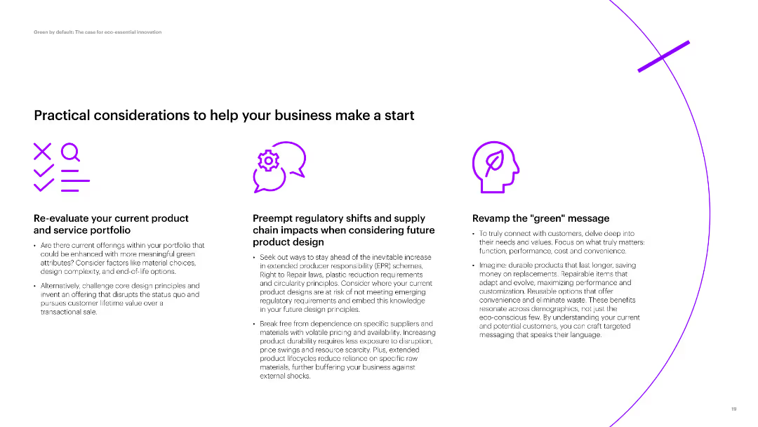
Three sections with icons and text, discussing product evaluation, regulatory impacts, and green messaging. Simple layout with moderate text density.
Strategic Planning
Environmental Services & Sustainability
Discusses practical steps for businesses to enhance their product portfolio with green attributes, consider regulatory impacts, and revamp their messaging for eco-conscious consumers.
product portfolio, regulatory impacts, green messaging, eco-friendly, business start
Pillar
Accenture
Saved
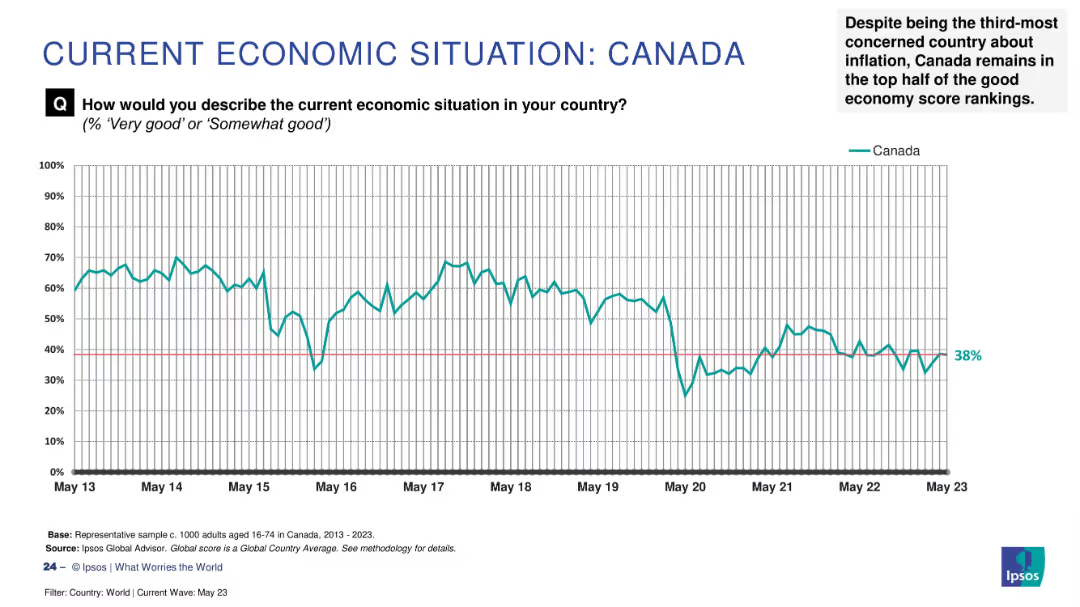
Line graph tracking Canada's economic sentiment (2013–2023); explanatory note in top right summarizes context.
Strategic Planning
Financial Services
Canada's “good economy” score stands at 38%, placing it in the upper half of the global ranking despite inflation concerns. The time-series chart shows fluctuations over the last decade, with a notable dip in May 2020. The narrative notes Canada’s resilience relative to other economies.
Canada, economic sentiment, Ipsos, inflation, public perception, resilience, global context, economic trend
Single Chart
IPSOS
Saved
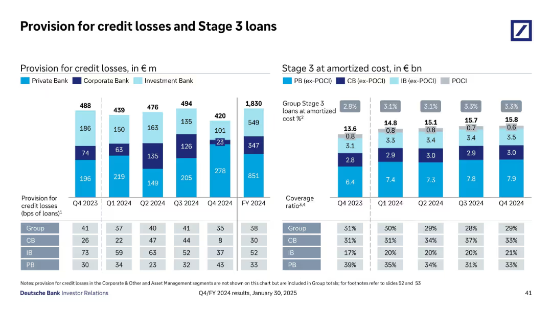
Stacked bar and column charts show credit loss provisions and Stage 3 loan amounts by division and time; includes table and key metrics
Risk Assessment and Management
Financial Services
Shows provisions for credit losses and Stage 3 loan balances by business unit from Q4 2023 to Q4 2024. Group-level ratios, coverage, and bps data illustrate a relatively stable risk environment, with investment and private banks absorbing most losses; Corporate Bank fluctuates moderately.
credit losses, Stage 3 loans, provisions, risk, amortized cost, coverage
Multiple Chart
Deutsche Bank
Saved
The slide includes two line charts. The left chart shows global supply chain pressure and freight costs over time. The right chart compares freight costs by route for Shanghai-Los Angeles and Shanghai-Rotterdam.
Operational Efficiency
Transportation & Logistics
The slide analyzes global supply chain pressures and freight costs, comparing different trade routes. It is used for understanding logistics challenges and optimizing supply chain management.
supply chains, freight costs, global logistics, trade routes, Shanghai-Los Angeles, Shanghai-Rotterdam, operational efficiency, logistics analysis
Multiple Chart
JP Morgan
Saved
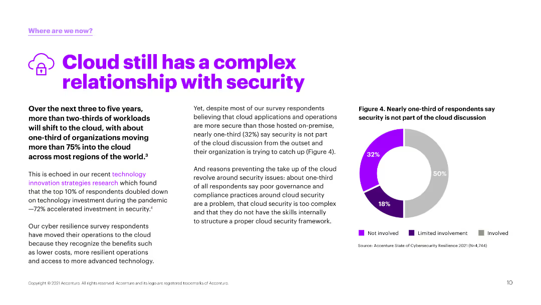
Text and a pie chart illustrating survey responses about the involvement of security in cloud discussions. The chart uses purple and gray to show different involvement levels.
Risk Assessment and Management
Technology & Software
The slide explores the ongoing challenges of cloud security, indicating that a significant portion of respondents feel that security is not adequately involved in cloud strategy discussions.
cloud, security, involvement, challenges, survey
Mixed Chart
Accenture
Saved
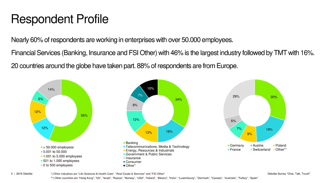
Three pie charts showing the profile of survey respondents by company size, industry, and geographic location.
Market Analysis and Trends
Professional Services
The slide outlines the demographic breakdown of survey respondents, detailing their company sizes, industries, and regions.
respondent profile, company size, industry, geography, survey, demographics
Multiple Chart
Deloitte
Saved
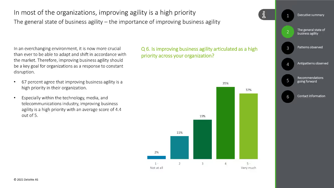
This slide shows a column chart with responses on the priority of business agility in organizations, featuring bars in green and blue colors.
Strategic Planning
Technology & Software
The slide emphasizes that improving business agility is a high priority for most organizations, supported by survey data indicating a high agreement among respondents.
business agility, priority, organizations, survey data, importance
Mixed Chart
Deloitte
Saved
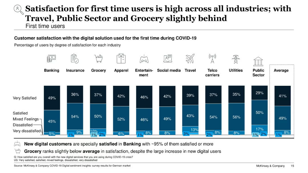
Vertical stacked bar chart showing degrees of satisfaction for first-time users by industry; blue color scheme
Customer and Market Segmentation
Technology & Software
This slide focuses on customer satisfaction among first-time digital users. Banking shows the highest satisfaction (~95%), while Travel, Grocery, and Public Sector lag slightly. Most users report being satisfied or very satisfied, with only a small percentage expressing dissatisfaction.
first-time users, satisfaction, customer experience, digital onboarding, banking, travel, public sector, survey
Single Chart
McKinsey
Saved
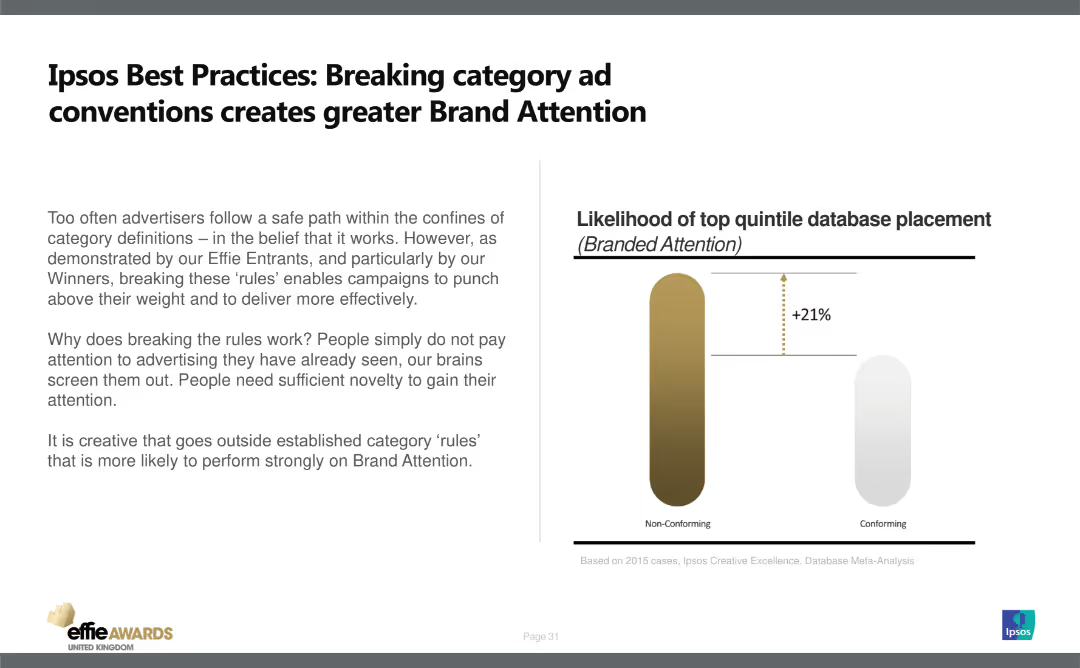
The slide has a title at the top, text on the left, and a column chart on the right. It features a simple design with minimal visual elements.
Strategic Planning
Media & Entertainment
Explains the importance of breaking category conventions in advertising to enhance brand attention. Uses data to show non-conforming ads have 21% higher likelihood of top quintile database placement.
Brand Attention, Advertising, Strategy, Conventions, Effectiveness
Mixed Chart
IPSOS
Saved
Previous
Next
If nothing, comes up, please save your slides first
Create a FREE account to continue browsing
Receive Instant Access to 1,000+ slides from companies like McKinsey, Google, and Goldman Sachs
First Name
Last Name
Email
Password
I agree to all
Terms & Privacy Policy
Thank you! Your submission has been received!
Oops! Something went wrong while submitting the form.
Have an account?
Sign in
Column Chart
Heatmap
Chevron
Org Chart
Infographic
Callouts
Timeline
List
Graphic
Picture
Process Flow
Diagram
Paragraph
Map
Table
Framework
Subtitle
Takeaway Box
Icon
Other Chart
Radar Chart
Waterfall Chart
Mekko Chart
Pie Chart
Scatter Plot
Line Chart
Bar chart
Bullet points