Create a FREE Account
Instant access to 1,000+ real slides from top companies like McKinsey, BCG, Goldman Sachs, Google and many more!
First Name
Last Name
Email
Password
I agree to all
Terms & Privacy Policy
Thank you! Your submission has been received!
Oops! Something went wrong while submitting the form.
Have an account?
Sign in
Library
Templates
Courses
Pricing
My Account
My Slides
My Templates
✦ AI
AI Prompt Library
AI Search
Sign in
Start Here
Logout
My Saved Slides
Bar graph showing total sales by segment, monochromatic color scheme, and source citation.
Market Analysis and Trends
Financial Services
Demonstrates the size and sector opportunities within the US wholesale distribution market.
Wholesale, Distribution, Market Size, Sales, Sectors, Opportunities
Single Chart
EY
Saved
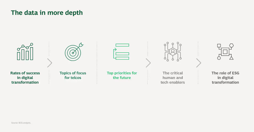
The slide uses a simple layout with five icons and brief text descriptions, visually connected by arrows, representing different focus areas in digital transformation for telcos.
Technology and Digital Transformation
Telecommunications
This slide provides an overview of the data topics covered in more detail later, focusing on digital transformation in the telecommunications sector.
Digital transformation, Telcos, Focus areas, Technology, Data analysis
Pillar
BCG
Saved
Bar chart and map detailing projected net employment changes across New Zealand regions by 2030.
Strategic Planning
Industrial & Manufacturing
Slide projects employment growth across New Zealand by region, useful for regional development and investment strategies.
Employment, Projections, New Zealand, 2030, Regions
Multiple Chart
McKinsey
Saved
The slide is organized into three main columns, each representing how companies within different sectors are responding to inflation—either by reducing, increasing, or maintaining marketing spend. The use of contrasting colors facilitates easy comparison.
Market Analysis and Trends
Professional Services
This slide categorizes how different industry sectors are reacting to inflation in terms of their marketing spend. It provides a nuanced view of economic strategies, highlighting which sectors are more resilient or vulnerable to market changes. This information is crucial for cross-sector analysis and strategic adjustments.
Inflation, Marketing Spend, Industry Comparison, Economic Strategy, Resilience
Table
Deloitte
Saved
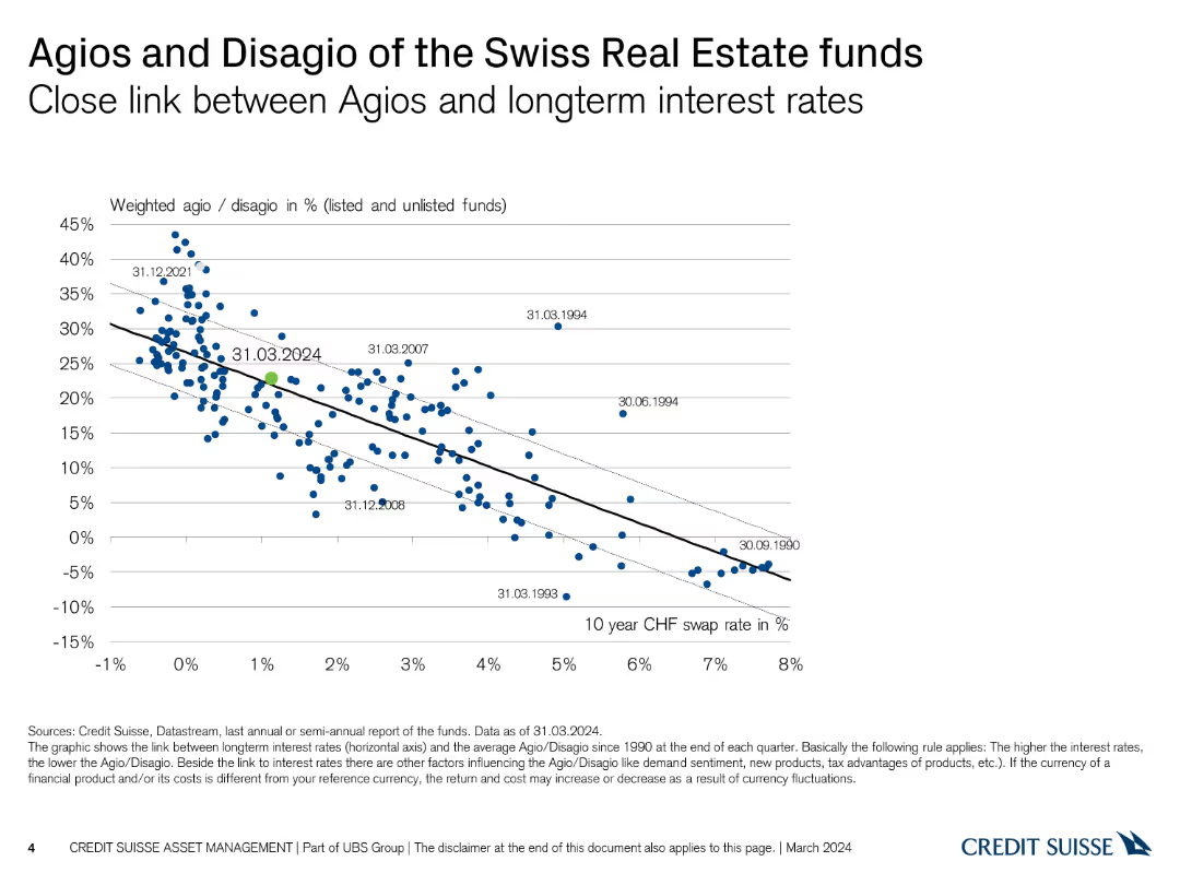
The slide shows a scatter plot with a trend line, displaying the relationship between agios/disagio and long-term interest rates from 1990 to 2024. The data points are in blue.
Financial Performance
Real Estate & Construction
This slide analyzes the correlation between agios/disagio rates of Swiss Real Estate funds and long-term interest rates. It is used to assess the impact of interest rates on fund performance.
agios, disagio, interest rates, real estate, trend line
Single Chart
Credit Suisse
Saved
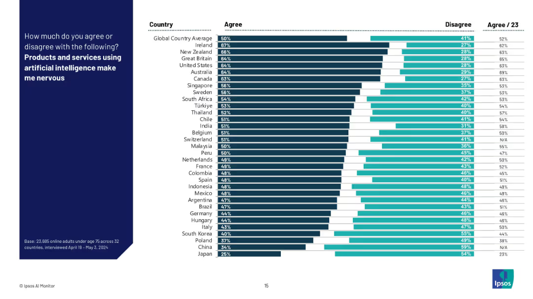
Bar chart with dark and light horizontal bars comparing “Agree” vs “Disagree” responses across countries; aligned country labels on the left.
Market Analysis and Trends
Artificial Intelligence
This slide visualizes the share of respondents across multiple countries who express nervousness about AI-powered products and services. It ranks countries by agreement level and highlights global sentiment towards AI adoption and unease.
AI perception, fear, country comparison, Ipsos, survey, consumer sentiment, technology anxiety, trust, global average, nervousness
Mixed Chart
IPSOS
Saved
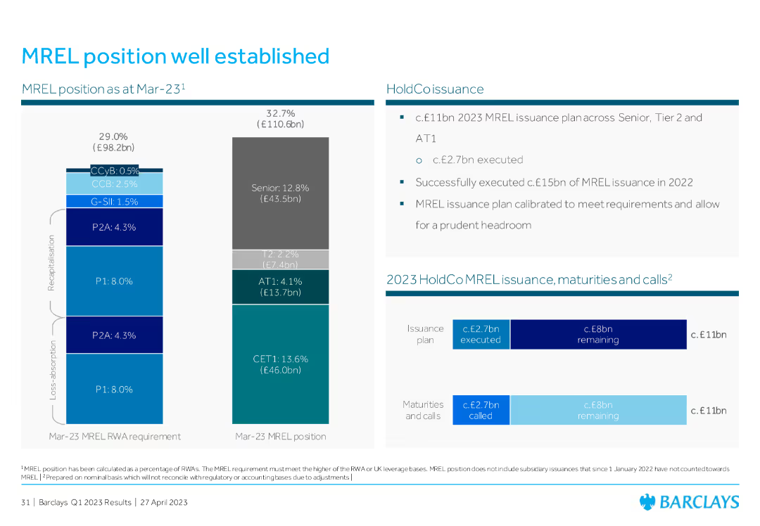
The slide features a bar chart on the left showing the MREL position and requirements, and a table on the right detailing issuance plans, maturities, and calls.
Risk Assessment and Management
Financial Services
This slide outlines the MREL (Minimum Requirement for own funds and Eligible Liabilities) position as of March 2023, highlighting the capital issuance plan and the status of MREL compliance.
MREL, issuance, compliance, risk management, capital
Multiple Chart
Barclays
Saved
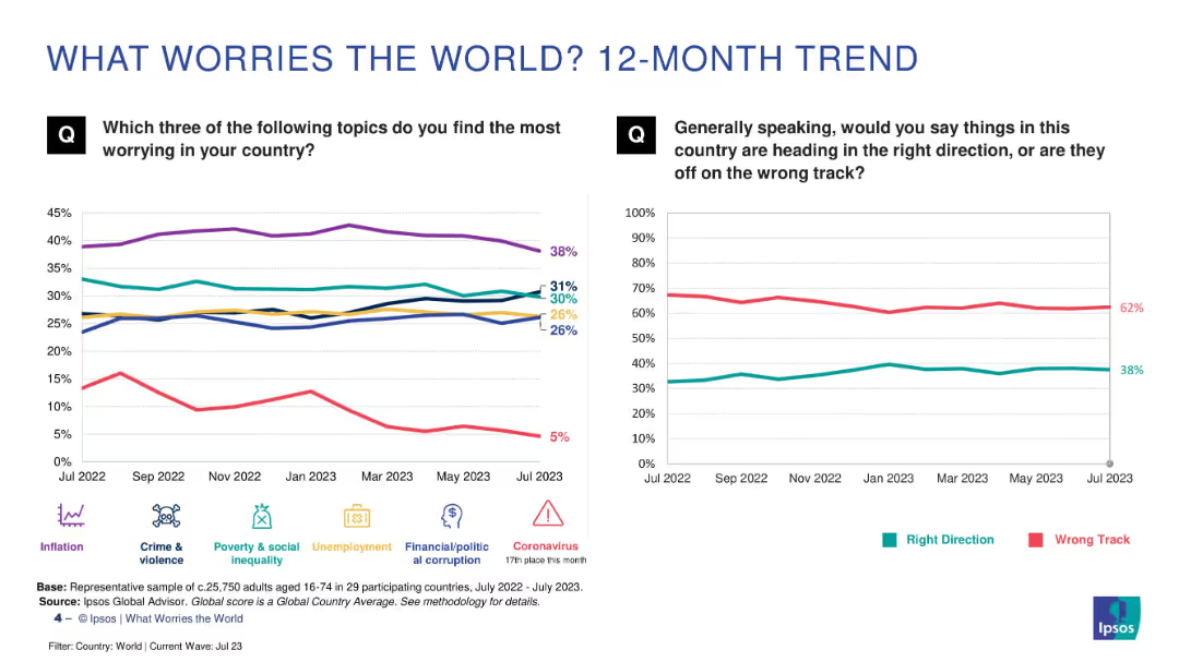
Two line charts comparing trends over time: left shows issues like inflation, crime, etc.; right shows global sentiment (right vs. wrong track). Clean, comparative layout.
Market Analysis and Trends
Professional Services
This slide tracks worry trends over 12 months, showing persistent concern over inflation and crime. The "wrong track" sentiment remains dominant, with minor fluctuations. It provides a temporal view of public priorities and dissatisfaction.
trends, inflation, global concerns, sentiment analysis, public opinion, Ipsos, 12-month trend
Multiple Chart
IPSOS
Saved
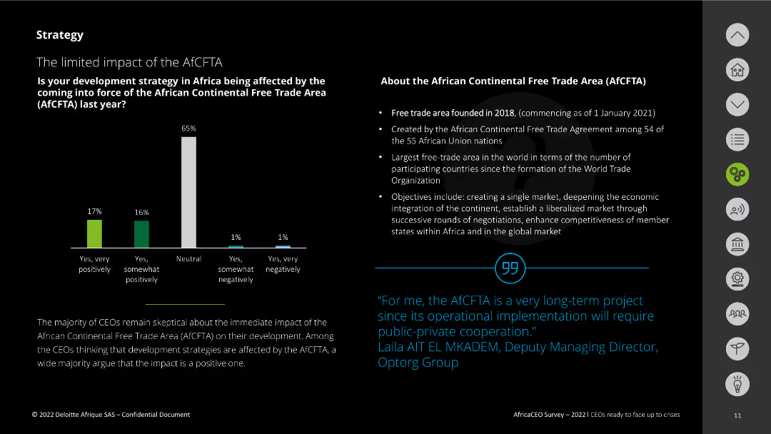
The slide features a column chart displaying survey responses about the impact of the AfCFTA. It also includes a text box explaining the AfCFTA, its founding, and objectives. A quote from a CEO is included at the bottom right.
Regulatory and Compliance
Government & Public Sector
This slide presents the survey results on the impact of the African Continental Free Trade Area (AfCFTA) on development strategies. It highlights skepticism among CEOs about its immediate impact and outlines the AfCFTA's key objectives and background.
AfCFTA, impact, survey, objectives, development strategy
Mixed Chart
Deloitte
Saved
Column chart showing the recovery of share prices across multiple industries. Uses a mix of green and blue to show recovery and remaining declines.
Market Analysis and Trends
Financial Services
Analyzes share price recovery across industries post-COVID-19, highlighting which sectors have bounced back or still struggle.
Share prices, Recovery, COVID-19, Industries, Analysis
Single Chart
McKinsey
Saved
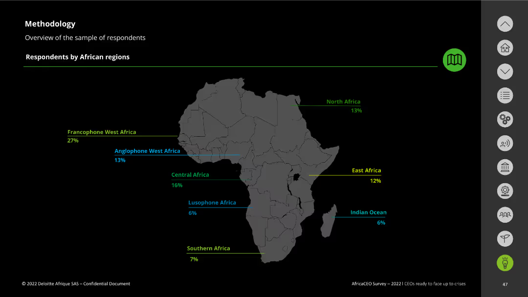
The slide features a map of Africa with regions highlighted and text describing respondents' distribution by African regions.
Strategic Planning
Professional Services
It gives a breakdown of survey respondents by African regions, providing context for the demographic distribution of the data collected.
respondents distribution, African regions, survey demographics, Africa CEO Survey
Graphic
Deloitte
Saved
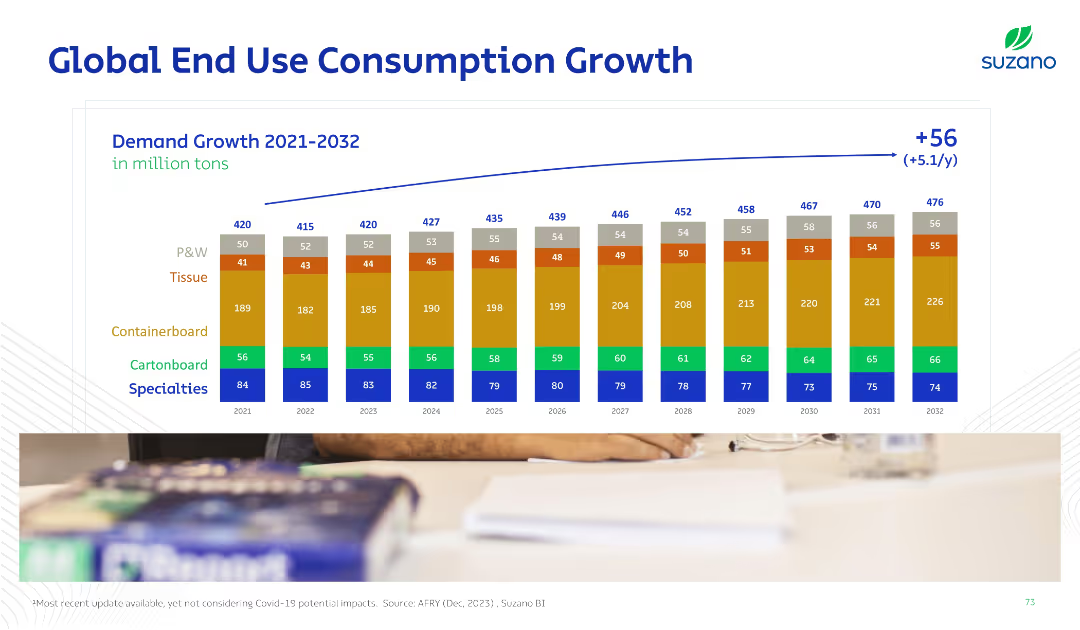
Horizontal bar chart over years with stacked categories (e.g., tissue, specialties). Blue arrow shows net increase. Color-coded for product types.
Strategic Planning
Industrial & Manufacturing
Forecasts global consumption growth across end-use pulp categories from 2021 to 2032. Categories like tissue and containerboard are emphasized, showing a +56 million ton increase with breakdowns by type.
consumption, end-use, tissue, containerboard, demand, forecast, growth, P&W, specialties
Single Chart
Goldman Sachs
Saved
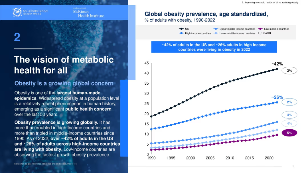
Split layout with text on left and line graph on right. Blue color theme with clear sectioning.
Industry Overview
Healthcare & Pharmaceuticals
Discusses global obesity trends and how obesity has become a significant public health concern. Provides statistical data showing rising prevalence across income groups, especially in the US and high-income countries.
obesity, public health, global trends, metabolic health, statistics
Mixed Chart
McKinsey
Saved
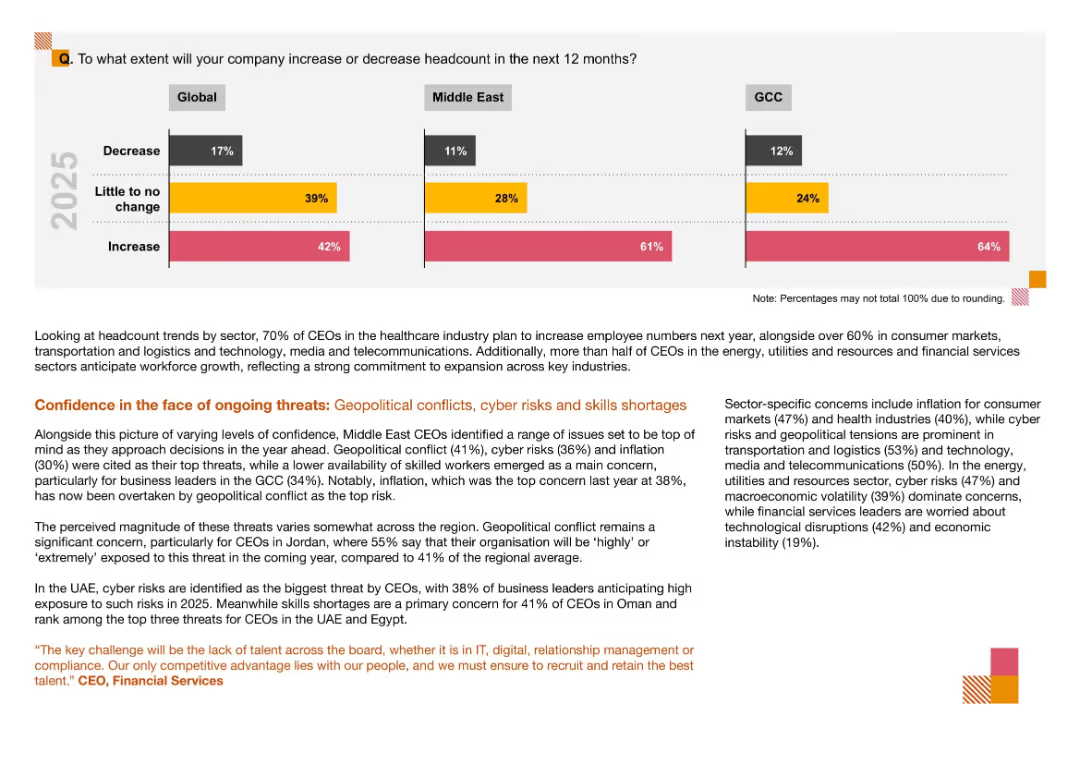
Three-bar segmented bar chart comparing Global, Middle East, and GCC regions; color-coded with text analysis below and highlights in orange and red
Human Resources and Talent Management
Financial Services
The slide shows anticipated headcount changes by region, highlighting growth expectations particularly in the GCC. It also outlines concerns like geopolitical conflict, cyber risks, and skills shortages, which shape CEO decisions on workforce planning in 2025.
Headcount, Workforce Trends, CEO Survey, Middle East, GCC, Cyber Risks, Geopolitical Conflict, Skills Shortage
Mixed Chart
PwC/Strategy&
Saved
Pie chart showing the current and planned usage of third-party APIs, alongside a word cloud highlighting popular API providers such as Salesforce, Oracle, and Microsoft.
Market Analysis and Trends
Technology & Software
The slide identifies the most commonly used third-party APIs and the intent to use them, supported by a word cloud of specific providers, emphasizing Salesforce as the leading provider.
third-party APIs, Salesforce, Oracle, providers
Mixed Chart
Gartner
Saved
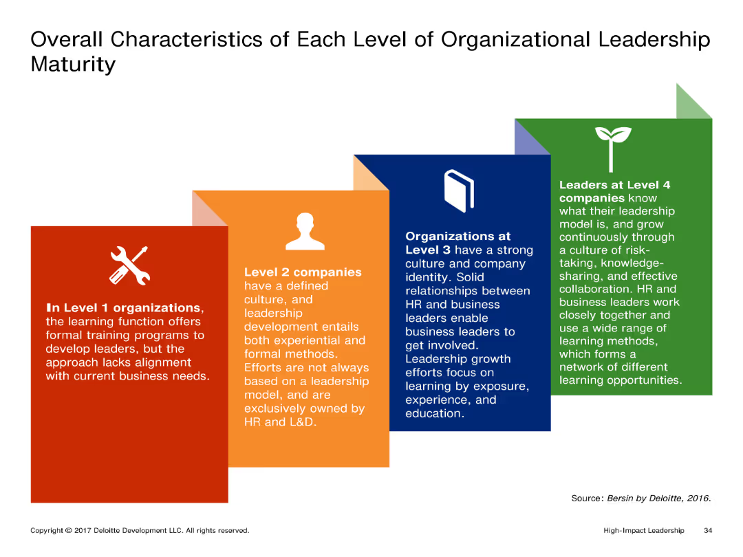
The slide shows a visual representation of different levels of organizational leadership maturity with distinct boxes for each level. Each box contains detailed text describing the characteristics of that level.
Market Analysis and Trends
Professional Services
It outlines the characteristics of organizations at different levels of leadership maturity, from Level 1 to Level 4. Each level's description highlights the leadership development approach and involvement of HR and business leaders.
Leadership, Organizational Maturity, Levels, Characteristics, Development
Pillar
Deloitte
Saved
Graphic illustration showing the convergence of marketing, sales, and services with icons and text, stressing on cross-functional collaboration.
Technology and Digital Transformation
Professional Services
Advocates for the removal of silos between marketing, sales, and services, suggesting a united approach with a focus on innovation and cross-channel effectiveness.
Marketing, Sales, Services, Innovation, Cross-Channel, Collaboration, Talent Management
Diagram
BCG
Saved
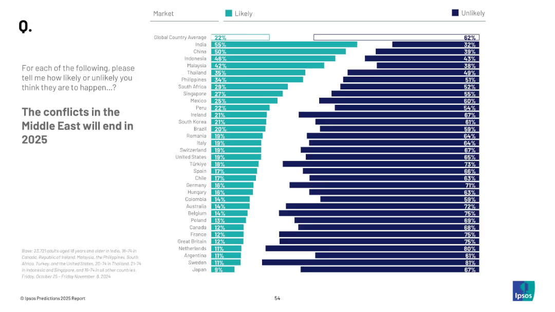
Consistent visual format with horizontal bars and national ranking; clean and symmetrical chart layout
Strategic Planning
Government & Public Sector
The slide evaluates expectations regarding peace in the Middle East by 2025. It aggregates perceptions from various countries, showing likelihood percentages and identifying major shifts in sentiment compared to the previous year.
Middle East, conflict resolution, peace prediction, 2025, survey, perception, geopolitics, regional conflict
Mixed Chart
IPSOS
Saved
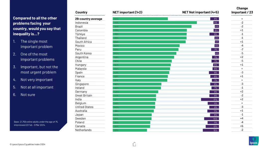
Horizontal bar chart on right, ranking countries by how many say inequality is important; color-coded bars (green = important, purple = not important); question and answer scale on left.
Market Analysis and Trends
Government & Public Sector
This slide presents country-by-country perceptions on the importance of inequality as a national problem. It compares the net percentage of people who consider it important vs. not important, highlighting changes over time and country averages.
inequality, global opinion, country ranking, importance scale, perceptions, Ipsos, net important, comparative chart, public opinion
Mixed Chart
IPSOS
Saved
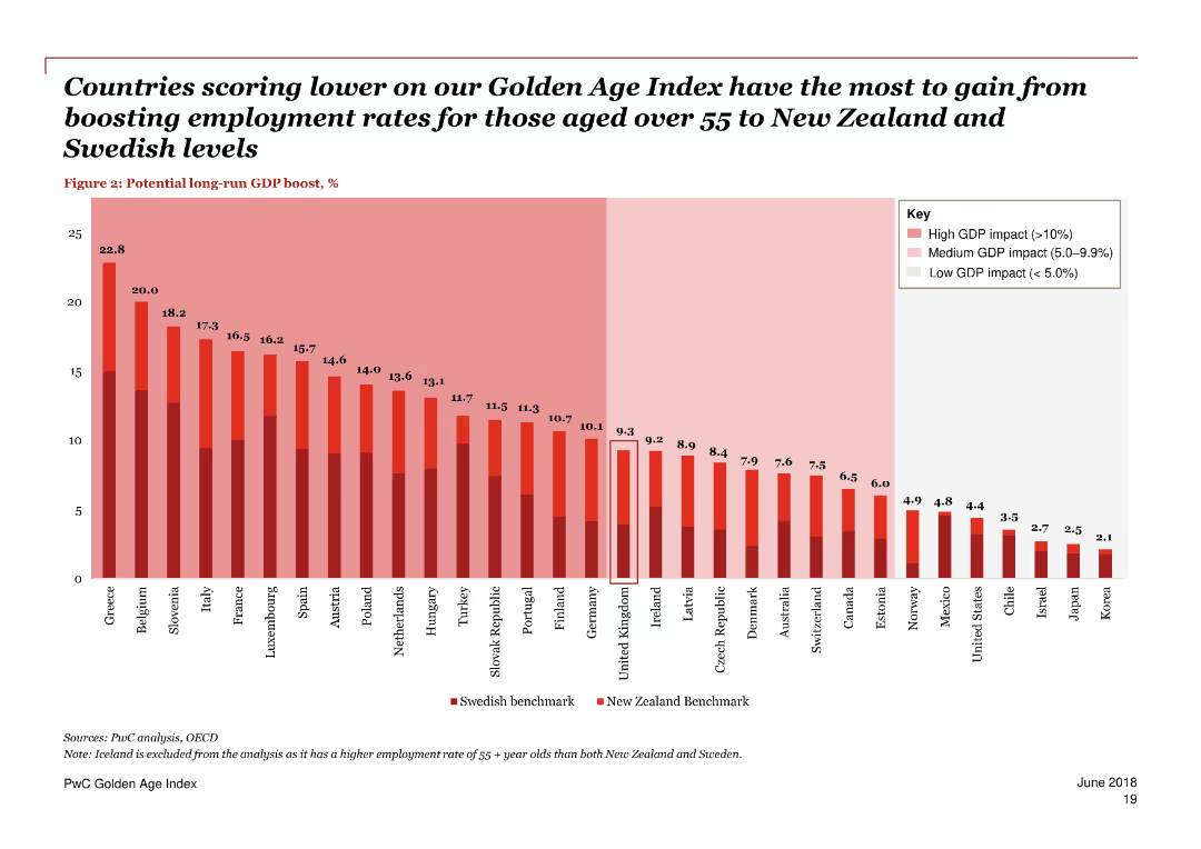
A column chart and text blocks, predominantly red and white color scheme.
Technology and Digital Transformation
Government & Public Sector
Discusses technological advances like automation and their impact on job prospects, highlighting the need for retraining and lifelong learning for older workers.
technology, automation, jobs, older workers, impact, retraining, lifelong learning, digital transformation, trends, future
Single Chart
PwC/Strategy&
Saved
This slide features multiple column charts showing adjusted fixed income sales, equity sales, capital markets, advisory fees, pre-tax income, and return on regulatory capital over several quarters. The slide is dense with data.
Financial Performance
Financial Services
The slide presents financial performance metrics for the investment bank, comparing quarterly results over time for various segments. It is used to analyze the financial health and trends in the investment banking sector.
Financial, investment, performance, quarterly, analysis, trends, advisory, equity, fixed income, regulatory capital
Multiple Chart
Credit Suisse
Saved
Features listing of focus areas, icons, and strategic drivers with a blue and white color scheme emphasizing digital trends.
Strategic Planning
Financial Services
Articulates strategic focuses such as product offerings, client relations, and trends like digital transformation in markets.
strategic focus, market trends, digital transformation, client engagement, trade lifecycle
Table
JP Morgan
Saved
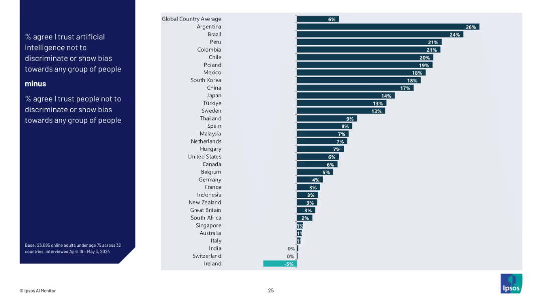
Bar chart showing difference between trust in AI vs trust in people for fairness by country (% AI trust minus % people trust).
Regulatory and Compliance
Artificial Intelligence
This slide visualizes the delta between trust in AI and trust in people to avoid bias, illustrating where AI is perceived as more or less fair than humans. Positive values favor AI; negative values favor people.
AI vs human trust, discrimination, bias perception, fairness, Ipsos, public opinion, country gap, ethical AI
Mixed Chart
IPSOS
Saved
The slide includes a scatter plot with orange dots representing different jobs, highlighting 'File clerks' and 'Landscaping workers'. It has a dual-axis showing hourly wage against the percentage of automation potential.
Risk Assessment and Management
Technology & Software
The slide analyzes the relationship between wages and automation potential across various occupations, emphasizing how both high-wage and low-wage jobs are subject to automation. It's useful for discussions on the future of work, labor economics, or presentations on technological impacts on employment.
automation, jobs, wages, scatter plot, future of work, labor economics, technology
Single Chart
McKinsey
Saved
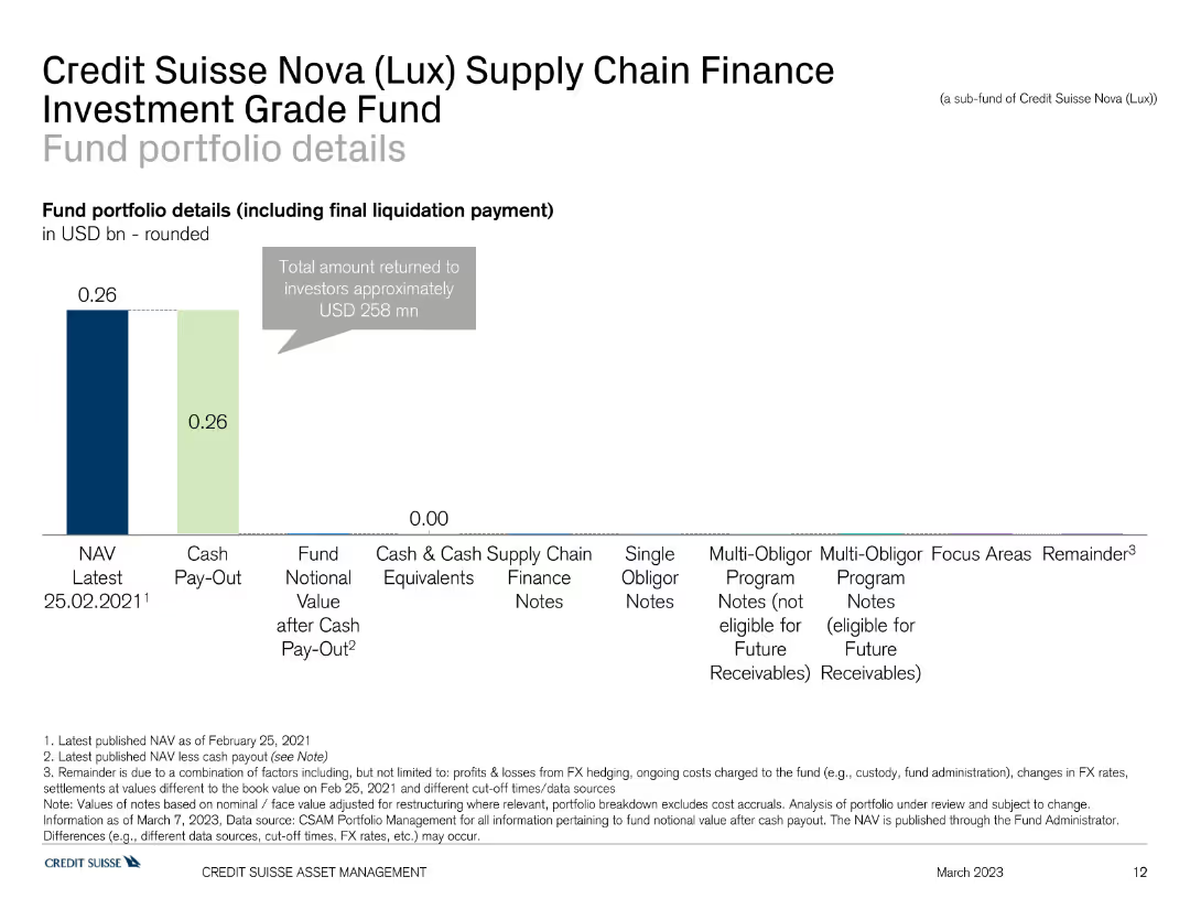
This slide shows a bar chart detailing the fund portfolio of the Credit Suisse Nova Supply Chain Finance Investment Grade Fund, with different sections indicating NAV, cash pay-out, and finance notes.
Investment Analysis
Financial Services
The slide provides an overview of the Credit Suisse Nova Supply Chain Finance Investment Grade Fund's portfolio, focusing on asset allocation and financial metrics. It is used for investment evaluation.
finance, supply chain, portfolio, Credit Suisse, investment grade
Single Chart
Credit Suisse
Saved
Previous
Next
If nothing, comes up, please save your slides first
Create a FREE account to continue browsing
Receive Instant Access to 1,000+ slides from companies like McKinsey, Google, and Goldman Sachs
First Name
Last Name
Email
Password
I agree to all
Terms & Privacy Policy
Thank you! Your submission has been received!
Oops! Something went wrong while submitting the form.
Have an account?
Sign in
Column Chart
Heatmap
Chevron
Org Chart
Infographic
Callouts
Timeline
List
Graphic
Picture
Process Flow
Diagram
Paragraph
Map
Table
Framework
Subtitle
Takeaway Box
Icon
Other Chart
Radar Chart
Waterfall Chart
Mekko Chart
Pie Chart
Scatter Plot
Line Chart
Bar chart
Bullet points