Create a FREE Account
Instant access to 1,000+ real slides from top companies like McKinsey, BCG, Goldman Sachs, Google and many more!
First Name
Last Name
Email
Password
I agree to all
Terms & Privacy Policy
Thank you! Your submission has been received!
Oops! Something went wrong while submitting the form.
Have an account?
Sign in
Library
Templates
Courses
Pricing
My Account
My Slides
My Templates
✦ AI
AI Prompt Library
AI Search
Sign in
Start Here
Logout
My Saved Slides
Line chart comparing the P/E ratios of FANGMANT stocks and the rest of the S&P 500, and a column chart showing changes in P/E ratios resulting in flat S&P 500 P/E ratio.
Financial Performance
Financial Services
Analyzes how most S&P 500 companies are trading at less demanding valuations, focusing on the disparity between FANGMANT stocks and other S&P 500 companies.
S&P 500, valuations, P/E ratio, FANGMANT stocks
Multiple Chart
Goldman Sachs
Saved
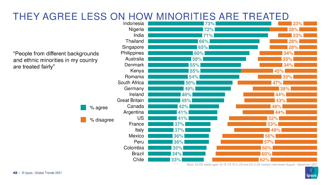
Dual-column layout with bar charts showing agreement levels by country and demographic segments.
Market Analysis and Trends
Artificial Intelligence
This slide presents survey data on global and demographic attitudes toward AI products and services, focusing on whether people think AI brings more benefits than drawbacks.
AI, global opinion, benefits, demographics, Ipsos, perception, countries, gender, generation, income
Multiple Chart
IPSOS
Saved
This slide features two line charts; one shows global oil supply and demand, and the other shows historical oil prices with notable peaks and troughs marked.
Market Analysis and Trends
Energy & Utilities
The slide examines short-term market dynamics in the oil industry, focusing on supply and demand trends and significant price movements.
oil supply, demand, market dynamics, price trends, energy market
Multiple Chart
JP Morgan
Saved
This slide shows a column chart illustrating a 10-year financial performance with another line graph overlay showing the growth rate. It uses shades of blue to distinguish years and performance metrics, with annotations for key statistics.
Financial Performance
Financial Services
Designed for financial review, the slide shows long-term growth and returns, making it suitable for investor presentations, annual reports, and financial analysis discussions.
growth, returns, financial, performance, analysis, long-term, metrics, banking, investment, trends
Single Chart
JP Morgan
Saved
Three-column layout with icons and key statistics about quantum computing players, investments, and geographic distribution
Industry Overview
Artificial Intelligence
This slide presents key insights about quantum computing: North America dominates in company presence, 90% of investment focuses on hardware, and a majority of players are in systems and algorithm layers. It establishes foundational statistics and context for the industry's structure.
quantum computing, investment, G7, North America, algorithms, startups, hardware
Pillar
McKinsey
Saved
The slide features a line chart and a column chart illustrating loan loss rates and credit impairment charges over time.
Risk Assessment and Management
Financial Services
This slide reiterates the loan loss rate guidance for FY23, supported by historical data and current credit impairment charges, to emphasize risk management.
loan loss, rate, guidance, FY23, credit, impairment, charges, financial, line chart, column chart
Multiple Chart
Barclays
Saved
Featuring icons representing five risk areas, the slide is laid out to facilitate easy comparison and risk assessment, using a blue and black theme.
Risk Assessment and Management
Professional Services
Focused on risk management, this slide outlines the primary areas of risk to consider during new technology implementation, from business to legal considerations. It's instrumental for leadership and management audiences in formulating a comprehensive risk assessment and mitigation strategy.
Risk Management, Technology, Business, Legal, Society, Operational, Compliance, Strategy
Pillar
McKinsey
Saved
The slide displays two column charts with varying backgrounds, showing survey responses by country.
Technology and Digital Transformation
Professional Services
This slide illustrates the principle of removing backgrounds to improve the clarity of data presentations in charts, following Tufte's guidelines.
Tufte, data-to-ink, ratio, survey, responses, visualization, backgrounds, chart, clarity, design
Multiple Chart
EY
Saved
This slide contains a column chart showing the top ways banks plan to accelerate digital transformation in the next three years, with specific focus areas like modernizing core functions.
Technology and Digital Transformation
Technology & Software
The slide discusses key strategies banks will adopt to accelerate digital transformation, including modernizing core functions, enhancing customer insights, and adopting cloud migration and AI.
digital transformation, strategies, column chart, banks
Multiple Chart
EY
Saved
Features a circular diagram with six segments representing different stakeholder groups involved in Chile's hydrogen market, paired with key considerations for engaging these stakeholders.
Strategic Planning
Energy & Utilities
Focuses on the roles of various stakeholders in developing the Chilean hydrogen ecosystem, including off-takers, ecosystem builders, and financiers, emphasizing coordinated action for market growth.
stakeholders, hydrogen, market, ecosystem
Framework
McKinsey
Saved
This slide includes line charts, column charts, and numerical data points. It visually represents the trends in cross-border IPO activity from Mainland China and Hong Kong, transaction sizes, and outbound/inbound IPO statistics.
Market Analysis and Trends
Financial Services
The slide provides insights into the cross-border IPO activity of Mainland China and Hong Kong issuers in 2019, highlighting outbound and inbound IPO numbers, transaction sizes, and notable trends in the region's IPO market.
IPO, Cross-border, Mainland China, Hong Kong, Market Trends, Transaction Size, Financial Services, Outbound, Inbound
Multiple Chart
EY
Saved
This slide shows a combination of text and a column chart. The text explains the rationale for outsourcing, and the chart lists various capabilities being outsourced by percentage.
Operational Efficiency
Financial Services
The slide describes how APAC family offices are outsourcing capabilities like tax, risk, and technology to manage external demands and improve in-house capabilities.
outsourcing, capabilities, APAC, family offices, external expertise
Mixed Chart
EY
Saved
Vertical bar chart showing digital banking maturity across various countries segmented into digital champions, smart followers, adopters, and latecomers.
Market Analysis and Trends
Financial Services
Compares digital banking maturity across different markets, categorizing countries into champions, smart followers, adopters, and latecomers based on maturity levels.
digital banking, maturity, market comparison, champions, adopters, bar chart
Mixed Chart
Deloitte
Saved
The slide contains a line chart on the left showing the global PMI for manufacturing and services from 2007 to 2023. On the right, there is a heatmap displaying the global PMI for manufacturing by country (U.S., Japan, Australia, Eurozone, China, etc.) from April 2023 to March 2024.
Market Analysis and Trends
Industrial & Manufacturing
The slide provides a detailed view of global manufacturing performance through PMI indices, offering insights into the health of the manufacturing sector across different countries.
PMI, Manufacturing, Global, Services, Heatmap
Mixed Chart
JP Morgan
Saved
This slide includes text and a column chart on the right. The chart highlights the top constraints to digital transformation, with a percentage breakdown.
Technology and Digital Transformation
Financial Services
It discusses major constraints faced by banks in accelerating digital transformation, including scale of change, limited budgets, and technology challenges.
Digital transformation, constraints, scale of change, budgets, technology
Mixed Chart
EY
Saved
This slide contains bar charts showing percentage increases in productivity, confidence, meaningful impact, and stress management among sales professionals using AI tools. Each bar is labeled with the exact percentage increase, providing a clear quantitative measure.
Strategic Planning
Technology & Software
Examines the positive changes in productivity, confidence, and stress management reported by sales professionals using AI tools.
AI, Sales, Productivity, Confidence, Impact, Stress Management, Tools, Professional Services, Technology
Mixed Chart
Accenture
Saved
The slide contains two column charts comparing the pace of government reforms and respondents' feelings on the pace over two years (2018 and 2019). The bars show varying levels of satisfaction.
Regulatory and Compliance
Government & Public Sector
This slide shows that respondents generally perceive government reforms positively, but there is a slight decline in satisfaction from 2018 to 2019.
government reforms, satisfaction, survey, comparison, 2018, 2019, pace of reform
Multiple Chart
Bain
Saved
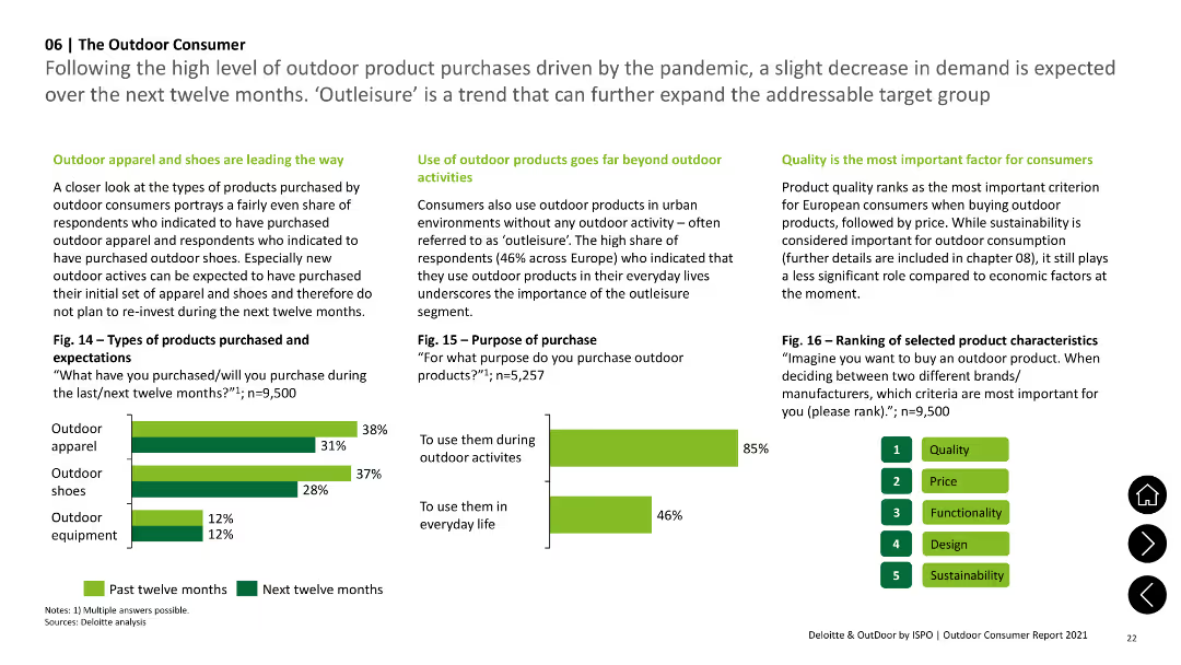
Column charts illustrating types of outdoor products purchased and purposes of purchase, highlighting 'outleisure' trend.
Market Analysis and Trends
Consumer Goods
Details types of outdoor products bought (apparel, shoes, equipment) and reasons for purchase, emphasizing urban use beyond outdoor activities.
Products, Purchase, Outdoor, Apparel, Shoes
Multiple Chart
Deloitte
Saved
Bar chart showing education spending per capita (2016–2024) and line showing percentage of GDP. Red theme with emphasis on key insights.
Regulatory and Compliance
Education & Training
The slide criticizes Nigeria’s education funding, showing low per capita spending and GDP share. Despite increases, the current levels are far below global benchmarks. With 18 million out-of-school children, major investment is urgently needed.
education, spending, GDP, Nigeria, out-of-school children, budget, policy, 2024 data
Mixed Chart
PwC/Strategy&
Saved
The slide features a line chart showing correlations between stocks and sovereign bonds, with the six-month correlation in gray and the one-year correlation in purple, covering the period from 1998 to 2023.
Market Analysis and Trends
Financial Services
This slide analyzes the correlations between stocks and sovereign bonds, providing insights into market trends and investment strategies.
Stock-bond correlation, market analysis, investment strategy, financial analysis, six-month correlation, one-year correlation
Multiple Chart
JP Morgan
Saved
Two-column layout with blue category labels and short paragraphs per use case; footer shows usage statistics.
Product and Service Analysis
Financial Services
Outlines key generative AI use cases in financial services such as fraud detection, customer service, compliance, and IT systems. Supports findings with survey data on AI implementation intentions and perceived value areas.
AI use cases, fraud detection, compliance, customer service, IT transformation, financial tech
Mixed Chart
KPMG
Saved
The slide has two pie charts. The left chart shows the segmentation of companies by number of employees, while the right chart depicts the segmentation by industry. Different colors are used for each segment.
Market Analysis and Trends
Professional Services
The slide provides a breakdown of respondents' companies by size and industry, highlighting the diversity of the sample and the representation across various sectors.
company size, industry, segmentation, pie charts, survey, sample diversity
Multiple Chart
Bain
Saved
Scatter plot graph correlating inventory turns with gross margin, accompanied by analyst commentary.
Investment Analysis
Financial Services
Illustrates the relationship between inventory management and profitability in distribution.
Inventory, Profitability, Distribution, Correlation, Gross Margin, Analysis
Single Chart
EY
Saved
Diagrams and flowcharts display the structure and financial divisions within Barclays Investment Bank.
Organizational Structure and Change
Financial Services
Provides an overview of the financial performance and structural organization of Barclays Investment Bank in 2023.
investment bank, structure, 2023, financial, Barclays
Diagram
Barclays
Saved
Bar chart showing the growth rates and share of new EV and PHEV registrations in major European countries in 2020 H2, highlighting China's role as a key driver.
Market Analysis and Trends
Transportation & Logistics
Analyzes the sharp increase in EV and PHEV registrations across Europe and the significant role of China's economic recovery in driving global xEV sales in 2020 H2.
EV registrations, PHEV registrations, Europe, China, market growth
Mixed Chart
Roland Berger
Saved
Previous
Next
If nothing, comes up, please save your slides first
Create a FREE account to continue browsing
Receive Instant Access to 1,000+ slides from companies like McKinsey, Google, and Goldman Sachs
First Name
Last Name
Email
Password
I agree to all
Terms & Privacy Policy
Thank you! Your submission has been received!
Oops! Something went wrong while submitting the form.
Have an account?
Sign in
Column Chart
Heatmap
Chevron
Org Chart
Infographic
Callouts
Timeline
List
Graphic
Picture
Process Flow
Diagram
Paragraph
Map
Table
Framework
Subtitle
Takeaway Box
Icon
Other Chart
Radar Chart
Waterfall Chart
Mekko Chart
Pie Chart
Scatter Plot
Line Chart
Bar chart
Bullet points