Create a FREE Account
Instant access to 1,000+ real slides from top companies like McKinsey, BCG, Goldman Sachs, Google and many more!
First Name
Last Name
Email
Password
I agree to all
Terms & Privacy Policy
Thank you! Your submission has been received!
Oops! Something went wrong while submitting the form.
Have an account?
Sign in
Library
Templates
Courses
Pricing
My Account
My Slides
My Templates
✦ AI
AI Prompt Library
AI Search
Sign in
Start Here
Logout
My Saved Slides
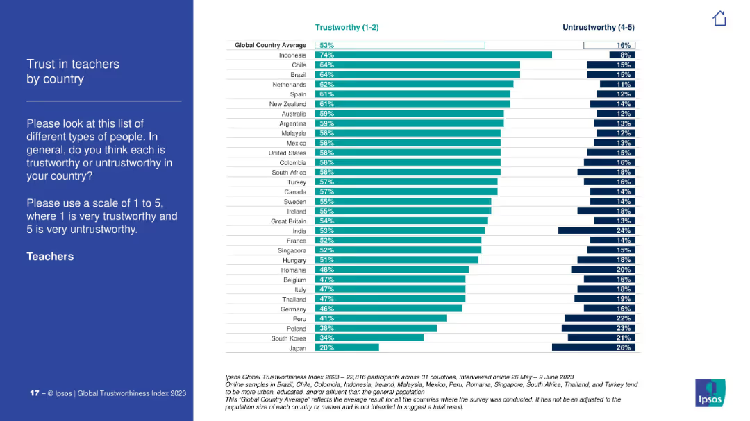
Vertical bar chart ranking countries by trust in teachers. Includes global average. Clean, consistent design with others in the series.
Customer and Market Segmentation
Education & Training
The slide displays the public's trust in teachers across different countries. Indonesia leads with 74% trust, while Japan and South Korea are at the bottom. The global average is 53%, with notable variation across regions.
teachers, trust index, international comparison, Ipsos, education, perception analysis
Mixed Chart
IPSOS
Saved
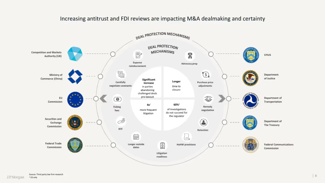
The slide contains a circular diagram detailing various deal protection mechanisms and regulatory bodies involved.
Regulatory and Compliance
Financial Services
It discusses the increasing impact of antitrust and FDI reviews on M&A activities and the associated deal protections.
Antitrust, FDI, M&A, regulatory, deal protection
Diagram
JP Morgan
Saved
The slide contains two column charts. The upper chart shows PE/VC exit values in US$m against the number of exits from Jan-22 to Jan-23. The lower chart breaks down PE/VC exits across asset classes within the same period. The slide uses green, orange, and blue colors to differentiate data segments.
Market Analysis and Trends
Financial Services
The slide provides a monthly breakdown of Private Equity and Venture Capital (PE/VC) exits from January 2022 to January 2023. It shows both the total value of exits and the number of exits. Additionally, it splits the PE/VC exits across different asset classes, giving a detailed view of market trends and performance.
PE/VC, exits, asset classes, monthly trends, financial data, value, number, breakdown, market trends, performance
Multiple Chart
EY
Saved
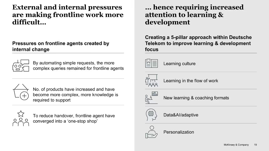
Split white slide with icons and bulleted lists on both sides, labeled as pressures vs. solutions
Human Resources and Talent Management
Telecommunications
The left side lists internal pressures on frontline agents, such as increased complexity and reduced handover. The right side introduces a five-pillar learning and development strategy from Deutsche Telekom to mitigate these challenges.
frontline agents, learning, complexity, pressure, telecom, L&D strategy, internal change
Boxed
McKinsey
Saved
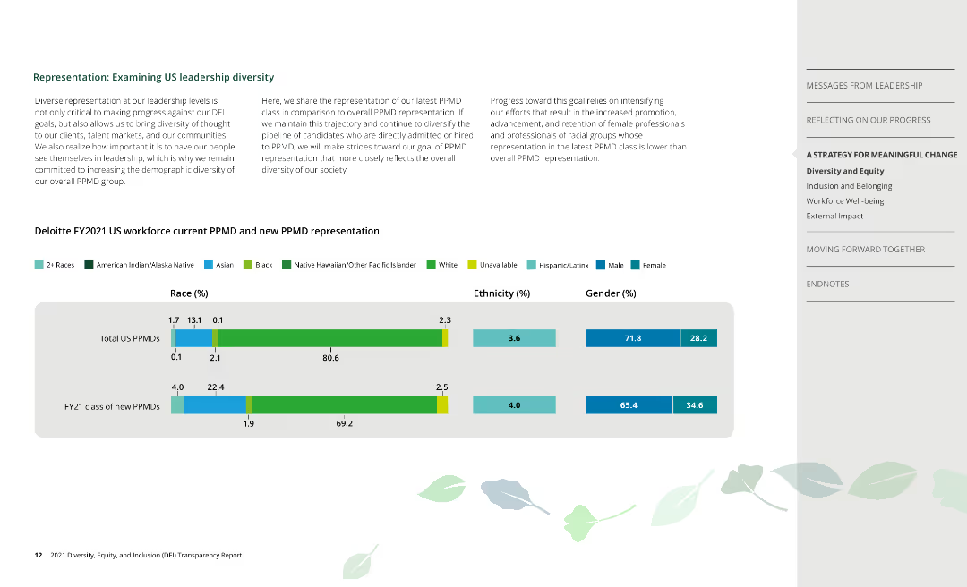
Column charts depict racial, ethnic, and gender representation of current and new PPMDs at Deloitte.
Human Resources and Talent Management
Professional Services
Examines leadership diversity at Deloitte, focusing on current and new Partner, Principal, and Managing Directors.
PPMD, leadership, race, ethnicity, gender
Mixed Chart
Deloitte
Saved
Multiple column charts showing year-to-date (YTD) performance metrics for the S&P 500 Index, including earnings growth, P/E, ROE, market cap, beta, and dividend yield.
Financial Performance
Financial Services
This slide offers a YTD analysis of the S&P 500 Index, presenting various performance metrics to give a clear picture of financial performance over the year.
S&P 500, YTD, performance, metrics, analysis
Multiple Chart
Morgan Stanley
Saved
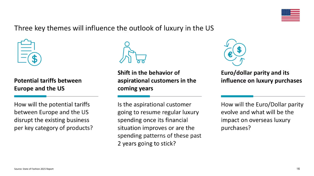
Three-column layout highlighting tariffs, aspirational behavior, and Euro/Dollar parity
Strategic Planning
Consumer Goods
This slide identifies three macroeconomic and consumer behavior themes—trade tariffs, consumer behavior shifts, and currency parity—that may affect the future of US luxury.
tariffs, aspirational consumers, dollar parity, macro themes, US outlook, purchasing behavior
Pillar
McKinsey
Saved
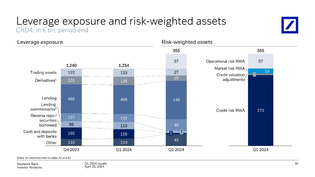
The slide contains two column charts comparing leverage exposure and risk-weighted assets for Q4 2023 and Q1 2024, broken down by categories like trading assets, derivatives, lending, etc.
Financial Performance
Financial Services
Compares leverage exposure and risk-weighted assets over two quarters, highlighting changes in various asset categories, and includes credit risk evaluation.
leverage, exposure, risk-weighted, assets, derivatives, lending, credit risk, trading assets
Multiple Chart
Deutsche Bank
Saved
The slide contains multiple line charts showing the performance of emerging market currencies, including nominal and REER index weights. The layout is focused and data-driven.
Market Analysis and Trends
Financial Services
The slide examines the strengthening of emerging market currencies during Q4, influenced by weaker economic data from the U.S. and Fed policy changes. It provides detailed index performance comparisons.
emerging markets, currencies, Q4 performance, FX, economic data
Mixed Chart
Morgan Stanley
Saved
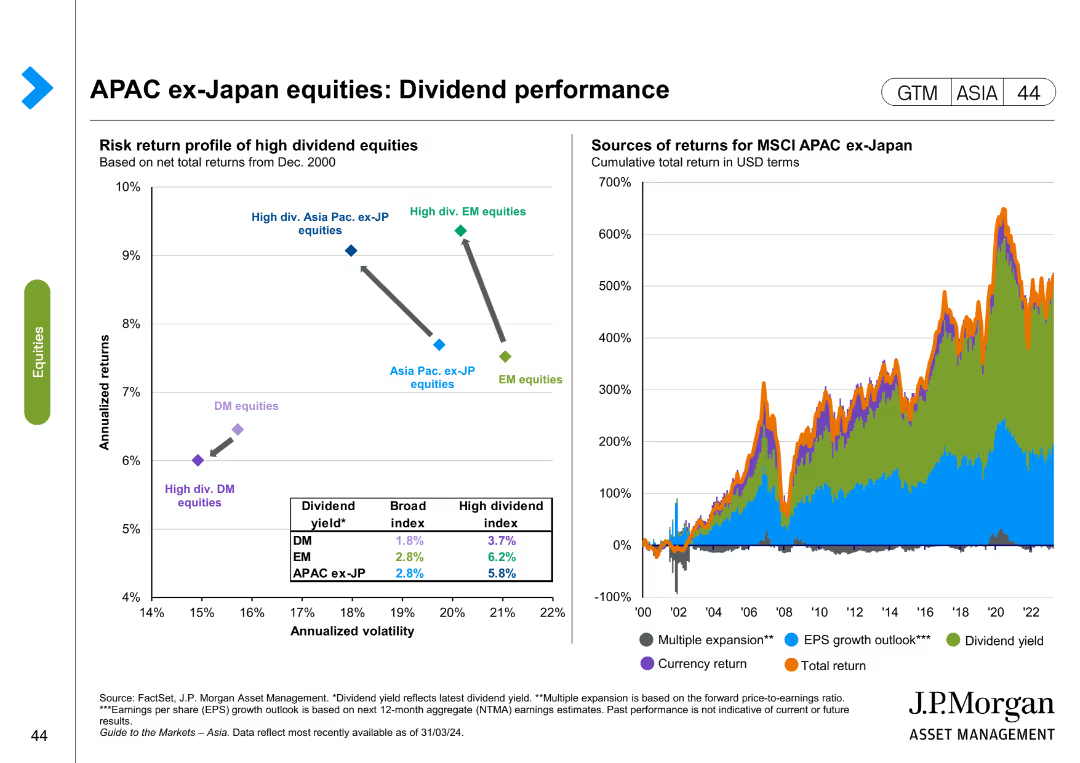
The slide includes a scatter plot showing the risk-return profile of high dividend equities and a line chart depicting sources of returns for MSCI APAC ex-Japan equities. Color coding is used to differentiate data points.
Financial Performance
Financial Services
This slide evaluates dividend performance for APAC ex-Japan equities, comparing risk-return profiles and sources of returns. It is useful for financial performance analysis and investment strategy development.
APAC, dividend performance, risk-return, equities, MSCI, financial analysis, investment strategy
Multiple Chart
JP Morgan
Saved
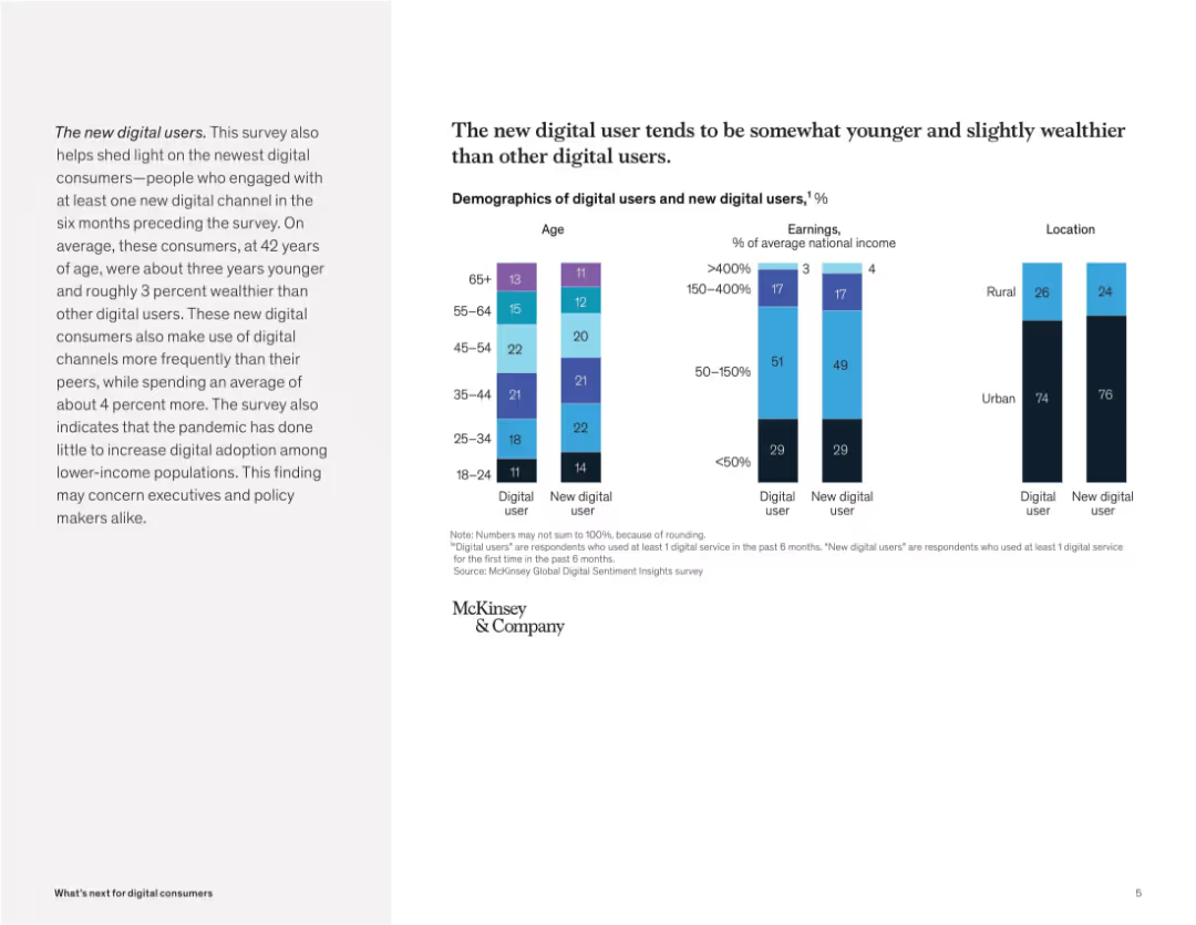
Split layout: text explanation on left, segmented bar charts on right showing age, income, and location comparisons. Minimalist with McKinsey branding.
Customer and Market Segmentation
Technology & Software
The slide outlines demographic traits of new digital users, who are younger and wealthier than traditional users. It uses charts to show differences in age brackets, earnings, and urban vs. rural distribution, highlighting increased digital usage among these newer segments.
digital users, demographics, income, urban, rural, age groups, segmentation, McKinsey, adoption, technology
Mixed Chart
McKinsey
Saved
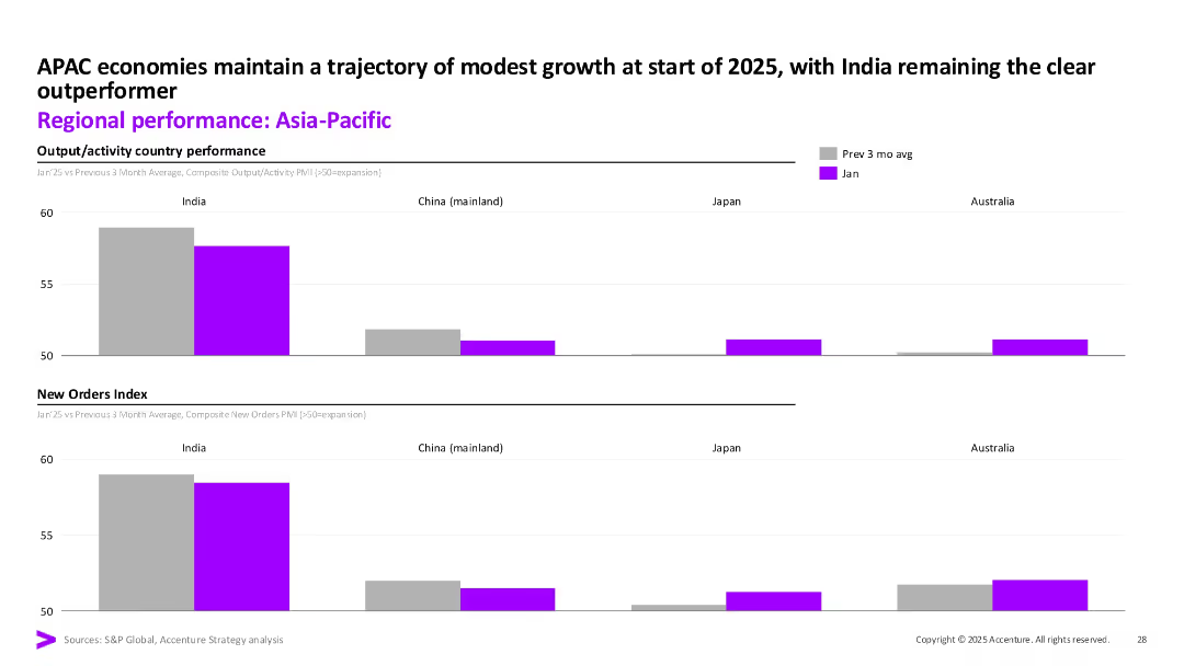
Two stacked bar charts comparing output/activity and new orders for Jan vs. 3-month avg; color-coded bars by country (India, China, Japan, Australia).
Market Analysis and Trends
Financial Services
This slide shows composite PMI data for output and new orders across key Asia-Pacific economies. India outperforms its peers, maintaining stronger momentum in both categories. Other countries show minimal changes or stagnation.
PMI, Asia-Pacific, India, Output Index, New Orders, Economic Activity, APAC, January 2025, Accenture, Market Comparison
Multiple Chart
Accenture
Saved
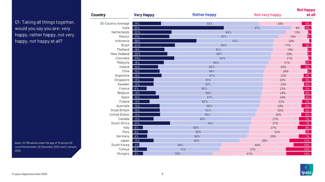
Bar chart with countries listed vertically and segmented horizontal bars for four happiness levels; left-aligned question text on dark blue background.
Market Analysis and Trends
Professional Services
This slide presents the percentage of people in 30 countries reporting different levels of happiness. It shows variation by country in responses to whether individuals feel "very happy," "rather happy," "not very happy," or "not happy at all." The chart reveals that India has the highest "very happy" rate, while Hungary ranks lowest.
happiness index, country comparison, survey, emotions, well-being, global trends, Ipsos, sentiment, 2025, ranking
Mixed Chart
IPSOS
Saved
Stacked bar chart showing the self-assessed financial situations of respondents compared to pre-COVID-19. The chart divides responses into categories from 'Much worse off' to 'Much better off'.
Risk Assessment and Management
Financial Services
The slide analyzes the perceived financial impact of COVID-19 on Canadian investors, indicating that a significant portion felt worse off financially. It highlights variations across income groups, showing those with lower incomes were more adversely affected.
COVID-19, Financial Impact, Canadian, Income, Pandemic
Mixed Chart
IPSOS
Saved
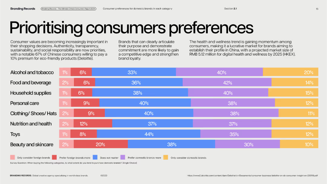
Clean, pastel horizontal bar chart segments on light background; each row color-categorized.
Customer and Market Segmentation
Consumer Goods
Reveals brand preference distribution in multiple product categories. Majority of Chinese consumers lean toward domestic brands, with few preferring foreign brands exclusively. Highlights trend toward eco-conscious shopping.
domestic vs. foreign, brand loyalty, consumer preference, eco-products, category trends
Single Chart
McKinsey
Saved
The slide features a large triangle diagram with six layers, each representing a different aspect of best practices in a company’s operations, with text explanations on the left. The color scheme is blue and teal with white text.
Organizational Structure and Change
Professional Services
This slide outlines the six fundamental aspects of best practices within an organization, likely to be discussed in detail in subsequent slides. It is useful for organizational strategy and planning.
culture, talent, compensation, acquisition, enablement, retainment, practices, organizational, strategy, planning
Framework
Kearney
Saved
Four line charts depicting trends in delinquent balances, disposable income, consumer debt, and household debt service.
Market Analysis and Trends
Financial Services
The slide analyses the financial health of consumers, showing trends in delinquency, disposable income, consumer debt, and debt service ratios.
Financial health, consumer debt, delinquent balances, disposable income, debt service
Multiple Chart
Credit Suisse
Saved
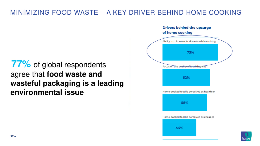
Simple bar chart highlighting key drivers for minimizing food waste while cooking.
Market Analysis and Trends
Environmental Services & Sustainability
Highlights the importance of minimizing food waste as a leading environmental issue.
food waste, cooking, environmental, global, drivers
Mixed Chart
IPSOS
Saved
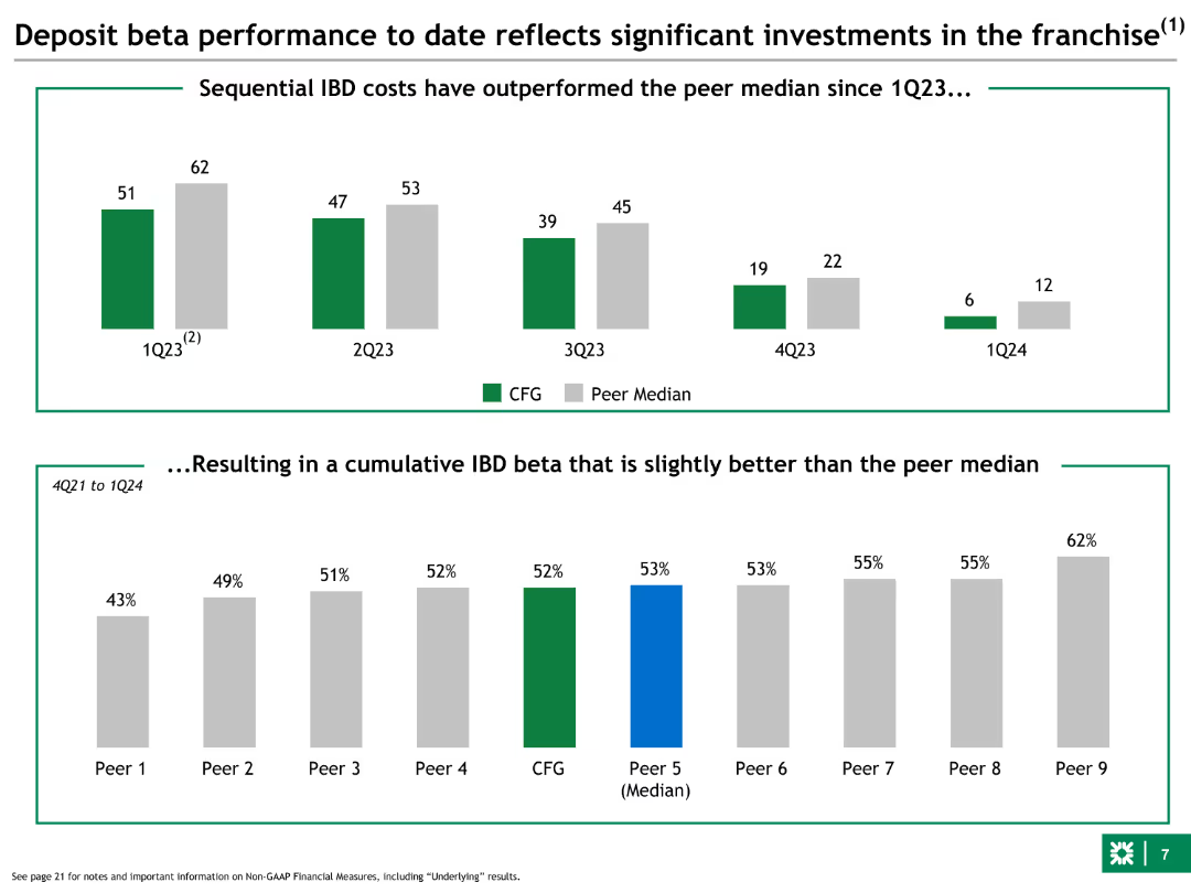
Column charts showing sequential IBD costs compared to peer median, and cumulative IBD beta. The slide uses green and grey colors for comparison.
Financial Performance
Financial Services
This slide shows the bank's deposit beta performance over time, comparing sequential costs with peers and demonstrating a cumulative beta slightly better than the median.
deposit, beta, performance, IBD, peer median
Multiple Chart
Barclays
Saved
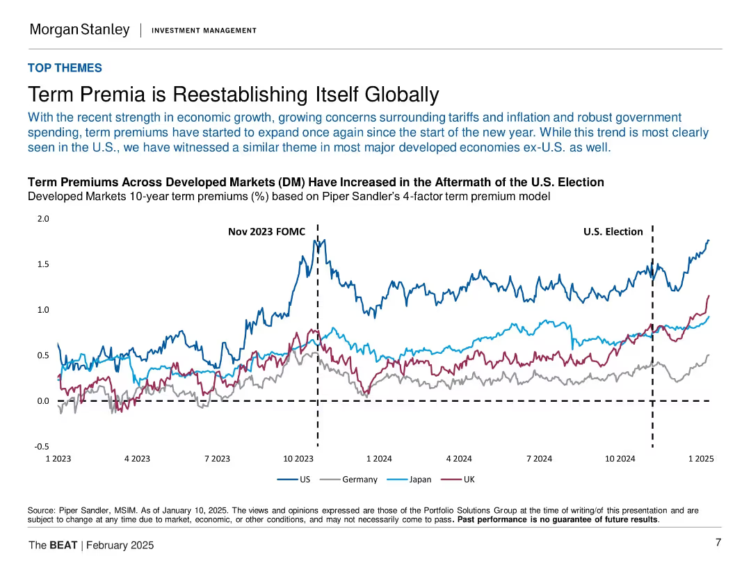
Line chart with four country lines (US, Germany, Japan, UK), vertical dashed markers for Nov 2023 FOMC and U.S. Election, on a clean white background.
Market Analysis and Trends
Financial Services
The slide highlights the reemergence of term premia across developed markets, especially in the U.S., following macroeconomic triggers like the U.S. election and the Nov 2023 FOMC. It uses a comparative line chart to show how term premiums have expanded post-election across the U.S., Germany, Japan, and the UK, suggesting global shifts in bond market expectations.
term premium, FOMC, bond market, U.S. election, inflation, tariffs, macroeconomics, yield curve, developed markets
Single Chart
Morgan Stanley
Saved
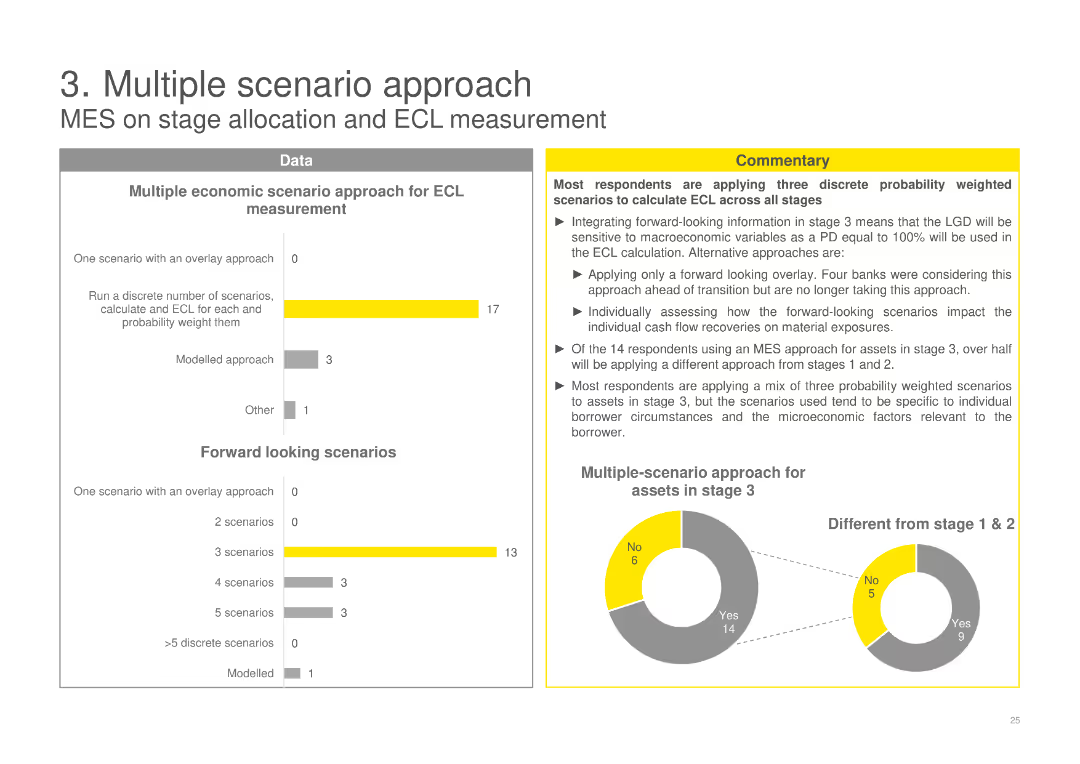
A column chart showing various approaches for ECL measurement, a pie chart showing multiple-scenario approach, and detailed commentary.
Risk Assessment and Management
Financial Services
Discusses the application of multiple economic scenarios for expected credit loss (ECL) measurement, highlighting various methods used by banks.
ECL, scenario, measurement, banks, methods, stage, forward looking, probability, weighted, assessment
Multiple Chart
EY
Saved
This slide continues with the theme of empowerment and skills, presenting bar charts that compare responses about job impact and training concerns between different generations, specifically Gen Z and Baby Boomers.
Market Analysis and Trends
Education & Training
This slide provides insight into generational differences concerning job security and the impact of technology. It highlights concerns among younger workers about their roles being replaced by technology and their worries about not receiving adequate training.
generational differences, technology impact, training concerns, job security
Multiple Chart
PwC/Strategy&
Saved
Map with highlighted regions and percentages indicating the likelihood to purchase a home in various areas such as York, Peel, Halton, Durham, and Toronto.
Market Analysis and Trends
Real Estate & Construction
The slide shows regional data on the likelihood of purchasing a home, with percentages and changes from previous data points, highlighting the most and least likely areas.
purchase likelihood, regional data, home buying, York, Peel, Halton, Durham, Toronto
Graphic
IPSOS
Saved
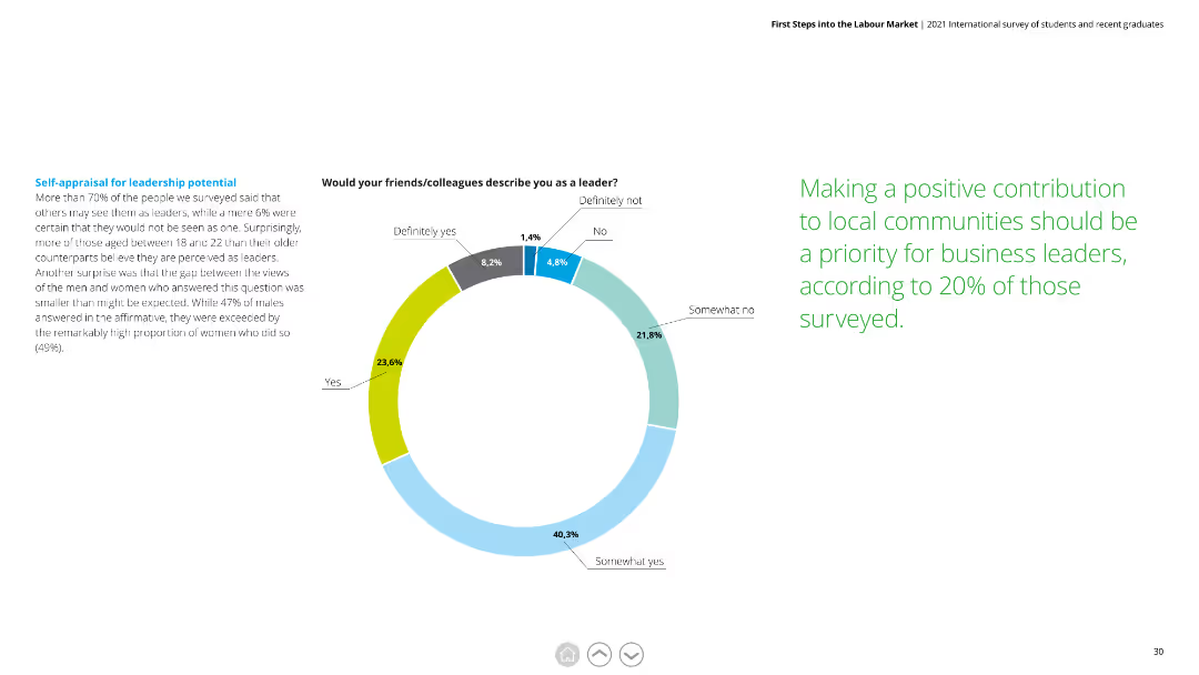
Donut chart showing how respondents perceive their leadership potential, with detailed text explaining the findings and gender differences in self-perception.
Human Resources and Talent Management
Education & Training
This slide reveals self-assessments of leadership potential among respondents, noting high levels of confidence, especially among younger and female participants.
self-appraisal, leadership potential, gender differences, confidence, young professionals
Mixed Chart
Deloitte
Saved
Features a line graph tracking the revenue growth of various internet advertising types from 2018 to 2027. Each line is color-coded, representing different advertising formats like mobile video, other display, and paid search, making it easy to follow their growth trajectories. The layout is simple with an emphasis on the graphical data, supported by bullet points highlighting key drivers such as 5G technology and social media.
Market Analysis and Trends
Media & Entertainment
Highlights the trends in mobile video advertising, showcasing its rapid growth as a primary driver in the internet advertising sector. Useful for digital marketing professionals looking to leverage the rising trend of video in advertising strategies.
mobile video, internet advertising, growth drivers, 5G technology, social media, Hong Kong
Mixed Chart
PwC/Strategy&
Saved
Previous
Next
If nothing, comes up, please save your slides first
Create a FREE account to continue browsing
Receive Instant Access to 1,000+ slides from companies like McKinsey, Google, and Goldman Sachs
First Name
Last Name
Email
Password
I agree to all
Terms & Privacy Policy
Thank you! Your submission has been received!
Oops! Something went wrong while submitting the form.
Have an account?
Sign in
Column Chart
Heatmap
Chevron
Org Chart
Infographic
Callouts
Timeline
List
Graphic
Picture
Process Flow
Diagram
Paragraph
Map
Table
Framework
Subtitle
Takeaway Box
Icon
Other Chart
Radar Chart
Waterfall Chart
Mekko Chart
Pie Chart
Scatter Plot
Line Chart
Bar chart
Bullet points