Create a FREE Account
Instant access to 1,000+ real slides from top companies like McKinsey, BCG, Goldman Sachs, Google and many more!
First Name
Last Name
Email
Password
I agree to all
Terms & Privacy Policy
Thank you! Your submission has been received!
Oops! Something went wrong while submitting the form.
Have an account?
Sign in
Library
Templates
Courses
Pricing
My Account
My Slides
My Templates
✦ AI
AI Prompt Library
AI Search
Sign in
Start Here
Logout
My Saved Slides
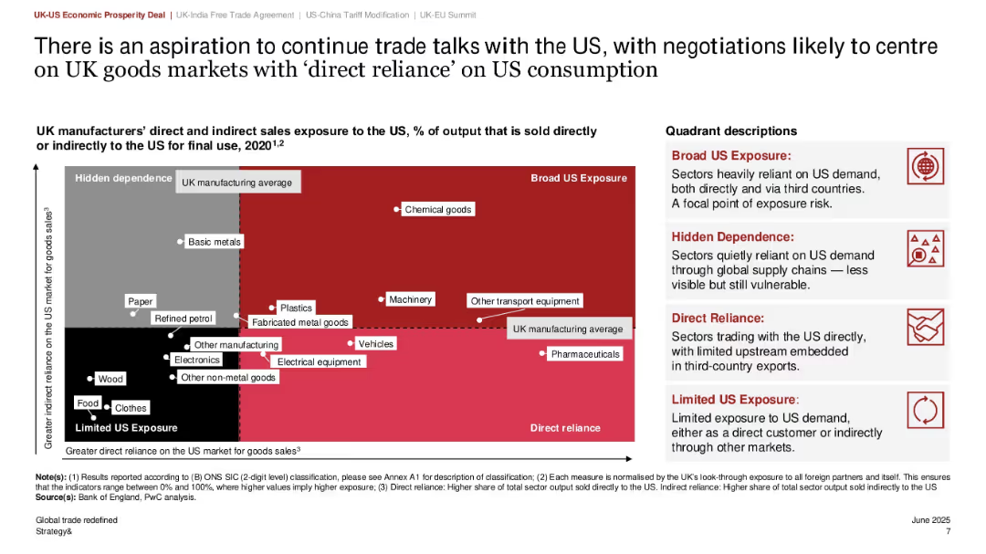
Scatter plot quadrant graph showing direct vs. indirect exposure to US market; color-coded quadrants with callouts; right-side text explaining quadrant meanings
Risk Assessment and Management
Government & Public Sector
This slide categorizes UK manufacturing sectors based on their exposure to the US market, using a matrix of direct and indirect reliance. Sectors such as chemical goods and transport equipment fall in the “Broad US Exposure” quadrant. It aids in identifying vulnerable sectors for targeted negotiations in future trade talks.
US exposure, UK manufacturing, export risk, sector analysis, trade dependency, quadrant matrix, policy planning
Mixed Chart
PwC/Strategy&
Saved
Line graphs comparing profitability trends relative to market disruptions between profitable growth companies and their peers.
Financial Performance
Financial Services
Discusses how companies that focus on profitability manage to grow despite facing significant disruptions, with comparative data over time.
profitability, market disruptions, growth companies, financial crisis, pandemic, comparative data, profitability trends
Mixed Chart
Accenture
Saved
The slide contains several horizontal bar graphs displaying percentage ratings of different underwriting solutions. Color gradients from purple to pink are used.
Operational Efficiency
Financial Services
This slide evaluates various underwriting solutions used today in organizations to improve process efficiency.
underwriting, automation, efficiency, bar graph, solutions
Single Chart
Accenture
Saved
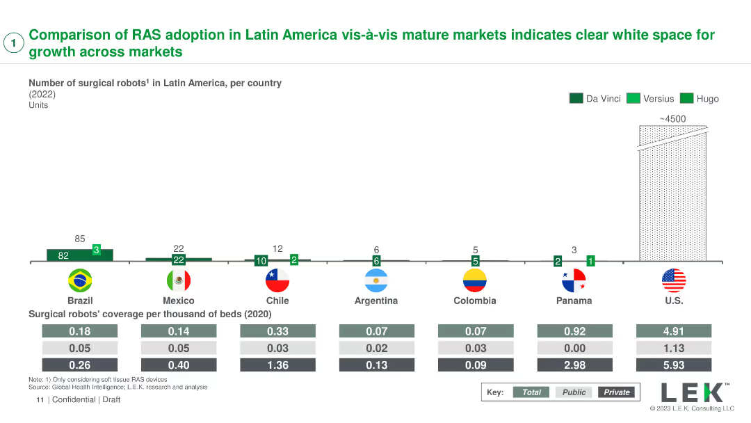
A column chart showing the number of surgical robots in various countries with coverage per thousand beds
Market Analysis and Trends
Healthcare & Pharmaceuticals
Compares the adoption of robotic-assisted surgery (RAS) systems in Latin America with mature markets, identifying growth opportunities
RAS adoption, market comparison, Latin America, growth, healthcare
Mixed Chart
LEK
Saved
A multi-bar column chart shows the percentage of mortgages in forbearance by type, with a time series comparison from 2020 to 2023.
Risk Assessment and Management
Financial Services
Assesses mortgage-backed securities (MBS) risk by highlighting the sharp reduction in forbearance rates since the pandemic, valuable for financial risk managers.
MBS, forbearance, mortgages, pandemic, risk, reduction, securities, financial, management
Single Chart
Morgan Stanley
Saved
Title, several bar charts detailing impacts of digital initiatives in the chemistry sector, mentions of "Digital R&D" and "Digital Plant".
Technology and Digital Transformation
Industrial & Manufacturing
Discusses how digitalization could transform the chemistry and advanced materials industry, emphasizing potential societal benefits like reduced emissions and injury rates.
chemistry, digitalization, societal benefits, emissions reduction, industry transformation
Mixed Chart
Accenture
Saved
Bar chart showing the percentage of "Yes" responses regarding HR information system adoption across various sectors.
Human Resources and Talent Management
Professional Services
Explores the adoption rate of HR information systems across different sectors.
HR, information system, adoption, sectors, rate
Multiple Chart
PwC/Strategy&
Saved
Images of batteries, pie chart, partnership flowchart
Strategic Planning
Industrial & Manufacturing
LANXESS's partnership with TINCI in electrolyte production
Electrolyte, Batteries, Partnership, TINCI, Market Leader
Mixed Chart
Morgan Stanley
Saved
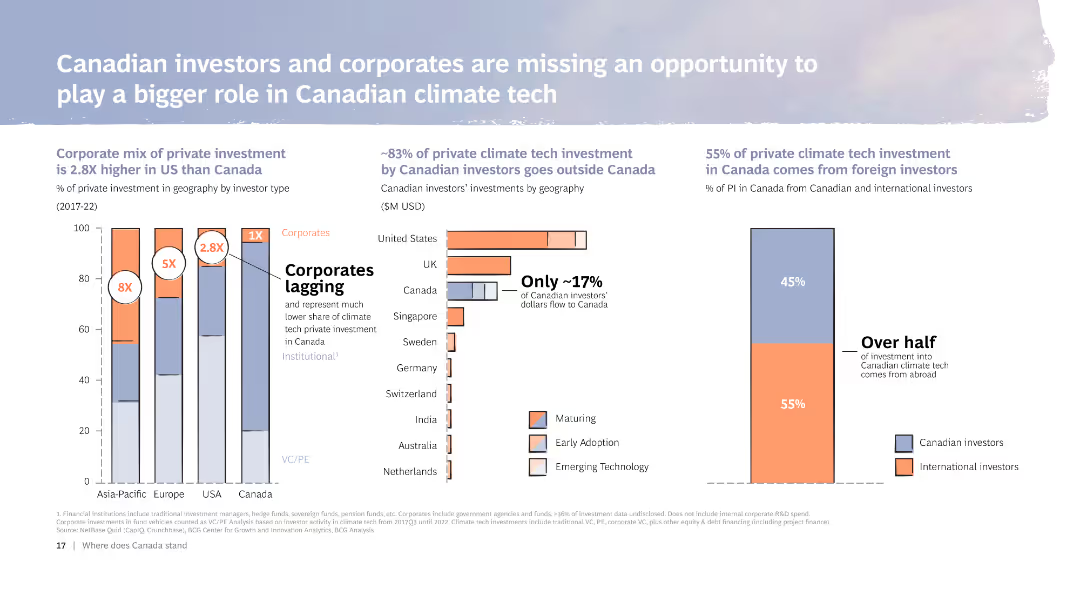
The slide includes multiple column charts and bar charts comparing private climate tech investment in Canada with other regions. It also features text discussing the investment landscape, highlighting areas where Canadian investors and corporates lag.
Investment Analysis
Financial Services
Analyzes the role of Canadian investors and corporates in climate tech investment, comparing with other regions. Highlights missed opportunities and the need for increased domestic investment.
Investment, Climate tech, Canada, Corporates, Chart
Multiple Chart
BCG
Saved
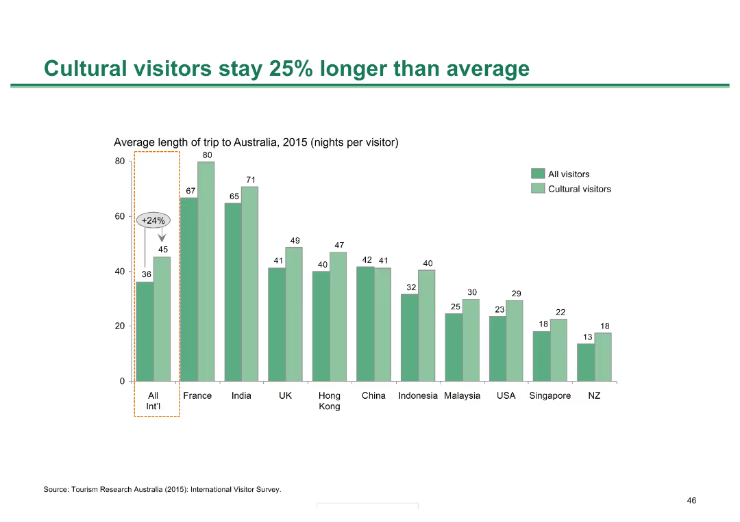
A column chart showing the average length of stay for cultural visitors compared to all visitors, with data broken down by country of origin.
Market Analysis and Trends
Hospitality & Tourism
Demonstrates that cultural visitors tend to stay longer in Australia compared to the average visitor, with specific country breakdowns highlighting variations.
cultural visitors, length of stay, Melbourne, tourism, visitor analysis
Single Chart
BCG
Saved
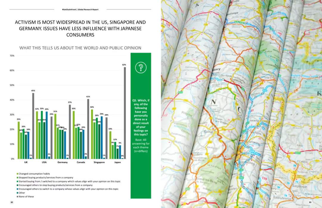
Shows a column chart comparing levels of activism across different countries, highlighting the differences in public engagement with various social issues.
Market Analysis and Trends
Government & Public Sector
Compares levels of activism across multiple countries, focusing on public engagement with social issues in the US, Singapore, Germany, and Japan.
Activism, country comparison, social issues, public engagement, market trends
Mixed Chart
Deloitte
Saved
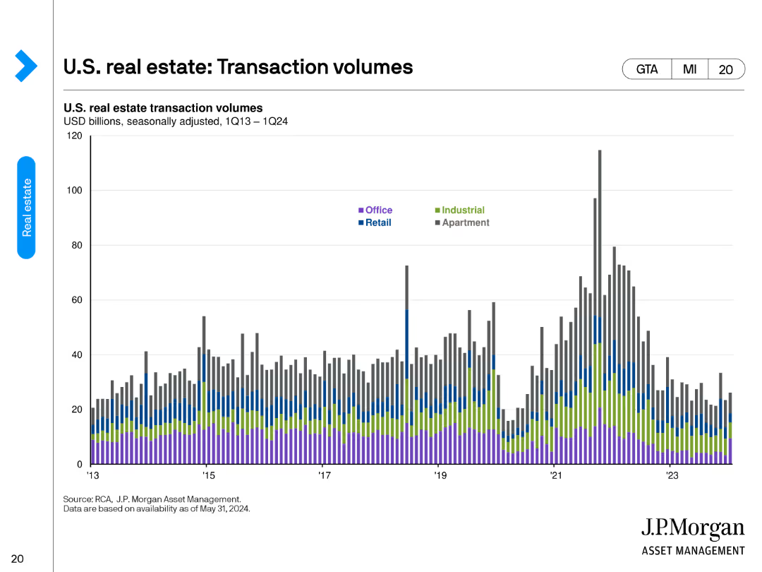
The slide features a column chart detailing U.S. real estate transaction volumes from 1Q13 to 1Q24. The volumes are segmented by property types: Office, Industrial, Retail, and Apartment.
Market Analysis and Trends
Real Estate & Construction
This slide shows the trends in U.S. real estate transaction volumes over time, segmented by different types of properties. It's useful for understanding market activity and investment trends in the real estate sector.
transaction volumes, property types, market trends, investment, real estate, analysis
Single Chart
JP Morgan
Saved
The slide features tables, regional maps, and icons. It visually separates information by countries and key international alliances.
Market Analysis and Trends
Government & Public Sector
Analyzes the strengthening of Australia's international alliances in the Indo-Pacific, influencing Australia's battery industries.
Indo-Pacific, alliances, Australia, trade agreements
Table
Accenture
Saved
Contains multiple bar charts and percentage data illustrating growth in marketing organizations by employee count and revenue, set in a purple color scheme.
Organizational Structure and Change
Professional Services
Discusses growth trends in marketing teams, providing data segmented by company size and revenue, helpful for HR and organizational planning.
marketing growth, employee count, revenue, organizational development, HR planning
Multiple Chart
Deloitte
Saved
Dark background with white text. Includes circular charts showing percentages and yellow highlights.
Market Analysis and Trends
Healthcare & Pharmaceuticals
This slide highlights that 59% of consumers would switch to virtual consultations for prescription renewal, 58% for discussing test results, 54% to save time, and 54% for minor medical conditions, indicating a preference for virtual healthcare solutions among U.S. consumers.
virtual consultations, healthcare, U.S. consumers, preferences, statistics
Mixed Chart
EY
Saved
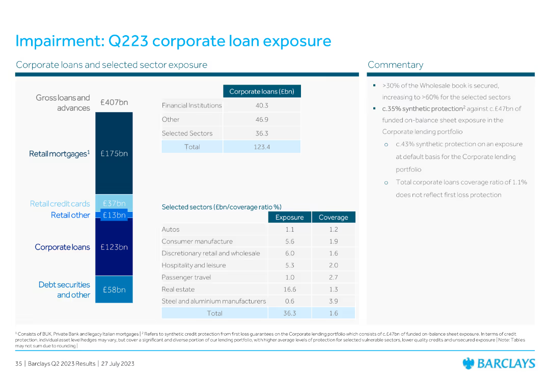
The slide contains a detailed table listing corporate loans and selected sector exposure with specific values for financial institutions, retail mortgages, credit cards, and other sectors. Includes commentary on the right-hand side.
Financial Performance
Financial Services
The slide presents corporate loan exposure and sector-specific coverage ratios. Commentary includes insights on wholesale book security and synthetic protection, highlighting overall corporate loan exposure and risk management.
corporate loans, sector exposure, retail mortgages, commentary, financial institutions
Mixed Chart
Barclays
Saved
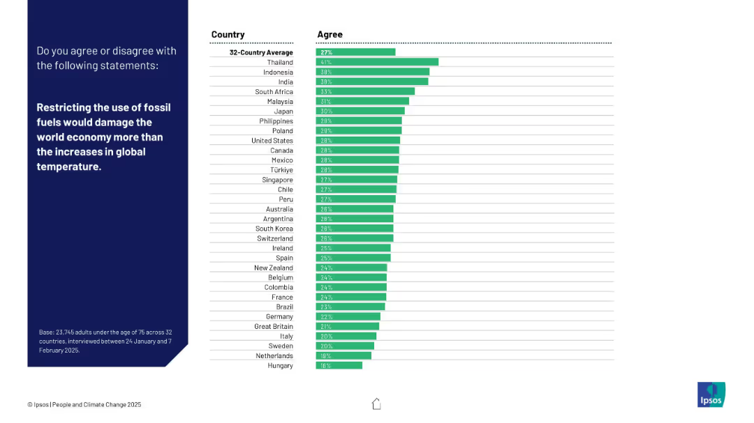
Standard layout with a horizontal bar chart showing agreement by country.
Strategic Planning
Environmental Services & Sustainability
Respondents were asked whether limiting fossil fuels would hurt the economy more than climate change. Thailand leads in agreement; Western countries show low support.
fossil fuels, economic impact, climate policy, temperature rise, global economy, Ipsos, energy strategy, environment vs economy, public opinion, international survey
Mixed Chart
IPSOS
Saved
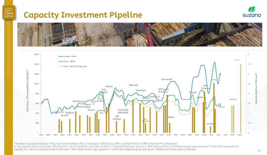
One large line graph with annotations showing plant names and capacity additions; vertical bars indicate capacity in tons/year.
Strategic Planning
Industrial & Manufacturing
The slide displays historical and projected pulp capacity additions and pulp prices in Europe and China. It illustrates key mill projects and investment trends, along with CPI-adjusted pricing and expected future capacity expansion globally.
pulp investment, capacity pipeline, Europe, China, mill projects, CPI
Single Chart
Goldman Sachs
Saved
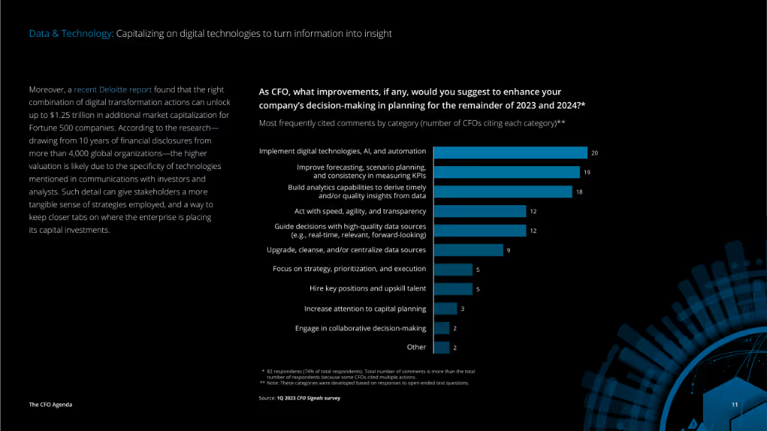
The slide features detailed text on the left discussing digital transformation benefits and a vertical column chart on the right showing suggested improvements for decision-making.
Technology and Digital Transformation
Technology & Software
The slide highlights the benefits of digital transformation and suggests improvements for enhancing decision-making through the implementation of digital technologies, AI, and automation, focusing on planning and strategy.
data, technology, digital transformation, AI, automation, decision-making, planning, strategy, CFO, improvements
Mixed Chart
Deloitte
Saved
Column chart displaying survey results with percentages for Europe, United States, and APAC regions. Five main processes listed.
Technology and Digital Transformation
Technology & Software
The slide shows the top five processes companies use to ensure technology adoption, including organizational structure and innovation units.
technology, adoption, processes, survey, Europe, US, APAC, innovation, KPI, skills
Mixed Chart
Accenture
Saved
A map highlights the distribution of unicorns across ASEAN, complemented by icons representing industry sectors. The layout is organized, with data points and percentages providing a clear visual summary.
Investment Analysis
Technology & Software
Examines the growth of unicorn companies in the ASEAN region, emphasizing the tripling number in 2021 and the industries they represent. This slide might be used to discuss investment potential and the impact of such companies on local economies and talent needs.
unicorns, ASEAN, growth, industries, investment
Boxed
Kearney
Saved
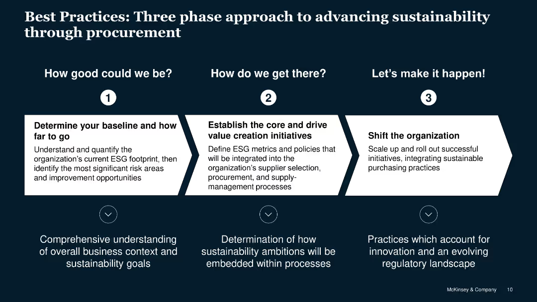
Step-by-step flow for advancing sustainability through procurement with detailed text descriptions.
Strategic Planning
Professional Services
Outlines a three-phase approach to integrating sustainable practices into procurement strategies.
best practices, sustainability, procurement, approach, phases
Linear Flow
McKinsey
Saved
Complex flow chart that maps different pandemic phases like Flatten, Fight, and Future with economic implications, asking critical questions for each phase.
Strategic Planning
Financial Services
This slide serves to dissect the potential economic trajectories in response to pandemic phases, providing a strategic framework for assessing impacts.
pandemic response, economic impact, Flatten phase, Fight phase, Future phase, economic trajectories, strategic framework
Mixed Chart
BCG
Saved
Contains line graphs showing progress against emissions targets for various sectors within Barclays' portfolio.
Risk Assessment and Management
Government & Public Sector
Highlights Barclays' progress in reducing emissions in various sectors, aligning with global sustainability targets.
emissions, targets, progress, sustainability, financial services, risk management, environmental impact
Multiple Chart
Barclays
Saved
The slide includes a stacked bar chart showing how respondents manage their investments, with different categories.
Operational Efficiency
Financial Services
The slide discusses the various methods respondents use to manage their investments, including advisors and self-directed approaches.
Management, Investments, Advisors, Self-Directed, Pension
Single Chart
IPSOS
Saved
Previous
Next
If nothing, comes up, please save your slides first
Create a FREE account to continue browsing
Receive Instant Access to 1,000+ slides from companies like McKinsey, Google, and Goldman Sachs
First Name
Last Name
Email
Password
I agree to all
Terms & Privacy Policy
Thank you! Your submission has been received!
Oops! Something went wrong while submitting the form.
Have an account?
Sign in
Column Chart
Heatmap
Chevron
Org Chart
Infographic
Callouts
Timeline
List
Graphic
Picture
Process Flow
Diagram
Paragraph
Map
Table
Framework
Subtitle
Takeaway Box
Icon
Other Chart
Radar Chart
Waterfall Chart
Mekko Chart
Pie Chart
Scatter Plot
Line Chart
Bar chart
Bullet points