Create a FREE Account
Instant access to 1,000+ real slides from top companies like McKinsey, BCG, Goldman Sachs, Google and many more!
First Name
Last Name
Email
Password
I agree to all
Terms & Privacy Policy
Thank you! Your submission has been received!
Oops! Something went wrong while submitting the form.
Have an account?
Sign in
Library
Templates
Courses
Pricing
My Account
My Slides
My Templates
✦ AI
AI Prompt Library
AI Search
Sign in
Start Here
Logout
My Saved Slides
Column charts show the development of the Tier 1 leverage ratio and changes in leverage exposure from 3Q22 to 4Q22.
Financial Performance
Financial Services
Describes the improvement in the Tier 1 leverage ratio due to capital raises and deleveraging, indicating strengthened financial leverage.
Tier 1 leverage, financial leverage, capital raises, deleveraging, banking metrics
Multiple Chart
Credit Suisse
Saved
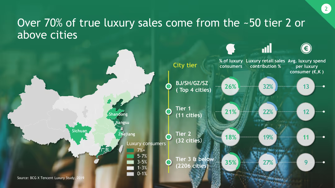
The slide includes a map of China highlighting tiered cities and their contribution to luxury sales, along with circular graphs representing consumer percentages and average spend.
Market Analysis and Trends
Consumer Goods
This slide shows that the majority of luxury sales come from approximately 50 tier 2 or above cities in China, with detailed data on consumer contributions and spending.
Luxury Sales, Tier Cities, Market Contribution, China, Consumer Data
Multiple Chart
BCG
Saved
Comparative chart of long-term senior unsecured debt credit ratings by Moody's, S&P, and Fitch for holding companies, including UBS and its peers.
Competitive Landscape
Financial Services
Comparison of credit ratings for UBS and its peers' holding companies, illustrating rating differences and outlooks from various agencies.
Credit ratings, holding companies, comparison, Moody's, S&P
Table
UBS
Saved
Displays various icons representing societal practices, virus monitoring, etc., with checkmarks in green circles indicating impact on spread and severity of infections.
Strategic Planning
Healthcare & Pharmaceuticals
Summarizes the critical factors influencing the duration of the pandemic fight, emphasizing vaccines as the most significant factor in resolving the crisis.
COVID-19, vaccines, societal practices, monitoring, therapeutics
Header Horizontal
BCG
Saved
The slide employs a flowchart design to illustrate treasury management solutions, paired with text descriptions and icons. The layout is clear and organized, allowing easy navigation through the content.
Product and Service Analysis
Financial Services
It breaks down how commercial banking provides differentiated treasury solutions, making it suitable for presentations aimed to inform about value-driven client services in treasury management.
treasury solutions, commercial banking, client value, service analysis, flowchart
Header Vertical
JP Morgan
Saved
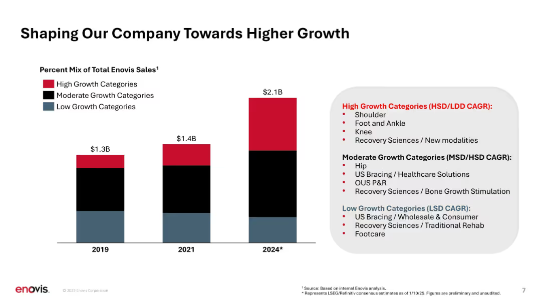
Vertical stacked bar chart with color-coded growth segments and legend; text callouts on right.
Strategic Planning
Healthcare & Pharmaceuticals
Illustrates shift in sales mix toward high-growth product categories over time (2019 to 2024), categorizing them into high, moderate, and low growth. Highlights strategic prioritization of faster-growing areas like shoulder, knee, and new modalities.
growth categories, product mix, revenue evolution, strategic focus, CAGR, product segmentation
Mixed Chart
JP Morgan
Saved
Column chart (horizontal) showing the percentage breakdown of integration costs across various functional areas such as HR, IT, and Finance.
Financial Performance
Professional Services
Breaks down the integration costs by function, highlighting the proportion of expenses in HR, IT, and other areas, demonstrating cost distribution.
integration, costs, HR, IT, finance, cost breakdown, functional expenses
Single Chart
Deloitte
Saved
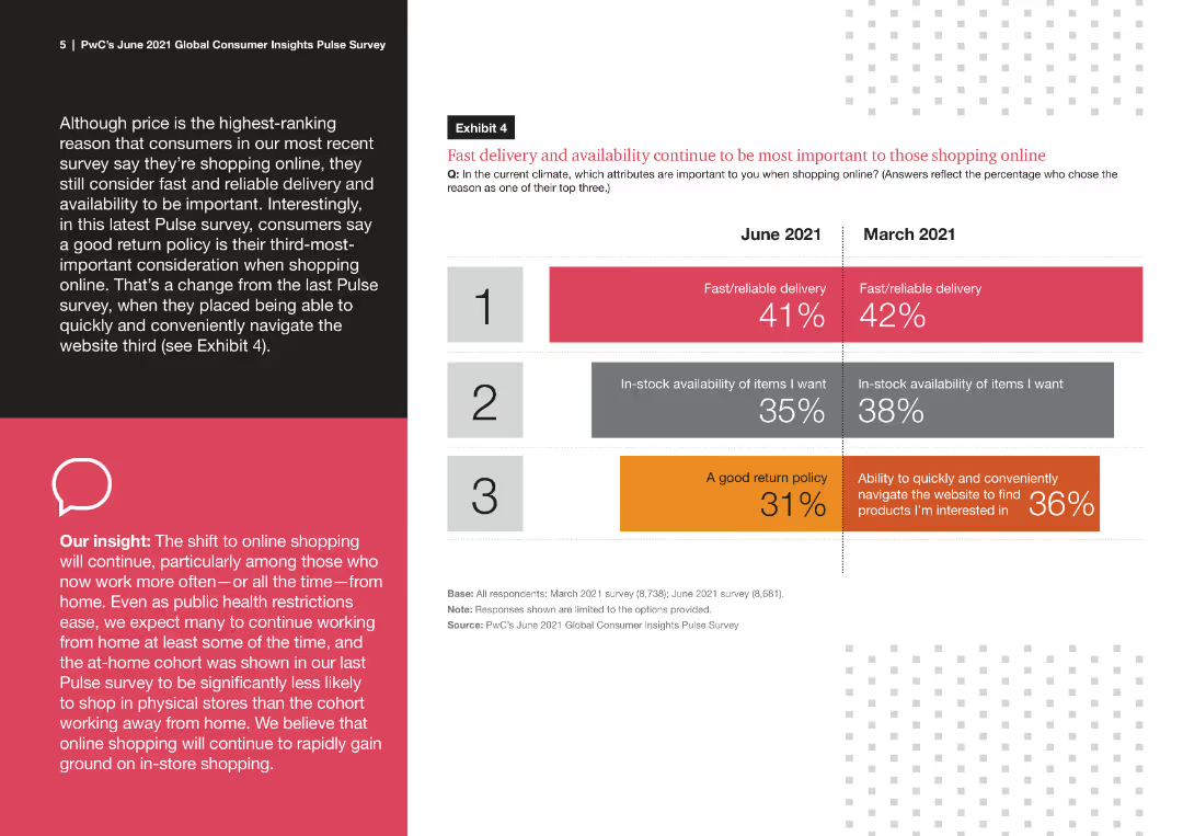
This slide features a comparative column chart displaying consumer priorities for online shopping in June 2021 and March 2021. It includes numerical percentages and color-coded bars for clarity.
Market Analysis and Trends
Retail & E-commerce
The slide presents data from a survey comparing consumer priorities for online shopping between June 2021 and March 2021. It highlights the importance of fast delivery, stock availability, and return policy changes over time.
fast delivery, online shopping, consumer priorities, survey data, comparative analysis
Mixed Chart
PwC/Strategy&
Saved
This slide includes a table with various metrics and two line charts showing contract value and quarterly net contract value increase.
Market Analysis and Trends
Technology & Software
It presents detailed research metrics, including contract value, net contract value increase, productivity, and client enterprises statistics.
Research, Metrics, Contract Value, Productivity, Client Enterprises, Net Increase
Multiple Chart
Gartner
Saved
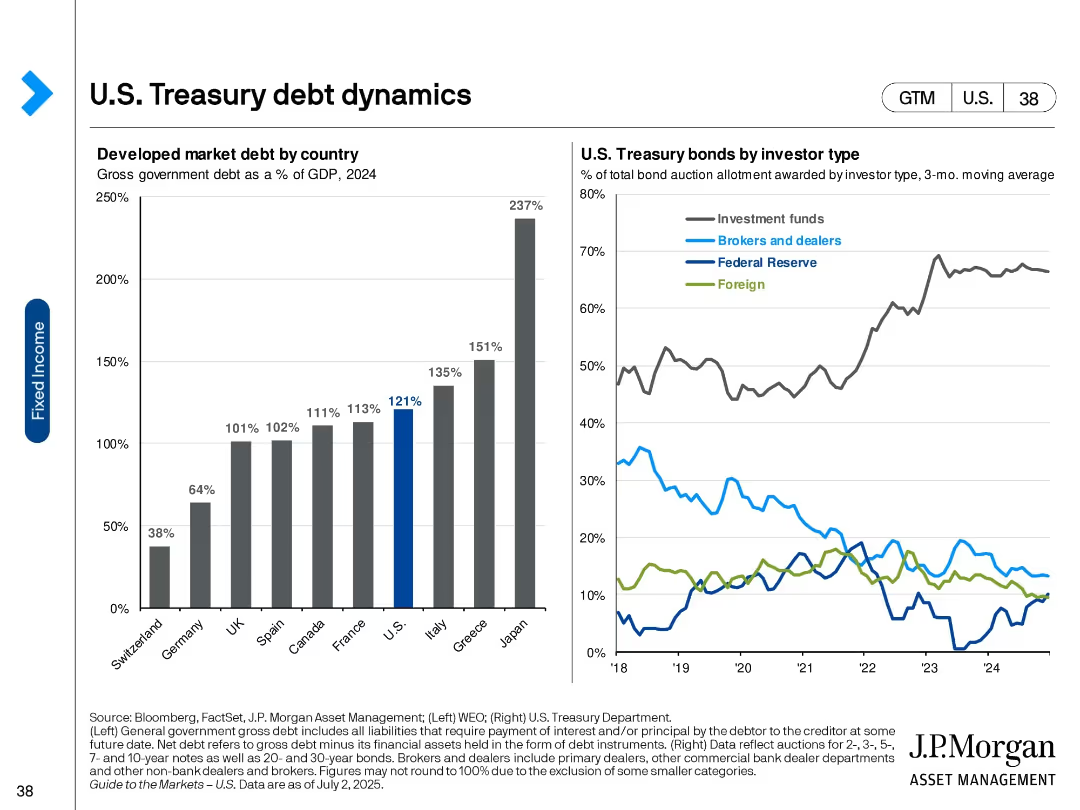
Two-panel visual: bar chart (left) of developed market debt as % of GDP and line chart (right) of bond allocations by investor type.
Market Analysis and Trends
Financial Services
The slide illustrates government debt levels across developed countries and the distribution of U.S. Treasury bond holdings by investor type. It shows the U.S. has high debt levels and investment funds dominate Treasury purchases.
U.S. debt, Treasury holdings, investor types, global debt, GDP ratio, fixed income, bond market, financial markets, government borrowing
Multiple Chart
JP Morgan
Saved
Exhibit 2 displays a table categorizing technology trends and their relevance across multiple industries with color-coded relevance.
Industry Overview
Technology & Software
This table slide exhibits the relevance of various technology trends across different industry sectors.
Industries, Technology, Trends, Relevance, Silicon Age, Engineering Tomorrow
Single Chart
McKinsey
Saved
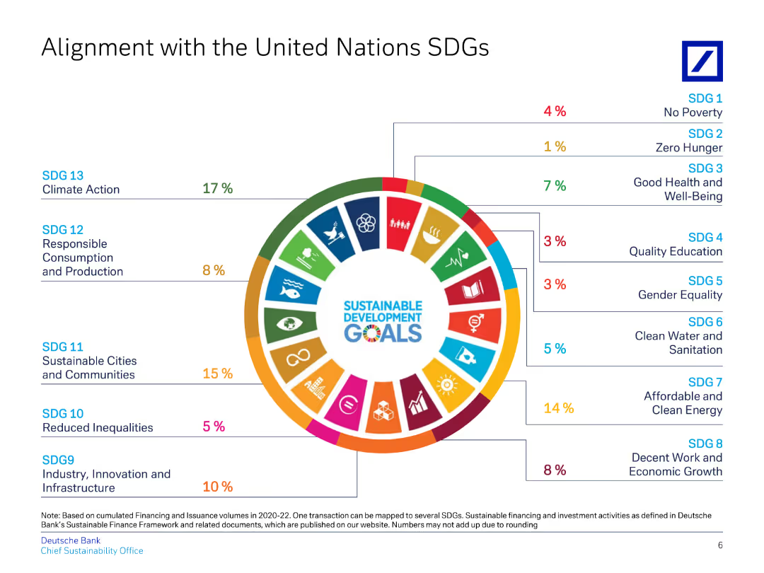
This slide uses a circular diagram to align Deutsche Bank's initiatives with various UN Sustainable Development Goals (SDGs).
Regulatory and Compliance
Financial Services
Highlights Deutsche Bank's contributions to specific UN SDGs, detailing percentages for each goal, showcasing commitment to ESG.
SDGs, UN, alignment, sustainability, ESG
Single Chart
Deutsche Bank
Saved
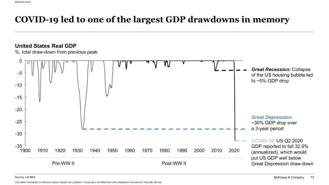
Single large line chart depicting U.S. GDP drawdowns from 1900–2020 with labeled economic crises
Market Analysis and Trends
Financial Services
This slide compares the U.S. GDP drawdown during COVID-19 to historic crises like the Great Depression and Great Recession. It highlights the exceptional severity of the 2020 Q2 drop, estimated at 32.9% annualized, the largest recorded in modern economic history.
GDP drawdown, COVID-19, recession, Great Depression, economic history
Single Chart
McKinsey
Saved
Bar chart and infographic style icons, simple and clean layout with blue highlights.
Customer and Market Segmentation
Telecommunications
Discusses future investments and priorities in customer service, including automation and self-service options.
customer service, future planning, investment
Multiple Chart
Deloitte
Saved
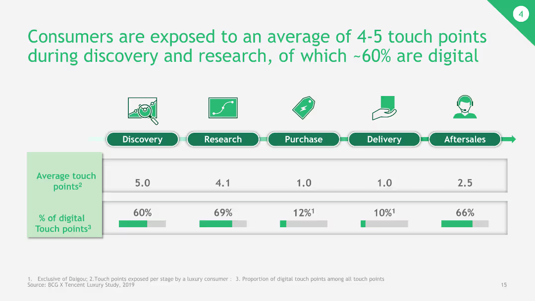
The slide presents a bar chart depicting the average number of touch points during different stages of the consumer journey, with a breakdown of digital touchpoints.
Customer and Market Segmentation
Consumer Goods
This slide shows the average touch points consumers are exposed to during various stages of the buying process, emphasizing the significant role of digital touchpoints.
consumer journey, touch points, digital touchpoints, buying process, average touch points
Single Chart
BCG
Saved
The slide is a complex visual representation, using a Cartesian coordinate system chart with multiple criteria plotted along X (Importance of criterion) and Y (Position of France). Various factors are highlighted in red, indicating areas of improvement.
Market Analysis and Trends
Professional Services
This slide evaluates France's attractiveness to American investors focusing on factors like workforce cost, administrative complexity, and social climate. It suggests key improvement areas to enhance France's business environment.
France, investment, administrative complexity, social climate, attractiveness
Single Chart
Bain
Saved
Lists pros and cons in energy, water, and food sectors with bullet points.
Strategic Planning
Environmental Services & Sustainability
Summarizes global trends and challenges in energy, water, and food.
global trends, energy, water, food, resources, challenges, opportunities
Table
Roland Berger
Saved
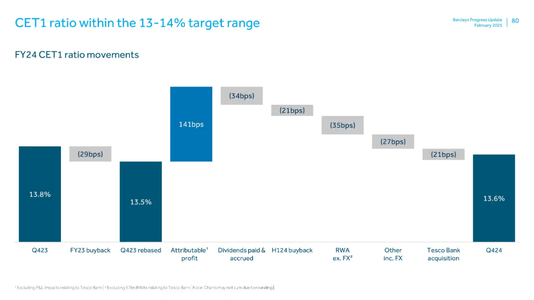
Waterfall chart showing changes in CET1 ratio from Q423 to Q424. Clear numeric and visual step-by-step adjustments.
Corporate Finance and Valuation
Financial Services
CET1 ratio decreased slightly from 13.8% to 13.6% due to buybacks, FX impacts, and acquisitions, despite strong attributable profits. Each component’s impact shown in basis points, highlighting careful capital management.
CET1, capital ratio, buyback, dividends, FX, profits, Q4 2024
Single Chart
Barclays
Saved
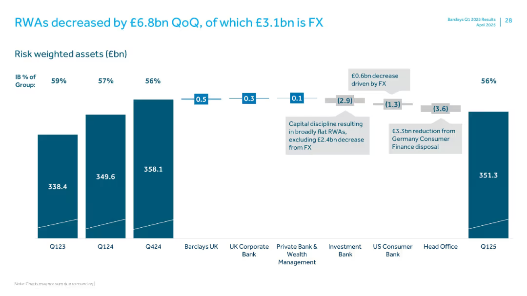
Vertical stacked bar chart with segments showing change in RWAs across divisions and FX effects
Performance Metrics and KPIs
Financial Services
Shows a £6.8bn quarter-over-quarter decrease in risk-weighted assets (RWAs), with detailed breakdowns by business units and impact from FX and the German consumer finance disposal.
RWAs, FX impact, Germany disposal, business units, Q125
Single Chart
Barclays
Saved
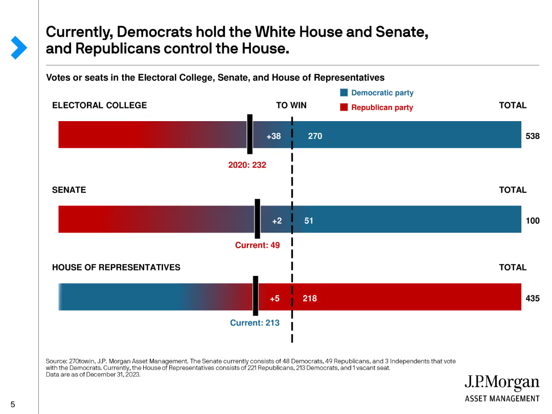
This slide includes bar charts showing the current composition of the Electoral College, Senate, and House of Representatives, with red and blue colors representing the respective parties.
Market Analysis and Trends
Government & Public Sector
Illustrates the current political landscape in the U.S., showing the distribution of power between Democrats and Republicans in the Electoral College, Senate, and House of Representatives.
Politics, Electoral College, Senate, House, Parties
Single Chart
JP Morgan
Saved
Various charts including bar and pie charts depicting firms' confidence levels, challenges, and growth expectations.
Market Analysis and Trends
Financial Services
This slide assesses firms' confidence in the economic outlook for 2023, highlighting major concerns such as supply chain issues, tight margins, and growth prospects.
Economic outlook, firms' confidence, supply chain, margins, growth, challenges, expectations, trends, 2023
Multiple Chart
EY
Saved
Line graph and forecasts showing quarterly luxury goods market trends in 2020 with scenario analysis for Q4 outcomes.
Market Analysis and Trends
Consumer Goods
Forecasts the Q4 luxury goods market performance for 2020 with scenario analysis and key drivers affecting the market.
luxury goods, market forecast, 2020, Q4 predictions, market trends
Mixed Chart
Bain
Saved
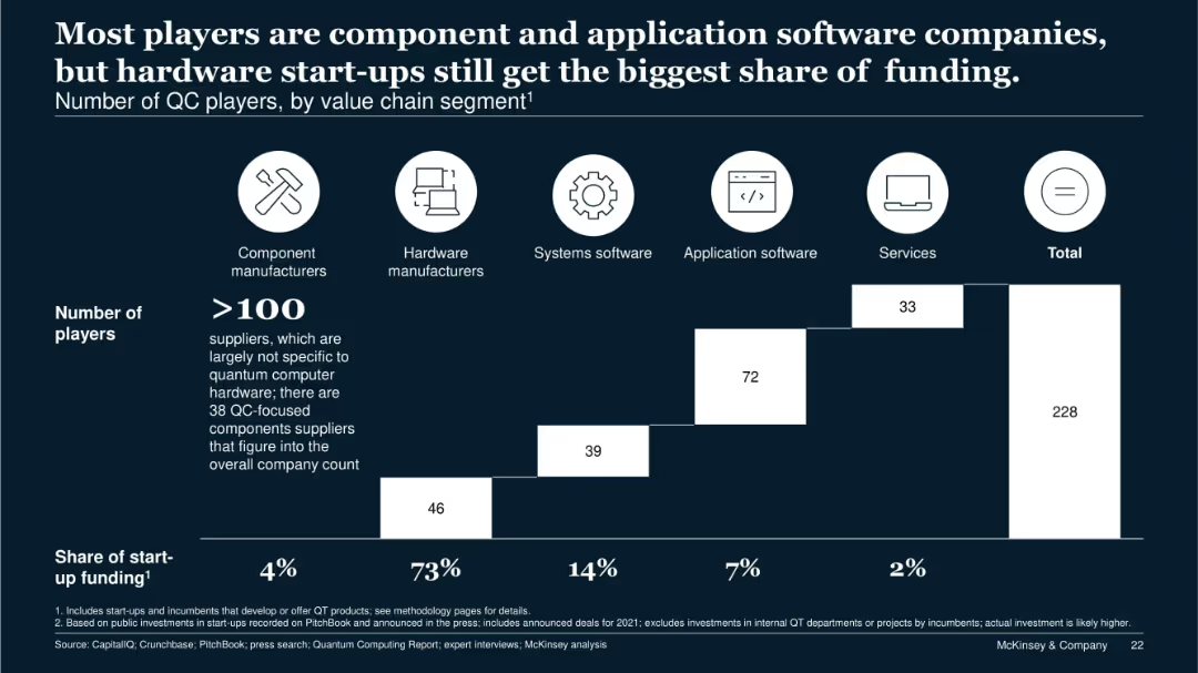
Stacked bar chart segmented by company type; icons for categories above the chart; funding share noted below.
Competitive Landscape
Technology & Software
This slide segments 228 quantum computing companies by value chain role. Although hardware manufacturers represent only a fraction of players, they receive 73% of total startup funding. It illustrates market imbalance and the dominant capital flow toward hardware.
value chain, QC players, startup funding, hardware, components, services
Single Chart
McKinsey
Saved
Features one column chart displaying 'Economic benefits of Copernicus through its contribution to marine exploitation and preservation' and a flow diagram showing economic impacts with icons representing various sectors such as fishing and ship routing.
Market Analysis and Trends
Environmental Services & Sustainability
The slide outlines the economic benefits from using Copernicus-derived products, focusing on improvements in ship routing and fisheries, with potential market and job creation impacts highlighted.
Economic Benefits, Copernicus, Fisheries, Ships
Mixed Chart
PwC/Strategy&
Saved
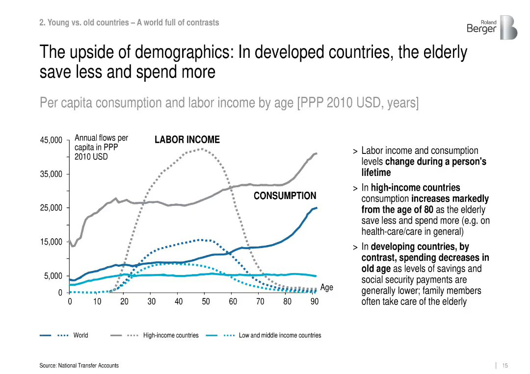
Line graph showing labor income vs. consumption by age across different country income levels (World, High, Low-Mid).
Market Analysis and Trends
Government & Public Sector
The slide presents per capita labor income and consumption over age, revealing that elderly populations in high-income countries consume more and save less, especially after age 80, contrasting with developing regions.
consumption, labor income, aging, high-income, developing countries, elderly spending, economic behavior
Mixed Chart
Roland Berger
Saved
Previous
Next
If nothing, comes up, please save your slides first
Create a FREE account to continue browsing
Receive Instant Access to 1,000+ slides from companies like McKinsey, Google, and Goldman Sachs
First Name
Last Name
Email
Password
I agree to all
Terms & Privacy Policy
Thank you! Your submission has been received!
Oops! Something went wrong while submitting the form.
Have an account?
Sign in
Column Chart
Heatmap
Chevron
Org Chart
Infographic
Callouts
Timeline
List
Graphic
Picture
Process Flow
Diagram
Paragraph
Map
Table
Framework
Subtitle
Takeaway Box
Icon
Other Chart
Radar Chart
Waterfall Chart
Mekko Chart
Pie Chart
Scatter Plot
Line Chart
Bar chart
Bullet points