Create a FREE Account
Instant access to 1,000+ real slides from top companies like McKinsey, BCG, Goldman Sachs, Google and many more!
First Name
Last Name
Email
Password
I agree to all
Terms & Privacy Policy
Thank you! Your submission has been received!
Oops! Something went wrong while submitting the form.
Have an account?
Sign in
Library
Templates
Courses
Pricing
My Account
My Slides
My Templates
✦ AI
AI Prompt Library
AI Search
Sign in
Start Here
Logout
My Saved Slides
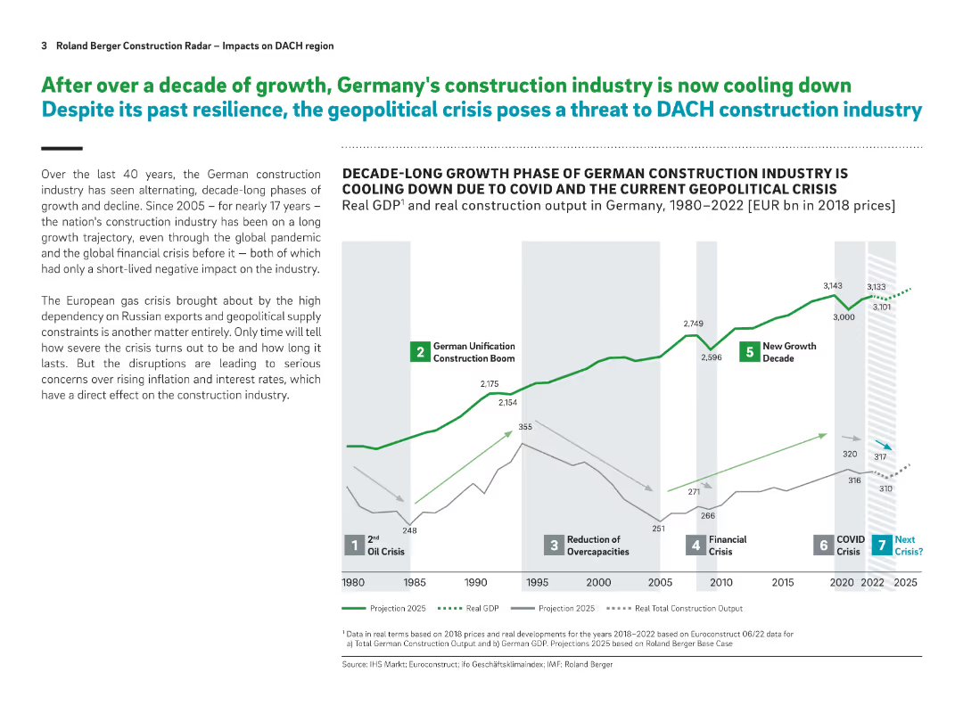
Timeline chart showing real GDP and construction output from 1980 to 2022 with projections; milestone annotations; text on the left
Market Analysis and Trends
Real Estate & Construction
This slide outlines historical and projected trends in Germany's construction industry, highlighting decade-long cycles and the impact of geopolitical crises. It shows how recent shocks like COVID-19 and the energy crisis are threatening growth.
construction, Germany, GDP, crisis, real estate, economic cycles, projections, DACH region
Mixed Chart
Roland Berger
Saved
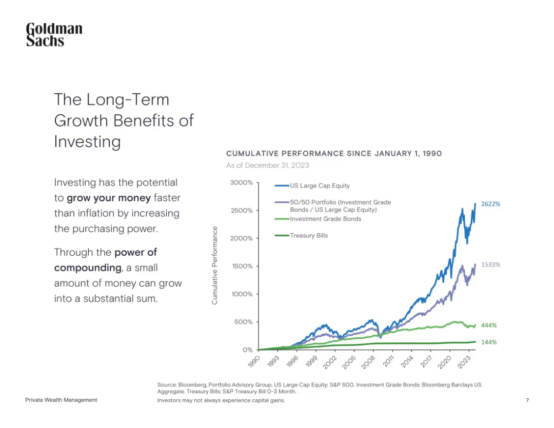
Left-aligned text with a line chart showing cumulative performance since 1990
Investment Analysis
Financial Services
The slide highlights the power of long-term investing by comparing cumulative returns from equities, bonds, and treasury bills since 1990.
Long-Term Investing, Compounding, Equities, Bonds, Treasury, Performance
Mixed Chart
Goldman Sachs
Saved
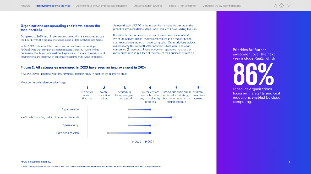
Left side explains improvement across tech categories; right side features a vertical progress bar chart. Far right has a bold statistic highlight.
Technology and Digital Transformation
Technology & Software
Organizations are maturing across tech categories, especially XaaS and data/analytics. Chart shows progress from 2023 to 2024 in four key tech areas. Notes ASPAC is leading in proactive implementation. Calls out 86% prioritizing XaaS for agility and cost savings.
XaaS, cloud, strategy evolution, tech maturity, AI, cybersecurity
Mixed Chart
KPMG
Saved
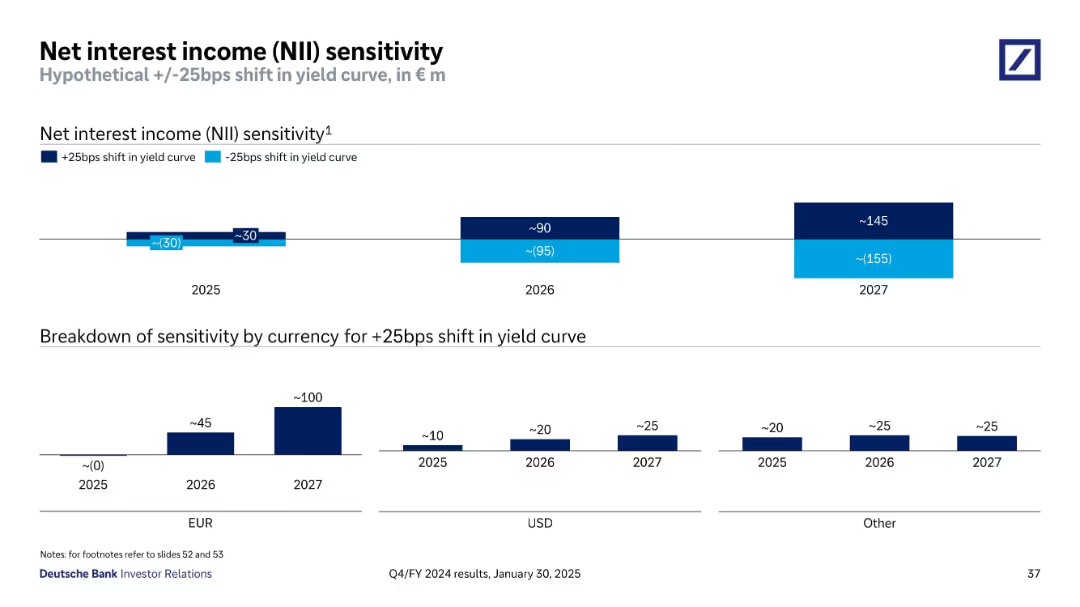
Bar chart projections showing sensitivity to +/-25bps shift in yield curve over 2025–2027
Risk Assessment and Management
Financial Services
Displays Deutsche Bank’s estimated NII sensitivity to yield curve shifts through 2027. The breakdown indicates impact by year and by currency, showing increasing NII benefit in future years under a rising rate scenario.
NII, Interest Rates, Yield Curve, Sensitivity, EUR, USD, Forecast
Multiple Chart
Deutsche Bank
Saved
Horizontal bar charts comparing agreement and disagreement on statements about societal change, conflict, immigration, and leadership, with a focus on specific concerns.
Market Analysis and Trends
Government & Public Sector
This slide addresses concerns related to rapid societal changes, such as values conflict, immigration issues, and weak leadership, highlighting agreement and disagreement levels.
societal change, conflict, immigration, leadership, concerns, bar chart, agreement, disagreement
Mixed Chart
IPSOS
Saved
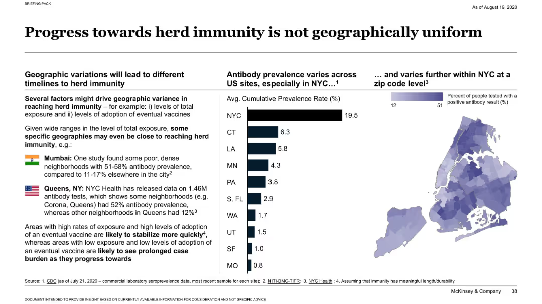
Dual layout with bar graph of antibody prevalence across U.S. states and a heatmap of NYC ZIP code data; includes callouts for Mumbai and Queens.
Market Analysis and Trends
Healthcare & Pharmaceuticals
Demonstrates wide geographic variation in antibody prevalence across U.S. cities and globally. Highlights that some dense areas (like Queens and Mumbai) have much higher rates, suggesting uneven progress toward herd immunity based on exposure and vaccine adoption.
herd immunity, antibody prevalence, NYC, Mumbai, geographic variation
Multiple Chart
McKinsey
Saved
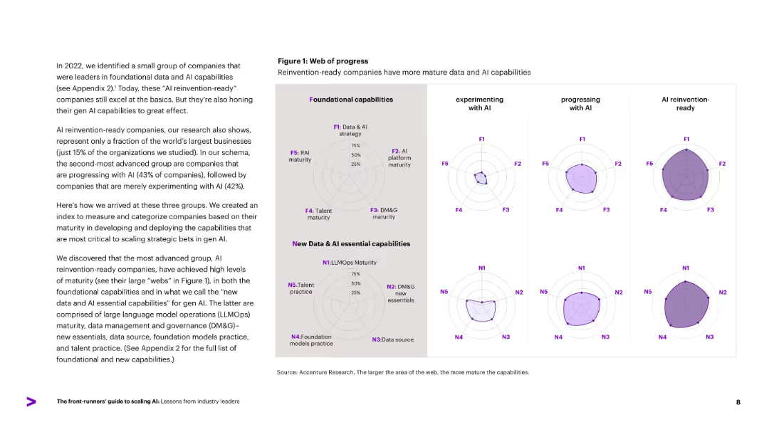
Radar charts compare three company groups (experimenting, progressing, AI reinvention-ready) across foundational and new AI capabilities. Left-aligned descriptive text.
Performance Metrics and KPIs
Artificial Intelligence
Introduces a capability maturity model, showing how companies fall into three AI adoption categories. Uses radar charts to illustrate progress in foundational and new Gen AI capabilities, including LLMOps, data governance, and talent practices. Reinvention-ready firms show the highest maturity across all axes.
maturity model, AI readiness, radar chart, data capabilities, LLMOps
Mixed Chart
Accenture
Saved
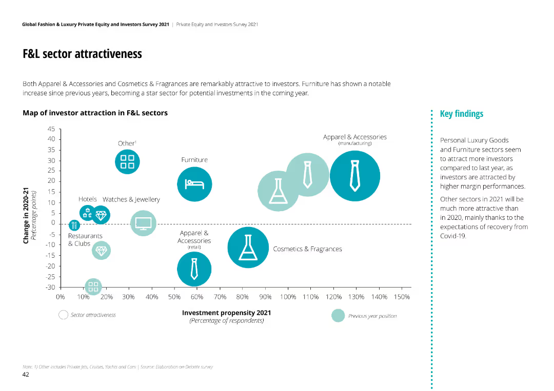
Bubble chart mapping investor attraction in F&L sectors, showing change in attractiveness from 2020-21. Sectors like Apparel & Accessories and Furniture highlighted.
Competitive Landscape
Financial Services
Apparel & Accessories and Cosmetics & Fragrances are highly attractive to investors. Furniture has shown notable increase in investment propensity for 2021.
sector attractiveness, F&L sectors, investor perspective, investment propensity, market trends
Mixed Chart
Deloitte
Saved
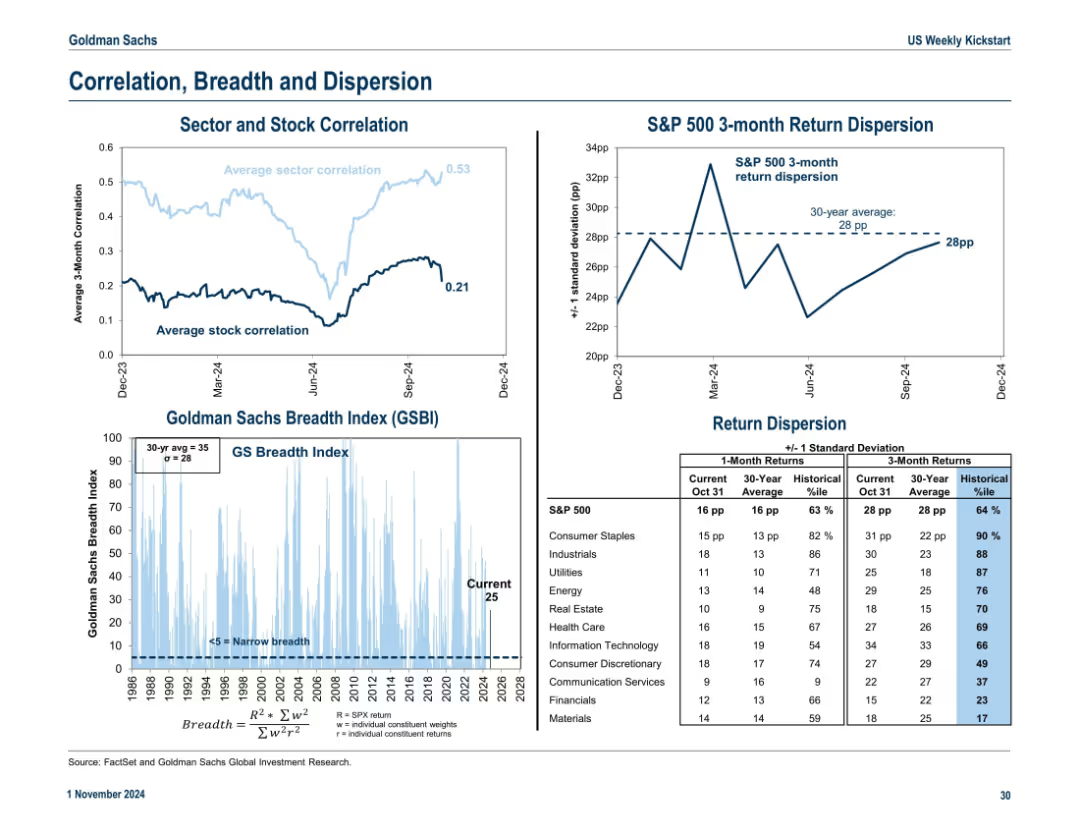
Three-section layout: average sector/stock correlation line chart, breadth index with historical context, and return dispersion stats. Blue gradient for breadth intensity.
Risk Assessment and Management
Financial Services
The slide presents market internals: sector and stock correlations, return dispersions, and the GS Breadth Index. It highlights market concentration and potential risks tied to narrow leadership or broad participation.
dispersion, correlation, breadth, return volatility, S&P 500, stock internals
Multiple Chart
Goldman Sachs
Saved
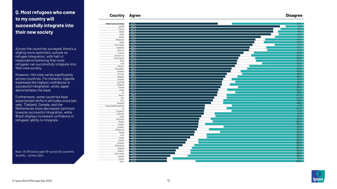
Ranked horizontal bar chart of countries by % agreement. Country names and bars on right; explanatory text on left side of slide.
Human Resources and Talent Management
Government & Public Sector
This slide explores confidence in refugee integration across countries. Uganda shows the highest agreement (63%), while Japan is lowest (27%). The global average is 51%, indicating a slightly optimistic but mixed global perspective. Regional and national variations highlight areas of perceived challenge or success in refugee integration.
integration, refugees, global trust, Ipsos survey, societal acceptance, immigration, cultural adjustment, country ranking, perception
Mixed Chart
IPSOS
Saved
Contains a table and icons representing various countries with national flags, detailing measures to diversify supply chains.
Market Analysis and Trends
Government & Public Sector
This slide provides an overview of different national strategies to reduce dependency on Chinese manufacturing amidst rising geopolitical tensions.
supply chains, geopolitics, diversification, China
Table
Accenture
Saved
Includes matrix charts and text blocks on talent management strategies, emphasizing identification and sourcing of critical skills. Visual elements are clear with green and gray highlights.
Human Resources and Talent Management
Education & Training
Discusses re-skilling and up-skilling strategies in line with business changes, focusing on digital and leadership skills essential for the future, and various sourcing strategies including tech-enabled recruiting.
Skills development, Talent management, Digital transformation, Recruitment
Framework
BCG
Saved
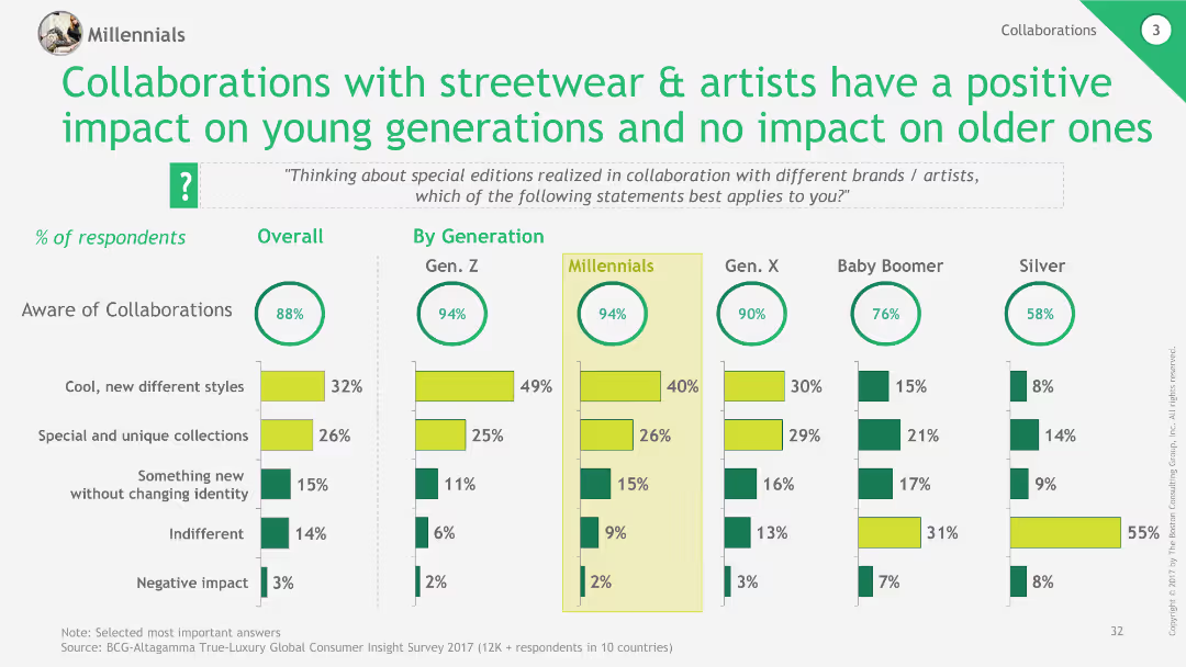
Column charts showing awareness and perceptions of collaborations by generation, with positive impact noted for younger generations.
Market Analysis and Trends
Retail & E-commerce
This slide discusses the impact of collaborations with streetwear and artists on different generations, highlighting positive reception among younger consumers.
collaborations, streetwear, generational impact, luxury, retail
Multiple Chart
BCG
Saved
This slide employs a flow chart to delineate the complex interrelations between various factors that influence food prices, such as demography, economic growth, and climate change. Each factor is connected by arrows indicating its impact on food supply and demand, and ultimately on prices. The chart is organized with clear labels and a central question mark symbolizing the uncertainty in future food price predictions.
Market Analysis and Trends
Financial Services
This slide outlines the multifaceted drivers influencing future food prices, integrating economic, demographic, and environmental factors. It portrays the complexity of predicting food prices due to these interdependencies, highlighting the critical need for comprehensive market analysis.
food prices, economic factors, demographic changes, supply and demand, climate impact, market predictions, uncertainty, trade policies, production costs, financial markets
Diagram
Roland Berger
Saved
Line and bar charts comparing domestic vs. export-oriented earnings and revenue exposure for Asian companies, highlighting revenue derived domestically.
Market Analysis and Trends
Financial Services
Examines earnings and revenue sources for Asia ex-Japan companies, contrasting domestic and export-oriented businesses to understand revenue exposure and trends.
Asia ex-Japan, earnings, revenue exposure, line chart, bar chart, financial analysis, domestic, export-oriented, market trends
Multiple Chart
JP Morgan
Saved
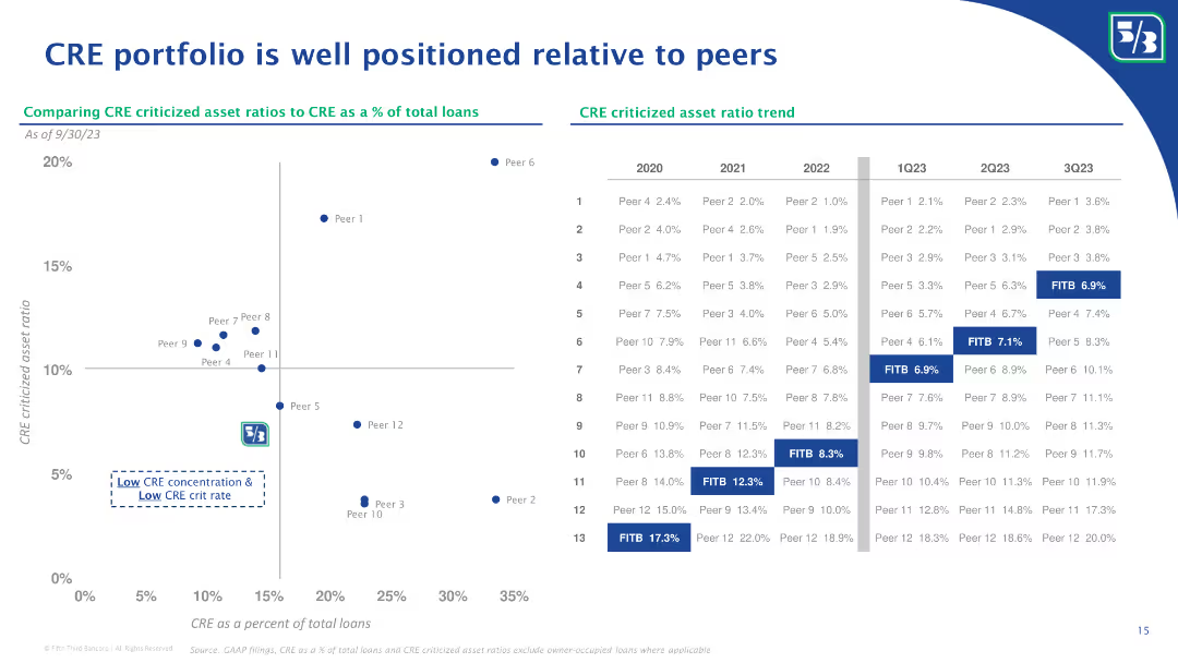
A scatter plot chart comparing CRE criticized asset ratios to CRE as a percentage of total loans. Includes a table detailing asset ratios over time.
Market Analysis and Trends
Real Estate & Construction
The slide compares the criticized asset ratios of CRE portfolios relative to peers, showing trends over several quarters.
CRE, criticized asset ratio, peer comparison, scatter plot, market analysis, asset ratio trend, real estate
Mixed Chart
Goldman Sachs
Saved
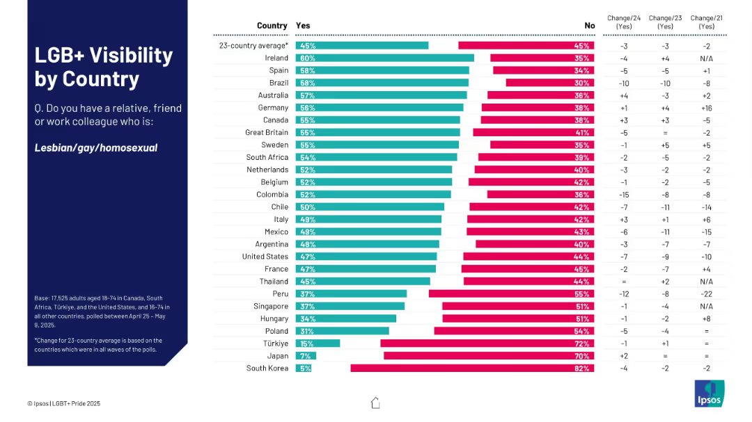
Horizontal bar chart format; lists % of respondents who know someone gay; right side shows changes over time.
Market Analysis and Trends
Government & Public Sector
This slide measures personal visibility of LGB+ individuals by country, based on respondents knowing someone who is gay. Ireland, Spain, and Brazil lead; South Korea and Japan rank lowest.
gay, relationships, visibility, survey, countries, Ipsos, familiarity
Mixed Chart
IPSOS
Saved
Column chart illustrating the Bloomberg Global Aggregate USD intra-year declines versus calendar year returns from 2003 to 2024.
Financial Performance
Financial Services
This slide examines the annual returns and intra-year declines of the Bloomberg Global Aggregate USD Index, providing insights into the performance of fixed income investments.
fixed income, returns, declines, Bloomberg, performance
Single Chart
JP Morgan
Saved
Textual content and comparative data visualizations with maps. Shows the number of unicorns in Asia Pacific countries and outlines the initiatives of China, India, South Korea, and Japan to fulfill digital imperatives.
Industry Overview
Government & Public Sector
Compares the progress of prominent Asian countries in developing their digital ecosystems. Discusses initiatives and policies implemented to push for a flourishing digital economy, useful for understanding competitive positioning and the race to achieve key digital imperatives.
Digital Ecosystem, Unicorns, Asia Pacific, China, India, South Korea, Japan, Policy, Digital Economy, Competitiveness
Single Chart
Kearney
Saved
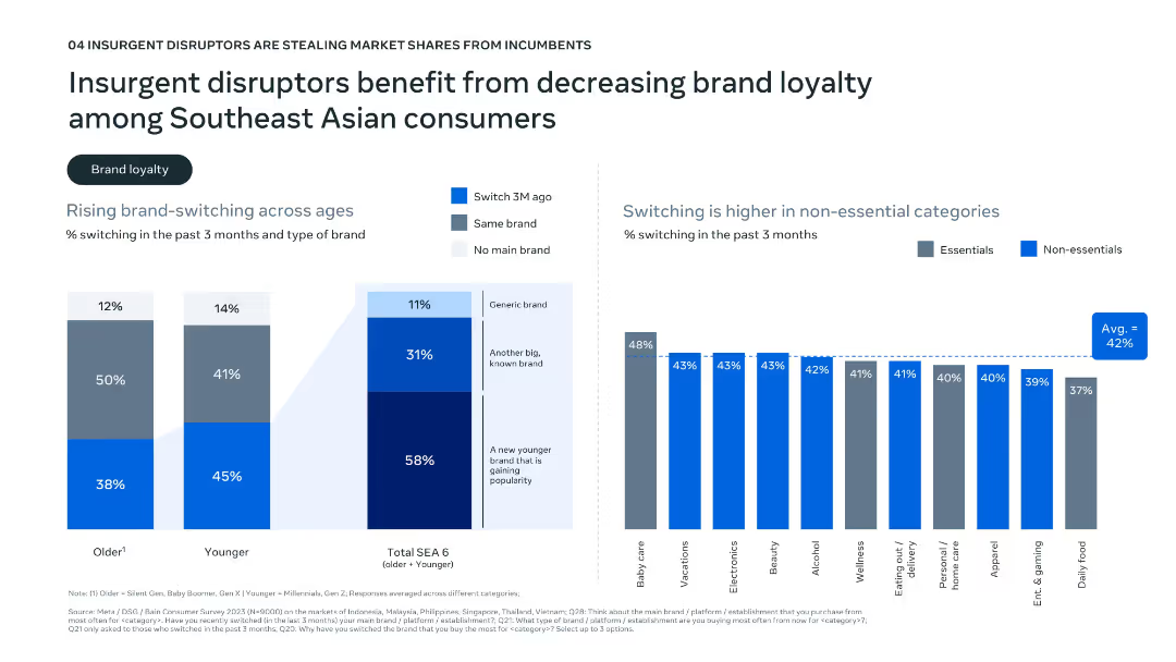
Dual-panel layout with bar graphs; left shows age-related brand-switching data; right shows switching by category (essentials vs. non-essentials).
Market Analysis and Trends
Consumer Goods
Highlights rising brand-switching behavior in Southeast Asia, especially among younger consumers and non-essential categories. The data shows a preference for newer and generic brands, suggesting that disruptors are benefiting from this decline in brand loyalty.
brand switching, loyalty, consumer behavior, generational trends, SEA
Multiple Chart
Bain
Saved
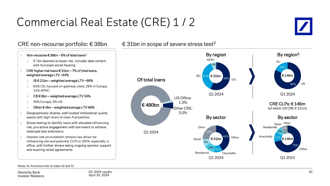
Multiple pie charts showing CRE exposure by region and sector, including stress test coverage; supported by bullet-point analysis and totals.
Risk Assessment and Management
Financial Services
Provides an overview of Deutsche Bank’s €38bn non-recourse CRE exposure and €31bn in scope for stress testing. Highlights include U.S. office concentration, LTV averages, and sector/region breakdowns. Emphasizes refinancing risks and ongoing risk mitigation strategies in a rising rate environment.
commercial real estate, CRE exposure, non-recourse, stress testing, refinancing risk, LTV, Deutsche Bank
Mixed Chart
Deutsche Bank
Saved
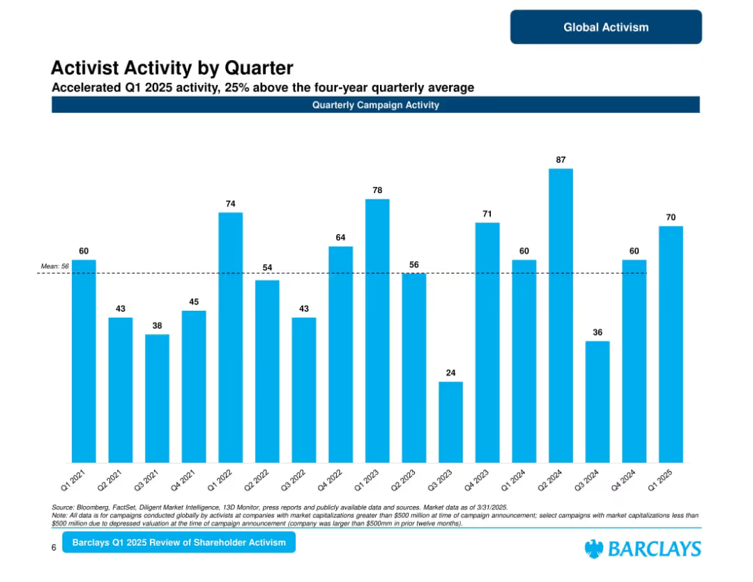
Bar chart of quarterly campaign activity from Q1 2021 to Q1 2025; average line marked; title and subtitle emphasize 25% above average activity.
Market Analysis and Trends
Financial Services
Depicts a quarter-by-quarter view of activist campaigns. Q1 2025 shows strong performance at 70 campaigns, surpassing the 4-year average. Highlights variability across quarters with visible spikes and lulls, indicating cyclic activism patterns.
quarterly campaigns, shareholder activism, 2025 Q1, Barclays, market patterns, campaign volume
Single Chart
Barclays
Saved
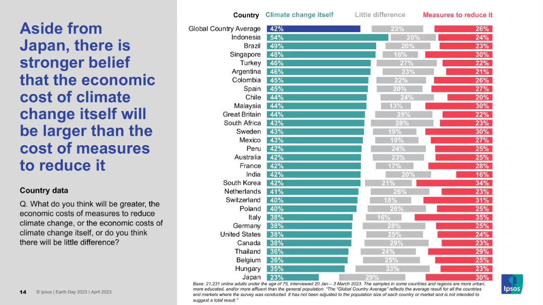
Detailed country-by-country horizontal bar chart; shows comparative belief in economic cost of climate change vs. action.
Market Analysis and Trends
Environmental Services & Sustainability
This chart shows that, aside from Japan, most countries believe the economic cost of inaction on climate change exceeds the cost of mitigation. Indonesia, Brazil, and Singapore lead this sentiment, while Japan stands out for its skepticism.
Economic impact, Climate cost, Mitigation, Global survey, Ipsos data
Mixed Chart
IPSOS
Saved
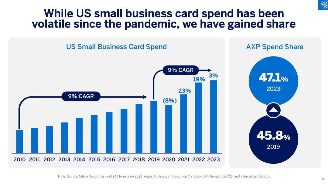
Left side features a vertical bar chart showing US small business card spend (2010–2023), while the right side includes two circular infographics showing AXP spend share for 2019 and 2023.
Financial Performance
Financial Services
The slide outlines the US small business card spending trend and highlights American Express’ increasing share, rising from 45.8% in 2019 to 47.1% in 2023, despite pandemic-related volatility.
CAGR, small business, card spend, AXP, market share, volatility, growth, pandemic impact, Nilson Report
Single Chart
McKinsey
Saved
This slide has a dual-topic layout with text summaries. It discusses the need for business portfolio adjustments and activism risk management, with a straightforward design for clear communication.
Strategic Planning
Professional Services
Discusses the importance for companies to adapt their business portfolios and address activism risks, useful in strategic business planning sessions.
Portfolio Management, Activism Risk, Business Strategy, Acquisitions, Divestitures, Market Adaptation, Risk Mitigation, Business Fundamentals, Strategic Decisions, Investor Advice
Text Only
BCG
Saved
Previous
Next
If nothing, comes up, please save your slides first
Create a FREE account to continue browsing
Receive Instant Access to 1,000+ slides from companies like McKinsey, Google, and Goldman Sachs
First Name
Last Name
Email
Password
I agree to all
Terms & Privacy Policy
Thank you! Your submission has been received!
Oops! Something went wrong while submitting the form.
Have an account?
Sign in
Column Chart
Heatmap
Chevron
Org Chart
Infographic
Callouts
Timeline
List
Graphic
Picture
Process Flow
Diagram
Paragraph
Map
Table
Framework
Subtitle
Takeaway Box
Icon
Other Chart
Radar Chart
Waterfall Chart
Mekko Chart
Pie Chart
Scatter Plot
Line Chart
Bar chart
Bullet points