Create a FREE Account
Instant access to 1,000+ real slides from top companies like McKinsey, BCG, Goldman Sachs, Google and many more!
First Name
Last Name
Email
Password
I agree to all
Terms & Privacy Policy
Thank you! Your submission has been received!
Oops! Something went wrong while submitting the form.
Have an account?
Sign in
Library
Templates
Courses
Pricing
My Account
My Slides
My Templates
✦ AI
AI Prompt Library
AI Search
Sign in
Start Here
Logout
My Saved Slides
The slide features a column chart with bold red background with multiple circular and linear elements indicating various stages and changes in the personal luxury goods market from 1996 to 2017. Various periods are marked such as "Sortie du Temple," "Democratization," "Crisis," "Chinese Bulimia," and "Reboot."
Market Analysis and Trends
Consumer Goods
This slide presents the growth trajectory and critical transformations in the personal luxury goods market, emphasizing shifts during different economic periods and their impact on market values, especially highlighting the "Reboot" phase starting in 2015 leading to a new normal in 2017.
luxury goods, market analysis, growth, crisis, Chinese market
Single Chart
Bain
Saved
This slide displays multiple column charts comparing expenditures in various government sectors between two fiscal years, highlighting percentage changes.
Regulatory and Compliance
Government & Public Sector
Analyzes year-on-year changes in government spending across different sectors, providing insights into budget allocation shifts.
Government spending, budget analysis, fiscal years, comparison
Single Chart
PwC/Strategy&
Saved
Contains a heat map to represent asset class performance from 2013 to the current year. It uses color coding to depict returns, with red indicating lower returns and green indicating higher returns. The layout is a complex grid with numerous data points for comparison.
Investment Analysis
Financial Services
Providing a yearly performance comparison of various asset classes, this slide serves as a tool for investors or financial advisors to assess historical returns. It visually distinguishes between high and low performers, facilitating strategic investment decisions based on past market behavior.
Asset Classes, Performance, Heat Map, Returns, Analysis
Table
Morgan Stanley
Saved
Stacked bar charts by region showing NCD death proportions by disease type (2016 vs. 2060). Sidebar explains future trends and cost burden.
Strategic Planning
Healthcare & Pharmaceuticals
The slide analyzes noncommunicable disease death shares by category and region. Cardiovascular disease remains the top cause, but dementia and diabetes are on the rise. Africa shows a notable increase in CVD and cancer. It emphasizes the long-term health system costs of NCDs and the need for prevention strategies, including insurance coverage in low-income regions.
NCDs, cardiovascular disease, cancer, dementia, diabetes, health systems, global trends
Multiple Chart
Roland Berger
Saved
The slide presents a pie chart comparing the levels of ESG investment planned by organizations for 2023 versus 2022. The chart uses color distinctions to show changes in investment strategies, such as increases or decreases.
Investment Analysis
Environmental Services & Sustainability
Analyzes trends in corporate ESG investment, highlighting a cautious approach in the wake of economic challenges. It indicates shifts in corporate spending on sustainability initiatives, providing insights into how businesses plan to navigate financial uncertainties while still prioritizing ESG goals.
ESG, investment, trends, corporate spending, 2023
Multiple Chart
PwC/Strategy&
Saved
A column chart shows the 5-Year Spreads for various countries, highlighting significant variance among issuers.
Risk Assessment and Management
Financial Services
It discusses the increased variance among issuers and the bifurcation based on issuer credit quality. Important for assessing credit risk and issuer performance.
credit quality, spreads, issuers, variance, EM
Single Chart
Morgan Stanley
Saved
Horizontal line chart depicting changes in investor capital allocation in response to economic uncertainty. Each bar is labeled with a percentage, reflecting investor agreement.
Investment Analysis
Financial Services
Details how investors are adjusting their capital allocation strategies due to inflation and recession risks, with increased focus on cash holdings and investments in stable sectors.
capital allocation, investors, economic uncertainty, inflation
Single Chart
BCG
Saved
A U.S. map highlights locations and prospective clients in the Middle Market Banking & Specialized Industries sector, using color-coding to differentiate data. The slide is data-driven and informative with minimal text for clarity.
Market Analysis and Trends
Financial Services
Offers a geographical overview of opportunities in the Middle Market segment, ideal for strategic discussions or investor presentations focused on expansion and market potential.
Middle Market, client franchise, growth opportunity, geographical overview, market potential
Graphic
JP Morgan
Saved
Two line charts are presented: one showing government debt as a percentage of GDP and the other illustrating government interest payments as a percentage of GDP for the US, Eurozone, and UK.
Risk Assessment and Management
Government & Public Sector
The slide examines government debt levels and interest payment trends, useful for assessing fiscal sustainability and debt risk in major economies.
Government debt, interest payments, fiscal sustainability, GDP, risk management
Multiple Chart
JP Morgan
Saved
Three-panel layout with text blocks summarizing pension developments, a capital impact table, and bar chart comparing 2021 vs 2022 IAS19 assets/liabilities.
Corporate Finance and Valuation
Financial Services
Barclays communicates that pension-related capital drag has been addressed through a triennial valuation, a pension transaction unwind, and improvements in portfolio balance. The result is elimination of deficit reduction requirements and improved CET1 impact.
pensions, CET1, capital impact, surplus, liabilities
Mixed Chart
Barclays
Saved
Dual bar chart comparing happiness and unhappiness drivers; left-aligned explanatory text in dark blue box; white background chart area.
Customer and Market Segmentation
Professional Services
The slide identifies key personal factors that contribute to happiness and unhappiness across 30 countries. Relationships and feeling loved are top drivers of happiness, while financial situation is the dominant cause of unhappiness. The layout compares these drivers side-by-side for clear contrast.
happiness, unhappiness, drivers, financial, relationships, mental health, global study, Ipsos, well-being, satisfaction
Mixed Chart
IPSOS
Saved
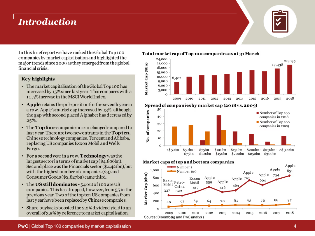
The slide contains two column charts showing total market capitalization data over the years, with text explanations on the side. The design is clear and data-centric.
Market Analysis and Trends
Financial Services
This slide highlights the market capitalization growth of the top 100 companies from 2010 to 2021, emphasizing the significant increase observed in the recent years.
market capitalization, growth, top companies, data analysis, 2010-2021, financial trends
Multiple Chart
PwC/Strategy&
Saved
A combination of line and bar charts showing the percentage of people in Britain, France, and Germany who are not concerned about online privacy in 2013 and 2021.
Market Analysis and Trends
Technology & Software
This slide presents the change in attitudes towards online privacy from 2013 to 2021 in Britain, France, and Germany, indicating a growth in comfort with data sharing.
privacy, data sharing, trends, Europe, survey
Multiple Chart
IPSOS
Saved
Text with bold red highlights discusses the disruptive impact of FinTech on financial institutions, accompanied by a bubble chart of customer retention strategies by sector.
Technology and Digital Transformation
Financial Services
The slide details how financial institutions are adapting to FinTech disruptions, focusing on customer retention strategies and internal innovation efforts.
Financial institutions, FinTech, Disruption, Customer retention, Innovation, Technology, Strategies, Adaptation, Transformation, Impact
Mixed Chart
PwC/Strategy&
Saved
Gantt-style chart with horizontal bars across years (2018–2025) showing truck model launches; includes legend and vehicle details
Product and Service Analysis
Transportation & Logistics
This slide presents a timeline of electric medium and heavy-duty truck model launches by major OEMs. It includes BEV, FCEV, and hybrid variants with SOPs, pilot phases, and announced projects. It highlights industry readiness and growing diversity in powertrain technology.
electric trucks, OEMs, xEV, model launch, timeline, MDT, HDT, SOP, BEV, powertrain
Single Chart
Roland Berger
Saved
This slide features a large circular progress chart showing a 50% reduction, and multiple icons with text descriptions on benefits of automated matching and remote closing.
Operational Efficiency
Transportation & Logistics
The slide illustrates how automation in transaction matching and business operations has improved efficiency and effectiveness in logistics, highlighting benefits like increased business partnering capacity and remote work adaptation.
Automation, efficiency, reconciliation, remote closing, logistics, business improvement, transaction matching, capacity enhancement, COVID-19 adaptation
Mixed Chart
Deloitte
Saved
The slide features a colorful table of contents with sections like "Fixed Income," "Equities," and "Alternatives," each with a page number.
Strategic Planning
Financial Services
This slide outlines the sections and their order in the market monitor report, functioning as a navigational tool for the viewer.
contents, sections, navigation, financial, colorful
Agenda
Morgan Stanley
Saved
The slide features three main points with corresponding text, an illustrative rocket icon on the left. A blue and white color scheme is maintained throughout.
Strategic Planning
Technology & Software
Highlights debate topics such as space militarization, legal conflicts, and space debris. Ideal for strategic discussions in space tech.
space militarization, legal conflicts, space debris, space governance, policy
Header Vertical
McKinsey
Saved
This slide features a column chart showing hedge fund manager dispersion based on returns from 2014-2023 in USD. It compares the performance of top quartile, median, and bottom quartile managers across different hedge fund strategies.
Investment Analysis
Financial Services
The slide examines hedge fund performance dispersion, providing a comparative analysis of returns across various hedge fund strategies over a multi-year period.
hedge funds, manager selection, returns, performance, dispersion
Single Chart
JP Morgan
Saved
Includes a timeline with phases of vaccine development and potential acceleration due to COVID-19. Marked with different stages and approval milestones.
Regulatory and Compliance
Healthcare & Pharmaceuticals
Describes the expedited development timeline for COVID-19 vaccines, highlighting phases and regulatory steps for early access.
vaccine, development, timeline, COVID-19
Linear Flow
BCG
Saved
Chart on the left comparing product yield, map on right with brand logos. Bottom section lists products and blending capabilities.
Operational Efficiency
Energy & Utilities
Highlights Calumet’s competitive edge in specialty product yield from NW Louisiana plant. Shows geographic integration with brand logos and details upstream/downstream capabilities, reinforcing scale and specialization.
integrated plants, Calumet, specialty products, processing, Louisiana, operational scale
Mixed Chart
Goldman Sachs
Saved
Bar chart comparing GPT-4 and GPT-3.5 performance across standardized tests; bold headline and image of a polygonal human face.
Performance Metrics and KPIs
Artificial Intelligence
This slide presents AI exam performance data, highlighting that GPT-4 outperforms GPT-3.5 in many academic benchmarks, but with varying results depending on subject, showcasing its uneven intelligence profile.
GPT-4, GPT-3.5, AI performance, standardized tests, exam results, metrics, benchmark
Single Chart
McKinsey
Saved
The slide features a column chart tracking announced layoffs by sector (Technology, Health, Financial Services, etc.) in the US from October 2022 to October 2023. Commentary on the right.
Market Analysis and Trends
Financial Services
The slide shows a drop in US layoffs for the second consecutive month in October, with technology leading the layoffs in October.
US, layoffs, corporate, tracker, technology, financial services, health, automotive, column chart
Mixed Chart
Accenture
Saved
The slide features a column chart with statements about ESG investing and a table comparing regions on ESG criteria.
Investment Analysis
Financial Services
The slide examines the increasing importance of ESG investing, highlighting regional differences and investor expectations.
ESG investing, Social impact, Financial Services, Investment, Regional comparison
Table
Deloitte
Saved
A slide presenting an external study's findings on the F-150's status as the most American-made full-size pickup.
Product and Service Analysis
Transportation & Logistics
Discusses the significance of the Ford F-150 in the American auto industry, its sales, and its rank as an American-made vehicle.
Ford F-150, American-made, auto industry, truck sales, vehicle classification, market analysis, competitive ranking
Single Chart
BCG
Saved
Previous
Next
If nothing, comes up, please save your slides first
Create a FREE account to continue browsing
Receive Instant Access to 1,000+ slides from companies like McKinsey, Google, and Goldman Sachs
First Name
Last Name
Email
Password
I agree to all
Terms & Privacy Policy
Thank you! Your submission has been received!
Oops! Something went wrong while submitting the form.
Have an account?
Sign in
Column Chart
Heatmap
Chevron
Org Chart
Infographic
Callouts
Timeline
List
Graphic
Picture
Process Flow
Diagram
Paragraph
Map
Table
Framework
Subtitle
Takeaway Box
Icon
Other Chart
Radar Chart
Waterfall Chart
Mekko Chart
Pie Chart
Scatter Plot
Line Chart
Bar chart
Bullet points