Create a FREE Account
Instant access to 1,000+ real slides from top companies like McKinsey, BCG, Goldman Sachs, Google and many more!
First Name
Last Name
Email
Password
I agree to all
Terms & Privacy Policy
Thank you! Your submission has been received!
Oops! Something went wrong while submitting the form.
Have an account?
Sign in
Library
Templates
Courses
Pricing
My Account
My Slides
My Templates
✦ AI
AI Prompt Library
AI Search
Sign in
Start Here
Logout
My Saved Slides
The slide features a mix of text boxes and images. It outlines the steps and modules of the EY IPO readiness assessment program. The layout is structured with numbered sections and highlighted key points.
Strategic Planning
Professional Services
This slide explains the EY IPO readiness assessment, detailing the steps and modules involved in preparing companies for an IPO. It includes strategic planning, structure, taxes, financial preparation, and more, providing a comprehensive guide for businesses looking to go public.
IPO readiness, professional services, strategic planning, assessment program, preparation steps, EY, business planning, public listing
Header Vertical
EY
Saved
The slide includes a column chart of 2023 redemptions alongside a comprehensive table showing bond details, including ISIN, instrument type, currency, notional amounts, and maturity dates.
Financial Performance
Financial Services
This slide provides an overview of bond redemptions by UBS in 2023, detailing instrument types, currencies, and financial metrics, useful for financial analysis and reporting.
UBS, 2023 redemptions, bonds, financial metrics, maturity dates
Mixed Chart
UBS
Saved
Split into two sections: left text box summarizing CRE portfolio composition; right side includes pie charts by region and sector and loan scope under stress test.
Risk Assessment and Management
Financial Services
Breaks down Deutsche Bank’s €36bn non-recourse CRE portfolio, highlighting €29bn in higher-risk loans and their geographic and sectoral distribution. Provides stress test scope and Credit Loss Provision data, notably focused on US office exposure.
CRE, stress test, LTV, CLPs, office loans, US exposure, EU, APAC, sectors
Mixed Chart
Deutsche Bank
Saved
The slide includes a pie chart and text. The chart indicates the offer of mobile applications to clients.
Technology and Digital Transformation
Financial Services
The slide discusses the growing trend of adopting a mobile-first approach to enhance customer engagement in financial services.
Mobile-first, customer engagement, financial services, mobile applications, technology
Mixed Chart
PwC/Strategy&
Saved
Column chart illustrating the distribution of podcast ad inventory by spot length (up to 15 seconds to over 91 seconds) across three years.
Product and Service Analysis
Media & Entertainment
Compares the standardization of podcast ad lengths to those typical in digital media, highlighting industry adoption of shorter ad formats.
Podcast, Ads, Digital Media, Ad Lengths
Single Chart
PwC/Strategy&
Saved
Slide shows multiple column charts with stages of digital transformation across two time points (last year and current), annotated with percentages.
Strategic Planning
Professional Services
Provides a snapshot of digital marketing transformation progress within companies, comparing past and present levels of integration.
digital transformation, marketing strategy, integration levels, progress tracking, bar chart
Multiple Chart
Deloitte
Saved
A bar chart showing the number of top 100 companies from South Korea, Taiwan, Belgium, Ireland, and Denmark for the years 2009, 2016, and 2017. The bars are horizontal, indicating the companies’ counts per year per country.
Market Analysis and Trends
Financial Services
This slide highlights the changes in the number of top 100 companies from South Korea, Taiwan, Belgium, Ireland, and Denmark over the years 2009, 2016, and 2017. It provides a comparative analysis of these countries’ standings in the top 100 companies list.
Top 100, companies, trends, countries, years, distribution, bar chart, financial analysis
Single Chart
PwC/Strategy&
Saved
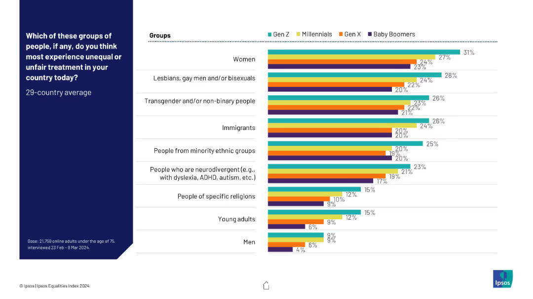
Horizontal bar chart format; lists % of respondents who know someone gay; right side shows changes over time.
Market Analysis and Trends
Government & Public Sector
This slide measures personal visibility of LGB+ individuals by country, based on respondents knowing someone who is gay. Ireland, Spain, and Brazil lead; South Korea and Japan rank lowest.
gay, relationships, visibility, survey, countries, Ipsos, familiarity
Mixed Chart
IPSOS
Saved
Text descriptions with bullet points and key figures, including a green sidebar for key success factors, alongside graphical elements emphasizing statistics.
Risk Assessment and Management
Healthcare & Pharmaceuticals
Discusses potential obstacles to COVID-19 vaccine uptake and outlines strategies to enhance vaccination rates, such as improving transparency and communication.
vaccine uptake, barriers, strategies, communication, transparency
Header Horizontal
BCG
Saved
2x2 matrix of charts showing relative P/E valuations across cyclical/defensive sectors and global/domestic equities. Clean layout with directional annotations and percentile bands.
Market Analysis and Trends
Financial Services
This slide compares valuation trends for cyclical vs. defensive sectors and global vs. domestic equities using relative P/E ratios. Annotations indicate over/undervaluation using historical percentiles.
cyclical, defensive, valuation, sector P/E, global, domestic, S&P 500, trends
Multiple Chart
Goldman Sachs
Saved
The slide includes a line chart showing the performance of various MENA equity indices throughout 2022. The chart uses multiple colored lines to represent different indices. The bottom section includes a detailed narrative of market performance.
Market Analysis and Trends
Financial Services
This slide depicts the performance of MENA equity markets in 2022, with a line chart tracking various equity indices. It also provides a narrative analysis of market trends, key events, and economic factors influencing the equity performance over the year.
MENA equity markets, financial services, market trends, equity indices, market performance, financial data, year analysis, investment
Mixed Chart
EY
Saved
Two column charts show Eaton's segment operating margin and sales from 2000 to 2018, across different business divisions like Electrical Products and Hydraulics.
Financial Performance
Technology & Software
Tracks profitability changes in Eaton’s various business divisions over nearly two decades, useful for financial analysis and strategy planning.
Eaton, profitability, sales, financial analysis
Multiple Chart
Deutsche Bank
Saved
Grid and column layout with forecast charts, comparative stats, and emissions breakdown
Risk Assessment and Management
Technology & Software
Shows projections that data centers will represent up to 3.1% of SEA power demand and ~2% of emissions by 2030. Includes a comparison between IEA and Bain estimates and outlines market-driven strategies to lower emissions, particularly through hardware/software improvements and green energy sourcing.
GHG emissions, data center emissions, AI workloads, SEA energy use, power demand, sustainability, decarbonization
Mixed Chart
Bain
Saved
Four vertical bar charts under categories: Audience, Engagement, Data, Monetisation. Each includes growth metrics and future projections.
Performance Metrics and KPIs
Financial Services
This slide communicates Experian’s core growth KPIs—membership, engagement, data usage, and monetization. It provides current performance (FY25) and future targets, emphasizing strong CAGR and commitment to scaling platform value.
KPIs, Engagement, Monetization, User growth, Data, Membership, Lifetime value
Single Chart
Barclays
Saved
A segmented bar chart showing expected changes in social media spending by market (APAC, LATAM, North America, EMEA). Each market is divided into segments indicating the percentage of expected increase or decrease in spending.
Market Analysis and Trends
Media & Entertainment
This slide analyzes the expected changes in social media budgets across different regions. It shows the percentage of marketers planning to increase, decrease, or maintain their social media spending over the next year.
Social Media, Spending, Market, Budget, Change
Mixed Chart
Nielsen
Saved
The slide compares Net Promoter Scores (NPS) across food delivery platforms, featuring graphical data visualization on the right and explanatory text on the left. The clear, professional design aids in understanding the content.
Performance Metrics and KPIs
Retail & E-commerce
Evaluates customer loyalty in the food delivery sector through Net Promoter Scores, providing a metric for comparing consumer satisfaction across platforms. The data indicates a significant opportunity for improvement and competition.
Net Promoter Score, customer loyalty, food delivery, consumer satisfaction, Southeast Asia, market competition, business metrics
Multiple Chart
Bain
Saved
Displays column charts breaking down export potentials and timelines for ammonia and hydrogen from Chile to various regions.
Market Analysis and Trends
Energy & Utilities
Analyzes export potentials for Chile in hydrogen and ammonia, forecasting growth and identifying key markets.
hydrogen, ammonia, exports, Chile, market size, LATAM, Europe, Asia
Multiple Chart
McKinsey
Saved
The slide features a column chart comparing group underlying revenues/RWA for UBS FY22, CS FY22, 2H23 annualized post-merger, and projected 2026 exit rate. Text on the left lists actions: >6bn capital release by 2026, reduction of low-return exposures, alignment of return hurdle frameworks, and optimization of models and hedging activities.
Financial Performance
Financial Services
The slide outlines strategies to optimize financial resources for sustainable growth and higher returns. It includes actions for capital release, reduction of low-return exposures, and optimization of financial models. This slide is suitable for discussing financial strategy and performance improvement with stakeholders.
optimization, financial resources, sustainable growth, returns, capital
Mixed Chart
UBS
Saved
Split design: left side with text and quote in purple, right side with bar graph and AI schematic illustration. Colorful, energetic layout with real-life photo.
Product and Service Analysis
Media & Entertainment
The slide explains the shortcomings of AI in ad testing, noting that AI lacks human empathy and cultural awareness. A graph illustrates that unconventional advertising outperforms conventional when humans are involved in the evaluation.
advertising, AI, empathy, brand, creativity
Mixed Chart
IPSOS
Saved
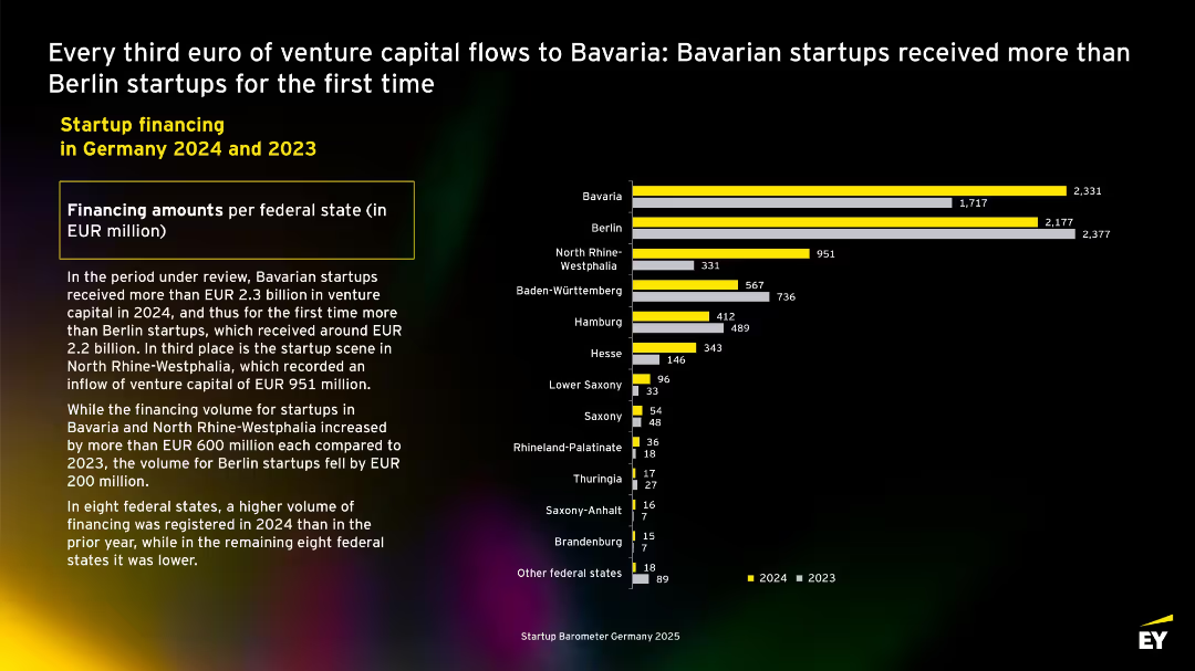
Horizontal bar chart showing deal count by sector with Software & Analytics leading. Health and E-Commerce follow. Descriptive paragraph highlights decline in deal numbers across all top sectors.
Customer and Market Segmentation
Technology & Software
Breaks down startup financing rounds in 2024 and 2023 by industry sector. Software & Analytics is the most active sector with 258 deals in 2024, although slightly down from 2023. Significant drop observed in E-Commerce financing rounds.
software, health, e-commerce, cleantech, fintech, Germany, sector analysis, deals
Mixed Chart
EY
Saved
The slide features a circular diagram linking Financial Metrics, Business Outcomes, and Leadership Outcomes. Each section includes text describing key aspects and metrics related to these outcomes.
Market Analysis and Trends
Professional Services
It connects financial performance, business outcomes, and leadership outcomes, showing how effective leadership can drive financial success and overall business performance. The slide highlights specific metrics and outcomes influenced by leadership.
Financial Performance, Business Outcomes, Leadership, Metrics, Strategy
Framework
Deloitte
Saved
The slide features a diagram and detailed table presenting the total potential of municipal solid waste (MSW) for energy production by 2060, including theoretical, technical, and sustainable potentials, and various factors affecting its scalability and sustainability constraints.
Technology and Digital Transformation
Energy & Utilities
This slide provides a deep-dive into the potential of municipal solid waste as a feedstock for energy production, analyzing its total potential by 2060 and highlighting the scalability issues and sustainability constraints associated with its use.
municipal solid waste, MSW, feedstock, total potential, energy production, 2060, scalability, sustainability constraints
Mixed Chart
Kearney
Saved
Dual-column layout: left contains contextual text and quotes; right features a bar chart comparison (Figure 8) of AI technology value perceptions.
Market Analysis and Trends
Financial Services
Compares perceived value across AI technologies like anomaly detection, machine learning, and genAI by leaders and others, highlighting industry-specific trends, especially in financial services and TMT sectors.
AI technologies, anomaly detection, machine learning, industry trends, value perception
Mixed Chart
KPMG
Saved
The slide shows a line chart detailing UK projects by activity from 2012 to 2021, with lines for different types of activities like business services, sales.
Market Analysis and Trends
Financial Services
This slide provides an overview of the distribution of UK projects by activity over the past decade, highlighting changes in business focus and investment.
UK projects, activity, business services, 2012-21
Multiple Chart
EY
Saved
Contains bullet points detailing application modernization and infrastructure modernization with emphasis on cloud adoption and data center consolidation. It uses a purple color scheme and icons to denote different points, including the aim to decommission applications and adopt a multi-cloud strategy.
Operational Efficiency
Technology & Software
Focuses on the bank's initiative to modernize its software development and infrastructure to increase efficiency and cost-effectiveness.
Application Modernization, Infrastructure, Cloud Strategy, Efficiency, Optimization, Data Centers, Security, Financial Services
Table
JP Morgan
Saved
Previous
Next
If nothing, comes up, please save your slides first
Create a FREE account to continue browsing
Receive Instant Access to 1,000+ slides from companies like McKinsey, Google, and Goldman Sachs
First Name
Last Name
Email
Password
I agree to all
Terms & Privacy Policy
Thank you! Your submission has been received!
Oops! Something went wrong while submitting the form.
Have an account?
Sign in
Column Chart
Heatmap
Chevron
Org Chart
Infographic
Callouts
Timeline
List
Graphic
Picture
Process Flow
Diagram
Paragraph
Map
Table
Framework
Subtitle
Takeaway Box
Icon
Other Chart
Radar Chart
Waterfall Chart
Mekko Chart
Pie Chart
Scatter Plot
Line Chart
Bar chart
Bullet points