Create a FREE Account
Instant access to 1,000+ real slides from top companies like McKinsey, BCG, Goldman Sachs, Google and many more!
First Name
Last Name
Email
Password
I agree to all
Terms & Privacy Policy
Thank you! Your submission has been received!
Oops! Something went wrong while submitting the form.
Have an account?
Sign in
Library
Templates
Courses
Pricing
My Account
My Slides
My Templates
✦ AI
AI Prompt Library
AI Search
Sign in
Start Here
Logout
My Saved Slides
Split into two main chart sections with titles. Left chart shows sector cap rates over time; right chart shows construction volume and inventory percentages. Uses multi-color lines and dotted indicators, clean layout.
Market Analysis and Trends
Real Estate & Construction
The slide argues that real estate may be stabilizing after repricing due to rising rates and oversupply. It highlights falling construction rates and stabilized cap rates, suggesting an improving fundamental outlook and favorable entry points for investment.
real estate, cap rates, construction slowdown, inventory, pricing, investment outlook, commercial property, macroeconomic effects, U.S. real estate
Multiple Chart
Morgan Stanley
Saved
The slide features a pie chart displaying the composition of the EM corporate debt market investor base, with segments for Local Investors, US & EU Institutional, and others.
Market Analysis and Trends
Financial Services
It describes the diverse mix of investors in the EM corporate debt market and emphasizes the unique buyer base. Useful for understanding the investor landscape in emerging markets.
investor base, corporate debt, EM, market composition, analysis
Mixed Chart
Morgan Stanley
Saved
The slide includes a horizontal bar chart listing various global issues that worry people the most, with percentages for each concern such as COVID-19, unemployment, and poverty.
Market Analysis and Trends
Environmental Services & Sustainability
This slide shows data from the Ipsos Global Advisor survey highlighting the top issues that worry people around the world, with increasing concern about climate change mentioned.
global concerns, COVID-19, unemployment, poverty, climate change, global survey, Ipsos, 2021, bar chart, percentages
Mixed Chart
IPSOS
Saved
Similar to the previous slide, it uses a two-column format to show strategies for building long-term supply chain resilience.
Strategic Planning
Consumer Goods
It discusses how companies can build resilience in their supply chains over the medium and long term, focusing on various strategic actions.
Supply Chain, Resilience, Strategic Planning, Long-Term, Companies
Header Horizontal
BCG
Saved
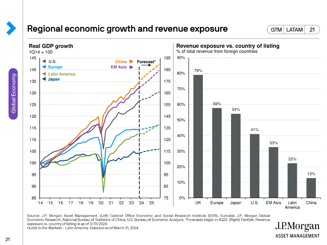
Shows bar charts and line charts depicting sector composition, unprofitable companies in the Russell 2000, and debt maturity profiles.
Market Analysis and Trends
Financial Services
It examines the vulnerability of small-cap stocks to higher interest rates despite their attractive valuations.
small-cap stocks, interest rates, sector composition, Russell 2000, debt maturity
Multiple Chart
JP Morgan
Saved
Horizontal stacked bar chart with four response categories per country; includes “Yes completely” to “No, not at all”; clean layout with legend.
Risk Assessment and Management
Education & Training
This slide visualizes opinions on whether schools provide safe spaces. Confidence is relatively low across many countries, with large portions of respondents saying “not really” or “not at all.”
safety, bullying, schools, environment, education, risk, perception, country comparison, survey
Mixed Chart
IPSOS
Saved
Timeline with icons and dates marking significant investments in battery manufacturing.
Investment Analysis
Industrial & Manufacturing
Showcases recent investments and future projections for battery manufacturing in India.
battery manufacturing, investments, India, lithium-ion, timeline
Linear Flow
PwC/Strategy&
Saved
Heatmap showing ZIP code-level premium increases (2022 YTD), overlaid with blue/yellow outlines referencing wildfire risk bands.
Pricing Strategies
Financial Services
Shows regional variations in insurance premium increases and draws a correlation with wildfire risk bands. While high-risk areas tend to see higher increases, the overall magnitude remains moderate. Maps both high-risk and low-risk overlap.
insurance premium, wildfire correlation, ZIP code analysis, Colorado
Mixed Chart
Oliver Wyman
Saved
This slide features a clear title, bullet points outlining strategy tenets, and a line graph (future state vs current state) with a focus on funding costs over different time intervals (tenor). It includes a legend for clarity.
Financial Performance
Financial Services
Focuses on Goldman Sachs’ strategic financial approach, presenting the methods and goals of diversifying funding and managing assets and liquidity to generate revenue through lower interest expenses, supported by a graph indicating projections of funding costs over time.
funding, liquidity, strategy, management, finance
Mixed Chart
Goldman Sachs
Saved
This slide contains a hexagonal diagram with 'Wellness' at the center, surrounded by key drivers such as demographics, healthcare industry, consumer goods, and the environment.
Strategic Planning
Healthcare & Pharmaceuticals
The slide outlines the various factors that will shape the future of wellness, including demographic shifts, technological advancements, and environmental factors. It sets the stage for a discussion on wellness trends.
Wellness, future trends, demographics, healthcare, environment
Diagram
IPSOS
Saved
Combination of bar charts and column charts for manufacturing performance, new orders, and employment
Market Analysis and Trends
Financial Services
This slide focuses on other emerging markets, detailing manufacturing performance, new orders, and employment trends.
emerging markets, manufacturing performance, new orders, employment trends
Multiple Chart
Accenture
Saved
Two line charts are shown: one for AAA muni-to-treasury yield ratios and one for credit quality spreads versus AAA. Data is color-coded by bond rating.
Market Analysis and Trends
Financial Services
The slide updates on the municipal bond market, comparing AAA muni-to-treasury yield ratios and credit quality spreads, highlighting bond performance metrics.
Municipal Bonds, Yield Ratios, Credit Quality, Bond Ratings, Performance
Multiple Chart
Morgan Stanley
Saved
The slide includes a map of Asia with annotations and percentages indicating market positions and growth. Awards and key strengths are listed on the right side.
Market Analysis and Trends
Financial Services
This slide showcases the company's strong regional footprint in Asia, highlighting market positions, growth percentages, and recent awards, emphasizing strengths in APAC IBCM and PB.
Regional Growth, APAC, Market Position, Awards, Strengths
Graphic
Credit Suisse
Saved
Vertical bar graph with year-by-year projections; upward growth trend; side bullet list on impact and use-cases
Technology and Digital Transformation
Artificial Intelligence
The slide presents forecasts for the AI healthcare market, expected to grow at 37% annually until 2030. It outlines how AI enhances diagnosis speed, reduces administrative workload, and supports chronic disease management. Emphasis is placed on the expanding role of AI in transforming healthcare delivery.
AI, Healthcare, Forecast, Digital Health, Diagnosis, Automation
Mixed Chart
Roland Berger
Saved
The slide features three circular graphs showing percentages of international expansion plans for ASEAN FinTechs, and two quotes.
Market Analysis and Trends
Financial Services
The slide discusses the increase in international expansion plans among ASEAN FinTech firms, highlighting statistics for 2016 and 2017, and includes expert quotes.
ASEAN, FinTech, expansion, global, market analysis, trends, international, quotes, statistics, 2017
Multiple Chart
EY
Saved
The slide features a column chart rating less significant challenges, such as maintaining liquidity and increasing regulatory burden.
Market Analysis and Trends
Financial Services
This slide highlights the least important challenges for CFOs: daily liquidity, regulatory burden, and cost-cutting, rated on a 1 to 5 scale.
Challenges, CFOs, Column Chart, PwC, Survey, 2022, Liquidity
Mixed Chart
PwC/Strategy&
Saved
The slide features a diagram showing the company life cycle stages and key private equity strategies for each stage, along with a list of private debt strategies.
Strategic Planning
Financial Services
This slide outlines various strategies for investing in private equity and private debt, showing how they align with different stages of a company's life cycle. It highlights venture, growth, buyout, and distressed debt strategies.
Private equity, private debt, investment strategies, company life cycle, venture
Linear Flow
UBS
Saved
The slide features two bar charts comparing current and planned product offerings by hedge funds and private equity. An image on the left shows a professional working with a laptop. The charts use shades of blue and purple.
Strategic Planning
Financial Services
The slide highlights the moderate expansion into new strategies by managers, focusing on product offerings in hedge funds and private equity, with some managers planning to increase allocations to alternative asset strategies.
New strategies, hedge funds, private equity, product offerings, strategic planning
Multiple Chart
EY
Saved
White text section on the left; dark background with vertical purple bar graph on the right.
Technology and Digital Transformation
Artificial Intelligence
Defines embodied AI and its application in robotics, emphasizing physical interaction with the world. Google’s Gato model and the RT-series are highlighted. A chart shows a 4x increase in related research papers, indicating growing industry interest and technological progress.
Embodied AI, robotics, Google Gato, RT models, foundation models
Mixed Chart
Accenture
Saved
This slide features a line chart showing TRREB sales and new listings forecast from 1988 to 2021 (F). Sales are in blue, and new listings are in gray, with future forecasts marked.
Market Analysis and Trends
Real Estate & Construction
The slide forecasts TRREB MLS® system sales and new listings, providing insights into future market conditions and trends based on historical data.
TRREB, MLS, sales forecast, new listings, market outlook
Single Chart
IPSOS
Saved
Includes several tables and bar chart outlining financial results and revenue performance for Deutsche Bank's Corporate Bank. Dense textual annotations and percentage changes are detailed beside each graphical representation.
Financial Performance
Financial Services
This slide details the Q2 2023 financial and revenue performance of Deutsche Bank's Corporate Bank, highlighting significant figures such as revenue growth, profit before tax, and changes in loans and deposits.
Corporate banking, revenue growth, financial performance, Q2 2023, profit analysis, Deutsche Bank
Mixed Chart
Deutsche Bank
Saved
Features two column charts comparing US and Euro high yield spread and defaults over time, with default rates and option-adjusted spreads.
Financial Performance
Financial Services
This slide analyzes high yield bonds in the US and Europe, focusing on spread and default rates to assess the risk and performance of these bonds.
high yield bonds, spreads, defaults, US, Euro
Multiple Chart
JP Morgan
Saved
This slide features two bar charts showing the costs of conversion and reconversion for different hydrogen storage methods, emphasizing compression costs.
Market Analysis and Trends
Energy & Utilities
The slide explains that conversion and reconversion processes increase LCOH, with compression being the cheapest yet lowest energy-dense option, supported by the charts.
LCOH, conversion, reconversion, compression, storage costs
Multiple Chart
Kearney
Saved
Contains multiple bar charts and percentage data illustrating growth in marketing organizations by employee count and revenue, set in a purple color scheme.
Organizational Structure and Change
Professional Services
Discusses growth trends in marketing teams, providing data segmented by company size and revenue, helpful for HR and organizational planning.
marketing growth, employee count, revenue, organizational development, HR planning
Multiple Chart
Deloitte
Saved
Shows a grey column chart comparing the company's dividend yield to peers, marked by a green horizontal line for the average and a special highlight for recent growth.
Financial Performance
Consumer Goods
Discusses the company’s consistent dividend growth over the years, contrasting it with the industry average to highlight its strength in returning shareholder value.
dividends, growth, comparison, shareholder value, industry average
Single Chart
Barclays
Saved
Previous
Next
If nothing, comes up, please save your slides first
Create a FREE account to continue browsing
Receive Instant Access to 1,000+ slides from companies like McKinsey, Google, and Goldman Sachs
First Name
Last Name
Email
Password
I agree to all
Terms & Privacy Policy
Thank you! Your submission has been received!
Oops! Something went wrong while submitting the form.
Have an account?
Sign in
Column Chart
Heatmap
Chevron
Org Chart
Infographic
Callouts
Timeline
List
Graphic
Picture
Process Flow
Diagram
Paragraph
Map
Table
Framework
Subtitle
Takeaway Box
Icon
Other Chart
Radar Chart
Waterfall Chart
Mekko Chart
Pie Chart
Scatter Plot
Line Chart
Bar chart
Bullet points