Create a FREE Account
Instant access to 1,000+ real slides from top companies like McKinsey, BCG, Goldman Sachs, Google and many more!
First Name
Last Name
Email
Password
I agree to all
Terms & Privacy Policy
Thank you! Your submission has been received!
Oops! Something went wrong while submitting the form.
Have an account?
Sign in
Library
Templates
Courses
Pricing
My Account
My Slides
My Templates
✦ AI
AI Prompt Library
AI Search
Sign in
Start Here
Logout
My Saved Slides
Timeline chart with vertical columns of top 10 tech companies by market cap by decade (1980–2030 projection); icons representing tech eras
Market Analysis and Trends
Technology & Software
Charts the evolution of top technology companies by market capitalization across major innovation waves (Mainframe to AI). Visuals include a tech-era timeline and bolded companies as new leaders. The slide conveys how market leadership shifts over time, emphasizing adaptation to technological disruption.
technology, innovation, market cap, top companies, leadership, disruption, historical trends, J.P. Morgan
Table
JP Morgan
Saved
Line graph showing LV production growth phases from 2010 to 2035.
Strategic Planning
Industrial & Manufacturing
Projects light vehicle production growth phases, noting a shift to shared mobility and potential volume decline in the long term (post-2025).
growth outlook, shared mobility, RoboCabs, LV production, forecast
Mixed Chart
Roland Berger
Saved
Two-column layout with a survey question on the left in a blue box and bar charts on the right comparing responses across segments.
Market Analysis and Trends
Government & Public Sector
This slide presents global survey results on the definition of a fair society. It contrasts agreement with two concepts: equal opportunity vs. equal quality of life, segmented by gender, generation, income, and education level.
fairness, equality, survey, demographics, opportunity, quality of life, perceptions
Mixed Chart
IPSOS
Saved
The slide features two line charts, one showing food prices and the other fertilizer prices, with indexes on the y-axis and years on the x-axis. Commentary text is present on the right.
Market Analysis and Trends
Agriculture & Food Production
The slide discusses the stability of food and fertilizer prices in November, highlighting dairy price increases and pressures from global events like the Russia-Ukraine conflict.
Food prices, fertilizer prices, dairy, market trends, global events
Multiple Chart
Accenture
Saved
Comprising of bar charts and textual sections, this slide visually presents Barclays' capabilities and achievements in the US partner card market. It highlights their growth in partner card receivables and reasons partners choose Barclays, like track record and partnership focus.
Market Analysis and Trends
Financial Services
This slide discusses Barclays' strategic advantages in the US partner card market, showcasing their growth in partner card receivables and reasons why partners opt for Barclays, emphasizing their specialized capabilities.
growth, partner market, receivables, partnership focus, integration
Mixed Chart
Barclays
Saved
Column chart comparing the top ten countries where physical health is prioritized over mental health, along with text comparing mental and physical health priorities in selected countries.
Customer and Market Segmentation
Healthcare & Pharmaceuticals
This slide compares the emphasis on physical versus mental health across various countries, identifying those where physical health is given more priority, with specific data from Kenya, Panama, etc.
physical health, mental health, priority, comparison, survey
Mixed Chart
IPSOS
Saved
The slide presents a pie chart comparison for 2020 and 2030 with text annotations. The visual elements are well-arranged, utilizing white space effectively on a purple background.
Market Analysis and Trends
Technology & Software
This slide predicts economic shifts in Indonesia, focusing on the growing importance of non-metropolitan areas in GDP contribution.
GDP growth, non-metropolitan, economic importance, forecast
Table
Kearney
Saved
Features a pie chart on the left and three column charts on the right, displaying car ownership statistics across various regions.
Market Analysis and Trends
Consumer Goods
The slide details car ownership statistics, showing the percentage of domestic residents who own cars, with a focus on rural vs. urban areas.
car ownership, statistics, rural, urban, survey
Multiple Chart
Deloitte
Saved
The slide features multiple column charts on a dark background, focusing on technology-enhanced healthcare preferences, with white and yellow text.
Technology and Digital Transformation
Healthcare & Pharmaceuticals
It highlights consumer readiness for personalized medicine, genetic testing, and wearable technology in healthcare.
technology, personalized care, genetic testing, survey, Germany
Mixed Chart
EY
Saved
This slide has two main sections, with column and line charts showing Global Investment Banking wallet and market share, as well as a global map indicating growth across regions. Additional charts show M&A, DCM, and ECM market share trends.
Financial Performance
Financial Services
Aimed at investors or corporate executives, it examines the growth in Global Investment Banking, highlighting regional performance and the company's market share within key financial sectors like M&A and ECM, emphasizing financial strength and market dominance.
investment banking, global growth, market share, regional performance, M&A, ECM, DCM
Multiple Chart
JP Morgan
Saved
The slide displays a column chart showing the growth of podcast ad revenues in the U.S. from 2015 to 2021, indicating significant year-over-year increases.
Market Analysis and Trends
Media & Entertainment
Highlights the explosive growth of the podcast industry, particularly in ad revenue, demonstrating its increasing significance within the media landscape. Useful for discussions on media trends, advertising potential, and strategic investments in digital audio platforms.
podcast growth, ad revenue, media trends, digital transformation, advertising potential
Single Chart
PwC/Strategy&
Saved
The slide contains three column charts showing adjusted return on average assets, adjusted return on average common equity, and adjusted return on tangible common equity for different time periods.
Financial Performance
Financial Services
Compares performance ratios of U.S. Bancorp with peer median across three metrics: return on average assets, return on average common equity, and return on tangible common equity over three, five, and ten years.
performance, ratios, return, equity, assets, comparison, financial, banking, metrics
Multiple Chart
Barclays
Saved
Includes revenue and margin charts above a detailed financial and operational table (e.g., backlog, utilization, headcount). Simple layout with emphasis on growth rates.
Product and Service Analysis
Professional Services
Summarizes the Consulting segment’s revenue, margin, and key drivers like backlog, billable headcount, and utilization rate. Shows how consulting performance has evolved and how labor vs. optimization revenue contribute to segment success.
consulting, backlog, utilization, labor revenue, growth, margins
Multiple Chart
Gartner
Saved
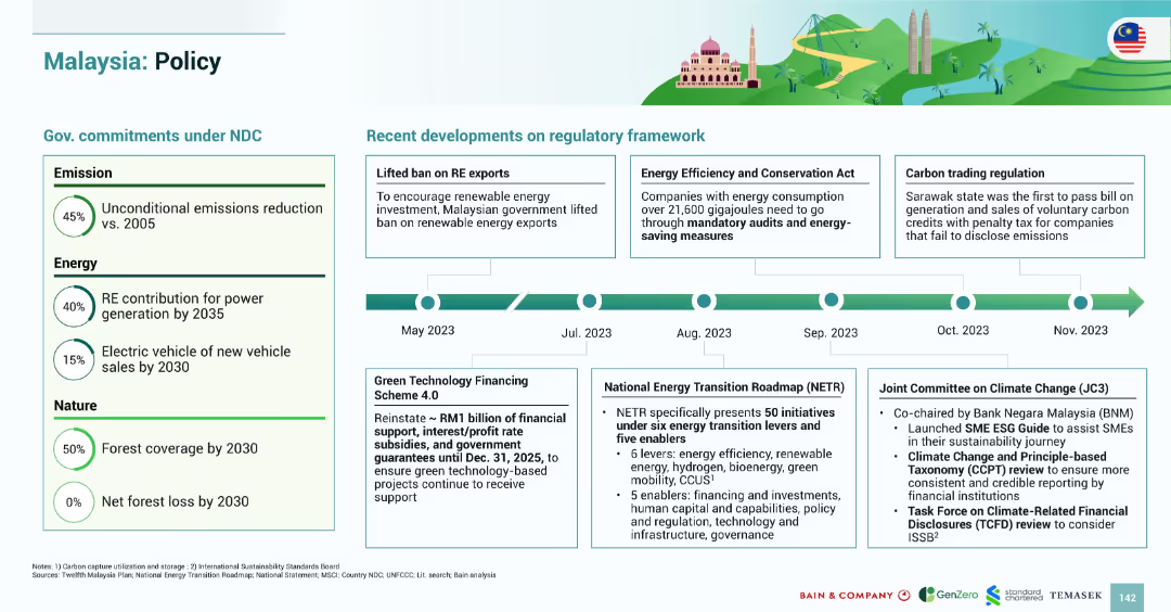
Three overlapping dark triangles each with graphs and data points. Icons of tree landscapes are used as background images for visual emphasis.
Market Analysis and Trends
Energy & Utilities
Displays projections of investments required in SEA, contrasting current green investments against the needed $3 trillion by 2030 for climate goals.
Investment, SEA, green economy, fossil fuels, renewables
Header Horizontal
Bain
Saved
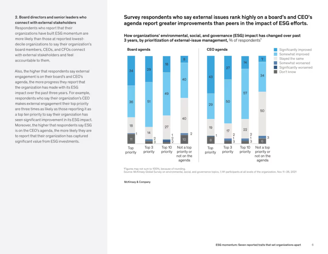
Slide features two column charts comparing leaders and lagging organizations in their concern and actions regarding climate change. It uses green and dark green bars, with significant textual annotations and percentage indicators.
Market Analysis and Trends
Environmental Services & Sustainability
This slide contrasts the attitudes and actions between leadership and lagging organizations concerning climate change, focusing on their level of concern and active measures taken.
Climate change, Leadership, Sustainability, Corporate Responsibility, Actions, Concern, Comparison, Statistics, Environmental
Multiple Chart
Deloitte
Saved
The slide contains a combination of line charts and explanatory text boxes to show cost decline trends and key drivers.
Investment Analysis
Energy & Utilities
The slide explains how the IRA will drive down costs for clean tech through capacity deployment and learning rates.
cost decline, IRA, clean tech, capacity deployment, learning rates
Header Horizontal
BCG
Saved
Split layout with value unlock and industry examples on the left; right side shows time spent chart for engineers.
Technology and Digital Transformation
Technology & Software
This slide outlines how GenAI enhances software engineering via code generation, debugging, and synthetic data creation. It shows the daily work distribution of a software engineer, highlighting large GenAI productivity gains in coding tasks.
Software Development, GenAI, Coding Automation, Productivity, Tech Industry, AI Tools, Code Review, Time Allocation
Mixed Chart
McKinsey
Saved
Line graph comparing regional trends of perceived national decline (LATAM, North America, etc.); similar format to 19035.
Market Analysis and Trends
Government & Public Sector
Regional perspective of perceived national decline from 2016–2023, with Europe showing recent increases while APAC remains lowest.
national decline, region-level, public sentiment, Ipsos, decline perception
Mixed Chart
IPSOS
Saved
Agreement and disagreement stats across countries; negative sentiment focus; bar chart format.
Risk Assessment and Management
Technology & Software
The slide reflects public concern over the perceived exploitative potential of technology companies, with data showing who believes firms would act unethically if they could.
exploitation, distrust, tech sector, risk, ethics, Ipsos, negative sentiment, public opinion, global survey, corporate behavior
Mixed Chart
IPSOS
Saved
This slide features a stacked column chart showing the CPI annual change contribution by category from 2019 to 2023. The chart uses different colors for services, energy, goods, and food, and it's presented over a white background with the title at the top.
Financial Performance
Financial Services
An analytical slide detailing contributions to the Consumer Price Index (CPI) by category, focusing on changes in inflation. It is suitable for discussions on economic health and policy decisions.
CPI, Inflation, Energy, Goods, Services, Food, Economic Analysis, Column Chart, Price Index, July
Single Chart
McKinsey
Saved
Clustered bar chart with three bars per industry: current share, expected share, and required increase; detailed textual explanation.
Strategic Planning
Professional Services
Companies project that new businesses must contribute 2.4x more revenue in the next five years than those from the past five years. This necessitates a significant increase in the rate of new-business creation and scaling.
revenue expectations, new-business, growth strategy, scaling, forecast, industry comparison
Mixed Chart
McKinsey
Saved
Area chart depicting LNG supply and demand balance from 2020 to 2050, including existing and future capacities (e.g., under construction, pre-FID). A demand range is overlaid.
Strategic Planning
Energy & Utilities
This slide forecasts LNG demand and required capacity growth up to 2050, indicating peak demand in 2046. It highlights the gap to be filled by new (pre-FID) projects and shows growth rates and investment needs.
LNG demand, capacity planning, energy forecast, gas supply, energy strategy, infrastructure, FID
Single Chart
McKinsey
Saved
Slide features multiple icons with annotations explaining digital impacts on decarbonization and decentralization.
Technology and Digital Transformation
Energy & Utilities
Discusses key digital trends impacting the electricity sector, focusing on decarbonization, decentralization, and technological growth.
digital trends, electricity industry, decarbonization, decentralization, technology impact, energy sector
Header Horizontal
Accenture
Saved
Slide contains three sections with lists and icons, detailing themes of customer experience, talent initiatives, and technology in contact centers. Colorful icons help differentiate the topics.
Operational Efficiency
Professional Services
Discusses three major themes identified in a global survey about contact centers: channel orchestration, talent initiatives, and cognitive technology, providing insights into current and future trends.
Contact Centers, Customer Experience, Talent Management, Technology, Survey Insights, Future Trends
Pillar
Deloitte
Saved
Features a column chart tracking economic outlook over several years with quotes from industry leaders reflecting on the future.
Market Analysis and Trends
Professional Services
Analyzes historical and projected economic sentiment in various sectors, providing insights into industry expectations and strategic planning.
Economic Trends, Predictions, Industry Leaders, Market Stability, Conservative Predictions
Mixed Chart
Bain
Saved
Previous
Next
If nothing, comes up, please save your slides first
Create a FREE account to continue browsing
Receive Instant Access to 1,000+ slides from companies like McKinsey, Google, and Goldman Sachs
First Name
Last Name
Email
Password
I agree to all
Terms & Privacy Policy
Thank you! Your submission has been received!
Oops! Something went wrong while submitting the form.
Have an account?
Sign in
Column Chart
Heatmap
Chevron
Org Chart
Infographic
Callouts
Timeline
List
Graphic
Picture
Process Flow
Diagram
Paragraph
Map
Table
Framework
Subtitle
Takeaway Box
Icon
Other Chart
Radar Chart
Waterfall Chart
Mekko Chart
Pie Chart
Scatter Plot
Line Chart
Bar chart
Bullet points