Create a FREE Account
Instant access to 1,000+ real slides from top companies like McKinsey, BCG, Goldman Sachs, Google and many more!
First Name
Last Name
Email
Password
I agree to all
Terms & Privacy Policy
Thank you! Your submission has been received!
Oops! Something went wrong while submitting the form.
Have an account?
Sign in
Library
Templates
Courses
Pricing
My Account
My Slides
My Templates
✦ AI
AI Prompt Library
AI Search
Sign in
Start Here
Logout
My Saved Slides
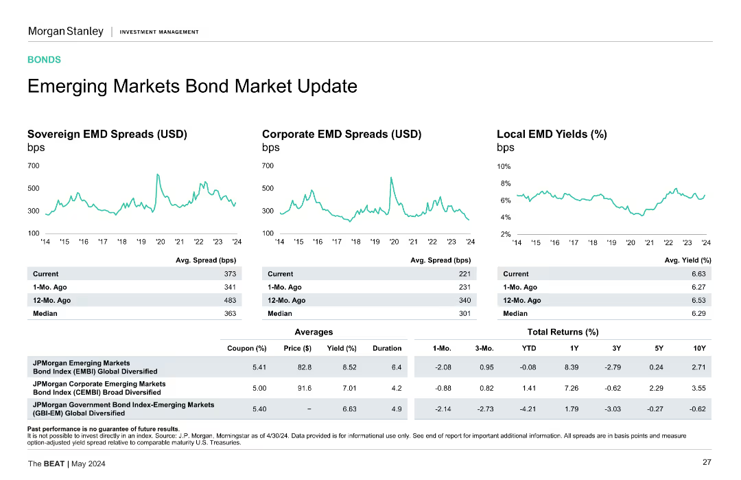
Contains line charts and column charts comparing sovereign bond yields and credit default swap spreads for various countries and regions.
Financial Performance
Financial Services
Displays sovereign bond yields for a 10-year maturity period and credit default swap spreads across different countries and regions.
sovereign bonds, yields, spreads, countries
Multiple Chart
JP Morgan
Saved
Tables and line charts showing gross loans, lending by sector, and arrears rates for UK and US cards.
Risk Assessment and Management
Financial Services
Detailed analysis of wholesale exposures and arrears rates for UK and US cards, with sector-specific data.
wholesale exposure, arrears rates, UK cards, US cards, sector exposure
Multiple Chart
Barclays
Saved
Two-panel layout: natural gas price comparison (US vs. Europe) and export trends chart (total vs. China); visual focus on cyclical and structural issues.
Market Analysis and Trends
Energy & Utilities
The slide outlines Europe's competitiveness challenges stemming from high energy costs and declining exports, particularly to China. It explains how structural inefficiencies, including energy price disparities with the US, undermine Europe’s manufacturing base and export performance.
Europe economy, energy prices, exports, competitiveness, manufacturing, natural gas, trade deficit, structural weakness, China, Eurozone
Multiple Chart
Accenture
Saved
This slide contrasts types of MSMEs with a focus on their business mindset and digital practices through a bar graph and text annotations.
Market Analysis and Trends
Financial Services
Analyzing MSME types in tier 2 and tier 3 cities, the slide presents a predominant 'wait-and-see' approach to digital adoption. It may be used to examine digital strategy and its adoption in these markets, reflecting the conservative mindset of most MSMEs towards new practices.
MSMEs, Tier 2 and 3 Cities, Digital Adoption, Business Mindset, Market Analysis
Mixed Chart
Kearney
Saved
This slide features a complex line chart comparing inflation trends over time among the US, Eurozone, and UK. The chart is accompanied by detailed text explanations on both sides, highlighting key statistics and analysis.
Financial Performance
Financial Services
The slide compares inflation rates across developed economies with insights into potential economic rebounds and consumer confidence. It's suited for financial analysis presentations or economic briefings, offering a detailed view of inflation trends and their implications for future policies and decisions.
inflation, economic trends, line chart, developed economies, financial analysis, policy implications
Mixed Chart
McKinsey
Saved
Vertical bar charts segmented by Regions/Styles and S&P 500 Sectors, with EPS growth data for 2024 and 2025.
Financial Performance
Financial Services
The slide presents projected earnings per share (EPS) growth for different global indices and S&P 500 sectors. It highlights strong expected growth in Russell 2000 and Technology, while sectors like Energy and Staples are forecasted to contract. A comparison with 2024 EPS growth is also provided.
EPS growth, earnings forecast, S&P 500 sectors, global indices, financial outlook, bar chart, projections, equities
Multiple Chart
Morgan Stanley
Saved
The slide contains horizontal bar charts for country-specific results and a donut chart for overall results, highlighting confidence levels.
Risk Assessment and Management
Financial Services
The slide summarizes survey findings on confidence in having the necessary tax and accounting data for complying with Pillar Two. It includes country-specific and overall responses.
Pillar Two, compliance, tax data, survey, financial services
Multiple Chart
Deloitte
Saved
The slide includes a line graph with historical and projected oil prices from 1990 to 2040. The graph shows different scenarios for future oil prices based on various economic factors.
Financial Performance
Energy & Utilities
Discusses the factors influencing oil prices with projections up to 2040, offering a detailed analysis of trends and potential future scenarios. The slide helps in understanding market volatility and can be crucial for economic forecasting and investment decisions in the energy sector.
oil prices, market trends, projections, energy, economics
Mixed Chart
Roland Berger
Saved
This slide is moderately complex, featuring four colored content blocks with descriptive icons, explaining a four-step methodology. Each block is labeled with steps 1 through 4.
Strategic Planning
Professional Services
This slide presents a four-step methodology for economic analysis by Deloitte Access Economics focusing on macroeconomic forecasting and regression analyses related to work in New Zealand and Australia. It serves as a summary of the analytical approach, detailing each step's focus from uncertainty scenarios to final outlooks.
Uncertainty, Macroeconomic, Forecasting, Regression, New Zealand, Australia, Economic Analysis, Scenario Planning
Pillar
Deloitte
Saved
Slide shows a bubble chart indicating the share of emissions per energy and land-use system. Text is complemented by bubbles of various sizes representing data points, set against a plain background for clarity.
Industry Overview
Environmental Services & Sustainability
Explains the universal nature of emission reductions required across all energy and land-use systems for a successful net-zero transition. Includes comparative data visualization for different emission types across various sectors.
Emissions, Net-Zero, Energy, Land-Use, Reduction, Carbon Dioxide, Methane, Nitrous Oxide
Single Chart
McKinsey
Saved
Two sets of column charts are present. The top set displays regional/style-based expected EPS growth versus actual EPS growth in 2022, using horizontal bars. The bottom set uses vertical bars to show S&P 500 sectors' EPS growth. Red and gray color schemes distinguish between expected and actual figures.
Investment Analysis
Financial Services
This slide examines the expected versus actual earnings per share growth for different regions and S&P 500 sectors, providing insights for investors and market analysts.
EPS growth, corporate earnings, regional analysis, sector performance, financial forecasting, investment strategy
Multiple Chart
Morgan Stanley
Saved
Standard format: bold blue statement on left and country agreement/disagreement distribution on right using horizontal bars.
Risk Assessment and Management
Environmental Services & Sustainability
The slide examines the belief that climate change is irreversible. While a minority agree it’s too late to act, the majority disagree, affirming a strong belief that mitigation efforts are still worthwhile and that the situation is not hopeless.
climate change, control, irreversibility, optimism, environmental responsibility, public perception, Ipsos
Mixed Chart
IPSOS
Saved
Light background with teal and black text. It includes a column chart showing statements about stress and mental health among women, alongside a professional woman's photo.
Human Resources and Talent Management
Healthcare & Pharmaceuticals
Highlights women's mental health issues, increased stress levels, and burnout, presenting statistics on support from employers and openness about mental health challenges.
mental health, stress, burnout, women, workplace
Mixed Chart
Deloitte
Saved
Column chart depicting Turkey's electricity generation by source from 2007 to 2022.
Market Analysis and Trends
Energy & Utilities
Illustrates the doubling of electricity generation over 15 years and the shift towards renewable sources.
Turkey, Electricity, Generation, Renewable, Sources
Mixed Chart
Kearney
Saved
Two-column layout with a bar chart on the right and text explanation on the left. The bar chart uses horizontal stacked bars in different shades of blue to show adoption stages of various technologies.
Technology and Digital Transformation
Real Estate & Construction
Presents a survey of how different digital and emerging technologies are being adopted in capital projects. AI, RPA, AR, ML, digital twins, and PMIS are highlighted. Adoption rates remain low for most technologies, showing potential for growth.
technology adoption, AI, PMIS, construction, survey, analytics, digital twins, robotics, ML, AR, VR
Mixed Chart
KPMG
Saved
The slide includes a column chart showing leverage ratios, debt service coverage, and equity contribution over different periods.
Risk Assessment and Management
Financial Services
The slide discusses concerns in credit markets, including rising interest rates and leverage multiples, along with mitigants like a strong economy.
credit markets, concerns, leverage ratio, debt service, equity contribution, interest rates, mitigants, trends
Multiple Chart
Credit Suisse
Saved
This slide displays two comparative column charts showing the distribution of personal luxury goods consumers by generation in 2016 and a 2017 estimate. The charts are color-coded in shades of red and gray, highlighting generational shifts particularly among Millennials and Gen Z.
Market Analysis and Trends
Consumer Goods
Analyzes shifts in consumer demographics for luxury goods, emphasizing the growing influence and market share of Millennials and Generation Z from 2016 to 2017. Demonstrates how these younger generations are becoming significant consumers in the luxury market.
demographics, Millennials, Gen Z, luxury goods, market shift
Multiple Chart
Bain
Saved
Table of income and balance sheet metrics; bar chart of divisional revenues; bullet points summarizing highlights like revenue growth, cost control, and RWA reductions.
Financial Performance
Financial Services
Provides a summary of Q4 and FY2024 results, including key metrics like revenue, profit, loan volumes, and provision for credit losses. Highlights growth drivers, expense changes, and capital efficiency efforts across divisions.
financial highlights, revenue, RoTE, RWA, Q4 2024, FY 2024, earnings
Mixed Chart
Deutsche Bank
Saved
The slide contains a donut chart showing the level of scrutiny investors have on managers' talent management programs. The left side has an image of professionals walking in a park. The donut chart uses shades of red and orange to indicate different levels of scrutiny.
Human Resources and Talent Management
Financial Services
The slide emphasizes the increased focus on talent retention among investors, showing that scrutiny of talent management programs has grown significantly over the past few years, reflecting its strategic importance.
Talent retention, investor scrutiny, DEI, talent management, strategic priority
Mixed Chart
EY
Saved
Two vertical bar charts side by side showing CET1 requirements vs. actual ratio; explanatory bullet points on the right in a light blue box.
Financial Performance
Financial Services
Shows Barclays’ CET1 ratio of 13.9% in Q1 2025, above the 12.2% minimum requirement. Provides context on Pillar 2A adjustment and flexibility under Basel 3.1. Emphasizes strong capital positioning and the bank’s ability to operate at the upper end of the target range.
CET1 ratio, capital buffer, Basel 3.1, Pillar 2A, financial strength, Barclays, Q1 2025
Mixed Chart
Barclays
Saved
A mix of column chart, a pie chart, and line graph that give an overview of the bank's customer-centric model, geographical diversification, and resilient earnings.
Market Analysis and Trends
Financial Services
This slide outlines BBVA's business model, showing a customer-focused approach, geographical diversification, and steady income. It’s useful for investor presentations and strategic market positioning discussions.
Business Model, Customer-Centric, Diversification, Resilient Earnings, Geographical Spread, Financial Stability
Multiple Chart
Morgan Stanley
Saved
The slide includes four line charts, showing trends in the EY UK Challenger Bank Index, EY UK Specialty Finance Index, FTSE 100, and FTSE 250 over recent years.
Market Analysis and Trends
Financial Services
It provides insights into equity market trends, focusing on specific financial indices, which is useful for investment analysis and market forecasting.
equity market, trends, indices, FTSE, finance
Multiple Chart
EY
Saved
Contains a combination of bar and line charts showing government spending forecasts, tax bill impacts on GDP deficit, and spending changes over time. Features various policy elements and their projected impacts.
Market Analysis and Trends
Financial Services
Analyzes the impact of fiscal policy compared to monetary policy on economic growth, emphasizing government spending and tax legislation. Useful for understanding policy effects on GDP and economic forecasts.
fiscal policy, monetary policy, economic growth, government spending, GDP, tax legislation
Multiple Chart
Morgan Stanley
Saved
A tree map and a donut chart depicting the main export products and destinations from Central America. The tree map uses different colors for each product, while the donut chart shows export destinations.
Market Analysis and Trends
Transportation & Logistics
This slide provides a visual breakdown of the main export products from Central America and their destinations, emphasizing trade relationships and the significance of various products.
Exports, Central America, trade, tree map, donut chart
Multiple Chart
Deloitte
Saved
Stacked bar chart showing IPO exit volumes by bourse (2020–2024), categorized by regions like Shenzhen, Hong Kong, NASDAQ, etc.
Mergers and Acquisitions
Financial Services
This slide presents the volume of IPO exits by stock exchange for PE/VC-backed companies. It shows a broad decline over time, particularly notable in 2023–2024, with Shenzhen and Shanghai STAR remaining relatively strong. The subdued IPO activity suggests ongoing market caution and valuation concerns.
IPO exits, PE-backed IPO, VC-backed IPO, bourse, Shenzhen, Hong Kong, NASDAQ, trend
Single Chart
PwC/Strategy&
Saved
Previous
Next
If nothing, comes up, please save your slides first
Create a FREE account to continue browsing
Receive Instant Access to 1,000+ slides from companies like McKinsey, Google, and Goldman Sachs
First Name
Last Name
Email
Password
I agree to all
Terms & Privacy Policy
Thank you! Your submission has been received!
Oops! Something went wrong while submitting the form.
Have an account?
Sign in
Column Chart
Heatmap
Chevron
Org Chart
Infographic
Callouts
Timeline
List
Graphic
Picture
Process Flow
Diagram
Paragraph
Map
Table
Framework
Subtitle
Takeaway Box
Icon
Other Chart
Radar Chart
Waterfall Chart
Mekko Chart
Pie Chart
Scatter Plot
Line Chart
Bar chart
Bullet points