Create a FREE Account
Instant access to 1,000+ real slides from top companies like McKinsey, BCG, Goldman Sachs, Google and many more!
First Name
Last Name
Email
Password
I agree to all
Terms & Privacy Policy
Thank you! Your submission has been received!
Oops! Something went wrong while submitting the form.
Have an account?
Sign in
Library
Templates
Courses
Pricing
My Account
My Slides
My Templates
✦ AI
AI Prompt Library
AI Search
Sign in
Start Here
Logout
My Saved Slides
Moderate visual complexity with a combination of text and infographic elements. The slide provides insights into common themes and strengths across leading companies in the process automation space.
Technology and Digital Transformation
Industrial & Manufacturing
This slide identifies the common strengths among leading companies in the process automation sector, highlighting key areas such as innovation, technology, product offerings, and market positions. It also discusses the role of process automation in addressing megatrends and the increasing demand for connected, software-enabled products in the global market.
Process automation, Industry analysis, Company strengths, Market trends
Boxed
LEK
Saved
Waterfall chart showing CET1 ratio progression with callouts; text box on right with strategic notes.
Corporate Finance and Valuation
Financial Services
Explains movements in UBS’s CET1 capital ratio across 2Q24 to 3Q24, including profit impact, dividend accrual, RWA increase, and regulatory amortization changes. Commentary outlines strategic goals and regulatory expectations.
CET1 ratio, PPA adjustment, capital return, RWA, amortization, UBS
Mixed Chart
UBS
Saved
The slide includes two charts: one line chart showing the global energy mix over time and another bar chart showing global investments in energy transition technologies.
Strategic Planning
Energy & Utilities
The slide highlights the shift in energy consumption from fossil fuels to renewables and the increasing investments in energy transition technologies.
energy transition, global energy mix, investments, renewables, strategic planning
Multiple Chart
JP Morgan
Saved
This slide features a timeline depicting UBS's milestones and achievements in sustainability, spanning from 1954 to 2023.
Strategic Planning
Financial Services
It highlights key moments in UBS's sustainability journey, including the launch of socially responsible investment funds, environmental certifications, and sustainability initiatives.
Sustainability, timeline, UBS, milestones, history
Linear Flow
UBS
Saved
Column charts showing activities, lifestyle, and tech attitudes of 'Skeptics' compared to the total. Pie charts on personalization and access.
Customer and Market Segmentation
Financial Services
Detailed segmentation of 'Skeptics' in financial services, focusing on their activities, lifestyle, attitudes towards tech, and personalization preferences.
Personas, financial services, segmentation, skeptics, activities, lifestyle, tech attitudes, personalization, market study, access
Multiple Chart
Accenture
Saved
Two-part chart: top shows long-term real interest rates for Eurozone & US; bottom visualizes expectations for major economies; right panel provides analysis
Financial Performance
Government & Public Sector
This slide outlines the shift in real interest rate expectations following inflationary pressures and central bank interventions in 2022. It discusses the implications for managing public debt under higher real rates.
real interest rates, inflation, central banks, public debt, monetary policy, forecasts, G7, long-term yields
Multiple Chart
Roland Berger
Saved
A horizontal bar chart with country names on the left and four response categories on the right, shaded in gradients of purple. A dark blue sidebar on the left presents the key question and correct answer.
Market Analysis and Trends
Environmental Services & Sustainability
The slide displays survey data from 32 countries, asking respondents about their perception of global water scarcity. It visually compares public estimates with the actual fact that about half the world experienced severe water scarcity in the past year.
water scarcity, perception, survey, climate, Ipsos, global, awareness, bar chart, countries, UN data
Mixed Chart
IPSOS
Saved
The slide displays revenue figures, a pie chart for Q3 2023 YTD product lines, geographies, and a notable badge indicating leadership in transfusion medicine. The layout is balanced and visually appealing.
Product and Service Analysis
Healthcare & Pharmaceuticals
The slide highlights the performance and market position of QuidelOrtho's Transfusion Medicine Business Unit, showcasing its revenue, installed base, and the breakdown of its product lines.
transfusion medicine, revenue, product lines
Multiple Chart
JP Morgan
Saved
The slide includes a flowchart detailing the structure of private equity funds, showing relationships between general and limited partners.
Organizational Structure and Change
Financial Services
This slide explains the structure of private equity funds, focusing on the roles and responsibilities of general partners and limited partners.
private equity, fund structure, general partner, limited partner, investment
Diagram
UBS
Saved
Bar chart showing the estimated time for financial recovery among households post-COVID-19. Categories range from one year to more than five years.
Risk Assessment and Management
Financial Services
The slide details the estimated time for Canadian households to recover financially from COVID-19, with responses indicating a range from one year to more than five years. It also notes a small percentage of respondents who feel their finances were not significantly impacted.
COVID-19, Financial Recovery, Canadian, Households, Pandemic
Mixed Chart
IPSOS
Saved
Two-column layout with line charts showing Nasdaq bank stock indexes and US lending conditions for businesses from 2021-2024 and 2008-2024.
Risk Assessment and Management
Financial Services
Analyzes the pressures on regional banks due to CRE-related vulnerabilities and the limited risk of broader financial contagion.
regional banks, CRE, financial vulnerabilities, banking system, risk assessment
Multiple Chart
EY
Saved
Vertical bar chart comparing gender responses; light blue for women, dark blue for men.
Customer and Market Segmentation
Healthcare & Pharmaceuticals
Gender-specific data reveals that women are significantly more concerned than men about mental health, cancer, and stress, highlighting notable differences in health perception.
gender insights, health concerns, survey data
Mixed Chart
IPSOS
Saved
Bar charts showing the percentage of marketing budgets allocated to digital across various company sizes and sectors.
Technology and Digital Transformation
Professional Services
Focuses on digital marketing spending across different sectors, particularly highlighting high investments in tech and media. Useful for digital strategy planning and understanding sector-specific digital adoption.
digital, marketing, spending, technology, media, strategy, investment, sectors
Multiple Chart
Deloitte
Saved
Three donut charts showing revenue mix by business and region, comparing UBS to GSIB averages. Minimalist design with gray tones.
Market Analysis and Trends
Financial Services
Compares UBS’s business model and revenue composition to GSIB averages, emphasizing UBS's 60% revenue share from wealth & asset management. The regional revenue breakdown highlights UBS’s global reach and diversified model.
UBS, diversification, revenue mix, GSIB, asset management, investment banking, APAC, EMEA, Americas
Single Chart
UBS
Saved
Two-column comparison of tech stacks and decoupling drivers across different categories like social media, applications, and infrastructure, with text descriptions.
Risk Assessment and Management
Technology & Software
The slide discusses the need for tech decoupling to manage geopolitical and regulatory dynamics, comparing different tech stacks and the drivers for decoupling.
tech decoupling, regulation, compliance, risk mitigation
Boxed
BCG
Saved
This slide features a column chart on how managers measure the success of new product launches, with categories like ROI in target time frame and establishing a track record. An image of professionals with laptops is on the left.
Investment Analysis
Financial Services
Evaluates how managers measure the success of new product launches, detailing different criteria used, including ROI timeframes and track records.
managers, product launch, success, ROI, track record, investment, strategies, analysis, professionals, laptops
Multiple Chart
EY
Saved
Line graph showing sentiment trend from 2013 to July 2023, marked with latest score (14%) and annotation.
Market Analysis and Trends
Financial Services
Japan's public perception of its economy has remained low, not surpassing 20% since February 2020. This slide reflects long-term pessimism with little improvement over the past three years.
Japan, economic sentiment, low confidence, Ipsos, trend analysis, public perception, long-term data, economic pessimism, survey, time series
Single Chart
IPSOS
Saved
The slide features a line chart showing short-term rental market revenues in Greece from 2019 to 2021 and a column chart showing June-September demand pacing by country in 2022 vs 2021. There are accompanying text explanations and data insights.
Market Analysis and Trends
Hospitality & Tourism
Shows the strong performance of the Greek short-term rental market in 2022, including a revenue rebound in 2021 and demand pacing by country for the June-September period. It discusses occupancy rates and trends across various Greek destinations.
Short-term rental, Greece, Revenue, Demand, Trends
Multiple Chart
EY
Saved
Slide showcases a set of vertical column charts depicting the year-to-date financial analysis of the S&P 500, focused on metrics like Earnings Growth and Market Cap.
Investment Analysis
Financial Services
Intended for financial analysts, this slide offers a comprehensive year-to-date analysis of the S&P 500 index's performance, highlighting crucial investment insights.
S&P 500, YTD Analysis, Financial Metrics, Earnings Growth, Market Cap, Beta, Dividend Yield, Column Chart
Multiple Chart
Morgan Stanley
Saved
This slide features a pie chart with three segments: 20% for eating a vegetarian diet with some imported products, 57% for eating a locally produced diet including meat and dairy products, and 23% for don't know. The left side includes a textual explanation.
Market Analysis and Trends
Environmental Services & Sustainability
The slide compares perceptions of diet choices that reduce greenhouse gas emissions. It highlights that a locally produced diet is perceived as more environmentally friendly by 57% of respondents, despite evidence suggesting a vegetarian diet with some imports is greener.
Greenhouse gas emissions, diet, vegetarian, local produce, environmental impact
Mixed Chart
IPSOS
Saved
Pie chart presenting the percentage distribution of survey respondents by job level. The chart uses multiple colors for different job levels.
Market Analysis and Trends
Professional Services
Highlights the distribution of survey respondents by their job levels, offering insights into the hierarchical diversity of the participants.
Pie chart, survey, job level, distribution, hierarchy
Single Chart
Deloitte
Saved
Slide features multiple bar charts and percentage graphics.
Market Analysis and Trends
Professional Services
Displays diversity statistics across various economic sectors by gender, ethnicity, and disability status, highlighting differences in representation in marketing roles.
Diversity, Statistics, Marketing, Economic Sectors, Representation, Gender, Ethnicity, Disability, Comparison, Bar Charts
Mixed Chart
Deloitte
Saved
This slide features a column chart comparing total revenue and expenditure over three fiscal years, highlighting budget surpluses or deficits.
Regulatory and Compliance
Government & Public Sector
Compares governmental revenue versus expenditure over recent years to assess financial health and operational efficiency.
Revenue, expenditure, budget deficit, fiscal years, comparison
Multiple Chart
PwC/Strategy&
Saved
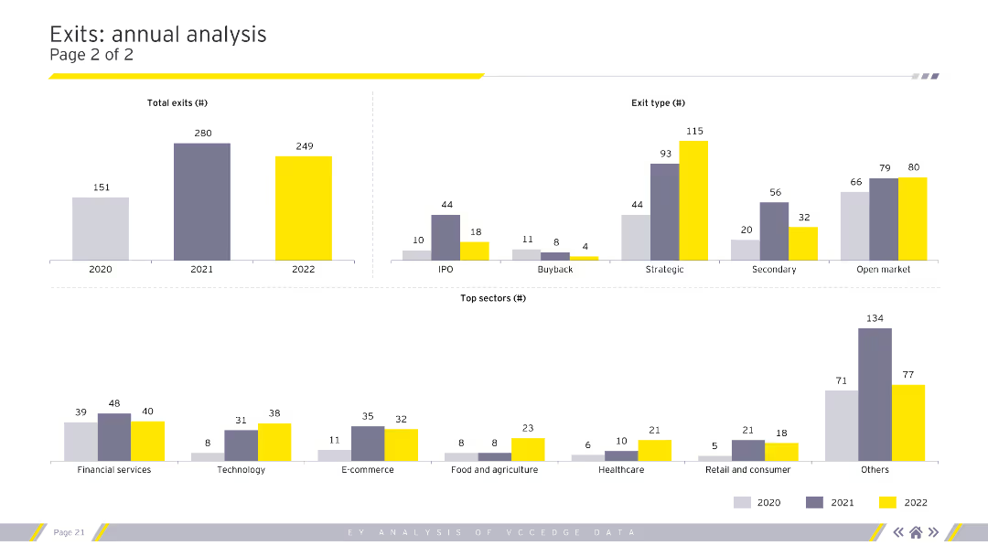
Text and chart layout showing projected supply and demand gaps for lithium, nickel, and cobalt to 2030. Left side contains risk assessment text, right shows stacked bar charts.
Risk Assessment and Management
Energy & Utilities
The slide assesses future supply-demand dynamics of lithium, nickel, and cobalt, projecting that while supplies may meet demand by 2030, risks remain due to long lead times and geopolitical constraints. Charts illustrate projected shortfalls and recovery trajectories.
supply demand, lithium, cobalt, nickel, raw materials, mining, shortages, projections
Mixed Chart
Roland Berger
Saved
Bar charts displaying U.S. employment and revenue by sector during COVID-19, segmented by contact intensity and susceptibility to lockdown measures.
Market Analysis and Trends
Professional Services
Examines the impact of COVID-19 on various U.S. economic sectors, offering insights into employment and revenue changes under different restrictions.
COVID-19, economic sectors, employment, revenue, U.S., impact analysis, lockdown, sector analysis
Multiple Chart
BCG
Saved
Previous
Next
If nothing, comes up, please save your slides first
Create a FREE account to continue browsing
Receive Instant Access to 1,000+ slides from companies like McKinsey, Google, and Goldman Sachs
First Name
Last Name
Email
Password
I agree to all
Terms & Privacy Policy
Thank you! Your submission has been received!
Oops! Something went wrong while submitting the form.
Have an account?
Sign in
Column Chart
Heatmap
Chevron
Org Chart
Infographic
Callouts
Timeline
List
Graphic
Picture
Process Flow
Diagram
Paragraph
Map
Table
Framework
Subtitle
Takeaway Box
Icon
Other Chart
Radar Chart
Waterfall Chart
Mekko Chart
Pie Chart
Scatter Plot
Line Chart
Bar chart
Bullet points