Create a FREE Account
Instant access to 1,000+ real slides from top companies like McKinsey, BCG, Goldman Sachs, Google and many more!
First Name
Last Name
Email
Password
I agree to all
Terms & Privacy Policy
Thank you! Your submission has been received!
Oops! Something went wrong while submitting the form.
Have an account?
Sign in
Library
Templates
Courses
Pricing
My Account
My Slides
My Templates
✦ AI
AI Prompt Library
AI Search
Sign in
Start Here
Logout
My Saved Slides
The slide features a scatter plot showing the spread to worst across fixed income sub-sectors over the last 10 years.
Market Analysis and Trends
Financial Services
The slide analyzes valuations in global fixed income markets, focusing on spreads across various sub-sectors. It is used for market analysis and investment decision-making.
Global fixed income, valuations, spreads, sub-sectors, market analysis, investment
Single Chart
JP Morgan
Saved
Pie chart and data points, featuring a concise and clean layout.
Investment Analysis
Energy & Utilities
Provides an overview of Compass's Oil & Gas portfolio, key figures, and risk assessments for BBVA USA.
Compass, portfolio, BBVA, risk
Mixed Chart
Morgan Stanley
Saved
Four quadrant-style boxes segmented by generation, showing the top three areas lacking space in the curriculum. Each entry includes a percentage.
Customer and Market Segmentation
Education & Training
The slide details generational perspectives on which parts of the curriculum receive too little emphasis. Boomers most frequently cite critical thinking, while Gen Z highlights wellbeing and curiosity.
education gaps, generational perspective, curriculum critique, critical thinking, wellbeing
Mixed Chart
IPSOS
Saved
This slide includes a column chart series showing trends over years and a separate opportunity section with two vertical bar charts. There are icons with brief text descriptions at the bottom, and the design is structured with a mix of blue tones.
Financial Performance
Financial Services
The slide depicts strategic growth through advisor hiring, client referrals, and assets, along with investment in future planning, innovation, and market awareness, showcasing trends and future opportunities in the private banking sector.
Growth, Strategy, Investment, Banking, Trends, Opportunities, Innovation, Planning, Financial Services, Market Share
Multiple Chart
JP Morgan
Saved
This slide is text-heavy with a split layout. The left side displays a column chart titled 'Liquidity Ratio Components', and the right side features a column chart comparing 'Average Liquidity Coverage Ratio Trend' across different quarters. Text content explains the liquidity risk management strategy.
Risk Assessment and Management
Financial Services
Focuses on liquidity risk, showcasing components and trends in coverage ratios, and is ideal for financial managers or analysts looking at liquidity risk preparedness and regulatory compliance.
liquidity risk, risk management, bar chart, financial stability, coverage ratio, regulatory compliance, risk assessment, asset management, stress scenario, financial oversight
Multiple Chart
Goldman Sachs
Saved
Horizontal layout with six icon-based segments; each column features a heading, icon, and bullet points under “Illustrative examples.” Green and black theme.
Product and Service Analysis
Technology & Software
The slide presents use cases for deploying custom capabilities using advanced analytics and GenAI to solve complex company-specific problems. It includes enhancing transparency, cost savings, supplier negotiation, contract optimization, and ESG goal support.
GenAI, custom solutions, supplier negotiations, ESG, analytics, Python, NLP, contract optimization
Pillar
BCG
Saved
The slide features a column chart showing data distribution and statistics about third-party risk management practices.
Risk Assessment and Management
Professional Services
This slide presents data on third-party risk management practices and their distribution across various parameters.
third-party, risk management, data distribution, statistics
Multiple Chart
Deloitte
Saved
This slide features a column chart comparing the average number of announced jobs per project in 2020 and 2021 for the UK, Germany, and France.
Market Analysis and Trends
Financial Services
The slide presents a comparison of the average number of announced jobs per project in 2020 and 2021 across three countries, highlighting the UK's performance.
FDI, jobs, comparison, UK, Germany, France
Multiple Chart
EY
Saved
Presents a series of column charts displaying growth in active accounts, sales volume, EOP outstandings, and revenue from 2014 to 2018. Several side notes elaborate on growth drivers.
Financial Performance
Financial Services
Highlights the financial growth of JP Morgan Chase in terms of active accounts, sales volume, and revenue, emphasizing the drivers behind the growth such as investment in rewards programs and digital engagement.
financial growth, sales volume, revenue, active accounts, digital engagement
Multiple Chart
JP Morgan
Saved
The slide is divided into a detailed text description on the left and a column chart on the right, showing portfolio transaction volumes by asset class over three years.
Market Analysis and Trends
Financial Services
It provides an overview of the loan portfolio sales market in the UK, highlighting transaction volumes and market impacts of the COVID-19 pandemic.
loan portfolio, market overview, UK, transactions, COVID-19
Mixed Chart
EY
Saved
An image of ADNOC’s Al Reyadah facility with accompanying descriptive captions.
Client Case Studies
Industrial & Manufacturing
Describes ADNOC's Al Reyadah facility as a self-sustaining CCUS project in the iron & steel industry.
CCUS, ADNOC, Al Reyadah, iron, steel, self-sustaining
Linear Flow
Kearney
Saved
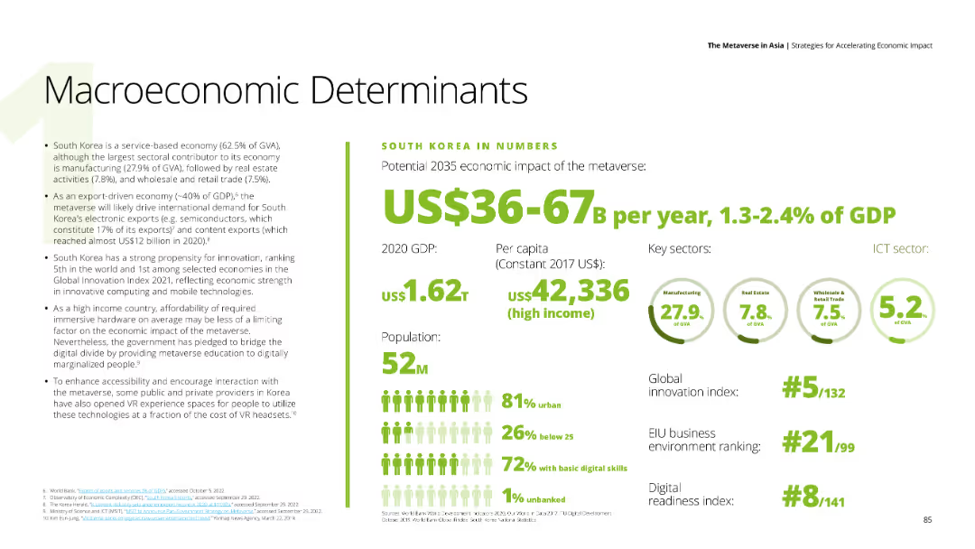
Features detailed text about China's economic impact of the metaverse, with numerical data on the right side including GDP, per capita income, and key sectors such as manufacturing, retail trade, and financial activities. The background is white.
Market Analysis and Trends
Financial Services
Discusses China's strong service sector and the potential economic impact of the metaverse, providing insights into China's GDP, innovation index ranking, and digital readiness.
China, metaverse, economic impact, service sector, digital readiness
Mixed Chart
Deloitte
Saved
The slide features several pie charts on loan distribution by type and geography and a comprehensive table summarizing the loan portfolio.
Risk Assessment and Management
Financial Services
Delivers a snapshot of the credit risk associated with the loan portfolio, showing loan sizes, security, and sectoral and geographical spread. Used in risk management to evaluate and discuss loan distributions and associated credit risks.
Credit Risk, Loan Portfolio, Corporate, Wealth Management, Real Estate, Consumer, Geographic Distribution, Loan Security, Key Metrics, Total Loans
Multiple Chart
Goldman Sachs
Saved
Slide with column charts depicting the percentage of publishers that utilize various ad spend effectiveness solutions. The solutions include ad impression counting, brand lift studies, and attribution for in-store foot traffic. Each solution is color-coded.
Market Analysis and Trends
Media & Entertainment
Analyzes different methods used to measure the effectiveness of podcast advertising spends in 2021. It underscores the focus on online attribution and the emerging interest in bridging online and offline metrics, illustrating the evolving landscape of digital advertising effectiveness measurement.
advertising, effectiveness, podcast, metrics, 2021
Single Chart
PwC/Strategy&
Saved
Bar chart comparing 32 countries’ responses; green bars for positive impact, purple bars for negative; left-aligned question prompt.
Market Analysis and Trends
Environmental Services & Sustainability
This slide shows public perception across 32 countries on the impact of transitioning from fossil fuels to renewable energy on global security. It visualizes both positive and negative perceptions.
global security, renewable energy, fossil fuels, climate transition, public opinion, Ipsos, global survey, sustainability, energy policy, bar chart
Mixed Chart
IPSOS
Saved
A column chart showing the actual rank and percentage of people who think various actions reduce greenhouse gas emissions. Two sets of bars for Global Market Average and Great Britain are displayed.
Market Analysis and Trends
Environmental Services & Sustainability
The slide compares public perceptions in Great Britain versus the global average regarding the most impactful actions to reduce individual greenhouse gas emissions, highlighting a discrepancy between perception and actual impact.
greenhouse gas, emissions, public perception, impactful actions, Great Britain, Global Market Average, CO2 savings
Mixed Chart
IPSOS
Saved
Two side-by-side bar charts comparing venture-backed exit activity in Asia (2018–2024) by type: number of exits and dollar value, color-coded for acquisitions, buyouts, and public listings.
Financial Performance
Financial Services
The slide highlights the dominance of IPOs in exit value among venture-backed companies in Asia, despite fluctuations in exit count. Public listings drive most exit value, peaking in 2021, while acquisitions dominate exit count. 2024 projections show a steep decline across all categories.
IPO, exit value, venture capital, Asia, public listing, acquisition, buyout, KPMG
Multiple Chart
KPMG
Saved
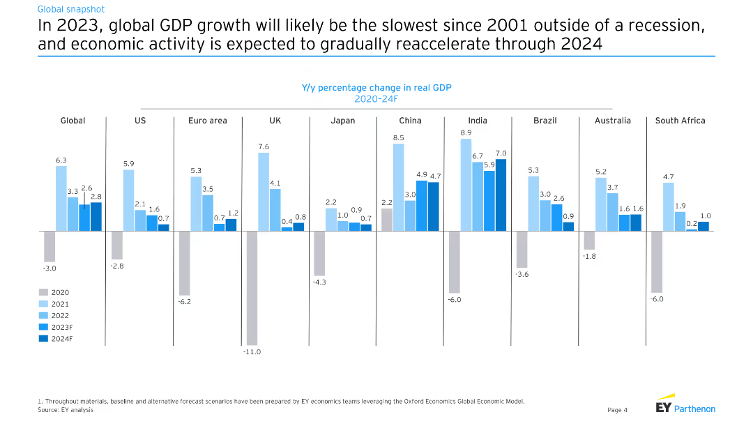
The slide displays horizontal bar charts with data points and forecast ranges for GDP growth in multiple countries from 2020 to 2021.
Market Analysis and Trends
Financial Services
Focuses on GDP growth forecasts versus baseline for different countries, projecting economic downturns and recoveries with forecast ranges and baseline comparisons.
GDP, forecast, economic downturn, baseline, 2020, 2021, recovery
Multiple Chart
BCG
Saved
The slide presents two line graphs depicting the EM consensus CPI and policy rate expectations, showing changes over time.
Market Analysis and Trends
Financial Services
Offers a look at inflation and policy rate expectations in emerging markets, with data supporting market trend analysis and forecasts.
emerging markets, inflation, CPI, policy rates, expectations, analysis, trends, Q4
Multiple Chart
Morgan Stanley
Saved
The slide presents two column charts, the first illustrating the growth in revenue and expenses for CIB Treasury Services, and the second showing operating and non-operating deposits growth across client segments and regions.
Financial Performance
Financial Services
Geared towards financial strategists and investors, it highlights the robust growth of CIB Treasury Services, with a focus on revenue increases, expense management, and deposit growth, essential for evaluating business health and operational strategy.
CIB, treasury services, revenue growth, expense management, deposits, operational strategy, financial health
Multiple Chart
JP Morgan
Saved
Dual-panel layout with bar charts. Left panel shows budget vs actual cloud migration cost; right panel shows migration timeline status. Bottom section details cost overrun by area.
Risk Assessment and Management
Technology & Software
This slide outlines how cloud-migration projects frequently exceed budgets and experience delays. It notes that 75% of respondents went over budget and 38% were behind schedule. Change management and systems-integrator spending were top cost overrun areas.
cloud migration, cost overrun, project delay, budget excess, IT transformation, timeline issues, risk management, systems integrators, McKinsey survey
Multiple Chart
McKinsey
Saved
The slide features a bar chart on the left depicting the ratio of companies with net cash by region, and a line chart on the right showing return on equity over time for different regions. The charts use color coding to differentiate between regions.
Regulatory and Compliance
Financial Services
This slide discusses corporate governance by illustrating the ratio of companies with net cash and their return on equity across different regions. It is useful for understanding financial health and governance standards in various markets.
Corporate governance, net cash, return on equity, financial health, Europe, U.S., Korea, Japan
Multiple Chart
JP Morgan
Saved
The slide contains a line chart and a matrix chart. It uses a black and white theme with green and blue highlights.
Market Analysis and Trends
Technology & Software
The slide discusses the impact of the Ukraine crisis on semiconductor supply, showing demand-supply imbalances and gas shortages.
Semiconductors, Supply Chain, Demand, Ukraine Crisis, Gases
Mixed Chart
BCG
Saved
Stacked bar chart comparing global domestic gas consumption (LNG, pipeline-import flows, domestic gas) for 2020, 2035, and 2050. Percentages are labeled by source.
Market Analysis and Trends
Energy & Utilities
The slide illustrates the projected shift in the composition of global gas supply through 2050, with LNG increasing its share as domestic and pipeline gas sources decline. It shows changes in volume and percentage contribution across three key years.
LNG, domestic gas, pipeline, gas supply, energy transition, consumption trends, 2035, 2050
Single Chart
McKinsey
Saved
Horizontal bar chart showing how real people perceive the threat of a health epidemic in their country, with countries ranked by concern level.
Risk Assessment and Management
Healthcare & Pharmaceuticals
Country comparison of how real people think the risk of a major health epidemic is. U.S. (74%) ranks highly, with global average at 63%. Canada’s concern is at 65%. Includes % change from previous year, showing shifting perceptions of epidemic threat.
health epidemic, public threat, perception, global concern, pandemic, Ipsos, national comparison, risk
Single Chart
IPSOS
Saved
Previous
Next
If nothing, comes up, please save your slides first
Create a FREE account to continue browsing
Receive Instant Access to 1,000+ slides from companies like McKinsey, Google, and Goldman Sachs
First Name
Last Name
Email
Password
I agree to all
Terms & Privacy Policy
Thank you! Your submission has been received!
Oops! Something went wrong while submitting the form.
Have an account?
Sign in
Column Chart
Heatmap
Chevron
Org Chart
Infographic
Callouts
Timeline
List
Graphic
Picture
Process Flow
Diagram
Paragraph
Map
Table
Framework
Subtitle
Takeaway Box
Icon
Other Chart
Radar Chart
Waterfall Chart
Mekko Chart
Pie Chart
Scatter Plot
Line Chart
Bar chart
Bullet points