Create a FREE Account
Instant access to 1,000+ real slides from top companies like McKinsey, BCG, Goldman Sachs, Google and many more!
First Name
Last Name
Email
Password
I agree to all
Terms & Privacy Policy
Thank you! Your submission has been received!
Oops! Something went wrong while submitting the form.
Have an account?
Sign in
Library
Templates
Courses
Pricing
My Account
My Slides
My Templates
✦ AI
AI Prompt Library
AI Search
Sign in
Start Here
Logout
My Saved Slides
The slide presents multiple stacked column charts in green shades showing the percentage of companies reporting different barriers to the development of personalized nutrition. Text boxes provide additional context and statistical data.
Market Analysis and Trends
Agriculture & Food Production
The slide provides insights into the main barriers faced by companies in developing personalized nutrition, such as R&D, consumer demand variations, and cost issues, alongside commentary on market trends and challenges.
personalized nutrition, R&D, consumer demand, cost barriers, market challenges
Mixed Chart
Deloitte
Saved
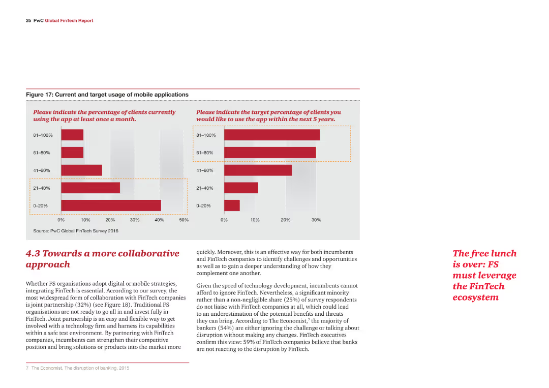
The slide has a detailed text on the left discussing CFO responsibilities and a vertical column chart on the right showing actions taken to streamline finance operations.
Human Resources and Talent Management
Professional Services
This slide outlines the steps CFOs have taken to improve finance operations, focusing on digital transformation, ERP implementation, and process improvements to better manage workforce changes and innovations.
talent, leadership, workforce, innovation, CFO, digital transformation, ERP, process improvement, finance operations
Mixed Chart
Deloitte
Saved
Vertical bar chart ranking countries by % trust in scientists. Similar visual format to previous slide. Countries ordered highest to lowest.
Customer and Market Segmentation
Education & Training
Highlights variation in public trust in scientists by country. Spain and Argentina top the list, while Japan ranks the lowest. The global average trust level is 57%. The chart also displays untrustworthy ratings on the right side.
scientists, trust levels, global survey, Ipsos, country comparison, public perception
Mixed Chart
IPSOS
Saved
Four bar chart panels comparing 2018–2022 SME lending volumes and GDP share for Micro and Small & Medium loans, plus bullet perspectives.
Investment Analysis
Financial Services
The slide shows a declining trend in new SME lending in the Netherlands, especially for micro enterprises. Lending volumes and GDP share dropped more than in other countries, indicating shrinking access to bank finance for SMEs in NL.
SME lending, micro, small & medium, GDP share, NL, volume decline
Multiple Chart
Oliver Wyman
Saved
A vertical bar chart displaying the historical average tariff rates on U.S. imports with 2025 estimates highlighted using color-coded annotations.
Regulatory and Compliance
Government & Public Sector
This slide shows average tariff rates on U.S. imports for consumption from 1900 to 2025. It includes forecasts for 2025 assuming no change in imports and illustrates the spike in effective tariff rates under new policy conditions.
tariffs, trade, imports, regulation, policy, duties, 2025 forecast, economic impact
Single Chart
JP Morgan
Saved
Features a flow diagram and column chart related to capital allocation strategies and future financial planning.
Financial Performance
Transportation & Logistics
Discusses strategies for capital allocation focusing on dividends, M&A, and share buybacks over the next years.
capital allocation, financial planning, dividends, M&A, buybacks
Mixed Chart
Deutsche Bank
Saved
Complex visual with column charts tracking quarterly financial data such as income, costs, and profitability metrics, specifically focusing on return on tangible equity (RoTE).
Financial Performance
Financial Services
Highlights the financial performance of Barclays UK in Q423, emphasizing profitability and efficiency in various banking services.
financial performance, RoTE, Barclays, Q423, banking, profitability, costs, income
Multiple Chart
Barclays
Saved
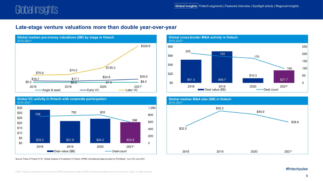
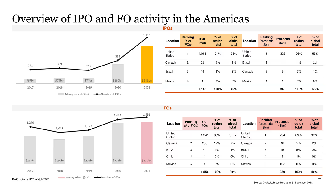
Column charts are used to show the number of IPOs and proceeds by sector for 2022 compared to 2021.
Market Analysis and Trends
Financial Services
It highlights the shift in sector focus, noting the decrease in technology IPOs and the rise in energy IPO proceeds.
sector focus, technology, energy, IPOs, proceeds
Multiple Chart
EY
Saved
The slide contains multiple column charts showing exit drivers, strategies, and multiples for funds divesting F&L assets. Key findings are presented.
Mergers and Acquisitions
Financial Services
The slide provides insights into exit strategies for funds in F&L for 2021, covering drivers, strategies, and expected multiples.
exit strategy, F&L, funds, divestment, analysis
Multiple Chart
Deloitte
Saved
Three bold blocks emphasizing strategic growth areas, with a brief descriptor under each. Very minimal text and high contrast.
Strategic Planning
Financial Services
Explains three strategic priorities for growth, likely for presenting to investors or company executives.
Strategy, Growth, Wealth, Digital, Consumer Bank
Boxed
Goldman Sachs
Saved
Bar charts depict profit before tax, operating income, and cost/income ratios.
Financial Performance
Financial Services
Discusses strong performance in asset management, highlighting profit growth and net new money inflows.
asset management, profit growth, net new money, operating income, cost/income ratio
Multiple Chart
UBS
Saved
The slide features a numbered list and images of various guidelines and principles related to environmental and social due diligence.
Regulatory and Compliance
Financial Services
It describes Deutsche Bank's internal environmental and social policies, international standards and principles they follow, and how they adapt to new regulations.
due diligence, environmental policies, social policies, international standards, regulatory adaptation, Deutsche Bank
Header Vertical
Deutsche Bank
Saved
This slide has a line chart tracking the growth prospects for the US and China from 2013 to 2018, with distinct lines for each country.
Market Analysis and Trends
Financial Services
It shows that the US has increasingly pulled ahead of China as the top market for growth prospects, highlighting the US's sustained dominance in attracting investments.
growth prospects, US, China, market dominance, 2013-2018, line chart, financial survey, PwC, CEO Survey
Mixed Chart
PwC/Strategy&
Saved
The slide uses a combination of pie charts and column charts to show the demographics and sectors of survey respondents. It includes a map to depict the geographical distribution of respondents.
Market Analysis and Trends
Financial Services
It provides an overview of the respondents' demographics in the survey, including the split between TMT and FS, geographical distribution, industry sectors, and company size.
Respondents, Survey, Demographics, TMT, FS, Map
Multiple Chart
PwC/Strategy&
Saved
The slide showcases a comparison of monthly active users for e-commerce and groceries across various consumer segments. It uses column charts with annotations, employing a blue color scheme for differentiation. The layout is well-organized, presenting clear comparative data points.
Market Analysis and Trends
Technology & Software
This slide examines the disparity in e-commerce and grocery shopping habits between urban and suburban users in SEA. It's an analytical tool for identifying gaps in market penetration and for developing strategies to increase online grocery adoption among less engaged demographic groups.
e-commerce, consumer habits, SEA, urban vs. suburban, online groceries, market penetration, column chart
Multiple Chart
Bain
Saved
World map with circular year markers indicating country-level net-zero targets; bright green color scheme
Regulatory and Compliance
Government & Public Sector
A global overview of countries' net-zero commitments, focusing on their targeted years for carbon neutrality and interim 2030 goals, especially in Europe, US, and UK.
net-zero, carbon emissions, commitments, global policy, sustainability, 2030 targets
Header Horizontal
Oliver Wyman
Saved
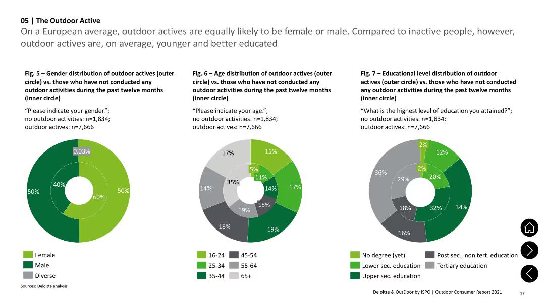
The slide includes a pie chart showing reasons for selling investments and a horizontal bar chart detailing primary reasons for sales. Clean white background.
Market Analysis and Trends
Financial Services
This slide explains the primary reasons Canadian investors sold their investments during the pandemic, including the need for cash, minimizing losses, and realizing profits from market price increases.
investment sales, rationale, pandemic, Canadian investors, market price
Multiple Chart
IPSOS
Saved
This slide presents a table in varying shades of blue, each representing different industries and showing the impact of 'timely offers' and 'knowledgeable customer service' on purchase decisions, based on a consumer survey.
Operational Efficiency
Professional Services
Highlights the effectiveness of AI-enhanced customer service strategies across various industries, from automotive to banking. The data suggests that knowledgeable customer service and timely offers are pivotal in influencing purchase decisions.
customer service, AI, retail, automotive, banking, purchase decisions
Table
Deloitte
Saved
Charts showing revenue and contribution margins above a detailed table. Table includes growth metrics and breakdown into subscription categories.
Performance Metrics and KPIs
Technology & Software
Provides updated data for the Research segment through 2Q24. Tracks sustained subscription growth and contraction in non-subscription revenue, alongside steady contribution margins and FX-neutral growth.
Research, Revenue, Contribution Margin, Subscription, FX Growth
Multiple Chart
Gartner
Saved
Combination of bar and line graphs projecting gross hedge income and yield rates.
Risk Assessment and Management
Financial Services
The slide projects gross hedge income beyond 2026 and shows historical and projected yield rates. It highlights growth in income and expectations around hedge maturities and market interest rates.
hedge income, swap rates, Barclays, risk management, hedge yield, Q125, interest rate, structural hedge, financial forecast
Multiple Chart
Barclays
Saved
Contains two column charts: one showing GVA growth in major cities and another showing indexed GVA output for 2022.
Market Analysis and Trends
Government & Public Sector
Analyzes GVA growth rates in major UK cities, comparing recovery levels to pre-pandemic benchmarks, and highlighting leading cities.
GVA growth, major cities, recovery, pre-pandemic, column chart
Multiple Chart
EY
Saved
Three line charts showing Japan y/y real GDP, Japan unemployment rate, and Japan y/y percentage change in CPI from 2005-25F. Moderate complexity, well-structured for presenting economic projections and trends.
Market Analysis and Trends
Financial Services
This slide forecasts modest economic growth in Japan, supported by wage growth and rebounding tourism. It addresses ongoing inflation, employment trends, and the impact of global demand on economic performance.
Japan, GDP, unemployment, inflation, growth
Multiple Chart
EY
Saved
Bar chart showing EBIT margin and revenue CAGR by supplier size (based on revenue tiers), with commentary on performance by tier.
Financial Performance
Industrial & Manufacturing
Analyzes profitability across different company sizes. Midsize and large suppliers outperform very small ones. The insights emphasize benefits of scale, innovation, and focused portfolios in driving profitability.
company size, profitability, growth, EBIT margin, revenue tier, automotive suppliers
Mixed Chart
Roland Berger
Saved
The slide has a clear, two-column layout with a title at the top. The left side features bullet points discussing credit risk outlook with blue highlights for key phrases. The right side shows a table labeled 'Net Charge-off Guidance' with columns for years and rows for different loan types.
Market Analysis and Trends
Financial Services
The slide details the outlook on credit normalization, highlighting strong consumer balance sheets and expectations for normalization of delinquency rates and charge-offs in various loan categories.
credit, normalization, liquidity, delinquency, charge-off rates, consumer behavior, financial outlook, loan categories
Table
JP Morgan
Saved
Dual line graphs comparing inflation expectations from various economic agents (consumers, businesses, forecasters) for the US, short and long term.
Market Analysis and Trends
Financial Services
The slide contrasts short- and long-term inflation expectations among US consumers, businesses, and forecasters. Recent consumer expectations have surged sharply, diverging from more anchored business and market expectations.
inflation expectations, US, consumers, long-term, short-term, forecasting, divergence, sentiment, price outlook
Multiple Chart
Accenture
Saved
Previous
Next
If nothing, comes up, please save your slides first
Create a FREE account to continue browsing
Receive Instant Access to 1,000+ slides from companies like McKinsey, Google, and Goldman Sachs
First Name
Last Name
Email
Password
I agree to all
Terms & Privacy Policy
Thank you! Your submission has been received!
Oops! Something went wrong while submitting the form.
Have an account?
Sign in
Column Chart
Heatmap
Chevron
Org Chart
Infographic
Callouts
Timeline
List
Graphic
Picture
Process Flow
Diagram
Paragraph
Map
Table
Framework
Subtitle
Takeaway Box
Icon
Other Chart
Radar Chart
Waterfall Chart
Mekko Chart
Pie Chart
Scatter Plot
Line Chart
Bar chart
Bullet points