Create a FREE Account
Instant access to 1,000+ real slides from top companies like McKinsey, BCG, Goldman Sachs, Google and many more!
First Name
Last Name
Email
Password
I agree to all
Terms & Privacy Policy
Thank you! Your submission has been received!
Oops! Something went wrong while submitting the form.
Have an account?
Sign in
Library
Templates
Courses
Pricing
My Account
My Slides
My Templates
✦ AI
AI Prompt Library
AI Search
Sign in
Start Here
Logout
My Saved Slides
Uses purple tones with pie charts detailing statistics about organizational control over worker data and the importance of leveraging this data for mutual benefits.
Organizational Structure and Change
Professional Services
Discusses the shift from traditional data ownership models to shared or worker-owned models, highlighting its importance to organizational success.
data ownership, worker data, mutual benefits, organizational success, data leverage, trust
Multiple Chart
Deloitte
Saved
Dual vertical bar charts for assets and liabilities; bullet points on the right; color-coded segments representing major categories
Corporate Finance and Valuation
Financial Services
Presents Barclays’ balance sheet for H1 2024, categorizing assets and liabilities by type. Highlights the funding sources, such as deposits and repo agreements, and discusses liquidity and risk management strategy.
Barclays, balance sheet, H1 2024, trading portfolio, deposits, derivatives, secured lending, liquidity, funding
Mixed Chart
Barclays
Saved
The slide displays a pie chart with different segments represented in blue hues. The text is split into two columns, one providing context and the other offering a detailed explanation.
Human Resources and Talent Management
Professional Services
Discusses the challenges of finding a common language with colleagues who have worked for many years. Emphasizes the importance of shared language in professional settings.
common language, colleagues, years, challenges, professional, shared language, respondents
Mixed Chart
Deloitte
Saved
Slide contains multiple column charts showing financial metrics from 2021 to 2023 with projections for 2026.
Financial Performance
Financial Services
Highlights key financial targets and progress of a financial institution over several years.
financials, targets, projections, banking, metrics
Multiple Chart
Barclays
Saved
Column charts and pie charts illustrating holdco issuance volumes and currency breakdowns for 2022.
Financial Performance
Financial Services
Reviews the 2022 funding plan execution, detailing issuance volumes, currencies used, and the financial impact of these actions.
funding plan, issuance, 2022, volumes, currency
Multiple Chart
Barclays
Saved
Column chart displaying purchase price multiples for leveraged buyouts over the years, highlighting trends in senior debt, sub-debt, equity, and other categories.
Financial Performance
Financial Services
The slide shows declining valuations in private equity, suggesting improved entry points for investments, and expecting a clearer pattern of lower valuations as volumes recover.
Private Equity, Valuations, Leveraged Buyouts, Debt, Equity, Investment Trends
Single Chart
Morgan Stanley
Saved
Contains a pie chart comparing user experiences between 4G and 5G networks, using a balanced color scheme to differentiate responses. The slide is visually straightforward and focused.
Technology and Digital Transformation
Telecommunications
Discusses user perceptions of 5G compared to 4G, highlighting improvements and challenges in mobile internet quality. This slide can be used to assess the impact of technological advancements in mobile networks.
5G, mobile internet, user experience, 4G, technology
Mixed Chart
Deloitte
Saved
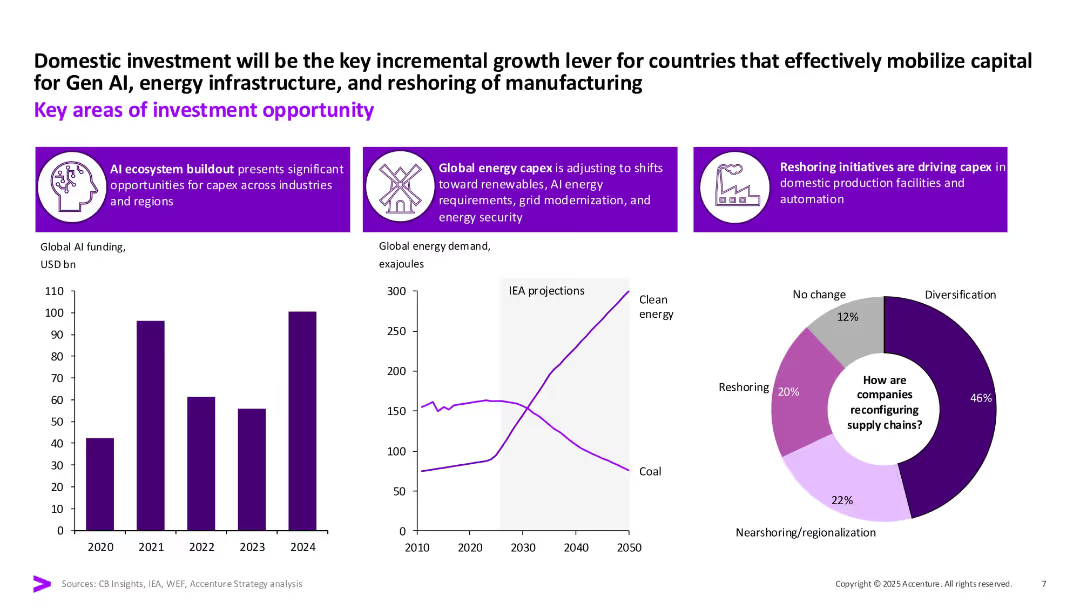
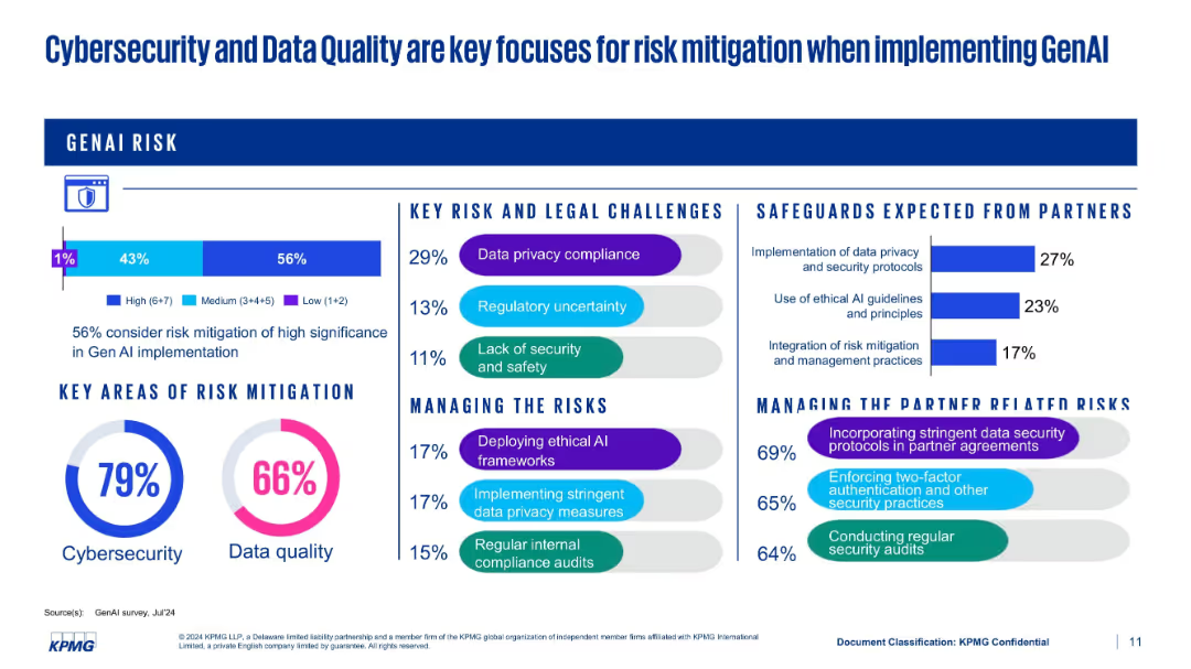
The slide features a combination of pie charts and column charts, along with textual points about the benefits and budget allocations for GenAI solutions in retail and commercial banks.
Technology and Digital Transformation
Financial Services
The slide highlights the growing interest of retail and commercial banks in GenAI technologies, detailing the anticipated benefits and current investment levels in these technologies.
GenAI, banks, profitability, investment, technology
Multiple Chart
EY
Saved
This slide is densely populated with financial data tables and column chart comparing net revenues by segment. The tables are detailed with numerous financial metrics and the graphs use blue bars, all set against a white background.
Financial Performance
Financial Services
Provides a comprehensive financial review of the company, with detailed analytics of revenue segments and profitability. Can be utilized for in-depth financial analysis or to inform stakeholders about the company's financial health.
Revenue, Financial, Banking, Management, EPS
Mixed Chart
Goldman Sachs
Saved
Line chart comparing discretionary mobility with testing, cases, and deaths across OECD countries. Commentary on right explains commercial activity and mobility patterns.
Market Analysis and Trends
Retail & E-commerce
Shows that discretionary consumer mobility (e.g., retail, transit) remained ~40% below pre-pandemic levels in late 2020, linked to sustained case and death rates. Indicates economic recovery is still constrained by ongoing public health concerns.
mobility trends, discretionary spending, commercial activity, COVID-19, consumer behavior, OECD, pandemic impact, health vs economy, mobility vs mortality, retail
Mixed Chart
McKinsey
Saved
Column chart displaying percentage of LGBT+ talents out at work in various countries. Green, gray, and red bars indicate different levels of openness. Minimalist design.
Regulatory and Compliance
Professional Services
The slide compares the percentage of LGBT+ talents who are out at work across multiple countries, highlighting that Germany has a lower percentage of openly out employees compared to other nations.
LGBT+, Germany, workplace, diversity, inclusion
Single Chart
BCG
Saved
The slide is divided into two sections, each featuring bar charts. One section shows the number of employees, and the other shows annual sales revenue percentages. This layout allows for quick comparisons between different size categories.
Market Analysis and Trends
Professional Services
This slide continues the demographic breakdown of the survey participants, focusing on the number of employees and sales revenue. It provides insights into the scale of companies involved in the survey, which can be critical for understanding the economic impact of their views and decisions.
Employees, Sales Revenue, Demographics, Survey, Company Size
Multiple Chart
Deloitte
Saved
Two charts: left bar/point combo showing spreads and percentiles; right bar chart of bank demand. Light background, data-focused layout.
Investment Analysis
Financial Services
Highlights the attractiveness of agency MBS, with higher spreads than BB-rated corporates and strong historical percentile positioning. Demand is projected to rise significantly in 2025 after recent declines, signaling renewed institutional interest.
MBS, spreads, fixed income, mortgage rates, bank demand, agency bonds, yield, investment opportunity
Multiple Chart
Morgan Stanley
Saved
Waterfall chart visualizing client value growth from attrition, price, and new business; annotations explain wallet growth and CV growth components.
Strategic Planning
Technology & Software
This slide explains Gartner's growth model for client value, breaking it into wallet growth (existing clients) and new business (new clients). It uses a waterfall chart to illustrate how client value progresses year-over-year.
growth model, CV growth, wallet growth, attrition, Gartner, waterfall
Mixed Chart
Gartner
Saved
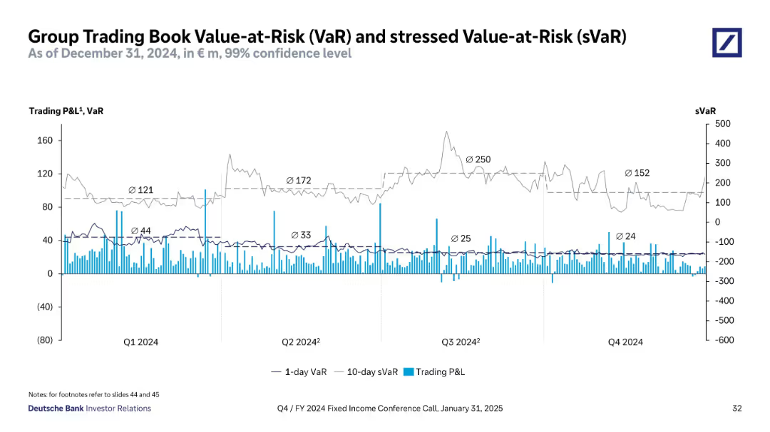
The slide combines a table and two line charts to show revenue and contribution margin trends over several quarters.
Market Analysis and Trends
Technology & Software
It details the performance of the research segment, including revenue, growth rates, contribution margins, and subscription revenue trends.
Research, Revenue, Contribution Margin, Subscription, Non-subscription, Growth
Multiple Chart
Gartner
Saved
Continues from the previous slide, adding further technological innovations and their implications for various sectors.
Technology and Digital Transformation
Technology & Software
Continues to detail emerging space technologies, including laser communications, edge computing, and in-orbit servicing capabilities.
space technologies, communications, digital capabilities, deep-space exploration
Header Horizontal
McKinsey
Saved
A bar chart outlines the top macro risk factors for investors, with changes from a previous survey period marked, highlighting interest rates, geopolitical risks, and inflation.
Risk Assessment and Management
Financial Services
Evaluates major macro risk factors considered by investors, with emphasis on how perceptions have shifted over recent periods. Useful for risk management and strategic investment planning.
risks, investors, macro factors, interest rates, inflation
Single Chart
BCG
Saved
Column charts showing interest in various types of personalization across different personas.
Customer and Market Segmentation
Financial Services
Analysis of customer personas' interest in personalized services in financial services, focusing on offers, text alerts, insurance models, and savings tips.
Personalization, financial services, customer personas, offers, text alerts, insurance models, savings tips, market analysis, segmentation
Multiple Chart
Accenture
Saved
The slide features a world map with highlighted regions, accompanied by text boxes explaining the methodology used in developing the insights, including survey details and participant demographics.
Risk Assessment and Management
Professional Services
Describes the methodology behind the research, including the survey's scope, participant demographics, and objectives to ensure comprehensive insights into the business and technology landscape.
methodology, insights, survey, demographics, research, professional services, global, participant, business, technology
Mixed Chart
Deloitte
Saved
Slide displays bar charts showing preferred price ranges for the next vehicle purchase, categorized by overall consumers and specific groups like ICE and EV intenders.
Market Analysis and Trends
Transportation & Logistics
Highlights consumer expectations on vehicle affordability, emphasizing the economic considerations significant in purchasing decisions in the automotive sector.
affordability, consumer expectations, price sensitivity, electric vehicles, automotive market, purchasing behavior, economic factors, price range
Mixed Chart
Deloitte
Saved
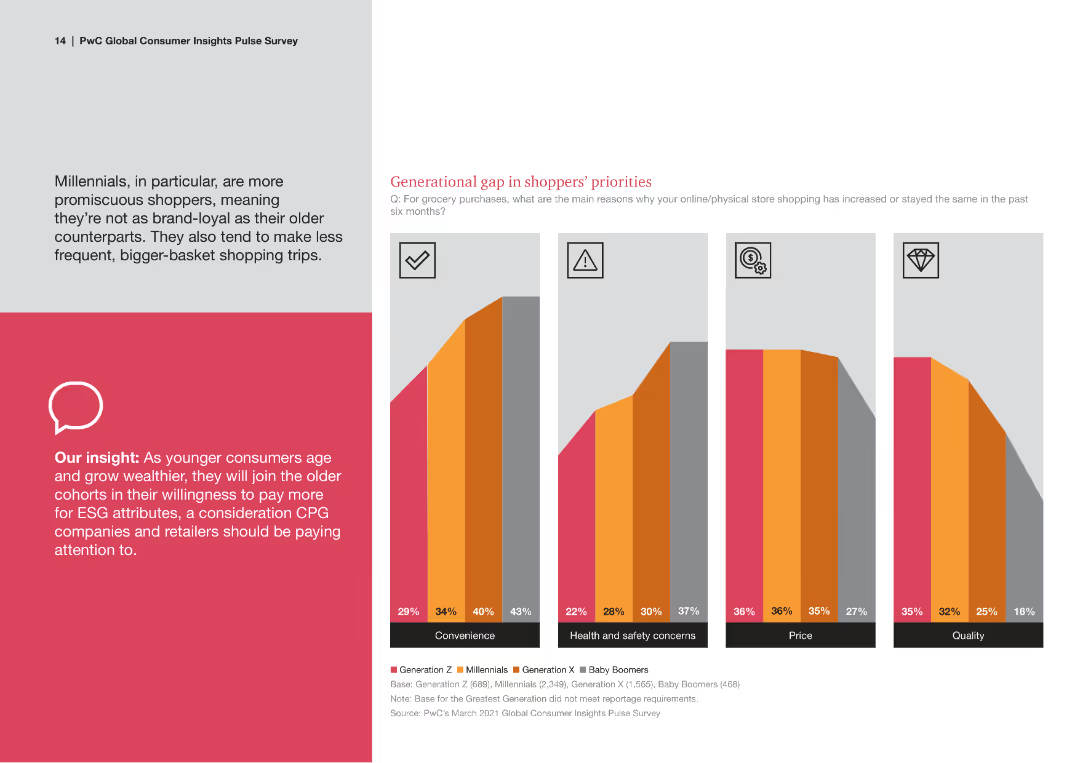
Clustered bar chart showing consumer behavioral response to perceived price increases by category (e.g., gas, apparel); action types color-coded
Pricing Strategies
Retail & E-commerce
Consumers are highly responsive to perceived price increases. Across categories like gasoline, energy, and food, many switch to lower-cost brands or delay purchases. Delaying purchases is particularly common for gas and non-essentials. The slide emphasizes behavior changes in response to inflationary pressure.
price perception, delayed purchase, inflation response, price sensitivity, category behavior, Germany, consumer change
Single Chart
McKinsey
Saved
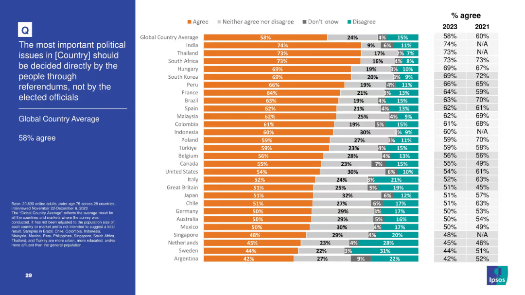
Left text block discussing notable trends; right shows side-by-side bar charts of trust/untrust ratings over time for politicians, gov ministers, and ad execs.
Performance Metrics and KPIs
Professional Services
Focuses on the three least trusted professions—politicians, government ministers, and advertising executives. Despite small improvements in trust since 2018, they remain at the bottom. The data illustrates the persistent skepticism toward these roles.
trust, professions, Ipsos, politicians, perception, reputation, trends, data
Mixed Chart
IPSOS
Saved
A stylistic column chart with projected quarterly growth, using contrasting colors and a clear timeline, also includes bullet points on rate outlook and loan growth.
Financial Performance
Financial Services
Forecasts the net interest income growth for a financial institution, detailing contributing factors and expectations for the upcoming quarters.
NII, financial forecast, interest income, growth, quarterly, finance, loan growth, projections
Single Chart
JP Morgan
Saved
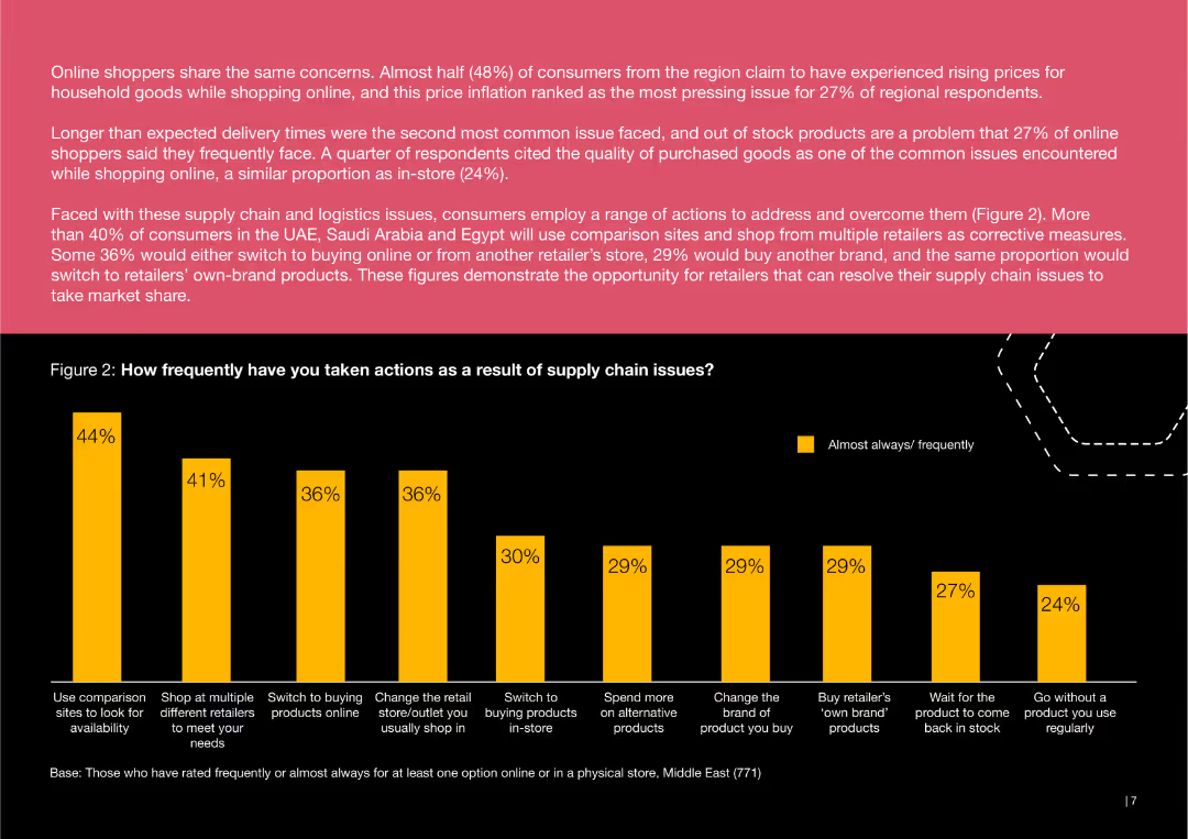
A bar chart with gray and blue bars indicating different frequencies of internet usage, labeled for various times.
Market Analysis and Trends
Technology & Software
Highlights the change in internet usage frequency before, during, and after lockdowns, demonstrating a shift in consumer behavior.
internet usage, frequency, lockdown, consumer behavior, shift
Single Chart
Bain
Saved
This slide showcases a breakdown of revenue growth factors with accompanying column charts and annotations, including a projection for net interest income.
Financial Performance
Financial Services
Analyzes the drivers of revenue growth within the business, including deposit and loan expansion. Ideal for financial strategy and planning meetings.
revenue growth, business development, financial strategy, net interest income, deposit growth, loan expansion, strategic planning
Single Chart
JP Morgan
Saved
Previous
Next
If nothing, comes up, please save your slides first
Create a FREE account to continue browsing
Receive Instant Access to 1,000+ slides from companies like McKinsey, Google, and Goldman Sachs
First Name
Last Name
Email
Password
I agree to all
Terms & Privacy Policy
Thank you! Your submission has been received!
Oops! Something went wrong while submitting the form.
Have an account?
Sign in
Column Chart
Heatmap
Chevron
Org Chart
Infographic
Callouts
Timeline
List
Graphic
Picture
Process Flow
Diagram
Paragraph
Map
Table
Framework
Subtitle
Takeaway Box
Icon
Other Chart
Radar Chart
Waterfall Chart
Mekko Chart
Pie Chart
Scatter Plot
Line Chart
Bar chart
Bullet points