Create a FREE Account
Instant access to 1,000+ real slides from top companies like McKinsey, BCG, Goldman Sachs, Google and many more!
First Name
Last Name
Email
Password
I agree to all
Terms & Privacy Policy
Thank you! Your submission has been received!
Oops! Something went wrong while submitting the form.
Have an account?
Sign in
Library
Templates
Courses
Pricing
My Account
My Slides
My Templates
✦ AI
AI Prompt Library
AI Search
Sign in
Start Here
Logout
My Saved Slides
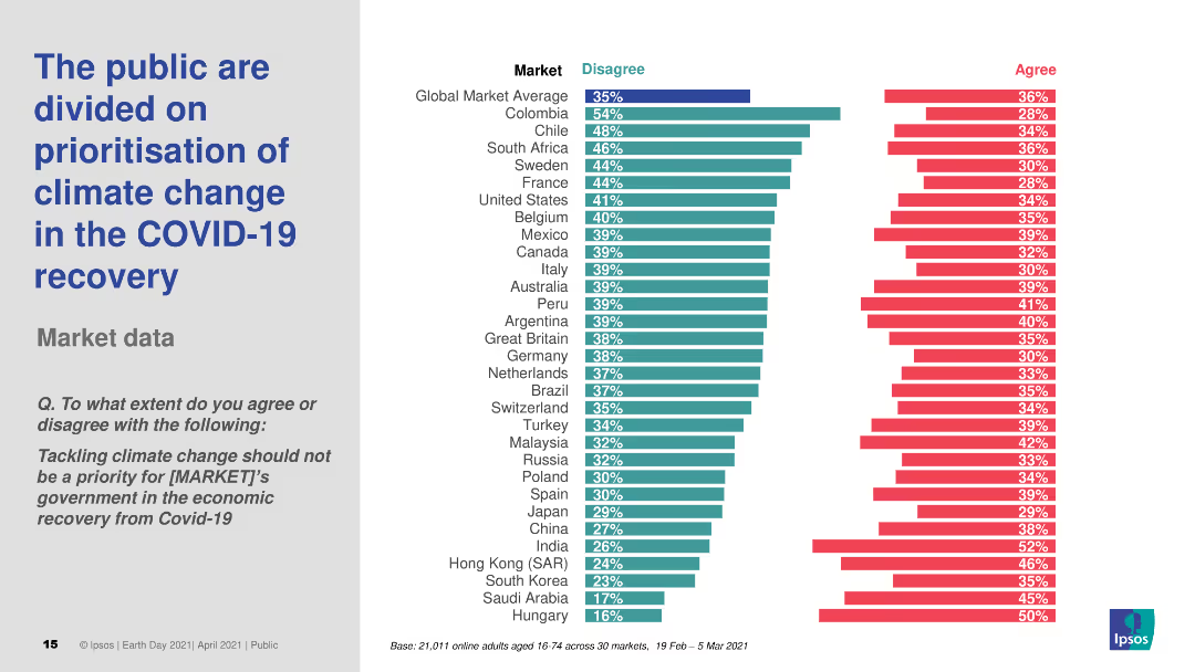
Line graph with country-specific trends from 2016–2023 showing agreement that “[Country] is in decline”; left panel with text and methodology.
Market Analysis and Trends
Government & Public Sector
Tracks beliefs about national decline over time; South Africa and Great Britain show recent increases, while Mexico and APAC show declines.
decline, national sentiment, trends, Ipsos, global comparison, longitudinal
Mixed Chart
IPSOS
Saved
This slide features a mix of text and a column chart. The text is on the left side, while the chart is on the right. The chart highlights various performance optimization approaches by percentage.
Investment Analysis
Financial Services
The slide discusses different approaches APAC family offices plan to implement to optimize performance and measure success, focusing on ESG factors and sustainability initiatives.
APAC, family offices, performance, optimization, ESG
Mixed Chart
EY
Saved
Contains detailed text definitions and an infographic explaining carbon credits and offsets, including creation and use.
Regulatory and Compliance
Environmental Services & Sustainability
Defines carbon credits as instruments for avoided or removed CO2 emissions, explaining their creation through offset projects and usage in emission reductions.
Carbon, credit, offset, definition, regulation, compliance, CO2, emissions, reduction
Diagram
EY
Saved
Presents potential hydrogen demand across countries using column charts, with scenarios up to 2050.
Strategic Planning
Energy & Utilities
Details Chile’s potential as a hydrogen exporter, considering demand forecasts in key global markets.
hydrogen, exports, Chile, demand, markets, Japan, EU, USA
Multiple Chart
McKinsey
Saved
Column chart and satisfaction/importance grid showing key issues with public charging, including location, availability, price, and waiting time. The slide uses multiple visual elements to present dissatisfaction reasons.
Customer and Market Segmentation
Transportation & Logistics
This slide highlights the main areas of dissatisfaction among EV owners with public charging stations, focusing on issues like location availability, waiting times, and pricing. It uses a grid to map satisfaction and importance levels.
public charging issues, location availability, EV owners, dissatisfaction factors, waiting times
Multiple Chart
PwC/Strategy&
Saved
The slide has four sections with icons and text, summarizing the key findings related to the third-party ecosystem, managing third-party risk, third-party governance, and technology and delivery models.
Strategic Planning
Professional Services
This slide summarizes the key findings of the study, covering four main areas: third-party ecosystem, managing third-party risk, third-party governance, and technology and delivery models. It outlines critical insights for organizational strategy.
key findings, third-party risk, governance, technology, delivery models, strategic planning, professional services
Pillar
Deloitte
Saved
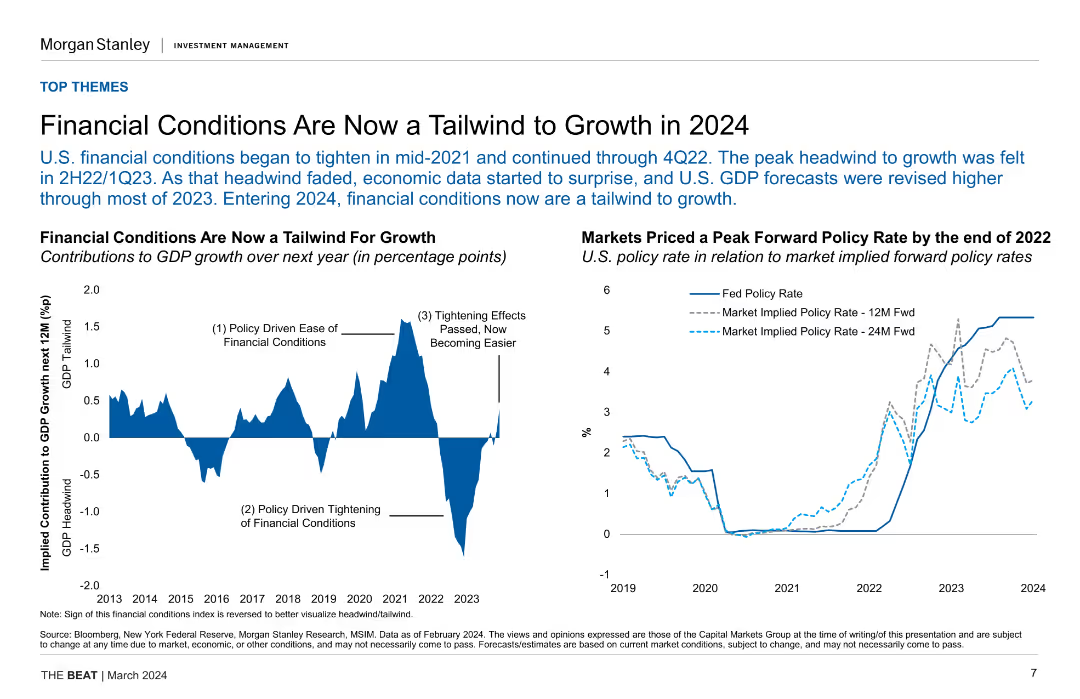
Dual-axis line chart showing India financial conditions and equity returns; minimal layout with focus on trends.
Investment Analysis
Financial Services
This slide supports overweighting Indian equities based on easing financial conditions and accommodative policy by the RBI. A dual-line chart illustrates the historical correlation between financial conditions and equity returns.
Indian equities, financial conditions, RBI, monetary policy, MSCI India, investments, easing, macroeconomic, returns
Single Chart
Morgan Stanley
Saved
The slide contains a column chart showing last purchase channel evolution from 2013 to 2017, with annotations explaining the trends.
Market Analysis and Trends
Retail & E-commerce
The slide discusses the stabilization of omnichannel and the growth of online-solo purchases among seniors, highlighting store recovery signs.
Omnichannel, Online-solo, Store recovery, Trends, Retail
Multiple Chart
BCG
Saved
This slide includes multiple sections: highlights from the market, markets, and activity. It uses column charts and data tables to present IPO data and market performance in the UK. The layout is detailed, offering a clear and structured overview of the market insights.
Market Analysis and Trends
Financial Services
Provides insights into the UK IPO market in 2018, including market highlights, performance data, and activity details. Useful for market analysis and strategic planning in the financial sector.
UK, IPO, market insight, performance, trends
Multiple Chart
EY
Saved
Dual donut charts visually breaking down total equities by region and style.
Performance Metrics and KPIs
Financial Services
Displays a detailed breakdown of USD 1,048 billion equities AUM. U.S. equity represents 71%, and styles are split into Core (45%), Growth (34%), and Value (21%). Helps stakeholders understand portfolio composition.
equities, AUM, U.S. equity, growth, value, portfolio distribution, investment strategy, performance
Multiple Chart
JP Morgan
Saved
Line chart showing historical data and projections of global CO2 emissions under different scenarios.
Market Analysis and Trends
Environmental Services & Sustainability
Analyzes global CO2 emissions data and projections, emphasizing the need for new technologies to meet climate goals.
CO2 emissions, global, projections, scenarios, climate goals
Mixed Chart
EY
Saved
The slide includes a column chart showing current NTM P/E ratios for various regions and styles compared to their 10-year high, low, and average. Text explanations are provided.
Investment Analysis
Financial Services
This slide compares the current NTM P/E ratios across different regions and styles with their historical values, offering insights for investment analysis.
NTM P/E, valuation, regions, investment, analysis
Mixed Chart
Morgan Stanley
Saved
Slide contains column charts and future projections.
Investment Analysis
Financial Services
Highlights plans and performance regarding shareholder distributions.
shareholder, dividends, buybacks
Multiple Chart
Deutsche Bank
Saved
Features a large split column chart showing assets and liabilities balanced at €1.007 trillion as of June 30, 2023.
Financial Performance
Financial Services
Displays the financial stability of Deutsche Bank with a detailed breakdown of assets and liabilities, highlighting liquidity reserves.
balance sheet, assets, liabilities, financial, stability, bar graph, liquidity, banking, June 2023, reserves
Multiple Chart
Deutsche Bank
Saved
A bar graph with text on the left showing the F-Series' market share among vehicles on the road.
Client Case Studies
Transportation & Logistics
States that the F-Series trucks make up a significant percentage of vehicles on the road.
F-Series, popularity, vehicles, market share, US roads
Single Chart
BCG
Saved
This slide contains pie charts, a leverage ratio comparison, and bullet points emphasizing the bank's strong capital position and strategies.
Financial Performance
Financial Services
The slide provides an overview of BBVA's capital ratios and risk-weighted assets, evidencing a robust capital position. Useful for discussions on financial solidity and regulatory compliance.
Capital Ratios, Financial Strength, Risk Management, Leverage Ratio, Regulatory Compliance, Capital Generation
Multiple Chart
Morgan Stanley
Saved
Horizontal bar chart of cooperation partners; side notes with examples (GE Ventures, Schaeffler)
Strategic Planning
Transportation & Logistics
Demonstrates the rail supply industry's cooperation landscape, noting that startups are emerging partners alongside universities, OEMs, and operators. Provides real-world examples of collaboration.
rail industry, cooperation, startups, innovation, GE Ventures, Schaeffler, ecosystem, collaboration strategy
Mixed Chart
Roland Berger
Saved
This slide presents data in a series of well-organized tables and charts. It compares epidemiological data across various European countries with economic indicators on the side. There's a consistent color theme for visual clarity.
Market Analysis and Trends
Government & Public Sector
This slide compares COVID-19 data among European countries, with a focus on epidemiological and economic impacts. It is designed for presenting to stakeholders interested in the pandemic's effects and measures like travel restrictions and health notices, with country-specific details for a granular approach.
COVID-19, Europe, Data Comparison, Travel Restrictions, Health Notice, Economic Impact, Epidemiological Data, Country-Specific, Pandemic, Measures
Multiple Chart
McKinsey
Saved
Diagram showing the projected development of quantum computing power with applications and sectors of interest based on the number of physical qubits.
Technology and Digital Transformation
Technology & Software
The slide discusses the projected development of quantum computing power and its potential applications in various sectors. It outlines the advancements in computing power and the transformative impact quantum computing could have on industries like finance, energy, and security.
Quantum Computing, Computing Power, Sectors
Table
Roland Berger
Saved
Historical line graph of US weighted average tariff rate from 1825 to 2025; annotations for policy events; red downward trend; right-side callouts summarize April-May 2025 tariff shifts
Regulatory and Compliance
Government & Public Sector
This slide provides historical context and recent developments in US trade policy, focusing on the reduction of tariffs between the US and China. The 2025 agreements lower tariffs by 115 p.p., significantly reducing average tariff rates. Key historical trade acts are also marked to show the evolution of trade liberalization.
tariff history, US-China trade, policy timeline, reciprocal tariffs, Economic Prosperity Deal, weighted average
Single Chart
PwC/Strategy&
Saved
The slide has a flowchart showing the methodology for forecasting NPL volumes, broken down into three steps: loan volume estimation, NPL volume estimation, and NPL sales estimation.
Strategic Planning
Financial Services
This slide explains the methodology for forecasting NPL volumes in Turkey, detailing the steps involved in estimating performing loan volumes, gross NPL volumes, and NPL sales volumes.
forecast, methodology, NPL, estimation, flowchart
Linear Flow
PwC/Strategy&
Saved
Timeline visualization featuring significant government interventions aimed at transforming e-mobility in India, presented in a clear, step-wise format.
Strategic Planning
Transportation & Logistics
Details a sequence of governmental actions and policies in India that have shaped the e-mobility landscape, illustrating their timeline and intended impacts.
e-mobility, policy, government intervention, India, timeline, transportation policy, electric mobility
Linear Flow
PwC/Strategy&
Saved
Two charts illustrating earnings growth rates and growth estimates for global equities, comparing various regions and future projections.
Investment Analysis
Financial Services
The slide focuses on the earnings growth and future revisions for global equities, highlighting trends and forecasts for different geographical markets.
global equities, earnings growth, revisions, forecasts, regions
Multiple Chart
JP Morgan
Saved
Graphical elements and text boxes detail the loyalty program structures and impacts on a Japanese e-commerce and media company's market growth.
Customer and Market Segmentation
Retail & E-commerce
This slide showcases the success of a loyalty program in retaining market leadership and expanding market share, highlighting the incentives and rewards that encourage repeat customer engagement in a Japanese e-commerce context.
Loyalty programs, e-commerce, Japan, market growth
Framework
BCG
Saved
Utilizes normalized area charts to compare the impact of major economic downturns (Great Depression, post-WWII, 9/11) on New York’s GDP with the COVID-19 recession. Each chart includes annotations and color distinctions to highlight differences in GDP impact percentages.
Strategic Planning
Government & Public Sector
Provides a comparative analysis of New York’s economic resilience across various recessions, emphasizing the unique challenges and recovery patterns presented by COVID-19. Useful for economic studies and policy-making.
recessions, GDP, New York, comparative analysis, economic impact, COVID-19, policy-making
Multiple Chart
BCG
Saved
Previous
Next
If nothing, comes up, please save your slides first
Create a FREE account to continue browsing
Receive Instant Access to 1,000+ slides from companies like McKinsey, Google, and Goldman Sachs
First Name
Last Name
Email
Password
I agree to all
Terms & Privacy Policy
Thank you! Your submission has been received!
Oops! Something went wrong while submitting the form.
Have an account?
Sign in
Column Chart
Heatmap
Chevron
Org Chart
Infographic
Callouts
Timeline
List
Graphic
Picture
Process Flow
Diagram
Paragraph
Map
Table
Framework
Subtitle
Takeaway Box
Icon
Other Chart
Radar Chart
Waterfall Chart
Mekko Chart
Pie Chart
Scatter Plot
Line Chart
Bar chart
Bullet points