Create a FREE Account
Instant access to 1,000+ real slides from top companies like McKinsey, BCG, Goldman Sachs, Google and many more!
First Name
Last Name
Email
Password
I agree to all
Terms & Privacy Policy
Thank you! Your submission has been received!
Oops! Something went wrong while submitting the form.
Have an account?
Sign in
Library
Templates
Courses
Pricing
My Account
My Slides
My Templates
✦ AI
AI Prompt Library
AI Search
Sign in
Start Here
Logout
My Saved Slides
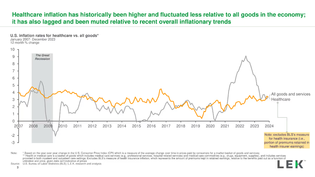
A line chart comparing U.S. inflation rates for healthcare and all goods from 2007 to 2023, highlighting key events and trends with clear lines and labels.
Market Analysis and Trends
Healthcare & Pharmaceuticals
The slide illustrates the historical inflation rates for healthcare versus all goods, showing how healthcare inflation has been higher and more stable over time.
inflation, healthcare, trends, comparison, U.S.
Single Chart
LEK
Saved
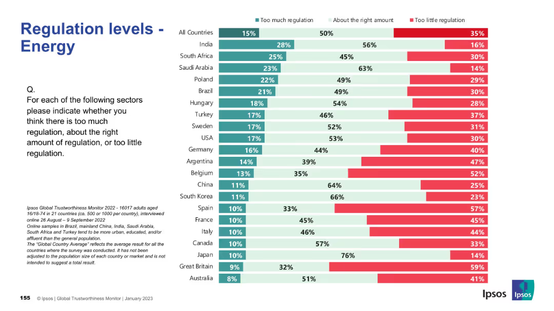
Similar layout to 19301; bar chart with red, teal, and mint green segments; country list ranked.
Regulatory and Compliance
Energy & Utilities
This slide shows perceptions of regulation in the energy sector across 21 countries. It highlights a global average sentiment that current regulation is mostly appropriate, though several countries like Belgium and Spain show higher concern over too little regulation.
energy sector, regulation, survey, Ipsos, policy, governance, international comparison, compliance, public opinion, bar chart
Mixed Chart
IPSOS
Saved
Similar layout to slide 9345, with a table showing board risk priorities from 2013 to 2022 and a bar chart of top board risk priorities for the next 12 months.
Risk Assessment and Management
Financial Services
The slide highlights the alignment and divergence between CROs and board members on risk priorities, with a focus on credit and geopolitical risks.
Board Risk, Priorities, Credit Risk, Geopolitical Risk, Analysis
Mixed Chart
EY
Saved
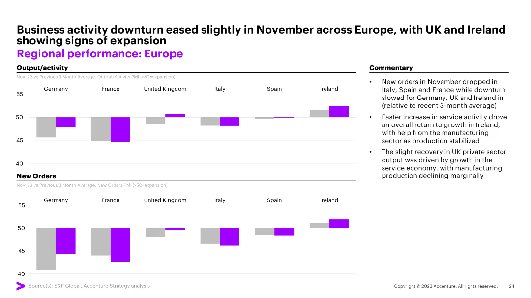
Two column charts comparing output/activity and new orders across European countries. The slide also includes commentary on business activity in November.
Market Analysis and Trends
Financial Services
This slide analyzes the performance of different European countries, comparing their output/activity and new orders, with a focus on changes observed in November.
Europe, performance, activity, orders, November
Multiple Chart
Accenture
Saved
An image of ADNOC’s Al Reyadah facility with accompanying descriptive captions.
Client Case Studies
Industrial & Manufacturing
Describes ADNOC's Al Reyadah facility as a self-sustaining CCUS project in the iron & steel industry.
CCUS, ADNOC, Al Reyadah, iron, steel, self-sustaining
Linear Flow
Kearney
Saved
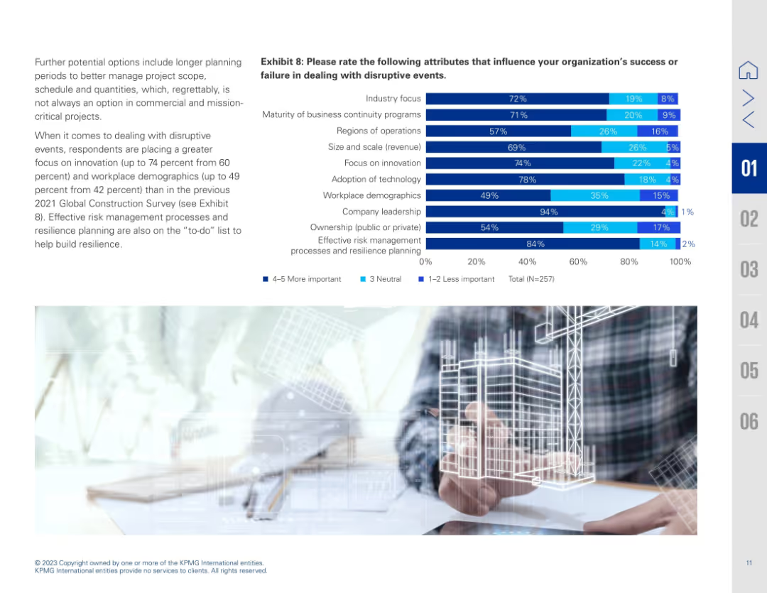
Left-aligned paragraph and right-aligned stacked bar chart (Exhibit 8). Chart evaluates attributes influencing success during disruption. Light background image of a digital building model on bottom right.
Operational Efficiency
Real Estate & Construction
The slide evaluates key attributes contributing to organizational resilience during disruptive events. Effective risk management, innovation, and company leadership were rated as most important. There's emphasis on adopting a holistic and tech-forward strategy, increasing the role of planning, innovation, and workforce demographics in enhancing resilience and performance.
resilience, business continuity, innovation, disruption, leadership, demographics, planning, construction success, risk management
Mixed Chart
KPMG
Saved
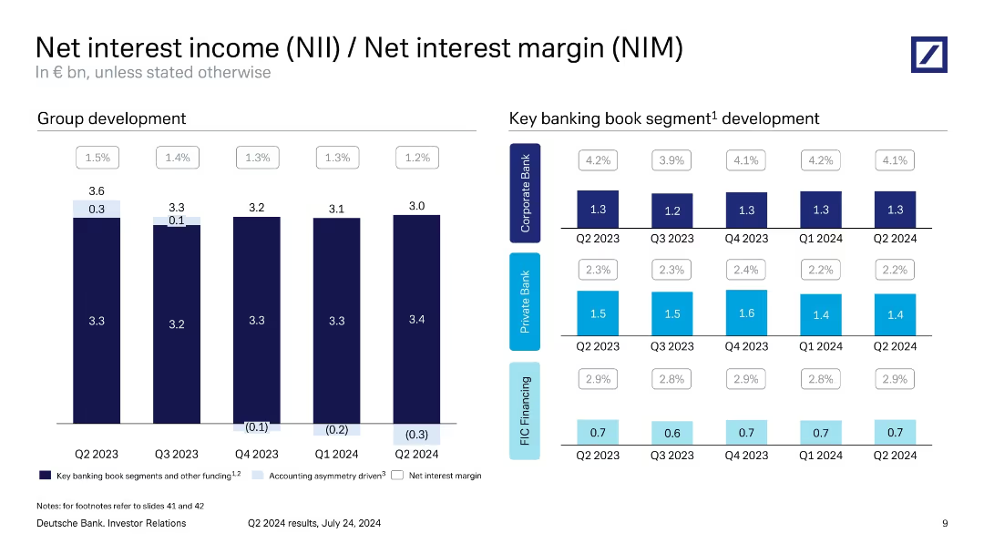
Left bar chart for group NII, right grid for NII by bank segment with margin overlays.
Financial Performance
Financial Services
Tracks quarterly development in net interest income and margin across the group and major banking segments. Shows gradual decline in NIM from Q2 2023 to Q2 2024 and provides insight into accounting asymmetry effects and segment-specific interest income contributions.
NII, NIM, interest margin, banking segments, Q2 2024, Deutsche Bank
Multiple Chart
Deutsche Bank
Saved
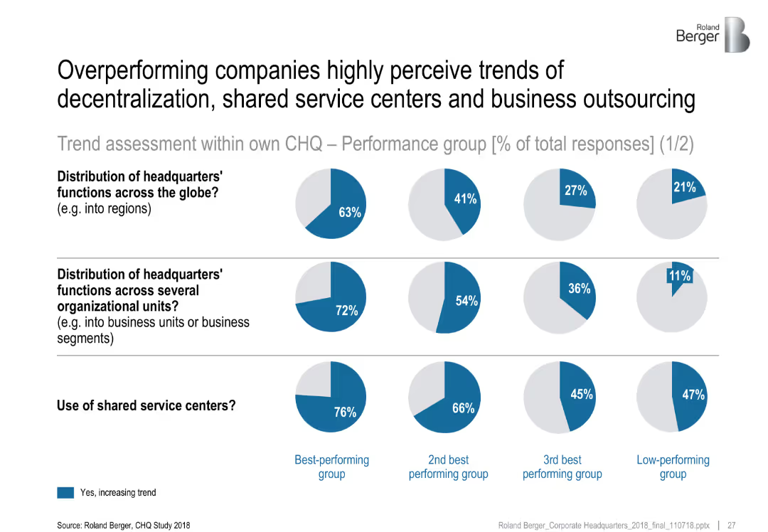
Comparative pie charts segmented by performance groups. Each row examines a different CHQ trend.
Performance Metrics and KPIs
Professional Services
The slide highlights how top-performing companies are more likely to report increasing trends in decentralization and use of shared service centers. It compares best and low-performing groups' perceptions across three key dimensions of headquarters functions.
decentralization, shared services, CHQ, business outsourcing, organizational units, performance comparison
Multiple Chart
Roland Berger
Saved
The slide features a line chart showing average grain exports by month for Australia, Ukraine, and Canada. The chart uses blue lines to differentiate between the countries. Text is present on the right side with bullet points explaining the seasonal patterns and opportunities for Australian grain exports.
Market Analysis and Trends
Agriculture & Food Production
The slide explains the seasonal patterns of Australian grain exports compared to the Northern Hemisphere, highlighting opportunities for export during specific months. It discusses the counter-cyclical nature of exports and the importance of timing in maximizing value.
Seasonal exports, grain export patterns, market opportunity, Northern Hemisphere, counter-cyclical export patterns
Mixed Chart
LEK
Saved
The slide shows a timeline with column charts depicting the annual venture capital investment in Brazil over different periods, emphasizing growth.
Investment Analysis
Financial Services
Reviews the evolution of venture capital investment in Brazil, emphasizing major investments and the development of the venture ecosystem over recent years.
venture capital, Brazil, investment growth, VC trends, 2019
Linear Flow
McKinsey
Saved
This slide features two stacked column charts: one showing PE/VC investments by deal segments in terms of value, and another showing the number of deals. The charts use different colors to differentiate between segments like Growth, Buyout, Start-up, PIPE, and Credit Investment, with detailed numerical data.
Market Analysis and Trends
Financial Services
This slide breaks down the PE/VC investments across various deal segments by both value and number of deals, providing a comprehensive view of how different segments are performing over time. This information is essential for strategic planning and investment analysis.
PE/VC, deal segments, investment value, number of deals, growth, buyout
Multiple Chart
EY
Saved
Bar graphs depict percentages of AI implementation across different underwriting processes. Purple color scheme, vertical bars.
Technology and Digital Transformation
Financial Services
Discusses the roles and penetration of AI in underwriting, indicating areas with room for increased AI implementation.
AI, underwriting, technology, implementation, analytics, data processing, insight
Mixed Chart
Accenture
Saved
The slide presents moderate visual complexity with a balance of graphical elements showcasing greenhouse gas emissions data and text explaining alternative fuel use and activity footprint reduction. The layout integrates visuals and information effectively, with color coding to highlight different sections.
Technology and Digital Transformation
Industrial & Manufacturing
This slide elaborates on how the process industries' significant greenhouse gas emissions can be managed through the use of alternative fuels or the reduction of activity footprints via automation. It outlines various strategies for improving energy efficiency, reducing emissions, and the role of automation technologies in achieving these goals.
Greenhouse gas management, Automation in emissions reduction, Energy efficiency, Industrial process optimization
Single Chart
LEK
Saved
The slide has a clean and organized design with column chart and table sections. It contrasts financial results across quarters, showing trends and changes in revenue, earnings, and profitability metrics. The use of blue hues emphasizes the financial data points.
Financial Performance
Financial Services
This slide provides an overview of financial results, comparing quarter-on-quarter and year-to-date performances. It is designed for investors or management to gauge the financial health and performance trends of the company, with a focus on revenues and earnings.
financial results, net revenues, earnings, year-to-date, overview
Mixed Chart
Goldman Sachs
Saved
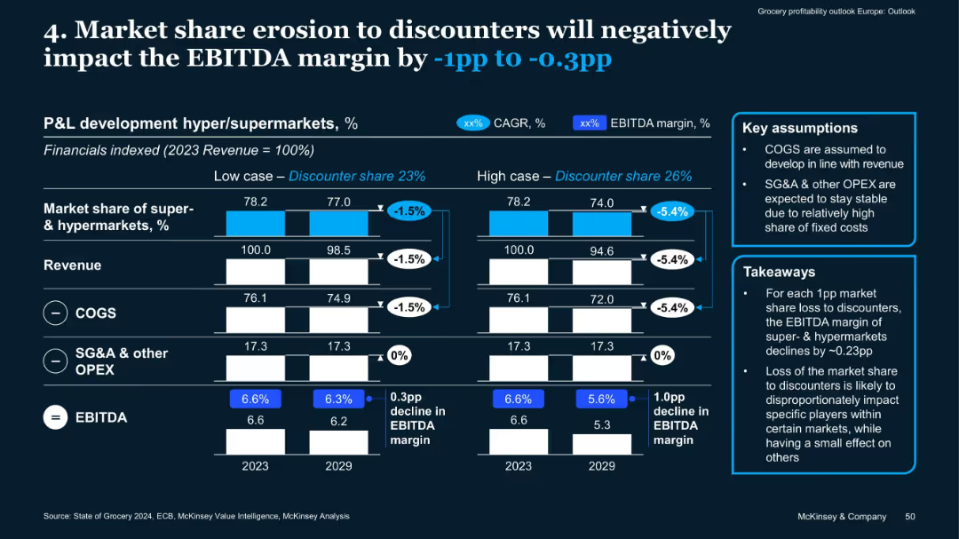
Dual scenario bar charts, revenue/COGS/SG&A breakdowns, key assumptions and takeaways in side boxes
Financial Performance
Retail & E-commerce
This slide analyzes how market share loss to discounters affects EBITDA margin of supermarkets/hypermarkets. In high and low scenarios, a 1–5.4% drop in revenue translates to 0.3–1.0pp EBITDA margin decline, driven mainly by lost volume.
EBITDA, market share, discounters, COGS, OPEX, revenue impact, margin
Mixed Chart
McKinsey
Saved
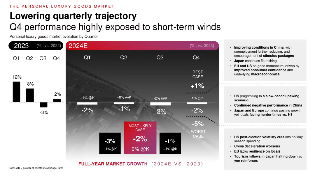
Two-part chart comparing 2023 quarterly growth with 2024 forecasts. Gradient background with projected performance ranges (best, worst, likely cases). Bullet insights on the right.
Financial Performance
Consumer Goods
Projects quarterly evolution of personal luxury goods in 2024. Shows decreasing growth throughout the year, with best-case and worst-case ranges. Factors include macroeconomic conditions, stimulus in China, and consumer confidence in the US and EU. Emphasizes H2 uncertainty and regional divergence in performance.
quarterly growth, luxury slowdown, projections, consumer sentiment, 2024, economic impact
Mixed Chart
Bain
Saved
Slide with comparative data in bar graph format, emphasizing regional differences in executive confidence and outlook for 2023, using green, red, and gray color scheme.
Market Analysis and Trends
Professional Services
Compares the optimism and confidence among C-suite leaders globally, highlighting regional variations and strategic concerns for 2023.
C-suite, optimism, strategy, 2023, global
Multiple Chart
BCG
Saved
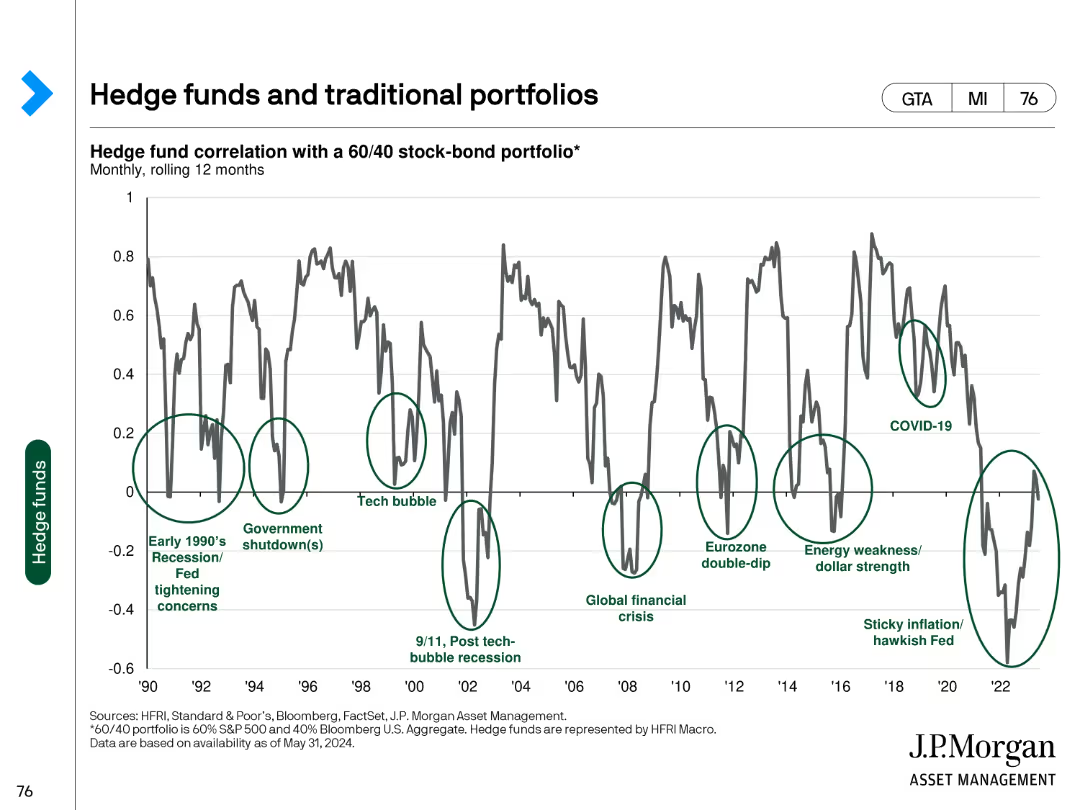
This slide features a line chart showing the correlation of hedge funds with a 60/40 stock-bond portfolio, highlighting major financial events from 1990 to 2024.
Investment Analysis
Financial Services
The slide analyzes the correlation between hedge fund performance and a traditional 60/40 portfolio, indicating how hedge funds behave in different economic conditions.
hedge funds, portfolios, correlation, financial events, investment analysis
Single Chart
JP Morgan
Saved
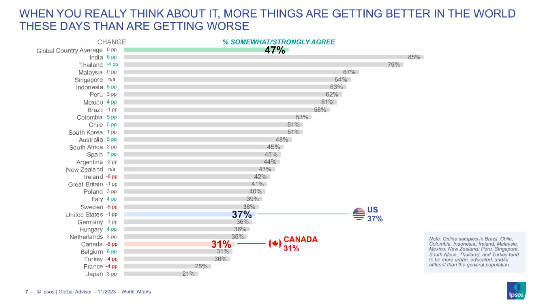
Bar chart with change indicators showing agreement with the view that the world is improving; ranked by country.
Market Analysis and Trends
Media & Entertainment
This slide explores public optimism globally, comparing countries that believe more things are improving than worsening, with India and Thailand showing the most positivity.
optimism, improvement, public sentiment, inequality, global attitudes, comparative analysis
Single Chart
IPSOS
Saved
Slide presents various funding methods with corresponding icons and bullet points explaining the suitability of each method for enhancing school connectivity in well-developed regions. A text box details concerns and justifications for each funding strategy.
Strategic Planning
Education & Training
Analyzes potential funding strategies for achieving full school connectivity in developed regions of Indonesia. Discusses the advantages and concerns associated with each method, including government subsidies and private investment models.
funding methods, school connectivity, government subsidy, private investment, developed regions
Table
BCG
Saved
Diagrams showing traditional, direct, and domestic supply chain archetypes for grain movement, with detailed steps from farm to port and export.
Operational Efficiency
Transportation & Logistics
The slide outlines three main supply chain models for grain movement in Australia, illustrating the processes involved from harvesting to export.
supply chain, grain movement, Australia, traditional, direct, domestic
Diagram
LEK
Saved
Includes multiple types of visual data representation like world maps and bar charts, along with descriptive texts and annotations.
Regulatory and Compliance
Environmental Services & Sustainability
Educates about the impact of climate change on different regions and industries, showing temperature increases, sea level rise, and water stress projections. It urges actions to mitigate these effects and adapt to changes.
climate change, environmental impact, global warming, adaptation, maps, bar charts, column charts
Mixed Chart
PwC/Strategy&
Saved
Features column charts and icons showing the ROE impact from capital and market segments, with a focus on change over time.
Financial Performance
Financial Services
Illustrates the impact of capital on ROE in market business, emphasizing strong returns despite increased capital, with a focus on sub-product ROEs and revenue growth.
Return on Equity, Capital Impact, Revenue Growth, Risk Management
Multiple Chart
JP Morgan
Saved
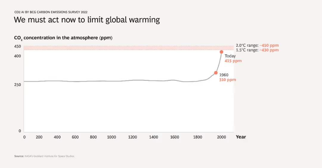
A line chart showing CO2 concentration in the atmosphere over time from year 0 to 2022. The chart highlights a significant increase in CO2 levels, especially after 1960, with today’s concentration at 415 ppm. The critical thresholds for 1.5°C and 2.0°C are also marked.
Market Analysis and Trends
Environmental Services & Sustainability
This slide emphasizes the urgent need to address global warming by illustrating the historical rise in atmospheric CO2 levels. It shows that current CO2 concentrations are dangerously high, surpassing thresholds that could limit global temperature increase.
CO2, global warming, climate change, historical data, critical thresholds
Single Chart
BCG
Saved
This slide includes a box plot and a column chart showing the distribution of average daily time spent on search engines. Two tables provide detailed statistics about the time and proportion of online time spent on search engines.
Market Analysis and Trends
Technology & Software
The slide presents information on the average daily time spent on Search Engines, with detailed statistics including mean, median, and percentile distributions, based on data from Ipsos Iris Clickstream Data.
Search Engines, Daily Time, Statistics, Box Plot, Column Chart
Mixed Chart
IPSOS
Saved
Previous
Next
If nothing, comes up, please save your slides first
Create a FREE account to continue browsing
Receive Instant Access to 1,000+ slides from companies like McKinsey, Google, and Goldman Sachs
First Name
Last Name
Email
Password
I agree to all
Terms & Privacy Policy
Thank you! Your submission has been received!
Oops! Something went wrong while submitting the form.
Have an account?
Sign in
Column Chart
Heatmap
Chevron
Org Chart
Infographic
Callouts
Timeline
List
Graphic
Picture
Process Flow
Diagram
Paragraph
Map
Table
Framework
Subtitle
Takeaway Box
Icon
Other Chart
Radar Chart
Waterfall Chart
Mekko Chart
Pie Chart
Scatter Plot
Line Chart
Bar chart
Bullet points