Create a FREE Account
Instant access to 1,000+ real slides from top companies like McKinsey, BCG, Goldman Sachs, Google and many more!
First Name
Last Name
Email
Password
I agree to all
Terms & Privacy Policy
Thank you! Your submission has been received!
Oops! Something went wrong while submitting the form.
Have an account?
Sign in
Library
Templates
Courses
Pricing
My Account
My Slides
My Templates
✦ AI
AI Prompt Library
AI Search
Sign in
Start Here
Logout
My Saved Slides
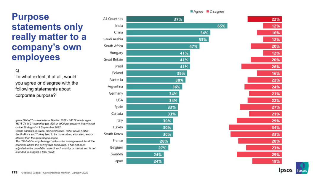
Bar chart, consistent with previous slides, comparing country responses, “Agree” vs “Disagree” format
Market Analysis and Trends
Professional Services
The chart reveals opinions about whether purpose statements matter primarily to employees. India, China, and Saudi Arabia show strong agreement. Many Western countries demonstrate higher disagreement, suggesting broader expectations.
purpose statement, employees, corporate identity, stakeholder opinion, Ipsos, public perception
Mixed Chart
IPSOS
Saved
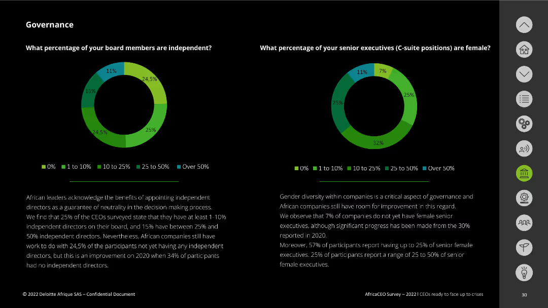
The slide features two pie charts showing the percentage of independent board members and senior female executives in companies. The charts are color-coded with a legend.
Organizational Structure and Change
Professional Services
This slide presents survey results on corporate governance, focusing on the percentage of independent board members and senior female executives in companies. It emphasizes the need for gender diversity and independent decision-making.
governance, independent directors, female executives, corporate diversity, survey
Multiple Chart
Deloitte
Saved
Features four rounded rectangles, each with a heading and a short text blurb beneath it. The slide is divided into quadrants representing different aspects of work structure and delivery.
Organizational Structure and Change
Professional Services
Encourages thinking about work delivery, organization, employee experience, and enabling work. Useful for initiating discussions on organizational changes needed for the future of work.
Organizational Change, Work, Structure, Planning
Pillar
Deloitte
Saved
This slide includes a text section on the left discussing carbon pricing as a commodity and two column charts on the right. One chart shows trades in CO2 emissions, and the other displays CO2 emissions intensity by region, both with clear color distinctions.
Market Analysis and Trends
Government & Public Sector
It argues for the benefits of treating carbon as a tradable commodity to drive global emissions reduction. The slide presents data on CO2 trades between regions and the carbon intensity of goods production, highlighting how regions can leverage carbon pricing to achieve more significant environmental and economic benefits.
Carbon Pricing, CO2 Emissions, Trades, Commodity, Intensity
Multiple Chart
EY
Saved
A column chart showing total usage of the TV screen by various viewing activities in January 2021 and January 2022, with color-coded categories.
Market Analysis and Trends
Media & Entertainment
The slide highlights the increasing share of connected TV (CTV) and time-shifting in total TV screen usage, reflecting changes in viewing habits over the past year.
CTV, television, usage, viewing habits, trends
Mixed Chart
Nielsen
Saved
Slide contains multiple column charts, and comparative data tables for loans and deposits across different bank types over several quarters, structured with clear section headers.
Financial Performance
Financial Services
This slide provides a quarterly financial performance overview for various types of banks, illustrating trends in loans and deposits, and highlighting key financial changes and ratios.
financial, banks, quarterly, loans, deposits, trends, performance, analysis
Multiple Chart
Deutsche Bank
Saved
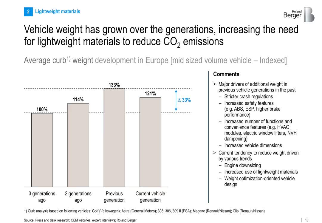
Bar chart illustrating indexed vehicle weight growth across generations. Right panel explains driving factors and emerging lightweighting trends.
Technology and Digital Transformation
Industrial & Manufacturing
This slide tracks the increase in average curb weight of midsize vehicles across generations and discusses the need for lightweighting to meet emissions goals. Key drivers include safety and comfort features, while current trends focus on engine downsizing and advanced materials.
vehicle weight, lightweight materials, emissions reduction, curb weight, automotive engineering
Mixed Chart
Roland Berger
Saved
Text with three column charts showing cross-border deal volumes (outbound, inbound, and Middle East) from fiscal years 2021 to 2023.
Mergers and Acquisitions
Financial Services
Provides data on cross-border M&A deal volumes, showing outbound, inbound, and regional trends, and emphasizing the resilience of the Middle East market.
M&A, cross-border, deal volume, outbound, inbound, Middle East, fiscal, years, market
Mixed Chart
PwC/Strategy&
Saved
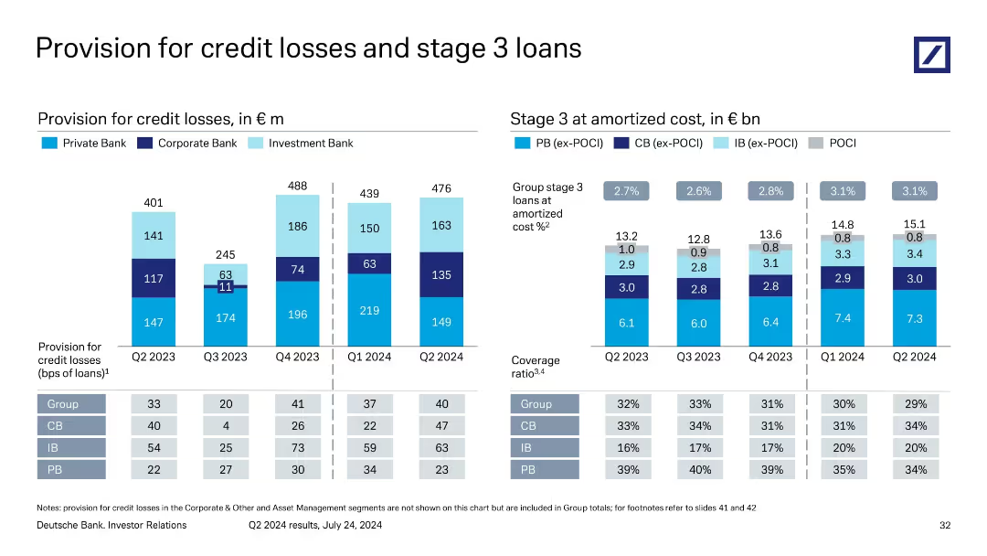
Two-column layout with vertical stacked bar charts; left side shows provisions over 5 quarters; right side shows stage 3 loans and coverage ratios over time.
Risk Assessment and Management
Financial Services
The slide details Deutsche Bank’s provision for credit losses by business segment over five quarters, alongside stage 3 loan balances and associated coverage ratios. It shows trends in credit provisioning and risk levels in private, corporate, and investment banking, highlighting the bank’s exposure and risk mitigation efforts.
credit losses, stage 3 loans, provisions, risk coverage, banking sectors
Multiple Chart
Deutsche Bank
Saved
A column chart comparing the provision for credit losses ratio between Credit Suisse and peers from 2010 to 2021.
Risk Assessment and Management
Financial Services
The slide discusses the weaknesses in risk management revealed by the Archegos incident, highlighting the deviations from historical performance and peer comparison in terms of provision for credit losses.
risk management, credit losses, peers, historical performance, Archegos
Single Chart
Credit Suisse
Saved
This slide features a pie chart and a column chart, presenting data on billing accuracy and the timeliness of invoice generation, with clear graphical representation.
Financial Performance
Energy & Utilities
The slide provides detailed information on billing accuracy and timeliness, including the percentage of accurate billings and the time taken for invoice generation, visualized through charts.
billing accuracy, timeliness, invoices, utilities, data
Multiple Chart
EY
Saved
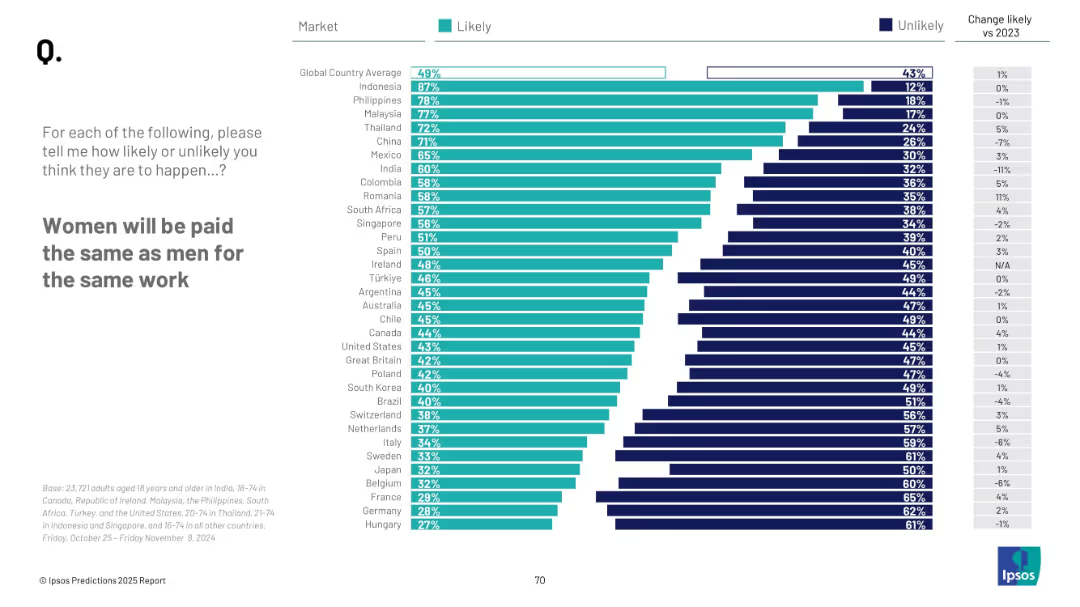
Horizontal bar chart ranking countries by Likely response; change vs. 2023 shown; global average marked.
Human Resources and Talent Management
Professional Services
This slide explores public belief in gender pay equality becoming reality by 2025. Indonesia is most optimistic, while Hungary and Germany are least. Global average is at 49%, a marginal increase from the previous year.
gender equality, pay gap, public opinion, Ipsos, HR trends, country comparison, 2025 expectations, workplace fairness
Mixed Chart
IPSOS
Saved
The slide presents a flow chart and bullet points outlining assumptions for economic recovery post-lockdown, categorized by industry and region. It includes symbolic representations (flags, state outlines) to visually distinguish between different geographical areas.
Strategic Planning
Financial Services
Outlines potential recovery scenarios from COVID-19 lockdowns, emphasizing different impacts and recovery rates by industry and region. Useful for strategic discussions on preparing for post-COVID economic landscapes.
COVID-19, recovery, industry, region, economic analysis, assumptions, strategic planning, lockdown
Header Vertical
BCG
Saved
It uses line charts to depict CEO expectations on economic growth, with a key and explanatory notes.
Market Analysis and Trends
Professional Services
Illustrates CEO perspectives on global economic growth, with a focus on the changes in optimism and confidence over recent years.
CEO, Economic Growth, Survey, Trends
Single Chart
PwC/Strategy&
Saved
The slide features column charts comparing the levelized cost of energy for methanation with other energy sources across different years and scenarios. Detailed visual.
Financial Performance
Energy & Utilities
Assesses the cost projections of methanation compared to biogas and injection, highlighting potential uncompetitiveness by 2030 using detailed financial data.
methanation, levelized cost, energy, biogas, injection, 2030, financial projections, cost comparison
Multiple Chart
Kearney
Saved
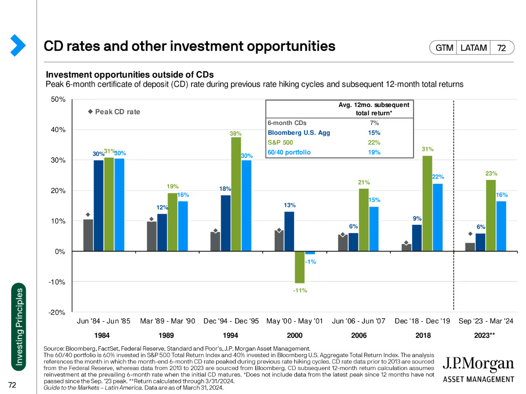
The slide includes a column chart comparing the returns of CDs to other investment opportunities, with historical data for context.
Investment Analysis
Financial Services
The slide evaluates the performance of certificates of deposit (CDs) against other investment options, highlighting potential returns during various market cycles.
CD rates, investment opportunities, historical returns, market analysis, financial comparison, investment strategies, performance metrics
Single Chart
JP Morgan
Saved
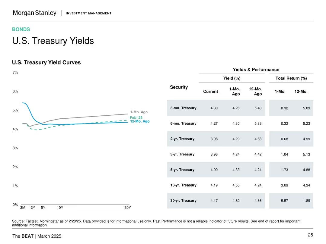
Left: U.S. Treasury yield curve over 3 time points. Right: Yield and return table for various tenors. Minimalist design with small color coding.
Financial Performance
Financial Services
This slide provides a snapshot of the U.S. Treasury yield curve and recent performance by tenor. It highlights recent downward shifts in yields and strong 12-month total returns, particularly for longer-dated securities, reflecting changing market sentiment.
U.S. Treasuries, yield curve, total return, short-term vs long-term, interest rate trend, bond performance, investment returns
Mixed Chart
Morgan Stanley
Saved
This slide uses a column chart to break down the projected domestic demand for energy storage systems (ESS) in Australia from 2023 to 2030. The chart is detailed and uses different shades of purple to represent various categories of demand, such as grid, behind the meter, off-grid, and hydrogen potential. Annotations provide insights into the drivers of each category's growth.
Competitive Landscape
Energy & Utilities
Details the growing domestic demand for energy storage solutions in Australia, emphasizing strategic opportunities for local industry development and grid stability.
energy storage, domestic demand, Australia, 2030 forecast, grid, behind the meter, off-grid, hydrogen, energy policy, market growth
Mixed Chart
Accenture
Saved
The slide features four product images of Horlicks and Boost brands with circular charts above them depicting market share and profitability. There is also a large text box on the left displaying financial metrics.
Market Analysis and Trends
Consumer Goods
This slide highlights the acquisition of Horlicks and Boost, emphasizing their market positions and financial significance within the functional nutrition sector.
acquisition, nutrition, market share, profitability, functional nutrition
Multiple Chart
Deutsche Bank
Saved
Contains several bar charts and a remarks section. Charts display respondents' age, years worked in the industry by line of business, and detailed remarks about workforce age and tenure.
Market Analysis and Trends
Financial Services
Detailed demographic analysis of insurance industry respondents segmented by line of business, offering insights into the age and tenure of workers in personal, commercial, and specialty lines.
insurance, demographics, business lines, age distribution, tenure, personal lines, commercial lines, specialty lines
Multiple Chart
Accenture
Saved
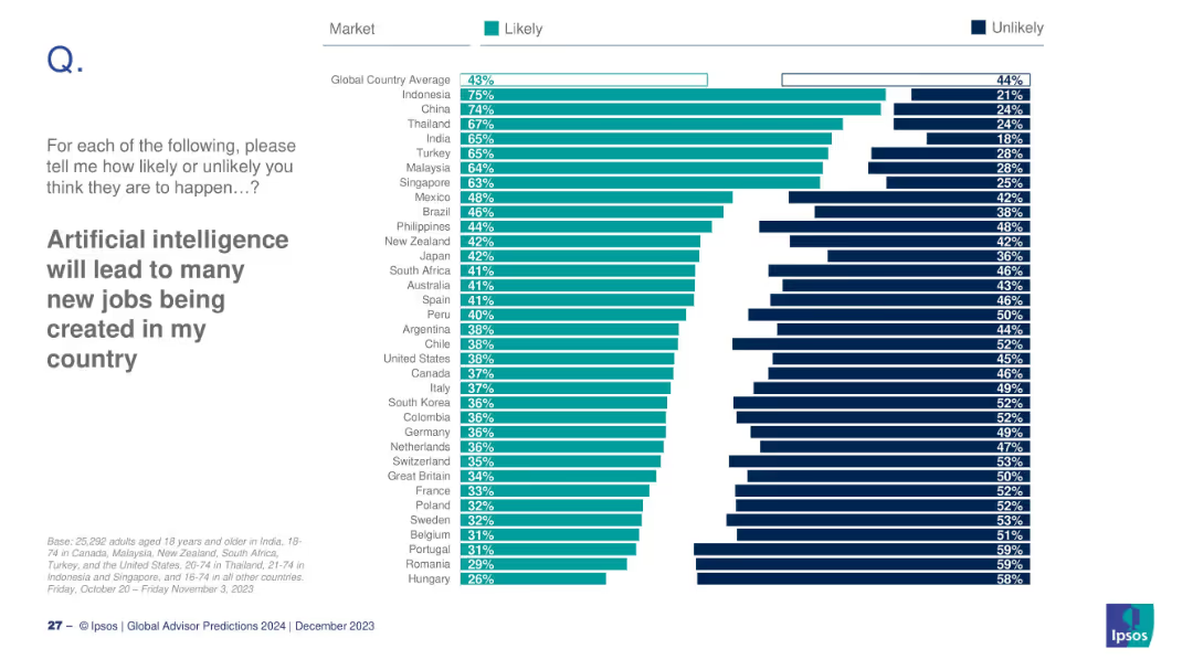
Country-level breakdown of likely/unlikely responses
Technology and Digital Transformation
Artificial Intelligence
A global snapshot of expectations around AI's potential to create new jobs. This slide ranks countries based on their optimism or skepticism about AI-driven job creation and compares percentages of likely and unlikely responses.
AI, job creation, workforce, optimism, future jobs
Mixed Chart
IPSOS
Saved
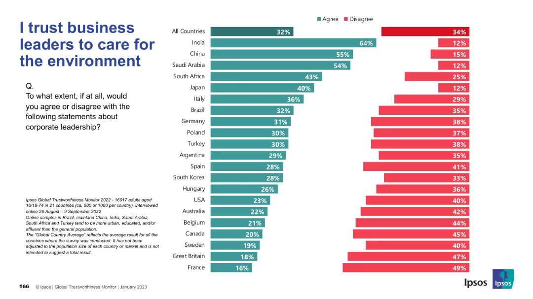
Similar bar chart format to Slide 19311; teal and red bars for agree/disagree; countries listed vertically; layout and design are consistent with previous slide.
Regulatory and Compliance
Environmental Services & Sustainability
The slide measures public belief in corporate leaders’ commitment to environmental issues. India, China, and Saudi Arabia rank high in trust, while Western nations express more skepticism.
sustainability, environment, leadership, ESG, perception, global views, Ipsos, corporate responsibility
Mixed Chart
IPSOS
Saved
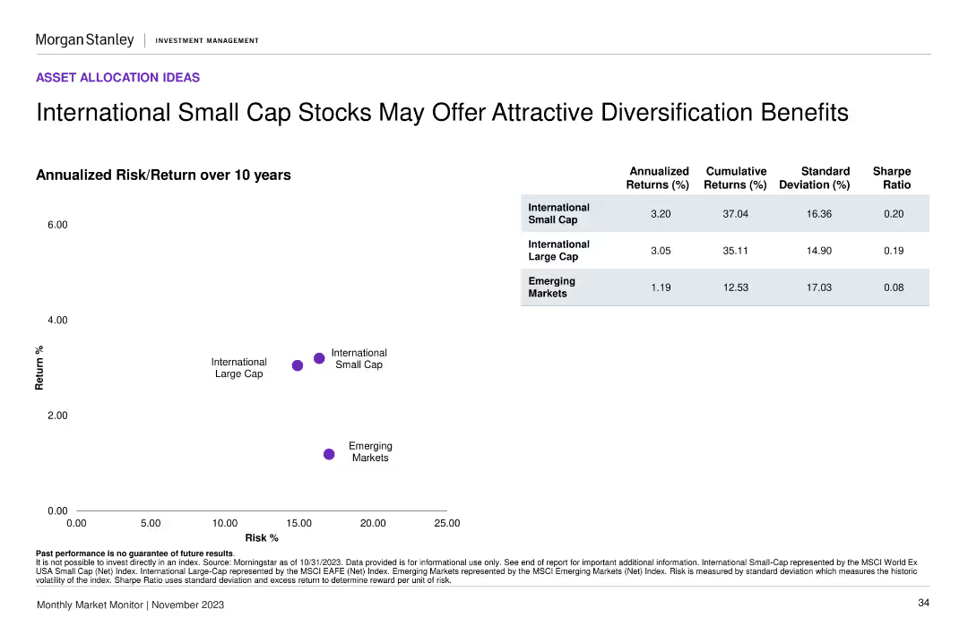
A scatter plot comparing annualized risk/return over 10 years for international small cap, large cap, and emerging markets. Includes a summary table with key statistics.
Investment Analysis
Financial Services
The slide compares the risk and return profiles of international small cap, large cap, and emerging market stocks, highlighting potential diversification benefits for investors.
risk/return, small cap stocks, diversification, emerging markets, investment
Mixed Chart
Morgan Stanley
Saved
Features a line chart for mortgage rates, column charts for mortgage market origination projections, and a line chart for home price index against housing inventory, all indicating significant changes and trends.
Market Analysis and Trends
Financial Services
Addresses the current state of the mortgage rates, originations market, and home price trends, signaling a changing macroeconomic environment impacting the home lending landscape.
Mortgage Rates, Market Origination, Home Prices, Inventory Shortage, Macroeconomics
Multiple Chart
JP Morgan
Saved
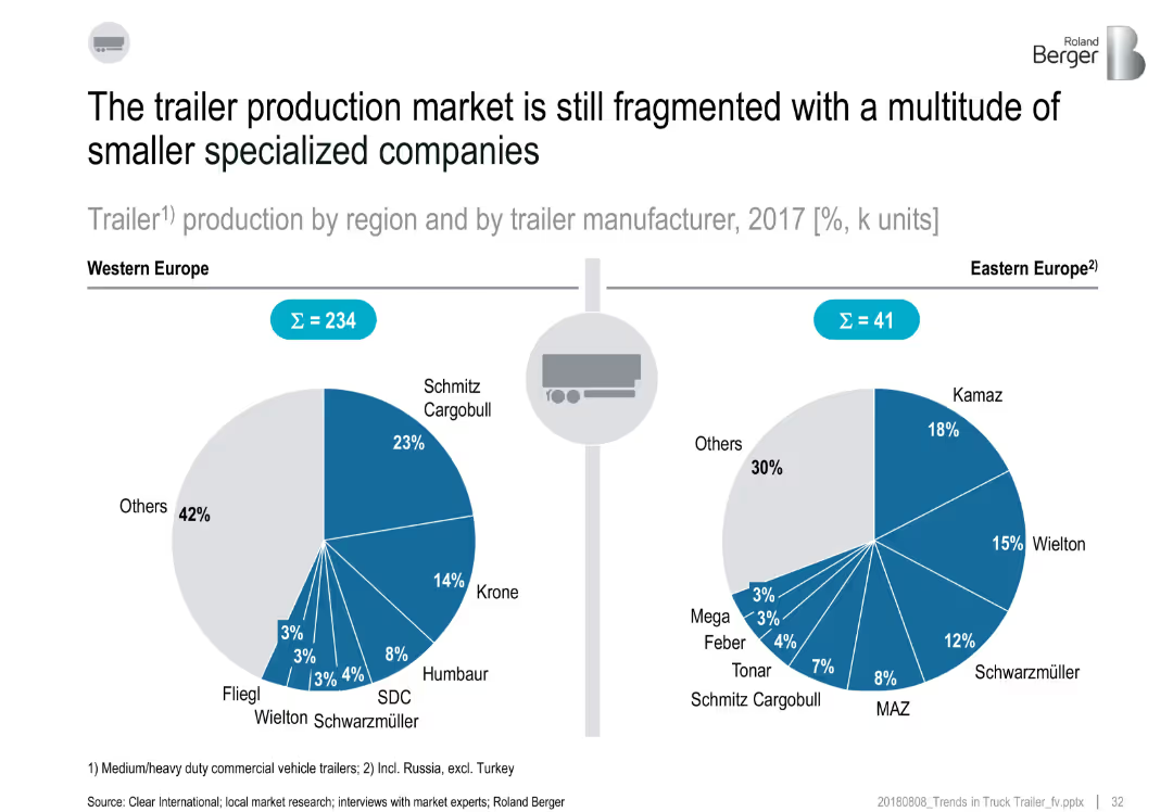
Split layout with two pie charts comparing trailer production market shares (2017) in Western and Eastern Europe; includes manufacturer names and percentages
Market Analysis and Trends
Transportation & Logistics
This slide compares the trailer manufacturing landscape in Western and Eastern Europe. Western Europe shows more dominance by major players like Schmitz Cargobull and Krone, while Eastern Europe is slightly less fragmented. Both regions show a high share of production by "Others," highlighting a fragmented market with many smaller manufacturers.
trailer production, market fragmentation, Western Europe, Eastern Europe, manufacturers, 2017, Schmitz, Krone, Kamaz
Multiple Chart
Roland Berger
Saved
Previous
Next
If nothing, comes up, please save your slides first
Create a FREE account to continue browsing
Receive Instant Access to 1,000+ slides from companies like McKinsey, Google, and Goldman Sachs
First Name
Last Name
Email
Password
I agree to all
Terms & Privacy Policy
Thank you! Your submission has been received!
Oops! Something went wrong while submitting the form.
Have an account?
Sign in
Column Chart
Heatmap
Chevron
Org Chart
Infographic
Callouts
Timeline
List
Graphic
Picture
Process Flow
Diagram
Paragraph
Map
Table
Framework
Subtitle
Takeaway Box
Icon
Other Chart
Radar Chart
Waterfall Chart
Mekko Chart
Pie Chart
Scatter Plot
Line Chart
Bar chart
Bullet points