Create a FREE Account
Instant access to 1,000+ real slides from top companies like McKinsey, BCG, Goldman Sachs, Google and many more!
First Name
Last Name
Email
Password
I agree to all
Terms & Privacy Policy
Thank you! Your submission has been received!
Oops! Something went wrong while submitting the form.
Have an account?
Sign in
Library
Templates
Courses
Pricing
My Account
My Slides
My Templates
✦ AI
AI Prompt Library
AI Search
Sign in
Start Here
Logout
My Saved Slides
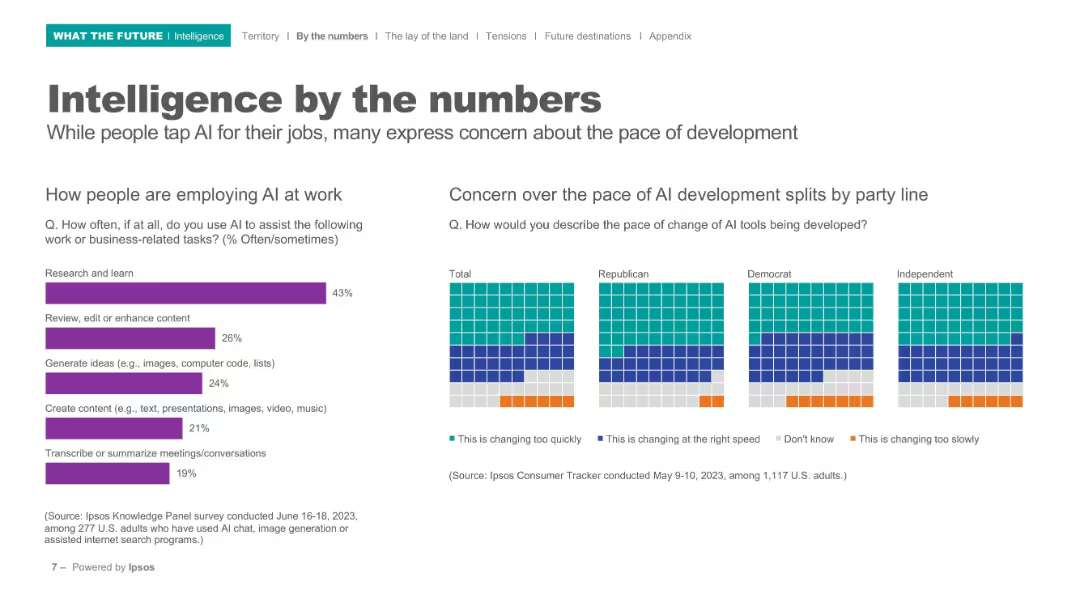
Left bar chart for work-related AI usage, right grid matrix for political view comparison; minimalistic layout.
Operational Efficiency
Artificial Intelligence
Demonstrates how people are using AI at work (e.g., research, content editing, summarizing). Also shows concern levels over AI’s development pace, broken down by political affiliation.
workplace AI, political views, research, productivity, AI development, Ipsos, pace of change
Multiple Chart
IPSOS
Saved
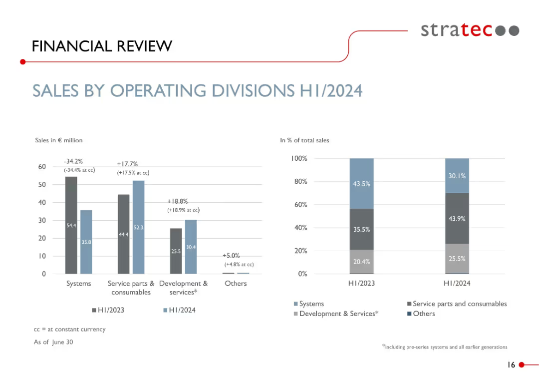
Dual bar charts: left shows YoY change in € sales by division; right shows % of total sales by category. Clean business-style design.
Performance Metrics and KPIs
Healthcare & Pharmaceuticals
Illustrates the H1/2024 revenue composition by operating division. Notable changes include a 34% decline in systems sales and growth in service parts and development services. Visualizes both absolute and proportional sales mix.
sales by division, diagnostics, consumables, systems, revenue mix, H1/2024, KPIs, STRATEC
Multiple Chart
Goldman Sachs
Saved
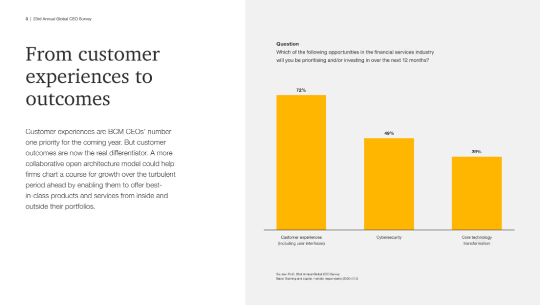
This slide includes a table displaying compliance review results over several years. It includes percentages for compliant, non-compliant, and those requiring improvement, accompanied by a brief description of the audit process and results.
Client Case Studies
Professional Services
The slide reviews the compliance status of audit engagements, showing improvement trends and emphasizing PwC's commitment to audit quality and adherence to regulatory standards.
Compliance, audit, regulatory standards, engagement reviews, audit quality
Mixed Chart
PwC/Strategy&
Saved
Two graphs showing growth trends: an area graph for client accounts and a column chart for client equity.
Financial Performance
Financial Services
Depicts IBKR's growth trajectory through area and column charts, detailing increased client accounts and equity, suggesting robust platform performance.
IBKR, Growth, Client Accounts, Client Equity, Area Graph, Column Chart, Financial Markets, Interconnectedness
Multiple Chart
Goldman Sachs
Saved
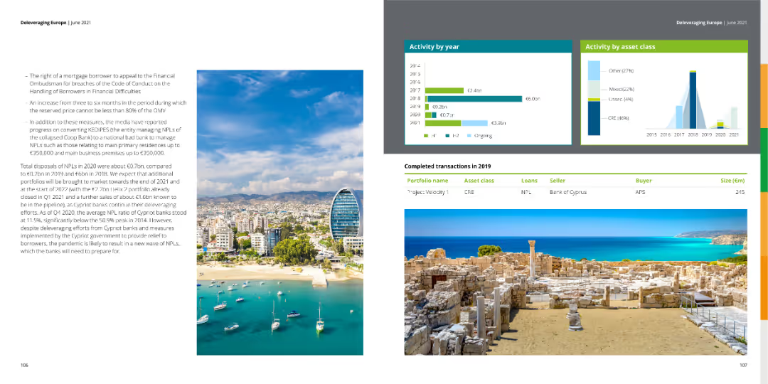
The slide presents tables of completed transactions for 2019, along with bar charts showing activity by year and asset class. The left side contains a dense text block discussing NPL volumes and bank actions.
Market Analysis and Trends
Financial Services
The slide offers a detailed overview of financial activities by year and asset class, including completed transactions in 2019, with insights into trends and strategic bank actions.
activity, transactions, asset class, trends, NPL
Multiple Chart
Deloitte
Saved
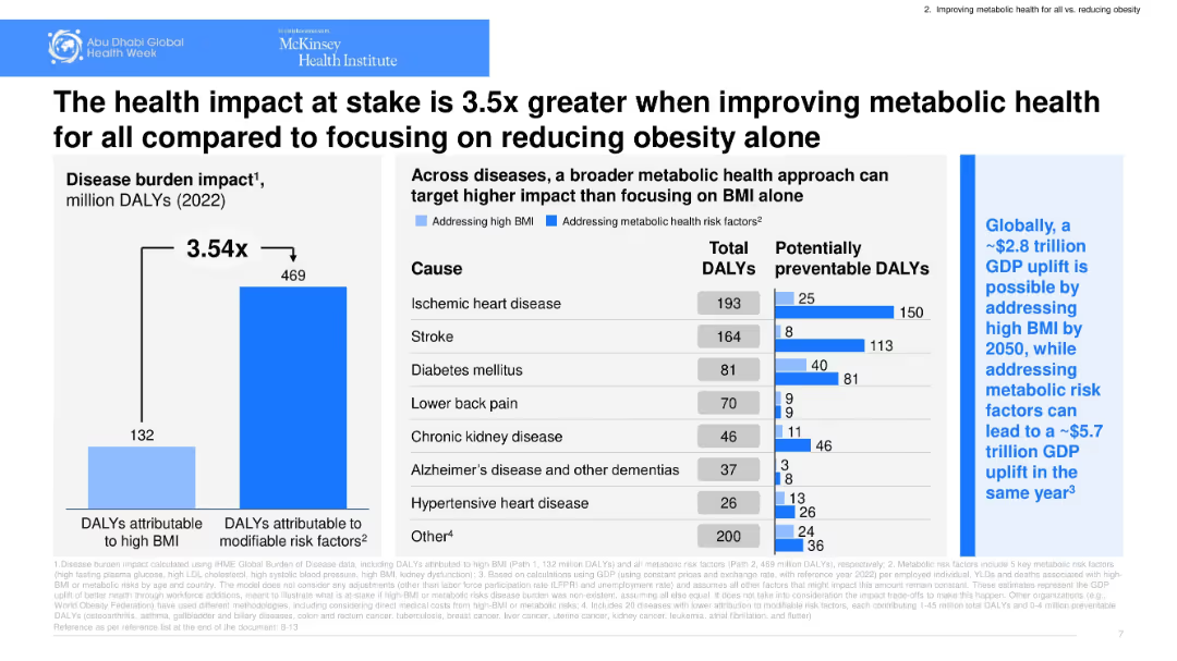
Bar chart comparing DALYs, table of disease causes, blue-on-white clinical design.
Risk Assessment and Management
Healthcare & Pharmaceuticals
Emphasizes that addressing broad metabolic risk factors has a far greater health impact than focusing solely on BMI. Includes breakdown of disease burden and potentially preventable DALYs. Links to economic benefits.
DALYs, metabolic risk, disease burden, public health, GDP impact
Multiple Chart
McKinsey
Saved
Displays a circular diagram detailing the nine dimensions of organizational health, supplemented by statistics and performance impacts in side pie charts.
Human Resources and Talent Management
Professional Services
This slide advocates for regular assessments of organizational health across nine critical dimensions to better integrate SDG strategies into the core business processes, highlighting how such practices can lead to enhanced performance and competitive advantage.
Organizational Health, SDG Strategy, Performance Improvement, Competitive Advantage
Multiple Chart
McKinsey
Saved
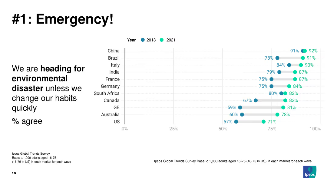
A dot plot showing the percentage of people agreeing that we are heading for environmental disaster unless habits change, comparing data from 2013 and 2021 across several countries.
Risk Assessment and Management
Environmental Services & Sustainability
The slide presents a critical view of global perceptions regarding environmental disaster. It compares data from 2013 and 2021, highlighting the urgency and growing awareness of the need for environmental action.
environmental disaster, global awareness, risk management, perception change, comparative data
Mixed Chart
IPSOS
Saved
Includes a line graph and a pie chart showing market share and revenue mix with institutional and corporate clients from 2014 to 2018.
Financial Performance
Financial Services
Analyzes JP Morgan's market share growth with institutional and corporate clients, showing sustained growth and client diversity.
market growth, institutional clients, corporate clients, revenue
Multiple Chart
JP Morgan
Saved
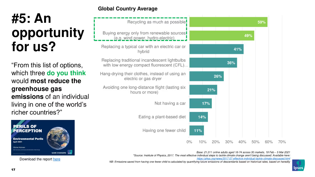
Column chart of actions to reduce greenhouse gas emissions, highlighting recycling and renewable energy
Market Analysis and Trends
Environmental Services & Sustainability
The slide asks which actions most reduce greenhouse gases, with recycling and renewables as top choices
greenhouse gas, emissions, recycling, energy, actions
Mixed Chart
IPSOS
Saved
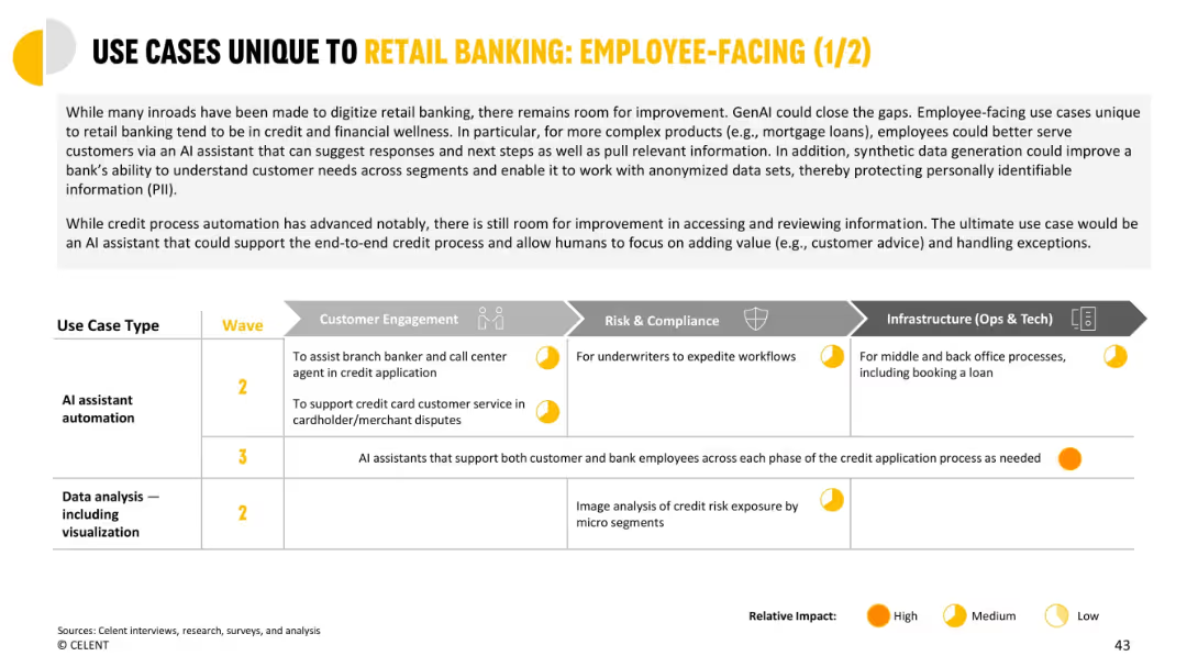
Grid chart organizing use cases across business functions like risk, engagement, and infrastructure.
Human Resources and Talent Management
Financial Services
Focuses on how GenAI can support employees in credit and dispute processes. Shows cross-functional benefits in workflows like underwriting and back-office processing. Medium to high impact predicted.
employee-facing, GenAI, credit application, underwriting, customer service, infrastructure
Mixed Chart
Oliver Wyman
Saved
Comparative charts detailing monthly sales changes for passenger vehicles in multiple countries, using color-coded bars.
Market Analysis and Trends
Transportation & Logistics
Reviews the recovery in passenger vehicle sales post-pandemic, useful for market analysis and predicting future consumer behavior in the auto industry.
auto sales, market recovery, pandemic impact, consumer behavior, sales analysis
Multiple Chart
BCG
Saved
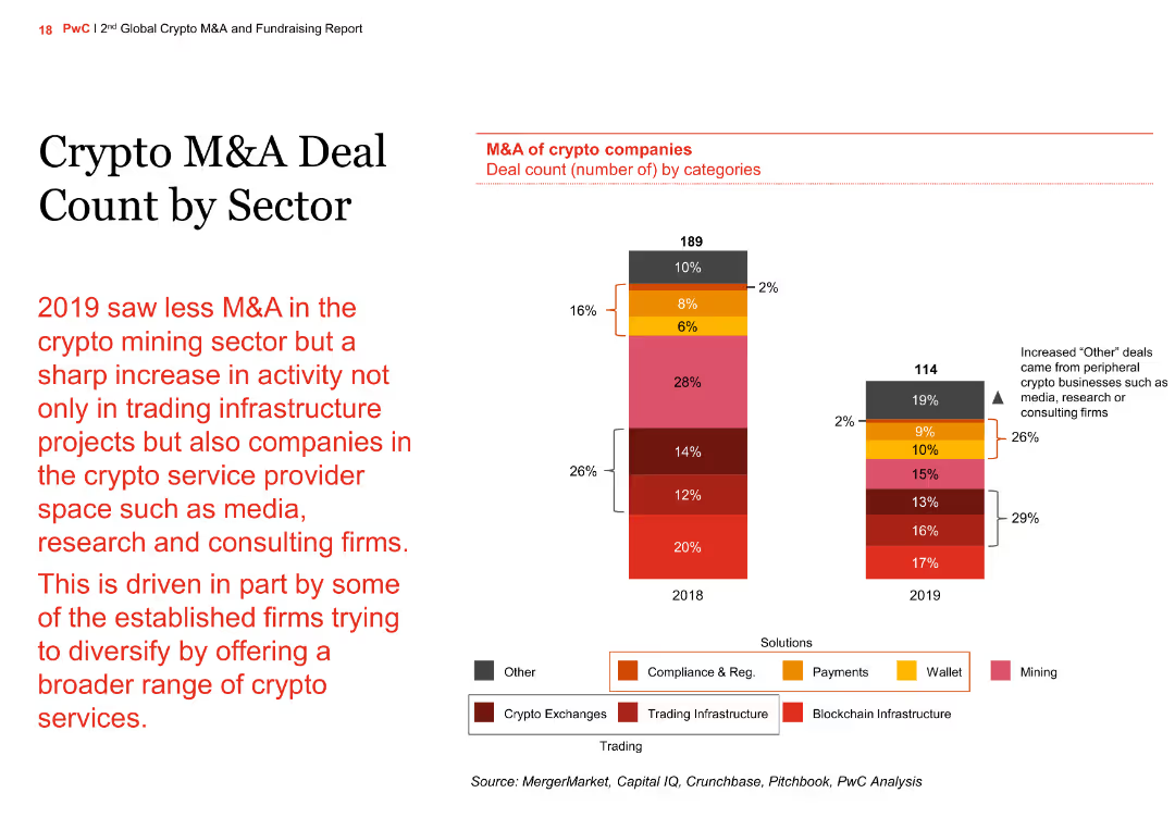
This slide includes a column chart showing the number of M&A deals by sector for the years 2018 and 2019. Sectors include mining, trading, and various service providers like media, research, and consulting.
Market Analysis and Trends
Financial Services
The slide highlights the decline in M&A activity in the crypto mining sector in 2019 and an increase in deals within the service provider space, driven by firms diversifying their service offerings.
crypto, M&A, sector, column chart, comparison
Mixed Chart
PwC/Strategy&
Saved
Features bar and line charts comparing 60/40 portfolio returns and stock-bond correlations over time.
Investment Analysis
Financial Services
Explores the annual return decomposition of a 60/40 portfolio and the rolling 12-month correlation between S&P 500 and U.S. 10-year Treasuries.
returns, correlation, stock, bond, portfolio
Multiple Chart
JP Morgan
Saved
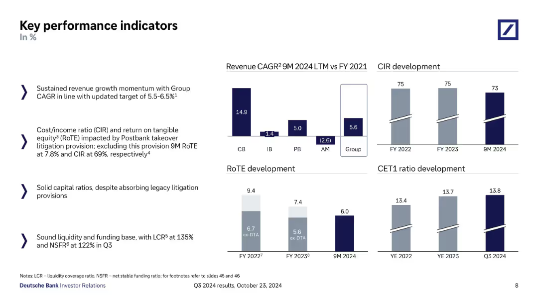
Multi-column layout; left side has bullet points; right side includes bar and column charts for KPIs.
Performance Metrics and KPIs
Financial Services
Presents Deutsche Bank’s performance indicators such as revenue CAGR, CIR, RoTE, CET1 ratio, and liquidity/funding ratios. Visuals show development over time with context about litigation provisions and capital strength.
RoTE, CET1 ratio, CIR, revenue CAGR, liquidity, litigation provision
Multiple Chart
Deutsche Bank
Saved
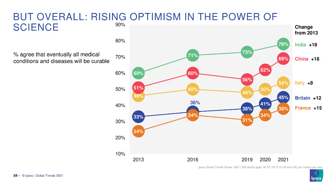
A line graph showing the percentage agreement over time (2013-2021) that all medical conditions will eventually be curable, with trends per country.
Market Analysis and Trends
Healthcare & Pharmaceuticals
The slide presents data on the rising optimism in the curability of all medical conditions, comparing several countries from 2013 to 2021.
Science, Optimism, Curability, Trends, Countries
Single Chart
IPSOS
Saved
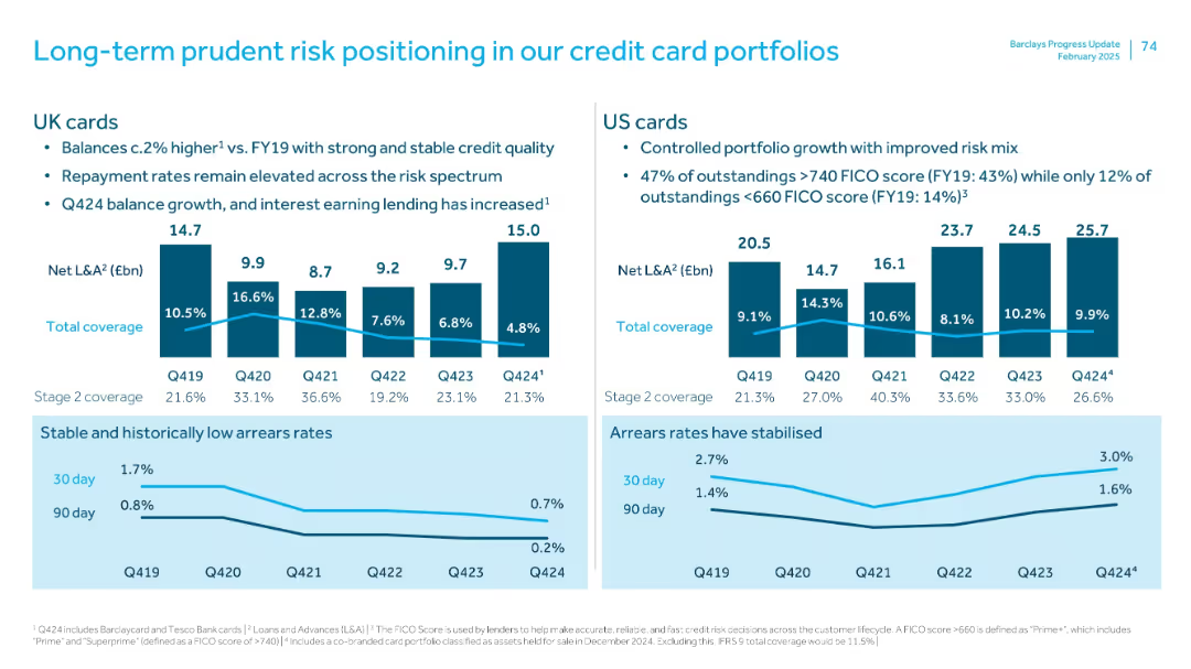
Dual-column format: UK cards (left), US cards (right); bar and line charts of net balances, coverage, and arrears trends
Risk Assessment and Management
Financial Services
This slide assesses credit card risk across UK and US segments. It shows net loans & advances, total and Stage 2 coverage, and arrears rates. Trends show stabilization and improvement in credit quality, aided by portfolio control, higher FICO score proportions, and strong repayment rates.
credit cards, risk coverage, arrears, FICO score, Stage 2, loan balances
Multiple Chart
Barclays
Saved
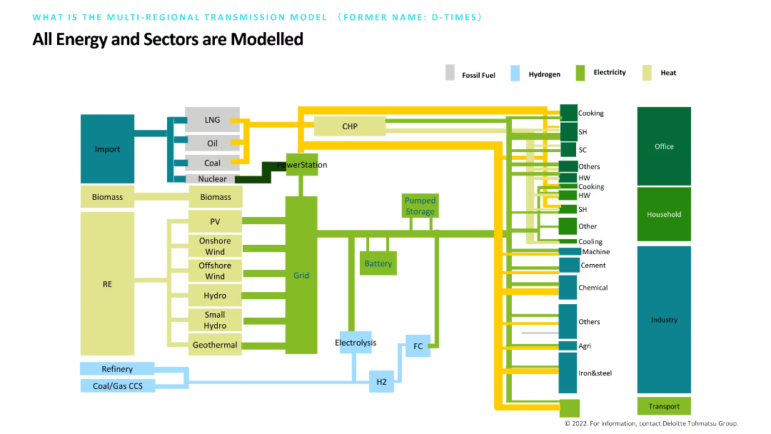
Features a detailed diagram with various energy sources and their connections to different sectors like household, industry, and transport. Each type of energy (fossil fuel, hydrogen, electricity, heat) is color-coded. The slide aims to model all energy and sector interactions comprehensively.
Market Analysis and Trends
Energy & Utilities
Provides a comprehensive model of how different energy sources interact with various sectors. The diagram helps in understanding the flow and impact of energy within households, industries, and transportation, aiming for a holistic view of energy modeling.
Energy, Sectors, Model, Fossil Fuel, Hydrogen
Diagram
Deloitte
Saved
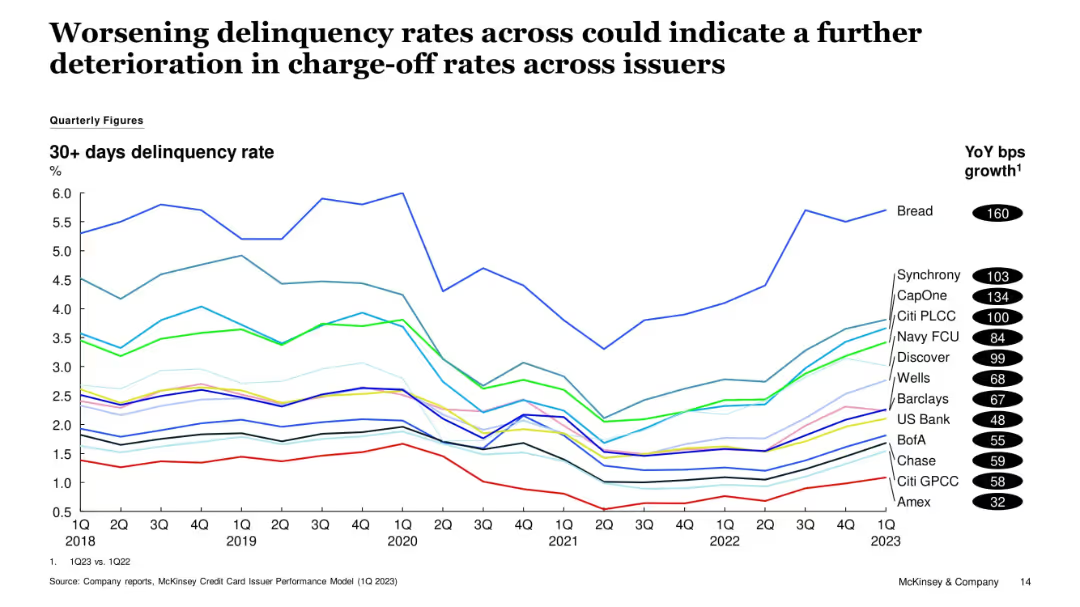
Time series line chart showing 30+ days delinquency rates by issuer from 1Q18 to 1Q23. Bread shows the highest increase. YoY bps growth listed on the right.
Risk Assessment and Management
Financial Services
The chart shows a worsening trend in delinquency rates among issuers, especially Bread, CapOne, and Synchrony. This suggests potential for higher future charge-off rates. The data spans 5 years with consistent issuer tracking.
Delinquencies, Credit Cards, CapOne, Synchrony, Bread, Risk Trends
Single Chart
McKinsey
Saved
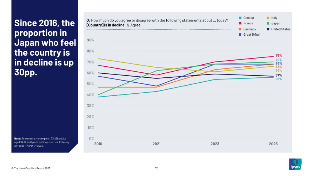
Line chart showing trends (2016–2025) in agreement with the “is in decline” statement across selected countries. Color-coded lines show country-specific sentiment shifts over time.
Market Analysis and Trends
Government & Public Sector
This chart tracks public agreement with the belief that one’s country is in decline across multiple nations. Japan shows the most dramatic increase (+30pp) since 2016, while other countries such as France, U.S., and U.K. exhibit more stable or varied trajectories.
trends, country sentiment, decline perception, Ipsos, public opinion, Japan, international comparison, long-term view
Mixed Chart
IPSOS
Saved
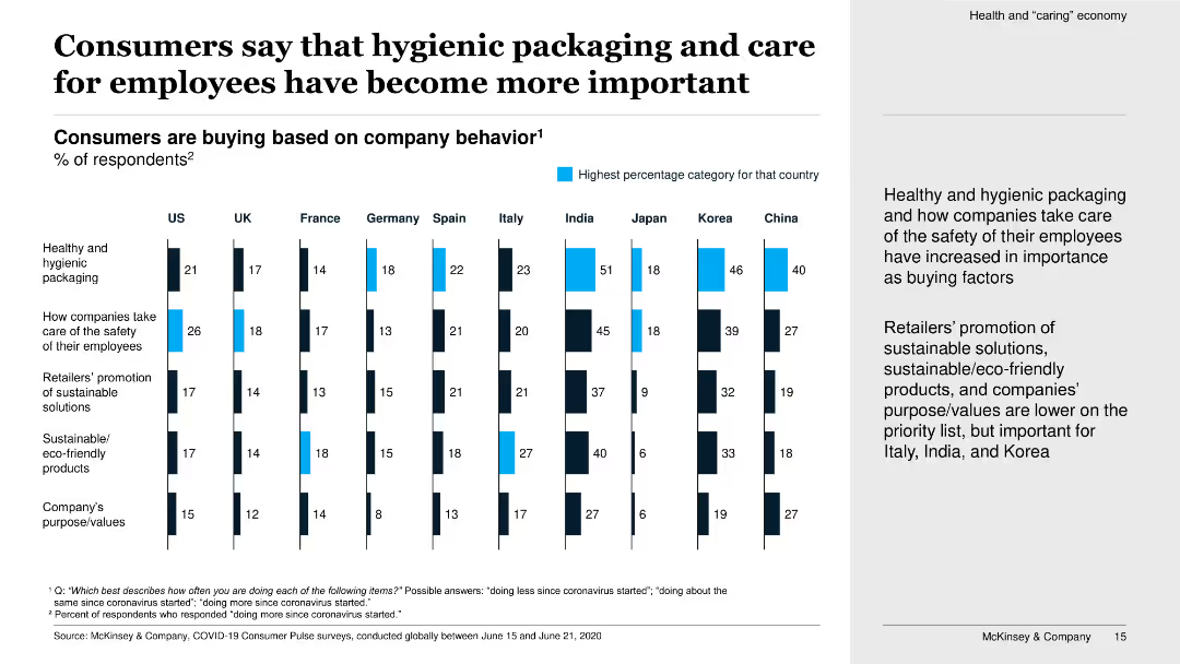
This slide features vertical bar charts showing the percentage of consumers buying based on company behavior regarding hygienic packaging and employee care.
Market Analysis and Trends
Retail & E-commerce
The slide focuses on the increased importance of hygienic packaging and employee care for consumers when buying, with significant variations across countries.
hygienic packaging, employee care, company behavior, consumer buying, bar charts, importance, survey, cross-country comparison
Multiple Chart
McKinsey
Saved
The slide shows a column chart comparing the cost of road freight in Australia, the US, and France, including factors like CO2 emissions, typical freight distances, and maximum HV capacity.
Market Analysis and Trends
Industrial & Manufacturing
It analyzes the higher cost of road freight in Australia compared to the US and France, citing various factors contributing to this disparity, including driver shortages and regulatory differences.
road freight, cost comparison, Australia, US, France, CO2 emissions
Mixed Chart
LEK
Saved
A slide featuring a several bar graphs detailing perceptions of systemic racism across various institutions.
Market Analysis and Trends
Professional Services
Highlights survey results on the perceptions of systemic racism within different societal institutions among Millennials and Gen Z.
Systemic Racism, Institutions, Survey, Millennials, Gen Z, Perceptions, Society, Workplace
Mixed Chart
Deloitte
Saved
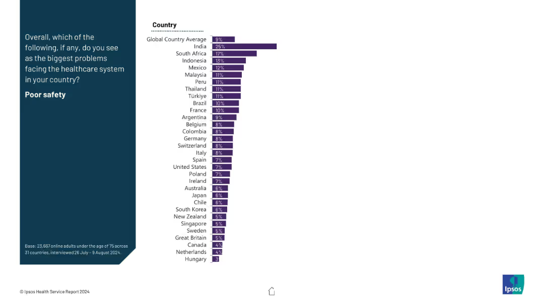
Similar layout with horizontal bar chart; ranks concern by country. Left section contains the title and question.
Risk Assessment and Management
Healthcare & Pharmaceuticals
The slide ranks global perceptions about safety within healthcare systems. India and South Africa lead in concern. Most developed countries report low concern, suggesting systemic safety variance.
healthcare safety, patient protection, system reliability, risk, safety concerns, global perception
Mixed Chart
IPSOS
Saved
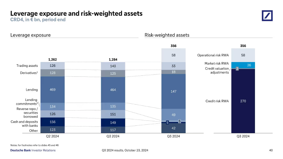
Side-by-side bar charts: left for leverage exposure by asset class, right for risk-weighted assets with detailed breakdowns.
Risk Assessment and Management
Financial Services
Displays Q3 2024 data for €1,284bn in leverage exposure and €356bn in risk-weighted assets. Breaks down exposure across trading, lending, repo, cash, and others; risk-weighted assets include credit, market, and operational risk.
Leverage, Risk-Weighted Assets, Credit Risk, Exposure, Q3 2024
Multiple Chart
Deutsche Bank
Saved
Previous
Next
If nothing, comes up, please save your slides first
Create a FREE account to continue browsing
Receive Instant Access to 1,000+ slides from companies like McKinsey, Google, and Goldman Sachs
First Name
Last Name
Email
Password
I agree to all
Terms & Privacy Policy
Thank you! Your submission has been received!
Oops! Something went wrong while submitting the form.
Have an account?
Sign in
Column Chart
Heatmap
Chevron
Org Chart
Infographic
Callouts
Timeline
List
Graphic
Picture
Process Flow
Diagram
Paragraph
Map
Table
Framework
Subtitle
Takeaway Box
Icon
Other Chart
Radar Chart
Waterfall Chart
Mekko Chart
Pie Chart
Scatter Plot
Line Chart
Bar chart
Bullet points