Create a FREE Account
Instant access to 1,000+ real slides from top companies like McKinsey, BCG, Goldman Sachs, Google and many more!
First Name
Last Name
Email
Password
I agree to all
Terms & Privacy Policy
Thank you! Your submission has been received!
Oops! Something went wrong while submitting the form.
Have an account?
Sign in
Library
Templates
Courses
Pricing
My Account
My Slides
My Templates
✦ AI
AI Prompt Library
AI Search
Sign in
Start Here
Logout
My Saved Slides
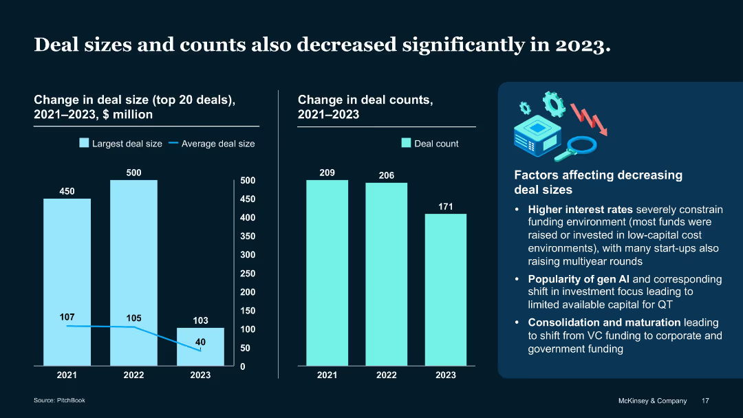
Dual column charts and text box on influencing factors
Performance Metrics and KPIs
Artificial Intelligence
Examines shrinking average deal size ($40M in 2023) and falling deal count (171). Cites high interest rates, AI investment popularity, and funding consolidation as major drivers.
Deal count, VC environment, QT investment, capital size, 2023 trends
Multiple Chart
McKinsey
Saved
Describes DEI initiatives, including tying executive compensation to DEI goals and fostering an inclusive culture.
Strategic Planning
Professional Services
Highlights DEI as a key element of the firm's growth plans and client mission needs.
DEI, diversity, equity, inclusion, leadership, innovation
Text Only
Booz Allen Hamilton
Saved
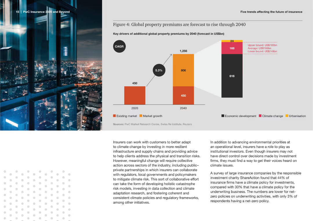
The slide features a bar chart forecasting additional global property premiums by 2040, broken down by economic development, climate change, and urbanization. It shows projections in existing and growth markets.
Market Analysis and Trends
Financial Services
This slide presents forecasts for the rise in global property premiums through 2040, attributing increases to factors like economic development, climate change, and urbanization. It offers insights into future market growth and risks.
Property Premiums, Forecast, Insurance, Market Growth, Climate Change, Urbanization, Economic Development, Bar Chart, Trends, Projections
Mixed Chart
PwC/Strategy&
Saved
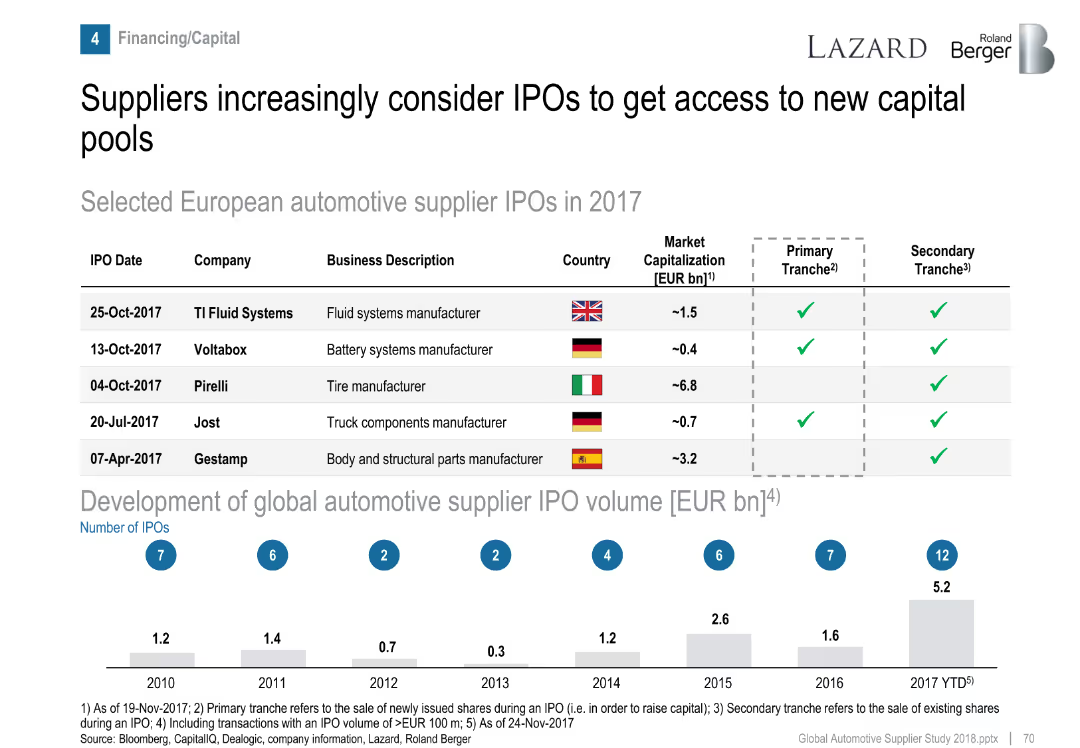
Table of IPOs and bar graph of historical IPO volumes.
Corporate Finance and Valuation
Industrial & Manufacturing
Highlights five European automotive supplier IPOs in 2017 and presents a trend in global IPO volume growth, indicating increased interest in capital markets by suppliers.
IPO, automotive suppliers, capital access, financing, market trends
Mixed Chart
Roland Berger
Saved
This slide contains multiple pie charts, a column chart, and detailed text sections.
Financial Performance
Financial Services
The slide presents a financial comparison of firmwide assets and management fees, along with asset mix and regional distribution.
Assets, Management, Wealth, Distribution, Pie Chart, Column Chart, Financial, Regional, Supervision, Fees
Multiple Chart
Goldman Sachs
Saved
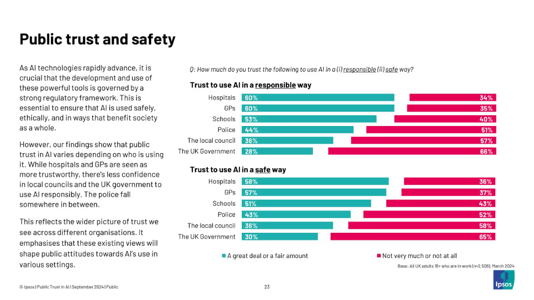
Two sets of horizontal bar charts on the right, comparing “Trust to use AI responsibly” and “Trust to use AI safely” across public institutions. Left-aligned explanatory text.
Risk Assessment and Management
Artificial Intelligence
This slide explores varying public trust levels in institutions using AI. Hospitals and GPs are trusted the most, while the UK Government and local councils rank lowest. Trust levels are split between “a great deal/fair amount” and “not very much/not at all,” indicating skepticism about responsible and safe AI use. This illustrates the role of institutional reputation in AI governance.
trust, AI safety, responsible use, healthcare, government, public perception, ethics, regulation, UK institutions
Mixed Chart
IPSOS
Saved
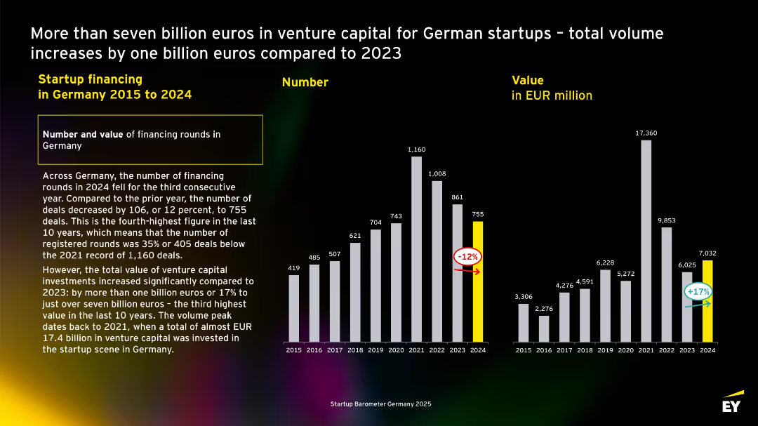
Dual bar charts comparing number and value of deals from 2015–2024. Highlighted values for 2024, black background with high contrast.
Investment Analysis
Professional Services
Highlights that while the number of startup financing rounds in Germany decreased in 2024, the total value of investments increased by 17%, signaling higher-value funding rounds despite fewer deals.
Germany, startup funding, venture capital, 2024, investment volume, deal count, EY, trends, growth, value
Multiple Chart
EY
Saved
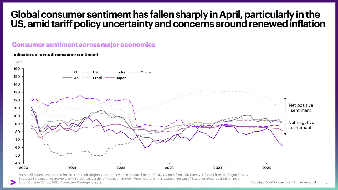
Line chart comparing consumer sentiment across countries from 2020 to 2025. Minimalist layout with gray and purple tones and a sentiment axis.
Market Analysis and Trends
Consumer Goods
The slide depicts a notable decline in US consumer sentiment due to tariff-related policy uncertainty and inflation concerns. It compares trends across global economies, highlighting diverging consumer confidence levels.
consumer sentiment, US, tariffs, inflation, global comparison, trends, economic confidence, surveys
Single Chart
Accenture
Saved
The slide includes a stacked bar chart showing how respondents manage their investments, with different categories.
Operational Efficiency
Financial Services
The slide discusses the various methods respondents use to manage their investments, including advisors and self-directed approaches.
Management, Investments, Advisors, Self-Directed, Pension
Single Chart
IPSOS
Saved
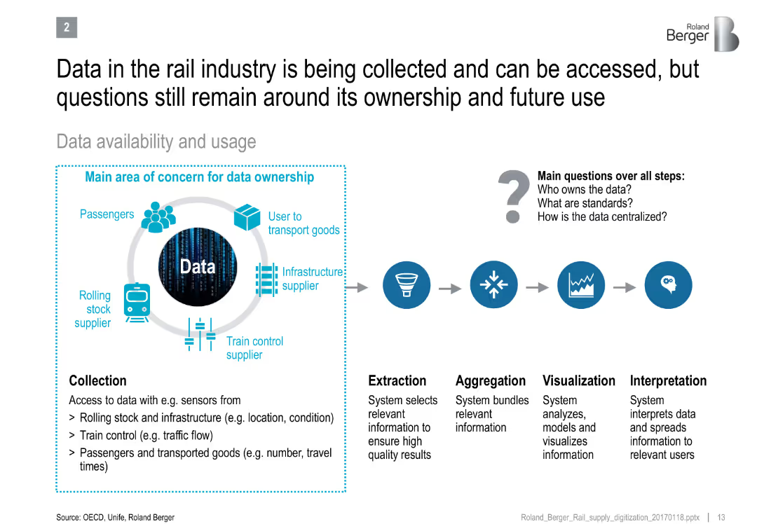
Diagram showing data flow from collection to interpretation, with concern areas around ownership and standards
Technology and Digital Transformation
Transportation & Logistics
Explains the lifecycle of rail industry data usage and the unclear governance issues around data ownership, standardization, and centralization.
rail industry, data ownership, IoT, data lifecycle, interpretation, infrastructure, digital systems
Diagram
Roland Berger
Saved
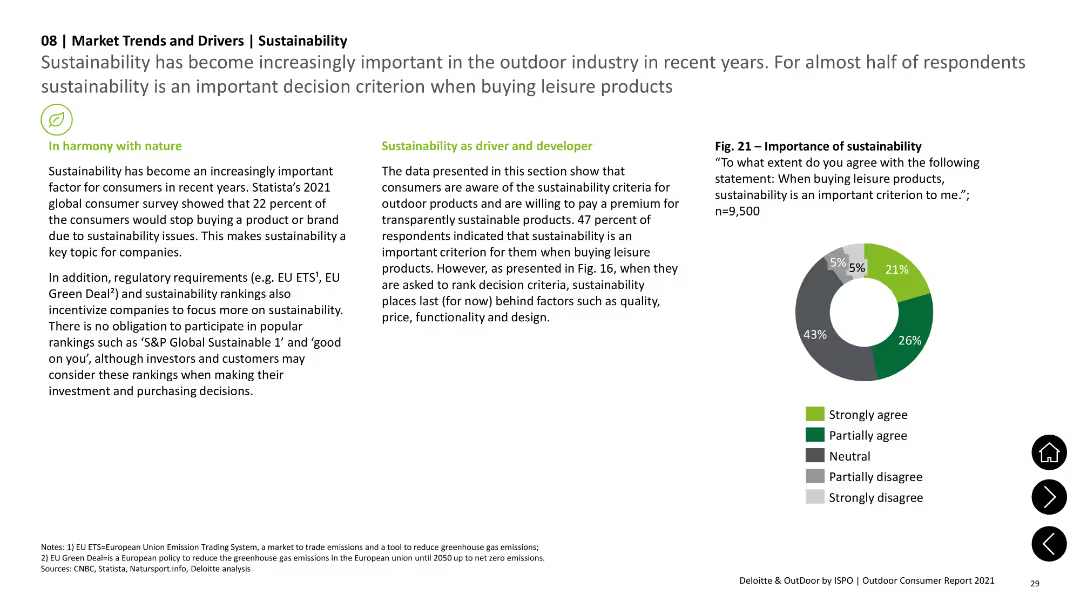
Includes pie chart showing agreement levels on the importance of sustainability in buying decisions, with supporting text on trends and regulations.
Technology and Digital Transformation
Environmental Services & Sustainability
Highlights the importance of sustainability in consumer decision-making and the impact of regulatory requirements on corporate focus on sustainability.
Sustainability, Consumer, Trends, Regulations, Importance
Mixed Chart
Deloitte
Saved
Diagram of a microservices ecosystem connected through an AI hub, featuring various procurement technology tools.
Technology and Digital Transformation
Technology & Software
Envisions the future of procurement technology as a decentralized ecosystem driven by AI, highlighting integration of various tech platforms.
procurement, AI, technology, future, ecosystem
Diagram
Kearney
Saved
Includes bubble charts and linear indicators to evaluate digital transformation's impact in media, with focuses on personalized content and OTT services.
Market Analysis and Trends
Media & Entertainment
Evaluates the $1.3 trillion potential from digital transformation in media, stressing the role of OTT and personalized advertising.
Media, Digital Transformation, Personalization, OTT, Industry Value
Mixed Chart
Accenture
Saved
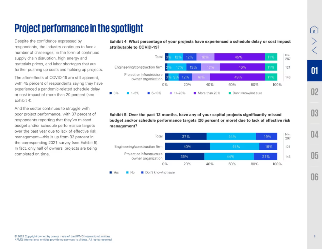
Two-column layout with text on the left and two horizontal bar charts on the right (Exhibits 4 & 5). Blue and purple gradient bars represent survey percentages.
Performance Metrics and KPIs
Real Estate & Construction
Highlights how COVID-19 continues to impact project performance, with many projects experiencing delays or cost increases. Exhibit 4 shows the extent of COVID-related schedule delays, while Exhibit 5 reveals that 37% of projects missed targets due to ineffective risk management. The slide emphasizes ongoing struggles in project delivery despite some return to confidence post-pandemic.
COVID-19 impact, project delay, cost overrun, risk management, schedule, survey data, construction, performance issues, engineering, metrics
Multiple Chart
KPMG
Saved
Two line charts comparing CEO remuneration opportunities at target and maximum performance across various countries, emphasizing the significant outlier status of the US in terms of total compensation.
Market Analysis and Trends
Financial Services
The slide illustrates the variation in CEO remuneration opportunities across different countries, showing that the US has significantly higher levels compared to other regions.
Remuneration, Geography, CEO, Performance, Compensation
Multiple Chart
Deloitte
Saved
An advanced layout that includes a series of bar graphs comparing the company's CRE concentration to its peers. Each bar graph is dedicated to a different aspect of CRE concentration, such as "Other CRE," "Multifamily," and "Office CRE." The slide is information-dense, using different shades of blue and gray to differentiate between the company and its peers.
Competitive Landscape
Financial Services
The slide compares the company’s commercial real estate (CRE) concentration to that of its peers, highlighting a strategic position of having the lowest CRE concentration. It serves to underline the company's prudent risk management practices in loan portfolio distribution.
CRE Concentration, Competitive Analysis, Risk Management, Real Estate, Loan Portfolio, Peer Comparison, Strategy, Market Position
Multiple Chart
Morgan Stanley
Saved
The layout includes values, icons, and a data flow diagram. The design is clean, with blue color accents and data-related imagery.
Technology and Digital Transformation
Technology & Software
Details how the breadth and scale of the firm's data are being transformed into value-added products for clients through various tools and services.
Data transformation, payment accounts, merchant acquiring, digital identity, data governance, biometrics, customer insights, identity verification
Header Horizontal
JP Morgan
Saved
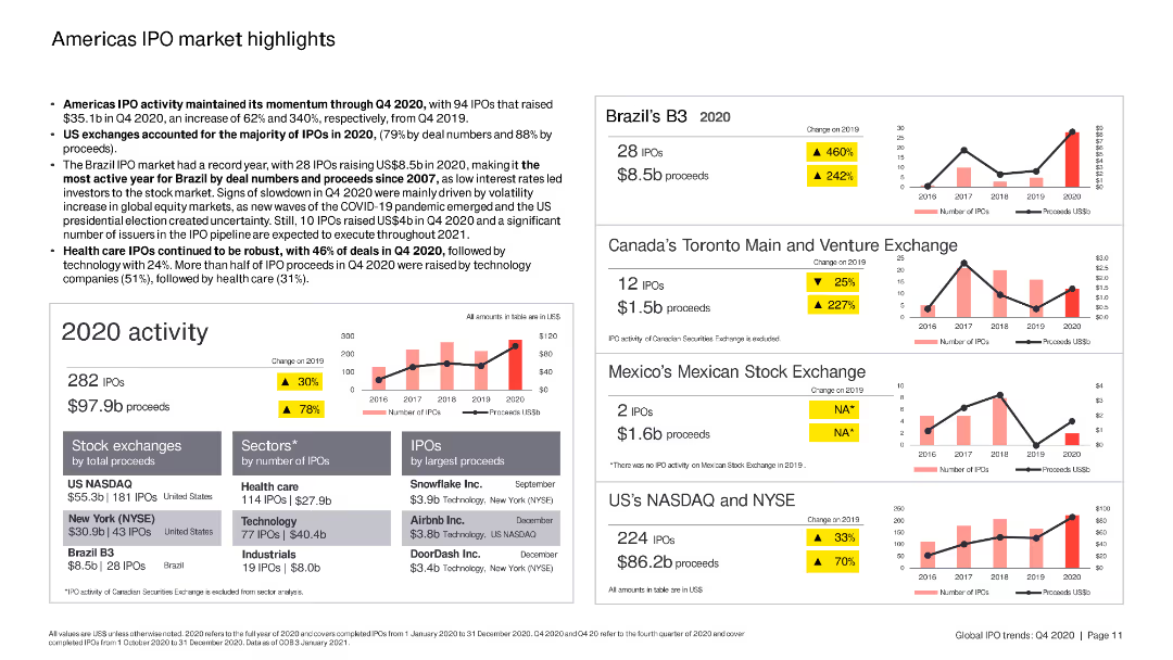
The slide includes column charts and bar charts summarizing IPO activity in the Americas, with specific focus on Brazil, Canada, and the US.
Market Analysis and Trends
Financial Services
The slide highlights key IPO trends in the Americas, focusing on the performance of various stock exchanges, sectors, and top IPOs by proceeds in 2020.
Americas, IPO, Brazil, Canada, US
Multiple Chart
EY
Saved
Features a combination of column charts and line graphs in grayscale and green, highlighting brand popularity in the second-hand market.
Market Analysis and Trends
Retail & E-commerce
Analyzes brand performance in the second-hand luxury market versus new goods market, with specific focus on brands like Alexander McQueen.
brand popularity, second-hand market, luxury goods, market analysis, brand performance
Single Chart
BCG
Saved
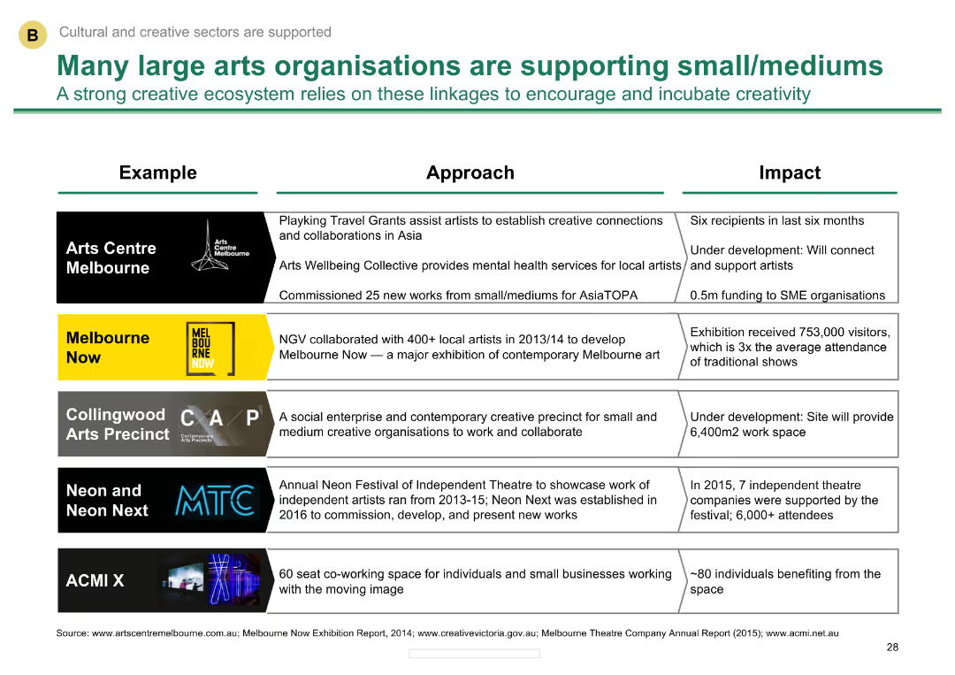
Comparative layout with examples of large arts organizations and their support initiatives
Client Case Studies
Media & Entertainment
Describes how large arts organizations in Melbourne support small and medium creative businesses, detailing specific programs and impacts.
Support initiatives, large organizations, small/medium businesses, Melbourne, arts support
Table
BCG
Saved
This slide compares growth in spending across different categories for Gen Z and Millennials, using bubble charts to represent the data visually. The layout is dynamic and clearly segregates data by demographic and category.
Market Analysis and Trends
Retail & E-commerce
Examines the fastest-growing spending categories for Gen Z and Millennials, providing insight into consumer behavior and market opportunities. Useful for retailers and marketers targeting these demographics.
Consumer Behavior, Millennials, Gen Z, Retail
Multiple Chart
Accenture
Saved
Utilizes bar charts and feedback scales to show the response effectiveness of organizations to harassment reports from Gen Z and Millennials. The layout is straightforward, focusing on readability and direct data presentation.
Market Analysis and Trends
Professional Services
This slide evaluates how well organizations handle reports of harassment from Gen Z and Millennials, highlighting the dissatisfaction with current workplace responses.
harassment response, organizational handling, Gen Z, Millennials, workplace feedback
Mixed Chart
Deloitte
Saved
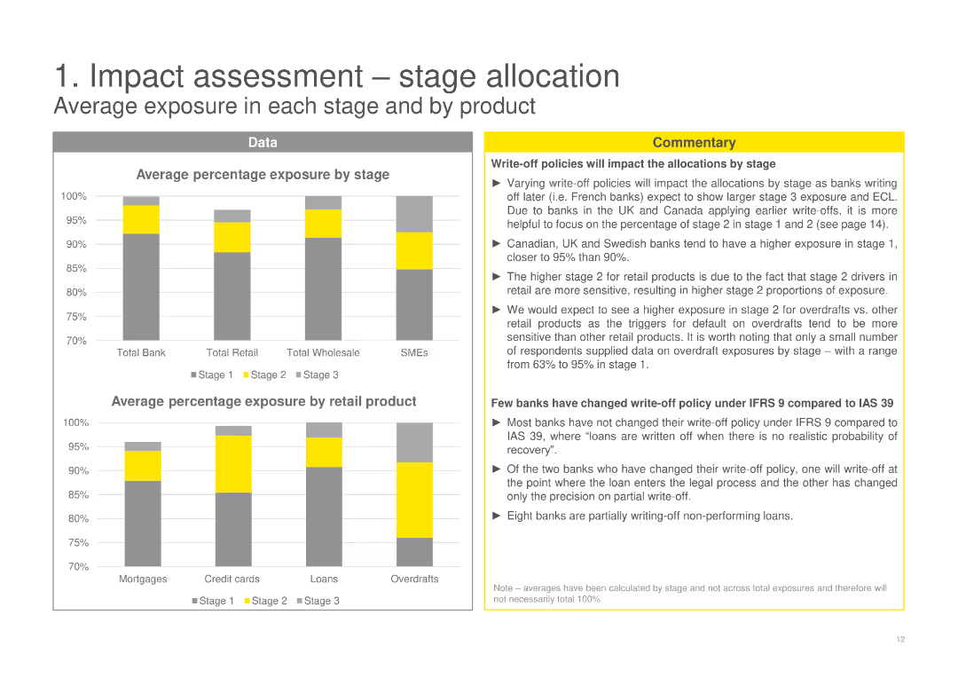
The slide features bar charts showing the average percentage exposure by stage and by product, with textual commentary on write-off policies.
Risk Assessment and Management
Financial Services
Analyzes average exposure by stage and product, with commentary on how write-off policies impact stage allocations for various products.
stage allocation, average exposure, retail product, write-off policies, IFRS 9, data-driven, bar charts
Multiple Chart
EY
Saved
Slide includes detailed bar charts showing costs breakdown for FY 2023 and Q4, with annotations explaining key variances and effects.
Financial Performance
Financial Services
Analyzes adjusted costs for FY 2023 and Q4, emphasizing changes in compensation, IT, and professional services.
cost analysis, FY 2023, Q4 2023, financial management, expenses
Multiple Chart
Deutsche Bank
Saved
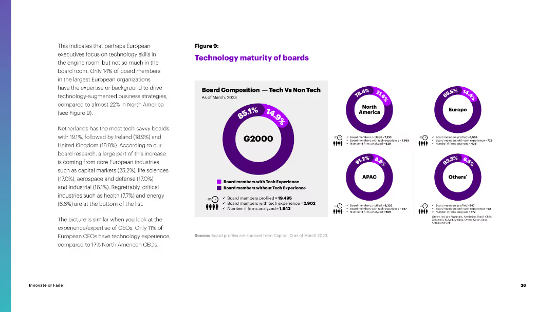
Circular diagrams comparing the tech experience of board members in North America, Europe, APAC, and other regions.
Organizational Structure and Change
Professional Services
The slide compares the technology maturity of boards across regions, highlighting the percentage of board members with tech experience.
technology, boards, North America, Europe, APAC, tech experience, board composition
Multiple Chart
Accenture
Saved
Previous
Next
If nothing, comes up, please save your slides first
Create a FREE account to continue browsing
Receive Instant Access to 1,000+ slides from companies like McKinsey, Google, and Goldman Sachs
First Name
Last Name
Email
Password
I agree to all
Terms & Privacy Policy
Thank you! Your submission has been received!
Oops! Something went wrong while submitting the form.
Have an account?
Sign in
Column Chart
Heatmap
Chevron
Org Chart
Infographic
Callouts
Timeline
List
Graphic
Picture
Process Flow
Diagram
Paragraph
Map
Table
Framework
Subtitle
Takeaway Box
Icon
Other Chart
Radar Chart
Waterfall Chart
Mekko Chart
Pie Chart
Scatter Plot
Line Chart
Bar chart
Bullet points