Create a FREE Account
Instant access to 1,000+ real slides from top companies like McKinsey, BCG, Goldman Sachs, Google and many more!
First Name
Last Name
Email
Password
I agree to all
Terms & Privacy Policy
Thank you! Your submission has been received!
Oops! Something went wrong while submitting the form.
Have an account?
Sign in
Library
Templates
Courses
Pricing
My Account
My Slides
My Templates
✦ AI
AI Prompt Library
AI Search
Sign in
Start Here
Logout
My Saved Slides
The slide features a line graph tracking CEO optimism versus pessimism over time, alongside a detailed analysis. The layout is clean with a balance of text and visual data.
Market Analysis and Trends
Professional Services
Depicts a shift in CEO sentiment towards economic growth, showcasing an increasing trend in pessimism. Useful for discussions on market sentiment and planning.
CEO, Pessimism, Optimism, Economic Growth, Survey
Mixed Chart
PwC/Strategy&
Saved
Text-heavy slide with a clear title and several bullet points; includes a timeline highlighting diversity milestones.
Organizational Structure and Change
Professional Services
Discusses the commitment to diversity, equity, and inclusion, showcasing programs and milestones, with the intent of building an inclusive and diverse workforce.
diversity, equity, inclusion, DEI, milestones, talent development, client service, corporate culture
Table
McKinsey
Saved
Circular layout representing a continuous process cycle.
Technology and Digital Transformation
Professional Services
Highlights Deloitte's approach to addressing workforce challenges with a three-part process: imagine, compose, activate.
Workforce, Solutions, Imagine, Compose, Activate
Diagram
Deloitte
Saved
Column charts showing NPL ratios, loan loss provisions, and Stage 2 loans for top UK banks.
Risk Assessment and Management
Financial Services
Analyzes NPL ratios and provisions of major UK banks, highlighting risk management strategies and trends.
UK, banks, NPL, risk, management
Multiple Chart
Deloitte
Saved
Multiple bar and column graphs, with a clean layout displaying JPMorgan's asset management performance metrics.
Financial Performance
Financial Services
This slide aims to communicate JPMorgan's strategy and success in scaling asset management, using data visualizations to highlight growth in various investment types and to position themselves as industry leaders with effective ETFs and SMAs.
scaling, asset management, JPMorgan, ETFs, performance
Multiple Chart
JP Morgan
Saved
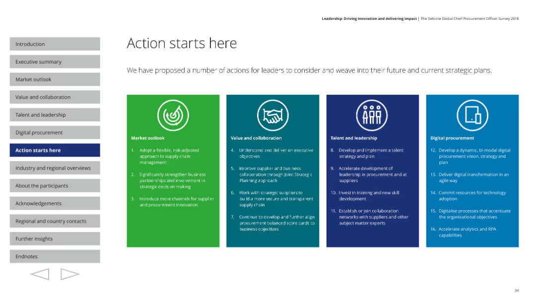
Features a structured layout with four distinct colored sections, each outlining strategic actions across different focus areas like market outlook and leadership.
Strategic Planning
Professional Services
Proposes strategic actions for leaders to integrate into their plans, covering market outlook, collaboration, leadership, and digital procurement.
Strategic actions, market outlook, collaboration, leadership
Pillar
Deloitte
Saved
This slide contains multiple column charts comparing annual operating expenditure, employing a red and grey color scheme to differentiate categories such as total, employee & judge expenditure, and others. Icons at the top indicate court operations, security, and travel, while text sections provide detailed descriptions.
Financial Performance
Government & Public Sector
The slide presents a financial comparison of two courts' expenses, focusing on specific areas such as employee costs and court operations. It's likely used to inform about budget allocation and financial transparency.
expenditure, courts, comparison, finance, operation costs
Mixed Chart
PwC/Strategy&
Saved
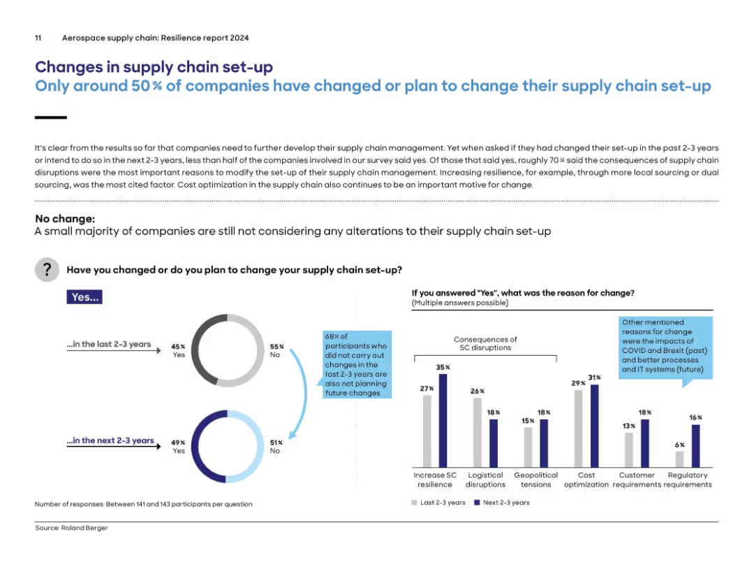
Split design with pie charts on the left showing past and planned changes, and a bar chart on the right detailing reasons for change.
Strategic Planning
Environmental Services & Sustainability
Less than half of companies have changed their supply chain set-up in the past 2–3 years or plan to do so. The main drivers for change were supply chain disruptions, increasing resilience, and cost optimization. The slide features visual data on the proportion of firms that changed, reasons cited, and future intentions, highlighting stagnation in proactive planning.
supply chain, change, resilience, planning, optimization, disruption, aerospace, pie chart
Multiple Chart
Roland Berger
Saved
Dark blue background with a large vertical column chart detailing the global demand for Li-ion battery cells from 2015 to 2040, split into three sectors: mobility, energy storage systems, and consumer electronics.
Market Analysis and Trends
Energy & Utilities
The slide analyzes the growing demand for Li-ion batteries, emphasizing the impact of electric vehicles on this increase. It highlights key insights about market growth expectations and sector contributions.
Li-ion, electric vehicles, market growth, energy storage, consumer electronics
Mixed Chart
McKinsey
Saved
Contains bar graphs and percentage data showcasing the financial impact of AI implementation.
Financial Performance
Financial Services
Highlights key financial benefits and the essential steps businesses take to scale AI initiatives for maximum economic impact.
AI Implementation, Financial Impact, Business Scaling, Economic Benefits, AI Steps, Financial Performance
Mixed Chart
BCG
Saved
Displays column charts detailing assets under management by business unit and product group, with clear textual annotations.
Financial Performance
Financial Services
Details the growth and distribution of assets under management within the private banking sector, highlighting net flows and product distribution.
assets, management, banking, financial, growth, distribution, private, investment
Multiple Chart
Deutsche Bank
Saved
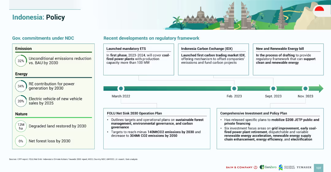
Timeline-based layout with left-side policy targets and right-side regulatory updates; illustrations and flags add clarity
Regulatory and Compliance
Government & Public Sector
Summarizes Indonesia’s regulatory progress on green policy, including NDC commitments, ETS launch, and carbon exchange developments, along with forest and investment frameworks
Indonesia policy, ETS, IDX, NDC, forest carbon, emissions targets, energy bill, regulatory updates
Mixed Chart
Bain
Saved
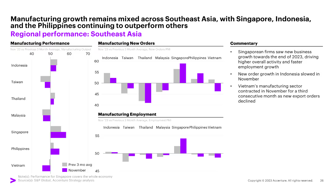
The slide features three column charts illustrating manufacturing performance, manufacturing new orders, and manufacturing employment across Southeast Asian countries. Commentary on the right.
Market Analysis and Trends
Financial Services
The slide highlights mixed manufacturing growth in Southeast Asia with Singapore, Indonesia, and the Philippines outperforming others.
Southeast Asia, manufacturing, new orders, employment, Indonesia, Singapore, Philippines, Taiwan, Thailand, Malaysia, Vietnam
Multiple Chart
Accenture
Saved
The slide features a bar chart highlighting the underutilization of advanced measurement use cases like attribution, ROI/ROAS, media mix modeling, and predictive analysis among DCR users.
Technology and Digital Transformation
Technology & Software
The slide points out that a significant portion of DCR users are not leveraging advanced measurement capabilities, presenting it as a missed opportunity for greater utilization.
DCR users, advanced measurement, attribution, privacy
Mixed Chart
IPSOS
Saved
The slide contains two column charts comparing country performance and new orders index for India, China, Japan, and Australia. There is a commentary section with three bullet points on the right.
Market Analysis and Trends
Financial Services
The slide shows India's strong growth momentum within Asia-Pacific, China's stable growth, and Australia's contraction.
Asia-Pacific, performance, growth, India, China, Japan, Australia, new orders, PMI
Multiple Chart
Accenture
Saved
Line chart slide tracking the contribution of social media to company performance over time, with annotations for different time points.
Performance Metrics and KPIs
Professional Services
Highlights the consistent lack of growth in social media's impact on business performance, suggesting a reassessment of social media strategies.
social media, company performance, performance review, strategy reassessment, line graph
Single Chart
Deloitte
Saved
The slide includes a column chart comparing container packing costs per tonne between Australia, Ukraine, and Canada, along with contextual notes.
Market Analysis and Trends
Transportation & Logistics
The slide compares container packing rates in Australia, Ukraine, and Canada, explaining the reasons behind the higher costs in Australia and their implications for the logistics industry.
Container packing, Australia, Ukraine, Canada, cost comparison, transportation, logistics, market analysis
Mixed Chart
LEK
Saved
The slide features a large image of an hourglass against a calendar background on the left. On the right, three column charts show firm operation years for total, hedge fund, and private equity.
Market Analysis and Trends
Financial Services
This slide presents data on how long firms have been in operation, divided into total, hedge fund, and private equity categories, with years of operation segmented in a column chart.
operation, firm, hedge fund, private equity, years
Multiple Chart
EY
Saved
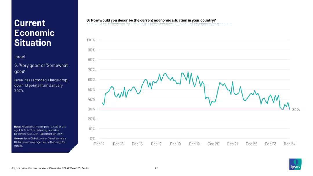
Line graph showing Israel's economic sentiment over time; notes a large recent decline.
Market Analysis and Trends
Financial Services
Israel experienced a sharp 10-point decline since January 2024, dropping to 30% of respondents viewing the economy as good, the lowest point in recent years.
Israel, sentiment drop, Ipsos, economic outlook, 2024 trend, survey data, macroeconomics, historical comparison
Mixed Chart
IPSOS
Saved
The slide features a detailed case study on biomethane production in China, covering the description, process characteristics, global market overview, and drivers/barriers. It includes a column chart showing biomethane demand forecast by continent from 2018 to 2040.
Client Case Studies
Energy & Utilities
This slide provides an in-depth analysis of the biomethane sector in China, detailing the production process, market potential, and the benefits and challenges of developing biomethane as a renewable energy source for power and transport sectors.
biomethane, China, case study, production process, market overview, drivers, barriers, demand forecast
Mixed Chart
Kearney
Saved
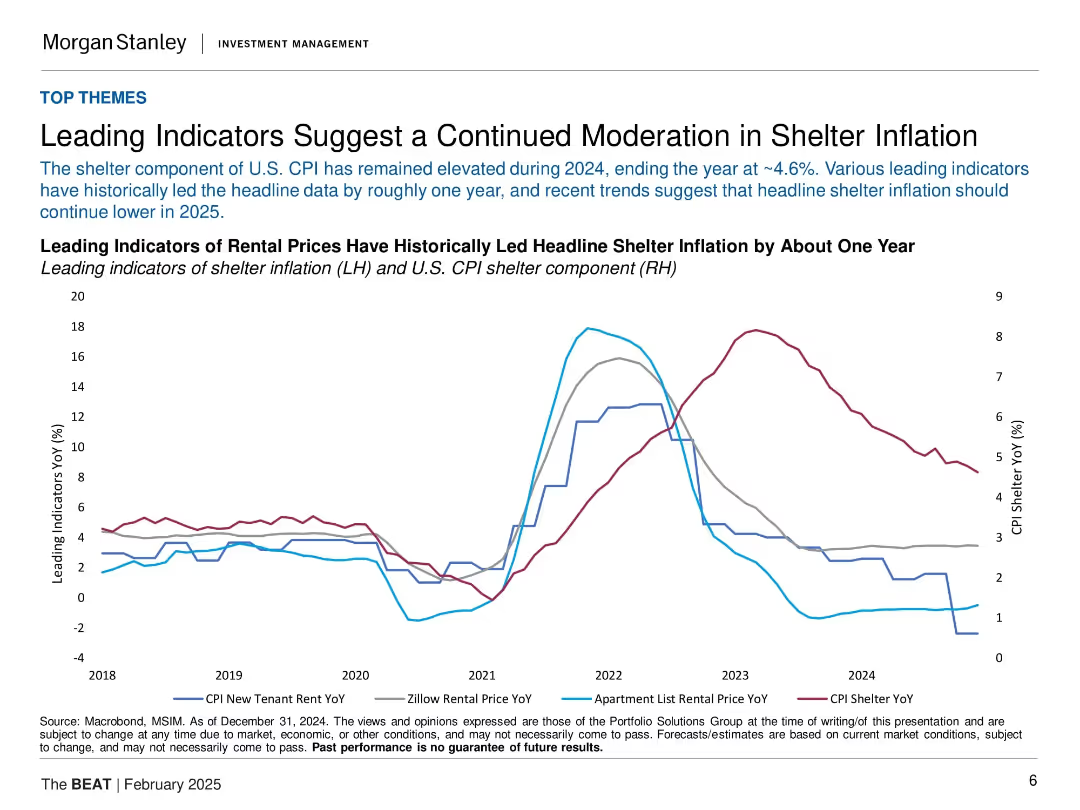
Line chart with four rental indicators and CPI shelter data. Minimal text, data-heavy with historical context.
Market Analysis and Trends
Real Estate & Construction
The slide presents rental price trends as leading indicators for shelter inflation in the U.S. It shows these indicators have declined ahead of CPI shelter, suggesting continued moderation in 2025. This is relevant for inflation expectations and interest rate decisions.
shelter inflation, CPI, rental prices, leading indicators, U.S. housing, macro trends, inflation outlook, interest rates
Single Chart
Morgan Stanley
Saved
The slide uses a comparative layout with icons representing different business sectors across the top and a horizontal bar chart below showing product opportunities. The color scheme is blue, complementing the corporate branding.
Market Analysis and Trends
Financial Services
It explains how the wholesale payments business can capitalize on growth opportunities in various sectors like SMBs and healthcare, highlighting core advantages and product opportunities, making it suitable for strategic planning discussions.
wholesale payments, growth opportunities, SMBs, healthcare, corporates, E-commerce, financial institutions, strategy
Pillar
JP Morgan
Saved
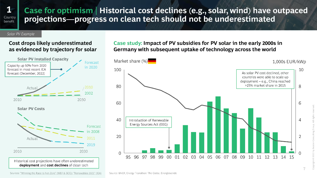
The slide includes line charts and a column chart to show historical and projected cost declines for solar PV technology.
Market Analysis and Trends
Energy & Utilities
The slide provides a case study on the cost declines in solar PV and the underestimated projections for clean tech progress.
cost declines, solar PV, projections, clean tech, case study
Multiple Chart
BCG
Saved
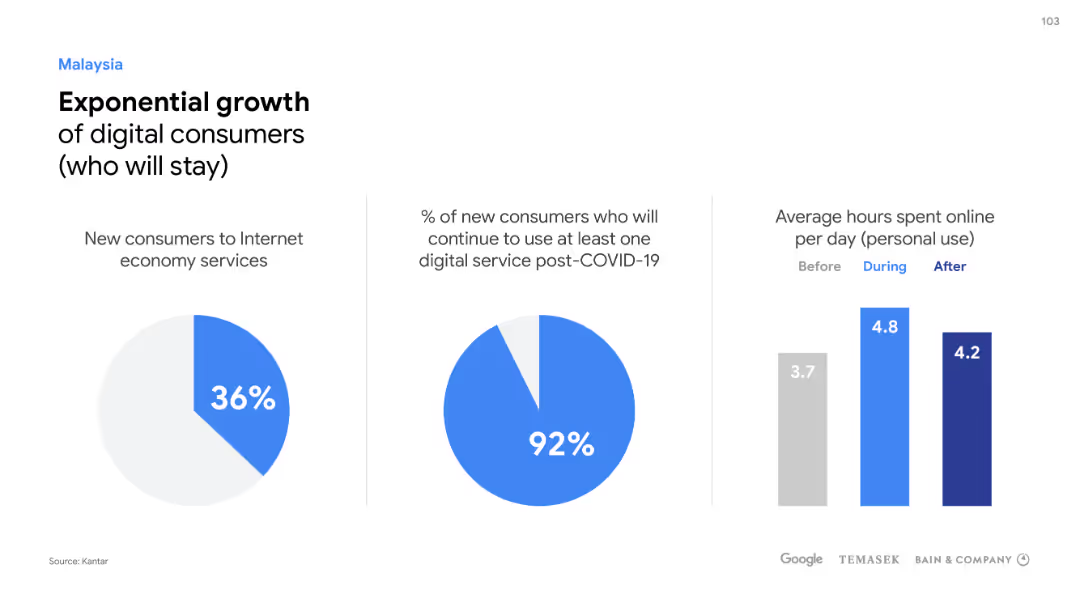
Two pie charts and a column chart detail Malaysia's digital consumer growth, continuity post-COVID-19, and online activity.
Market Analysis and Trends
Technology & Software
Demonstrates Malaysia's digital consumer surge and the ongoing engagement in internet economy services post-pandemic.
Digital consumers, Malaysia, Growth, Internet economy, COVID-19, Online activity, Engagement
Multiple Chart
Bain
Saved
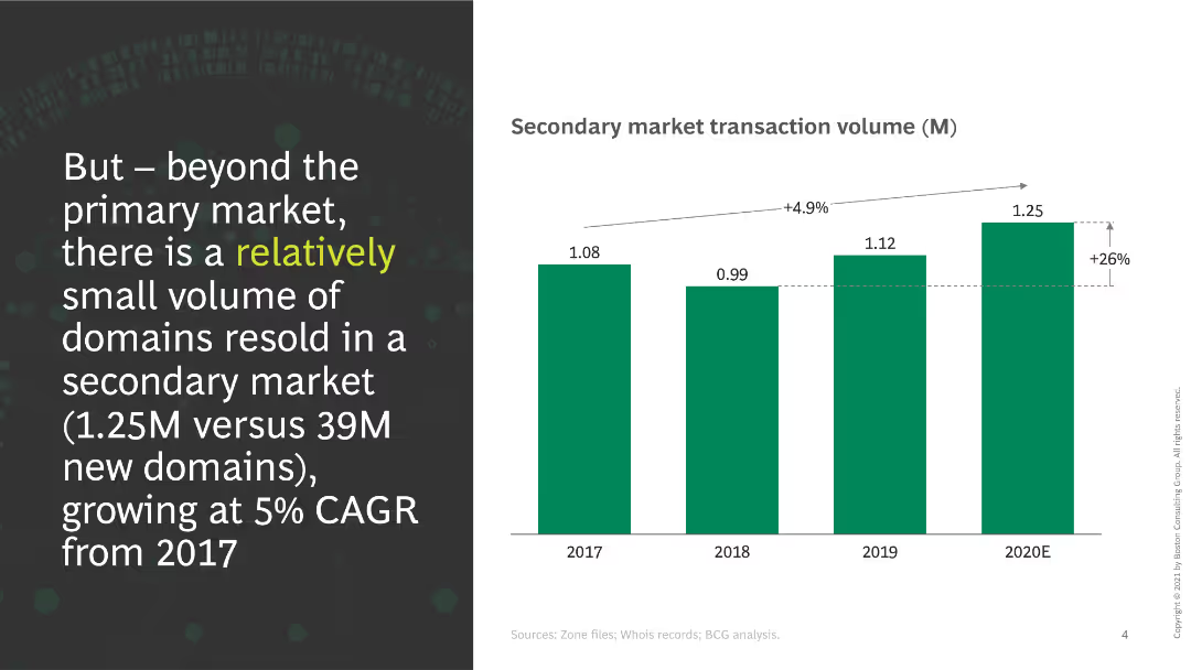
This slide shows a column chart indicating secondary market transaction volumes from 2017 to 2020E. A significant increase in transactions is noted, with a CAGR of 5%.
Market Analysis and Trends
Retail & E-commerce
The slide discusses the volume of domains resold in the secondary market, emphasizing the growth rate and the small volume compared to the primary market.
secondary market, transactions, growth, domains, volume, CAGR
Mixed Chart
BCG
Saved
Previous
Next
If nothing, comes up, please save your slides first
Create a FREE account to continue browsing
Receive Instant Access to 1,000+ slides from companies like McKinsey, Google, and Goldman Sachs
First Name
Last Name
Email
Password
I agree to all
Terms & Privacy Policy
Thank you! Your submission has been received!
Oops! Something went wrong while submitting the form.
Have an account?
Sign in
Column Chart
Heatmap
Chevron
Org Chart
Infographic
Callouts
Timeline
List
Graphic
Picture
Process Flow
Diagram
Paragraph
Map
Table
Framework
Subtitle
Takeaway Box
Icon
Other Chart
Radar Chart
Waterfall Chart
Mekko Chart
Pie Chart
Scatter Plot
Line Chart
Bar chart
Bullet points