Create a FREE Account
Instant access to 1,000+ real slides from top companies like McKinsey, BCG, Goldman Sachs, Google and many more!
First Name
Last Name
Email
Password
I agree to all
Terms & Privacy Policy
Thank you! Your submission has been received!
Oops! Something went wrong while submitting the form.
Have an account?
Sign in
Library
Templates
Courses
Pricing
My Account
My Slides
My Templates
✦ AI
AI Prompt Library
AI Search
Sign in
Start Here
Logout
My Saved Slides
The slide contains a line chart comparing different portfolios' returns and risks, including leveraged and non-leveraged options.
Investment Analysis
Financial Services
This slide explains how low-cost leverage can enhance portfolio returns while maintaining competitive risk levels, compared to higher-risk portfolios.
leverage, portfolio returns, risk, investment strategy, borrowing costs
Single Chart
UBS
Saved
This slide features a central circular graphic and several textual elements. It has a clean design with blue tones and clearly labeled sections. The pie chart is centrally positioned and surrounded by key data points.
Market Analysis and Trends
Financial Services
Discussing Goldman Sachs’ position as a leading asset and wealth manager, this slide showcases their scale and scope in the industry. It's designed for presentations emphasizing market leadership and client-oriented approaches.
asset management, wealth management, global, Goldman Sachs, AUS, client-oriented, scale
Framework
Goldman Sachs
Saved
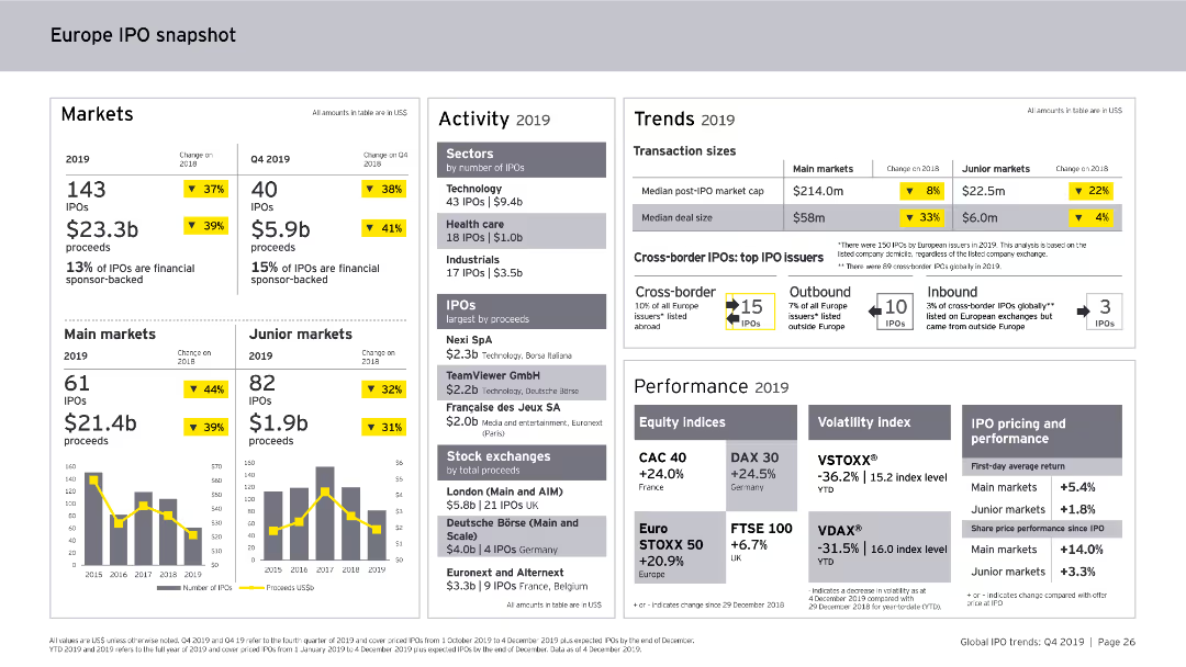
This slide includes column charts and numerical data points. It provides a snapshot of the Europe IPO market in 2019, covering markets, activity levels, trends, and performance metrics.
Market Analysis and Trends
Financial Services
The slide offers an overview of the Europe IPO market for 2019, detailing the number of IPOs, proceeds, sector activity, transaction sizes, cross-border IPOs, and performance indicators.
Europe, IPO, Market Analysis, Financial Services, Trends, Activity, Performance, 2019
Multiple Chart
EY
Saved
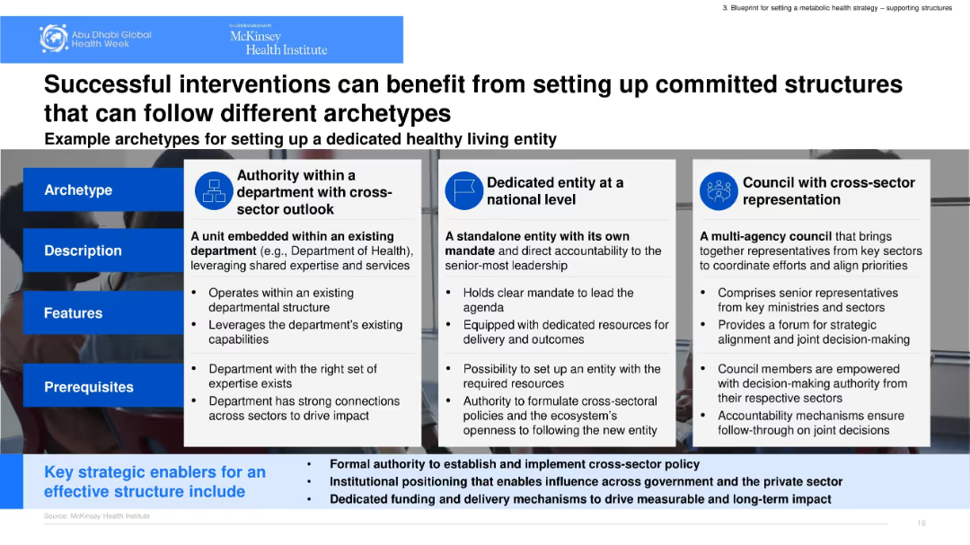
Matrix layout with three archetype models shown in adjacent columns. Each column includes description, features, and prerequisites. Icons and bold headers support structure.
Organizational Structure and Change
Government & Public Sector
Outlines three governance archetypes to support healthy living: departmental authority, national entity, and cross-sector council. It emphasizes structural roles, prerequisites, and institutional mandates to ensure effective implementation and accountability.
governance, cross-sector, archetypes, department, council
Table
McKinsey
Saved
The slide combines graphical representations of JPMC's market share in various banking sectors with icons of Fortune's top 5 companies, creating a strong visual impact with its segmented circular graphic and bold text captions.
Industry Overview
Financial Services
Showcasing JPMC's industry dominance and comparing it to the most admired companies globally, the slide is utilized for market positioning and corporate presentations.
market position, JPMC, banking sectors, Fortune 500, admired companies, industry dominance, corporate presentation.
Framework
JP Morgan
Saved
Slide includes column charts showing GDP growth by quarter and future projections compared to the rest of the world. The visual elements are organized neatly, using green and purple to differentiate between past performance and future expectations, enhancing readability.
Strategic Planning
Government & Public Sector
Analyzes China's economic recovery post-COVID-19 and its projected impact on global GDP growth, focusing on sector-specific growth and future contributions to the world economy.
economic recovery, GDP growth, China, post-COVID-19, global impact
Mixed Chart
BCG
Saved
The slide includes a column chart displaying the ratio of direct to distributed traffic according to an alternative central approach, which considers any source within the last 5 steps and excludes subsequent visits. Detailed annotations included.
Market Analysis and Trends
Media & Entertainment
This slide explores the ratio of direct to distributed traffic using an alternative central approach, considering any source within the last 5 steps before reaching news articles and excluding subsequent visits, providing insights into traffic patterns.
Central Approach, Direct Traffic, Distributed Traffic, Column Chart, Traffic Ratio
Single Chart
IPSOS
Saved
Three-panel design illustrating phases of stabilization, sustainable growth, and future leadership aspirations with icons.
Strategic Planning
Financial Services
This slide outlines the bank's strategic roadmap post-2019, focusing on past achievements and future goals aimed at establishing industry leadership, highlighting key phases in strategy implementation.
Leadership, Growth, Strategy, Aspirations, Roadmap, Industry, Future
Linear Flow
Deutsche Bank
Saved
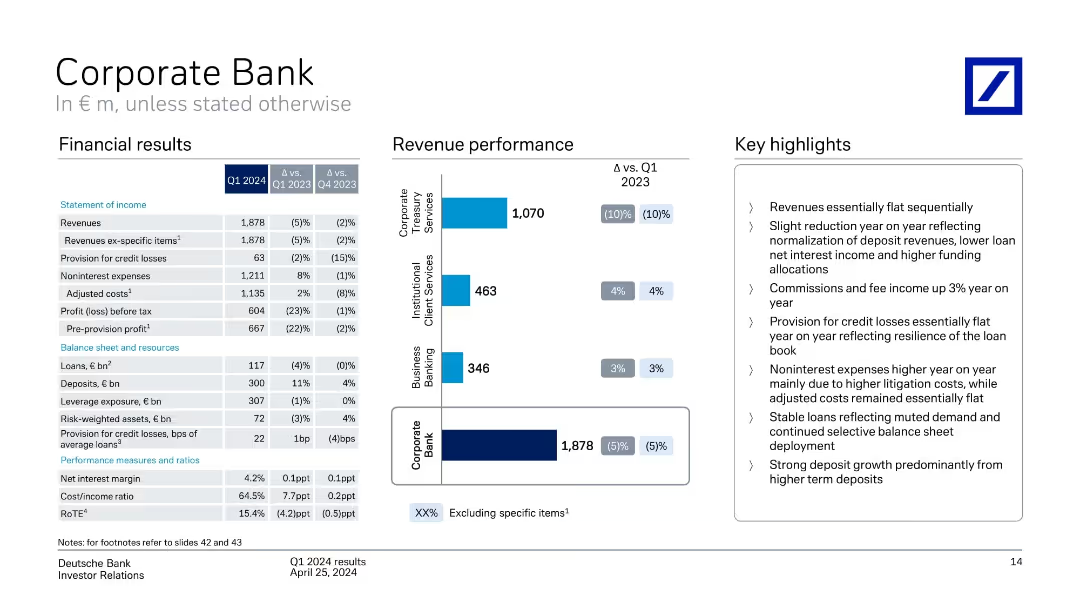
Split layout: income table, bar chart of revenues by segment, and bullet highlights
Financial Performance
Financial Services
Q1 2024 financial results for the Corporate Bank, with YoY and QoQ comparisons. Shows revenue sources, expenses, and profit before tax. Highlights include flat revenues, resilient loan book, and strong term deposit growth.
corporate banking, revenue, expenses, deposits, loans, credit losses
Mixed Chart
Deutsche Bank
Saved
Features a large pie chart showing percentages of Generative AI tool usage among the public, with explanatory text providing additional context on usage barriers.
Market Analysis and Trends
Technology & Software
Analyzes the percentage of the population that has used Generative AI tools, emphasizing the low engagement despite high awareness.
Generative AI, usage statistics, technology adoption, market barriers, public engagement
Mixed Chart
Deloitte
Saved
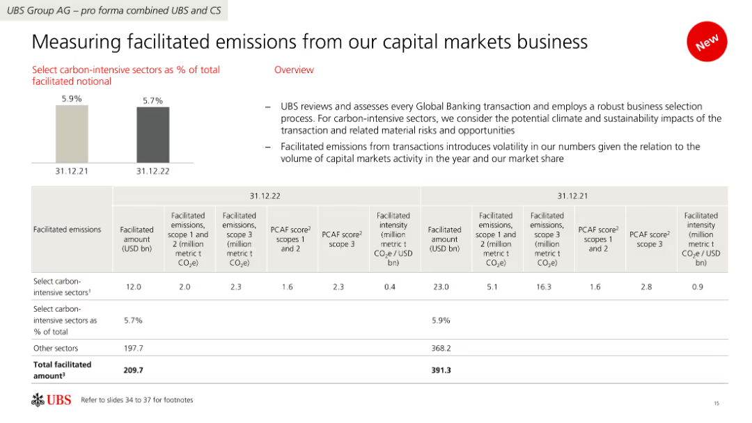
The slide contains a combination of bar and table charts displaying data on facilitated emissions from capital markets business, with a focus on carbon-intensive sectors.
Risk Assessment and Management
Financial Services
It reviews facilitated emissions by UBS's capital markets business, assessing transactions' impact on climate and sustainability, and showing data on emissions and facilitated amounts.
Facilitated emissions, carbon-intensive, capital markets, UBS, sustainability
Mixed Chart
UBS
Saved
The slide includes a column chart with blue and red columns for assets, deposits, and loans, a map of branch footprints, and two company logos. The layout is balanced between text and visuals.
Financial Performance
Financial Services
This slide presents financial data highlighting the growth due to acquisitions, emphasizing market position and customer base expansion. It's used to communicate business growth and performance metrics.
acquisitions, customer base, financial data, growth, market position
Multiple Chart
Goldman Sachs
Saved
Slide features a complex column chart comparing various funding strategies to achieve school connectivity with different assumed conditions. Colorful text boxes provide additional contextual information.
Strategic Planning
Education & Training
The slide offers a theoretical approach to combining different funding models to achieve school connectivity in Java, Bali, and Sumatra, addressing potential surplus and challenges.
school connectivity, funding models, Java, Bali, Sumatra, theoretical surplus, financial analysis, government subsidy, practical hurdles, strategy planning
Mixed Chart
BCG
Saved
Features box plots comparing returns of different half-year venture-backed IPO cohorts, and a multi-line chart for EV/forward revenue multiple trends. Accompanied by textual analysis on trends and implications.
Investment Analysis
Financial Services
It evaluates the performance of venture-backed IPOs relative to established companies, signifying a trend of underperformance and potential repercussions on investment decisions.
IPO, Venture-Backed, Market Analysis, Performance
Multiple Chart
JP Morgan
Saved
Bar chart presenting future plans of refugees regarding their stay in Poland.
Strategic Planning
Government & Public Sector
Analyzes the future intentions of refugees in Poland based on survey data.
refugees, future plans, Poland, survey data
Single Chart
Deloitte
Saved
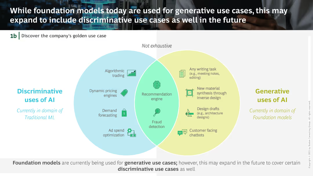
Venn diagram comparing discriminative uses of AI (Algorithmic trading, Dynamic pricing, etc.) with generative uses (Writing tasks, Material synthesis, etc.).
Technology and Digital Transformation
Technology & Software
The slide explores the potential expansion of foundation models from current generative use cases to include discriminative use cases, highlighting areas of overlap and distinction.
Foundation models, Generative AI, Discriminative uses, Venn diagram, AI applications
Diagram
BCG
Saved
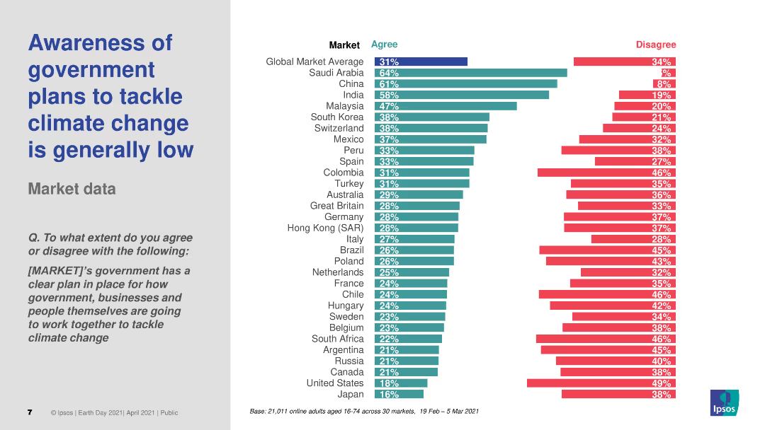
The slide includes a header, a text block, and a column chart. The column chart shows survey data on public awareness of government plans to tackle climate change across various markets, with different colors representing levels of agreement and disagreement.
Market Analysis and Trends
Environmental Services & Sustainability
Discusses the low awareness of government plans to tackle climate change across different countries. The column chart presents survey data on public agreement with the statement that their government's plans are clear, comparing awareness levels across multiple markets.
Climate change, government plans, awareness, survey, markets
Multiple Chart
IPSOS
Saved
World map, pie charts, and statistics about companies participating in SHoP assessment.
Technology and Digital Transformation
Professional Services
Presents a global survey of over 100 companies, highlighting industry participation and regional distribution.
global, survey, industry, participation, SHoP, assessment
Multiple Chart
BCG
Saved
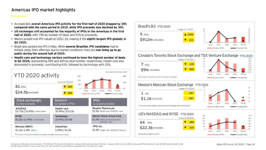
Contains multiple column charts and a bar chart detailing YTD 2020 IPO activity in the Americas, including sector-specific analysis and major stock exchanges.
Market Analysis and Trends
Financial Services
Highlights key IPO market trends in the Americas for the first half of 2020, including a breakdown by sectors, stock exchanges, and notable IPOs.
IPO, Americas, YTD 2020, sector analysis, stock exchanges
Multiple Chart
EY
Saved
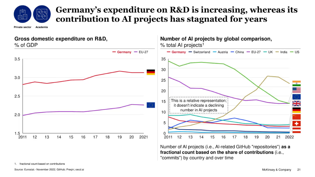
Dual line charts: left for R&D as % of GDP, right for AI project contribution by country over time; comparative analysis.
Technology and Digital Transformation
Artificial Intelligence
The slide contrasts Germany’s rising R&D investment with a stagnant contribution to global AI projects. It shows Germany surpassing EU-27 in R&D spending, but its relative AI contribution has not improved, highlighting a disconnect between investment and AI output.
R&D, AI projects, Germany, contribution, stagnation, investment, technology, research
Multiple Chart
McKinsey
Saved
This slide displays a mix of bar graphs, a donut chart, and a statistical sidebar. The color scheme is blue and white, highlighting key data points. It's visually complex, with multiple data sets and annotations.
Regulatory and Compliance
Technology & Software
It outlines energy consumption, renewable energy usage, and electricity source mix. The slide aims to communicate progress in sustainability and environmental goals.
sustainability, ESG report, energy consumption, renewable resources, electricity mix, emissions reduction, corporate responsibility, efficiency
Multiple Chart
McKinsey
Saved
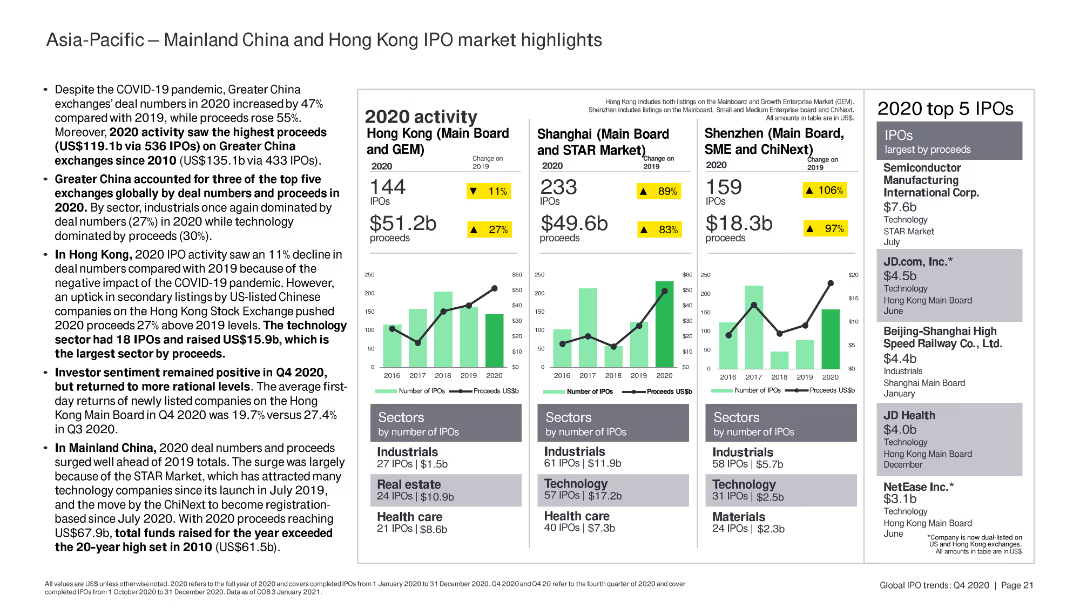
The slide features column charts and bar charts summarizing IPO activity in Mainland China and Hong Kong, highlighting key sectors and top IPOs by proceeds.
Market Analysis and Trends
Financial Services
The slide highlights IPO activity in Mainland China and Hong Kong in 2020, focusing on the performance of key stock exchanges, sectors, and top IPOs by proceeds.
China, Hong Kong, IPO, sectors, proceeds
Multiple Chart
EY
Saved
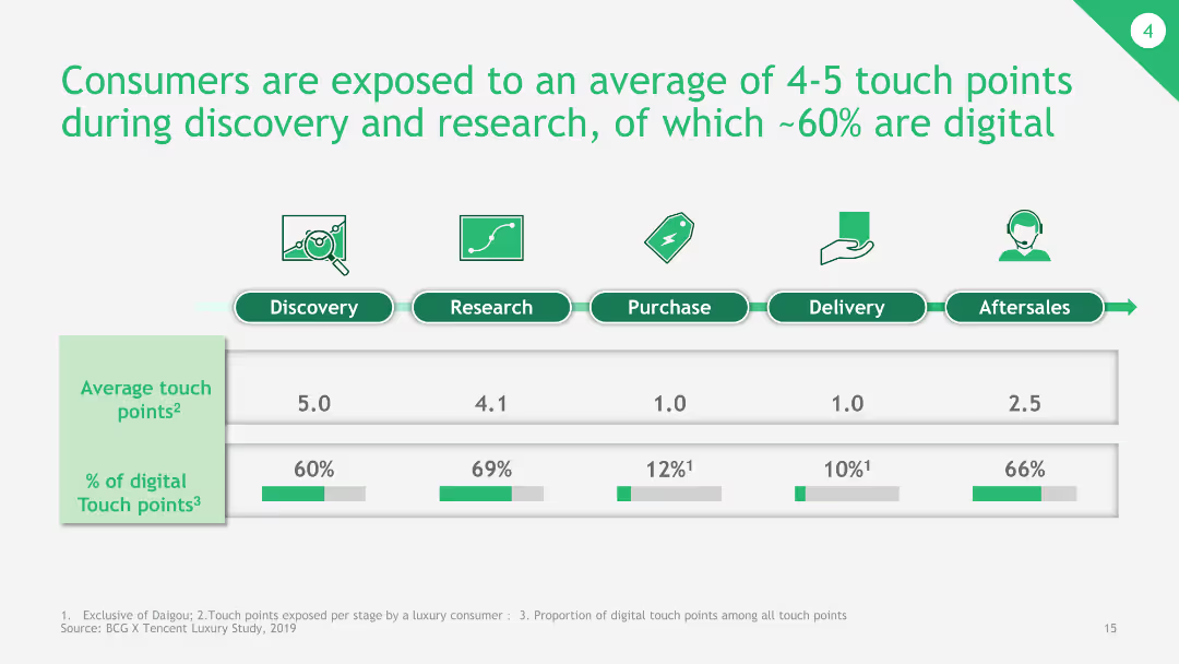
The slide presents a bar chart depicting the average number of touch points during different stages of the consumer journey, with a breakdown of digital touchpoints.
Customer and Market Segmentation
Consumer Goods
This slide shows the average touch points consumers are exposed to during various stages of the buying process, emphasizing the significant role of digital touchpoints.
consumer journey, touch points, digital touchpoints, buying process, average touch points
Single Chart
BCG
Saved
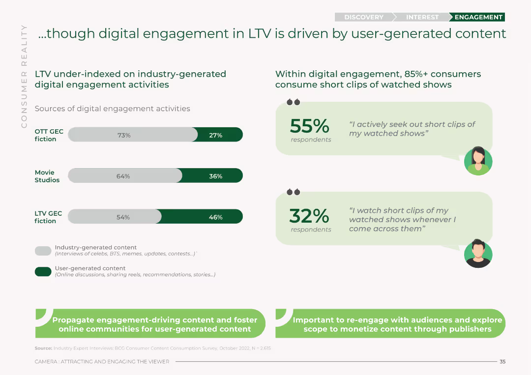
The slide features bar charts comparing industry-generated vs. user-generated digital engagement activities across OTT GEC fiction, Movie Studios, and LTV GEC fiction. It uses a green and white color scheme with percentages for each category.
Market Analysis and Trends
Media & Entertainment
This slide analyzes digital engagement in LTV, showing that user-generated content drives more engagement compared to industry-generated activities. It presents percentages for OTT GEC fiction, Movie Studios, and LTV GEC fiction.
digital engagement, LTV, user-generated content, industry-generated content, OTT, Movie Studios, engagement sources
Mixed Chart
BCG
Saved
The slide presents a line chart comparing Federal Funds Rate with MSCI Index for developed, emerging, and frontier markets, highlighting trends and key insights.
Market Analysis and Trends
Financial Services
The slide discusses how increased interest rates may cause capital reallocation from frontier markets to developed markets, with specific data and analysis.
interest rates, MSCI Index, frontier markets, capital reallocation, financial trends
Mixed Chart
PwC/Strategy&
Saved
Previous
Next
If nothing, comes up, please save your slides first
Create a FREE account to continue browsing
Receive Instant Access to 1,000+ slides from companies like McKinsey, Google, and Goldman Sachs
First Name
Last Name
Email
Password
I agree to all
Terms & Privacy Policy
Thank you! Your submission has been received!
Oops! Something went wrong while submitting the form.
Have an account?
Sign in
Column Chart
Heatmap
Chevron
Org Chart
Infographic
Callouts
Timeline
List
Graphic
Picture
Process Flow
Diagram
Paragraph
Map
Table
Framework
Subtitle
Takeaway Box
Icon
Other Chart
Radar Chart
Waterfall Chart
Mekko Chart
Pie Chart
Scatter Plot
Line Chart
Bar chart
Bullet points