Create a FREE Account
Instant access to 1,000+ real slides from top companies like McKinsey, BCG, Goldman Sachs, Google and many more!
First Name
Last Name
Email
Password
I agree to all
Terms & Privacy Policy
Thank you! Your submission has been received!
Oops! Something went wrong while submitting the form.
Have an account?
Sign in
Library
Templates
Courses
Pricing
My Account
My Slides
My Templates
✦ AI
AI Prompt Library
AI Search
Sign in
Start Here
Logout
My Saved Slides
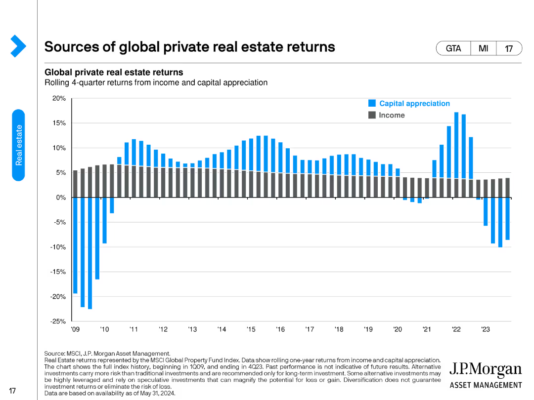
The slide includes a dual-axis column chart showing the rolling 4-quarter returns from income and capital appreciation for global private real estate from 2009 to 2024. The chart uses blue for capital appreciation and grey for income.
Performance Metrics and KPIs
Real Estate & Construction
This slide examines the sources of returns for global private real estate, breaking down the contributions from income and capital appreciation over time, presented in a rolling 4-quarter format from 2009 to 2024.
Real Estate, Returns, Income, Capital Appreciation, Global
Single Chart
JP Morgan
Saved
Basic visual complexity, contrasting textual information with a relatable image.
Strategic Planning
Professional Services
Discusses the need for businesses to adapt to changes and disruptions, hinting at strategies for maintaining competitiveness and relevance.
business strategy, adaptability, global trends, disruptions
Mixed Chart
Bain
Saved
This slide features a bar chart with different colors to indicate the stages of technological maturity. It includes several bars aligned horizontally with labels on the left side.
Market Analysis and Trends
Energy & Utilities
It outlines the maturity levels of various CO₂ separation technologies, categorized under liquid solvent, solid absorbent, membrane, solid-looping, and inherent CO₂ capture.
CO₂ capture, technological maturity, liquid solvent, solid absorbent, membrane, solid-looping, maturity stages
Table
Kearney
Saved
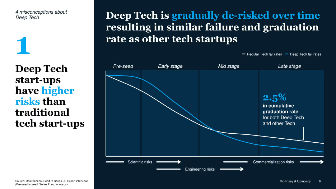
Split layout with misconception text on left and chart on right; line graph comparing fail rates of Deep Tech vs traditional tech over lifecycle stages
Risk Assessment and Management
Artificial Intelligence
Refutes the notion that Deep Tech has higher failure rates by showing it becomes de-risked over time; line graph compares failure rates of tech startups through different stages.
Deep Tech, risks, failure rate, tech lifecycle, de-risked, chart, misconception
Single Chart
McKinsey
Saved
Two column charts comparing industry compliance costs and Credit Suisse compliance costs, with other performance metrics.
Regulatory and Compliance
Financial Services
The slide presents advanced technical capabilities to manage risk and compliance costs, showing industry and Credit Suisse comparisons.
Compliance costs, technical capabilities, risk management, industry comparison, performance metrics
Multiple Chart
Credit Suisse
Saved
A bar graph compares the F-Series' revenue with other major consumer products and sports leagues.
Client Case Studies
Transportation & Logistics
Demonstrates the F-Series' revenue size in comparison to well-known products and major sports leagues' combined revenue.
F-Series, consumer products, sports leagues, revenue comparison
Single Chart
BCG
Saved
Features a pie chart with associated column charts detailing changes in broadband subscriptions. Color-coded for clarity and visually simple to enhance understanding.
Operational Efficiency
Telecommunications
Details the modifications in broadband packages by UK households over the past year, showing preferences for better packages and cost reductions. Useful for telecom businesses to understand consumer behavior changes.
broadband, consumer behavior, subscriptions, changes, UK
Multiple Chart
Deloitte
Saved
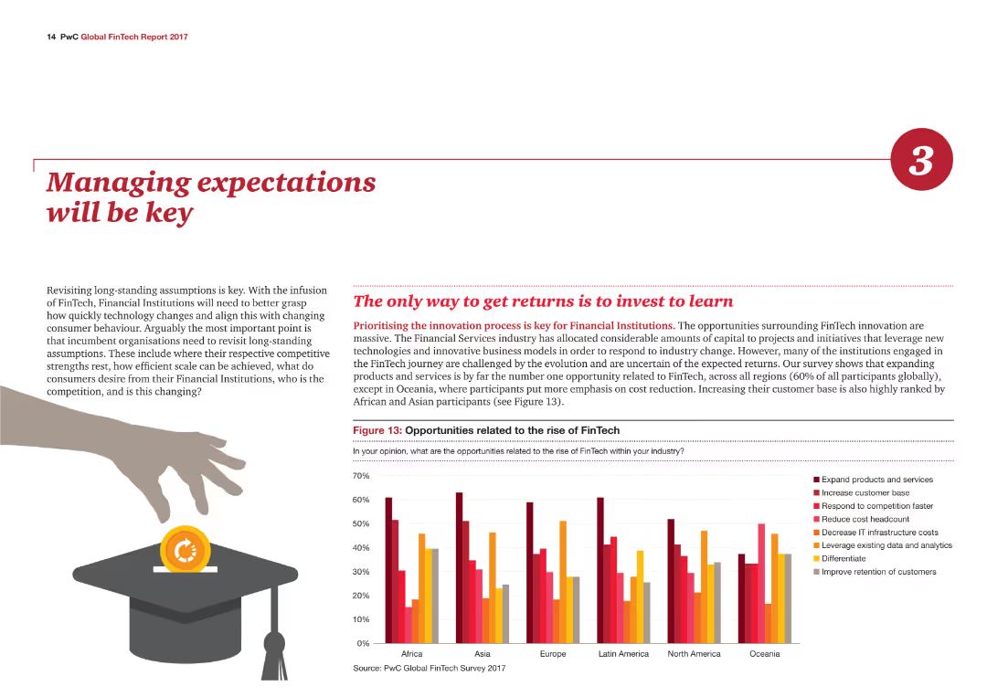
The slide contains a column chart illustrating opportunities related to the rise of FinTech by region, with different colors representing various opportunities such as expanding products.
Strategic Planning
Financial Services
The slide emphasizes the importance of managing expectations in the financial services industry, highlighting key opportunities related to FinTech across different regions.
Expectations, FinTech, Opportunities, Regions, Strategic
Mixed Chart
PwC/Strategy&
Saved
Similar to the previous slide, this uses a split circular diagram with segments highlighted in orange and red, focusing on different tax proposals like Betting activities and VAT on asset managers. Icons and minimal text enhance clarity.
Regulatory and Compliance
Government & Public Sector
Further tax amendments for Namibia in 2018 are shown, discussing betting and gaming taxes, VAT changes for asset managers, and fuel levy increases. It helps in reviewing the expected financial outcomes from these legislative changes.
tax, amendments, revenue, betting, VAT, asset managers, fuel levy, Namibia, 2018
Framework
PwC/Strategy&
Saved
Contains column charts, pie charts, bar graph overlay.
Market Analysis and Trends
Retail & E-commerce
Discusses growth in luxury goods retail, market trends.
luxury, retail, growth, 2019, Asia
Multiple Chart
Bain
Saved
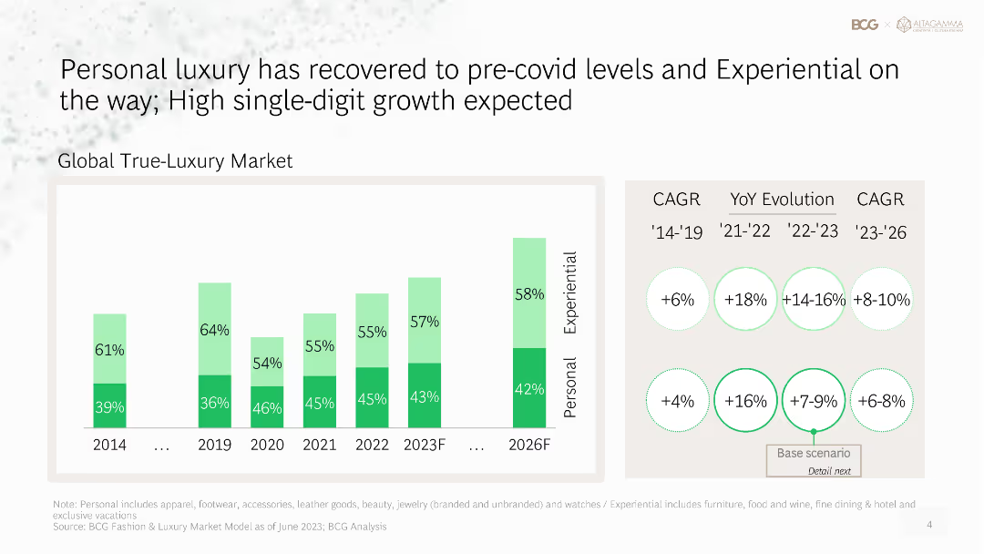
Column chart showing the recovery of the personal luxury market to pre-COVID levels, with projections for future growth in both personal and experiential categories.
Market Analysis and Trends
Consumer Goods
Analyzes the recovery of the personal luxury market post-COVID, providing growth projections for both personal and experiential luxury segments.
personal luxury, market recovery, post-COVID, growth projections, experiential
Mixed Chart
BCG
Saved
Displays a column chart with total deal values in the Edtech sector, accompanied by key insights in a sidebar. The design utilizes color coding to make distinctions between different years and highlights a trend in deal sizes.
Investment Analysis
Education & Training
Explores the increasing investor interest in Edtech despite scaling challenges. It notes the predominance of early-stage deals and suggests the need for region-specific approaches to ensure effective educational technology dissemination.
Edtech, Investment, Scaling, SEA
Mixed Chart
Bain
Saved
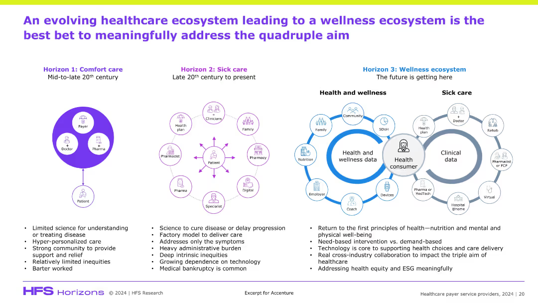
Three-part horizontal timeline (Comfort care → Sick care → Wellness ecosystem); icons around a central "health consumer" visual; descriptive text below each stage; stylized, infographic-heavy design.
Technology and Digital Transformation
Healthcare & Pharmaceuticals
This slide outlines the evolution of healthcare delivery from comfort care to a future-focused wellness ecosystem. It emphasizes consumer-centric care, technology enablement, and cross-industry collaboration as the means to achieve the quadruple aim. Wellness data and prevention-oriented care models are the future direction of transformation.
wellness ecosystem, evolution, health consumer, prevention, digital health, collaboration
Header Horizontal
Accenture
Saved
This slide displays a stacked column chart with annotations for half-yearly data points from 2019 to H1 2023. It uses grayscale for different sectors with a clear legend. Deal count numbers are presented at the bottom.
Investment Analysis
Financial Services
Shows private funding trends in Vietnam for different sectors, indicating a small increase in H1 2023. It suggests a focus on nascent sectors, hinting at emerging investment areas.
Vietnam, Private Funding, H1 2023, Investment Trends, Nascent Sectors, Deal Count, Travel, Digital Media, E-commerce
Single Chart
Bain
Saved
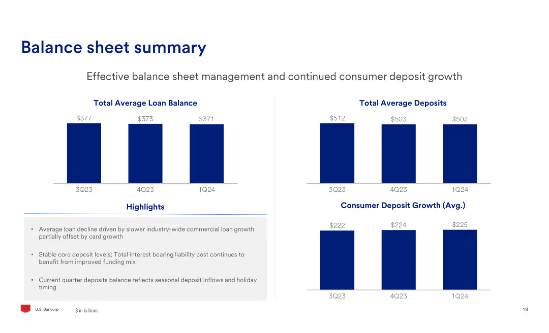
The slide includes two column charts showing total average loan balance and total average deposits over three quarters, along with text highlights on balance sheet management.
Financial Performance
Financial Services
The slide provides an overview of the balance sheet, focusing on effective management of loans and deposits, highlighting the trends in average balances and deposit growth.
Balance, Sheet, Loans, Deposits, Management, Growth
Multiple Chart
Barclays
Saved
The slide contains a large percentage graphic and horizontal bar charts showing the fee payment status for selling mutual funds during the pandemic. Clean white background.
Market Analysis and Trends
Financial Services
This slide discusses the payment of fees by Canadian investors for selling mutual funds during the pandemic, indicating that most did not pay a fee, while some had to pay or had fees waived.
mutual funds, fee payment, pandemic, Canadian investors, investment fees
Mixed Chart
IPSOS
Saved
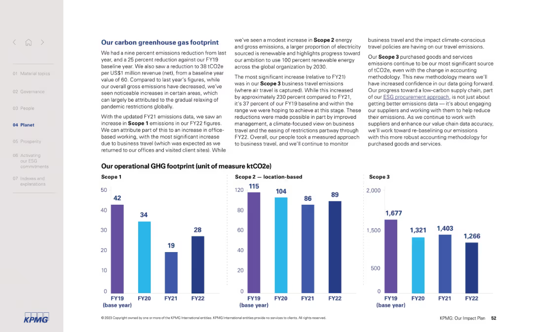
Two-column layout with detailed text on the left and three bar charts for Scope 1, 2, and 3 GHG on the right. Clean, structured, and corporate visual style.
Regulatory and Compliance
Professional Services
This slide outlines KPMG’s GHG emissions performance across Scope 1, 2, and 3 categories, highlighting trends from FY19 to FY22. It discusses reductions in overall emissions, reasons for increases (e.g., business travel), and procurement methodology improvements.
GHG emissions, Scope 1, Scope 2, Scope 3, carbon footprint, FY22, ESG, business travel, renewables, emissions tracking
Mixed Chart
KPMG
Saved
Includes a column chart displaying carbon abatement potential against abatement cost for different sectors. Descriptive text explains the significance of each data point.
Market Analysis and Trends
Environmental Services & Sustainability
Analyzes the abatement potential and cost-effectiveness of various decarbonization levers across sectors in Southeast Asia, emphasizing the high payback potential of proven technologies and the need for their broader implementation to meet carbon reduction goals.
decarbonization, cost-effectiveness, SEA, carbon reduction
Mixed Chart
Bain
Saved
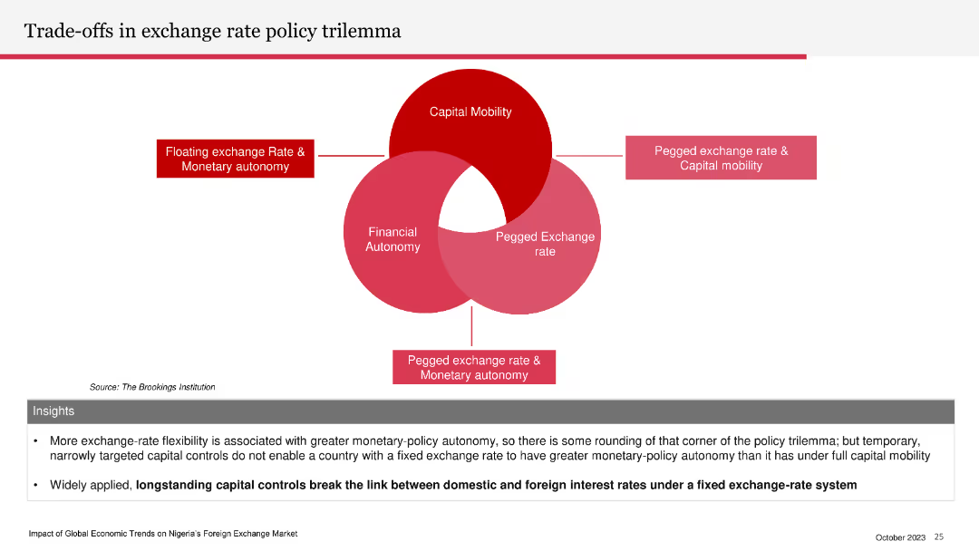
Venn diagram illustrating the exchange rate policy trilemma: capital mobility, financial autonomy, and pegged exchange rate. Insights section below.
Strategic Planning
Financial Services
The slide explains the trade-offs involved in exchange rate policy, emphasizing the limitations of having a fixed exchange rate, capital mobility, and monetary autonomy simultaneously. It highlights the impact of capital controls on interest rates.
exchange rate, policy trilemma, capital mobility, financial autonomy, pegged rate
Diagram
PwC/Strategy&
Saved
Left text section lists renewable projects. Right side image of an offshore converter platform. A column chart illustrates the split in net order book between renewable and other solutions.
Strategic Planning
Energy & Utilities
Describes commitment to energy transition, detailing key renewable projects and their contribution to the net order book. Used for strategic communication of company's focus on sustainability.
energy transition, renewables, net order book, offshore wind, sustainability, investment
Mixed Chart
Morgan Stanley
Saved
Modern building image on a blue-toned background listing topics such as blockchain fundamentals and commercial applications of Web 3 technologies.
Strategic Planning
Technology & Software
Serves as an agenda slide for a presentation on Web 3 and digital assets, outlining the scope and sequence of topics to be covered, from blockchain technology to its commercial applications.
Web 3, digital assets, blockchain, agenda, technologies
Agenda
McKinsey
Saved
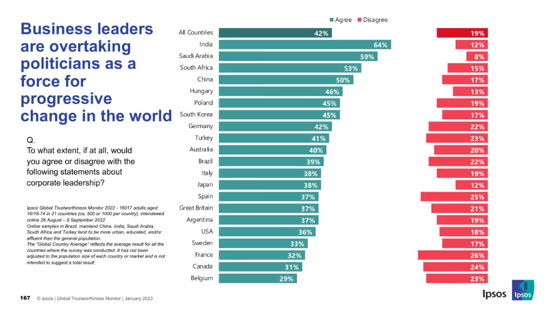
Same design as previous slides with vertical country list and agree/disagree bar chart; teal for "Agree", red for "Disagree".
Market Analysis and Trends
Government & Public Sector
This slide explores the perception that corporate leaders are becoming more progressive change agents than politicians. Agreement is highest in India and Saudi Arabia, showing a trend of growing corporate influence.
corporate influence, progressive change, politics, public perception, Ipsos, leadership, governance, reform
Mixed Chart
IPSOS
Saved
A doughnut chart in the center showing the distribution of crypto asset ownership categories, with percentages indicated in different colors.
Market Analysis and Trends
Financial Services
Presents data on crypto asset ownership among Canadians, highlighting the percentages of current and previous owners, and the breakdown of asset categories.
crypto ownership, crypto assets, investment funds, market analysis, financial services
Mixed Chart
IPSOS
Saved
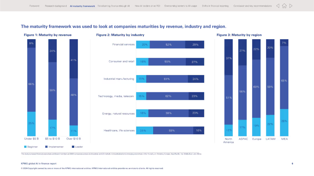
Full-width layout with three vertical bar charts showing AI maturity distribution across revenue, industry, and geography.
Operational Efficiency
Financial Services
Illustrates AI maturity levels (beginner, implementer, leader) across company revenue bands, industries, and regions. Highlights disparities in adoption and positioning for AI leadership across sectors and regions.
AI maturity, benchmarking, revenue, industry comparison, regional trends, implementation, leader status, AI adoption
Multiple Chart
KPMG
Saved
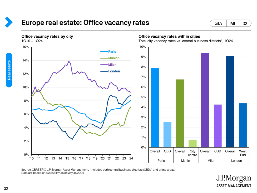
This slide features two column charts. The left chart shows office vacancy rates by city, and the right chart compares city center to CBD vacancy rates.
Market Analysis and Trends
Real Estate & Construction
It analyzes office vacancy rates in major European cities, highlighting differences between overall city and central business districts (CBD).
real estate, office, vacancy rates, city, CBD, Paris, Munich, Milan, London
Multiple Chart
JP Morgan
Saved
Previous
Next
If nothing, comes up, please save your slides first
Create a FREE account to continue browsing
Receive Instant Access to 1,000+ slides from companies like McKinsey, Google, and Goldman Sachs
First Name
Last Name
Email
Password
I agree to all
Terms & Privacy Policy
Thank you! Your submission has been received!
Oops! Something went wrong while submitting the form.
Have an account?
Sign in
Column Chart
Heatmap
Chevron
Org Chart
Infographic
Callouts
Timeline
List
Graphic
Picture
Process Flow
Diagram
Paragraph
Map
Table
Framework
Subtitle
Takeaway Box
Icon
Other Chart
Radar Chart
Waterfall Chart
Mekko Chart
Pie Chart
Scatter Plot
Line Chart
Bar chart
Bullet points