Create a FREE Account
Instant access to 1,000+ real slides from top companies like McKinsey, BCG, Goldman Sachs, Google and many more!
First Name
Last Name
Email
Password
I agree to all
Terms & Privacy Policy
Thank you! Your submission has been received!
Oops! Something went wrong while submitting the form.
Have an account?
Sign in
Library
Templates
Courses
Pricing
My Account
My Slides
My Templates
✦ AI
AI Prompt Library
AI Search
Sign in
Start Here
Logout
My Saved Slides
The slide features two pie charts and a column chart showing the growth of digital consumers in the Philippines.
Market Analysis and Trends
Technology & Software
Captures the Philippines' notable increase in digital consumers who are likely to continue using internet services post-COVID-19.
Digital consumers, Philippines, Growth, Internet services, COVID-19, Usage trends, Continuity
Multiple Chart
Bain
Saved
The slide features various bar graphs and pie charts detailing respondents' familiarity with different emerging technologies and their roles within organizations.
Technology and Digital Transformation
Technology & Software
The slide provides a profile of respondents' familiarity with emerging technologies, detailing the levels of familiarity, roles, and generations of respondents.
emerging tech, respondent profile, technology adoption, digital transformation, tech familiarity
Multiple Chart
EY
Saved
Features a world map highlighting the GDP PPP growth rates of specific countries and bar charts showing the share of global GDP PPP. Utilizes color differentiation for clear distinction among country groups.
Market Analysis and Trends
Financial Services
The slide presents real GDP PPP growth rates alongside the global share of GDP, useful for discussions on economic influence and forecasting global economic balances.
GDP PPP, economic forecasting, BRICS, global economy, growth rates
Multiple Chart
Roland Berger
Saved
Column chart comparing conversion rates of online channels with and without genAI enabled contact centers. Shows significant improvement with genAI integration.
Sales and Business Development
Financial Services
Demonstrates how genAI enabled customer centers significantly increase sales performance by improving conversion rates for online loan applications.
genAI, customer center, sales, conversion rates, online channel
Multiple Chart
Kearney
Saved
The slide displays tables comparing cancellation policies and meal limits for HCPs across different companies.
Regulatory and Compliance
Healthcare & Pharmaceuticals
This slide provides a detailed comparison of HCP meal limits and speaker cancellation policies, crucial for compliance and event planning.
HCP, meal limits, cancellation policies, compliance, comparison
Multiple Chart
Deloitte
Saved
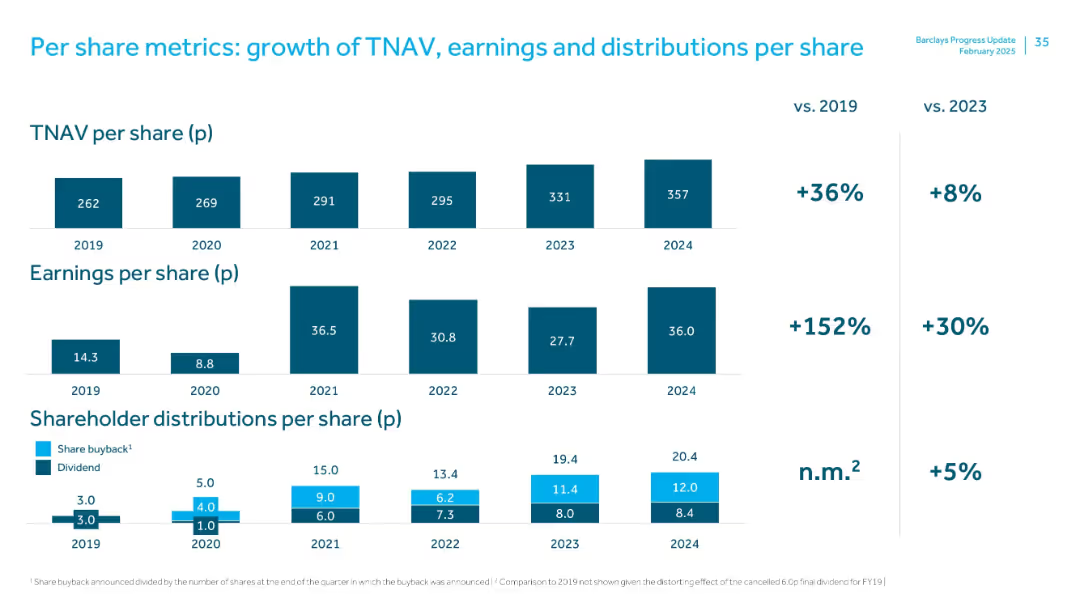
Three-panel stacked bar chart covering TNAV, earnings, and shareholder distributions per share from 2019–2024, with % change vs 2019 and 2023 shown on the right.
Financial Performance
Financial Services
The slide tracks 5-year per-share metrics. TNAV rose 36% vs. 2019; EPS grew 152%, and distributions also increased. A focus on long-term value creation through sustained earnings and return to shareholders.
TNAV, earnings per share, shareholder value, dividend, buyback, 5-year trend
Multiple Chart
Barclays
Saved
Horizontal bar chart depicting nostalgia levels among different age groups.
Market Analysis and Trends
Government & Public Sector
This slide shows how nostalgia affects various age groups, indicating a high level of nostalgia across all ages.
nostalgia, age groups, sentiment analysis, generational differences, emotional trends
Mixed Chart
IPSOS
Saved
Displays three pie charts showing the evolution of podcast advertising campaigns by type from 2018 to 2020, highlighting a shift towards branding.
Strategic Planning
Media & Entertainment
Evaluates changes in the types of advertising campaigns in podcasts, moving from direct response to a focus on branding.
podcast advertising, campaign types, branding, direct response, 2018-2020
Multiple Chart
PwC/Strategy&
Saved
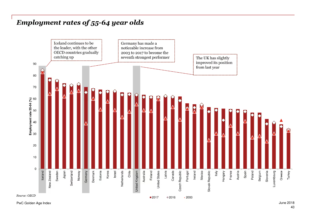
The slide features a column chart comparing the employment rates of 55-64 year olds across various OECD countries. Annotations highlight notable trends and changes over time.
Market Analysis and Trends
Government & Public Sector
This slide presents the employment rates of 55-64 year olds across OECD countries, highlighting trends and improvements in specific countries. It shows the UK's position relative to other countries and notes significant changes over time.
employment rates, 55-64 year olds, OECD, trends, UK, comparisons, improvements, data analysis
Single Chart
PwC/Strategy&
Saved
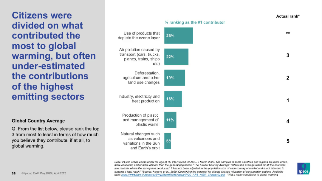
Left-aligned title with vertical bar chart on the right showing perceived top contributors to global warming versus actual ranks.
Market Analysis and Trends
Environmental Services & Sustainability
This slide highlights public misconceptions about the main contributors to global warming. The most frequently chosen contributors (e.g., ozone-depleting products) differ from the actual top emitters like industry and electricity. Perception vs. reality is emphasized.
global warming, perception gap, emissions, climate change, public opinion, misconceptions, top contributors, Ipsos, sustainability
Mixed Chart
IPSOS
Saved
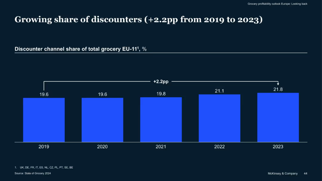
Single bar chart comparing discounter channel share of grocery sales from 2019–2023
Market Analysis and Trends
Retail & E-commerce
Discounter grocery channels have increased their share by 2.2 percentage points across EU-11 countries from 2019 to 2023, suggesting a shift in consumer preference towards cost-saving formats in a high-inflation environment.
Discounters, Grocery Share, EU Market, Cost-Sensitive Shoppers, Trends
Single Chart
McKinsey
Saved
Venn diagram showing the overlap of content consumption across LTV, OTT, and movie studios, with consumer quotes on their viewing preferences.
Customer and Market Segmentation
Media & Entertainment
This slide presents the seamless transition of consumers between LTV and OTT platforms, supported by a Venn diagram and consumer quotes.
LTV, OTT, transition, consumers, preferences
Mixed Chart
BCG
Saved
This slide features a column chart displaying expected changes in second-hand consumption across various markets post-pandemic. The chart uses three color bars for "More," "About the same," and "Less." The text includes a question and survey details.
Market Analysis and Trends
Consumer Goods
The slide shows survey data on anticipated changes in second-hand purchasing behaviors post-pandemic, with comparisons across different global markets.
second-hand, consumption, market trends, survey, global behavior
Multiple Chart
IPSOS
Saved
Includes three line graphs for 'Historical Yields' and 'Correlation of S&P 500 Stocks', plus column chart for 'Current Yields' and a line graph for 'CBOE Market Volatility Index (VIX)'. The slide has a clear separation of sections, with color-coded elements and succinct axis labeling.
Investment Analysis
Financial Services
Targeting investors, this slide analyzes dividend yields and market volatility, contrasting historical and current data. It highlights yield trends and the correlation within the S&P 500, alongside the VIX trend, crucial for understanding market stability and potential investment risks.
Dividends, Yields, Volatility, S&P 500, VIX
Multiple Chart
Morgan Stanley
Saved
This slide consists of multiple horizontal bar charts detailing the percentage of consumers willing to pay more for various types of sustainable food.
Customer and Market Segmentation
Agriculture & Food Production
Shows consumer willingness to pay premiums for food with attributes like GMO-free, fair trade, and organic. Useful for understanding market preferences for sustainable products.
Consumer, Food, Sustainable, Premiums, Preferences
Single Chart
Deloitte
Saved
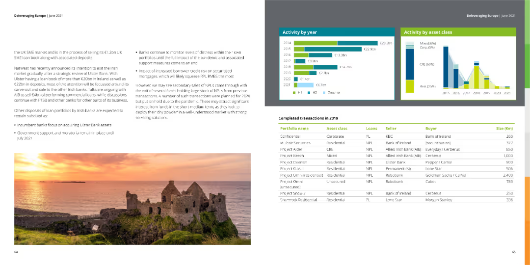
The slide shows column charts of activity by year and asset class, along with a table of completed transactions in 2019. An image of a scenic landscape is featured.
Market Analysis and Trends
Financial Services
This slide details the completed transactions in 2019 within the financial services industry, focusing on activity by year and asset class.
completed transactions, 2019, financial services
Multiple Chart
Deloitte
Saved
Features a pie chart and several bar charts showing job titles, average account premiums, respondents' ages, and years in the insurance industry for commercial lines-focused underwriters.
Market Analysis and Trends
Financial Services
Detailed demographic and financial profile of commercial lines-focused underwriters, covering aspects like job roles, premium sizes, age groups, and industry tenure.
commercial lines, insurance, demographics, job roles, premiums, age distribution, tenure, financial analysis
Multiple Chart
Accenture
Saved
Bar chart displaying sector performance percentages; dominant orange theme; clear 80% "Yes" response visualization.
Human Resources and Talent Management
Professional Services
Highlights the adoption of formal performance management processes across various sectors.
performance, management, sector, adoption, visualization
Multiple Chart
PwC/Strategy&
Saved
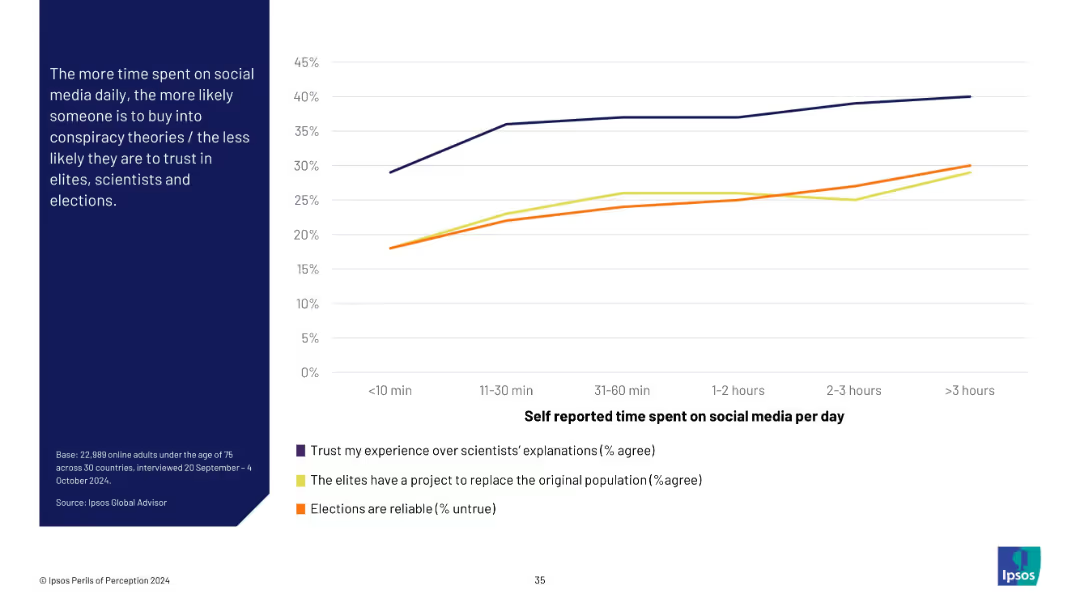
Split layout: left panel with text on navy blue background; right side features a line chart with three colored lines over time vs. social media use.
Market Analysis and Trends
Media & Entertainment
Shows correlation between time spent on social media and increased distrust in scientists, elites, and elections. The graph uses self-reported usage to reveal how beliefs diverge based on media consumption habits.
social media, conspiracy, trust, elections, science, misinformation, Ipsos, time spent, perception, beliefs
Mixed Chart
IPSOS
Saved
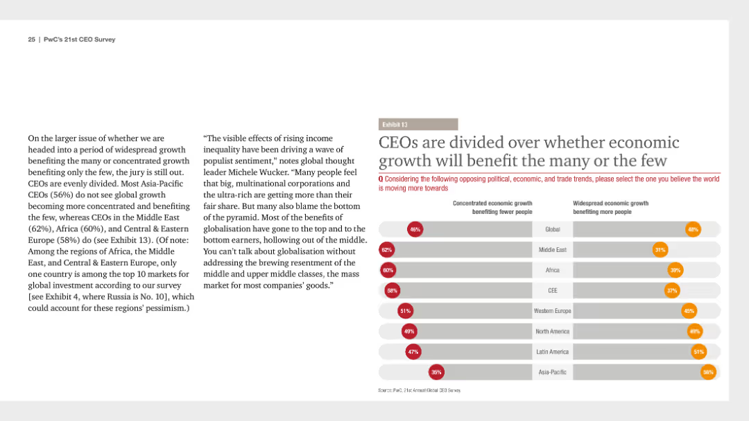
A column chart showing regional opinions on whether economic growth will benefit the many or the few. Accompanying text discusses CEO perspectives on global growth and economic inequality.
Risk Assessment and Management
Financial Services
The slide presents divided opinions among CEOs about whether economic growth will benefit many people or a few, highlighting regional differences and economic inequality concerns.
economic, growth, inequality, CEOs, regional
Multiple Chart
PwC/Strategy&
Saved
Column charts showing percentages of company performance indicators like sales, customer retention, and profits.
Market Analysis and Trends
Professional Services
Compares company performance metrics across B2B and B2C sectors, noting particularly strong performance in B2B services.
B2B, B2C, company performance, sales, profits
Mixed Chart
Deloitte
Saved
The slide displays bar charts and percentage data highlighting the positive impacts on First Nations communities, using colors to differentiate between various impact levels.
Market Analysis and Trends
Telecommunications
Discusses the significant positive impact of the nbn network on the life satisfaction of First Nations users, emphasizing employment, education, and environmental benefits.
nbn, First Nations, Satisfaction, Impact, Positive
Multiple Chart
Accenture
Saved
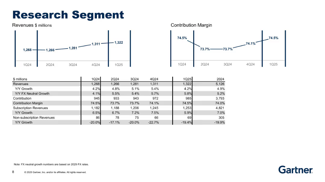
Line charts for revenues and margin, and detailed financial table covering 1Q24–1Q25 and full year 2024.
Performance Metrics and KPIs
Technology & Software
Detailed performance metrics for Gartner’s Research segment, including revenue growth (YoY), FX-neutral growth, subscription vs non-subscription splits, and contribution margins. Shows consistent growth and strong profitability.
research, subscription, revenue growth, margin, KPIs, FX neutral, contribution, segment analysis, Gartner
Multiple Chart
Gartner
Saved
Presents data and future strategies in lending market share through various graphs.
Market Analysis and Trends
Financial Services
Discusses strategies to increase lending market share and improve service models.
lending, market share, strategies, service model
Linear Flow
Barclays
Saved
A pie chart dominates half the slide, with complementary circular graphics and minimal text for clarity in comparison.
Market Analysis and Trends
Technology & Software
Examines the influx of new digital consumers during the pandemic, offering a breakdown that could influence digital marketing strategies.
digital consumers, pandemic trends, consumer analysis, SEA, pre-pandemic comparison, internet economy
Single Chart
Bain
Saved
Previous
Next
If nothing, comes up, please save your slides first
Create a FREE account to continue browsing
Receive Instant Access to 1,000+ slides from companies like McKinsey, Google, and Goldman Sachs
First Name
Last Name
Email
Password
I agree to all
Terms & Privacy Policy
Thank you! Your submission has been received!
Oops! Something went wrong while submitting the form.
Have an account?
Sign in
Column Chart
Heatmap
Chevron
Org Chart
Infographic
Callouts
Timeline
List
Graphic
Picture
Process Flow
Diagram
Paragraph
Map
Table
Framework
Subtitle
Takeaway Box
Icon
Other Chart
Radar Chart
Waterfall Chart
Mekko Chart
Pie Chart
Scatter Plot
Line Chart
Bar chart
Bullet points