Create a FREE Account
Instant access to 1,000+ real slides from top companies like McKinsey, BCG, Goldman Sachs, Google and many more!
First Name
Last Name
Email
Password
I agree to all
Terms & Privacy Policy
Thank you! Your submission has been received!
Oops! Something went wrong while submitting the form.
Have an account?
Sign in
Library
Templates
Courses
Pricing
My Account
My Slides
My Templates
✦ AI
AI Prompt Library
AI Search
Sign in
Start Here
Logout
My Saved Slides
This slide presents line graphs detailing economic recovery under a scenario of virus recurrence with muted recovery, highlighting GDP changes and recovery timelines.
Financial Performance
Financial Services
Evaluates the potential economic outcomes of a recurring COVID-19 scenario, focusing on delayed or subdued economic recovery across key global markets.
GDP, economic downturn, COVID-19, muted recovery, markets
Single Chart
McKinsey
Saved
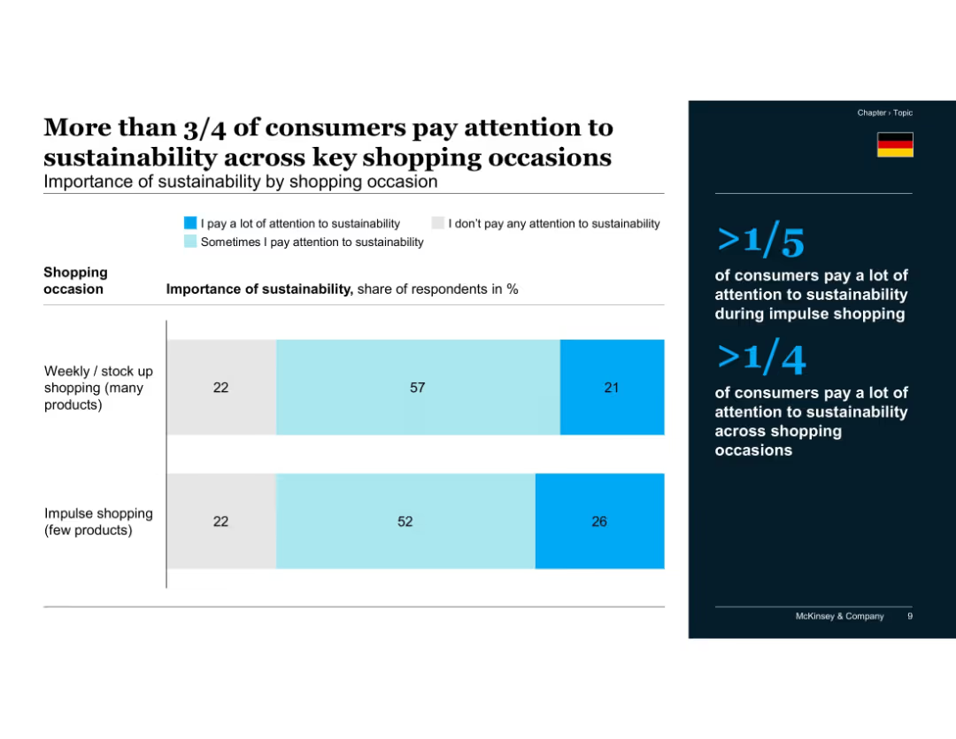
Two stacked bar charts comparing sustainability attention during different shopping types, with right-side key points
Customer and Market Segmentation
Consumer Goods
The majority of consumers consider sustainability in their shopping, with 78% doing so during weekly stock-up trips and 73% even during impulse buying. Highlights that sustainability is a consistent consideration across shopping contexts.
sustainability, impulse shopping, weekly shopping, consumer behavior, shopping habits, attention span, environmental concern, McKinsey, Germany
Mixed Chart
McKinsey
Saved
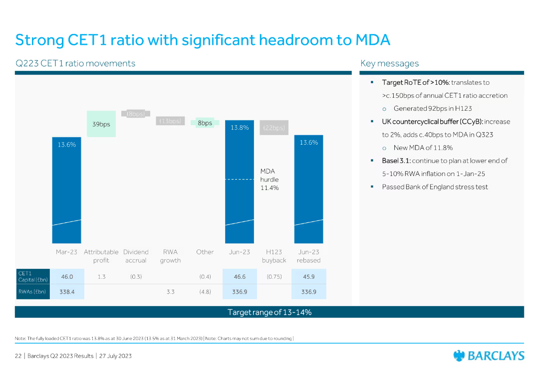
Contains bar charts and key metrics related to CET1 ratio movements and regulatory headroom.
Financial Performance
Financial Services
Explains the strong CET1 ratio and the significant headroom to the MDA, including key regulatory and financial metrics.
CET1, ratio, MDA, regulatory, headroom
Mixed Chart
Barclays
Saved
This slide is highly graphical, featuring a mix of a cycle diagram and pyramid diagram in bright purple and green, with four data-driven boxes presenting key statistics related to automotive market penetration and behaviors.
Market Analysis and Trends
Financial Services
This slide illustrates how Experian's distribution platform can integrate with automotive data to drive new revenue streams, focusing on consumer behavior and expansion potential within the auto industry.
automotive, revenue, data integration, consumer behavior, expansion potential
Multiple Chart
Barclays
Saved
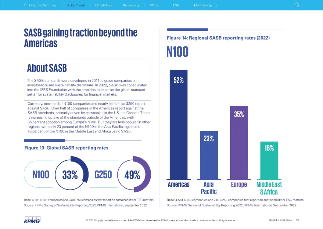
Left side explains SASB framework; right shows global and regional adoption bar charts
Regulatory and Compliance
Professional Services
Discusses adoption of the SASB framework for sustainability disclosure. It shows that the Americas lead (52%), followed by Europe (35%), with lower uptake in Asia Pacific (23%) and Middle East & Africa (18%). Global rates for N100 and G250 are also included.
SASB, sustainability disclosure, ESG standards, global adoption, Americas, G250, N100
Multiple Chart
KPMG
Saved
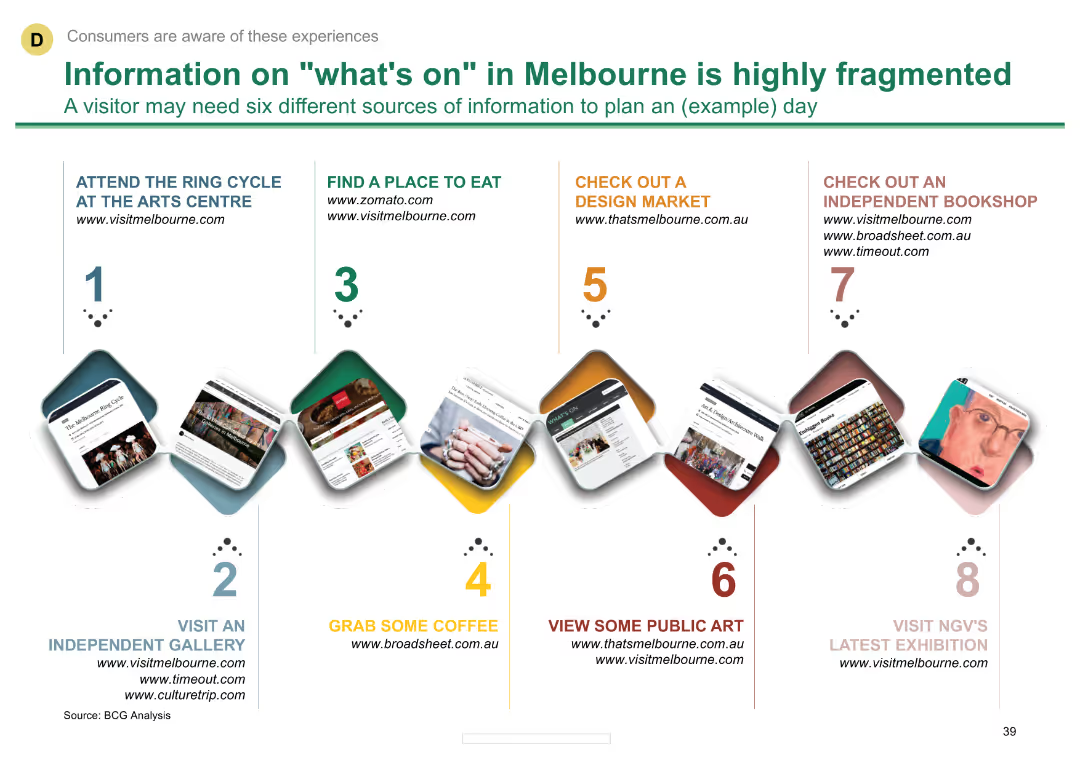
A timeline diagram showing various activities and websites where visitors can find information about Melbourne's attractions. Each step includes a small image and text describing the activity.
Customer and Market Segmentation
Hospitality & Tourism
Highlights the fragmented nature of information sources for tourists in Melbourne and suggests six different sources visitors might need to plan a day.
tourism, Melbourne, attractions, visitor information, websites
Vertical Flow
BCG
Saved
Includes a bar chart showing consumer preferences for smartphone features, focusing on battery life and camera quality.
Product and Service Analysis
Telecommunications
Highlights consumer preferences for certain smartphone features like battery life and camera, while noting lower interest in eco-friendly specifications.
smartphone features, consumer preferences, battery life, camera quality, sustainability
Mixed Chart
Deloitte
Saved
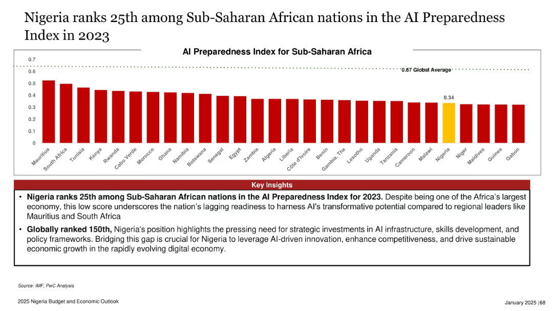
Horizontal bar chart comparing AI readiness index scores of SSA countries; Nigeria highlighted in yellow
Industry Overview
Artificial Intelligence
The slide ranks Nigeria low in AI preparedness among Sub-Saharan African nations, with a score of 0.34—below the global average of 0.67. Insights emphasize the urgent need for investments in infrastructure, policy, and skills to leverage AI’s economic potential and competitiveness in the digital age.
AI, Nigeria, digital economy, infrastructure, readiness, innovation, skills, policy
Mixed Chart
PwC/Strategy&
Saved
Features bullet points and icons detailing challenges and strategies in AI implementation.
Risk Assessment and Management
Technology & Software
Examines the broader challenges of AI adoption, including labor market shifts, data management, and regulatory concerns.
AI Challenges, Labor Market, Data Management, Regulatory Issues, Risk Management, AI Adoption, Ethical Considerations
Multiple Chart
BCG
Saved
The slide is structured with a column chart and a line graph, where the column chart represents the portfolio occupancy percentages and the line graph tracks rent reversion percentage. The color scheme used is uniform for the columns, with a clear legend and time period indicators. It also includes an explanatory footnote about the data comparison.
Market Analysis and Trends
Real Estate & Construction
Analyzes the high occupancy levels and tenant retention rates within the light industrial/logistics portfolio, indicating effective management and market demand.
Logistics Portfolio, Occupancy Rates, Tenant Retention, Rent Reversion, Asset Management, Market Demand
Single Chart
Morgan Stanley
Saved
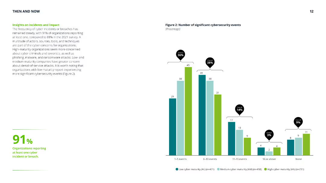
Column chart showing the number of significant cybersecurity events, with accompanying text highlighting the steady frequency of cyber incidents and differences in concerns across maturity levels.
Risk Assessment and Management
Technology & Software
Provides insights into the frequency and impact of cybersecurity incidents, emphasizing the concerns of low, medium, and high-maturity organizations and their experiences with cyber threats.
cyber security, incidents, impact, risk assessment, maturity levels, cyber threats, frequency, organization concerns
Mixed Chart
Deloitte
Saved
Slide with column chart comparing investment banking net revenues, alongside a table detailing financial metrics such as net revenues, earnings, and equity. The graphs use blue and white bars, and the layout is clean and data-focused.
Investment Analysis
Financial Services
Summarizes the financial results and highlights of investment banking activities, suitable for investor briefings or financial strategy meetings. It provides insights into areas like equity, debt underwriting, and financial advisory services.
Investment Banking, Net Revenue, Financial Advisory
Mixed Chart
Goldman Sachs
Saved
The slide splits into two sections, one with bullet points outlining strategic imperatives and the other with a graphic metaphor of "timeboxing" the virus. It's simple with minimal color usage, primarily black and white.
Strategic Planning
Healthcare & Pharmaceuticals
This slide discusses strategic imperatives to safeguard lives and livelihoods amid COVID-19, alongside a graphic illustrating the concept of "timeboxing" the pandemic's impact. It's useful for conveying strategic actions and their expected outcomes.
Strategic Imperatives, COVID-19, Timeboxing, Safety
Mixed Chart
McKinsey
Saved
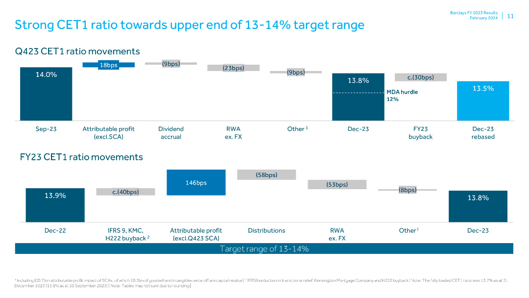
The slide uses a combination of column charts and text blocks to show CET1 ratio movements for Q423 and FY23. It features a mixture of blue and gray.
Financial Performance
Financial Services
Highlights the CET1 ratio movements for Q423 and FY23, showing progress toward the target range. Includes figures for profits, buybacks, and other factors.
CET1 ratio, Q423, FY23, target range, financial performance, dividend, RWA, FX, buyback, attributable profit
Multiple Chart
Barclays
Saved
Slide with icons and bullet points, outlining the reasons for leadership to consider Web3 impacts.
Technology and Digital Transformation
Technology & Software
Discusses the implications of Web3 on business models, innovation, access and inclusion, and customer experience.
Web3 implications, leadership, business model disruption, innovation, inclusion
Pillar
McKinsey
Saved
This slide contains multiple pie charts showing different maturity levels of second-line climate-risk management teams across various organizations. The layout is clean and structured.
Risk Assessment and Management
Financial Services
The slide presents data on how organizations rate the maturity of their second-line climate-risk management teams, distinguishing between G-SIBs and non-G-SIBs.
climate risk, maturity, pie charts, G-SIB, non-G-SIB
Multiple Chart
EY
Saved
A horizontal bar chart listing factors negatively affecting HR function, highlighting the top three factors.
Strategic Planning
Professional Services
Slide illustrates major barriers in HR function performance, useful in HR management discussions for identifying critical areas of focus.
HR, barriers, management, performance, top three
Single Chart
PwC/Strategy&
Saved
This slide includes a column chart with past, present, and projected future data points comparing the extent of outsourcing in digital marketing. It uses a clean and straightforward design, employing contrasting colors to differentiate between the time frames and sectors involved. Additional text provides context and insights related to the chart.
Customer and Market Segmentation
Professional Services
Analyzing the role of external agencies in digital marketing, this slide provides data on outsourcing trends across different sectors. It is relevant for evaluating and planning digital marketing strategies, particularly the decision to in-source versus outsource elements of digital campaigns.
outsourcing, digital marketing, sector comparison, future trends, agencies
Mixed Chart
Deloitte
Saved
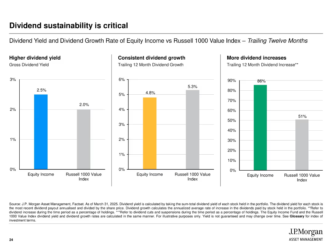
Three-column layout with bar charts comparing Equity Income and Russell 1000 Value Index on dividend yield, growth, and increases; simple design with color-coded bars.
Financial Performance
Financial Services
The slide emphasizes the sustainability of dividends by comparing gross yield, dividend growth rate, and frequency of dividend increases between Equity Income and the Russell 1000 Value Index over the trailing twelve months.
dividends, yield, growth, Russell 1000, equity income, comparison, bar chart, sustainability, income, financial metrics
Multiple Chart
JP Morgan
Saved
Bullet points and icons create a navigable visual hierarchy. The design is straightforward, highlighting the key imperatives for digital adoption acceleration.
Strategic Planning
Technology & Software
Focuses on the imperatives that need to be accelerated to boost digital adoption in Indonesia. Aimed at guiding government policy development and enhancing the Indonesian internet economy, especially in tier 2 and 3 cities.
Digital Adoption, Imperatives, Policy Development, Internet Economy, Indonesia, Tier 2 and 3 Cities, Government
Pillar
Kearney
Saved
A slide with two main sections, each containing bullet points, highlighted statistics, and icons representing different countries.
Market Analysis and Trends
Financial Services
The slide summarizes the macroeconomic impact on Europe’s FDI in 2022 and discusses investment trends in various European countries.
Europe, FDI, investment, macroeconomic, trends
Multiple Chart
EY
Saved
This slide contains column charts showing the drivers of recent CPI inflation in the US, UK, and Euro area from January 2021 to February 2023. The charts display contributions from major goods and services categories like energy, food, and housing. Commentary provides additional insights.
Market Analysis and Trends
Consumer Goods
The slide examines inflation drivers, focusing on food price pressures in the UK, and compares them with trends in the US and Euro area. It highlights contributions from various goods and services categories to overall inflation, noting the persistent high core inflation in these regions.
inflation, food prices, US, UK, Euro area, CPI, trends
Multiple Chart
Accenture
Saved
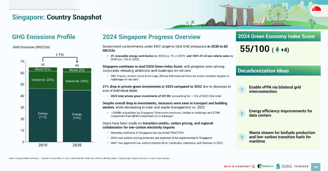
Bar chart on left showing GHG trends; progress summary on right includes text blocks, Green Index Score, and decarbonization ideas in numbered blocks.
Strategic Planning
Government & Public Sector
Singapore aims to cut emissions to 60 MtCO2e by 2030. It leads SEA in Green Index Score (55/100). 2023 saw a drop in private green investments, but building and transport sectors saw gains. Key strategies include vPPA, data center efficiency, and waste-to-fuel transitions.
Singapore, emissions, decarbonization, energy, transport, data centers, vPPA, 2024
Mixed Chart
Bain
Saved
Slide contains a bar chart showing hydrogen production costs over time comparing grey, blue, and green hydrogen.
Investment Analysis
Energy & Utilities
Analyzes cost trends in hydrogen production, emphasizing the economic shift towards green hydrogen as a viable future investment in energy.
hydrogen, green energy, cost trends, investment analysis, energy sector
Linear Flow
McKinsey
Saved
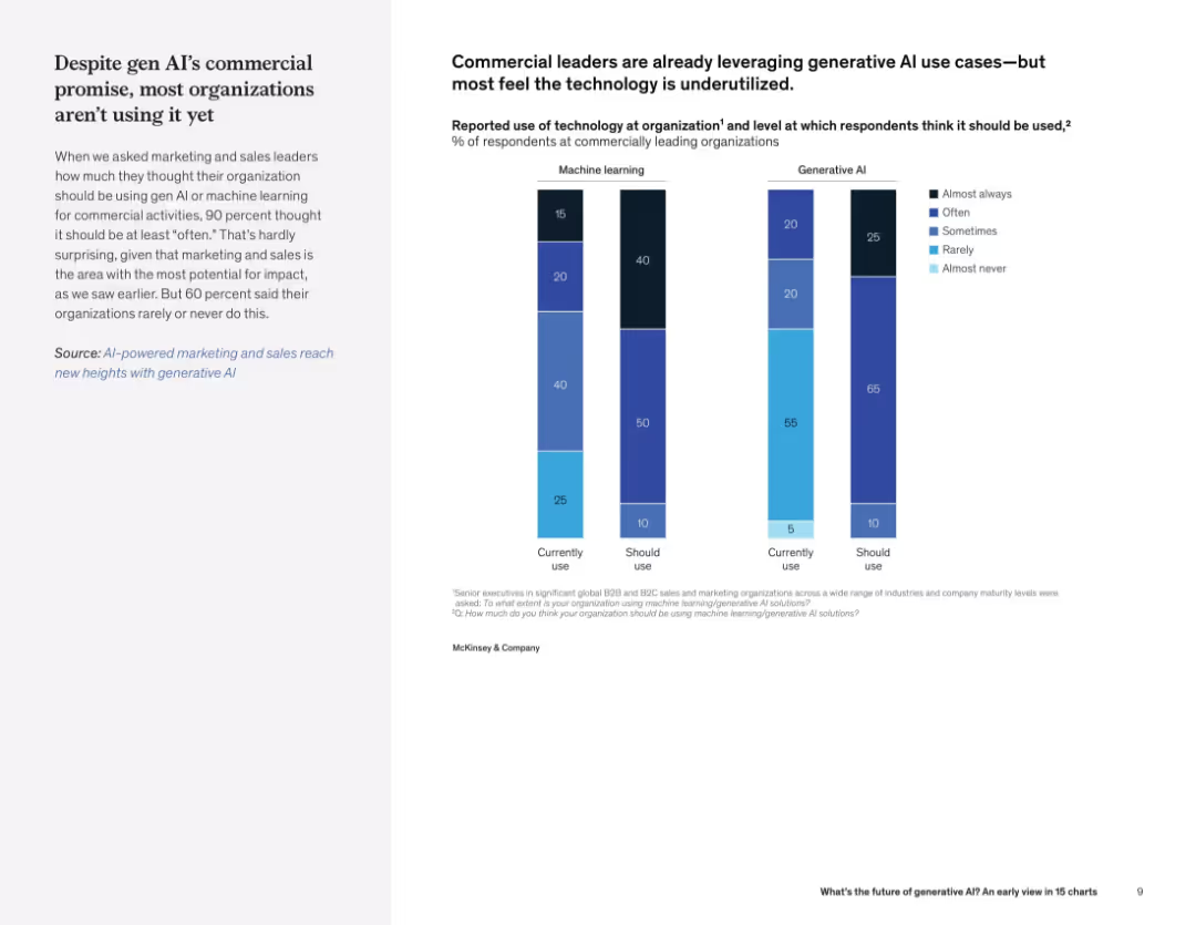
Two-column layout with text on the left and vertical bar charts comparing current vs. desired use of ML and generative AI on the right.
Technology and Digital Transformation
Artificial Intelligence
This slide compares the current vs. ideal use of ML and generative AI in commercial organizations. Although leaders believe AI should be used often, current adoption is much lower, particularly for generative AI.
generative AI, machine learning, adoption, underutilized, commercial leaders, usage gap, current use, expected use
Mixed Chart
McKinsey
Saved
Previous
Next
If nothing, comes up, please save your slides first
Create a FREE account to continue browsing
Receive Instant Access to 1,000+ slides from companies like McKinsey, Google, and Goldman Sachs
First Name
Last Name
Email
Password
I agree to all
Terms & Privacy Policy
Thank you! Your submission has been received!
Oops! Something went wrong while submitting the form.
Have an account?
Sign in
Column Chart
Heatmap
Chevron
Org Chart
Infographic
Callouts
Timeline
List
Graphic
Picture
Process Flow
Diagram
Paragraph
Map
Table
Framework
Subtitle
Takeaway Box
Icon
Other Chart
Radar Chart
Waterfall Chart
Mekko Chart
Pie Chart
Scatter Plot
Line Chart
Bar chart
Bullet points