Create a FREE Account
Instant access to 1,000+ real slides from top companies like McKinsey, BCG, Goldman Sachs, Google and many more!
First Name
Last Name
Email
Password
I agree to all
Terms & Privacy Policy
Thank you! Your submission has been received!
Oops! Something went wrong while submitting the form.
Have an account?
Sign in
Library
Templates
Courses
Pricing
My Account
My Slides
My Templates
✦ AI
AI Prompt Library
AI Search
Sign in
Start Here
Logout
My Saved Slides
This slide includes text blocks and icons in a bi-directional flowchart layout, highlighting factors of ASEAN's digital economy boom and related talent demand. It is clear with well-spaced elements, a white background, and teal highlights.
Investment Analysis
Technology & Software
Detailing the booming digital economy in ASEAN, this slide lays out contributing factors like internet penetration and digital services demand. It also emphasizes the role of digitalization in traditional industries, which impacts the demand for specialized local talent.
digital economy, ASEAN, internet penetration, talent demand, digitalization
Linear Flow
Kearney
Saved
Contains a column chart showing percentages for three years under categories such as 'significantly more attention' to 'significantly less attention' regarding employee focus on financial benefits, with an emphasis on the increase since 2022.
Performance Metrics and KPIs
Financial Services
Analyzes the trends of employee attention to financial benefits over the years, with a focus on the increased attention in the recent year, useful for gauging employee priorities.
Financial Benefits, Employee Attention, Trend Analysis, Year-over-Year, Bar Graph
Single Chart
Goldman Sachs
Saved
Light background with green accents, a bar chart on the left showing positive contributions of cyber initiatives, explanatory text on the right.
Operational Efficiency
Technology & Software
The slide discusses the positive contributions of cyber initiatives, such as improved brand reputation and operational stability, with survey data supporting these benefits.
Cyber initiatives, benefits, operational stability, survey, bar chart
Mixed Chart
Gartner
Saved
The slide features a mix of tables, column charts, and text boxes to present IPO data across APAC markets.
Market Analysis and Trends
Financial Services
It highlights the number and proceeds of IPOs in the APAC region, focusing on the strong performance of Greater China and South Korea.
APAC, Greater China, South Korea, IPOs, performance
Multiple Chart
EY
Saved
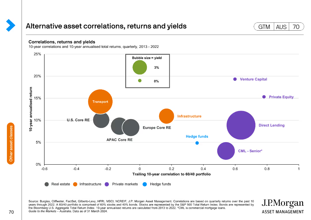
The slide features a bubble chart showing correlations, returns, and yields of alternative assets from 2013 to 2022. The x-axis represents the trailing 10-year correlation to a 60/40 portfolio, and the y-axis shows the 10-year annualized return.
Investment Analysis
Financial Services
This slide provides insights into the performance of various alternative assets, highlighting their correlations, returns, and yields for investment analysis and portfolio management.
Alternative assets, correlations, returns, yields, investment analysis, portfolio management, bubble chart
Single Chart
JP Morgan
Saved
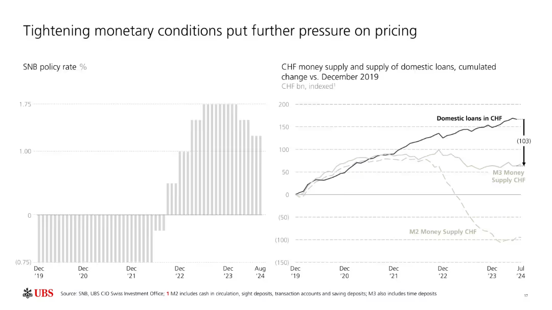
Dual-chart layout: bar chart of SNB policy rates and line graph of CHF loan/money supply trends.
Market Analysis and Trends
Financial Services
This slide shows the tightening of monetary policy by the SNB and its effects on domestic loan supply and CHF money supply (M2/M3). The decline in monetary aggregates vs. stable loan demand reflects increasing pricing pressure and tighter credit environments.
SNB, interest rates, CHF, loan supply, money supply, monetary tightening, M2, M3, pricing pressure, macroeconomic
Multiple Chart
UBS
Saved
This slide features a pyramid diagram with text boxes, highlighting strategies and actions. There is also a bullet point text section on the right side.
Strategic Planning
Transportation & Logistics
The slide outlines the National Freight and Supply Chain Strategy, detailing actions and priority actions for improving freight performance and efficiency.
Strategy, Freight, Supply Chain, Logistics, Data
Diagram
LEK
Saved
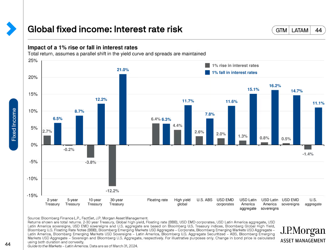
A column chart depicting the impact of a 1% rise or fall in interest rates on various fixed income assets. The chart includes blue and gray bars representing the rise and fall respectively, with detailed values for each asset category on the x-axis.
Risk Assessment and Management
Financial Services
This slide illustrates the potential effects of a 1% interest rate change on the total return of different fixed income instruments, highlighting the sensitivity of various assets like treasuries, corporates, and sovereigns to interest rate fluctuations.
Interest rates, fixed income, total return, sensitivity, risk
Single Chart
JP Morgan
Saved
Includes pie charts and bullet points detailing non-recourse portfolio composition, regional loan distribution, and sector breakdown.
Investment Analysis
Real Estate & Construction
Highlights key metrics in commercial real estate portfolio, focusing on non-recourse loans, region-based distribution, and sector engagement, suitable for investment analysis.
commercial real estate, investment, non-recourse, loans, regional distribution, sectors
Multiple Chart
Deutsche Bank
Saved
Contains a map of the U.S. with color-coded regions, table comparing the company to its peers, and a clear textual overview of assets, deposits, and loans.
Industry Overview
Financial Services
Overview of the company's financial standing, market position, and operational scope, suitable for introducing the company to stakeholders or for orientation purposes.
financial overview, market position, company scope, operational reach
Graphic
Goldman Sachs
Saved
Includes market share column and line charts for equities and FICC, along with a market share comparison bar chart against peers.
Market Analysis and Trends
Financial Services
Demonstrates firm’s leading positions in equities and FICC, and market share growth relative to peers.
Equities, FICC, Market Share, Industry Wallet, Competitive Analysis
Multiple Chart
JP Morgan
Saved
The slide displays two column charts, one with colors and one with minimized color usage, following Tufte's principle to remove colors.
Technology and Digital Transformation
Professional Services
The slide illustrates the principle of removing colors to focus on data clarity and efficiency in presentations, as advised by Tufte.
Tufte, data-to-ink, ratio, survey, responses, visualization, colors, chart, clarity, design
Multiple Chart
EY
Saved
Diagram showing interconnectivity between different CIB businesses and client engagement statistics in a geometric layout.
Industry Overview
Financial Services
This diagram illustrates the synergy among JP Morgan's CIB businesses—Investment Banking, Markets, Payments, and Securities Services—and their client coverage. It shows the percentage of clients engaged with multiple CIB services, emphasizing comprehensive client solutions and connectivity.
CIB, clients, business, synergy
Mixed Chart
JP Morgan
Saved
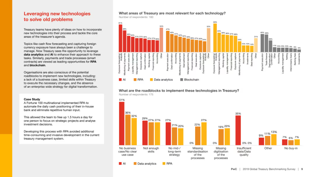
Column charts comparing areas of treasury relevance and roadblocks for implementing technologies like AI, RPA, and data analytics, with a case study example included.
Technology and Digital Transformation
Financial Services
The slide analyzes how new technologies can solve traditional treasury problems, highlighting the relevance of different technologies and potential implementation roadblocks.
New technologies, treasury, AI, RPA, data analytics
Multiple Chart
PwC/Strategy&
Saved
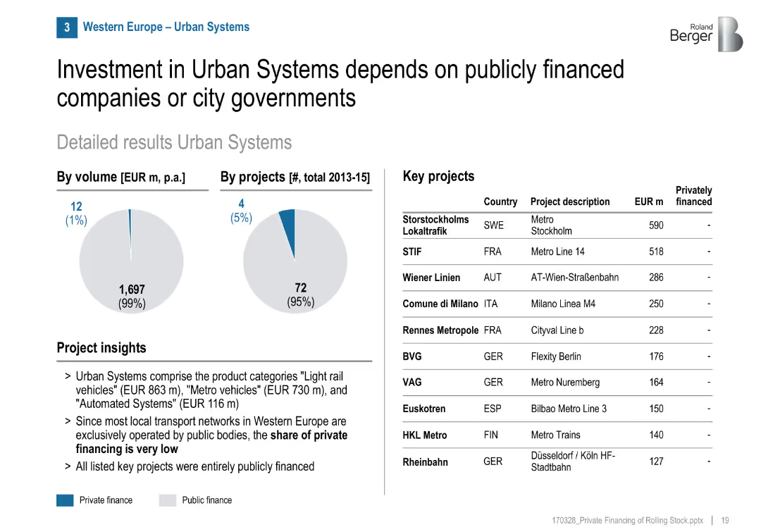
Minimal private finance (pie charts), project table, mostly public projects, layout mirrors previous slides
Market Analysis and Trends
Transportation & Logistics
Urban transport systems like metros and trams in Western Europe are almost entirely publicly financed, with minimal private involvement. Key projects are funded by municipalities or public entities.
urban transport, metro, trams, public sector, city governments, public finance, Western Europe
Mixed Chart
Roland Berger
Saved
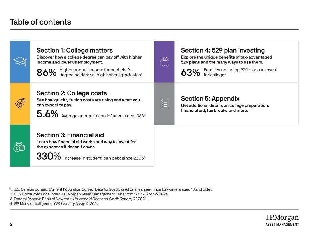
A clean grid layout with five colored blocks indicating major sections. Icons and large font percentages highlight key points.
Strategic Planning
Education & Training
The table of contents outlines five major sections of a presentation related to college education topics, including cost, value, financial aid, and tax-advantaged plans. It uses icons and stats to preview each section's key theme.
college planning, education cost, financial aid, 529 plans, presentation guide, tuition inflation, student loans, college value, savings plan, income statistics
Agenda
JP Morgan
Saved
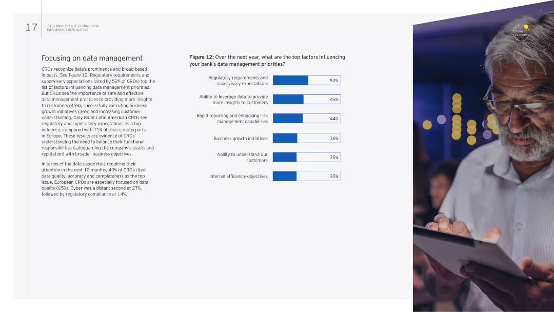
The slide has a combination of text and a column chart on the right. The chart identifies the top factors influencing data management priorities over the next year.
Strategic Planning
Financial Services
It emphasizes the importance of data management in banking, identifying key influencing factors such as regulatory requirements, data quality, and customer insights.
Data management, regulatory requirements, priorities, data quality, customer insights
Mixed Chart
EY
Saved
A content-rich slide with a bar graph and detailed text analysis. The graph on the right side displays percentages of brand-switching consumers from different Southeast Asian countries. The left side contains a descriptive analysis of brand-switching behavior.
Customer and Market Segmentation
Retail & E-commerce
Slide examines consumer openness to switching brands, with statistical data on Southeast Asian countries' brand loyalty. It discusses the implications for businesses in terms of innovation and customer retention, and variations in behavior by country.
brand switching, consumer behavior, Southeast Asia, market research, brand loyalty, business innovation, customer retention
Single Chart
Bain
Saved
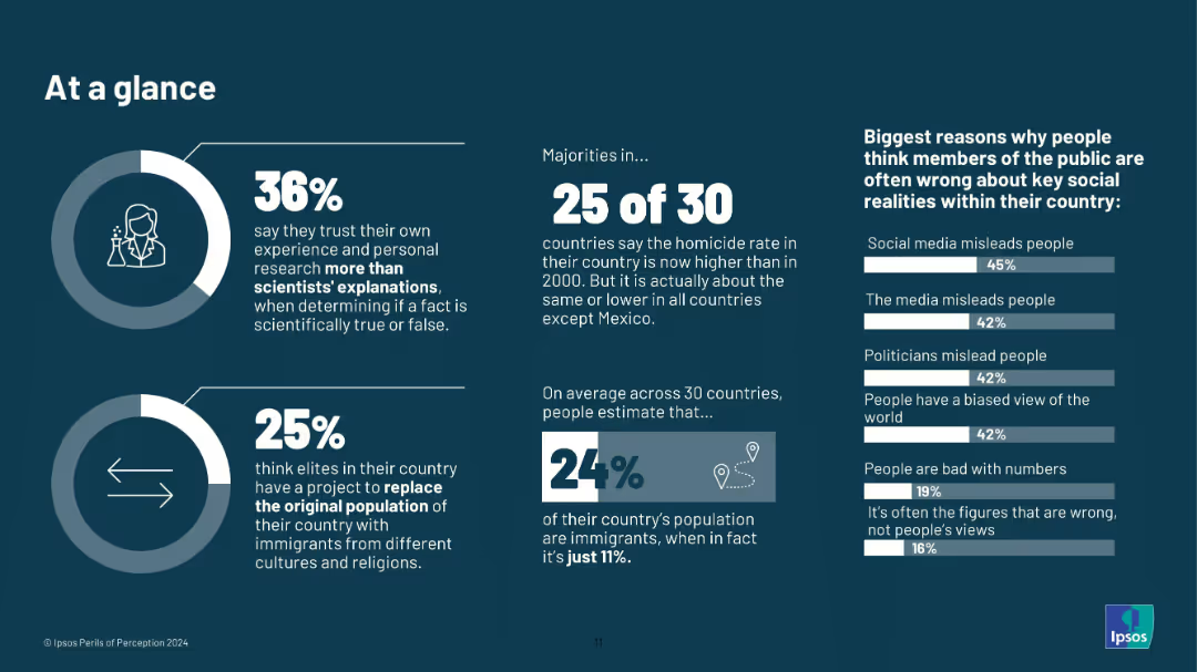
Infographic layout; icons, donut charts, large typography; dark background with white and blue text; no country-level breakdown.
Market Analysis and Trends
Education & Training
A summary slide offering highlights from the broader report. It shows 36% trust their own research over science, 25% believe in elite-driven population replacement, and 24% overestimate immigrant share. Misperceptions are tied to media, politicians, and biases.
misinformation, public opinion, perception gap, media influence, science trust, demographic myths, Ipsos, 2024, infographic, elite theories
Multiple Chart
IPSOS
Saved
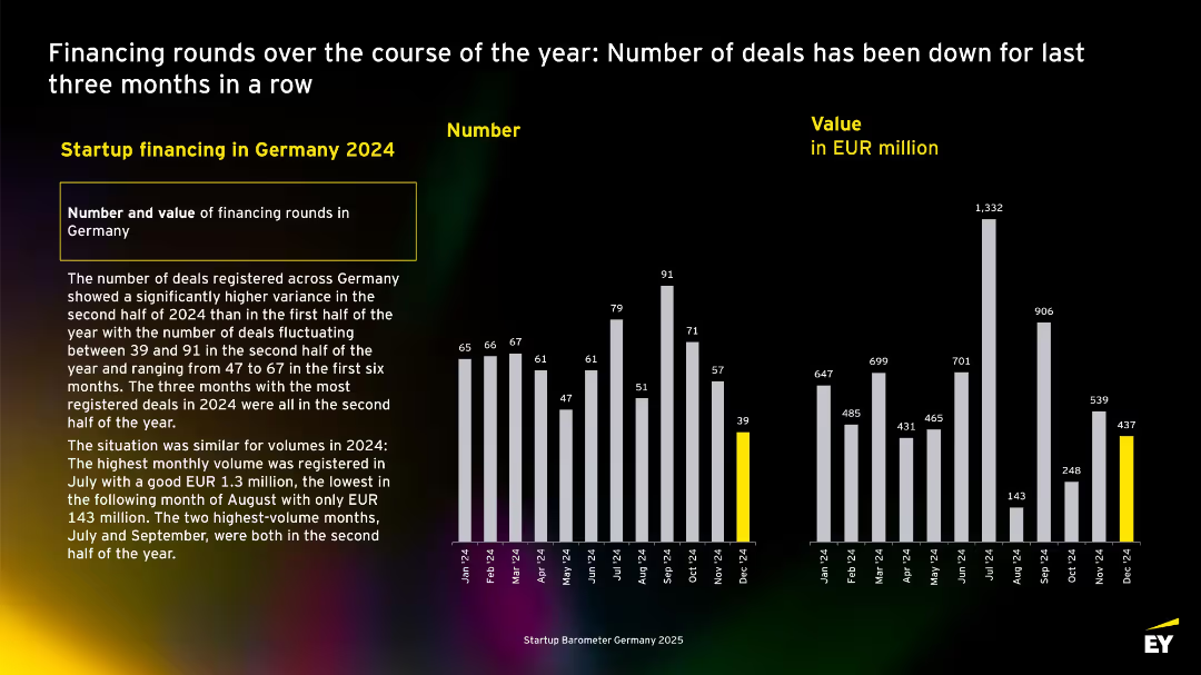
Monthly bar charts of deal numbers and values for 2024, with descriptive text on the left. Yellow highlight for December data.
Investment Analysis
Professional Services
Illustrates monthly fluctuations in startup deal counts and values for 2024. Highest activity was in Q3, while December marked the lowest. Emp
Multiple Chart
EY
Saved
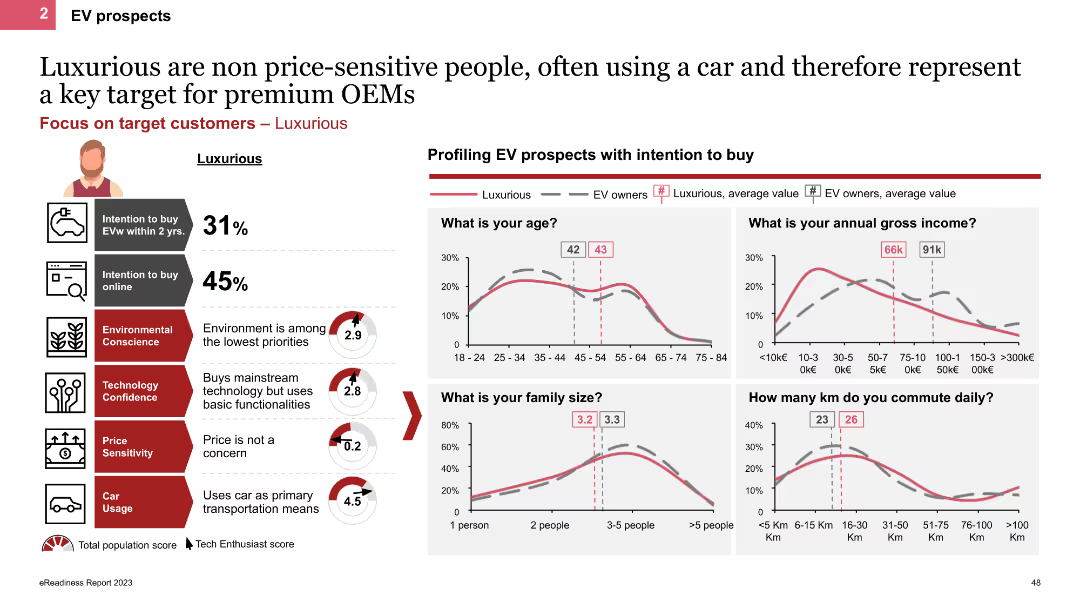
The slide profiles Luxurious personas using line charts and icons, showing demographic details like age, income, and family size. It highlights their high car usage and low price sensitivity, with charts comparing their characteristics to other EV owners.
Customer and Market Segmentation
Transportation & Logistics
This slide describes Luxurious personas, emphasizing their high income, frequent car usage, and lack of price sensitivity. It provides demographic comparisons and insights into their EV purchase behaviors and preferences.
EV prospects, Luxurious, line charts, demographics, high income
Multiple Chart
PwC/Strategy&
Saved
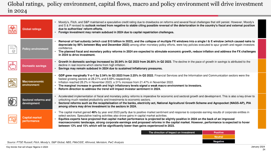
The slide features a well-structured layout with icons, bullet points, and color-coded sections to denote different categories such as global ratings, policy environment, domestic savings, macroeconomic environment, sectoral reforms, and capital market performance.
Market Analysis and Trends
Financial Services
The slide discusses the factors influencing investment in 2024, including global ratings, policy changes, domestic savings, and sectoral reforms. It highlights various economic indicators and trends that are expected to drive investment in the coming year.
global ratings, policy environment, capital flows, macroeconomic environment, investment trends
Table
PwC/Strategy&
Saved
Before-and-after comparison with two columns contrasting past and current business models. Lists key aspects with numbers and uses blue color highlights.
Organizational Structure and Change
Financial Services
Explains the shift in Morgan Stanley's business model, highlighting increased scale, added channels, and expanded service models.
Business model, scale increase, service expansion, channels, Morgan Stanley, organizational change, evolution
Table
Goldman Sachs
Saved
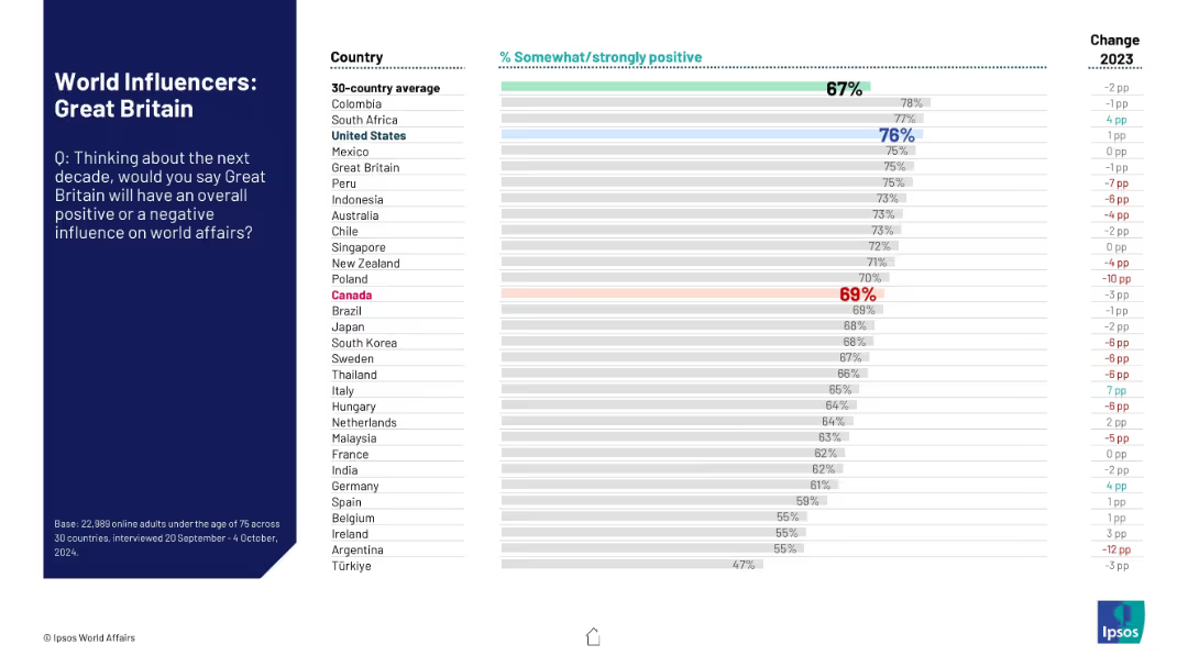
Split layout with dark blue title section on the left and a horizontal bar graph with country rankings on right.
Market Analysis and Trends
Government & Public Sector
The slide shows global perceptions of Great Britain's future influence on world affairs over the next decade. It includes a comparison across 30 countries, showing the percentage of people who view the UK's influence positively.
Great Britain, perception, influence, global opinion, Ipsos, bar chart, public opinion, international relations, positive impact, 2024 survey
Mixed Chart
IPSOS
Saved
The left side of the slide features a column chart illustrating the exponential growth in global commitment to Science-Based Targets from 2015 to 2021. The right side lists top problems for implementing ESG strategies in a bar chart.
Market Analysis and Trends
Environmental Services & Sustainability
The slide highlights the rapid increase in companies committing to Science-Based Targets for sustainability from 2015 to 2021 and identifies major challenges companies face in executing ESG strategies, such as lack of knowledge, prioritization, and funding.
sustainability, ESG, growth, challenges, targets
Multiple Chart
Kearney
Saved
Previous
Next
If nothing, comes up, please save your slides first
Create a FREE account to continue browsing
Receive Instant Access to 1,000+ slides from companies like McKinsey, Google, and Goldman Sachs
First Name
Last Name
Email
Password
I agree to all
Terms & Privacy Policy
Thank you! Your submission has been received!
Oops! Something went wrong while submitting the form.
Have an account?
Sign in
Column Chart
Heatmap
Chevron
Org Chart
Infographic
Callouts
Timeline
List
Graphic
Picture
Process Flow
Diagram
Paragraph
Map
Table
Framework
Subtitle
Takeaway Box
Icon
Other Chart
Radar Chart
Waterfall Chart
Mekko Chart
Pie Chart
Scatter Plot
Line Chart
Bar chart
Bullet points