Create a FREE Account
Instant access to 1,000+ real slides from top companies like McKinsey, BCG, Goldman Sachs, Google and many more!
First Name
Last Name
Email
Password
I agree to all
Terms & Privacy Policy
Thank you! Your submission has been received!
Oops! Something went wrong while submitting the form.
Have an account?
Sign in
Library
Templates
Courses
Pricing
My Account
My Slides
My Templates
✦ AI
AI Prompt Library
AI Search
Sign in
Start Here
Logout
My Saved Slides
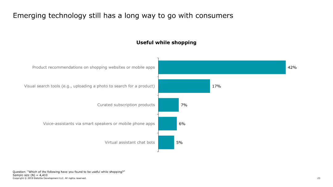
This slide features a column chart showing the usefulness of various shopping technologies. The chart includes categories like product recommendations, visual search tools, curated subscription products, voice assistants, and virtual assistant chat bots.
Technology and Digital Transformation
Technology & Software
The slide presents data on consumer perceptions of emerging shopping technologies, highlighting the percentage of users who find each technology useful while shopping. It emphasizes the gaps in technology adoption and usefulness.
shopping technology, consumer technology, retail tech, product recommendations, visual search
Single Chart
Deloitte
Saved
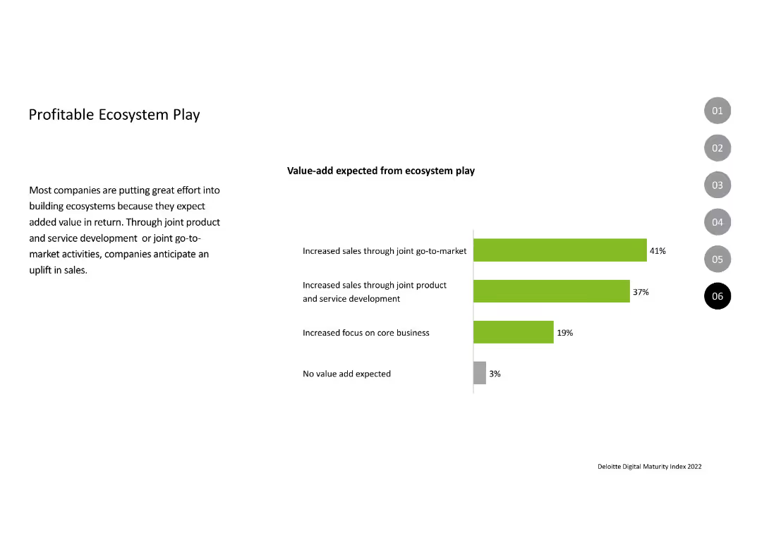
Contains a column chart displaying the expected value-add from ecosystem play, with bars in green and gray indicating percentages. The text on the left explains the rationale behind building ecosystems, highlighting benefits like increased sales and focus on core business.
Strategic Planning
Technology & Software
Describes the efforts companies are making to build ecosystems to enhance sales and focus on core business. The slide presents data on the anticipated value additions from joint go-to-market strategies and product development, with a small percentage expecting no value-add.
Ecosystem, Value-add, Sales, Development, Strategy
Mixed Chart
Deloitte
Saved
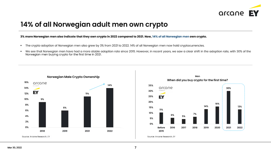
This slide presents data on Norwegian men owning cryptocurrency, including a column chart showing the percentage from 2018 to 2022 and a survey on when men first bought crypto. It highlights a 3% increase in ownership in 2022, reaching 14% overall.
Market Analysis and Trends
Financial Services
Shows that 14% of Norwegian men own cryptocurrency, with a steady increase over the years. Highlights the growth from 2021 to 2022 and the survey findings on the timeline of initial crypto purchases among men.
Cryptocurrency, Male adoption, Norway, Survey, Trends
Multiple Chart
EY
Saved
The slide includes a scatter plot chart showing upcoming CCUS clusters by operational year and region.
Strategic Planning
Energy & Utilities
This slide shows the expected development of cross-industries CCUS clusters in Europe and North America.
CCUS, clusters, Europe, North America, operational year
Single Chart
Kearney
Saved
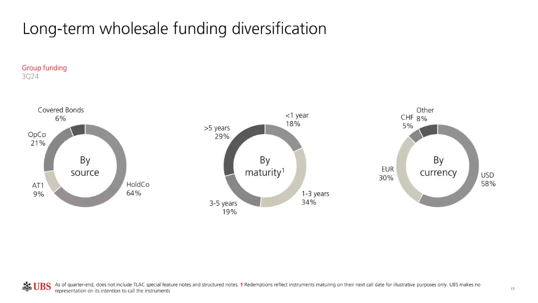
Three donut charts categorizing funding by source, maturity, and currency.
Investment Analysis
Financial Services
Displays the diversification of UBS’s long-term wholesale funding portfolio. Categorizes by instrument type (e.g., HoldCo, OpCo), maturity periods, and currency mix. Emphasizes UBS's broad funding base and balanced risk structure.
funding diversification, maturity, currency mix, UBS, wholesale funding
Single Chart
UBS
Saved
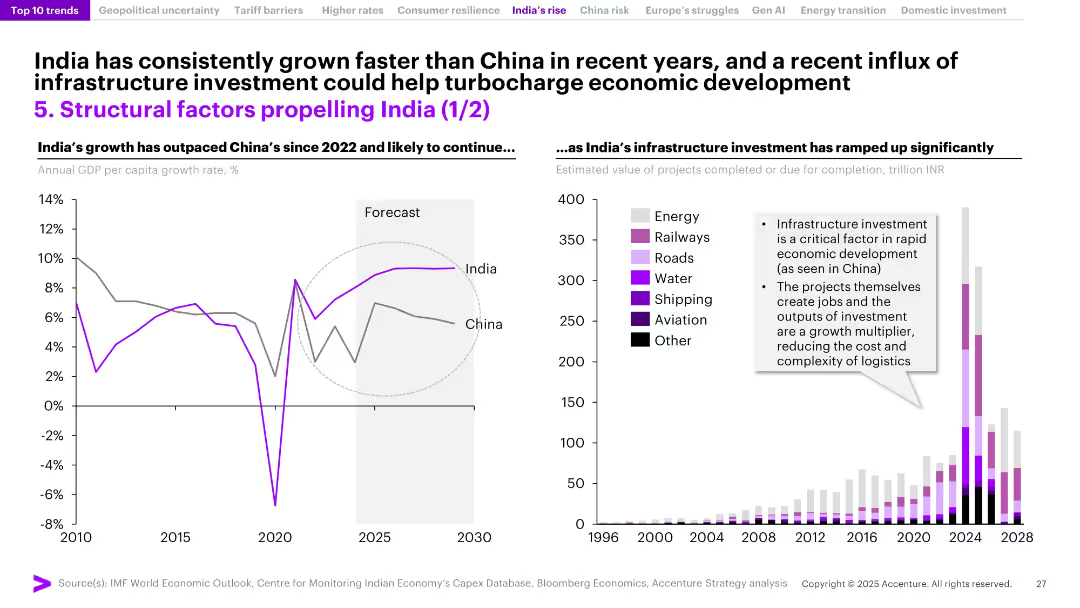
Split slide with left-side GDP growth comparison chart (India vs. China) and right-side bar chart of infrastructure investments by sector. Forecast zones shaded.
Investment Analysis
Government & Public Sector
India’s recent economic outperformance relative to China is showcased, alongside a rapid increase in infrastructure investment across sectors such as energy, roads, and railways. The slide underscores how infrastructure acts as a growth catalyst by creating jobs and improving logistics, positioning India for continued expansion.
India growth, GDP, infrastructure, China comparison, economic development, energy, railways, logistics, investment, capital spending
Multiple Chart
Accenture
Saved
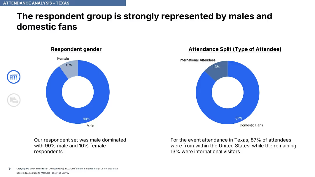
Two donut charts showing respondent gender and type (domestic vs international); text summaries
Customer and Market Segmentation
Media & Entertainment
Attendance in Texas was heavily male-dominated (90%) and largely domestic (87%). Provides demographic insight into event attendees.
attendance, demographics, Texas, ICC, domestic fans, male audience, gender split, survey, Nielsen, international attendees
Single Chart
Nielsen
Saved
Features timelines and bar graphics detailing the growth in hydrogen infrastructure and vehicle production capacities, supplemented by bullet points.
Operational Efficiency
Energy & Utilities
Explores South Korea's targeted expansion in hydrogen infrastructure and production capacities within the transportation and power sectors, aiming for substantial growth by 2040.
South Korea, Hydrogen, Transport, Electricity, Scale-up
Mixed Chart
McKinsey
Saved
This world map slide highlights specific countries like the USA, China, India, and Japan with red pins, indicating a focus on these regions for the survey. It provides a clear global comparison context.
Industry Overview
Professional Services
Offers a global overview of the countries prioritized in the survey, marking them as critical for understanding varying cultural attitudes across different regions.
global survey, cultural study, USA, China, India, Japan
Graphic
PwC/Strategy&
Saved
Features a world map and portrait of a woman, highlighting Brazil's role as a continental hub attracting global tech companies
Market Analysis and Trends
Technology & Software
Focuses on Brazil's emerging status as a tech hub, mapping major global tech players and their activities within the region
Brazil, tech hub, global, market, innovation
Graphic
McKinsey
Saved
The slide features a detailed flowchart showing the possible routes for converting various feedstocks (animal waste, agricultural residues, MSW, forestry residues, algae, energy crops) into energy through conditioning, pretreatment, intermediates, conversion, and final product stages.
Technology and Digital Transformation
Energy & Utilities
This slide outlines the complex pathways for converting different types of biomass feedstocks into energy, illustrating the various conditioning, pretreatment, and conversion processes involved.
feedstocks, energy pathways, biomass, conversion, conditioning, pretreatment, intermediates, final product
Diagram
Kearney
Saved
Slide presents a bar chart assessing the quality of underwriting processes across various criteria like strategy and tools, with varying shades indicating quality levels.
Operational Efficiency
Financial Services
Reviews the current quality of underwriting processes within a company, showing areas of strength and those needing improvement across various functions.
underwriting quality, assessment, process improvement, strategic quality, tool effectiveness
Mixed Chart
Accenture
Saved
Bar charts showing survey results about management difficulty over time in various countries.
Organizational Structure and Change
Professional Services
Highlights perceptions of increased difficulty in management roles from both managers and employees, useful for assessing global workforce sentiments and planning interventions.
management difficulty, survey results, global comparison, workforce sentiment, professional services, organizational challenges
Multiple Chart
BCG
Saved
Comparative column charts detailing perceptions of ROI on different educational degrees among Gen Z students.
Market Analysis and Trends
Education & Training
Compares the perceived value and ROI of four-year degrees versus associates’ degrees among different student demographics.
education, ROI, Gen Z, degree value, student perceptions
Multiple Chart
BCG
Saved
The slide features column charts showing adjusted net revenues, cost/income ratio, assets under management, and more for Swiss Bank.
Financial Performance
Financial Services
This slide provides financial performance metrics for the Swiss Bank sector, highlighting net revenues, cost/income ratio, and pre-tax income.
Swiss Bank, net revenues, cost/income ratio, assets under management, financial performance
Multiple Chart
Credit Suisse
Saved
Features pie charts and column charts detailing harassment and microaggressions in the workplace, with annotations explaining the data points. The design ensures easy comparison of statistics between Gen Z and Millennials.
Market Analysis and Trends
Professional Services
Details the prevalence of non-inclusive behaviors in workplaces affecting Gen Z and Millennials, with data on types of harassment experienced and reporting rates.
harassment, workplace, Gen Z, Millennials, non-inclusive behavior, reporting rates
Multiple Chart
Deloitte
Saved
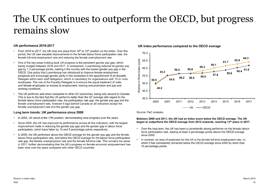
A slide with text on the left and a line chart on the right. The line chart compares the UK Index performance with the OECD average from 2000 to 2017. The slide has a moderate amount of text and visual elements.
Market Analysis and Trends
Government & Public Sector
Analyzes the UK's performance on the Women in Work Index, showing improvements over time and comparing it with the OECD average. Highlights key factors affecting progress, such as the gender pay gap and female labor force participation rates.
UK, Women in Work Index, OECD, gender pay gap, labor force participation
Mixed Chart
PwC/Strategy&
Saved
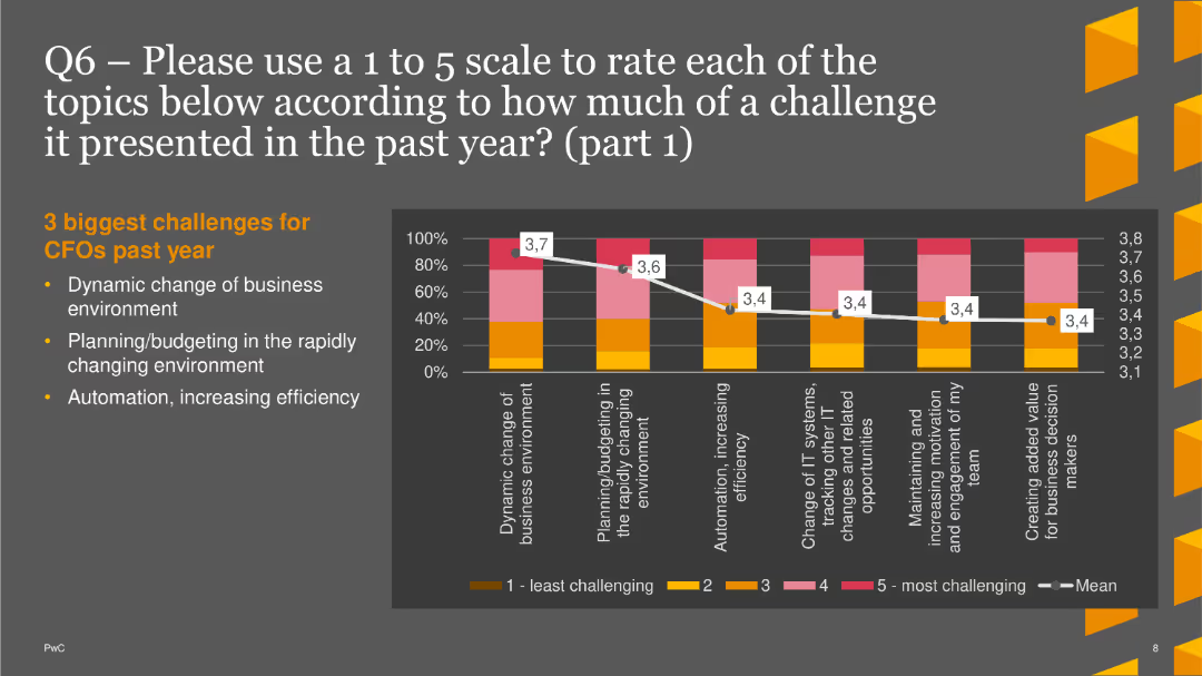
The slide displays a column chart rating the challenges faced by CFOs, including dynamic business changes and planning/budgeting.
Market Analysis and Trends
Financial Services
This slide shows the top three challenges for CFOs: dynamic business environment, planning/budgeting, and automation/efficiency, rated on a 1 to 5 scale.
Challenges, CFOs, Column Chart, PwC, Survey, 2022, Business Environment
Mixed Chart
PwC/Strategy&
Saved
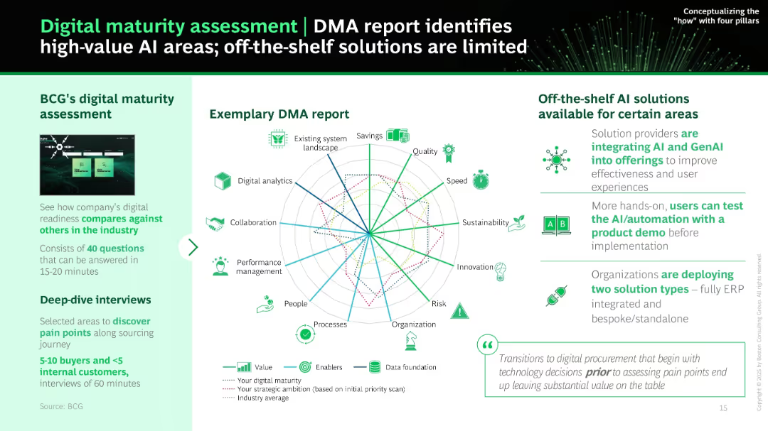
Left panel gives overview of BCG's DMA tool; right panel shows a radar chart with multiple KPIs. Icons and brief explanations summarize off-the-shelf AI solutions and their limitations.
Industry Overview
Technology & Software
This slide promotes BCG’s digital maturity assessment (DMA) to identify strategic AI implementation areas. It highlights the value of evaluating current readiness and pain points via surveys and interviews before choosing AI tools. Charts illustrate current gaps vs. strategic ambitions.
DMA, maturity assessment, radar chart, AI readiness, off-the-shelf, BCG, pain points, procurement tools
Mixed Chart
BCG
Saved
This slide includes a table, column charts, and a photo. The left side features a table of survey respondents by country, while the right has column charts for industries and demographics.
Market Analysis and Trends
Professional Services
Presents survey demographics, showing respondents by country, industry representation, and age group. Highlights key statistics about the survey sample.
demographics, survey, industries, age groups, countries
Multiple Chart
EY
Saved
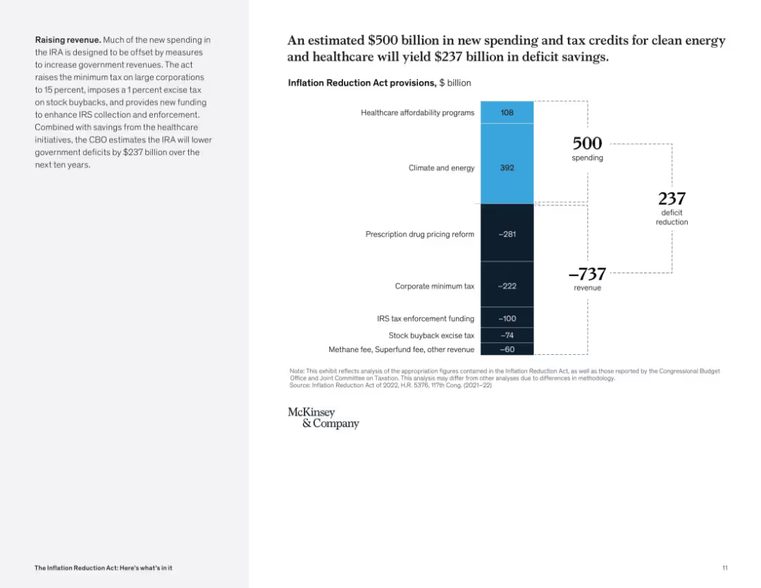
Waterfall chart comparing spending and revenue measures; large contrast between top and bottom segments; left panel describes fiscal goals.
Financial Performance
Government & Public Sector
The slide illustrates how the IRA balances $500B in new spending with $737B in revenue measures, resulting in a projected $237B deficit reduction. Key policies include tax reforms and enhanced IRS enforcement.
deficit reduction, tax revenue, healthcare, clean energy, spending, government finance
Mixed Chart
McKinsey
Saved
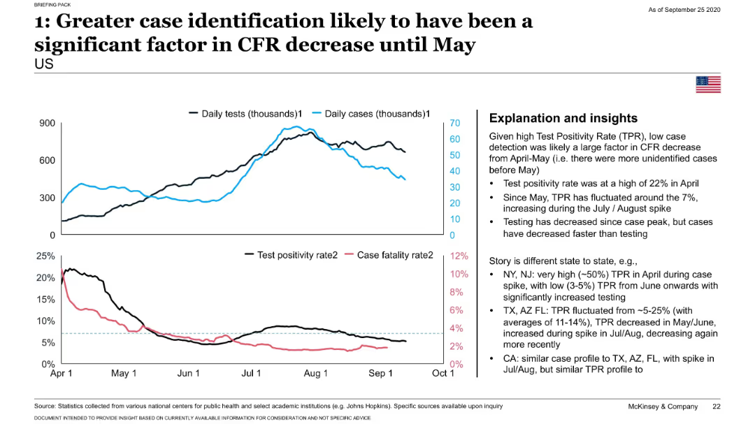
Dual-line graph comparing daily tests and cases; lower chart compares test positivity and CFR; insights presented in a right-side box.
Risk Assessment and Management
Healthcare & Pharmaceuticals
Highlights how the sharp decline in CFR through May 2020 was likely due to expanded testing identifying more mild or asymptomatic COVID-19 cases. Test positivity data from various U.S. states supports this conclusion.
testing, test positivity, CFR, COVID-19, case detection, states
Mixed Chart
McKinsey
Saved
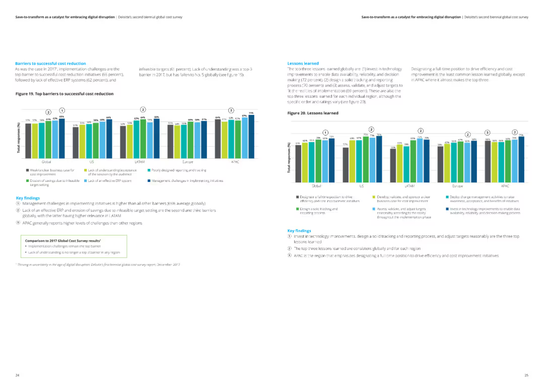
This slide includes a column chart illustrating the top barriers to successful cost reduction globally and regionally. Key findings are summarized in text boxes.
Risk Assessment and Management
Financial Services
The slide highlights the key barriers to successful cost reduction, including management challenges and ineffective ERP systems, with a comparison to the 2017 survey results.
Cost reduction, barriers, challenges, analysis, financial services
Multiple Chart
Deloitte
Saved
The slide includes a line chart displaying U.S. Treasury Yield Curves for different durations and a table comparing yields and performance over different periods.
Investment Analysis
Financial Services
The slide provides an analysis of U.S. Treasury yields, showing how they have changed over time and comparing current yields with past performance.
Treasury Yields, Yield Curves, Performance, Investment, U.S. Treasury
Mixed Chart
Morgan Stanley
Saved
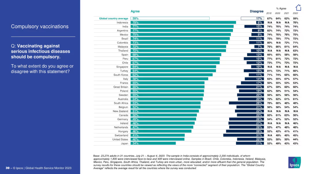
Ranked horizontal bar chart of countries showing % agreement and disagreement; includes trend data from 2018–2022.
Regulatory and Compliance
Healthcare & Pharmaceuticals
This slide presents global survey results on whether vaccination against infectious diseases should be mandatory. Country-wise agreement levels vary, with Indonesia and India showing high agreement and Japan the lowest.
vaccinations, compulsory, global opinion, infectious diseases, regulation, Ipsos, country comparison, trends
Mixed Chart
IPSOS
Saved
Previous
Next
If nothing, comes up, please save your slides first
Create a FREE account to continue browsing
Receive Instant Access to 1,000+ slides from companies like McKinsey, Google, and Goldman Sachs
First Name
Last Name
Email
Password
I agree to all
Terms & Privacy Policy
Thank you! Your submission has been received!
Oops! Something went wrong while submitting the form.
Have an account?
Sign in
Column Chart
Heatmap
Chevron
Org Chart
Infographic
Callouts
Timeline
List
Graphic
Picture
Process Flow
Diagram
Paragraph
Map
Table
Framework
Subtitle
Takeaway Box
Icon
Other Chart
Radar Chart
Waterfall Chart
Mekko Chart
Pie Chart
Scatter Plot
Line Chart
Bar chart
Bullet points