Create a FREE Account
Instant access to 1,000+ real slides from top companies like McKinsey, BCG, Goldman Sachs, Google and many more!
First Name
Last Name
Email
Password
I agree to all
Terms & Privacy Policy
Thank you! Your submission has been received!
Oops! Something went wrong while submitting the form.
Have an account?
Sign in
Library
Templates
Courses
Pricing
My Account
My Slides
My Templates
✦ AI
AI Prompt Library
AI Search
Sign in
Start Here
Logout
My Saved Slides
The slide features a line chart depicting the levelized cost of CO2 capture for various large-scale post-combustion projects at coal-fired power plants from 2004 to 2028.
Market Analysis and Trends
Energy & Utilities
The slide highlights how CCUS technology can expect cost reductions from learning and technology deployment, showing historical and projected costs for various facilities. The chart illustrates a downward trend in capture costs over time, with expected further reductions as technology improves.
CO2 capture, cost, post-combustion, trends
Single Chart
Kearney
Saved
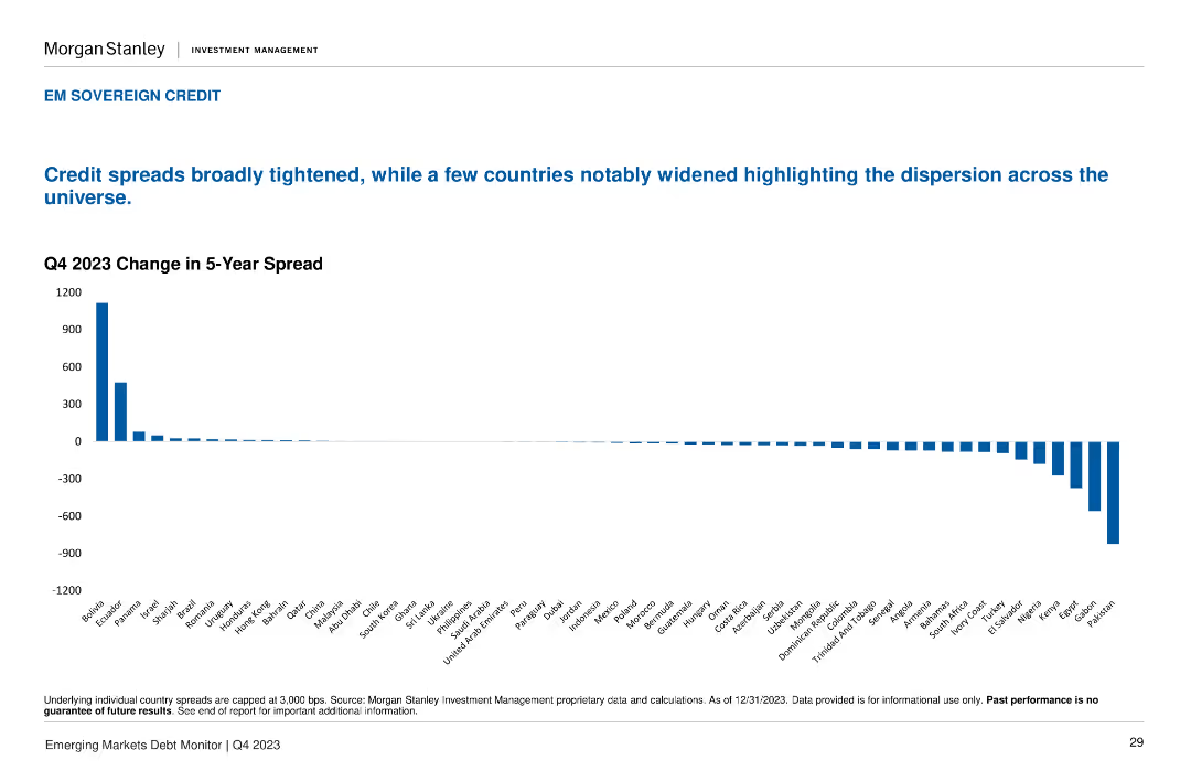
A column chart displays the Q4 2023 Change in 5-Year Spread for various countries, showing positive and negative changes across the board.
Market Analysis and Trends
Financial Services
The slide highlights the broad tightening of credit spreads, with notable widenings in a few countries. Useful for tracking credit spread changes across emerging markets.
credit spreads, change, Q4 2023, sovereign, EM
Single Chart
Morgan Stanley
Saved
This slide presents column charts evaluating leadership confidence in understanding the risks of automating work and the effectiveness of communication on the impact of technology.
Market Analysis and Trends
Professional Services
Explores leaders' preparedness and strategic planning regarding the integration of technology and automation in the workforce. It suggests the need for better communication and risk assessment strategies to ensure a human-centric approach in technology adoption.
technology, automation risks, strategic planning, leadership, communication effectiveness
Multiple Chart
PwC/Strategy&
Saved
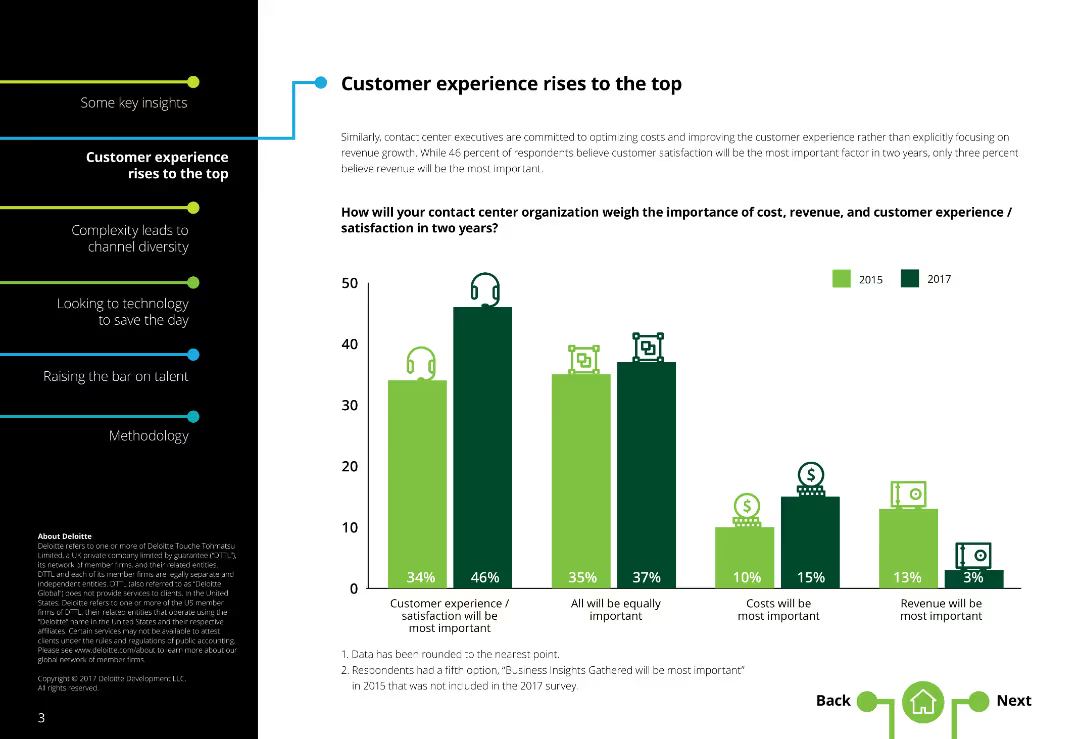
The slide contains a column chart showing the importance of cost, revenue, and customer satisfaction in contact centers over time, with icons representing each factor.
Market Analysis and Trends
Professional Services
This slide focuses on how contact center organizations prioritize cost, revenue, and customer satisfaction. It compares survey data across different years to show trends and shifts in importance placed on each factor by respondents. The chart illustrates the varying emphasis on customer experience, revenue growth, and cost management.
Customer satisfaction, contact centers, cost, revenue, column chart
Single Chart
Deloitte
Saved
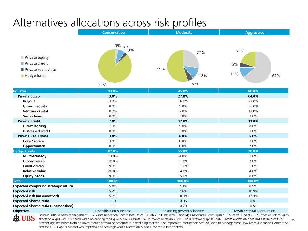
Pie charts and a table showing allocations across different risk profiles (Conservative, Moderate, Aggressive) for various investment types.
Investment Analysis
Financial Services
The slide details how different types of investments (equity, credit, real estate, hedge funds) are allocated based on risk profiles, providing expected returns and risks.
Allocations, Risk Profiles, Private Equity, Hedge Funds, Expected Returns
Multiple Chart
UBS
Saved
Contains bullet points and iconography. It features a high-level summary of Western Australia's LNG industry, economic contributions, and impact metrics like $220 billion added and 57,000 workers.
Industry Overview
Energy & Utilities
Highlights Western Australia's significant role in the LNG industry, mentioning major projects, economic contributions, and employment impact over the last decade.
LNG, Economic Impact, Western Australia, Energy Industry, Employment, Major Projects, Investment, Tax Revenue
Header Horizontal
EY
Saved
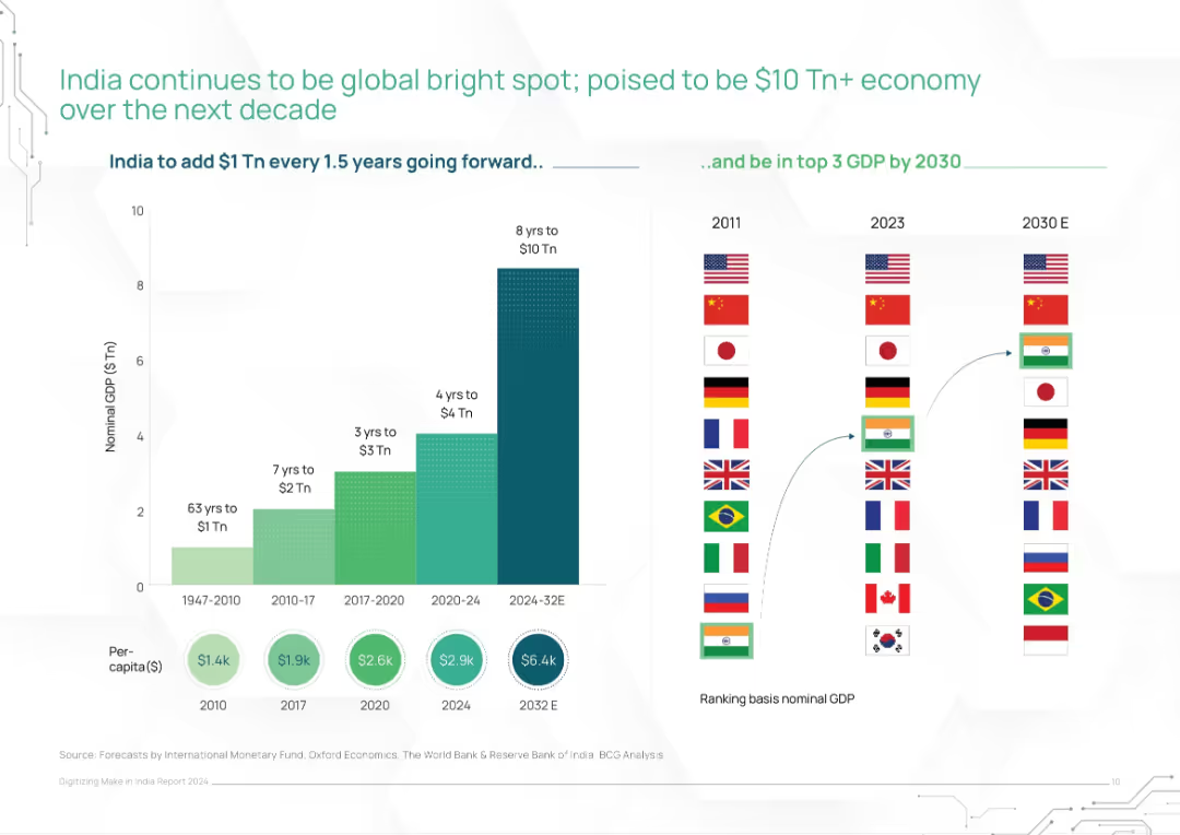
Dual-panel layout: left stacked bar of GDP timeline, right rank shifts of countries by GDP (2011–2030E)
Market Analysis and Trends
Financial Services
This slide charts India's rapid GDP growth trajectory and its expected rise to the top 3 global economies by 2030. It visually compares historical and projected GDP levels, showing acceleration from $1T in 63 years to an expected $10T in 8 years. Includes global ranking comparisons.
India GDP, economic growth, global ranking, nominal GDP, IMF forecast, growth projection, $10 trillion economy
Mixed Chart
BCG
Saved
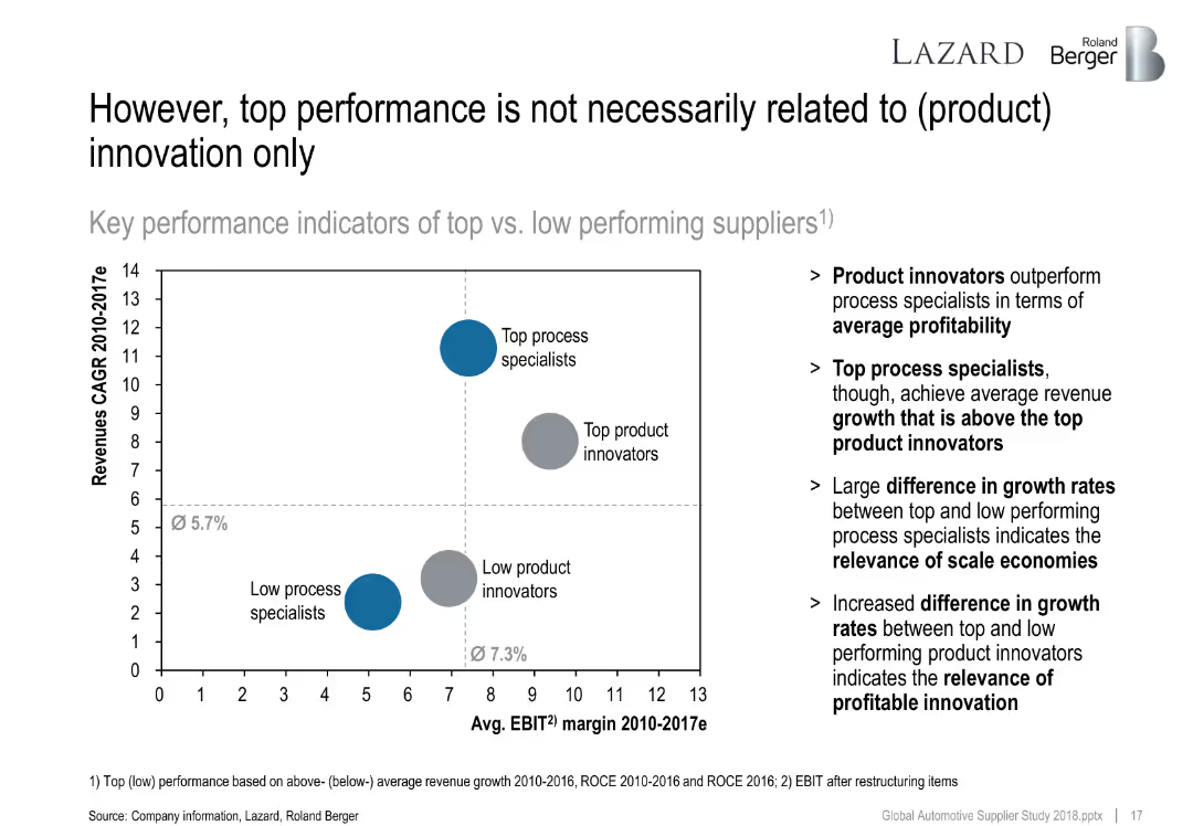
Bubble chart comparing revenue CAGR and EBIT margin of four supplier groups (top/low innovators and process specialists).
Financial Performance
Industrial & Manufacturing
Analyzes whether innovation is the sole driver of performance. Concludes that scale and execution also matter, with top process specialists sometimes outperforming in growth versus top innovators in profitability.
innovation, process specialist, profitability, scale economies, growth drivers
Mixed Chart
Roland Berger
Saved
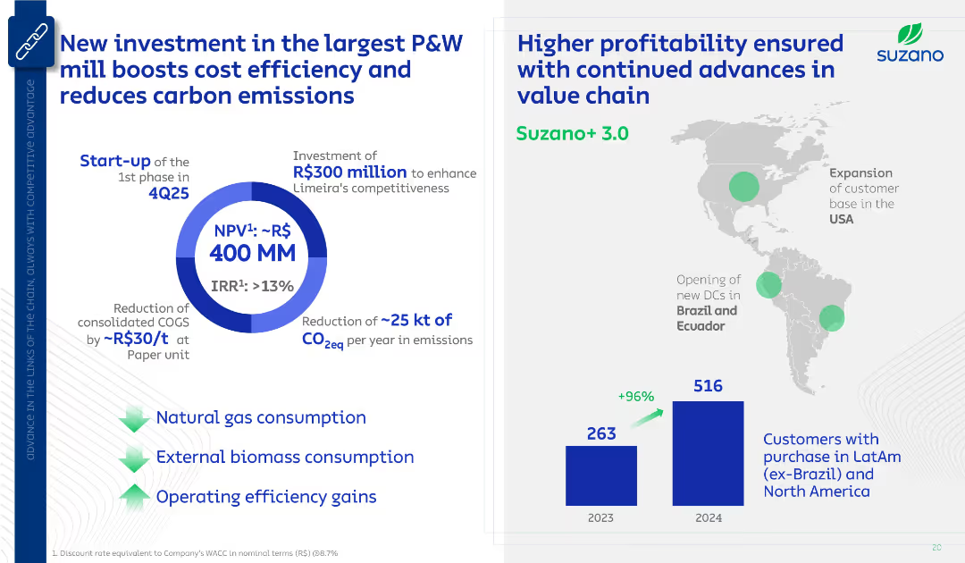
Two-part layout: Left shows investment highlights with a circular ROI visual; right shows geographic expansion map and customer base bar chart. Clean blue-and-white design with icons and arrows.
Strategic Planning
Industrial & Manufacturing
Communicates Suzano’s investment in a P&W mill to reduce cost and emissions. Also notes expansion in distribution centers and a doubling of customer base from 2023 to 2024, highlighting strategic and environmental benefits.
Suzano, investment, CO2 reduction, customer growth, ROI, P&W, logistics
Multiple Chart
Goldman Sachs
Saved
The slide has four column charts, comparing financial metrics with competitors. The colors and data points are clearly marked.
Financial Performance
Financial Services
Showcases the year-on-year growth in revenue, net income, ROTCE, and overhead ratios compared to competitors.
Revenue growth, net income, ROTCE, overhead ratio, financial comparison
Multiple Chart
JP Morgan
Saved
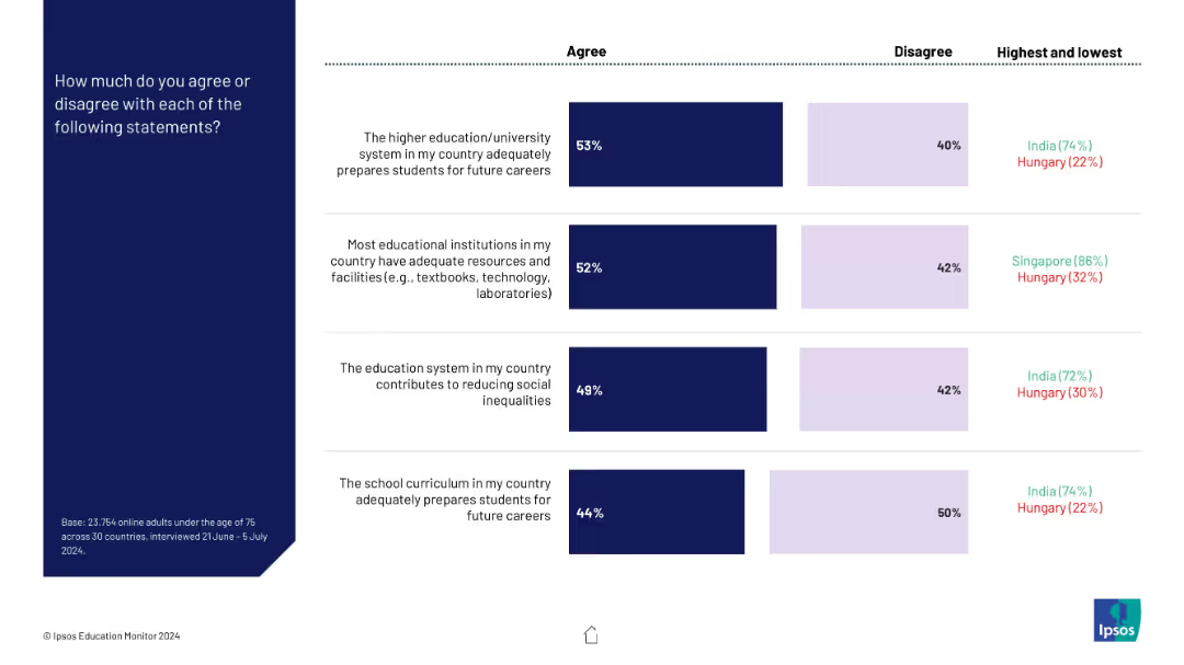
Four horizontal bar charts comparing agreement/disagreement with statements on education systems. Highest and lowest agreement countries shown on the right. Dark blue and light purple represent agree/disagree.
Market Analysis and Trends
Education & Training
This slide displays public sentiment across countries regarding how well national education systems prepare students, provide resources, reduce inequalities, and support future careers. It also shows comparative data by country, highlighting India and Hungary at performance extremes.
education systems, survey data, global comparison, career preparation, inequality, facilities, agreement levels
Mixed Chart
IPSOS
Saved
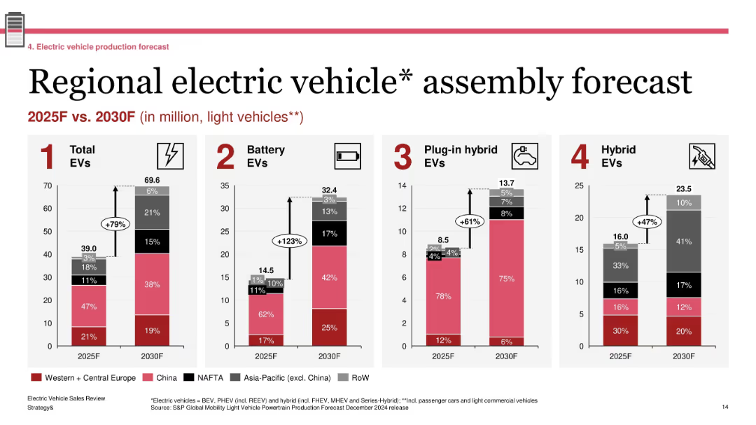
Four grouped bar charts showing production forecasts by region; labeled segments with growth percentages; standard red-gray-black color palette
Technology and Digital Transformation
Industrial & Manufacturing
The slide forecasts EV assembly volumes across major global regions between 2025 and 2030. It projects a 79% increase in total EVs, with battery EVs seeing the most significant growth (+123%). Regional shares are shown for each EV type (BEV, PHEV, Hybrid), emphasizing China and Western Europe as leading contributors.
EV forecast, regional production, BEV growth, 2030 outlook, light vehicles, automotive transformation
Single Chart
PwC/Strategy&
Saved
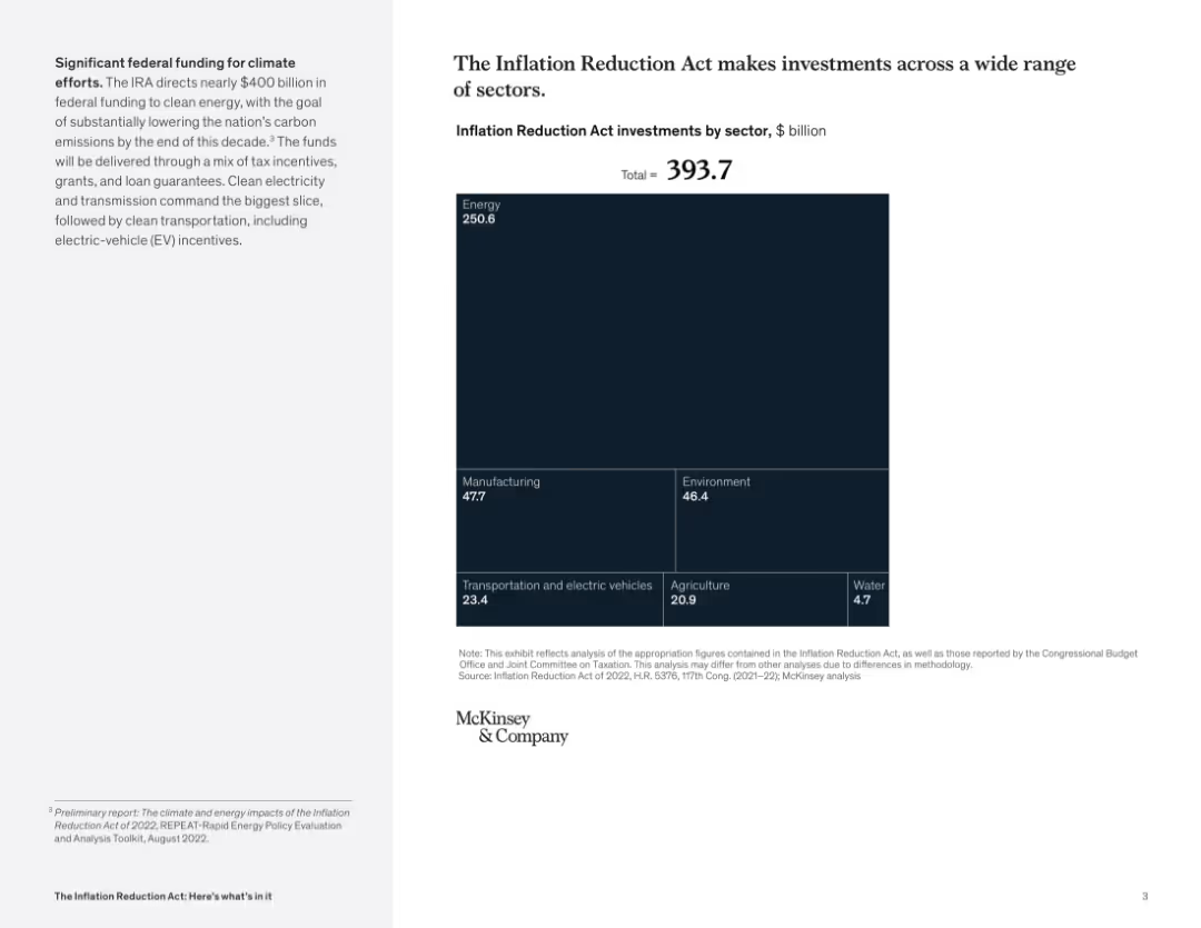
Right-aligned slide with a large square treemap chart showing $393.7B in IRA investments by sector; small text explanation on the left panel. Dark blue color scheme.
Strategic Planning
Government & Public Sector
The slide illustrates the allocation of nearly $400B from the Inflation Reduction Act across multiple sectors, with the majority directed toward energy, manufacturing, environment, and transportation. It visually emphasizes the energy sector as the largest recipient.
Inflation Reduction Act, funding, sectors, energy, manufacturing, environment, EV, investment, climate
Mixed Chart
McKinsey
Saved
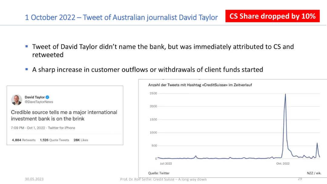
Two-column layout: left side has a tweet screenshot, right side has a line graph showing tweet activity; red box highlights a 10% share drop.
Risk Assessment and Management
Financial Services
The slide outlines the impact of a viral tweet suggesting a bank's instability. It was widely attributed to Credit Suisse, triggering a 10% stock drop and customer fund withdrawals. A graph illustrates the surge in social media mentions.
social media, stock drop, Credit Suisse, customer reaction, tweet
Mixed Chart
Credit Suisse
Saved
This slide uses multiple column charts to depict the revenue trends for printed publications versus digital media in Hong Kong, Singapore, and Taiwan from 2022 to 2027. The graphs are clearly marked and color-coded, making it easy to distinguish between the regions and media types. The design is clean, focusing on the visual data complemented by minimal text to provide context and clarity.
Market Analysis and Trends
Media & Entertainment
Offers a comparative analysis of revenue trends in printed and digital media across multiple regions, highlighting the ongoing decline in print. Useful for strategic planning in media and advertising sectors focusing on digital growth.
printed publications, digital media, revenue trends, Hong Kong, Singapore, Taiwan, market shift
Multiple Chart
PwC/Strategy&
Saved
A pie chart showing company size distribution and a world map indicating surveyed countries. Text lists respondent demographics and industries.
Market Analysis and Trends
Professional Services
The slide presents the demographic breakdown of a survey, including company size, industries, and geographical distribution of the respondents.
Demographics, Survey, Company Size, Industries, Global Distribution
Mixed Chart
Accenture
Saved
This slide features a matrix highlighting key actions for health organizations to improve consumer perceptions, categorized by performance and importance of health system aspects.
Strategic Planning
Healthcare & Pharmaceuticals
It identifies key opportunity areas for health organizations to improve consumer perceptions, focusing on aspects rated as important but with lower performance, such as mental health and sustainability.
health organizations, consumer perceptions, key actions, performance, importance
Mixed Chart
EY
Saved
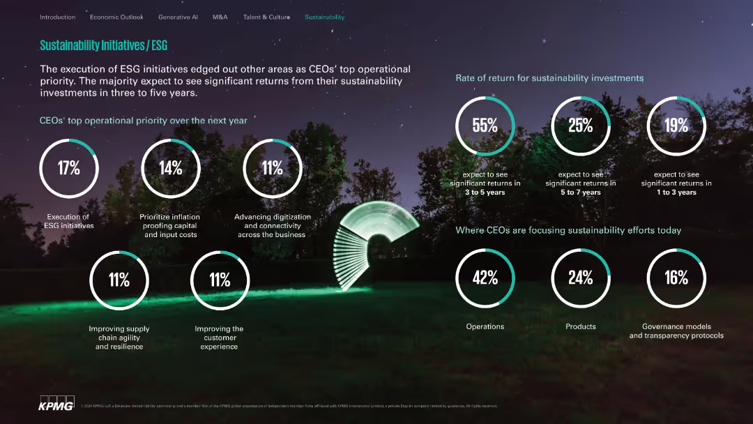
Nature-themed background with white circle stats; clean and segmented layout.
Customer and Market Segmentation
Environmental Services & Sustainability
Highlights ESG execution as a top CEO priority, expected investment return timelines, and primary focus areas like operations, products, and governance. Communicates optimism on sustainability ROI within 3–5 years.
ESG, sustainability, ROI, operations, governance, digital transformation
Single Chart
KPMG
Saved
The slide contains a map of Asia with highlighted countries and color-coded areas to depict various policies.
Market Analysis and Trends
Government & Public Sector
This slide explores ambitious policies in Indonesia, India, and Thailand aimed at growing their battery industries through strategic incentives.
emerging markets, policies, battery industry, Asia
Graphic
Accenture
Saved
The slide features a simple, clean layout with a bold title and a bullet list of upcoming presentation topics. The design is minimalistic, employing only text and no images or charts. The color scheme is blue and white, with the title 'Agenda' prominently displayed at the top.
Investment Analysis
Agriculture & Food Production
This slide outlines the main points to be covered in the presentation, specifically focusing on the agriculture industry, crop market investments, and value chain. It's used to give the audience an overview of what to expect.
agriculture, overview, market, investment, value chain, agenda, crop, presentation
Agenda
EY
Saved
Slide includes stacked column charts displaying credit losses and stages of loans across different banking sectors.
Risk Assessment and Management
Financial Services
Analyzes credit loss provisions and the status of stage 3 loans in Q1 2023 across various banking divisions, illustrating risk management and credit performance within the bank.
credit losses, loans, risk management, Q1 2023
Multiple Chart
Deutsche Bank
Saved
The slide is primarily textual with a header at the top. It includes a list titled 'Key Tenets of our Strategy' with three strategic points, and a line chart on the right depicting 'Target State' with a timeline and plotted points, illustrating the future direction of funding costs.
Strategic Planning
Financial Services
Aimed at outlining strategic approaches for diversifying funding and managing assets and liabilities, this slide provides insights into the future funding cost targets, suitable for financial strategists or management.
funding strategy, asset management, liability management, line chart, strategic planning, diversification, financial goals, cost targets, liquidity optimization, financial forecasting
Mixed Chart
Goldman Sachs
Saved
The slide shows two bar charts: one depicting real GDP year-over-year change by political party, and another showing S&P 500 calendar year returns by political party.
Market Analysis and Trends
Financial Services
This slide provides an analysis of economic and market performance under different government configurations, suggesting that both fare well regardless of the political party in power.
Government Configurations, GDP, S&P 500, Market Performance, Political Party
Multiple Chart
JP Morgan
Saved
Bar chart comparing 2022 vs. 2030e EAF production in US, EU, China with textual insights below
Industry Overview
Industrial & Manufacturing
Projects significant growth in electric arc furnace (EAF) steel production in the US, EU, and China driven by decarbonization goals. China's EAF share expected to double by 2030.
EAF, steel production, decarbonisation, infrastructure, forecast
Mixed Chart
Goldman Sachs
Saved
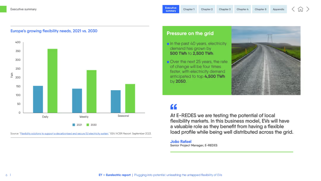
Clean white-blue layout with bar chart (TWh by time frame), photo of road and power lines, and testimonial with green sidebar.
Technology and Digital Transformation
Energy & Utilities
This slide compares electricity flexibility needs in Europe between 2021 and 2030. It forecasts a significant increase in daily, weekly, and seasonal demand, driven by EV integration and energy transition. A testimonial emphasizes distributed grid solutions.
electricity demand, flexibility, EVs, power grid, energy transition, TWh, distributed energy
Mixed Chart
EY
Saved
Previous
Next
If nothing, comes up, please save your slides first
Create a FREE account to continue browsing
Receive Instant Access to 1,000+ slides from companies like McKinsey, Google, and Goldman Sachs
First Name
Last Name
Email
Password
I agree to all
Terms & Privacy Policy
Thank you! Your submission has been received!
Oops! Something went wrong while submitting the form.
Have an account?
Sign in
Column Chart
Heatmap
Chevron
Org Chart
Infographic
Callouts
Timeline
List
Graphic
Picture
Process Flow
Diagram
Paragraph
Map
Table
Framework
Subtitle
Takeaway Box
Icon
Other Chart
Radar Chart
Waterfall Chart
Mekko Chart
Pie Chart
Scatter Plot
Line Chart
Bar chart
Bullet points