Create a FREE Account
Instant access to 1,000+ real slides from top companies like McKinsey, BCG, Goldman Sachs, Google and many more!
First Name
Last Name
Email
Password
I agree to all
Terms & Privacy Policy
Thank you! Your submission has been received!
Oops! Something went wrong while submitting the form.
Have an account?
Sign in
Library
Templates
Courses
Pricing
My Account
My Slides
My Templates
✦ AI
AI Prompt Library
AI Search
Sign in
Start Here
Logout
My Saved Slides
Circular diagram with icons and text blocks around pricing, student acquisition, and other factors.
Strategic Planning
Financial Services
This slide highlights key value creation levers for investors in the education sector, such as pricing and linkage with employers.
investors, value creation, education, pricing, strategy
Framework
LEK
Saved
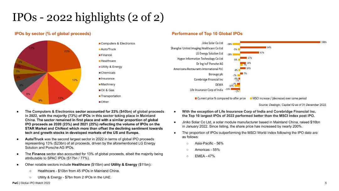
This slide includes a pie chart showing IPOs by sector and a bar chart of the performance of the top 10 global IPOs. Text blocks provide additional context and analysis of the data presented.
Market Analysis and Trends
Financial Services
The slide provides an analysis of IPO activity by sector and evaluates the performance of the top IPOs globally in 2022. It is useful for financial analysts reviewing sector-specific IPO performance and investment opportunities.
IPO sectors, top IPOs, global performance, 2022 analysis
Multiple Chart
PwC/Strategy&
Saved
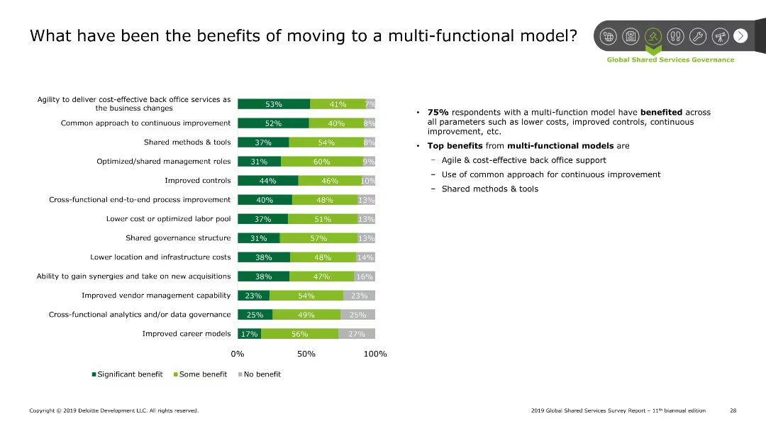
The slide contains a column chart showing the benefits of moving to a multi-functional model. There are three categories in the chart: Significant benefit, Some benefit, No benefit.
Operational Efficiency
Professional Services
This slide presents data on the benefits of adopting a multi-functional model in organizations. Key benefits include cost-effectiveness, improved controls, and shared methods.
Benefits, multi-functional model, cost savings, improvement, controls
Mixed Chart
Deloitte
Saved
The slide shows a line graph of COVID-19 test results in Ontario, indicating the waves of the pandemic.
Risk Assessment and Management
Healthcare & Pharmaceuticals
It presents data on the fluctuating positive COVID-19 test results over time, highlighting key dates and events.
COVID-19, test results, waves, Ontario, line graph, pandemic, positive, data, key dates, events
Single Chart
IPSOS
Saved
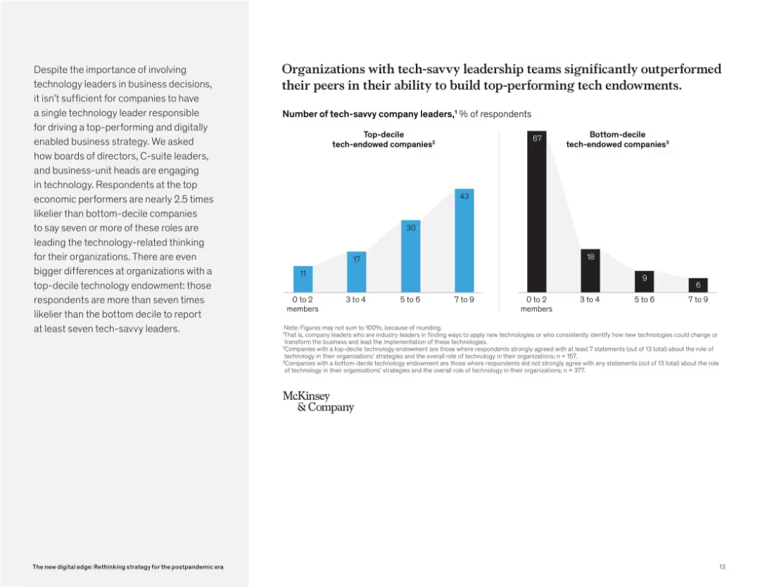
Side-by-side bar charts comparing the number of tech-savvy leaders in top-decile vs. bottom-decile companies. Accompanied by text on the left.
Organizational Structure and Change
Technology & Software
This slide shows that companies with more tech-savvy leaders (across leadership roles) are far more likely to develop strong tech capabilities. Top performers show greater representation of such leadership compared to bottom performers.
tech endowment, leadership, digital strategy, executive roles, McKinsey, performance, C-suite, technology engagement
Mixed Chart
McKinsey
Saved
The slide includes line charts comparing AAA muni-to-treasury yield ratios and credit quality spreads vs. AAA for different rating categories (AA, A, BBB).
Market Analysis and Trends
Financial Services
The slide offers insights into municipal bonds, focusing on yield ratios and credit spreads. Useful for evaluating municipal bond investments.
municipal bonds, yield ratios, credit quality, spreads, AAA, financial analysis
Multiple Chart
Morgan Stanley
Saved
A column chart comparing the use of various crypto trading platforms in 2023 and 2022, with an additional column chart for 2023 platforms usage not listed in 2022.
Market Analysis and Trends
Financial Services
This slide presents the usage rates of different crypto trading platforms in 2023 compared to 2022, highlighting significant changes and trends in user preferences.
Crypto, trading, platforms, 2023, 2022, comparison
Multiple Chart
IPSOS
Saved
Presents a blue column chart with amounts of cash returned to shareholders over four fiscal years, highlighting a significant share repurchase initiative.
Financial Performance
Consumer Goods
Reviews the substantial amounts returned to shareholders through dividends and share repurchases, underscoring the company's commitment to shareholder returns.
shareholder return, dividends, share repurchase, fiscal years, investment
Single Chart
Barclays
Saved
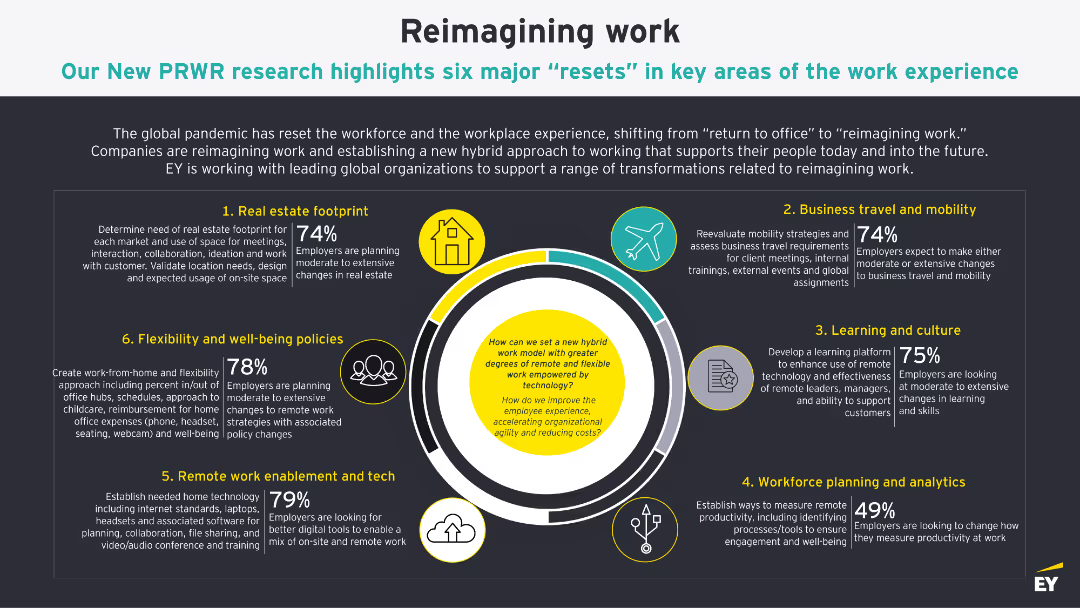
The slide presents a detailed diagram with six major resets in key areas of the work experience. Each area is illustrated with icons and supported by percentage data highlighting employer plans.
Market Analysis and Trends
Professional Services
The slide highlights six areas where employers are planning significant changes post-COVID-19, including real estate, travel, flexibility, tech enablement, learning, and workforce planning.
work, experience, resets, flexibility, planning
Framework
EY
Saved
Column charts showing the growth in consumer need for debt, originations for securitizations, and asset class allocations.
Market Analysis and Trends
Financial Services
The slide highlights the positive outlook for SP products, showing increased consumer debt needs, and rising allocations by hedge funds and insurers.
SP products, consumer debt, securitizations, hedge funds, insurance allocations
Multiple Chart
Credit Suisse
Saved
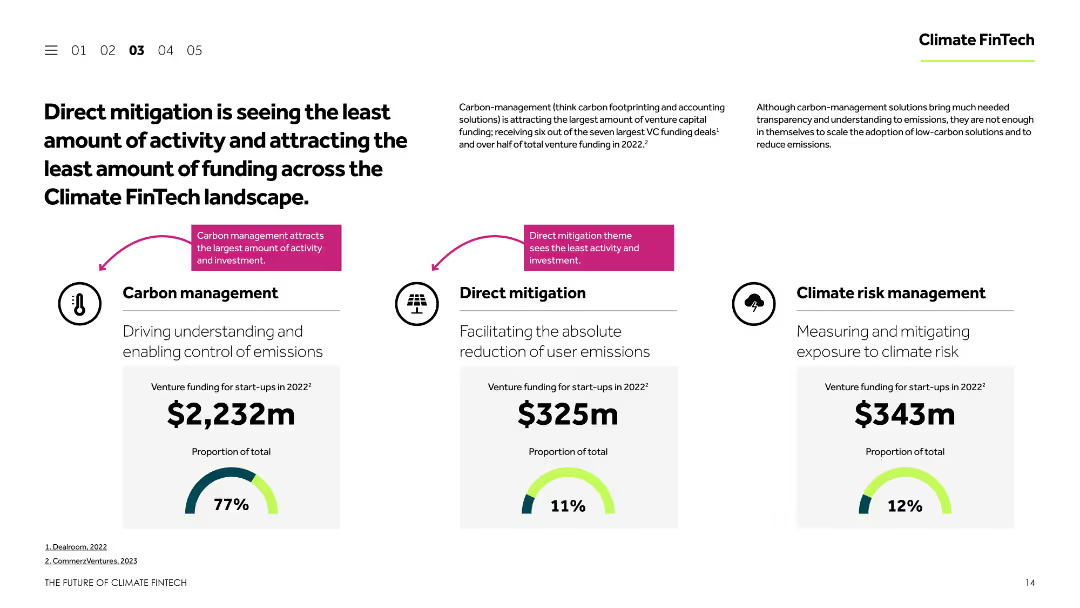
This slide includes a comparative analysis of venture funding across three themes: carbon management, direct mitigation, and climate risk management. The data is presented using column charts and textual descriptions to highlight the differences in funding and activity levels.
Investment Analysis
Financial Services
The slide compares the venture funding and activity levels for different Climate FinTech themes, emphasizing that direct mitigation is receiving the least attention and funding. It uses column charts to visually represent the data and highlights key statistics for each theme.
Venture funding, Climate FinTech, carbon management, direct mitigation, climate risk management
Multiple Chart
Barclays
Saved
Contains detailed text along with a world map illustrating 'DALYs' attributable to ambient air pollution per 100,000 population in 2016, and a bar chart showing data on EU energy-related CO2 emissions over time.
Regulatory and Compliance
Environmental Services & Sustainability
Provides an overview of the impacts of air quality on public health, focusing on DALY metrics to illustrate the global burden of disease linked to air pollution. Discusses the role of monitoring and policy in improving air quality standards.
Air Quality, Public Health, Pollution, DALYs
Graphic
PwC/Strategy&
Saved
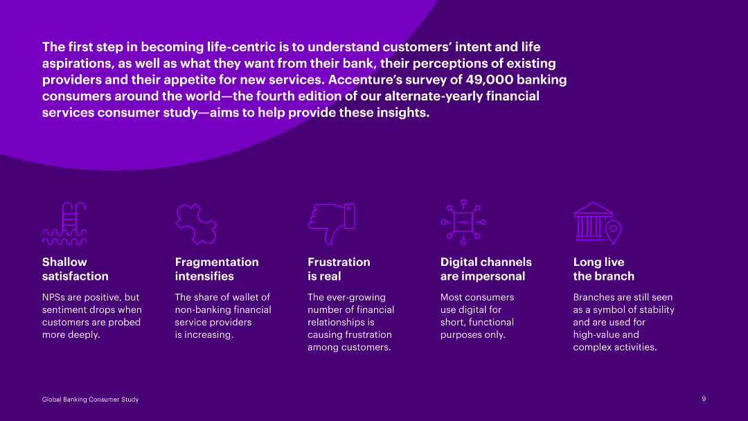
Text-focused slide with multiple icons illustrating points such as shallow satisfaction, fragmentation, frustration, and digital channels.
Customer and Market Segmentation
Financial Services
Discusses findings from a global banking consumer study, identifying key issues like satisfaction, fragmentation, and digital channel preferences.
banking, consumer, satisfaction, fragmentation, frustration, digital channels, preferences, survey, insights
Pillar
Accenture
Saved
Contains bullet point lists in three content blocks, color-coded to differentiate between maintaining discipline, optimizing current models, and transforming for the future.
Strategic Planning
Financial Services
This slide outlines the strategic initiatives for growth in the financial services sector, including maintaining operational discipline, optimizing the current business model, and investing in future transformations such as ML & AI.
growth, strategy, optimization, financial, discipline, AI, ML
Boxed
JP Morgan
Saved
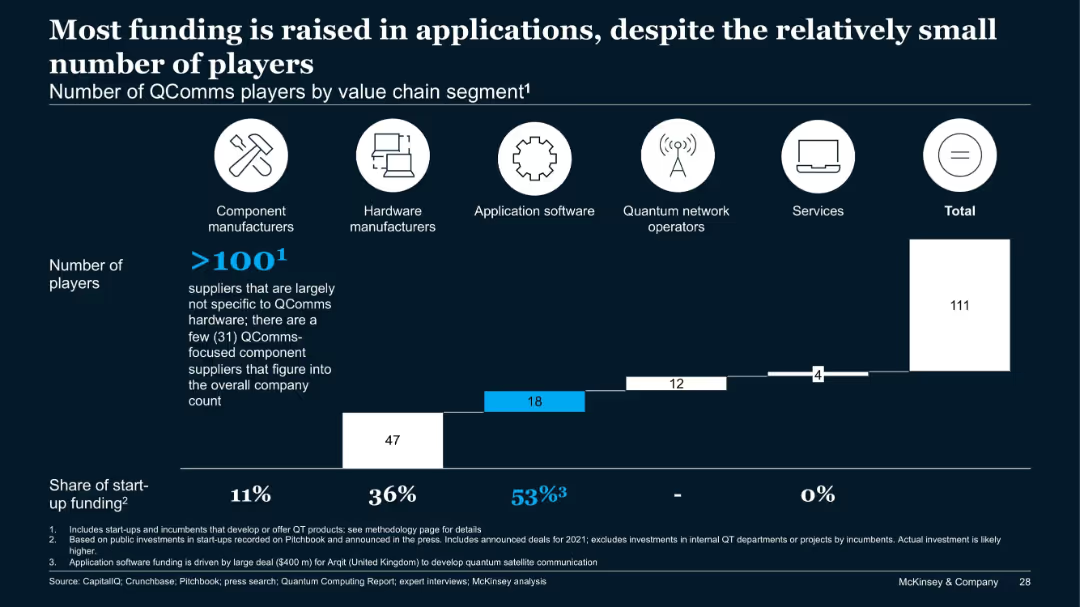
Bar chart categorizing QComms players by value chain segments and their share of funding.
Financial Performance
Telecommunications
While the number of QComms players is highest in components, the bulk of funding (53%) goes to application software, driven by major investments like Arqit ($400M). Hardware follows with 36% of funds. The chart shows a misalignment between player count and capital allocation.
QComms, funding, applications, value chain, Arqit, investment, segments
Single Chart
McKinsey
Saved
This slide uses a bar graph to show the distribution of applications across various sectors like Agriculture, ICT, and Education, alongside a pie chart depicting the business stage (e.g., Idea, Growth) of these applications.
Market Analysis and Trends
Technology & Software
Analyzing the sector distribution and business stage of applications, this slide highlights the predominance of sectors like Agriculture and ICT and shows the maturity stages of these business ideas.
Sector Distribution, Applications, Agriculture, ICT, Education, Business Stage, Analysis, Maturity, Predominance
Multiple Chart
Accenture
Saved
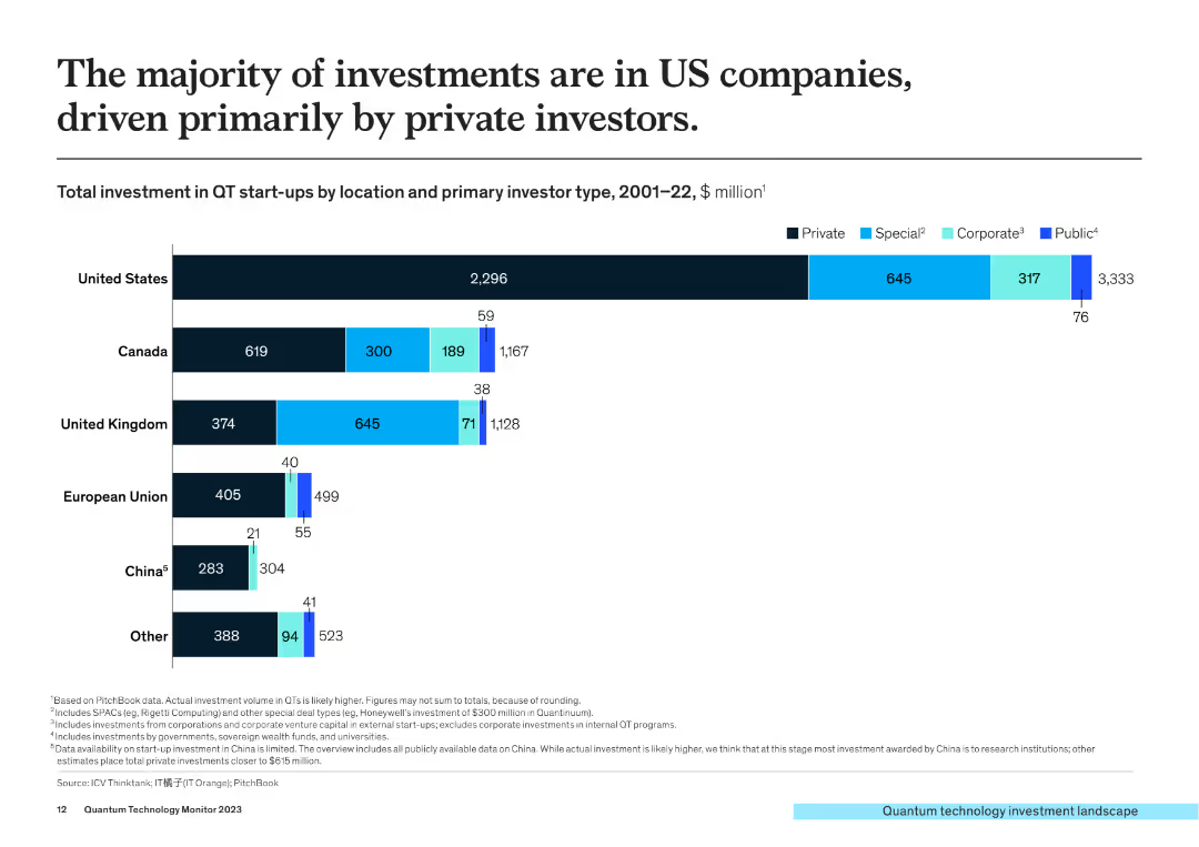
The slide presents a column chart showing total investment in QT start-ups by location (US, Canada, UK, EU, China, Other) and primary investor type (Private, Special, Corporate, Public) from 2001-2022.
Market Analysis and Trends
Financial Services
This slide shows that the majority of QT investments are in US companies, driven by private investors, with a detailed breakdown of investment types across different regions.
investment, quantum technology, US companies, private investors, regional analysis
Single Chart
McKinsey
Saved
A scatter plot similar to the IT intensity slide, but focused on cloud intensity. It compares IT spending per employee and value-added per employee, with countries grouped and color-coded.
Market Analysis and Trends
Technology & Software
The slide evaluates cloud intensity by country, comparing IT spending on cloud services to the economic value added per employee, useful for understanding global cloud adoption.
Cloud Intensity, Country Analysis, Cloud Spending, Economic Value, International Comparison
Single Chart
Gartner
Saved
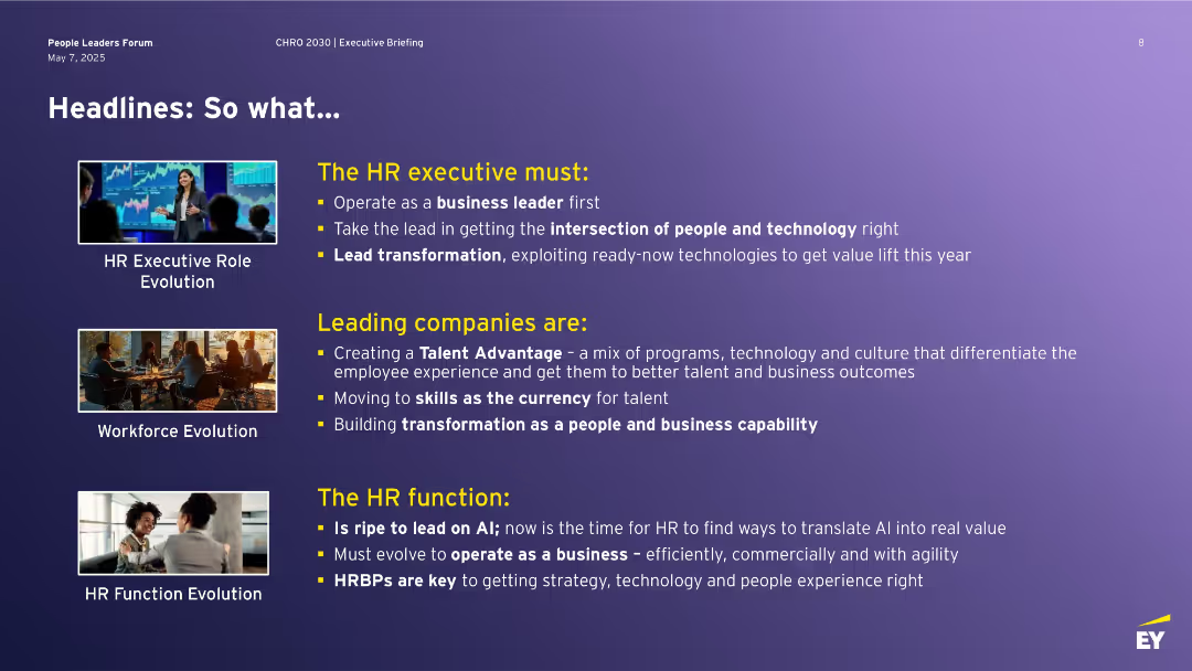
Purple background with three section blocks on HR role evolution, each with a photo and bullet-point text explaining HR's current imperatives.
Human Resources and Talent Management
Professional Services
Summarizes the evolving responsibilities of HR executives, emphasizing their role as business leaders who lead transformation by integrating technology and people strategy. Discusses how companies are shifting to skills-based models and AI adoption, and the need for HRBPs to deliver business outcomes through transformation and people experience strategies.
HR, transformation, talent advantage, AI, people strategy, HRBP, skills-based models
Header Vertical
EY
Saved
Slide presents a bar chart comparing investment priorities between larger and smaller companies with emphasis on advanced technology.
Technology and Digital Transformation
Professional Services
Discusses how larger companies prioritize AI and technology investments more compared to smaller companies which focus on diverse operational aspects.
technology, AI, investments, productivity, companies
Single Chart
Deloitte
Saved
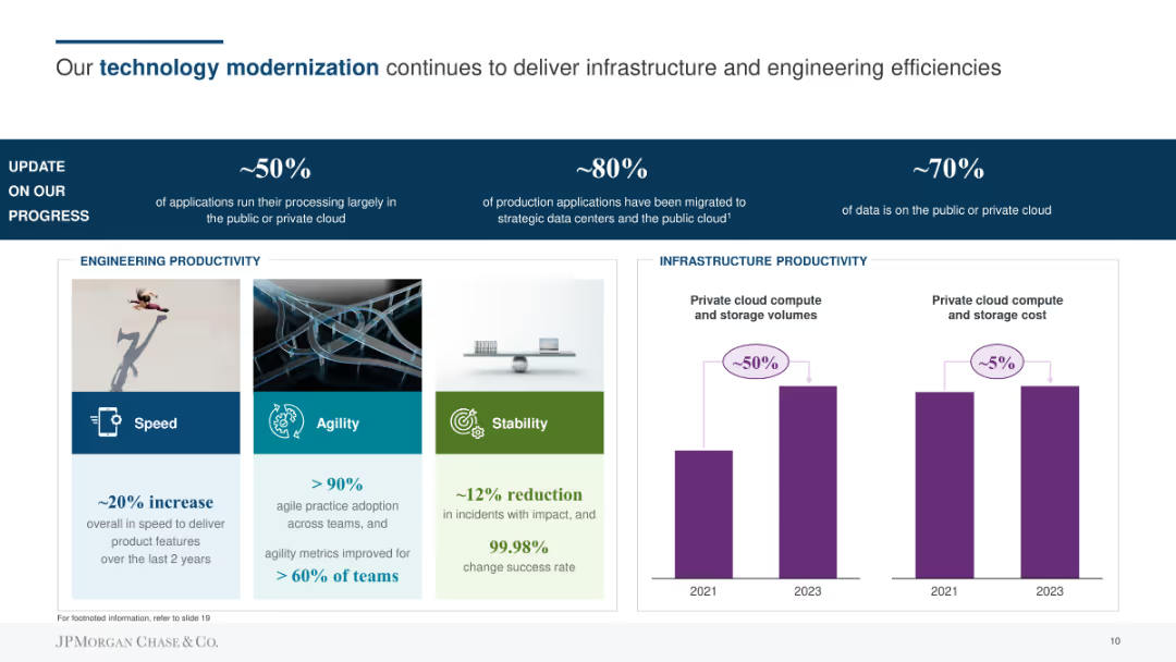
The slide contains a title with a blue underline, three sections highlighting percentages of progress in technology modernization, and a section with three visuals (speed, agility, stability) alongside column charts showing infrastructure productivity.
Technology and Digital Transformation
Financial Services
The slide details JPMorgan Chase & Co.'s technology modernization progress, focusing on application processing in the cloud, migration of production applications, and data storage. Highlights improvements in engineering and infrastructure productivity.
technology, cloud, infrastructure, productivity, progress
Mixed Chart
JP Morgan
Saved
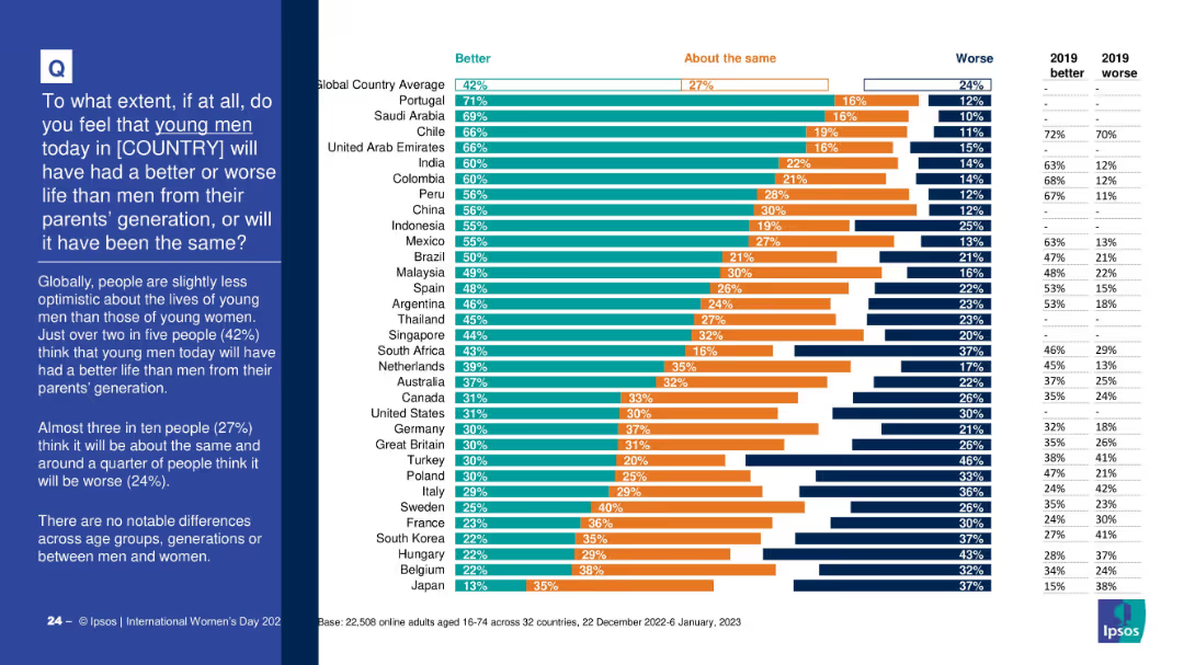
Similar format to Slide 19411, showing segmented bar chart by country and 2019 data. The left column provides a summary and highlights global opinions on young men's future.
Market Analysis and Trends
Government & Public Sector
This slide examines perceptions of young men’s life outcomes compared to previous generations. Globally, 42% believe life will be better for young men. Slightly lower optimism is shown compared to young women, with detailed breakdowns by country.
gender perception, young men, generational comparison, life outlook, international survey, Ipsos, societal progress
Mixed Chart
IPSOS
Saved
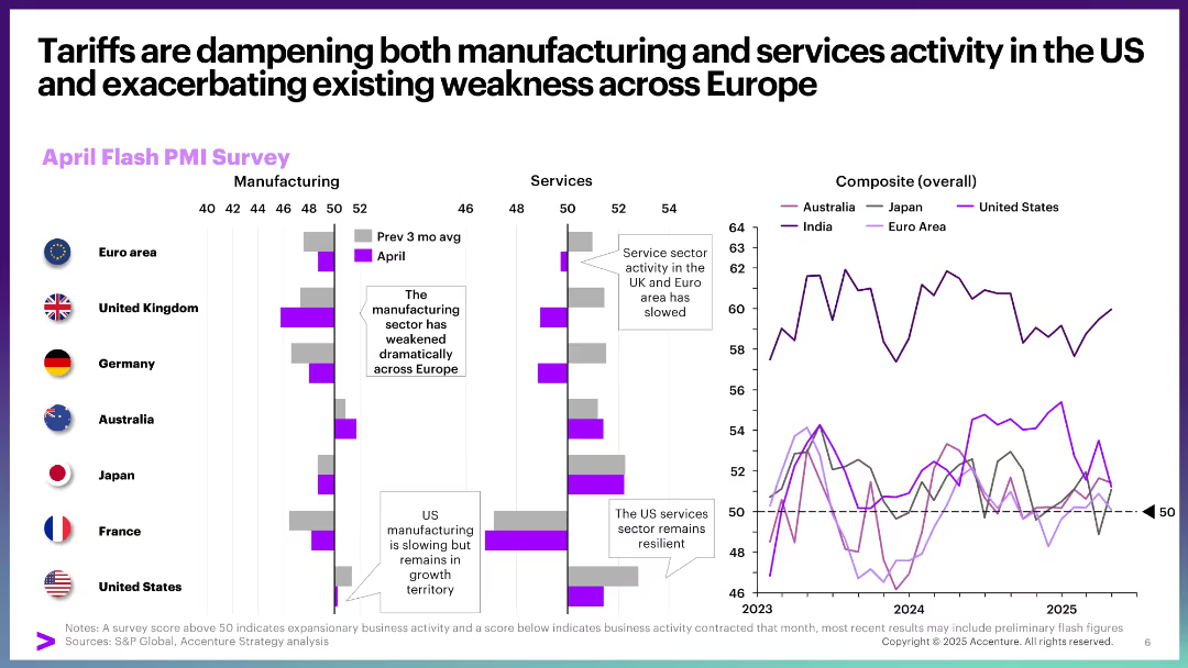
Bar and line charts showing April Flash PMI Survey for manufacturing and services by country, and composite trends over time. Clean, data-rich layout with annotations and vertical split design.
Performance Metrics and KPIs
Professional Services
This slide visualizes the impact of tariffs on business activity, highlighting contraction in Europe and resilience in US services. It uses PMI data to show declining manufacturing and service activity, especially in Europe and the UK, with a comparative composite line chart for multiple regions.
tariffs, PMI, services, manufacturing, Europe, US, business activity, slowdown, resilience, composite index
Multiple Chart
Accenture
Saved
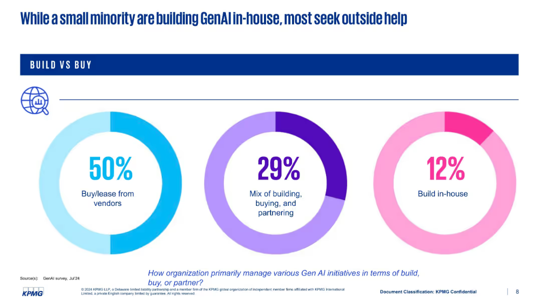
Three donut charts representing three modes of implementation: buy, mix, and build in-house
Technology and Digital Transformation
Artificial Intelligence
This slide highlights how organizations manage GenAI development—50% buy or lease from vendors, 29% use a hybrid approach, and only 12% build in-house. The chart design emphasizes the preference for external partnerships over internal development.
build vs buy, vendors, in-house, GenAI, strategy, KPMG
Single Chart
KPMG
Saved
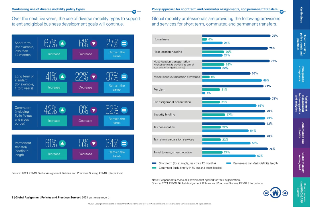
Split-panel layout with infographic bars and percentage stats on left, and horizontal bar chart on right.
Strategic Planning
Professional Services
The slide outlines the expected evolution in mobility policy types over the next five years, showing a strong trend toward increasing short-term and permanent transfers. It also lists provisions most often offered for short-term and commuter assignments.
mobility policies, short-term assignment, permanent transfer, global workforce, relocation provisions, commuter assignment, global mobility, policy trends, workforce planning
Mixed Chart
KPMG
Saved
Previous
Next
If nothing, comes up, please save your slides first
Create a FREE account to continue browsing
Receive Instant Access to 1,000+ slides from companies like McKinsey, Google, and Goldman Sachs
First Name
Last Name
Email
Password
I agree to all
Terms & Privacy Policy
Thank you! Your submission has been received!
Oops! Something went wrong while submitting the form.
Have an account?
Sign in
Column Chart
Heatmap
Chevron
Org Chart
Infographic
Callouts
Timeline
List
Graphic
Picture
Process Flow
Diagram
Paragraph
Map
Table
Framework
Subtitle
Takeaway Box
Icon
Other Chart
Radar Chart
Waterfall Chart
Mekko Chart
Pie Chart
Scatter Plot
Line Chart
Bar chart
Bullet points