Create a FREE Account
Instant access to 1,000+ real slides from top companies like McKinsey, BCG, Goldman Sachs, Google and many more!
First Name
Last Name
Email
Password
I agree to all
Terms & Privacy Policy
Thank you! Your submission has been received!
Oops! Something went wrong while submitting the form.
Have an account?
Sign in
Library
Templates
Courses
Pricing
My Account
My Slides
My Templates
✦ AI
AI Prompt Library
AI Search
Sign in
Start Here
Logout
My Saved Slides
This advanced slide contains two vertical stacked column charts representing changes in loan mix and noninterest income from 2012 to the present. It uses shades of blue, green, and other colors to differentiate between segments. Textual content is provided on the right to give context to the graphs, and bullet points below the graphs highlight key takeaways.
Strategic Planning
Financial Services
The slide outlines the strategic diversification of the company’s balance sheet and fee revenue to perform well in different economic environments. It presents changes in loan mix and noninterest income, emphasizing the reduction of cyclical impacts and improving fee diversification. Intended for strategic financial planning.
Balance Sheet, Diversification, Loan Mix, Revenue, Strategic Planning, Noninterest Income, Fee Diversification, Economic Performance
Multiple Chart
Morgan Stanley
Saved
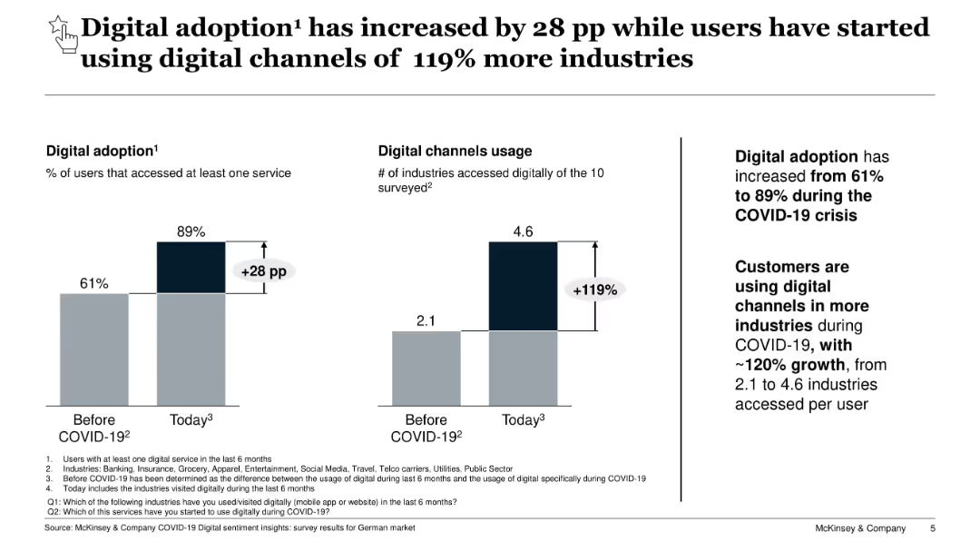
Two side-by-side bar charts showing digital service access pre- and post-COVID. Text emphasizes digital channel expansion.
Technology and Digital Transformation
Technology & Software
Shows a sharp increase in digital adoption and number of industries accessed digitally by users due to COVID-19. Highlights the behavioral shift in consumer engagement across industries in the German market.
digital adoption, COVID-19, consumer behavior, digital transformation
Mixed Chart
McKinsey
Saved
This slide features multiple line charts tracking performance forecasts across three categories: passenger cars/light trucks, trucks, and specialties. Each chart includes two lines representing the years 2022 and 2023 with shaded areas between them, illustrating projections and past performance. Icons represent each category and textual annotations provide additional context and previous forecast comparisons.
Market Analysis and Trends
Transportation & Logistics
The slide presents a market scenario for fiscal year 2023, with slight improvements in passenger cars/light trucks and ongoing destocking in trucks. It includes a detailed analysis of trends in various sub-categories of the tire industry such as mining, aircraft, and two-wheel tires. It aims to provide an updated market outlook and forecast changes, suggesting industry trends and market conditions.
market, forecast, tires, performance, trend, passenger, truck, specialty, projections, destocking
Multiple Chart
Morgan Stanley
Saved
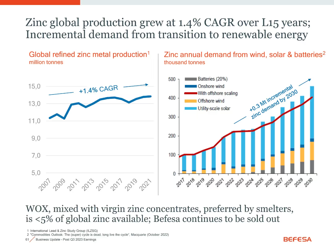
Two-panel layout with line and stacked bar charts, annotated CAGR and projections
Market Analysis and Trends
Industrial & Manufacturing
The slide presents historical and projected data on zinc production and its growing demand, especially from renewable energy sectors like wind, solar, and batteries.
Zinc, Renewable Energy, CAGR, Demand Growth, Batteries, Solar, Wind
Multiple Chart
Goldman Sachs
Saved
Includes a map with icons and a pie chart. Dense with textual annotations and regional highlights.
Market Analysis and Trends
Energy & Utilities
Describes the strategic transmission and midstream operations of gas, highlighting supply connections and growth areas.
energy, utilities, gas, transmission, growth
Mixed Chart
Barclays
Saved
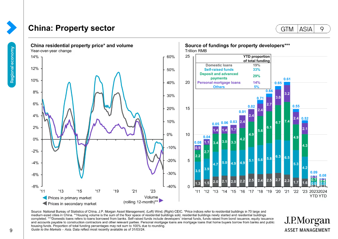
Features two line charts and a bar chart showing China residential property prices and volume, and the source of funding for property developers over time.
Market Analysis and Trends
Real Estate & Construction
Examines the property sector in China by tracking residential property prices and funding sources, useful for market and investment analysis in real estate.
Property sector, China, Real estate, Funding, Residential prices, Market trends, Investment, Economic data
Multiple Chart
JP Morgan
Saved
Contains a single horizontal bar graph in purple, outlining various investment areas within underwriting over time.
Strategic Planning
Financial Services
The slide shows current and planned investments in underwriting technology and processes for the next three years.
investments, underwriting, strategic planning, bar graph
Mixed Chart
Accenture
Saved
Features a mix of text and a column chart illustrating preferred working patterns for Gen Z and millennials. Includes benefits of remote work in text bubbles.
Operational Efficiency
Professional Services
The slide highlights the high demand for hybrid working models among Gen Z and millennials and the need for businesses to adapt to this preference. It includes data on preferred working patterns and the benefits of remote work, such as cost savings and improved work-life balance.
Hybrid work, remote work, Gen Z, millennials, work-life balance
Mixed Chart
Deloitte
Saved
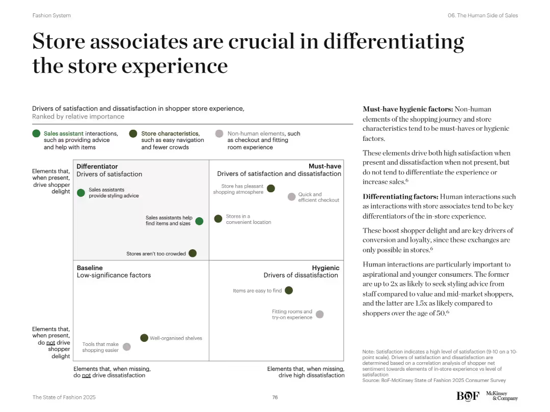
2x2 quadrant chart categorizing satisfaction/dissatisfaction drivers in store experience. Green and gray dots represent factors like store characteristics and human interactions. Explanatory text on right.
Human Resources and Talent Management
Retail & E-commerce
Outlines importance of human interaction in physical stores. Sales associates providing help and advice are key differentiators of satisfaction. Store features like pleasant atmosphere are must-haves, but only staff interactions boost customer delight and loyalty significantly.
store associates, customer experience, in-store drivers, satisfaction, human interaction
Mixed Chart
McKinsey
Saved
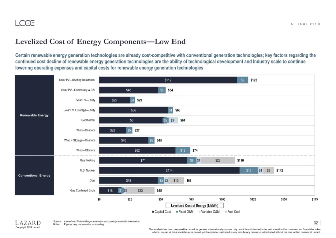
Horizontal bar chart decomposing LCOE for various renewable and conventional energy types at the low-cost end.
Performance Metrics and KPIs
Energy & Utilities
Shows the capital and operating cost breakdowns for renewable and conventional energy technologies at the low end of the cost spectrum. Highlights how some renewables are now cost-competitive or cheaper than fossil-based power generation.
LCOE, capital cost, fixed O&M, variable O&M, fuel cost, renewable energy, cost structure
Single Chart
Roland Berger
Saved
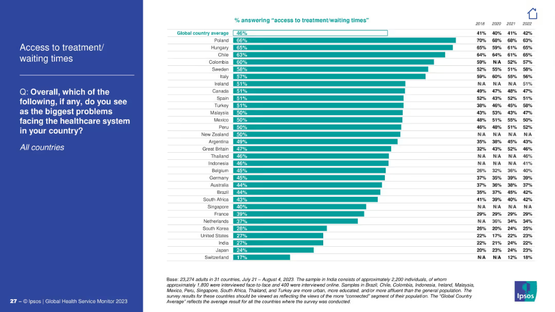
Vertical bar chart by country; left panel contains the title and question.
Performance Metrics and KPIs
Healthcare & Pharmaceuticals
This slide compares perceived issues with access to treatment and wait times across countries. Poland, Hungary, and Chile report the highest concern. Yearly comparison data is shown from 2018 to 2022.
access to care, wait times, global healthcare
Mixed Chart
IPSOS
Saved
A scatter plot shows the risk/return over 10 years for different market segments, paired with a table detailing the same, to articulate diversification benefits.
Investment Analysis
Financial Services
This slide assesses the risk-return profile of small cap stocks internationally versus emerging markets, underscoring diversification benefits in portfolio management.
risk-return profile, small cap, international markets, emerging markets, diversification, portfolio management, scatter plot
Single Chart
Morgan Stanley
Saved
A composite slide with two images of women, text, and a graph detailing statistics about women's menstrual health at work. The design is informative, with clear sections for textual explanation and data visualization in a professional blue and green color scheme.
Technology and Digital Transformation
Healthcare & Pharmaceuticals
The slide presents statistical data on menstrual health challenges affecting women in the workplace, suggesting the need for policy changes regarding paid leave for menstrual symptoms.
menstrual health, workplace, statistics, policy, paid leave, health challenges
Single Chart
Deloitte
Saved
The slide contains an explanatory text about the survey, a world map showing survey participant locations, and pie charts representing company sizes and sectors.
Market Analysis and Trends
Professional Services
Overview of the survey methodology, participant demographics, and data collection timeline.
Survey, methodology, demographics, data collection, participant locations
Mixed Chart
EY
Saved
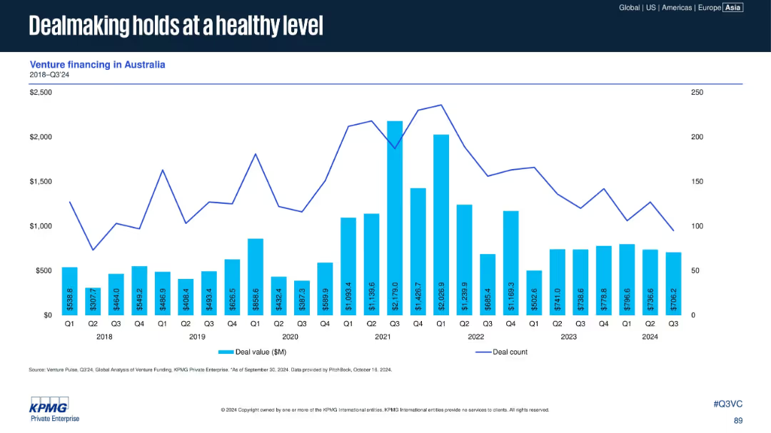
Bar and line chart presenting venture financing data (deal value and count) in Australia from 2018 to Q3 2024.
Investment Analysis
Financial Services
Australia has maintained relatively stable VC activity, with healthy dealmaking volumes in 2024. Although deal counts declined slightly, deal values remain resilient, supported by consistent investor interest in the region.
Australia, deal value, deal count, venture financing, KPMG, investment stability
Single Chart
KPMG
Saved
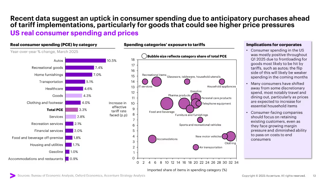
Left: Bar chart of real consumer spending by category. Right: Bubble chart showing spending category exposure to tariffs.
Pricing Strategies
Consumer Goods
Indicates temporary increases in US consumer spending due to anticipatory purchases ahead of tariffs—especially for autos and recreational goods. Accompanied by bubble plot detailing categories most exposed to tariff hikes, highlighting risks and opportunities for pricing strategy.
tariff impact, consumer behavior, pricing, spending categories, strategy
Multiple Chart
Accenture
Saved
This slide presents column charts showing the percentage of schools affected by various challenges impacting ICT teaching time. It includes quotes from the Federal Ministry of Education, Nigeria, and the Universal Basic Education Commission, highlighting the severity of irregular power supply in Nigeria.
Strategic Planning
Education & Training
This slide depicts the significant challenge of irregular power supply on ICT education in Nigerian public schools. It presents data and authoritative quotes to highlight the urgency of the issue and its impact on the effectiveness of ICT teaching, advocating for infrastructural improvements in the power supply.
ICT, Education, Nigeria, Power Supply, Challenges
Mixed Chart
BCG
Saved
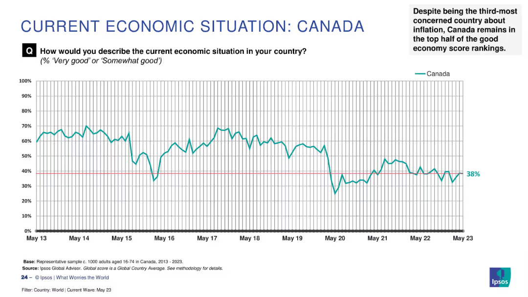
Line graph tracking Canada's economic sentiment (2013–2023); explanatory note in top right summarizes context.
Strategic Planning
Financial Services
Canada's “good economy” score stands at 38%, placing it in the upper half of the global ranking despite inflation concerns. The time-series chart shows fluctuations over the last decade, with a notable dip in May 2020. The narrative notes Canada’s resilience relative to other economies.
Canada, economic sentiment, Ipsos, inflation, public perception, resilience, global context, economic trend
Single Chart
IPSOS
Saved
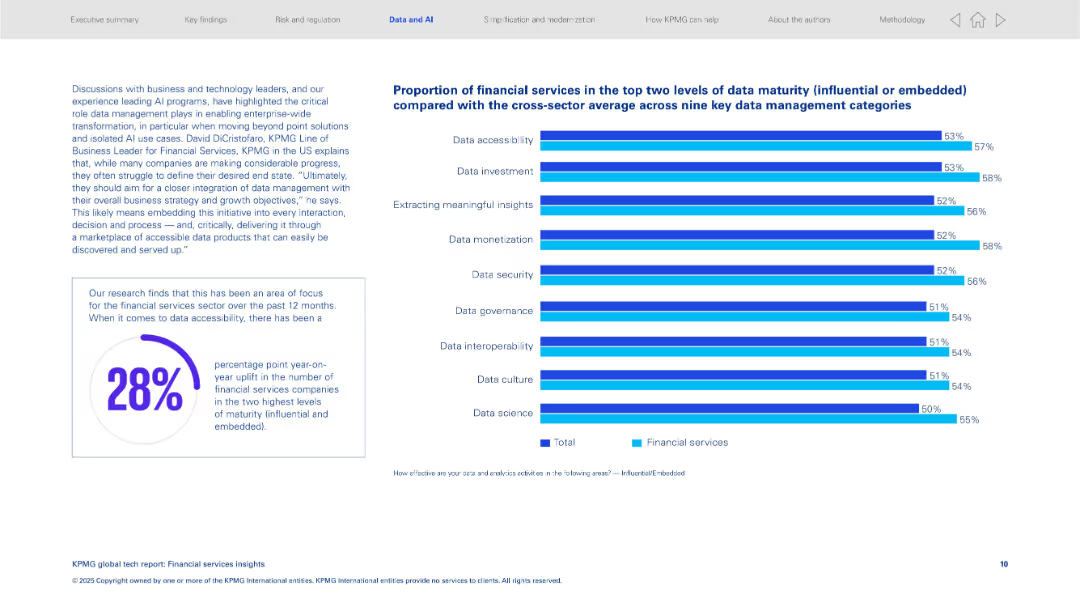
Left: narrative box and 28% statistic in circle; right: bar chart with 9 data categories showing financial services vs total sector average.
Performance Metrics and KPIs
Financial Services
Analyzes financial services data maturity across nine categories, showing significant improvements, especially in accessibility. It emphasizes integrating data management with business objectives for enterprise-wide transformation.
data maturity, accessibility, financial services, data governance, insights, business alignment
Multiple Chart
KPMG
Saved
Consists of pie charts and bar graphs, a table, and a key point section, all maintaining a professional blue, gray, and white color scheme.
Investment Analysis
Financial Services
Analyzes asset management investment distribution by sector and geography, offering insights for strategic investment decisions.
Asset, Management, Investment, Distribution, Sector, Geography, Analysis, Insights, Strategic, Decisions
Multiple Chart
Goldman Sachs
Saved
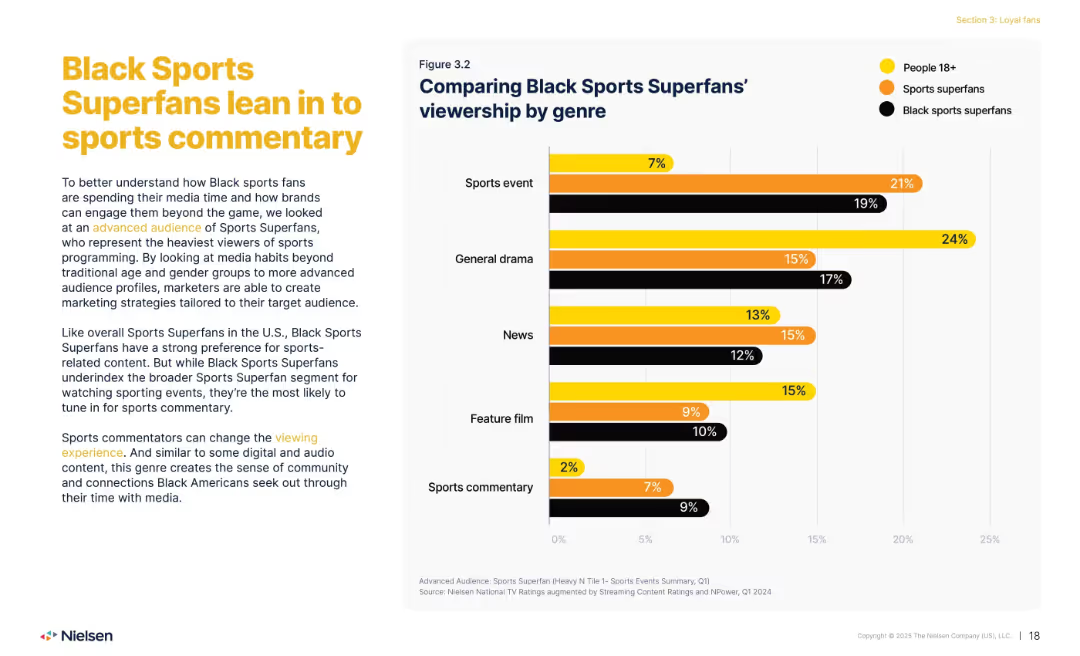
Left: explanatory text; right: bar chart comparing viewership across genres.
Customer and Market Segmentation
Media & Entertainment
Explores how Black Sports Superfans differ in content preferences, leaning strongly toward sports commentary. Contrasts their media habits with general population and overall sports superfans, emphasizing a desire for deeper engagement beyond live events.
sports superfans, commentary, genre, Black viewers, media habits
Mixed Chart
Nielsen
Saved
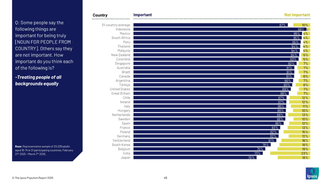
Horizontal bar chart similar in structure to slide 18911, comparing "Important" and "Not important" across countries.
Market Analysis and Trends
Government & Public Sector
The slide compares global public opinion across 31 countries regarding the importance of treating people from all backgrounds equally. Overwhelming majorities in nearly all countries consider this important, especially Indonesia (98%).
equality, diversity, inclusion, national values, public opinion, global, Ipsos, bar chart, fairness
Mixed Chart
IPSOS
Saved
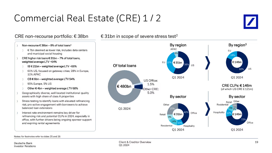
The slide includes pie charts showing the CRE portfolio's regional and sectoral distribution. It also details the non-recourse portfolio and higher risk loans with weighted average LTVs.
Risk Assessment and Management
Real Estate & Construction
Details the composition and risk profile of the CRE portfolio, including non-recourse and higher risk loans. It highlights geographical and sectoral diversification and weighted average loan-to-value ratios, indicating the bank's exposure and risk management in CRE.
CRE, non-recourse, LTV, portfolio distribution, risk management
Multiple Chart
Deutsche Bank
Saved
Filled with pie charts and graphs, depicts salary expectations and job satisfaction levels across various sectors.
Human Resources and Talent Management
Professional Services
Discusses evolving workforce expectations regarding pay, crucial for financial planning and HR strategies in businesses.
Workforce Trends, Pay Dynamics, Salary Expectations, Job Satisfaction, HR Strategy
Multiple Chart
PwC/Strategy&
Saved
Contains two line charts. The left chart depicts policy rate trends of the Fed, ECB, and BoJ from January 2020 to April 2024. The right chart shows the return-on-equity of US, European, and Japanese banks from 2010 to 2024.
Market Analysis and Trends
Financial Services
Discusses how global economic resilience and higher inflation expectations affect central bank policies, influencing the profitability of banks, particularly in the US, Europe, and Japan.
Banks, Fed, ECB, BoJ, Return-on-Equity, Policy Rates, Inflation, Market Analysis
Multiple Chart
Morgan Stanley
Saved
Previous
Next
If nothing, comes up, please save your slides first
Create a FREE account to continue browsing
Receive Instant Access to 1,000+ slides from companies like McKinsey, Google, and Goldman Sachs
First Name
Last Name
Email
Password
I agree to all
Terms & Privacy Policy
Thank you! Your submission has been received!
Oops! Something went wrong while submitting the form.
Have an account?
Sign in
Column Chart
Heatmap
Chevron
Org Chart
Infographic
Callouts
Timeline
List
Graphic
Picture
Process Flow
Diagram
Paragraph
Map
Table
Framework
Subtitle
Takeaway Box
Icon
Other Chart
Radar Chart
Waterfall Chart
Mekko Chart
Pie Chart
Scatter Plot
Line Chart
Bar chart
Bullet points