Create a FREE Account
Instant access to 1,000+ real slides from top companies like McKinsey, BCG, Goldman Sachs, Google and many more!
First Name
Last Name
Email
Password
I agree to all
Terms & Privacy Policy
Thank you! Your submission has been received!
Oops! Something went wrong while submitting the form.
Have an account?
Sign in
Library
Templates
Courses
Pricing
My Account
My Slides
My Templates
✦ AI
AI Prompt Library
AI Search
Sign in
Start Here
Logout
My Saved Slides
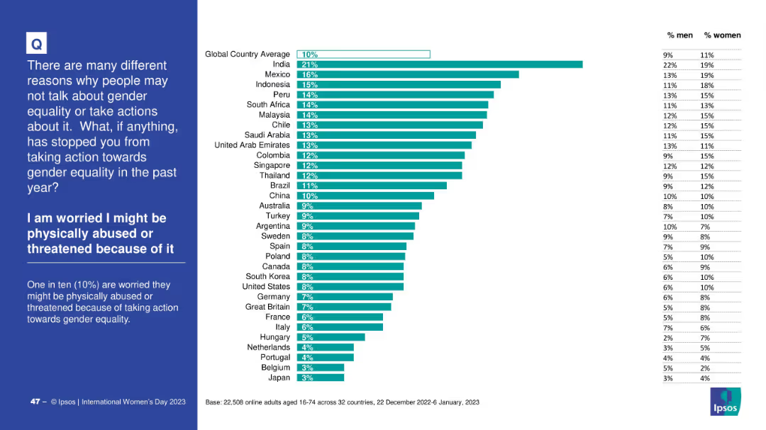
Horizontally ranked bar chart with % values by country and a gender split table on the right; left side panel in blue for context and explanation.
Risk Assessment and Management
Government & Public Sector
This slide shows the proportion of respondents by country who fear physical abuse or threats for taking action toward gender equality. India ranks highest at 21%. The global average is 10%, with a gender breakdown showing some differences.
threat, abuse, fear, gender equality, country comparison, survey data, risk, Ipsos
Mixed Chart
IPSOS
Saved
Slide shows line graphs contrasting the current and potential trajectories of nickel supply (Class 1 and 2) against demand scenarios on a dark background.
Strategic Planning
Industrial & Manufacturing
Outlines strategies to address the tight supply of nickel by detailing supply chain dynamics, projected demands, and the influence of market conditions from 2012 to 2031.
nickel, supply chain, market dynamics, class 1, class 2
Multiple Chart
McKinsey
Saved
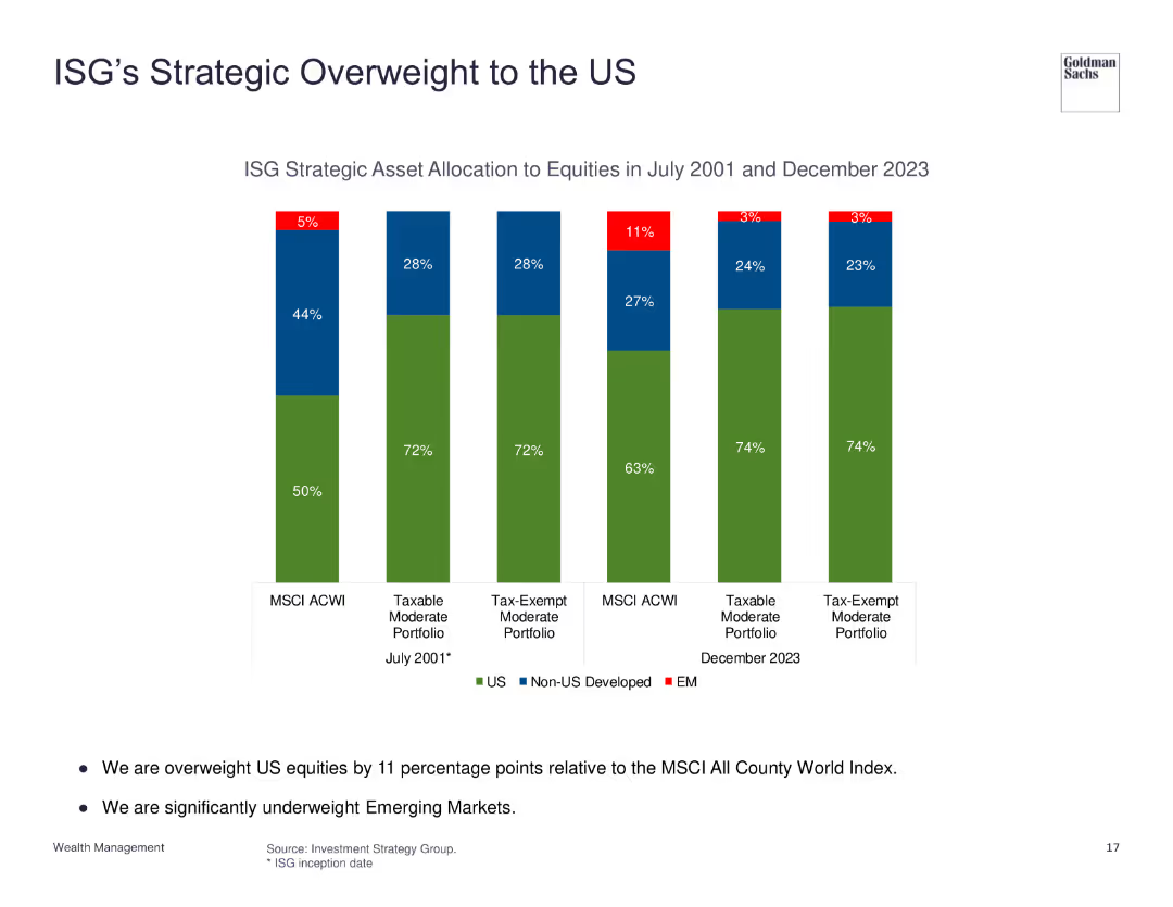
The slide shows column charts comparing ISG's asset allocation to equities in 2001 and 2023, highlighting an increased overweight to US equities.
Strategic Planning
Financial Services
The slide illustrates ISG's strategic decision to overweight US equities, showing the changes in asset allocation over time and the focus on US market investments compared to non-US developed and emerging markets.
ISG, Strategy, Asset Allocation, US Equities, Overweight
Single Chart
Goldman Sachs
Saved
A column chart showing conversion rates that increase from 2x to 15x across four steps labeled 1 to 4. Arrows between bars suggest progression and growth over time.
Investment Analysis
Financial Services
The slide depicts the growth in pilot conversion rates when investing based on initial learnings, demonstrating a significant increase through digital warming, corporate events, and relationship manager referrals.
Conversion rates, Investment, Growth, Corporate events, Digital warming
Single Chart
Goldman Sachs
Saved
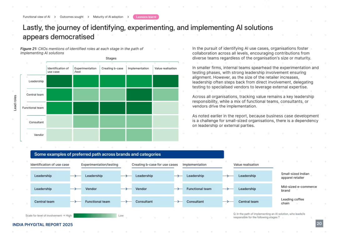
Heatmap showing CXO involvement across AI adoption stages, supported by an illustrative flow diagram at the bottom. Right panel includes insights and analysis. Uses green intensity to indicate involvement level.
Organizational Structure and Change
Retail & E-commerce
This slide details the roles played by leadership, teams, consultants, and vendors throughout the AI adoption journey—from use case identification to value realization. It suggests a democratized approach with high leadership involvement early on and more vendor/consultant responsibility in later stages, especially for small firms needing external expertise.
AI roles, leadership, vendors, experimentation, implementation, democratization
Mixed Chart
PwC/Strategy&
Saved
Contains line charts comparing the growth of mobile versus wired internet advertising revenues in India from 2016 to 2025.
Market Analysis and Trends
Media & Entertainment
Explores the shift towards mobile internet advertising in India, noting it as a major growth driver in digital advertising revenues.
mobile advertising, growth driver, India, digital revenue, 2025 forecast, internet advertising
Mixed Chart
PwC/Strategy&
Saved
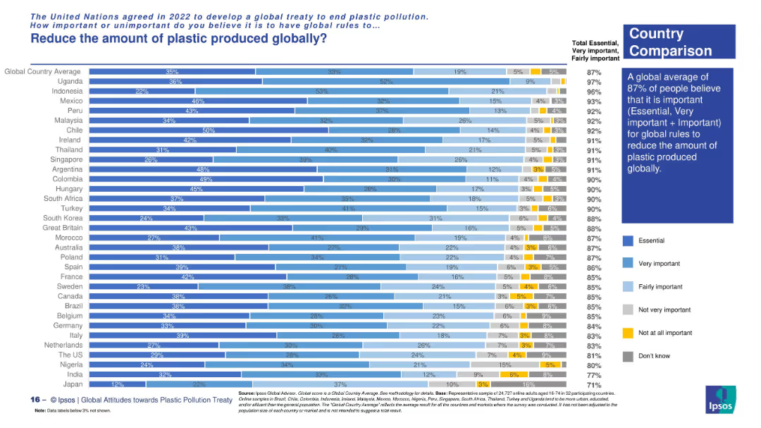
Vertical bar chart showing country-level opinions with five shades indicating importance levels. A summary box on the right highlights global sentiment.
Market Analysis and Trends
Environmental Services & Sustainability
This slide presents public opinion across countries on the importance of reducing global plastic production. The vast majority (87% globally) consider it essential or important. Country-level comparisons show highest support in Uganda, Indonesia, and Mexico.
plastic reduction, global rules, environmental awareness, country comparison, Ipsos survey, public opinion, global treaty
Mixed Chart
IPSOS
Saved
The slide features a line chart showing wheat production volumes for Canada, Australia, and Ukraine, with annotations explaining the volatility and growth rates.
Market Analysis and Trends
Agriculture & Food Production
The slide explains the volatility in Australian wheat production compared to Canada and Ukraine, emphasizing the factors contributing to slower growth in Australia.
Wheat production, volatility, Australia, Canada, Ukraine, growth rate, agriculture, food production, market trends
Mixed Chart
LEK
Saved
Slide uses a comparative layout with text blocks and a central transition arrow.
Strategic Planning
Financial Services
Discusses strategic shifts in UK digital investing and wealth management to enhance market position.
strategy, wealth management, digital investing, market share, UK
Linear Flow
Barclays
Saved
This slide features a mix of column charts, pie charts, and arrows indicating trends. There are multiple graphs showing leadership positions, market share gains, and regional performance comparisons. The design incorporates shades of blue and green, with concise textual information.
Financial Performance
Financial Services
This slide showcases the market leadership and growth of JPMorgan's Corporate & Investment Bank (CIB). It displays their global leadership positions in bar charts and pie charts detailing regional market share gains. There's a focus on the strategic business expansion and investments made since 2015. It illustrates the company's successful growth and competitive edge in the financial services industry.
JPMorgan, Market Leadership, Growth, Financial Services, CIB, Market Share, Bar Chart, Pie Chart, Investment
Multiple Chart
JP Morgan
Saved
A table with yields, returns, maturities, and correlations of various bond types, alongside a bar chart of return impact from interest rate changes.
Financial Performance
Financial Services
Evaluates the performance of different bonds and potential returns under changing interest rate scenarios.
Bond returns, yields, performance, interest rates, U.S. Treasuries, correlation, impact, analysis, strong
Mixed Chart
JP Morgan
Saved
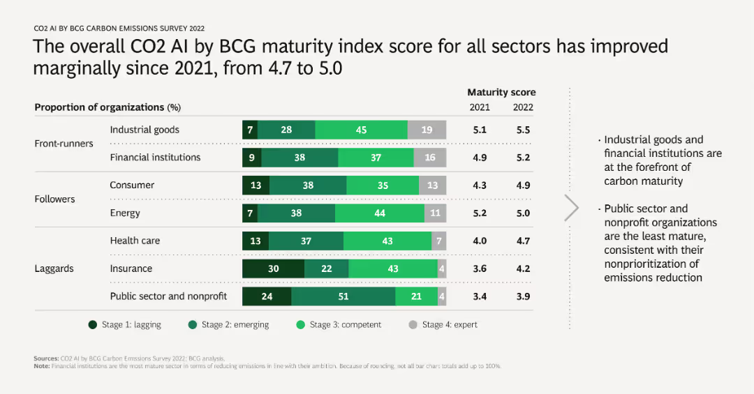
A mixed chart with horizontal bars representing the proportion of organizations at different maturity stages in various sectors, along with a line chart showing the average maturity score for 2021 and 2022. Includes sector-specific analysis.
Market Analysis and Trends
Environmental Services & Sustainability
Evaluates the progress in emissions measurement and reduction across different sectors, noting a slight overall improvement. Highlights leaders and laggards in environmental maturity, useful for benchmarking and setting goals.
maturity index, sector analysis, progress, emissions reduction, benchmarking
Mixed Chart
BCG
Saved
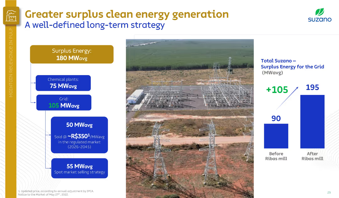
Left side shows energy allocation flowchart; right side includes bar chart and substation photo. Uses blue and gold color scheme.
Operational Efficiency
Energy & Utilities
Suzano demonstrates its clean energy surplus strategy, producing 180 MWavg and allocating 105 MWavg to the grid. A chart shows energy sales and increase post-Ribas mill. The strategy includes long-term spot and regulated market sales.
surplus energy, Suzano, clean energy, MWavg, Ribas mill, regulated market, strategy, power grid
Mixed Chart
Goldman Sachs
Saved
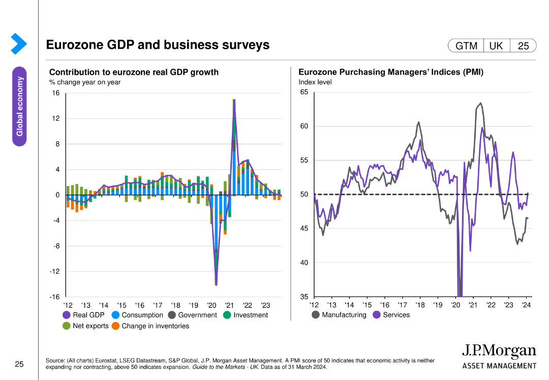
This slide contains two column charts. The left chart presents the contribution to eurozone real GDP growth by different sectors. The right chart shows Eurozone Purchasing Managers' Indices (PMI) over time. The charts are detailed and use various colors to distinguish data categories.
Market Analysis and Trends
Financial Services
The slide analyzes the eurozone's GDP growth and business activity through sector contributions and PMI trends, essential for economic analysis and business strategy.
eurozone GDP, business surveys, PMI, sector growth, economic analysis
Multiple Chart
JP Morgan
Saved
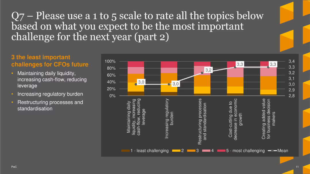
The slide features a column chart showing less significant expected challenges, including liquidity management and regulatory burden.
Market Analysis and Trends
Financial Services
This slide highlights the least important expected challenges for CFOs in the next year: daily liquidity, regulatory burden, and restructuring processes.
Future Challenges, CFOs, Column Chart, PwC, Survey, 2022, Regulatory Burden
Mixed Chart
PwC/Strategy&
Saved
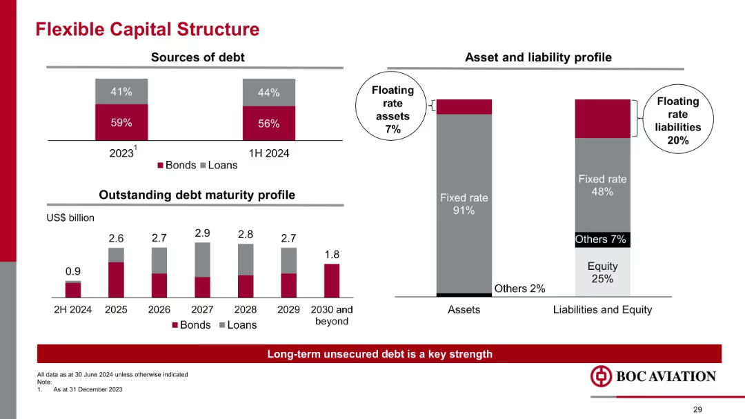
Stacked bar charts and vertical bar layout; financial breakdowns with debt maturity and asset-liability alignment
Risk Assessment and Management
Financial Services
Describes capital structure with a balance between bonds and loans, and maturity profile of debt through 2030. Emphasizes low exposure to floating rate liabilities versus floating rate assets, mitigating interest rate risk.
capital structure, debt maturity, bonds, loans, interest rate risk, fixed rate, liabilities, floating rate
Multiple Chart
Goldman Sachs
Saved
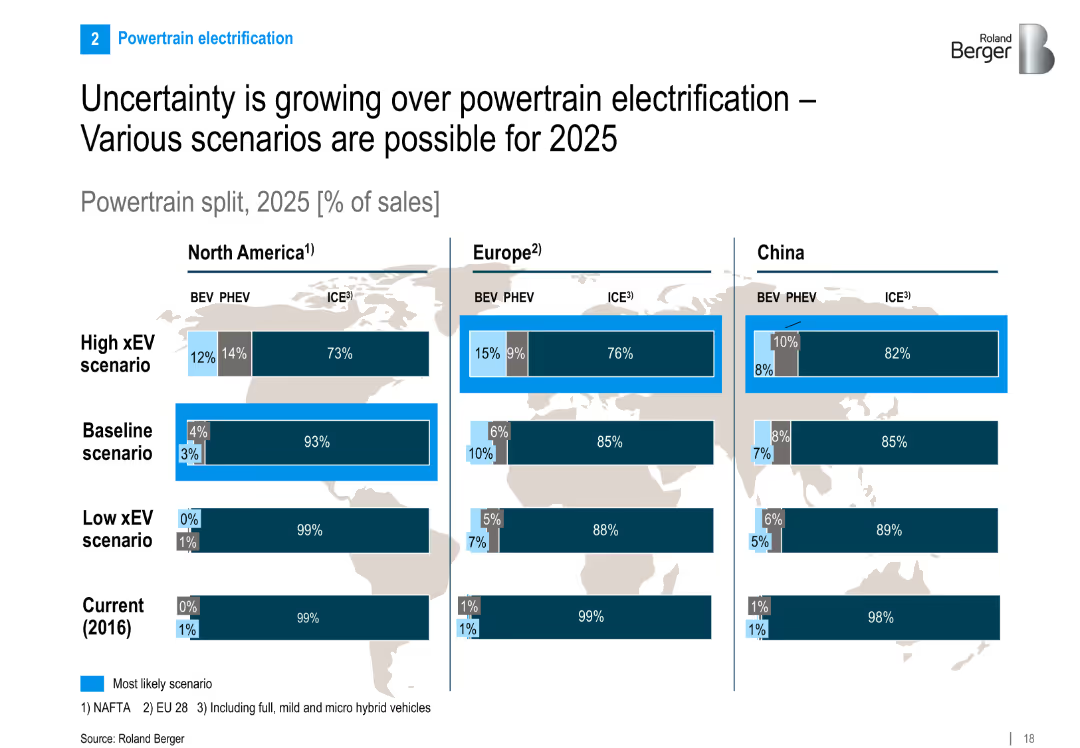
Split layout: three region-specific bar charts (NA, EU, China) showing 2025 powertrain split scenarios (BEV, PHEV, ICE); scenarios from low to high xEV adoption
Strategic Planning
Industrial & Manufacturing
Presents three scenarios for EV adoption across regions by 2025, showing potential market splits between ICEs, PHEVs, and BEVs. Highlights uncertainty in electrification growth and regional variation in expectations.
EV, PHEV, ICE, powertrain, xEV scenario, electrification, 2025 forecast, North America, Europe, China
Multiple Chart
Roland Berger
Saved
Bar chart with response categories about authorized entry routes and corresponding support levels
Regulatory and Compliance
Government & Public Sector
The slide assesses global support for refugee entry methods. While 36% believe existing authorized routes are enough, 31% support expanding legal pathways. A smaller portion (14%) oppose providing any authorized routes. Results show divided views on refugee entry legality.
entry routes, refugee policy, legal migration, Ipsos, global average, access, support levels
Mixed Chart
IPSOS
Saved
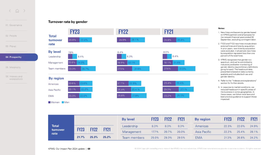
Layout mirrors previous slides with rates displayed by role and region; total turnover shown at bottom.
Human Resources and Talent Management
Professional Services
Analyzes turnover rate segmented by gender across fiscal years FY21–FY23. Detailed by leadership level and global region, the chart supports strategic planning and retention initiatives. Notes reiterate data scope and inclusion principles.
turnover rate, gender analysis, retention, HR strategy, leadership, team, regions, FY data
Mixed Chart
KPMG
Saved
Pie chart slide comparing the percentage of TV time spent streaming in February 2021 and February 2022, with distinct color segments for different streaming services.
Market Analysis and Trends
Media & Entertainment
Compares the growth in TV streaming time over a year, showing an increase in streaming's share and the distribution across various services.
TV streaming, growth, comparison, streaming services, time spent
Multiple Chart
Nielsen
Saved
The slide includes two columns of text with images, and trend assessments.
Technology and Digital Transformation
Technology & Software
Describes consumer profiling and supply chain transparency, highlighting the importance of data analysis and blockchain technology.
Consumer Profiling, Supply Chain, Data Analysis, Blockchain, Transparency, Data Privacy
Multiple Chart
Deloitte
Saved
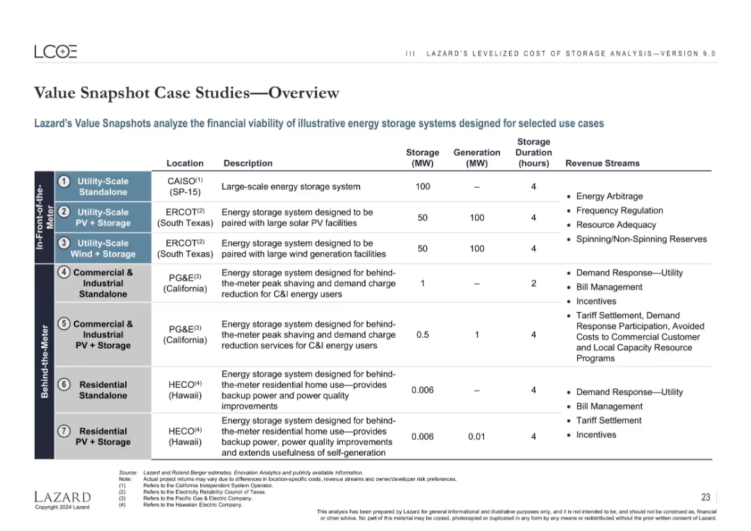
Tabular layout listing 7 case studies categorized by location, configuration, and revenue stream.
Client Case Studies
Energy & Utilities
Summarizes 7 case studies of standalone and hybrid energy storage systems across use cases (utility-scale, commercial, residential). Details include location, generation/storage capacity, and expected revenue sources like arbitrage, incentives, and demand response.
case studies, energy storage, PV, wind, residential, utility-scale, C&I, duration
Table
Roland Berger
Saved
This slide presents a pie chart alongside a graph showing a positive trend over three years. There's also a circular diagram with various percentages, all surrounding the central theme of financial wellness. The layout is neat, with clear demarcation of the visual elements.
Market Analysis and Trends
Financial Services
Revealing the increase in HR leaders offering financial wellness benefits, this slide could be used to discuss the evolving role of employee benefits in job satisfaction and recruitment strategies in the financial industry.
financial wellness, HR leaders, employee benefits, job satisfaction
Multiple Chart
Goldman Sachs
Saved
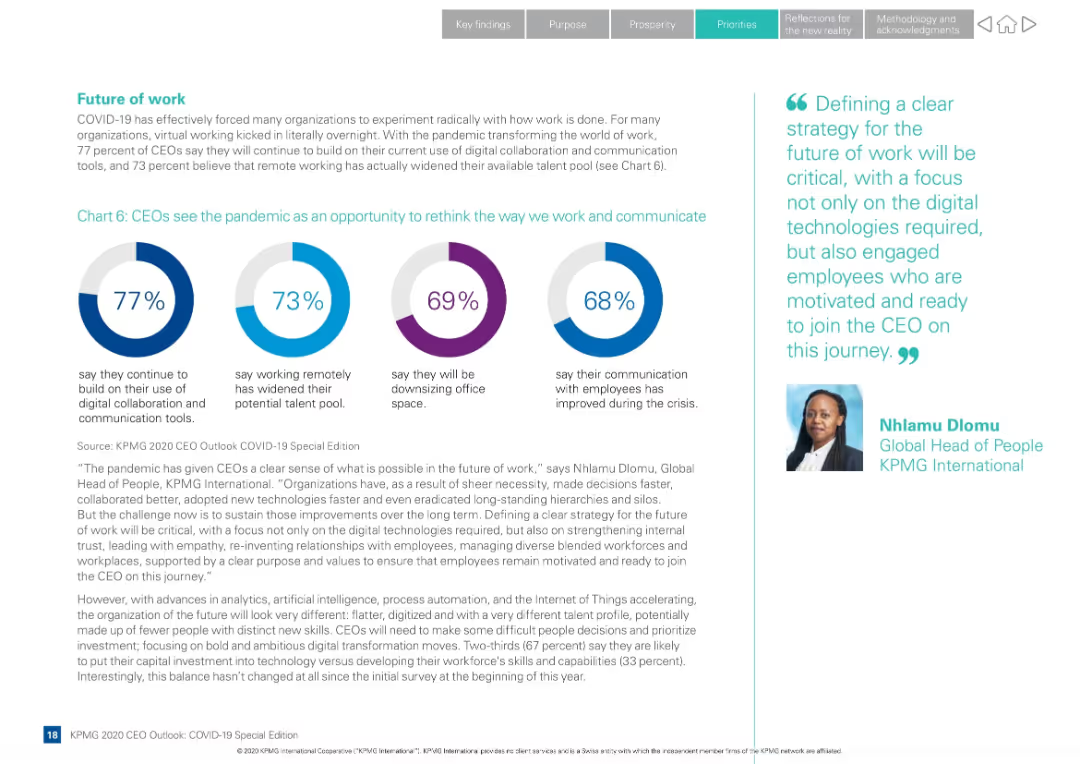
Layout with four circular infographics and supporting text; quote from KPMG Global Head of People on the right
Human Resources and Talent Management
Professional Services
CEOs reflect on how COVID-19 changed work. Majority plan to continue remote work tools and see an expanded talent pool. Slide also explores communication improvements and office downsizing.
remote work, future of work, digital tools, talent pool, communication, office space, KPMG, employee strategy
Mixed Chart
KPMG
Saved
Slide includes column charts and data visualizations comparing quarterly financial performance metrics and historical data points to highlight trends and earnings.
Financial Performance
Financial Services
Displays a financial summary for Q423, including income, costs, profit before tax, and related metrics, with comparisons to previous quarters.
Q423, income, profit, financial performance, Barclays, tax, earnings, costs
Mixed Chart
Barclays
Saved
Previous
Next
If nothing, comes up, please save your slides first
Create a FREE account to continue browsing
Receive Instant Access to 1,000+ slides from companies like McKinsey, Google, and Goldman Sachs
First Name
Last Name
Email
Password
I agree to all
Terms & Privacy Policy
Thank you! Your submission has been received!
Oops! Something went wrong while submitting the form.
Have an account?
Sign in
Column Chart
Heatmap
Chevron
Org Chart
Infographic
Callouts
Timeline
List
Graphic
Picture
Process Flow
Diagram
Paragraph
Map
Table
Framework
Subtitle
Takeaway Box
Icon
Other Chart
Radar Chart
Waterfall Chart
Mekko Chart
Pie Chart
Scatter Plot
Line Chart
Bar chart
Bullet points