Create a FREE Account
Instant access to 1,000+ real slides from top companies like McKinsey, BCG, Goldman Sachs, Google and many more!
First Name
Last Name
Email
Password
I agree to all
Terms & Privacy Policy
Thank you! Your submission has been received!
Oops! Something went wrong while submitting the form.
Have an account?
Sign in
Library
Templates
Courses
Pricing
My Account
My Slides
My Templates
✦ AI
AI Prompt Library
AI Search
Sign in
Start Here
Logout
My Saved Slides
Column chart on right showing emission reduction, text with bullet points on the left
Strategic Planning
Environmental Services & Sustainability
Highlights EY's efforts to reduce CO2 emissions from air travel, outlining strategies and goals
Green mobility, CO2 reduction, travel, emissions, EY
Mixed Chart
EY
Saved
The slide contains a donut chart showing the subscription mix of Gartner's research revenue. The chart highlights that 92% of revenue is subscription-based.
Financial Performance
Professional Services
It highlights the dominance of subscription revenue in Gartner’s research segment, indicating a stable and recurring revenue model.
Gartner, research, subscription, revenue, recurring, financial performance, model
Single Chart
Gartner
Saved
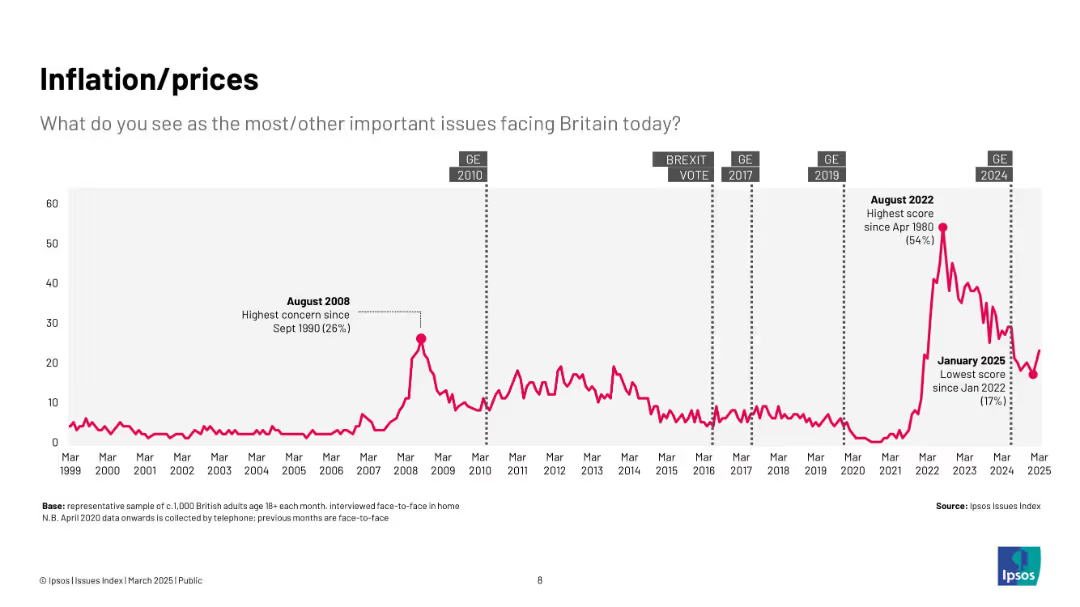
Pink line chart (1999–2025) with peak in 2022 and sharp drop by 2025; context points include financial crises and recent inflation spikes.
Market Analysis and Trends
Government & Public Sector
Highlights the rising and falling concern over inflation and prices, with major spikes during economic shocks such as 2008 and the post-COVID inflationary period.
inflation, prices, cost of living, Ipsos, economy, concern, UK, trends
Single Chart
IPSOS
Saved
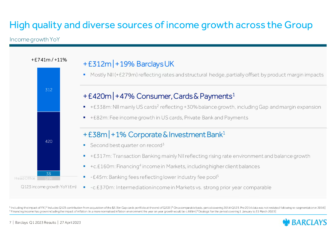
Column chart on the left showing income growth YoY, with three main income categories listed on the right with bullet points detailing contributions from Barclays UK, Consumer, and CIB.
Financial Performance
Financial Services
The slide showcases Barclays' income growth across various sectors: Barclays UK, Consumer Cards & Payments, and Corporate & Investment Bank, highlighting year-over-year increases.
income growth, Barclays UK, Consumer Cards, Corporate Investment Bank, financial performance
Mixed Chart
Barclays
Saved
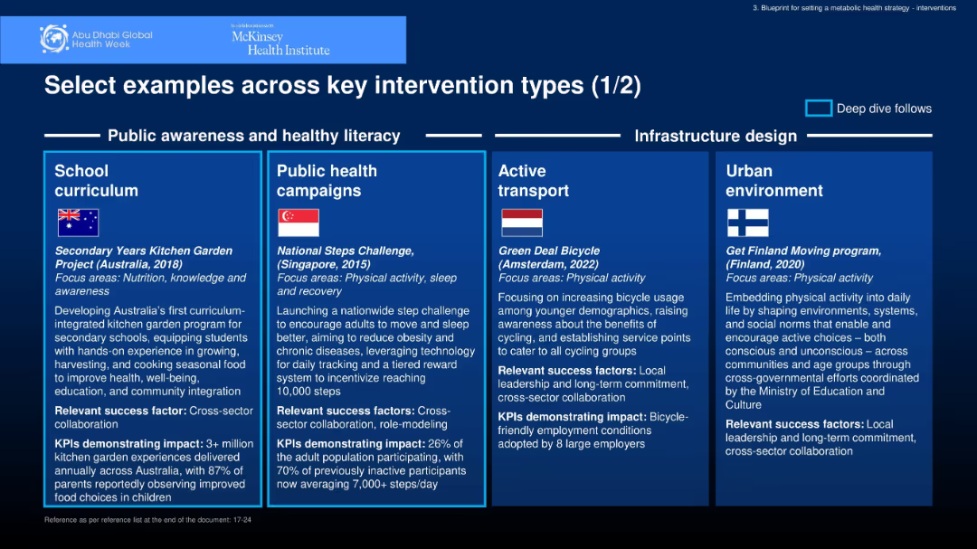
Four-panel layout with boxed sections, each featuring a country flag, initiative title, year, and detailed description; color-coded segments under a "Public awareness and healthy literacy" and "Infrastructure design" header.
Strategic Planning
Healthcare & Pharmaceuticals
Highlights global interventions promoting health through school curriculum, public campaigns, active transport, and urban planning. Examples include Australia’s kitchen garden program, Singapore’s steps challenge, Amsterdam’s bike scheme, and Finland’s active environments.
public health, awareness, transport, nutrition, physical activity
Pillar
McKinsey
Saved
Contains columns outlining various resiliency capabilities in dynamic product development, autonomous production, and agile organization, using circular icons and connecting arrows.
Operational Efficiency
Industrial & Manufacturing
Analyzes different resiliency capabilities needed in engineering, supply, production, and operations, emphasizing investment priorities in dynamic and sustainable product development, among others.
resiliency, dynamic development, autonomous production, agile organization, investment priorities, engineering, supply chain, Accenture Research
Header Vertical
Accenture
Saved
A comparative bar chart showing top concerns among Millennials and Gen Z before and after the pandemic, with categories like climate change and health care.
Market Analysis and Trends
Professional Services
This slide compares the primary concerns of Millennials and Gen Z before and after the pandemic, focusing on issues like climate change and health care.
World challenges, pandemic, Millennials, Gen Z, concerns, climate change, health care, comparison, global issues
Multiple Chart
Deloitte
Saved
The slide combines a paragraph of text on the left and a stylized image of a person on a bike next to trees on the right. The graphics are simple and the layout balances text and image well.
Industry Overview
Environmental Services & Sustainability
Discusses the importance of environmental issues among Millennials and Gen Z, their view on businesses' environmental focus, and the potential for a greener future.
Environment, Millennials, Gen Z, Climate Change, Survey, Business, Optimism, Future
Mixed Chart
Deloitte
Saved
World map with data points and legends indicating COVID-19 spread and statistics, high visual complexity.
Risk Assessment and Management
Healthcare & Pharmaceuticals
Global dashboard showing the spread and impact of COVID-19, useful for risk assessment and international response planning.
COVID-19, global dashboard, transmission, pandemic, risk management, health crisis, leading indicators
Graphic
McKinsey
Saved
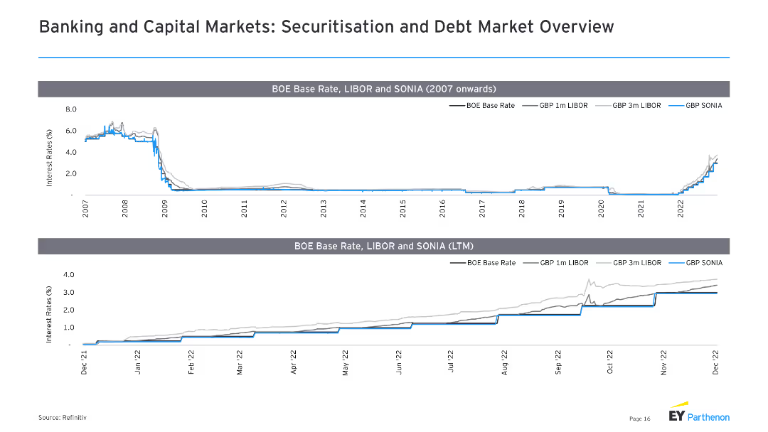
The slide features two line charts, displaying BOE base rate, LIBOR, and SONIA from 2007 onwards and LTM.
Market Analysis and Trends
Financial Services
It analyzes the trends in interest rates, particularly focusing on BOE base rate, LIBOR, and SONIA, useful for understanding monetary policy impacts.
BOE base rate, LIBOR, SONIA, interest rates, trends
Multiple Chart
EY
Saved
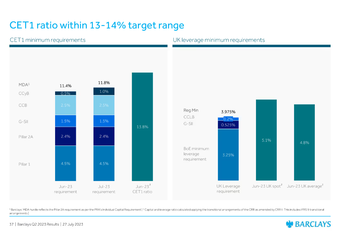
The slide displays two column charts: one for CET1 minimum requirements with different components and their percentages, and the other for UK leverage minimum requirements, highlighting the regulatory minimums and actual ratios.
Financial Performance
Financial Services
The slide shows CET1 and UK leverage ratios against regulatory minimum requirements, emphasizing the bank’s capital adequacy and compliance with financial regulations.
CET1 ratio, UK leverage, minimum requirements, capital adequacy, financial regulations
Multiple Chart
Barclays
Saved
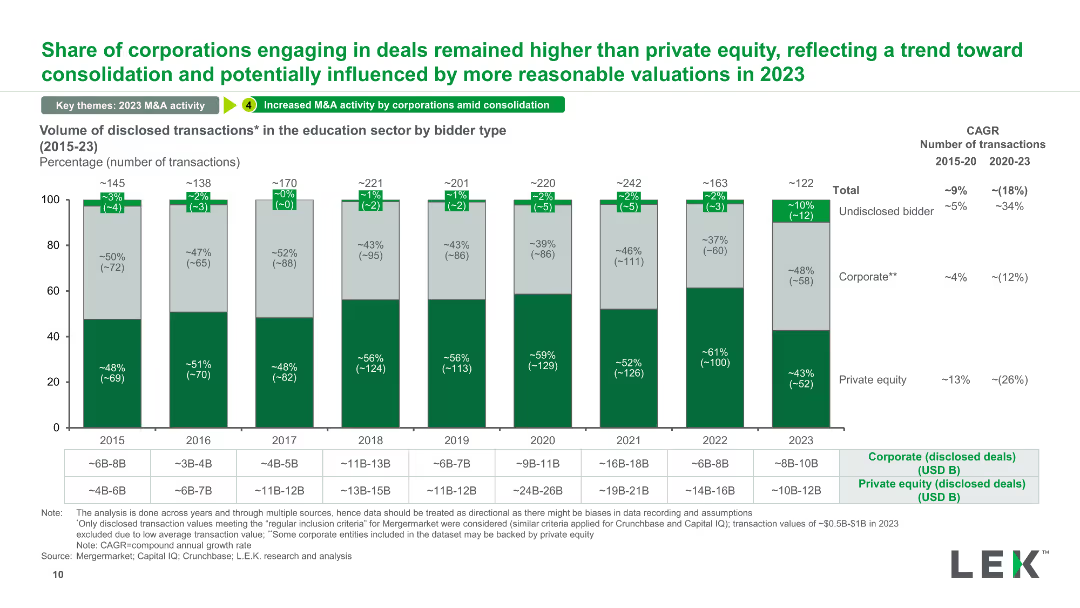
A stacked column chart showing the volume of disclosed transactions in the education sector categorized by bidder type (corporate, private equity, undisclosed) from 2015 to 2023.
Competitive Landscape
Education & Training
This slide categorizes the volume of disclosed transactions in the education sector by bidder type, illustrating trends in corporate vs. private equity involvement and changes over time.
disclosed transactions, bidder type, education sector, corporate, private equity
Mixed Chart
LEK
Saved
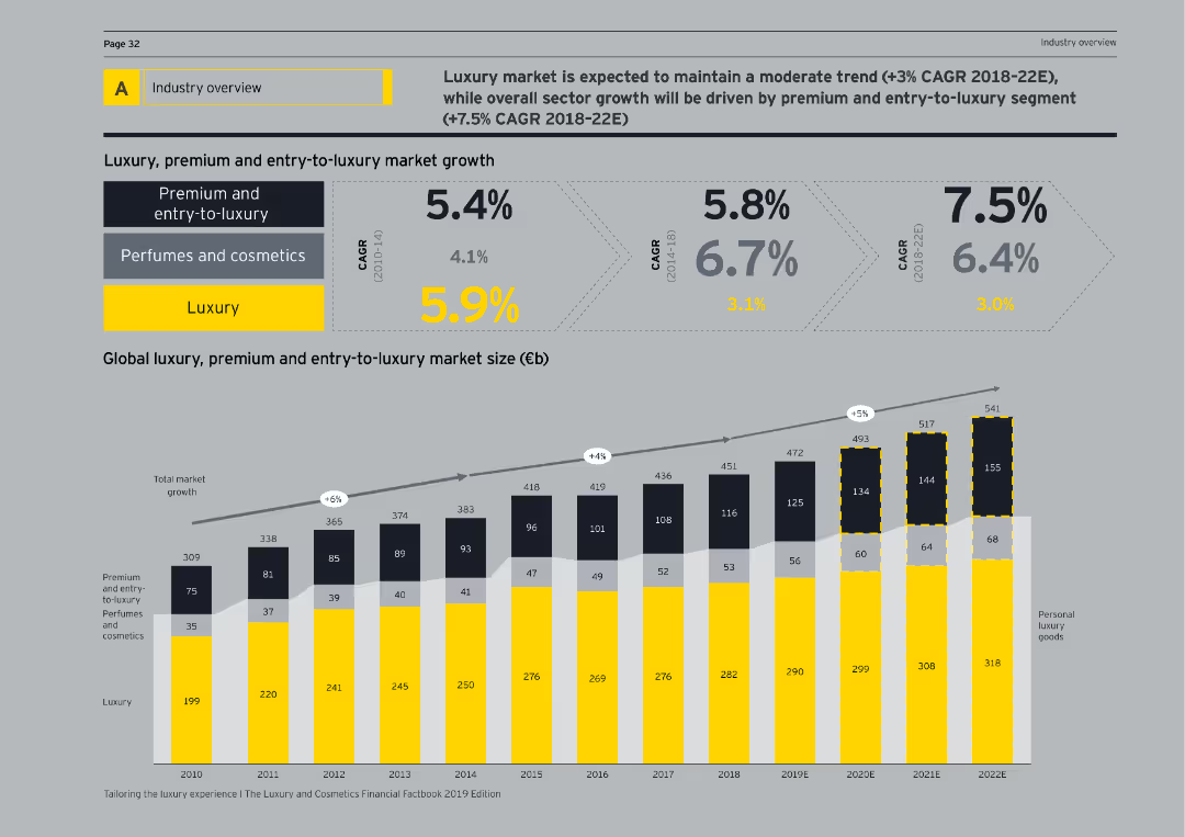
This slide presents growth rates in luxury, premium, and entry-to-luxury markets, supported by a column chart showing market size from 2010 to 2022E.
Industry Overview
Consumer Goods
Highlights the growth trends and market sizes for luxury, premium, and entry-to-luxury segments, projecting future trends and CAGR percentages.
industry overview, luxury, premium, entry-to-luxury, market growth, CAGR, market size, 2010-2022E, column chart, consumer goods
Mixed Chart
EY
Saved
The slide has stacked bar graphs representing leaders' economic outlook and expectations for the year ahead, including revenue, profit, and capital expenditure projections.
Financial Performance
Financial Services
Displays business leaders' sentiments on the global and national economic prospects and their company’s performance, indicating general optimism for sales and profits amidst a cautious economic view.
Economic Outlook, Performance, Profit, Sales
Multiple Chart
JP Morgan
Saved
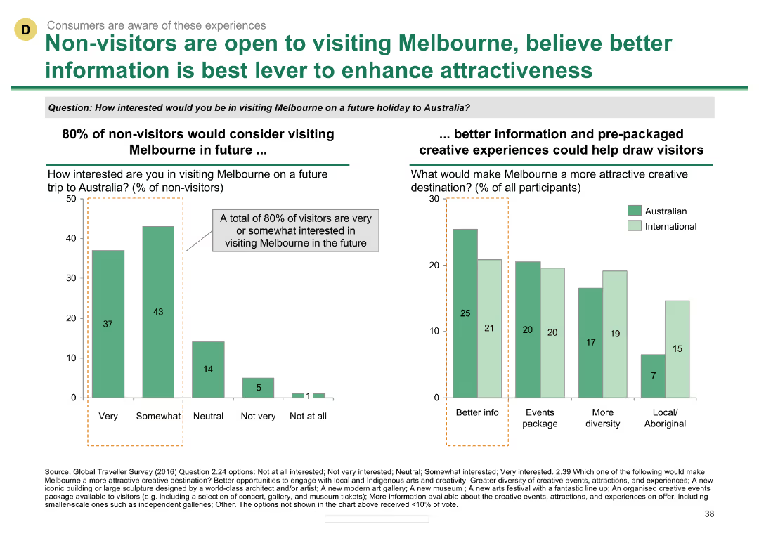
Column chart showing interest in visiting Melbourne among non-visitors and factors enhancing attractiveness
Customer and Market Segmentation
Hospitality & Tourism
Suggests that better information and pre-packaged creative experiences could attract more visitors to Melbourne.
Non-visitors, Melbourne, attractiveness, information, creative experiences
Multiple Chart
BCG
Saved
Slide includes flow charts and bar charts depicting types of transactions in the informal market and their tender types.
Market Analysis and Trends
Financial Services
Details the prevalence of cash transactions in B2C and B2B sectors within informal markets, highlighting types of payments.
B2C, B2B, cash transactions, informal market, payment types
Multiple Chart
BCG
Saved
The slide has two column charts. The left chart shows U.S. online retail sales by segment as a percentage of total retail sales for 2Q18 and 1Q24. The right chart details the change in the number of physical retail establishments from 2Q13 to 3Q23.
Market Analysis and Trends
Real Estate & Construction
This slide analyzes U.S. online retail sales by segment and tracks changes in the number of physical retail establishments over time. It provides insights into the shifting landscape of retail and e-commerce trends.
online retail, sales segments, physical retail, e-commerce, market trends, retail analysis
Multiple Chart
JP Morgan
Saved
Includes a textual section and a dot matrix chart that visually represents the level of agreement with statements regarding regulation and collaboration in AI. The design is clean, with green dots signifying the percentage agreement.
Regulatory and Compliance
Government & Public Sector
The slide highlights the desire for more government regulation and global collaboration on AI technologies. It presents data showing a significant majority of business leaders advocating for these measures to manage the unique risks of generative AI, raising concerns about leaving regulation solely to individual organizations.
AI, regulation, collaboration, government, leaders, risks, technology
Mixed Chart
Deloitte
Saved
This slide features two comparative line charts. The left chart compares EM and DM Real Yields using inflation forecasts, and the right chart shows the EM-DM Real Yield Differential.
Market Analysis and Trends
Financial Services
It highlights the real yield differences using inflation expectations and the narrowing yield differentials over the past year. Useful for comparing emerging and developed markets.
EM, DM, real yields, inflation, comparison
Multiple Chart
Morgan Stanley
Saved
Column chart showing agreement and disagreement percentages on the belief that all diseases will be curable across countries.
Market Analysis and Trends
Healthcare & Pharmaceuticals
The slide examines the belief in the future curability of all medical conditions, with significant variation across countries.
medical advancements, future expectations, public opinion, global health, curability
Multiple Chart
IPSOS
Saved
A column chart comparing the performance returns of the MS INVF Emerging Leaders Equity Fund against the MSCI EM Index over various time periods.
Financial Performance
Financial Services
This slide shows the performance returns of the MS INVF Emerging Leaders Equity Fund, highlighting excess returns and performance benchmarks.
Performance, Returns, Emerging Leaders, Equity Fund, MSCI, Index, Investment, Financial, Comparison, Benchmark
Mixed Chart
Morgan Stanley
Saved
Detailed horizontal bar chart showcasing the percentage of respondents planning major technology upgrades in areas like ERP and supply chain analytics.
Technology and Digital Transformation
Retail & E-commerce
Focuses on the growing emphasis on technology upgrades in inventory and warehouse management, crucial for improving operational efficiency in businesses.
technology upgrades, inventory management, ERP, warehouse management, operational efficiency, business, analytics, supply chain
Mixed Chart
Deloitte
Saved
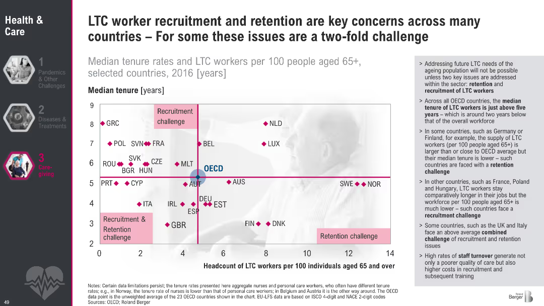
Scatter plot quadrant chart with median tenure on Y-axis and headcount of LTC workers on X-axis; quadrant labels for types of challenges; supporting bullet text on the right; dark theme on left menu
Human Resources and Talent Management
Healthcare & Pharmaceuticals
This slide analyzes long-term care (LTC) worker availability across countries using median tenure and headcount per 100 elderly. It categorizes countries by whether they face recruitment, retention, or both challenges. The OECD average is used as a benchmark. Commentary on workforce trends and high turnover is provided on the right.
LTC, recruitment, retention, tenure, aging, workforce, OECD, healthcare, staffing, elder care
Mixed Chart
Roland Berger
Saved
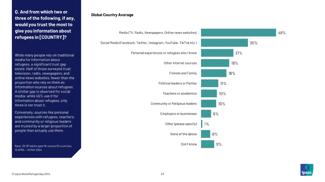
Horizontal bar chart ranking most trusted sources for refugee-related information, showing a trust gap between usage and credibility. Sidebar summarizes key findings.
Market Analysis and Trends
Media & Entertainment
This slide highlights a trust gap in refugee information sources. While media and social platforms are widely used, fewer people trust them. Personal experiences and educators are more trusted than used, showing a contrast in influence and credibility.
trust, information sources, refugee communication, media trust, public opinion, Ipsos, credibility, personal experience
Mixed Chart
IPSOS
Saved
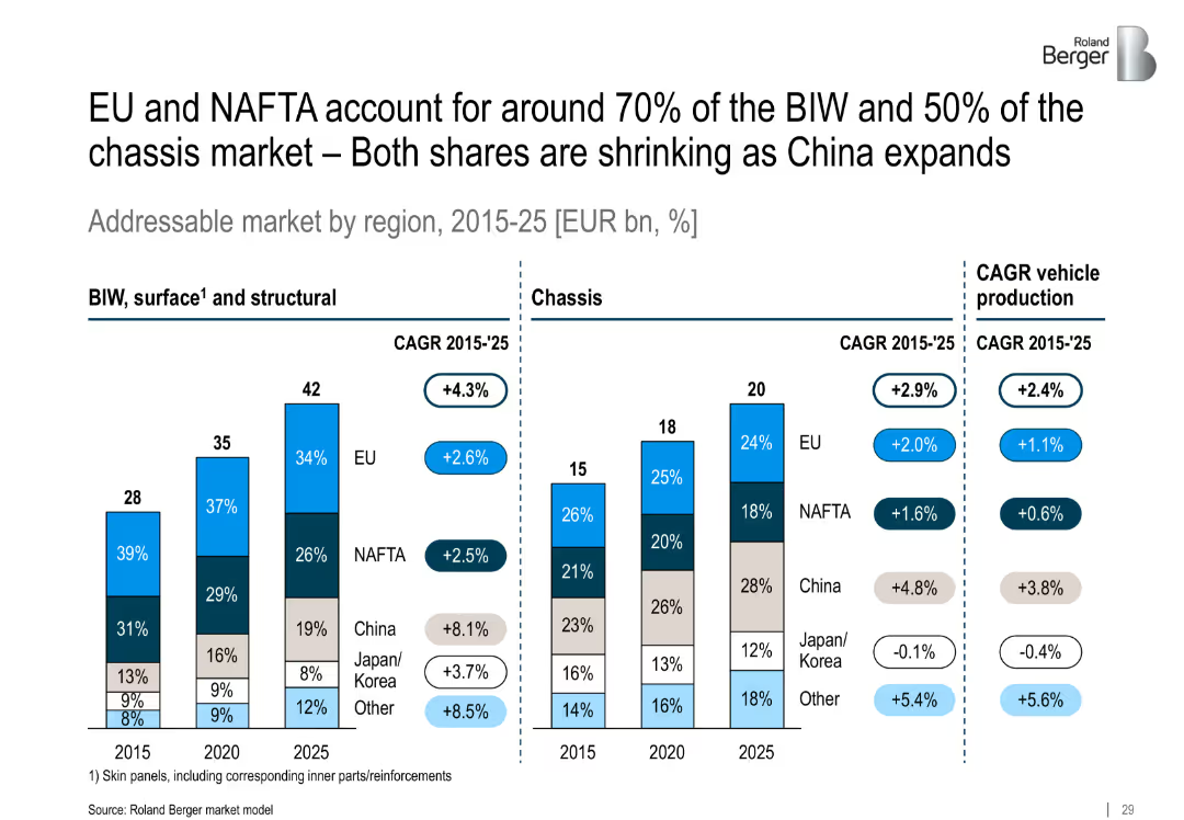
Two grouped vertical stacked bar charts representing BIW and chassis markets by region (2015, 2020, 2025), with side notes and CAGR values beside each bar cluster.
Market Analysis and Trends
Industrial & Manufacturing
This slide analyzes the geographic shift in addressable automotive market shares, highlighting China's rapid growth and decline of EU/NAFTA share in BIW and chassis segments.
regional market, BIW, chassis, China growth, NAFTA, EU, CAGR, automotive, outsourcing
Multiple Chart
Roland Berger
Saved
Previous
Next
If nothing, comes up, please save your slides first
Create a FREE account to continue browsing
Receive Instant Access to 1,000+ slides from companies like McKinsey, Google, and Goldman Sachs
First Name
Last Name
Email
Password
I agree to all
Terms & Privacy Policy
Thank you! Your submission has been received!
Oops! Something went wrong while submitting the form.
Have an account?
Sign in
Column Chart
Heatmap
Chevron
Org Chart
Infographic
Callouts
Timeline
List
Graphic
Picture
Process Flow
Diagram
Paragraph
Map
Table
Framework
Subtitle
Takeaway Box
Icon
Other Chart
Radar Chart
Waterfall Chart
Mekko Chart
Pie Chart
Scatter Plot
Line Chart
Bar chart
Bullet points