Create a FREE Account
Instant access to 1,000+ real slides from top companies like McKinsey, BCG, Goldman Sachs, Google and many more!
First Name
Last Name
Email
Password
I agree to all
Terms & Privacy Policy
Thank you! Your submission has been received!
Oops! Something went wrong while submitting the form.
Have an account?
Sign in
Library
Templates
Courses
Pricing
My Account
My Slides
My Templates
✦ AI
AI Prompt Library
AI Search
Sign in
Start Here
Logout
My Saved Slides
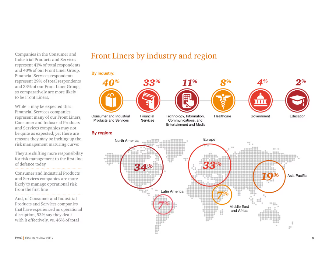
This slide displays a combination of circular icons and a world map with percentages, categorizing 'Front Liners' by industry and region. It has a structured layout with clear visual hierarchy and minimal text.
Risk Assessment and Management
Consumer Goods
It categorizes survey respondents as 'Front Liners' across various industries and regions, indicating higher risk management maturity. The slide shows the distribution of Front Liners, with detailed percentages for each industry and geographical region.
Risk management, Front Liners, industry distribution, regional analysis, survey
Mixed Chart
PwC/Strategy&
Saved
Displays a multi-layered diagram categorizing operational maturity into four levels: Stable, Efficient, Predictive, and Future-ready. Each level is described with respect to technology, process, data, and talent.
Operational Efficiency
Professional Services
Describes different levels of operational maturity in organizations and their implications on business efficiency and future readiness. Useful for consultants and managers aiming to enhance operational strategies.
Operational Maturity, Business Strategy, Efficiency
Table
Accenture
Saved
The slide features three line charts representing the US, Euro area, and UK with input and output PPI trends from 2017 to 2024.
Financial Performance
Financial Services
The slide explains how companies in the US, Euro area, and UK are passing input costs to consumers, highlighting margin erosion trends.
US, Euro area, UK, input PPI, output PPI, margin erosion, financial performance, cost pass-through
Multiple Chart
Accenture
Saved
Two-column text-heavy layout with Circular diagram split into four quadrants illustrating skill distribution within GBS roles.
Organizational Structure and Change
Professional Services
Discusses key skills for GBS effectiveness and strategic value, highlighting areas like leadership and action orientation.
GBS, skills, strategy, leadership, action-oriented
Diagram
Deloitte
Saved
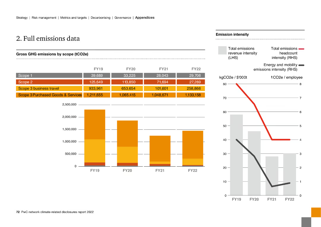
The slide includes multiple column charts and line graphs, presenting detailed GHG emissions data by scope from FY19 to FY22 and emission intensity metrics.
Financial Performance
Energy & Utilities
The slide presents comprehensive GHG emissions data across different scopes from FY19 to FY22, including business travel and purchased goods and services.
emissions data, GHG, scope, FY19, FY22, intensity, business travel, purchased goods
Multiple Chart
PwC/Strategy&
Saved
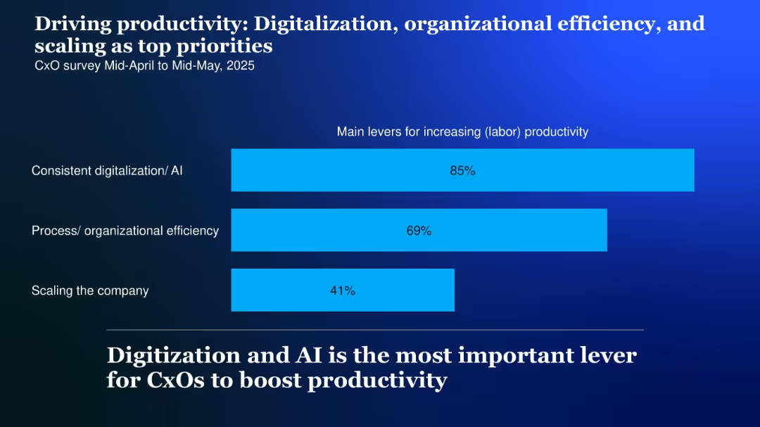
Horizontal bar chart with three bars showing productivity drivers, labeled on the left; high-contrast background and bold headline
Performance Metrics and KPIs
Technology & Software
CxOs cite digitalization and AI (85%), organizational efficiency (69%), and company scaling (41%) as top productivity levers for 2025.
Productivity, digitalization, AI, scaling, efficiency, levers, 2025
Single Chart
McKinsey
Saved
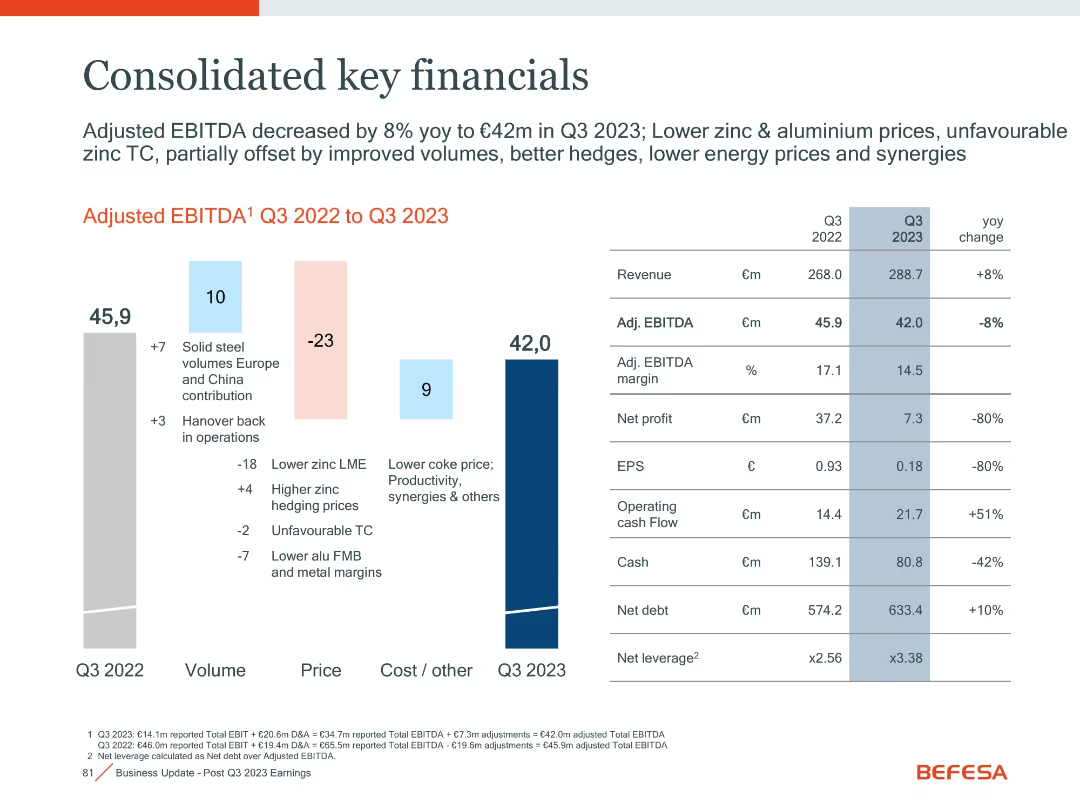
Waterfall chart on left; financial table on right
Financial Performance
Financial Services
This slide summarizes Befesa’s Q3 2023 financial performance, including revenue, EBITDA, cash flow, and profit metrics, with year-over-year comparisons.
EBITDA, Revenue, Cash Flow, Financials, Profit, Q3 2023
Mixed Chart
Goldman Sachs
Saved
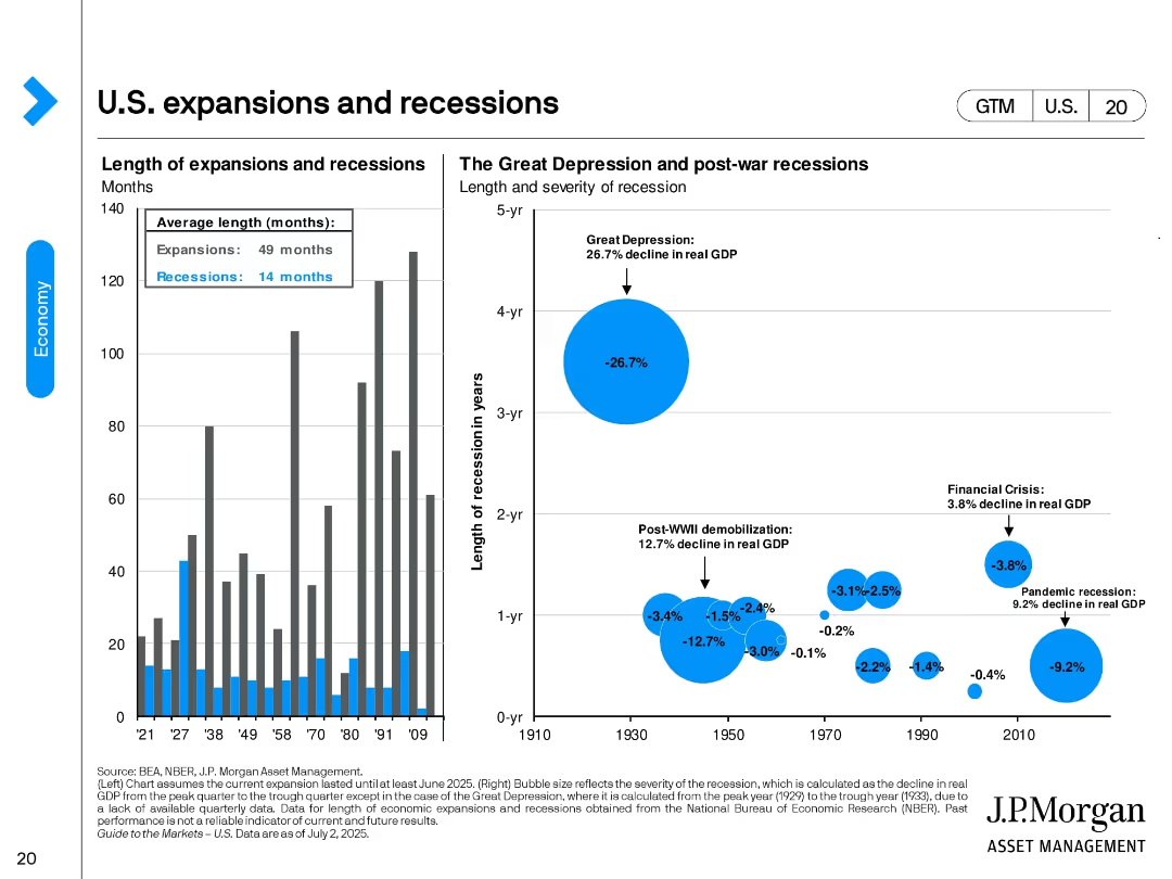
Two-panel design. Left: bar chart showing duration of U.S. expansions vs. recessions. Right: bubble chart comparing size and duration of major recessions by real GDP decline. Key events like the Great Depression are visually emphasized.
Industry Overview
Financial Services
This slide provides historical context on U.S. economic cycles, highlighting average durations (expansions: 49 months, recessions: 14 months). It visualizes the severity of downturns such as the Great Depression and the 2008 Financial Crisis.
expansions, recessions, GDP decline, Great Depression, historical economy, NBER, economic cycle, recovery duration
Multiple Chart
JP Morgan
Saved
This slide contains a bar chart titled "Exhibit 18" with multiple bars representing different regions. The bars are segmented by the level of agreement to a statement about transitioning to a greener economy.
Regulatory and Compliance
Government & Public Sector
This slide shows global and regional perspectives on the transition to a greener economy, with data segmented by agreement level. It highlights areas where progress is deemed slowest, implicitly calling for increased action in those regions.
greener economy, regional analysis, CEO survey, environmental progress
Mixed Chart
PwC/Strategy&
Saved
The slide displays a column chart comparing reasons for not purchasing crypto assets between 2022 and 2023, with bars indicating percentage responses.
Risk Assessment and Management
Financial Services
It outlines the main reasons for avoiding crypto investments, such as perceived risk, lack of understanding, and concerns about volatility and security.
Crypto assets, non-purchase, reasons, risk, 2023, 2022, security, volatility, understanding, concerns
Multiple Chart
IPSOS
Saved
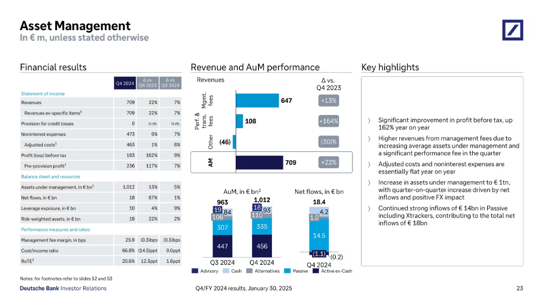
Structured with financial tables, stacked bar charts for AuM & net flows, and performance highlights
Financial Performance
Financial Services
The Asset Management division reported a 22% YoY increase in revenue, driven by strong net inflows and higher management and performance fees. Assets under management reached €1,012bn with inflows of €18.4bn. Adjusted costs remained flat, and profit before tax rose by 162% YoY.
Asset Management, AuM, Net Flows, Fees, Profit, Expenses, Inflows
Multiple Chart
Deutsche Bank
Saved
Slide contains a line chart depicting the declining trend in the impact of mobile marketing on company performance, along with sector-specific performance ratings.
Performance Metrics and KPIs
Professional Services
Reviews the diminishing returns from mobile marketing on overall business performance, stressing the need for reevaluation of strategies.
mobile marketing, company performance, performance evaluation, strategy reevaluation, line graph
Mixed Chart
Deloitte
Saved
This slide features multiple line charts showing Japan's inflation, wage growth, correlation between yen and equity market, and a column chart showing the price-to-book ratio of Japanese companies.
Market Analysis and Trends
Financial Services
The slide provides an economic overview of Japan, covering inflation and wage growth trends, currency market correlation with equity, and valuation metrics for Japanese companies, useful for market analysis.
Japan, economy, inflation, wage growth, yen, equity market, price-to-book ratio, Japanese companies, market analysis
Multiple Chart
JP Morgan
Saved
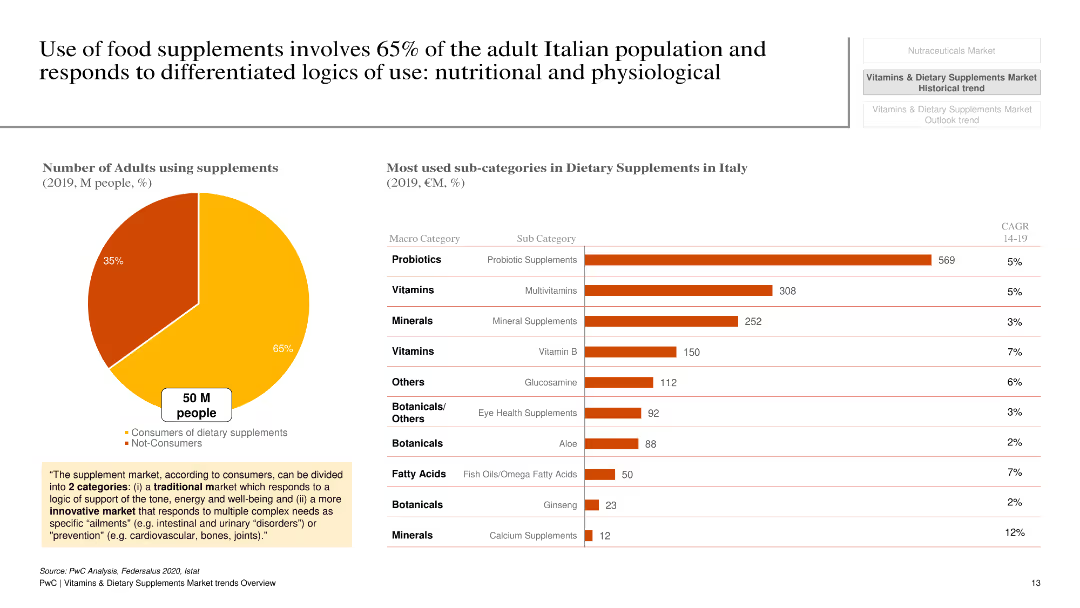
The slide features a pie chart and a column chart. The pie chart shows the percentage of adults using supplements, and the column chart lists the most used sub-categories in dietary supplements in Italy, with bars representing the value in million euros.
Market Analysis and Trends
Healthcare & Pharmaceuticals
The slide highlights that 65% of adults in Italy use dietary supplements and shows the most popular sub-categories of supplements with their respective market values in 2019. It provides insights into consumer behavior and market segmentation within the dietary supplement industry.
dietary supplements, Italy, consumer behavior, market segmentation, probiotics, vitamins, minerals
Multiple Chart
PwC/Strategy&
Saved
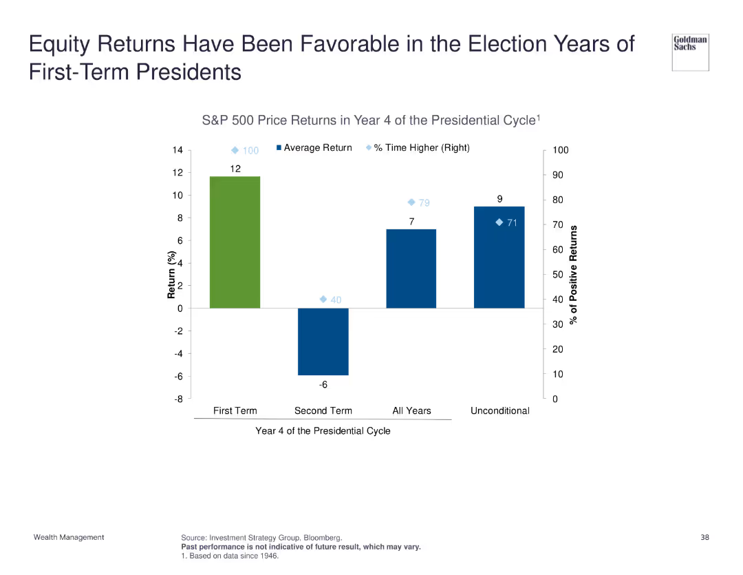
Column chart depicting S&P 500 price returns in year 4 of the presidential cycle, comparing first-term and second-term presidents, and average return statistics.
Market Analysis and Trends
Financial Services
Highlights that equity returns tend to be favorable during the election years of first-term presidents, supported by historical S&P 500 price return data across different presidential cycles.
equity returns, presidential cycle, election years, S&P 500
Single Chart
Goldman Sachs
Saved
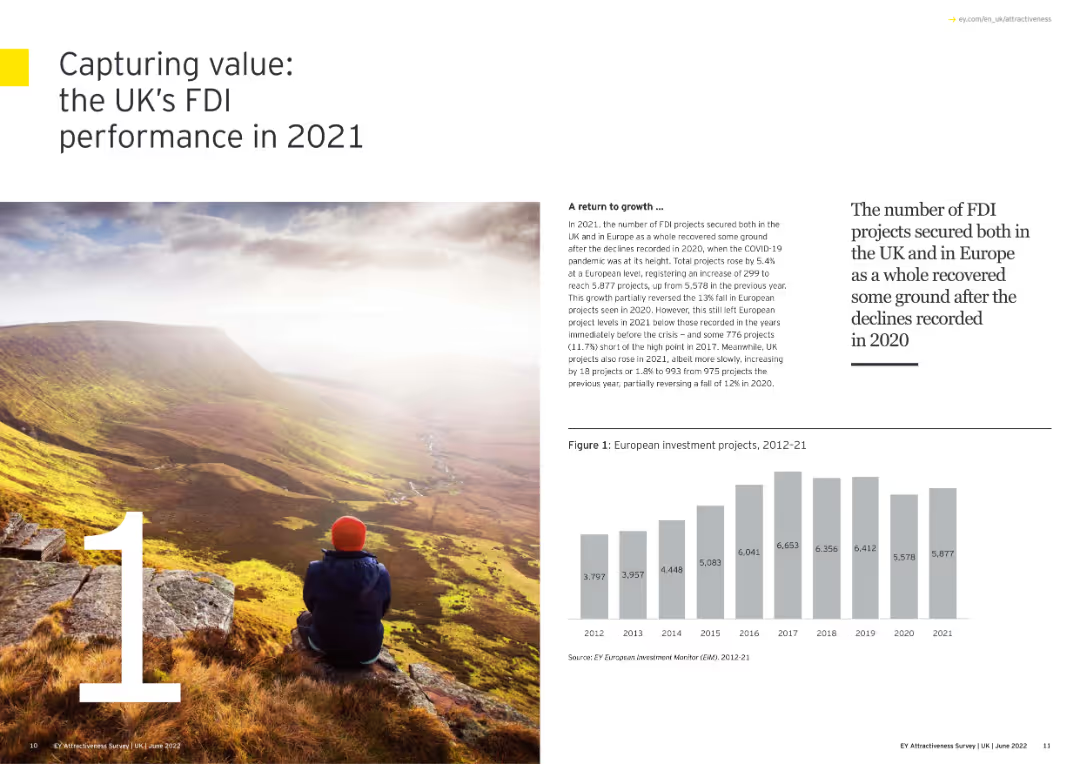
The slide has a scenic image with overlaid text summarizing the UK’s FDI performance.
Market Analysis and Trends
Financial Services
The slide summarizes the UK's FDI performance in 2021, highlighting the recovery from 2020, growth in project numbers, and the UK's leading position in attracting new FDI projects across Europe.
FDI, UK, Performance, Recovery, Growth
Mixed Chart
EY
Saved
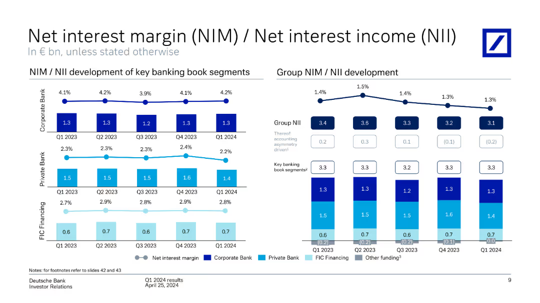
Contains multiple line charts and column charts showing NIM and NII development for key banking segments and overall group. The slide is detailed with several visual elements and annotations.
Financial Performance
Financial Services
The slide shows the development of NIM and NII for Deutsche Bank across key banking segments and the group, highlighting trends over different quarters.
Net interest margin, net interest income, banking segments, quarterly trends
Multiple Chart
Deutsche Bank
Saved
Combines text with icons representing various strategic actions for integrating AI into businesses.
Strategic Planning
Technology & Software
Provides strategic guidance on incorporating AI into business models and operational practices to drive growth and innovation.
AI Integration, Business Strategy, Operational Model, Innovation, Growth Driving, Strategic Guidance, Business Transformation
Table
BCG
Saved
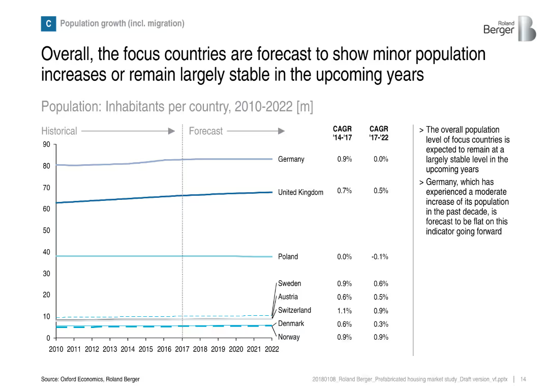
Line graph showing population forecasts by country from 2010–2022, with CAGR statistics and commentary.
Strategic Planning
Real Estate & Construction
The slide discusses demographic stability in focus countries and its implication on housing demand. It shows minor changes in population growth across countries like Germany, UK, and Poland, suggesting stable but modest housing market expansion.
population growth, migration, housing demand, stability, demographics, forecast, Germany, UK, Poland
Mixed Chart
Roland Berger
Saved
The slide showcases a complex multi-column chart detailing digital service adoption percentages across different consumer groups. The chart is accompanied by explanatory notes and uses a color gradient of blue to differentiate between consumer segments.
Customer and Market Segmentation
Technology & Software
Presenting digital adoption percentages for various consumer demographics, this slide reveals patterns in the uptake of digital services, such as e-commerce and gaming. It’s a valuable resource for understanding the behaviors of affluent users versus other demographic groups, and for tailoring digital offerings to match these behaviors.
digital services, consumer behavior, adoption rates, affluent users, young natives, digital natives, comparative chart
Table
Bain
Saved
The slide includes two column charts: one for developed market local interest rates and one for emerging market local interest rates, comparing current rates with rates from the prior year.
Market Analysis and Trends
Financial Services
This slide examines the local interest rates for sovereign currencies in developed and emerging markets, providing a comparative analysis of current and previous year rates.
local interest rates, sovereign currencies, developed markets, emerging markets, analysis
Multiple Chart
Morgan Stanley
Saved
Two large column charts comparing UK and US credit card metrics, with additional trend lines below.
Risk Assessment and Management
Financial Services
Analyzes risk metrics for credit card portfolios in UK and US, highlighting changes in arrears and repayment rates.
credit cards, risk management, UK, US, financial stability
Multiple Chart
Barclays
Saved
The slide shows a series of vertical stack coin icons representing the value distribution of household investments.
Financial Performance
Financial Services
The slide illustrates the distribution of household investment values, ranging from under $50K to over $1M.
Household, Investments, Value, Distribution, Wealth
Single Chart
IPSOS
Saved
Slide contrasts two lists detailing what Strategic Cost Transformation (SCT) is and is not, with highlighted focus points in green.
Strategic Planning
Professional Services
Defines and differentiates Strategic Cost Transformation (SCT) from traditional cost management approaches, focusing on its scope, nature, and business alignment, tailored to specific business challenges.
Strategic Cost Transformation, Business Alignment, Organizational Change, Scope
Table
Deloitte
Saved
Contains two pie charts comparing GDP percentage and market capitalization across countries, indicating the distribution of global equity allocations.
Investment Analysis
Financial Services
Highlights the disproportionate allocation of global equity towards the U.S., illustrated by its GDP versus market capitalization share, significant for strategic investment planning.
equity allocation, GDP, market capitalization, strategic planning, investment, USA dominance, global distribution
Multiple Chart
Morgan Stanley
Saved
Previous
Next
If nothing, comes up, please save your slides first
Create a FREE account to continue browsing
Receive Instant Access to 1,000+ slides from companies like McKinsey, Google, and Goldman Sachs
First Name
Last Name
Email
Password
I agree to all
Terms & Privacy Policy
Thank you! Your submission has been received!
Oops! Something went wrong while submitting the form.
Have an account?
Sign in
Column Chart
Heatmap
Chevron
Org Chart
Infographic
Callouts
Timeline
List
Graphic
Picture
Process Flow
Diagram
Paragraph
Map
Table
Framework
Subtitle
Takeaway Box
Icon
Other Chart
Radar Chart
Waterfall Chart
Mekko Chart
Pie Chart
Scatter Plot
Line Chart
Bar chart
Bullet points