Create a FREE Account
Instant access to 1,000+ real slides from top companies like McKinsey, BCG, Goldman Sachs, Google and many more!
First Name
Last Name
Email
Password
I agree to all
Terms & Privacy Policy
Thank you! Your submission has been received!
Oops! Something went wrong while submitting the form.
Have an account?
Sign in
Library
Templates
Courses
Pricing
My Account
My Slides
My Templates
✦ AI
AI Prompt Library
AI Search
Sign in
Start Here
Logout
My Saved Slides
Features a column chart showing the capital expenditure (capex) of major telco operators from 2016 to 2020, with a line graph overlay representing capex to revenue ratio. Color-coded for each operator to show investment patterns relative to revenue.
Operational Efficiency
Telecommunications
Discusses the capital investment trends in the telecommunications industry, highlighting how smaller operators are increasingly investing in expanding their 4G networks, contrasted with Telkom's steady investment strategy.
capex, 4G network, investment, Telkom, telecommunications industry, revenue ratio
Multiple Chart
BCG
Saved
A combination of a line chart and a stacked column chart. The line chart shows GDP per capita vs. urbanization. The stacked column chart shows middle-class growth contribution.
Market Analysis and Trends
Financial Services
The slide compares GDP per capita against urbanization ratios and forecasts the contribution of different regions to middle-class growth from 2024 to 2030.
GDP, urbanization, middle-class, growth, forecast, regions, contribution, financial trends, economic analysis, development
Multiple Chart
JP Morgan
Saved
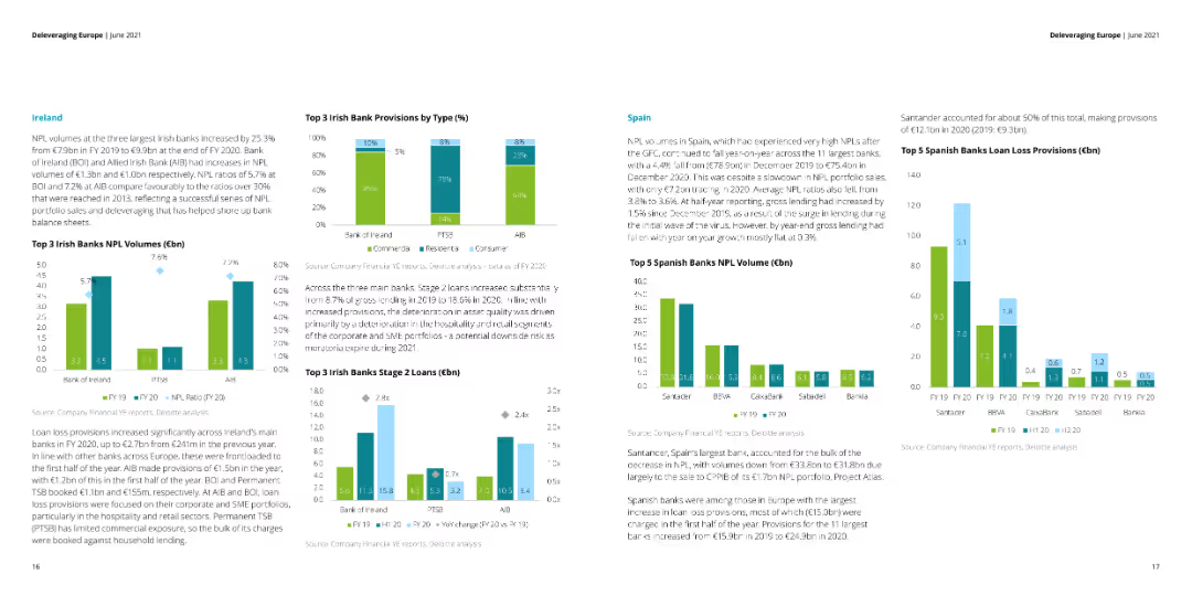
Multiple column charts showing activity by asset type, completed deals, and loan sale activity by portfolio type.
Market Analysis and Trends
Financial Services
Analyzes European activity in various asset types since 2014, highlighting trends in completed and ongoing deals by country.
Europe, asset, market, trends, deals
Multiple Chart
Deloitte
Saved
The slide contains two line charts. The left chart shows the commodity prices and FX, comparing the commodity price index and AUD/USD. The right chart illustrates short rates and FX with the bond yield spread and AUD/USD.
Market Analysis and Trends
Financial Services
This slide examines the Australian dollar's performance in relation to commodity prices and bond yields, providing valuable insights for financial analysis and market predictions.
Australian dollar, commodity prices, FX, bond yield, market analysis, financial analysis, AUD/USD, short rates
Multiple Chart
JP Morgan
Saved
Two graphs presented; a line graph for coal power assets' age distribution between OECD and China, and a column chart for median plant age by energy source.
Operational Efficiency
Energy & Utilities
The slide examines the age distribution of coal power assets, comparing OECD countries and China, and provides median plant ages for various energy sources, emphasizing the durability and age of these assets.
assets, energy, resilience, age distribution, coal
Multiple Chart
BCG
Saved
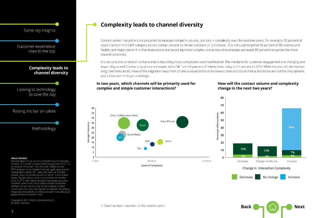
The slide features a two-column layout with text on the left and two column charts on the right. There is a moderate amount of text.
Market Analysis and Trends
Telecommunications
It addresses the increasing complexity in customer interactions and how contact channels are diversifying, with future projections for channel usage.
Channel diversity, Contact centers, Complexity, Communication channels, Customer interaction, Future projections
Multiple Chart
Deloitte
Saved
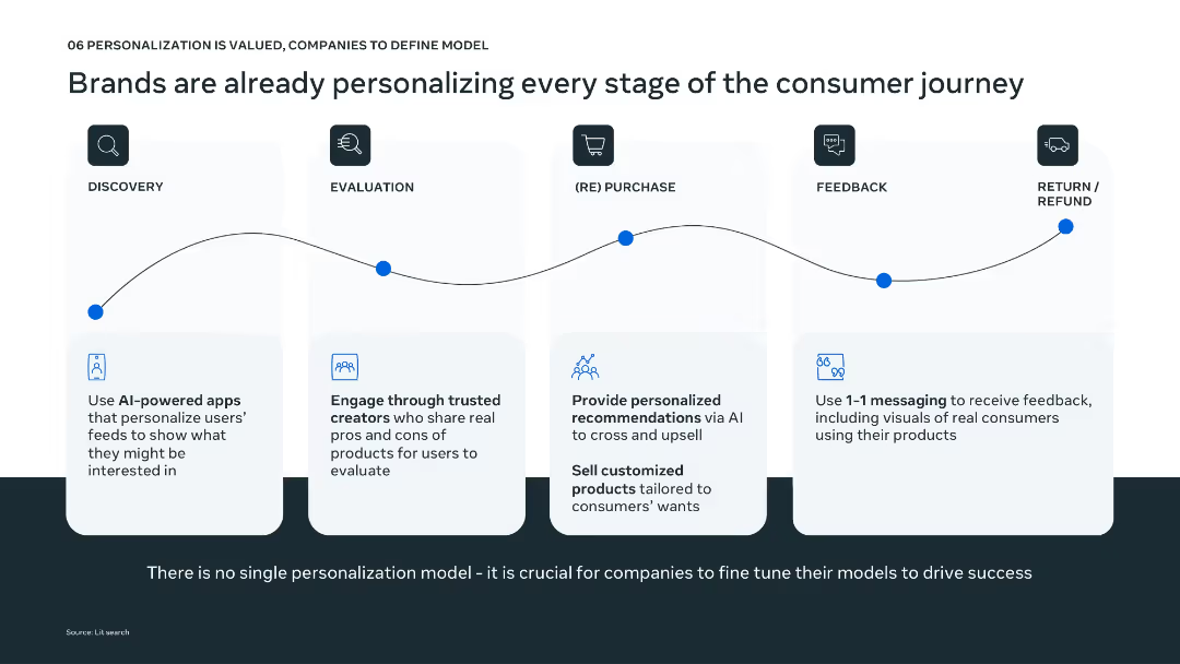
Timeline layout from discovery to refund; icons and minimal text explain personalization strategies at each stage.
Technology and Digital Transformation
Technology & Software
Shows how brands are applying personalization across the consumer journey using tools like AI-powered discovery, trusted evaluation, personalized recommendations, 1:1 feedback loops, and tailored return processes. Highlights the importance of model tuning for effective execution.
customer journey, personalization, AI tools, feedback, discovery
Pillar
Bain
Saved
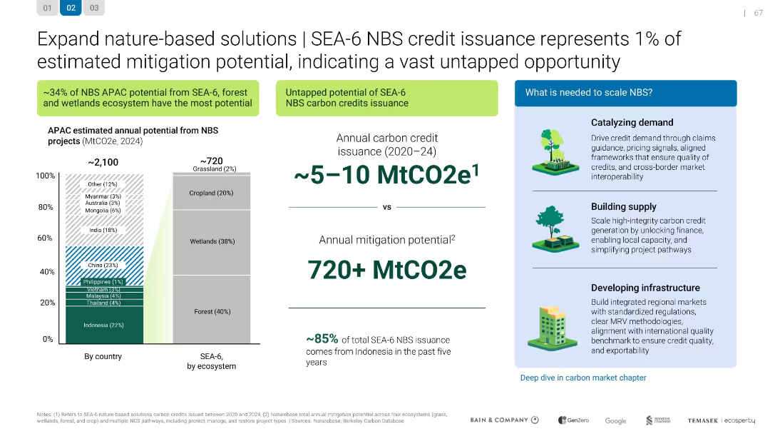
SEA-6 NBS credit issuance represents 1% of estimated mitigation potential
Investment Analysis
Environmental Services & Sustainability
Investment Analysis
Shows SEA-6's underutilized potential in issuing carbon credits from nature-based solutions, with >720 MtCO2e mitigation possible. Recommends steps to scale NBS through demand, supply, and infrastructure development.
Mixed Chart
Bain
Saved
A column chart representing income statements for various operating groups, paired with a text block describing key drivers. The layout is clean with contrasting colors for easy differentiation.
Financial Performance
Financial Services
Evaluates financial performance by operating group, highlighting contributions and key factors driving results. It is used to understand divisional performance within the overall corporate structure.
Operating Groups, Financial Performance, Net Profit Contribution, Key Drivers, Analysis
Mixed Chart
Goldman Sachs
Saved
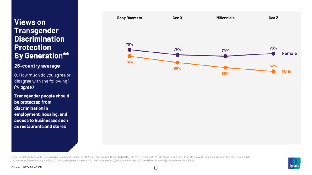
Line graph by generation and gender; female and male response trends
Market Analysis and Trends
Government & Public Sector
This slide tracks generational differences in agreement with protecting transgender people from discrimination. Female agreement remains higher across all generations, with Baby Boomers and Gen Z females showing the highest support. Male support declines notably in Gen Z.
transgender protection, generation gap, male vs female, social support, discrimination, Ipsos
Mixed Chart
IPSOS
Saved
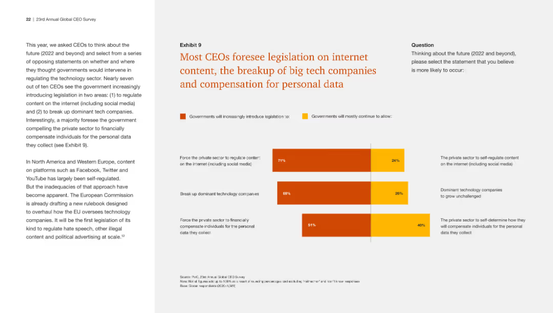
This slide includes a bar chart showing CEOs' predictions about future legislation on internet content, tech company breakups, and personal data compensation. The design is clear.
Regulatory and Compliance
Technology & Software
The slide presents survey results indicating that most CEOs believe there will be increased government regulation in internet content, tech company breakups, and data compensation.
Internet legislation, tech companies, personal data, CEO predictions, regulation
Mixed Chart
PwC/Strategy&
Saved
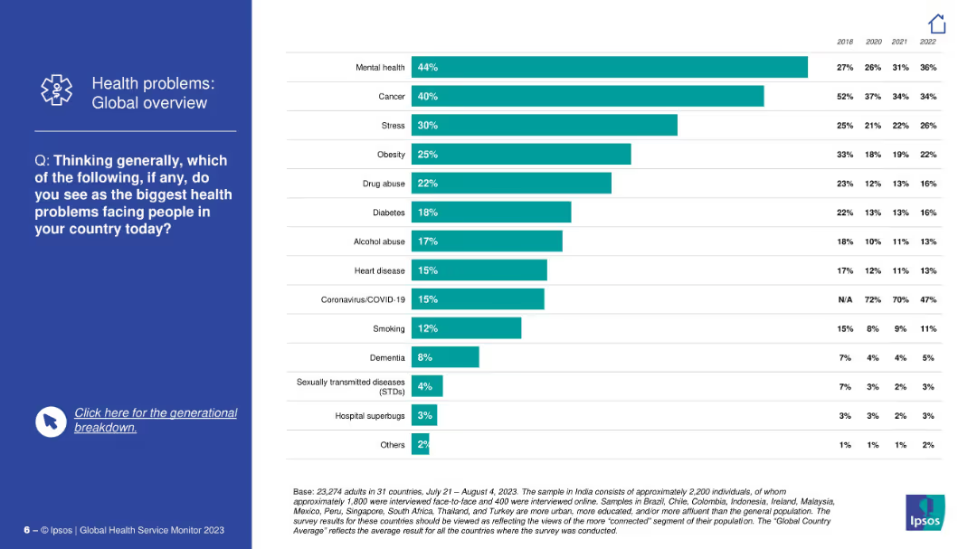
Blue sidebar with question text; right side shows vertical bar chart listing global top health concerns like mental health, cancer, stress, obesity, etc.
Market Analysis and Trends
Healthcare & Pharmaceuticals
This slide provides a global ranking of perceived major health issues. Mental health tops the list, followed by cancer and stress. It also includes trend data from 2018 to 2022 showing changes in public concern for each issue.
health issues, mental health, cancer, public perception, global ranking, Ipsos, stress, obesity, disease awareness, trends
Mixed Chart
IPSOS
Saved
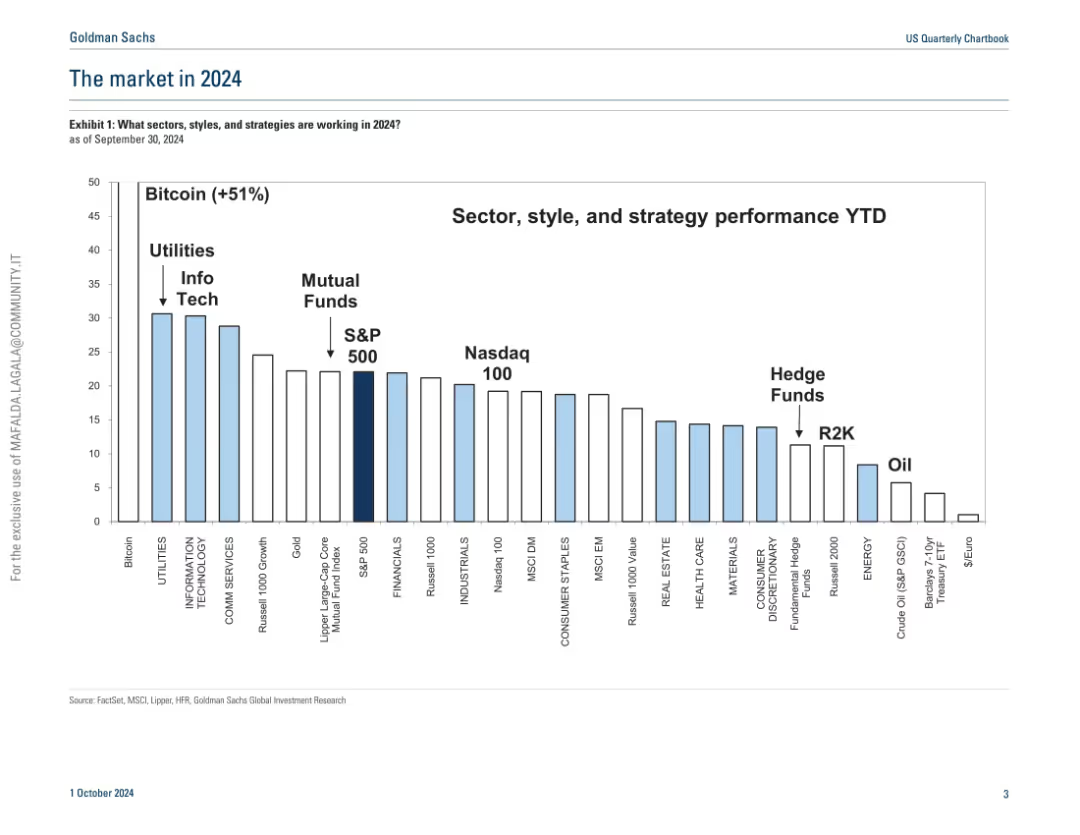
Vertical bar chart in light blue and white; ranks asset classes and strategies by performance year-to-date.
Market Analysis and Trends
Financial Services
A comparative bar chart ranks the YTD performance of various asset classes and investment strategies. Bitcoin leads with +51%, followed by utilities and tech sectors. The S&P 500 and mutual funds fall in the middle, with oil and treasury ETFs underperforming. The chart helps contextualize market winners and laggards.
Bitcoin, YTD performance, utilities, tech, S&P 500, mutual funds, Nasdaq, R2K
Single Chart
Goldman Sachs
Saved
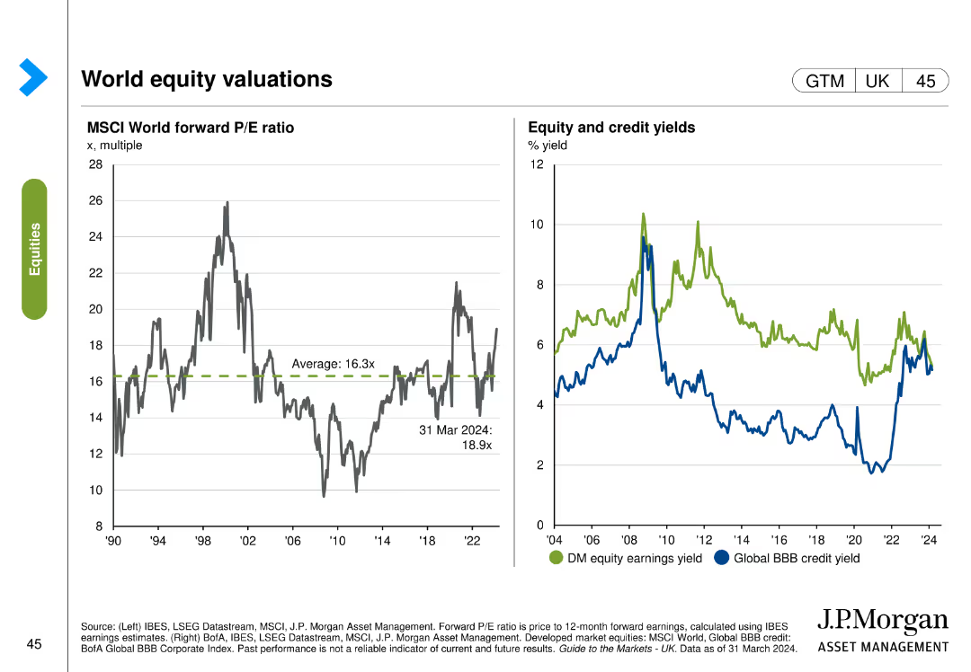
Two charts: one shows the MSCI World forward P/E ratio, and the other depicts equity and credit yields comparing developed market equity earnings yield with global BBB credit yield.
Investment Analysis
Financial Services
This slide provides an overview of global equity valuations, comparing forward P/E ratios and yields for equity and credit. Used for investment evaluation and portfolio management.
Equity, valuations, P/E ratio, yields, MSCI
Multiple Chart
JP Morgan
Saved
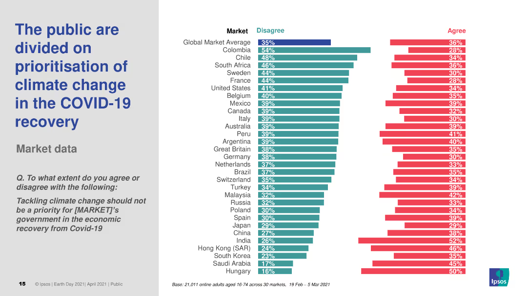
Horizontal bar chart comparing agreement and disagreement levels on prioritizing climate change in COVID-19 recovery across global markets.
Market Analysis and Trends
Government & Public Sector
Highlights divided public opinion on whether climate change should be prioritized during economic recovery from COVID-19, with varying levels of agreement by country.
climate change, COVID-19, economic recovery, public opinion, survey
Multiple Chart
IPSOS
Saved
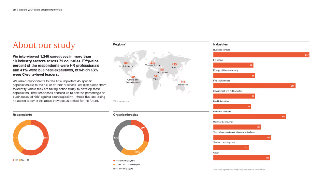
The slide presents an overview of the study, including a world map showing respondent distribution, pie charts of respondent roles and organization sizes, and a list of industries surveyed.
Strategic Planning
Professional Services
This slide provides a summary of the study's scope, detailing the demographics of respondents, the regions and industries covered, and the roles of the participants.
Study overview, respondent demographics, regions, industries, roles
Multiple Chart
PwC/Strategy&
Saved
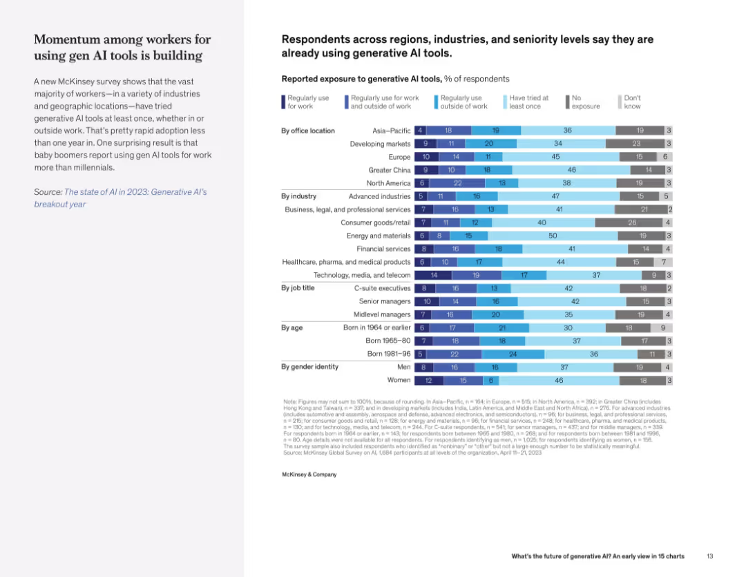
Text on left, with a detailed segmented bar chart on right showing AI exposure levels by region, industry, role, age, and gender.
Market Analysis and Trends
Artificial Intelligence
The slide details generative AI adoption across demographics and geographies, indicating widespread early use and notable surprises (e.g., boomers using it more than millennials).
AI exposure, workforce adoption, demographics, region, industry, generational use, workplace tools
Mixed Chart
McKinsey
Saved
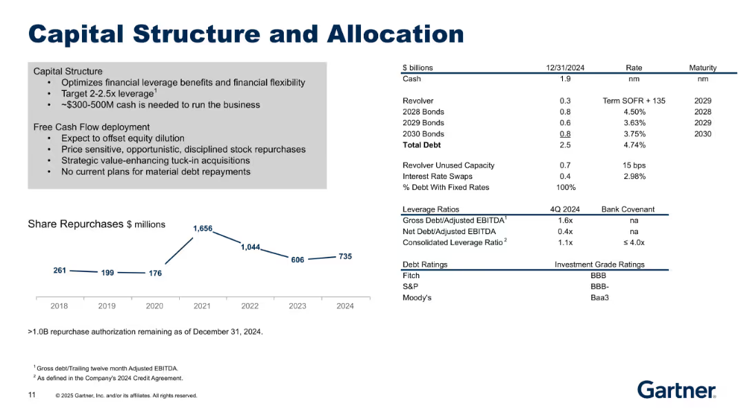
Split layout: Left side outlines strategy in bullet points; right side shows financial stats. Bottom line chart of share repurchases over time (2018–2024).
Corporate Finance and Valuation
Financial Services
Describes Gartner's capital allocation strategy including leverage targets, debt structure, and share repurchases. Emphasizes disciplined use of free cash flow, debt profile, and equity dilution considerations.
capital structure, leverage, repurchase, debt, cash flow, allocation
Mixed Chart
Gartner
Saved
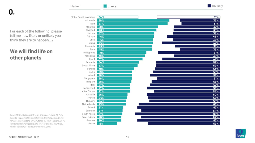
Horizontal bar chart with ranked countries; “Likely” vs “Unlikely” columns in teal/navy
Strategic Planning
Government & Public Sector
This slide gauges belief in discovering extraterrestrial life. Countries like Indonesia and India show higher optimism; global average is 34% likely.
space, extraterrestrial, discovery, science, global opinion, life on planets, belief, Ipsos survey
Mixed Chart
IPSOS
Saved
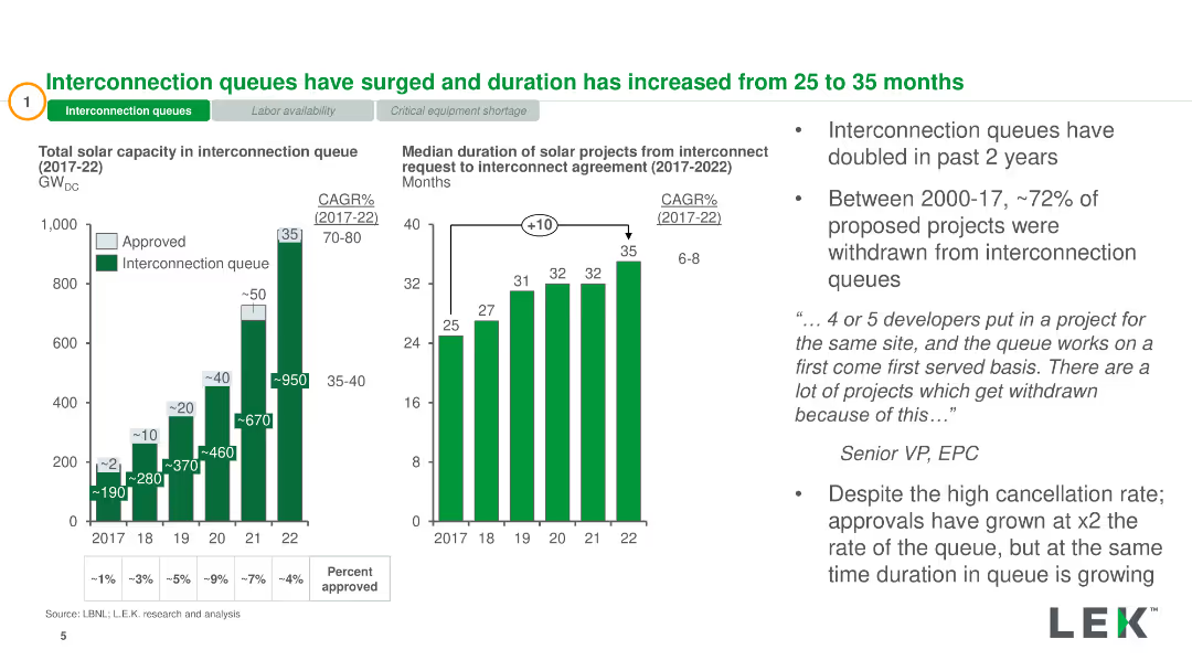
Column charts showing total solar capacity in interconnection queue and duration from request to agreement
Market Analysis and Trends
Energy & Utilities
Highlights the increase in interconnection queues and duration for solar projects, with relevant data from 2017 to 2022
interconnection queues, solar capacity, duration, market analysis, energy
Multiple Chart
LEK
Saved
The slide features a column chart with vertical columns, two text blocks, and a diagram with a dotted line indicating the efficiency ratio. The layout is well-organized, and the color scheme is muted with blue highlights.
Financial Performance
Financial Services
The slide provides a detailed comparison of expenses and financial results, highlighting key areas such as compensation, transaction-based expenses, and efficiency ratio. It’s designed for financial analysis and might be used to illustrate fiscal responsibility or areas for cost reduction in a corporate finance context.
financial, expenses, efficiency, compensation, technology, professional fees, tax rate, Goldman Sachs
Mixed Chart
Goldman Sachs
Saved
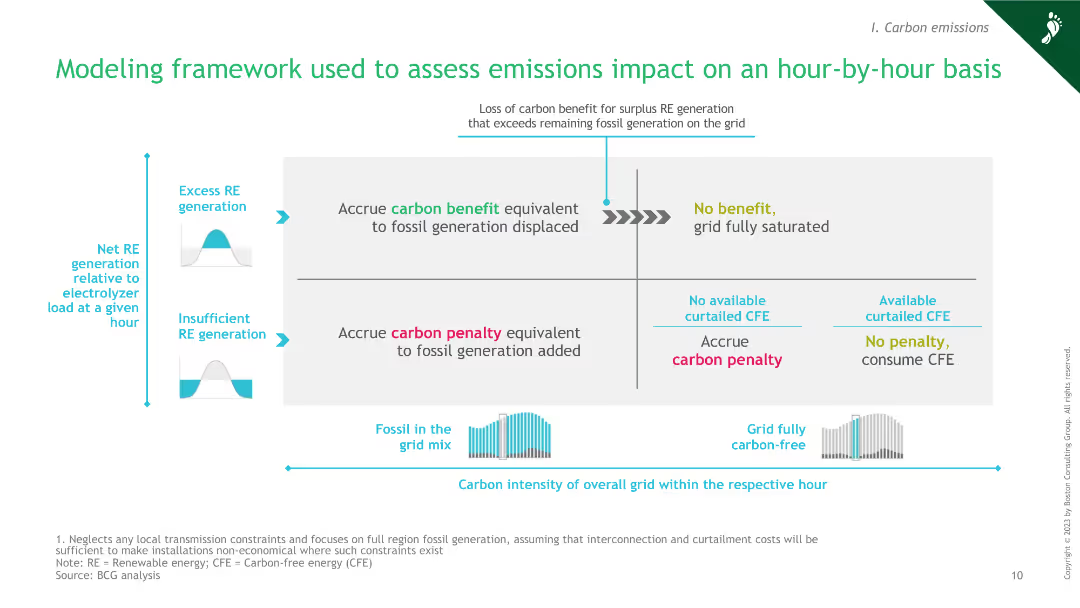
The slide features a diagram explaining the framework for assessing emissions impact hourly, including factors like excess RE generation, carbon benefit, and penalty.
Market Analysis and Trends
Energy & Utilities
This slide presents a modeling framework for assessing emissions impacts on an hour-by-hour basis, highlighting the interplay between excess renewable energy generation, fossil grid mix, and carbon penalties.
green hydrogen, emissions impact, modeling framework, renewable energy, carbon penalty
Framework
BCG
Saved
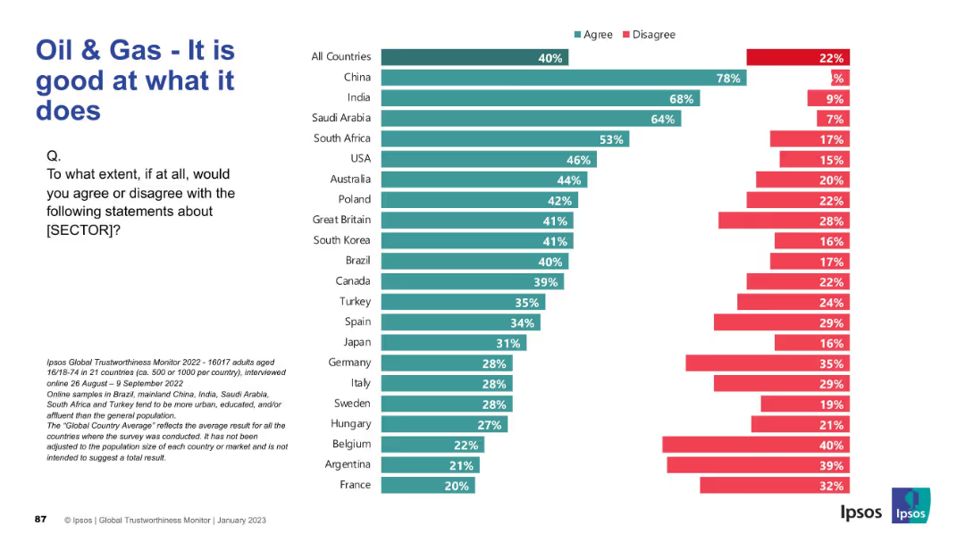
Horizontal bar chart for multiple countries with title and question on left. Sector changed to "Oil & Gas"; maintains same color-coded structure.
Market Analysis and Trends
Energy & Utilities
This slide evaluates how competent people think the oil and gas sector is at its core functions. China, India, and Saudi Arabia again show highest agreement, while European countries like France and Belgium are the most skeptical. This differs slightly from pharmaceutical sentiment.
oil & gas, performance, sector perception, Ipsos, energy industry, global opinion, agreement levels, international comparison, competence
Mixed Chart
IPSOS
Saved
The left side of the slide features a column chart showcasing the balance sheet mix with a positive trend arrow and percentage distribution across categories. On the right, a pie chart delineates the 'Sources of Funding' with a legend explaining the elements within the pie chart.
Financial Performance
Financial Services
This slide provides a visual breakdown of a company's balance sheet and funding sources, indicating a substantial liquidity and a growing balance sheet, useful for financial analysis or investor presentations.
balance sheet, funding sources, liquidity, pie chart, bar chart, financial analysis, trend, asset mix, financial growth, capital management
Multiple Chart
Goldman Sachs
Saved
The slide includes three distinct sections with icons representing vision, governance, and teamwork. Each section includes bullet points summarizing key activities and strategic approaches in a straightforward layout.
Organizational Structure and Change
Industrial & Manufacturing
Discusses how a transformation team can improve outcomes and enable circular business models by clarifying, aligning, and measuring changes. It highlights the roles of vision, governance, and the transformation team itself.
Vision, Governance, Transformation, Strategy, Teamwork
Table
Accenture
Saved
Previous
Next
If nothing, comes up, please save your slides first
Create a FREE account to continue browsing
Receive Instant Access to 1,000+ slides from companies like McKinsey, Google, and Goldman Sachs
First Name
Last Name
Email
Password
I agree to all
Terms & Privacy Policy
Thank you! Your submission has been received!
Oops! Something went wrong while submitting the form.
Have an account?
Sign in
Column Chart
Heatmap
Chevron
Org Chart
Infographic
Callouts
Timeline
List
Graphic
Picture
Process Flow
Diagram
Paragraph
Map
Table
Framework
Subtitle
Takeaway Box
Icon
Other Chart
Radar Chart
Waterfall Chart
Mekko Chart
Pie Chart
Scatter Plot
Line Chart
Bar chart
Bullet points