Create a FREE Account
Instant access to 1,000+ real slides from top companies like McKinsey, BCG, Goldman Sachs, Google and many more!
First Name
Last Name
Email
Password
I agree to all
Terms & Privacy Policy
Thank you! Your submission has been received!
Oops! Something went wrong while submitting the form.
Have an account?
Sign in
Library
Templates
Courses
Pricing
My Account
My Slides
My Templates
✦ AI
AI Prompt Library
AI Search
Sign in
Start Here
Logout
My Saved Slides
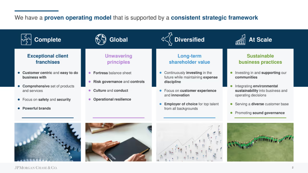
Four columns with text and icons, highlighting key aspects of the operating model: Complete, Global, Diversified, At Scale.
Strategic Planning
Professional Services
Describes the company's strategic framework focusing on exceptional client franchises, unwavering principles, long-term shareholder value, and sustainable practices.
operating model, strategy, client franchises, principles, shareholder value, sustainability
Pillar
JP Morgan
Saved
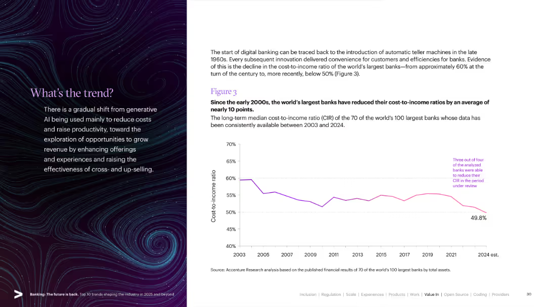
Split slide: left side has a stylized visual with text; right side features a line graph showing cost-to-income ratio trends from 2003 to 2024.
Operational Efficiency
Financial Services
Demonstrates how the world's largest banks have successfully reduced their cost-to-income ratios over two decades, highlighting improvements in digital banking and operational efficiency.
Cost-to-Income, Efficiency, Digital Banking, CIR, Banking Trends, Global Banks, Operational Metrics
Mixed Chart
Accenture
Saved
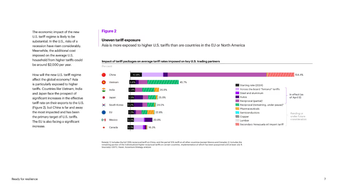
Bar chart comparing average tariff rate increases for key U.S. trading partners, color-coded by tariff category.
Risk Assessment and Management
Government & Public Sector
Illustrates asymmetric exposure of countries to U.S. tariffs, showing Asia is more affected than EU/North America. China faces the highest increase (154.4%), with Vietnam and India also highly impacted. Shows segmentation of tariffs across industries.
tariffs, China, trade exposure, Vietnam, India, trade war, U.S. partners, risk, import duties, policy impact
Mixed Chart
Accenture
Saved
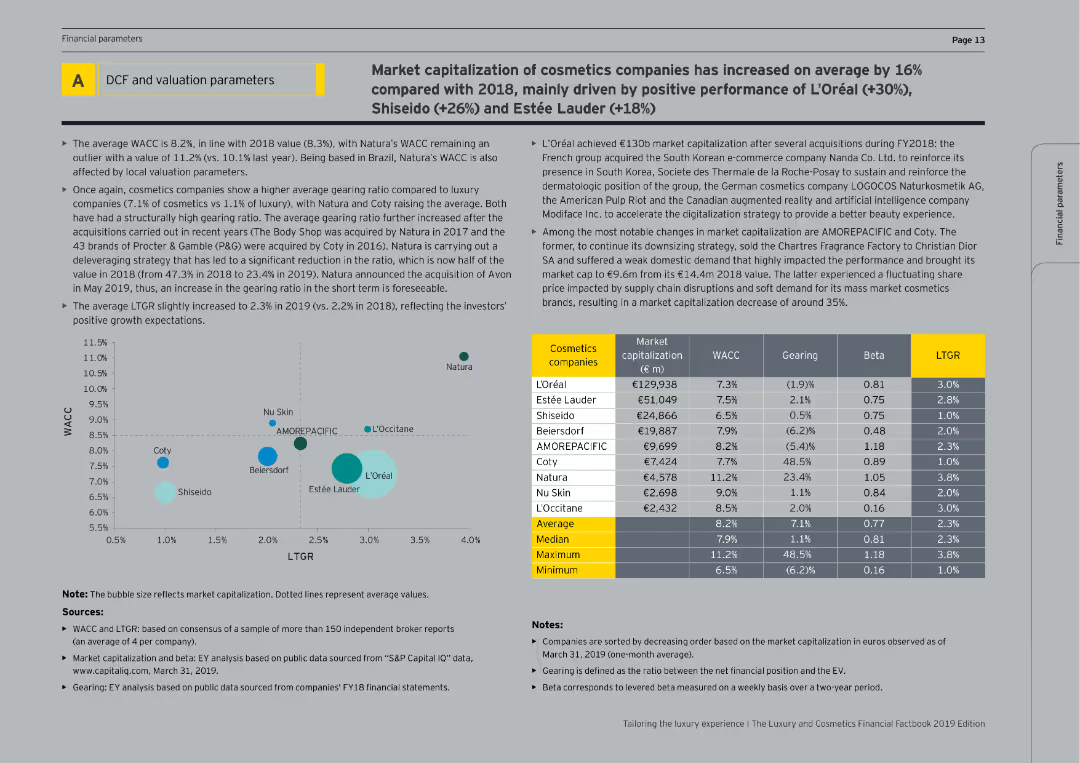
This slide includes tables and bubble charts showing the market capitalization, WACC, gearing, beta, and LTGR of cosmetics companies.
Financial Performance
Consumer Goods
The slide provides financial data on cosmetics companies, analyzing market capitalization, cost of capital, and gearing ratios, with a focus on recent performance and growth expectations.
Valuation parameters, cosmetics companies, financial metrics, market capitalization, WACC
Mixed Chart
EY
Saved
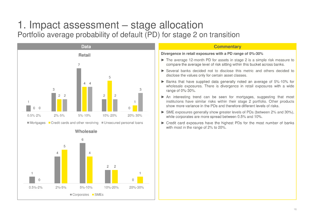
Contains column charts comparing the portfolio average probability of default (PD) for stage 2 assets in Retail and Wholesale categories, with a detailed commentary discussing divergences and implications for different asset classes.
Risk Assessment and Management
Financial Services
Evaluates the portfolio average probability of default for stage 2 assets, noting variances in risk levels among retail and wholesale exposures and analyzing the implications for different financial products.
probability of default, stage 2, retail, wholesale, financial products
Multiple Chart
EY
Saved
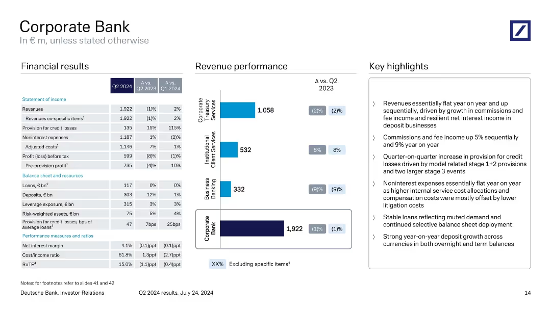
Three-column layout with financial table, revenue bar chart, and key highlights.
Product and Service Analysis
Financial Services
Reviews Q2 2024 performance of the Corporate Bank division. Highlights include flat revenue, rising provisions for credit losses, steady expenses, and growth in deposits. Segment-level revenue performance for treasury, institutional, and business banking is visualized.
Corporate Bank, Q2 2024, revenue, credit losses, business banking, Deutsche Bank
Mixed Chart
Deutsche Bank
Saved
This slide emphasizes expansion strategy with bullet points detailing market attractiveness, cross-LOB customers, omni-channel strategy, and smart footprint, alongside a column chart showing an increase in U.S. customer footprint from 69% to 93%. The layout is clean, with the chart on the right and the bullet points arranged on the left for easy comparison and reference.
Market Analysis and Trends
Financial Services
It explains the bank's strategic approach to market expansion and its effective implementation, as evidenced by growth in U.S. customer reach. It may be used to discuss market development strategies and the rationale behind successful expansions.
market expansion, customer base, strategy, omni-channel
Mixed Chart
JP Morgan
Saved
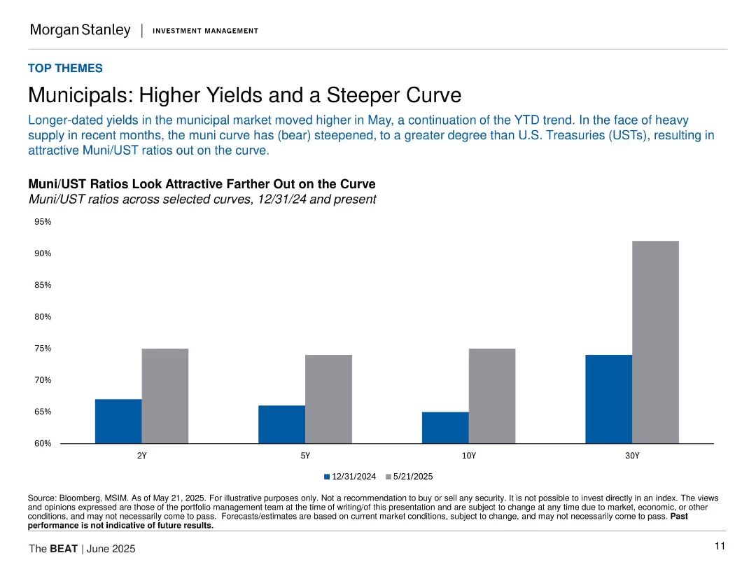
Bar chart comparing Muni/UST ratios at 2Y, 5Y, 10Y, and 30Y; clean layout with labeled bars and subdued color tones.
Investment Analysis
Financial Services
The slide discusses recent steepening in the municipal yield curve and shows how Muni/UST ratios have become more attractive, especially at longer durations, supported by a bar comparison between Dec 2024 and May 2025.
municipals, UST, yield curve, ratios, interest rates, bonds, fixed income, investment, steepening, Morgan Stanley
Single Chart
Morgan Stanley
Saved
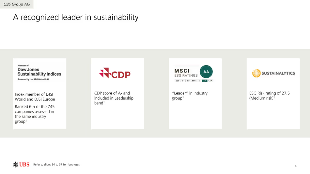
Four-column layout showcasing sustainability ratings and recognitions from different organizations like Dow Jones, CDP, MSCI, and Sustainalytics. Each column includes a logo and a brief description of the recognition.
Industry Overview
Environmental Services & Sustainability
Highlights UBS Group AG's achievements in sustainability, recognized by various rating agencies. Includes information on ratings, scores, and leadership positions in the sustainability sector.
Sustainability, Ratings, Recognition, Environment, Leadership, Achievements
Pillar
UBS
Saved
The slide includes a column chart with vertical bars showing the quarterly reported EPS volatility from 1999 to Q4'19 for various banks. There's a horizontal axis representing net income increase, with banks arranged according to this measure. Logos of the banks are displayed below each bar. The design is clean with minimal text, using shades of blue, red, and gray. The Santander logo is in the top corner, and there's a 'Strength' icon on the right.
Financial Performance
Financial Services
This slide provides a comparative analysis of earnings volatility and net income increase among leading banks, emphasizing Santander's low volatility and strong income growth. This could be used in presentations to showcase financial stability and growth over a 20-year period to investors or company stakeholders.
Quarterly Earnings, Volatility, Net Income, Banks, Santander, Long-term Growth, Financial Stability, Market Comparison, EPS Volatility
Single Chart
Morgan Stanley
Saved
Illustrates a conceptual journey from "Exploring" to "Being" a digital company with a line chart and icons representing different stages. Large text box in the center with a detailed explanation.
Human Resources and Talent Management
Technology & Software
Discusses the stages of digital maturity for organizations, emphasizing the shift from just doing digital tasks to fully being digital in their culture and operations.
digital culture, maturity, organizational change, digital transformation, exploring, doing, becoming, being
Linear Flow
Deloitte
Saved
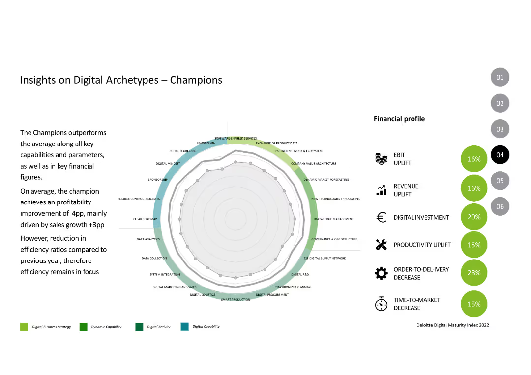
The slide features a radar chart with multiple parameters like digital mindset, market forecasting, and software-enabled services, alongside financial profile metrics like EBIT and revenue uplift.
Competitive Landscape
Industrial & Manufacturing
This slide analyzes the performance of "Champions" in digital transformation, highlighting their strengths in various digital capabilities and financial metrics.
Digital Archetypes, Champions, Performance, Digital Transformation, Financial Metrics
Mixed Chart
Deloitte
Saved
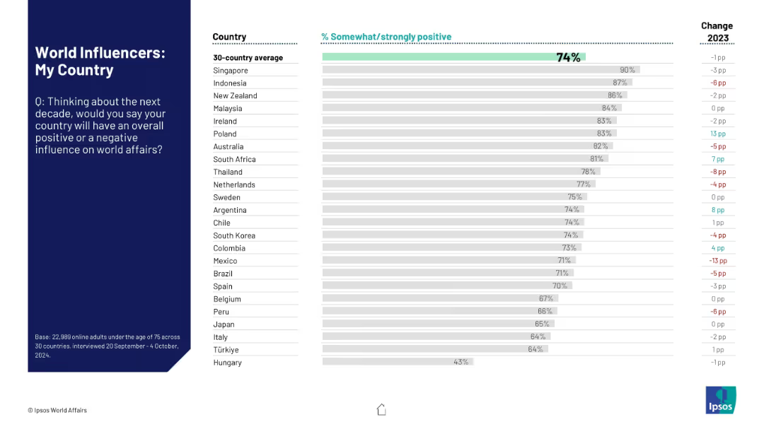
Ranked horizontal bar chart showing how residents in each country perceive their own country’s influence on world affairs in the next 10 years.
Strategic Planning
Government & Public Sector
This slide highlights self-perception across 30 nations about their country's influence in future global affairs. The data compares each country's self-evaluation with the overall average and shows year-over-year changes.
self-perception, national pride, influence, public sentiment, Ipsos, strategic outlook, global affairs, national image
Mixed Chart
IPSOS
Saved
This slide includes multiple line graphs comparing the growth of luxury market segments from 2010 to 2017. The graphs are color-coded to differentiate between experiences, experiencing goods, and personal goods, enhancing clarity and readability. The layout prioritizes visual data presentation, supported by minimal text summarizing key trends and growth rates.
Market Analysis and Trends
Consumer Goods
Compares the growth trajectories of different luxury market segments post-crisis, highlighting the increasing preference for experiences over goods. Useful for insights into consumer behavior changes and market shifts in the luxury sector.
luxury market trends, post-crisis growth, consumer preferences, experiences vs goods, strategic insights
Single Chart
Bain
Saved
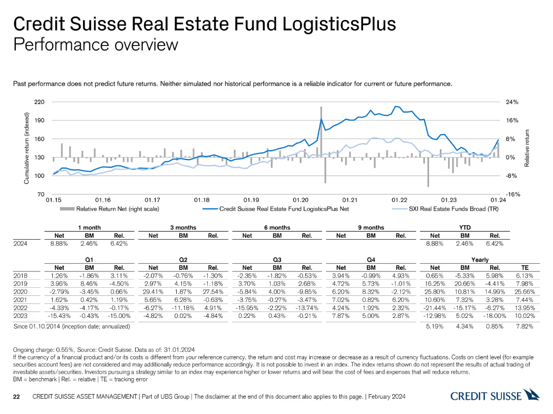
This slide features a line chart and a table summarizing the performance of the Credit Suisse Real Estate Fund LogisticsPlus.
Financial Performance
Financial Services
It reviews the performance of the LogisticsPlus fund, highlighting its returns and comparison with benchmarks and historical trends.
performance, Credit Suisse, Real Estate Fund, LogisticsPlus, benchmarks
Mixed Chart
Credit Suisse
Saved
Features line graphs comparing the sex ratio at birth (SRB) across various countries from 1970 to 2017, highlighting trends and disparities.
Market Analysis and Trends
Government & Public Sector
Discusses the implications of gender ratio imbalances in selected countries, exploring the causes and long-term impacts of skewed sex ratios. It provides a historical perspective on how policies and cultural factors have shaped these trends.
gender ratio, demographics, policy, cultural impact, trends
Mixed Chart
Roland Berger
Saved
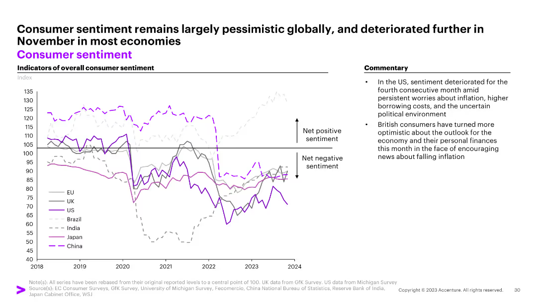
The slide features a line graph showing indicators of overall consumer sentiment for the EU, UK, US, Brazil, India, Japan, and China from 2018 to 2024. Commentary on the right.
Market Analysis and Trends
Consumer Goods
The slide shows largely pessimistic global consumer sentiment with a deterioration in most economies in November.
consumer sentiment, EU, UK, US, Brazil, India, Japan, China, pessimism, line graph
Mixed Chart
Accenture
Saved
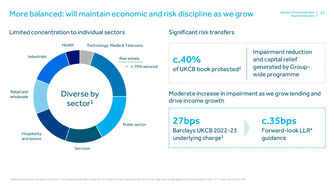
Circular chart showing sector diversity in the loan book, with text boxes on risk transfers and impairment metrics.
Risk Assessment and Management
Financial Services
Emphasizes risk diversification and mitigation. Nearly 40% of the loan book is protected, impairment charges are low, and the bank plans to maintain strong risk discipline as lending increases.
risk management, sector diversification, impairment, capital relief, loan book, risk transfers, discipline, LLR
Mixed Chart
Barclays
Saved
The slide features a large header in bold type, two bar graphs comparing ASEAN and OECD firms in terms of formal training offerings, and the number of training hours per employee. The layout is split into two sections with dark and light blue bars representing different regions. There are two callout boxes with recommendations at the bottom.
Market Analysis and Trends
Education & Training
The slide contrasts the percentage of firms offering formal training and the number of training hours per employee between ASEAN and OECD countries. It advocates for government intervention to increase corporate training programs. The aim is to facilitate a competitive edge for companies by ensuring training compliance, particularly in digital skill areas, over a 5-year growth target.
Training, ASEAN, OECD, Government Policy, Corporate Training, Digital Skills, Formal Training, Employee Development, Competitiveness, Growth Target
Multiple Chart
Kearney
Saved
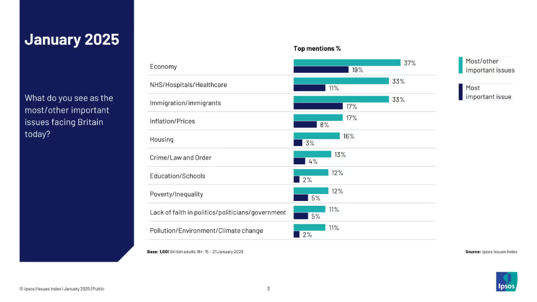
Nearly identical layout to 19473 but adds a dual-color bar split for “most important” vs. “most/other important”
Market Analysis and Trends
Government & Public Sector
This slide expands on the previous one by splitting the responses into two categories: most important and most/other important issues. It visually contrasts how concerns differ in perceived urgency.
top issues, comparison, priorities, Ipsos, public opinion, chart, UK, 2025, concern levels
Mixed Chart
IPSOS
Saved
The slide presents two charts: a bar chart on sector composition by market cap for large and small caps, and a line chart on small vs. large cap relative valuation.
Investment Analysis
Financial Services
Analyzes large vs. small cap equities, focusing on market cap composition and valuation comparisons, useful for portfolio management strategies.
equities, large cap, small cap, market cap, valuation
Multiple Chart
JP Morgan
Saved
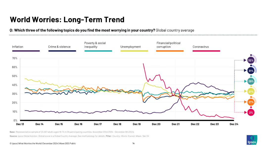
Line graph with colored trend lines tracking the percentage of global concern for various issues from Dec 2013 to Dec 2024, with a legend and summary percentages.
Market Analysis and Trends
Government & Public Sector
This slide presents long-term trends in global public concerns such as inflation, crime, poverty, unemployment, corruption, and coronavirus. It shows that inflation and crime now top the list, while concern about COVID-19 has plummeted.
global worries, trends, inflation, crime, poverty, unemployment, Ipsos, COVID-19, public opinion
Multiple Chart
IPSOS
Saved
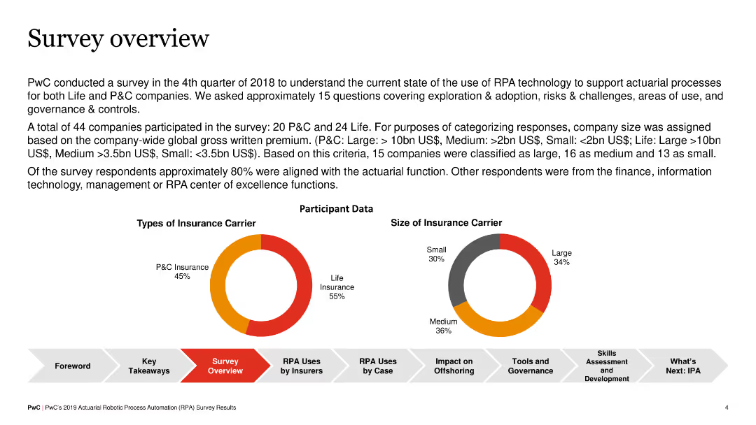
The slide summarizes the survey conducted by PwC on RPA adoption in insurance companies, including participant data on types of insurance carriers and the size of insurance carriers. It features pie charts and key data points.
Market Analysis and Trends
Financial Services
The slide provides an overview of a survey on RPA adoption, detailing the types and sizes of participating insurance carriers. It indicates that a majority of participants were from the actuarial function, with a split between P&C and life insurers.
RPA, survey, insurance, pie chart, overview
Multiple Chart
PwC/Strategy&
Saved
A visually engaging slide presenting a variety of computing methods like device edge, remote edge, and hybrid cloud, illustrated with relevant icons and diagrams, all on a sleek dark background.
Technology and Digital Transformation
Technology & Software
The slide provides a comprehensive overview of the cloud and edge computing trend, explaining the shift from centralized to hybrid computational models. It details various computing locations and their use cases, highlighting how they contribute to tomorrow's networks with closer user computation.
Edge Computing, Hybrid Cloud, Computational Models
Header Horizontal
McKinsey
Saved
The slide showcases a Sankey diagram illustrating the flow of meter point analytics data, detailing agent handover processes. The diagram uses various color-coded paths to represent data flow and changes.
Operational Efficiency
Energy & Utilities
This slide offers an analysis of meter point data, focusing on agent handovers within the utility sector, using a Sankey diagram to visualize the flow and changes in data.
Meter Point, Analytics, Agent Handover, Data Flow, Visualization
Single Chart
EY
Saved
Previous
Next
If nothing, comes up, please save your slides first
Create a FREE account to continue browsing
Receive Instant Access to 1,000+ slides from companies like McKinsey, Google, and Goldman Sachs
First Name
Last Name
Email
Password
I agree to all
Terms & Privacy Policy
Thank you! Your submission has been received!
Oops! Something went wrong while submitting the form.
Have an account?
Sign in
Column Chart
Heatmap
Chevron
Org Chart
Infographic
Callouts
Timeline
List
Graphic
Picture
Process Flow
Diagram
Paragraph
Map
Table
Framework
Subtitle
Takeaway Box
Icon
Other Chart
Radar Chart
Waterfall Chart
Mekko Chart
Pie Chart
Scatter Plot
Line Chart
Bar chart
Bullet points