Create a FREE Account
Instant access to 1,000+ real slides from top companies like McKinsey, BCG, Goldman Sachs, Google and many more!
First Name
Last Name
Email
Password
I agree to all
Terms & Privacy Policy
Thank you! Your submission has been received!
Oops! Something went wrong while submitting the form.
Have an account?
Sign in
Library
Templates
Courses
Pricing
My Account
My Slides
My Templates
✦ AI
AI Prompt Library
AI Search
Sign in
Start Here
Logout
My Saved Slides
Features column and line charts comparing emission reduction targets with vibrant colors and a clear title. The layout is complemented by bullet-pointed text and annotations.
Strategic Planning
Environmental Services & Sustainability
Communicates LANXESS's commitment to achieving climate neutrality, detailing their reduction targets and comparing their progress to EU regulations.
ESG, Climate Neutrality, Targets, LANXESS
Multiple Chart
Morgan Stanley
Saved
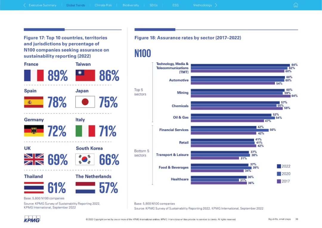
Dual-chart slide: left shows top countries by assurance % with flags; right has sector-based bar chart showing assurance rate trends over time. Visually segmented top 5 and bottom 5 sectors.
Performance Metrics and KPIs
Professional Services
The slide ranks countries by their N100 assurance reporting and displays sector-based assurance rate trends. France and Taiwan lead in assurance adoption, while TMT and Automotive sectors show high assurance rates, contrasting with lagging sectors like Healthcare.
assurance, countries, sectors, France, Taiwan, TMT, automotive, KPMG
Mixed Chart
KPMG
Saved
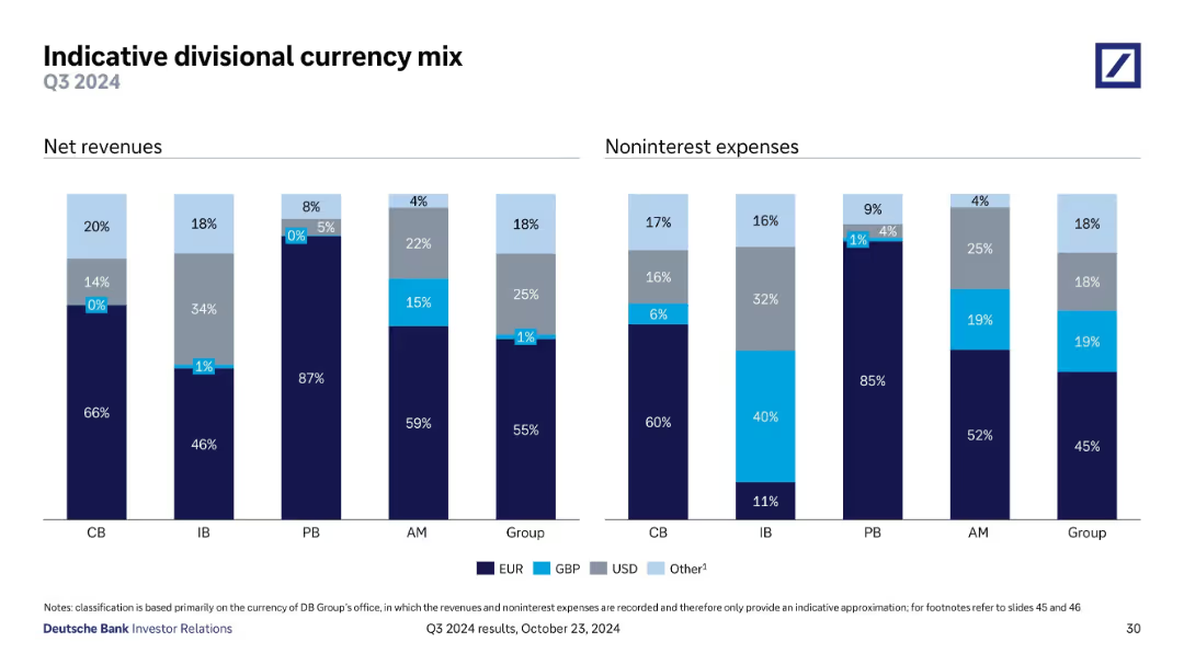
Two bar graphs comparing net revenues and noninterest expenses by currency (EUR, USD, GBP, Other) across various divisions; labeled by percent share per division.
Risk Assessment and Management
Financial Services
This slide displays currency exposure by business unit. It reveals revenue and cost structures by currency, helping assess foreign exchange risk. EUR dominates net revenues in most divisions, while cost bases show more currency diversification, especially in the IB.
currency, revenue, expenses, forex, EUR, USD, GBP, risk
Single Chart
Deutsche Bank
Saved
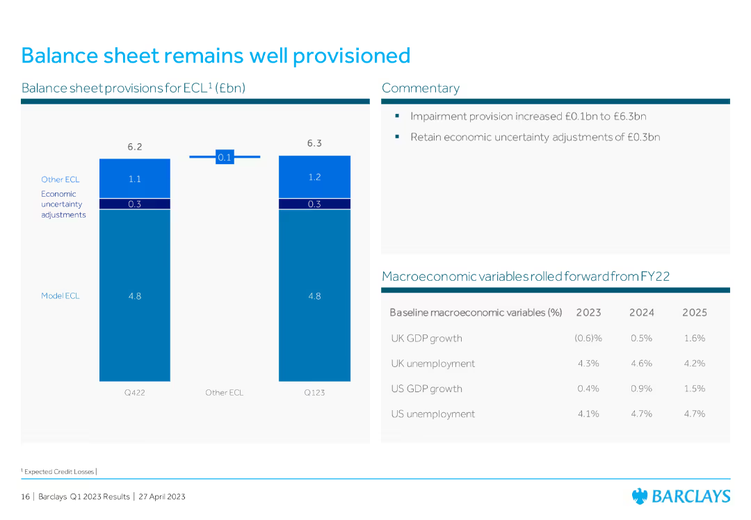
Bar chart displaying balance sheet provisions for ECL, with commentary on the right explaining impairment provision and economic uncertainty adjustments.
Risk Assessment and Management
Financial Services
The slide discusses Barclays' well-provisioned balance sheet, detailing expected credit losses (ECL) and economic adjustments, ensuring financial stability and risk management.
balance sheet, ECL, impairment provision, economic adjustments, risk management
Mixed Chart
Barclays
Saved
Featuring a box plot distribution chart, the slide has a title, descriptive subtext, and clearly labeled axes. Each box plot indicates the inter-quartile and 90th percentile ranges of year-to-date total shareholder returns by industry.
Risk Assessment and Management
Financial Services
Showcases the variability of shareholder returns within industries, highlighting that even companies within the same sector can experience widely different financial performances. Designed for risk analysis within sectors.
Shareholder returns, Variability, Industry analysis, Risk management, Financial performance
Single Chart
McKinsey
Saved
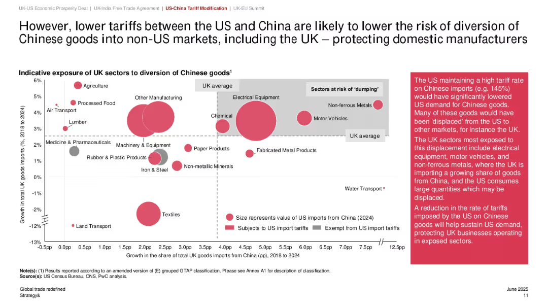
Bubble chart showing UK sectors exposed to Chinese import diversion; bubble size reflects import value; shaded zones highlight sectoral risk; annotation box explains implications.
Risk Assessment and Management
Government & Public Sector
This slide highlights how reduced US tariffs on Chinese imports lower the risk of goods being diverted into the UK market, mitigating the dumping risk for domestic manufacturers. Sectors like electrical equipment and motor vehicles are most exposed. Bubble sizes represent 2024 import values.
Chinese imports, sector exposure, dumping risk, UK manufacturing, tariff reduction, import diversion, bubble chart, global trade, domestic protection
Mixed Chart
PwC/Strategy&
Saved
Two individuals under a multicolored umbrella looking at a phone. Text on the left. Moderate complexity.
Market Analysis and Trends
Retail & E-commerce
Explores digital habits post-pandemic, particularly in Southeast Asia, with a focus on technology adoption.
Southeast Asia, technology adoption, digital habits
Agenda
Bain
Saved
This slide continues with the theme of empowerment and skills, presenting bar charts that compare responses about job impact and training concerns between different generations, specifically Gen Z and Baby Boomers.
Market Analysis and Trends
Education & Training
This slide provides insight into generational differences concerning job security and the impact of technology. It highlights concerns among younger workers about their roles being replaced by technology and their worries about not receiving adequate training.
generational differences, technology impact, training concerns, job security
Multiple Chart
PwC/Strategy&
Saved
Bar chart detailing inefficiencies at various stages of the manufacturing value chain. Accompanied by detailed descriptions of inefficiencies and potential improvements.
Operational Efficiency
Industrial & Manufacturing
Analyzes specific inefficiencies in the manufacturing value chain, highlighting areas with potential for improvement in sustainability and efficiency. It provides a breakdown of problems and solutions at different stages such as product design, sourcing, and end-of-life disposal.
manufacturing, inefficiencies, value chain, sustainability, operational efficiency
Mixed Chart
Accenture
Saved
A complex diagram spans the slide, mapping roles across different growth stages, categorized into business, technology, and risk, with a clear progression pathway illustrated.
Human Resources and Talent Management
Technology & Software
It depicts a role architecture to provide a comprehensive view of career progression within an organization, for HR planning and organizational development workshops.
role architecture, career mapping, growth stages, HR planning, organizational development, employee progression, job families
Diagram
Kearney
Saved
Includes multiple bar charts on managers' perceptions of their future roles.
Organizational Structure and Change
Professional Services
Evaluates how managers foresee the impact of changes on their roles within companies.
role change, managerial perceptions, future outlook, industry comparison, management
Mixed Chart
BCG
Saved
Informative text with supporting icons and diagrams focusing on KPIs and predictive modeling, emphasizing a customer-centric measurement approach.
Technology and Digital Transformation
Retail & E-commerce
Suggests a paradigm shift in success measurement, advocating for customer-centric KPIs and predictive models for accurate ROI analysis.
KPIs, ROI, Customer-Centric, Predictive Modeling, Success Metrics, Channel Strategy
Header Horizontal
BCG
Saved
Featuring a digital avatar, the slide presents a question-answer format with a focus on debate topics. The dark background emphasizes the text and the avatar, guiding the viewer's attention directly to the content. The layout facilitates an easy-to-follow structure, highlighting key discussion points.
Strategic Planning
Technology & Software
Aimed at sparking conversation, this slide presents debate questions surrounding the adoption and implications of next-generation software development. It encourages critical thinking about the cultural, legal, and operational challenges of integrating these new technologies in various settings.
Debate, Software Development, Automation, Intellectual Property, Culture, Responsibility
Text Only
McKinsey
Saved
Bar charts show enrollment rates and degree considerations among first-generation and continuing-generation students.
Market Analysis and Trends
Education & Training
Analyzes educational preferences and outcomes, focusing on enrollment differences between student groups.
education, enrollment rates, student choices, outcomes
Multiple Chart
BCG
Saved
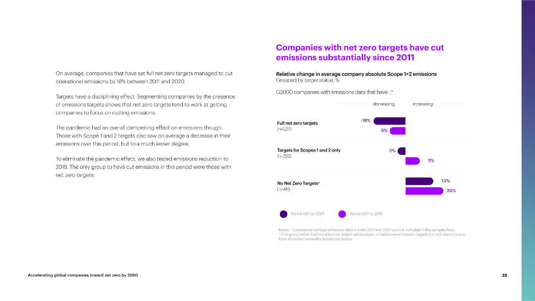
The slide features a column chart comparing the relative change in average company emissions by target status from 2011 to 2020.
Performance Metrics and KPIs
Environmental Services & Sustainability
The slide shows that companies with full net zero targets have significantly reduced their operational emissions compared to those with limited or no targets.
net zero targets, emissions reduction, average company, full targets, scopes 1 and 2, no targets, operational emissions, 2011-2020
Mixed Chart
Accenture
Saved
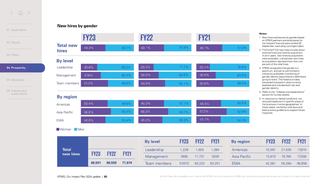
Matrix of horizontal bar charts segmented by FY and subcategories (level and region); notes on the right.
Human Resources and Talent Management
Professional Services
Provides gender distribution of new hires across leadership, management, and team levels as well as across regions (Americas, Asia Pacific, EMA) over three fiscal years. Includes raw numbers at the bottom and notes explaining definitions and methodology. Indicates a push for inclusivity and gender balance across the organization.
gender diversity, hiring, workforce, leadership, regions, inclusion, HR, FY metrics, equality, statistics
Mixed Chart
KPMG
Saved
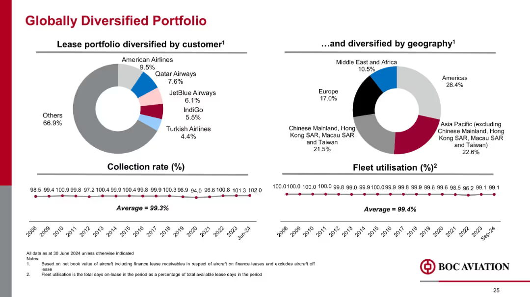
Side-by-side pie charts showing customer and geographic distribution; timeline graphs beneath; minimalist layout
Risk Assessment and Management
Financial Services
Emphasizes portfolio diversification across customers and regions. Shows a strong collection rate (99.3%) and high fleet utilization (99.4%), indicating low credit risk and operational reliability across markets.
customer mix, geography, utilization, collection rate, diversification, aviation portfolio, risk management
Multiple Chart
Goldman Sachs
Saved
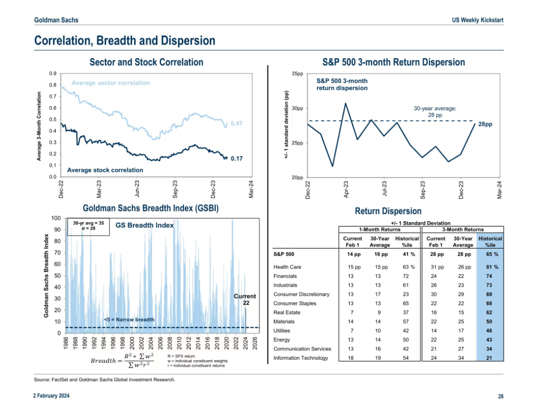
Combines line charts and histograms showing sector/stock correlation, breadth index, and return dispersion. Structured in a three-column layout with legends and annotations.
Risk Assessment and Management
Financial Services
The slide assesses market internals, including correlations among stocks and sectors, breadth of market participation, and return dispersion. It provides insight into market dynamics, concentration risks, and the probability distribution of returns across various sectors.
correlation, breadth, dispersion, stock returns, risk, market structure
Multiple Chart
Goldman Sachs
Saved
Three panels with economic indicators, energy sector data, and doing business metrics. Each panel uses simple arrows and text to convey changes.
Market Analysis and Trends
Financial Services
This slide highlights the post-pandemic economic recovery trends, focusing on inflation, energy sector performance, and doing business metrics.
Economic recovery, inflation, energy sector, doing business, indicators, post-pandemic, trends, metrics, analysis, performance
Pillar
EY
Saved
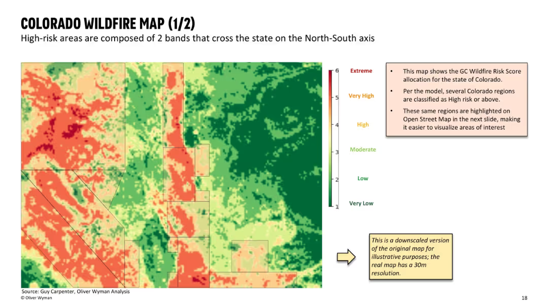
Full-screen heat map of wildfire risk zones using gradient from green (low) to red (extreme); includes a small annotation panel explaining data origin and purpose; clean, map-focused layout with minimal text.
Risk Assessment and Management
Financial Services
This slide shows a detailed wildfire risk map of Colorado, based on GC Wildfire Risk Scores. Two prominent high-risk bands are visible running north-south. The slide helps visualize geographic exposure for insurers and supports analysis of ZIP-level underwriting decisions.
wildfire risk, Colorado map, geographic exposure, heat map, GC score, insurance risk, spatial analysis, underwriting map, high-risk zones
Mixed Chart
Oliver Wyman
Saved
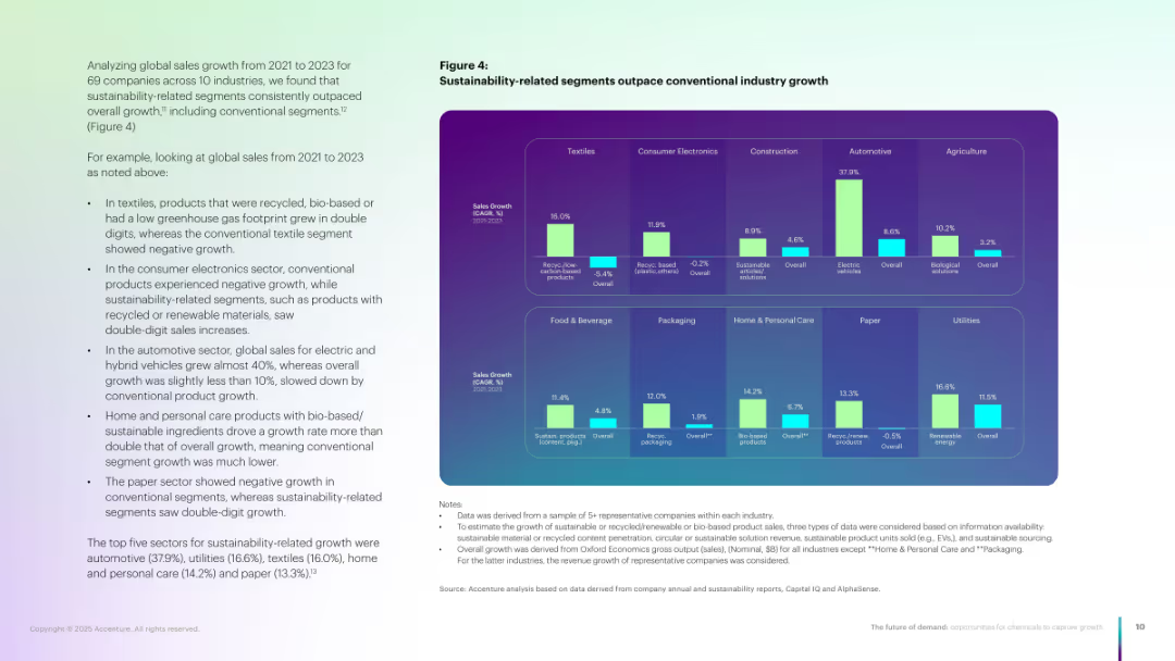
Grid-style chart with 10 industry segments; each has dual bars (sustainable vs. overall).
Market Analysis and Trends
Environmental Services & Sustainability
Compares growth of sustainable vs. conventional products across ten industries. Shows double-digit growth in sustainable segments in textiles, auto, HPC, etc., with overall demand lagging behind.
Sustainability, industry growth, recycled products, bio-based, segments
Multiple Chart
Accenture
Saved
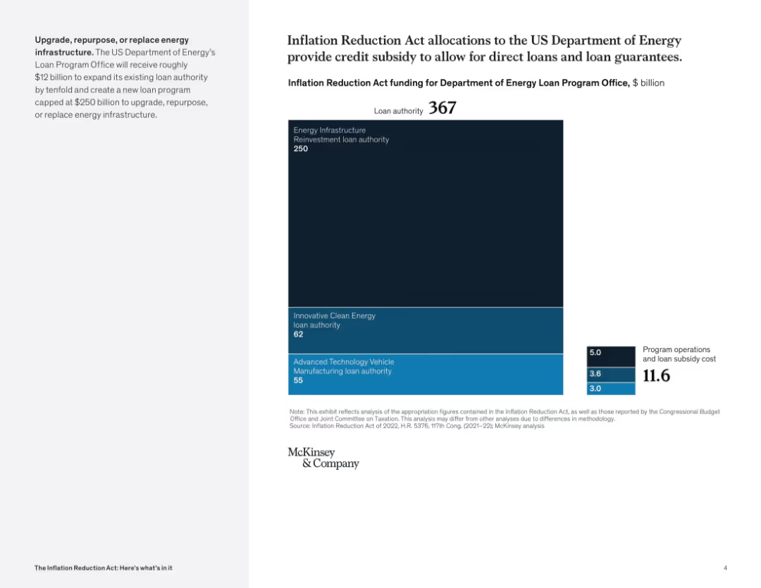
Full-screen treemap with a bold vertical block format; right-side numeric box for operational costs; left panel describes DOE program expansion.
Investment Analysis
Government & Public Sector
This slide details how $367B in IRA funding is allocated to the DOE Loan Program Office, emphasizing energy infrastructure and innovative technologies. It also accounts for operational and subsidy costs.
Department of Energy, loans, clean energy, subsidies, infrastructure, investment, vehicle tech
Mixed Chart
McKinsey
Saved
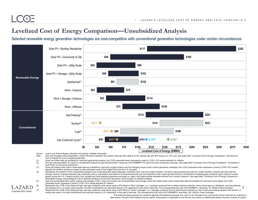
Features a comparative bar chart displaying the levelized cost of energy (LCOE) for various renewable and conventional energy sources. The chart includes both current and projected costs, highlighting the competitiveness of different technologies.
Market Analysis and Trends
Energy & Utilities
Provides an analysis of the levelized cost of energy for various renewable and conventional energy sources. Highlights the cost competitiveness and market potential of different energy generation technologies under specific conditions.
Energy, LCOE, Renewable, Conventional, Comparison
Single Chart
Roland Berger
Saved
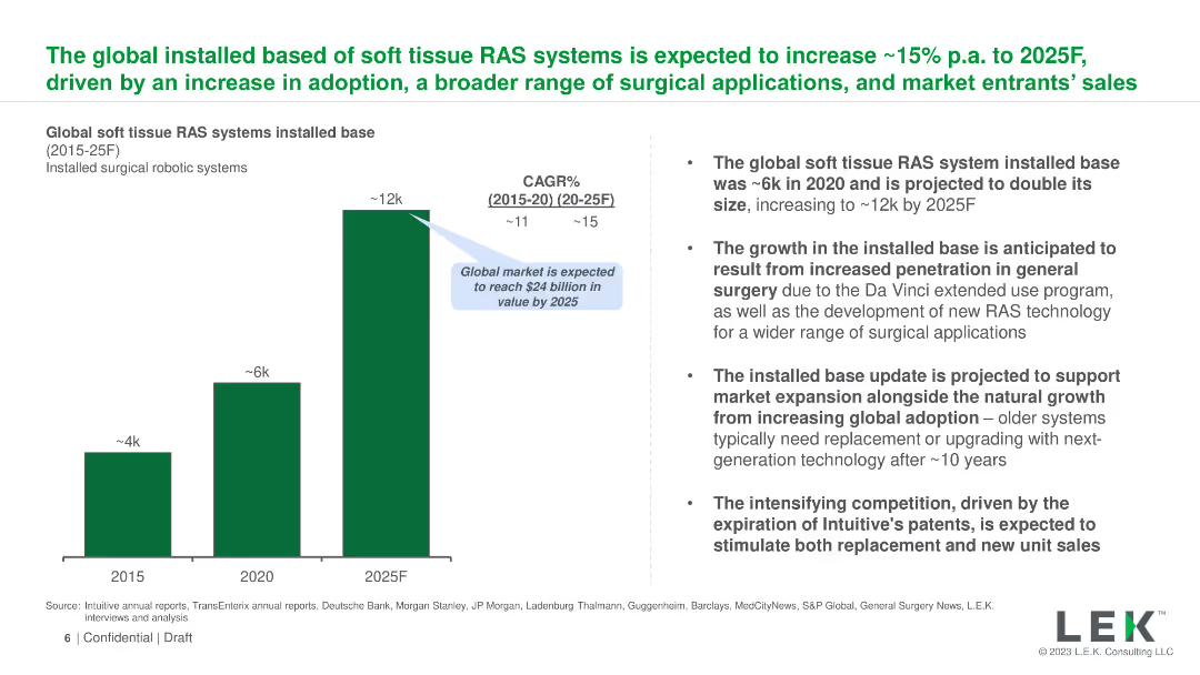
The slide uses a column chart to show the projected growth of the global installed base of soft tissue RAS systems from 2015 to 2025. Text on the right provides context and details about the projected growth, market expansion, and competitive landscape.
Market Analysis and Trends
Healthcare & Pharmaceuticals
The slide forecasts the growth of the installed base of soft tissue robotic-assisted surgery (RAS) systems globally, expecting an increase from ~6k in 2020 to ~12k by 2025. It outlines the drivers of this growth, including market expansion and technological advancements.
RAS, growth, global, installed base, soft tissue, projection, 2025, market expansion, technology, competition
Mixed Chart
LEK
Saved
Column charts with drawn lines illustrating the growth impact of combining technology and talent post-pandemic, with a focus on competitive advantage.
Technology and Digital Transformation
Technology & Software
Discusses how a strong digital core and talent management contribute to rapid capability development and competitive advantage post-pandemic.
technology, talent management, post-pandemic, competitive advantage, digital core, growth impact, capability development
Multiple Chart
Accenture
Saved
Previous
Next
If nothing, comes up, please save your slides first
Create a FREE account to continue browsing
Receive Instant Access to 1,000+ slides from companies like McKinsey, Google, and Goldman Sachs
First Name
Last Name
Email
Password
I agree to all
Terms & Privacy Policy
Thank you! Your submission has been received!
Oops! Something went wrong while submitting the form.
Have an account?
Sign in
Column Chart
Heatmap
Chevron
Org Chart
Infographic
Callouts
Timeline
List
Graphic
Picture
Process Flow
Diagram
Paragraph
Map
Table
Framework
Subtitle
Takeaway Box
Icon
Other Chart
Radar Chart
Waterfall Chart
Mekko Chart
Pie Chart
Scatter Plot
Line Chart
Bar chart
Bullet points