Create a FREE Account
Instant access to 1,000+ real slides from top companies like McKinsey, BCG, Goldman Sachs, Google and many more!
First Name
Last Name
Email
Password
I agree to all
Terms & Privacy Policy
Thank you! Your submission has been received!
Oops! Something went wrong while submitting the form.
Have an account?
Sign in
Library
Templates
Courses
Pricing
My Account
My Slides
My Templates
✦ AI
AI Prompt Library
AI Search
Sign in
Start Here
Logout
My Saved Slides
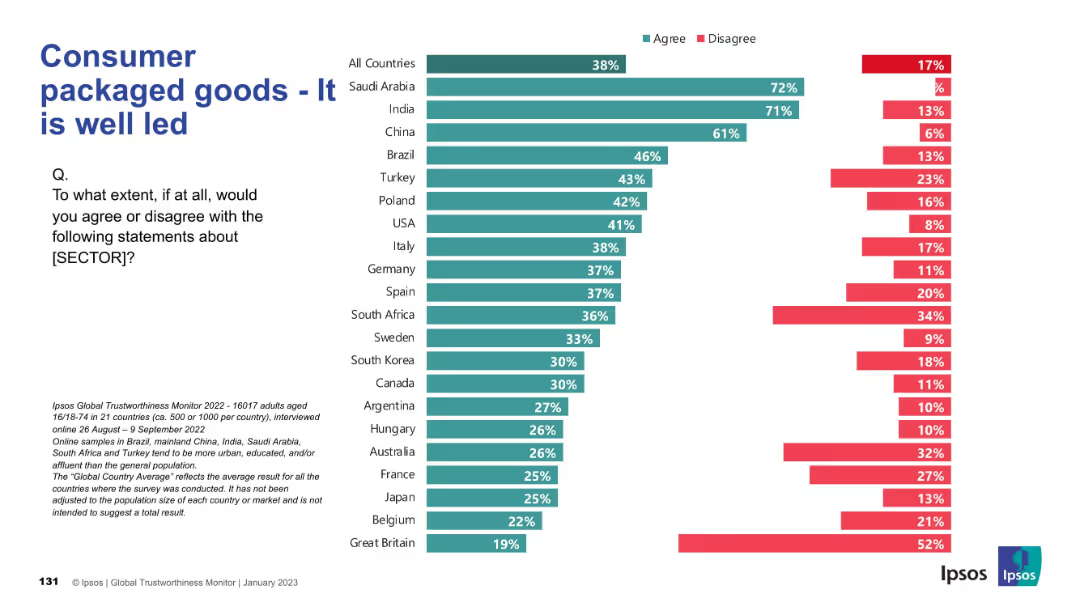
Horizontal bar chart comparing leadership perceptions in the consumer goods sector across countries; consistent Ipsos chart style.
Product and Service Analysis
Consumer Goods
This slide analyzes how well-led consumer packaged goods companies are perceived to be. Trust is highest in Saudi Arabia, India, and China, while European and Western countries show lower confidence in industry leadership.
leadership, corporate governance, trust, consumer sector, international analysis
Mixed Chart
IPSOS
Saved
The slide contains two charts. The left line chart shows U.S. goods imports by location. The right bar chart displays company plans to relocate out of China.
Competitive Landscape
Transportation & Logistics
This slide examines the commercial relationship between the U.S. and China, focusing on import locations and companies' relocation plans.
Commercial, U.S., China, Imports, Relocation
Multiple Chart
JP Morgan
Saved
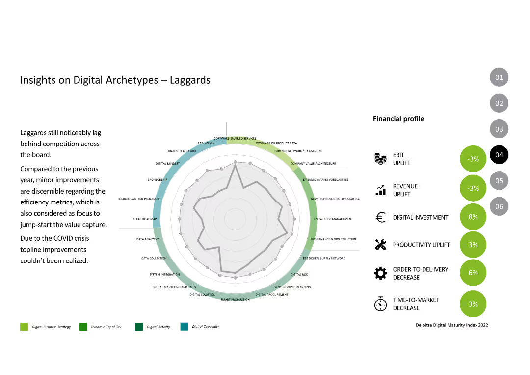
The slide features a radar chart and financial profile metrics like EBIT uplift, revenue uplift, and productivity uplift, similar to previous archetype slides.
Competitive Landscape
Industrial & Manufacturing
This slide discusses the "Laggards" archetype, focusing on their lagging performance compared to competition, highlighting their minor improvements and impact of the COVID crisis.
Digital Archetypes, Laggards, Performance, Digital Capabilities, Financial Metrics
Mixed Chart
Deloitte
Saved
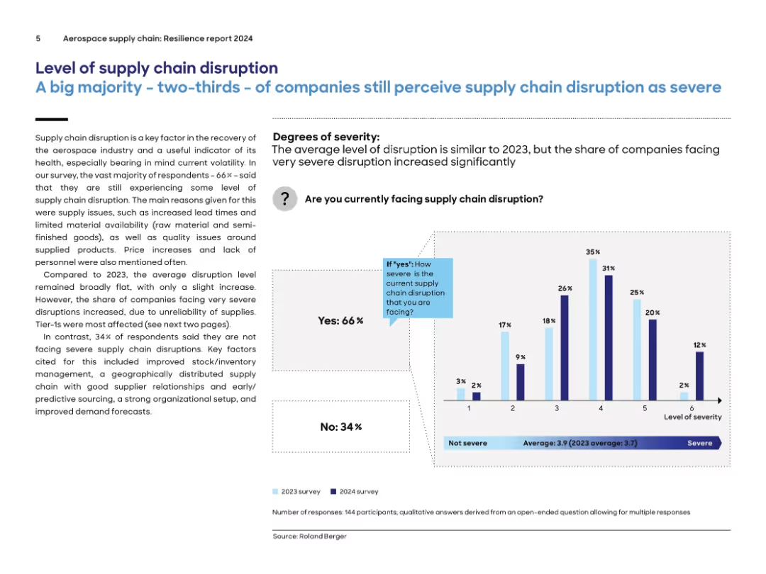
Text on left with explanation and bar chart on right showing severity levels; blue accents used; comparison between 2023 and 2024 survey results.
Risk Assessment and Management
Environmental Services & Sustainability
The slide highlights that 66% of aerospace companies still experience significant supply chain disruptions, with severity remaining similar to 2023. The primary issues include lead times, material availability, and labor shortages. Tier-1 companies are the most affected. A bar graph illustrates disruption severity levels, comparing survey responses from 2023 and 2024.
supply chain, disruption, aerospace, 2024, severity, tier-1, lead times, materials, labor, survey
Mixed Chart
Roland Berger
Saved
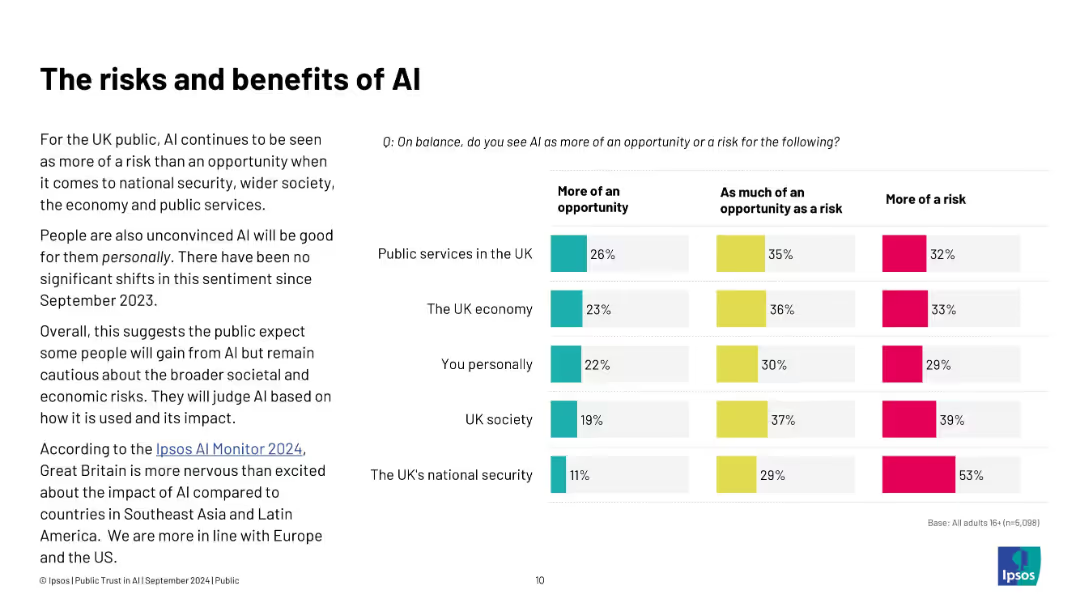
Left: summary of UK perceptions; right: bar chart assessing AI as opportunity or risk across various domains
Risk Assessment and Management
Artificial Intelligence
The slide reflects that AI is viewed more as a risk than an opportunity in areas like national security, public services, and the economy. The sentiment has remained consistent since Sept 2023, revealing cautious public attitudes toward AI’s societal impact.
AI risks, public services, UK sentiment, national security, Ipsos, economy, opportunity, perception
Mixed Chart
IPSOS
Saved
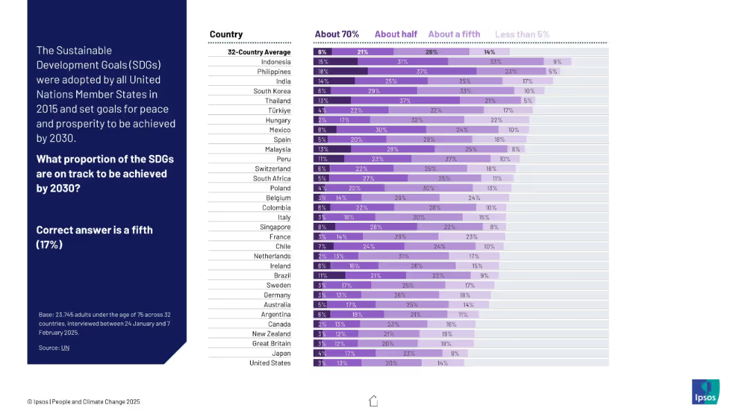
Stacked bar chart using shades of purple to show estimates across countries. Left panel provides correct answer (17%) for reference.
Industry Overview
Government & Public Sector
The chart shows how people estimate progress toward UN Sustainable Development Goals by 2030. Many overestimate; few select the accurate proportion (about one-fifth).
SDGs, sustainable development, UN goals, public awareness, global perception, Ipsos, progress tracking, purple chart, development targets, 2030 goals
Mixed Chart
IPSOS
Saved
Contains multiple line graphs depicting a hypothetical recurrent virus impact on GDP. Colored lines represent different regions.
Market Analysis and Trends
Financial Services
Discusses how a potential virus recurrence could impact GDP in various major economies, useful for strategic economic planning.
GDP, Recurrence, Virus, Economic impact, Planning
Single Chart
McKinsey
Saved
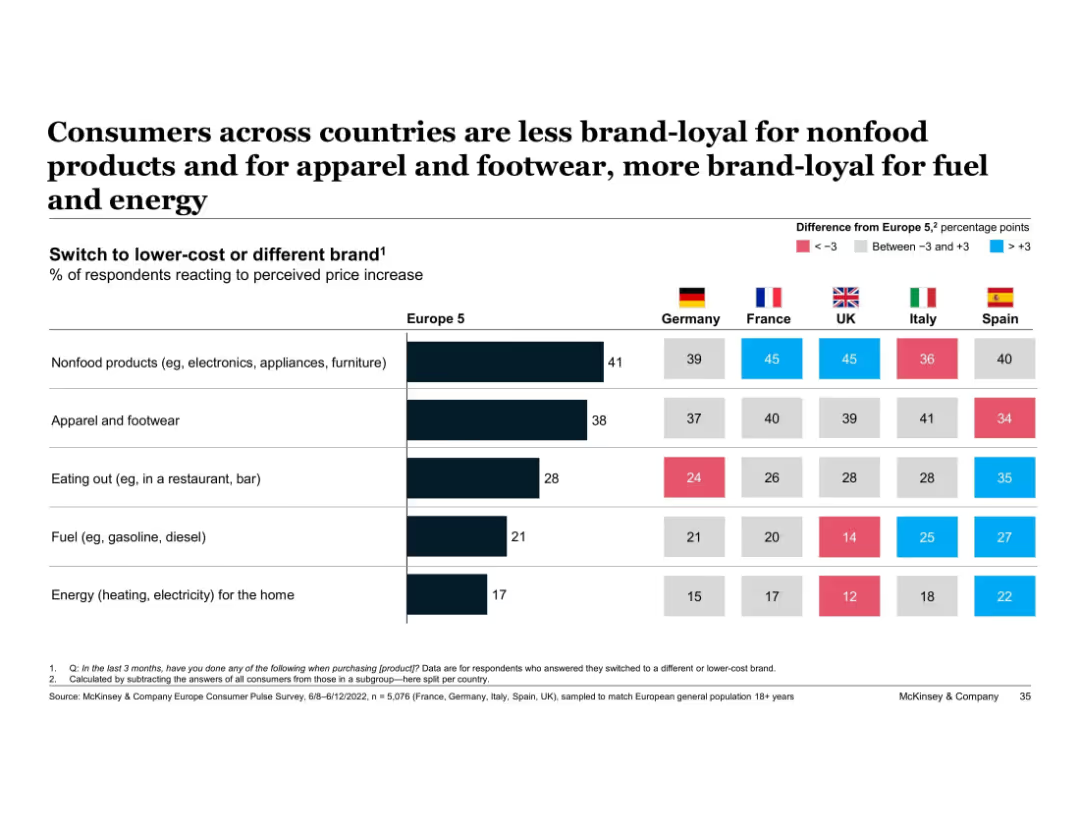
Horizontal bar chart with country-level comparison tables and color-coded difference indicators
Customer and Market Segmentation
Consumer Goods
Compares brand loyalty across five European countries by product category, showing who is more or less likely to switch brands due to price hikes. Differences from average are color-coded.
brand loyalty, price sensitivity, nonfood, energy, apparel, Europe, McKinsey, country comparison, switch behavior
Multiple Chart
McKinsey
Saved
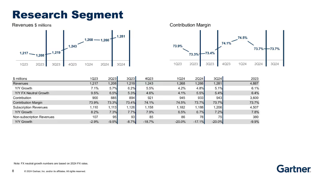
Duplicate of slide 18622 but updated to Q3 2024. Same format with revenue and margin charts and a table below showing updated financial data.
Product and Service Analysis
Technology & Software
Updated financial performance and KPIs for the Research segment. Reflects most recent data to aid in performance tracking and strategic decisions related to subscription and non-subscription services.
research, FX neutral, margin, subscription, financial update
Multiple Chart
Gartner
Saved
Column chart detailing the proportion of fiscal variance attributed to different factors like disasters and engineering, with a deep dive expected on these issues. The layout is clean with a distinct color coding.
Regulatory and Compliance
Government & Public Sector
Examines the causes of fiscal variance in NCDOT's budget, focusing on disasters and management issues. Useful for detailed fiscal analysis and strategy discussions in government finance.
fiscal analysis, disasters, engineering, management, government
Mixed Chart
McKinsey
Saved
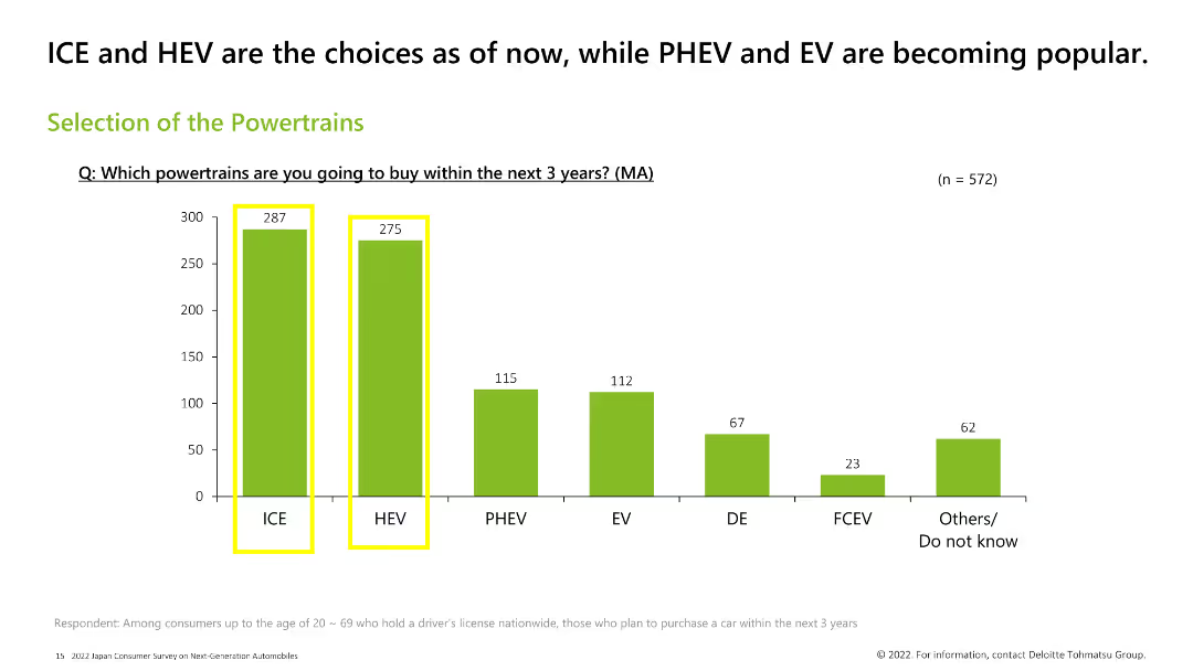
Column chart displaying preferences for different powertrain types among consumers planning to buy a car in the next 3 years. Bars for ICE and HEV are highlighted in yellow, indicating they are the most popular choices.
Market Analysis and Trends
Transportation & Logistics
This slide shows the preferred powertrain types among consumers planning to buy a car in the next 3 years. ICE and HEV are the most popular choices, followed by PHEV, EV, DE, FCEV, and others.
powertrains, ICE, HEV, consumer preference, EV, PHEV
Single Chart
Deloitte
Saved
The slide is populated with multiple bar charts detailing different business outcomes achieved through AI, colored in shades of blue to differentiate levels of achievement. The layout is straightforward and focuses on presenting the outcome data clearly.
Technology and Digital Transformation
Technology & Software
Reviews business outcomes from AI initiatives, with a focus on revenue generation and market expansion. Useful for evaluating the effectiveness of AI strategies and planning future business models in tech-driven industries.
AI outcomes, revenue generation, business models, effectiveness evaluation, tech-driven industries, market expansion
Multiple Chart
Deloitte
Saved
The slide presents bar charts showing historical and projected M&A activity in industrial automation, along with key trends and factors driving this activity.
Mergers and Acquisitions
Industrial & Manufacturing
The slide forecasts increased M&A activity in industrial automation, driven by trends such as digitalization, recurring revenues, and the impact of COVID-19 on investment strategies.
M&A activity, industrial automation, trends, digitalization, COVID-19, investment strategies
Multiple Chart
LEK
Saved
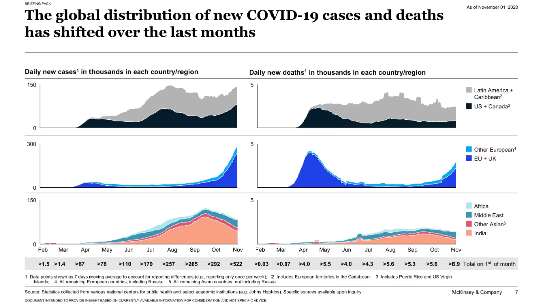
Grid of area graphs showing daily new cases and deaths by region; stacked visuals by geography; minimalistic dark background.
Risk Assessment and Management
Healthcare & Pharmaceuticals
This slide uses visual graphs to show how COVID-19 cases and deaths have evolved over months by region. It highlights a shift in the pandemic’s epicenter over time across continents.
COVID-19, cases, deaths, timeline, regional, global trends, healthcare, McKinsey
Single Chart
McKinsey
Saved
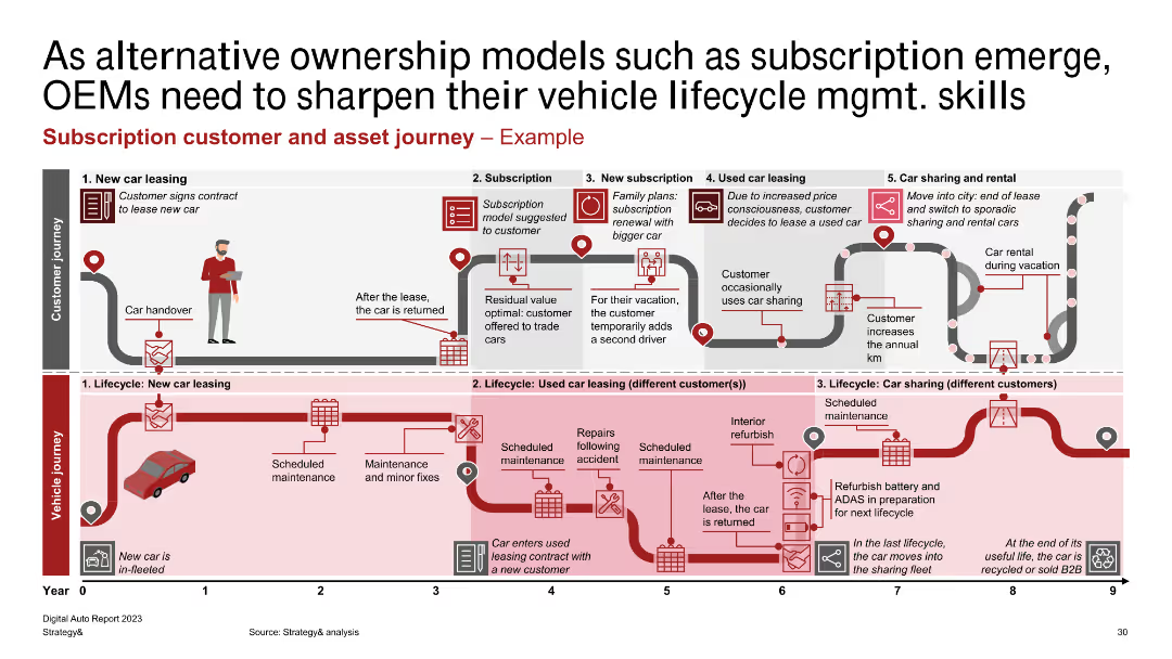
A detailed process flow diagram showing customer and vehicle journey stages for subscription-based ownership models.
Customer and Market Segmentation
Transportation & Logistics
Depicts the stages of customer and vehicle journeys in subscription models, from new car leasing to car sharing and rental, highlighting key activities and touchpoints.
subscription, customer journey, asset management, vehicle journey
Linear Flow
PwC/Strategy&
Saved
Slide presents a pie chart and bar charts detailing the methodology of a survey on C-level executives' attitudes towards climate action, with key statistics highlighted.
Industry Overview
Environmental Services & Sustainability
Describes the methodology of a comprehensive survey targeting C-level executives regarding climate action, detailing the demographic and job title distribution of respondents.
Survey Methodology, Climate Action, C-Level Executives, Demographics, Job Titles, Statistical Analysis
Multiple Chart
Deloitte
Saved
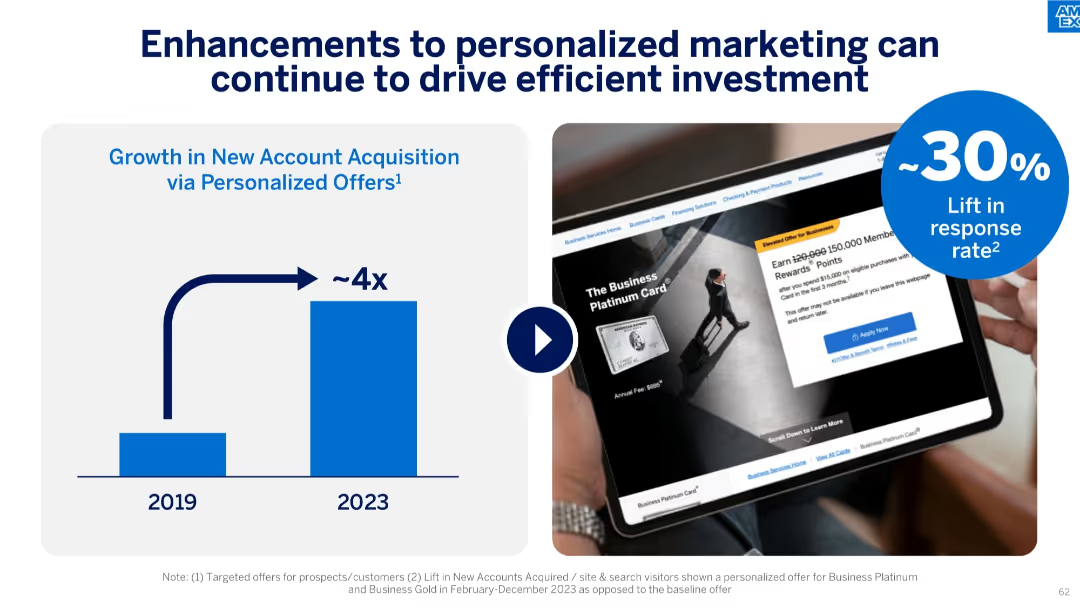
Split into two halves: left has a vertical bar chart (2019 vs 2023), right shows a tablet ad mockup and a 30% lift icon.
Investment Analysis
Financial Services
The slide demonstrates how personalized marketing efforts have significantly improved new account acquisition (~4x growth) and lifted response rates by ~30%. It showcases data from 2019 to 2023, emphasizing the value of targeted digital offers.
personalized marketing, account acquisition, response rate, ROI, 2023, digital offers, ad performance, efficiency, marketing growth, customer targeting
Mixed Chart
McKinsey
Saved
Slide divided into three sections with bullet points, headers, and check/cross icons representing evaluation of strategic choices.
Strategic Planning
Financial Services
Focuses on investors' evolving criteria, stressing sustainability, essential services, and growth sectors.
investors, selectivity, sustainability, essential services, technology, growth
Header Vertical
Bain
Saved
This slide is divided into three sections with bullet points summarizing Macquarie’s commitments to environmental, social, and governance aspects. It uses a combination of icons and text, with a consistent color palette and an organized layout that facilitates ease of reading and comprehension.
Regulatory and Compliance
Financial Services
It details Macquarie's dedication to ESG principles and highlights actions and goals in these areas. The slide is used to communicate to stakeholders about Macquarie’s initiatives and commitment to sustainability, social responsibility, and ethical governance practices.
ESG, Macquarie, environmental, social, governance, sustainability, corporate responsibility, ethical practices, commitment
Pillar
Morgan Stanley
Saved
Blue and white color scheme with multiple graphics. There's a flowchart at the top, three outlined boxes below indicating rankings (#1 Primary bank market share, #2 SMB credit card spend, #1 Payment provider), and logos for VISA and Chase.
Market Analysis and Trends
Financial Services
The slide communicates Chase's market position and services offered to SMBs, highlighting key rankings in primary bank market share and SMB credit card spend.
Banking, SMBs, Chase, Market Share, Credit Card, Payment Provider, Rankings, Services, Business
Linear Flow
JP Morgan
Saved
This slide features a column chart with vertical bars representing FL CET1 erosion under adverse scenarios, labeled with numerical values. There are dotted lines indicating peer and system averages, with a mix of icons representing different countries. The slide has a header with the Santander logo, a slide number, and the word 'Strength' in the top right corner. It employs a color scheme of light and dark blue tones.
Financial Performance
Financial Services
The slide displays the bank's resilience in adverse conditions by comparing the CET1 capital erosion against peers, indicating Santander's position as the strongest bank. It would be used in presentations to show financial stability and strength to stakeholders such as investors or analysts.
Santander, EBA Stress Test, Financial Resilience, Adverse Scenarios, European Banking, Capital Erosion, Peer Comparison, Strength, Financial Stability
Single Chart
Morgan Stanley
Saved
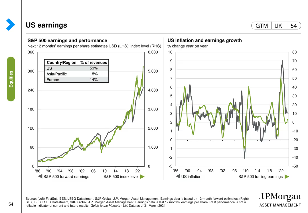
The slide includes two visual elements: the left chart shows S&P 500 earnings and performance, and the right chart shows US inflation and earnings growth over time.
Financial Performance
Financial Services
The slide analyzes US earnings by tracking the S&P 500 earnings performance and correlating it with inflation and earnings growth trends.
S&P 500, earnings, performance, inflation, growth, US economy, financial performance
Multiple Chart
JP Morgan
Saved
Slide shows a line chart analyzing the perspectives on talent retention within I&D frameworks, comparing U.S. and global views with demographic detail.
Strategic Planning
Professional Services
Discusses opinions from U.S. non-minority women on improving I&D efforts in talent retention.
talent retention, I&D, U.S., non-minority women, line chart, global comparison, improvement opportunities
Mixed Chart
Accenture
Saved
The slide includes a column chart depicting the percentage of people receiving various types of help, comparing data from May and December. Text boxes highlight key percentages.
Client Case Studies
Healthcare & Pharmaceuticals
This slide presents data on the types of help received by people in the last month, comparing survey results from May and December, with a focus on the percentage of people receiving different types of help.
help, survey, received, comparison, types of help, column chart, healthcare, public opinion, time periods
Single Chart
IPSOS
Saved
The slide includes column charts showing the budget outlook for medium-size and large-size public hospitals over the last three years, current year, and next three years.
Financial Performance
Healthcare & Pharmaceuticals
This slide details the budget outlook for public hospitals in APAC, comparing medium-size and large-size facilities. It highlights budget deficit and surplus trends over a three-year period.
public, hospitals, budget, outlook, financial
Multiple Chart
LEK
Saved
Previous
Next
If nothing, comes up, please save your slides first
Create a FREE account to continue browsing
Receive Instant Access to 1,000+ slides from companies like McKinsey, Google, and Goldman Sachs
First Name
Last Name
Email
Password
I agree to all
Terms & Privacy Policy
Thank you! Your submission has been received!
Oops! Something went wrong while submitting the form.
Have an account?
Sign in
Column Chart
Heatmap
Chevron
Org Chart
Infographic
Callouts
Timeline
List
Graphic
Picture
Process Flow
Diagram
Paragraph
Map
Table
Framework
Subtitle
Takeaway Box
Icon
Other Chart
Radar Chart
Waterfall Chart
Mekko Chart
Pie Chart
Scatter Plot
Line Chart
Bar chart
Bullet points