Create a FREE Account
Instant access to 1,000+ real slides from top companies like McKinsey, BCG, Goldman Sachs, Google and many more!
First Name
Last Name
Email
Password
I agree to all
Terms & Privacy Policy
Thank you! Your submission has been received!
Oops! Something went wrong while submitting the form.
Have an account?
Sign in
Library
Templates
Courses
Pricing
My Account
My Slides
My Templates
✦ AI
AI Prompt Library
AI Search
Sign in
Start Here
Logout
My Saved Slides
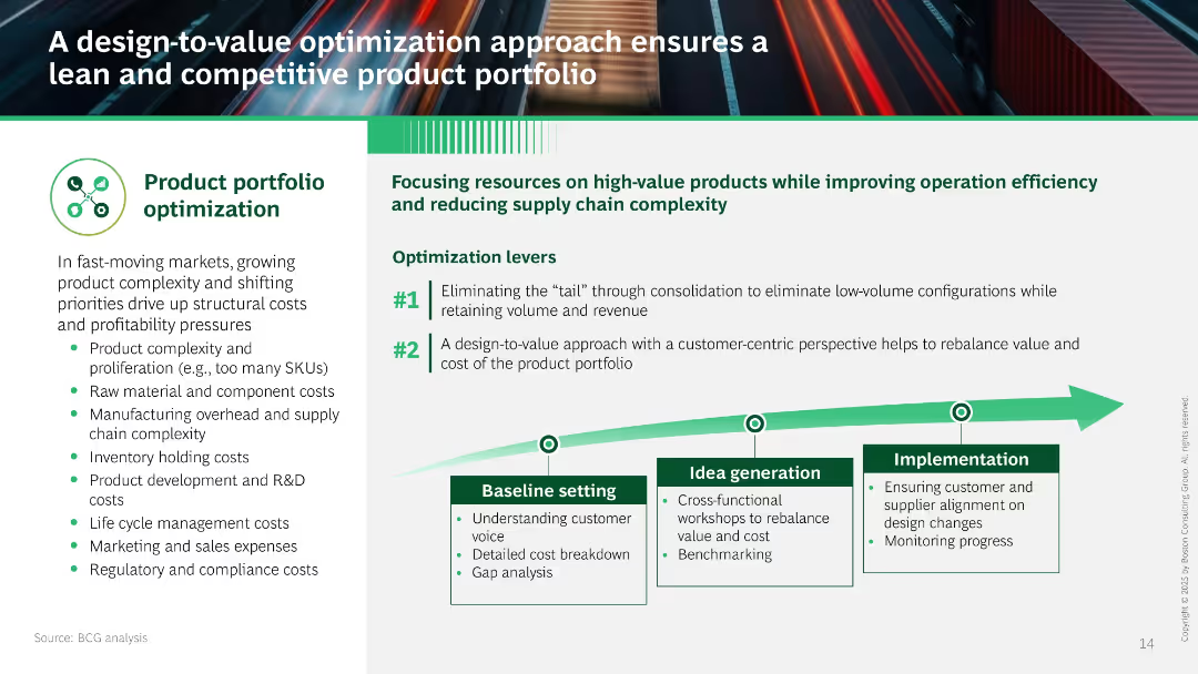
Left panel lists cost pressures; right focuses on two optimization levers with a process graphic (baseline setting to implementation). Dominated by green/white tones.
Product and Service Analysis
Consumer Goods
Describes a design-to-value strategy that reduces complexity and costs by focusing on high-value products. Emphasizes consolidating SKUs and aligning design with customer value through structured implementation stages.
product portfolio, cost reduction, design-to-value, SKU consolidation, customer-centric, complexity, efficiency
Linear Flow
BCG
Saved
The slide includes two vertical bar charts showing where businesses receive information about Greece's attractiveness, along with a donut chart displaying investment intentions.
Market Analysis and Trends
Government & Public Sector
Shows survey results on where businesses get information about Greece and their willingness to invest if certain issues are addressed.
Information sources, investment, Greece, survey results, attractiveness
Multiple Chart
EY
Saved
Graphs depicting U.S. Treasury yield curves with a comparative view of 1-month ago and 12-month ago yields.
Investment Analysis
Financial Services
This slide offers insight into the U.S. Treasury market by showcasing yield curves and comparing past and present data points.
U.S. Treasury, yield curves, market insight, comparison, financial
Mixed Chart
Morgan Stanley
Saved
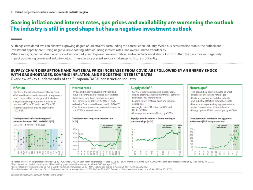
Multi-panel layout with four boxes (Inflation, Interest Rates, Supply Chain, Natural Gas) and relevant line/bar charts; headline in bold green/blue
Risk Assessment and Management
Real Estate & Construction
This slide outlines macroeconomic factors negatively affecting construction: inflation, interest rates, energy supply issues, and supply chain disruptions. It uses data from 2021–2022 to visualize recent shocks and their impact on the industry.
inflation, energy crisis, interest rates, supply chain, construction outlook, Europe, DACH
Multiple Chart
Roland Berger
Saved
Slide with multiple line graphs on a white background, comparing the projected demand and mine supply of nickel, lithium, and cobalt up to 2032.
Market Analysis and Trends
Industrial & Manufacturing
Analyzes the future trends in the mining of essential minerals for battery production, highlighting potential shortages and growth in demand. The focus shifts to nickel due to its significant role in battery technology.
mining, minerals, battery, nickel, lithium, cobalt
Multiple Chart
McKinsey
Saved
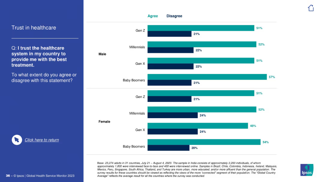
Same visual layout as previous: question and text on left, horizontal bar chart on right categorized by gender and generation.
Risk Assessment and Management
Healthcare & Pharmaceuticals
This slide explores trust in the healthcare system to provide the best treatment, comparing agreement and disagreement percentages across gender and generations. Baby Boomers show highest trust levels overall.
trust, healthcare, treatment, survey, gender, generations, perceptions, Ipsos, agreement, confidence
Mixed Chart
IPSOS
Saved
A comparative column chart showing regional differences in EV ownership metrics such as income, age, gender, and living conditions across APAC, EMEA, and North America.
Market Analysis and Trends
Transportation & Logistics
Highlights the varying demographics and characteristics of EV owners in different regions, indicating different stages of EV adoption maturity.
EV owners, regional differences, income, demographics, survey
Multiple Chart
PwC/Strategy&
Saved
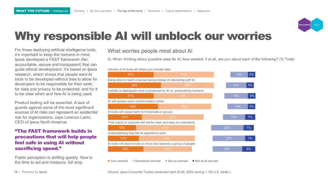
Left panel text; right panel horizontal bar chart indicating worry levels; categories use color-coded segments.
Risk Assessment and Management
Artificial Intelligence
Lists top public concerns regarding AI (e.g., privacy, bias, misinformation). Visual data shows levels of worry using segmented bar charts to represent varying degrees of concern from "Very worried" to "Not worried". Tied to Ipsos' FAST (fair, accountable, secure, transparent) framework.
AI ethics, public concerns, privacy, misinformation, bias, accountability, FAST framework
Mixed Chart
IPSOS
Saved
Graphs and charts illustrating payment fee revenues and sales volume growth, juxtaposed with sector-specific data. The color scheme is blue, green, and gray.
Operational Efficiency
Financial Services
Examines the resurgence in payment processing sectors, underlining the economic recovery's impact on sales volumes. It's for evaluating operational performance in the payment services domain.
Payment Fees, Revenue, Growth, Sales
Multiple Chart
Goldman Sachs
Saved
The slide employs a donut chart and a simple table to depict the distribution of commercial real estate loans. It is complemented by a blue and gray color scheme that adds visual clarity to the categorical distribution.
Market Analysis and Trends
Real Estate & Construction
Specialized for real estate professionals and investors, the slide analyzes commercial real estate loan distributions and investment grades, facilitating discussions on portfolio risk and investment opportunities within the commercial real estate sector.
commercial real estate, loans, investment grade, real estate distribution, portfolio risk
Mixed Chart
Goldman Sachs
Saved
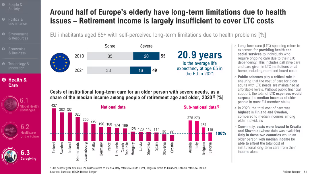
Split layout with bar chart, EU flag, bold heading, infographic on costs, and detailed bullet points on the right; prominent magenta vertical sidebar
Market Analysis and Trends
Healthcare & Pharmaceuticals
This slide highlights the financial challenges of long-term care (LTC) for Europe’s elderly, showing that LTC costs can exceed median retirement incomes in many EU countries. It includes statistics on elderly limitations due to health issues and life expectancy, and emphasizes the critical role of public support in managing LTC affordability.
Long-term care, aging population, Europe, healthcare costs, public schemes, life expectancy, EU, retirement income, health limitations, LTC dependency
Multiple Chart
Roland Berger
Saved
Contains a column chart comparing the importance of future food priorities to businesses and the applications companies are working on, such as plant-based proteins and conservation.
Strategic Planning
Agriculture & Food Production
Explores corporate strategies towards future food trends, revealing that most companies prioritize sustainable practices but recognize a need for capabilities improvement. It also highlights areas like conservation and plant-based innovations.
future food trends, sustainability, corporate strategies, priorities
Mixed Chart
Deloitte
Saved
The slide contains two column charts. The left chart shows the top countries for universities with QT research programs, and the right chart shows the number of universities offering QT master’s degrees per country.
Human Resources and Talent Management
Education & Training
This slide provides data on the growth of quantum technology education, indicating a significant increase in the number of universities offering QT master's degrees. It highlights the leading countries in QT research and education.
Universities, QT, Master's Degrees, Research, Education
Multiple Chart
McKinsey
Saved
Features a bar chart comparing cumulative advisory revenues and text sections summarizing M&A leadership and achievements. The design is straightforward, with blue tones and well-organized information.
Competitive Landscape
Financial Services
It outlines Goldman Sachs' dominance in financial advisory, comparing cumulative revenues and highlighting achievements in M&A, suitable for showcasing the firm’s advisory capabilities to investors or during corporate strategy meetings.
Financial advisory, M&A, revenue, market leadership, Goldman Sachs
Mixed Chart
Goldman Sachs
Saved
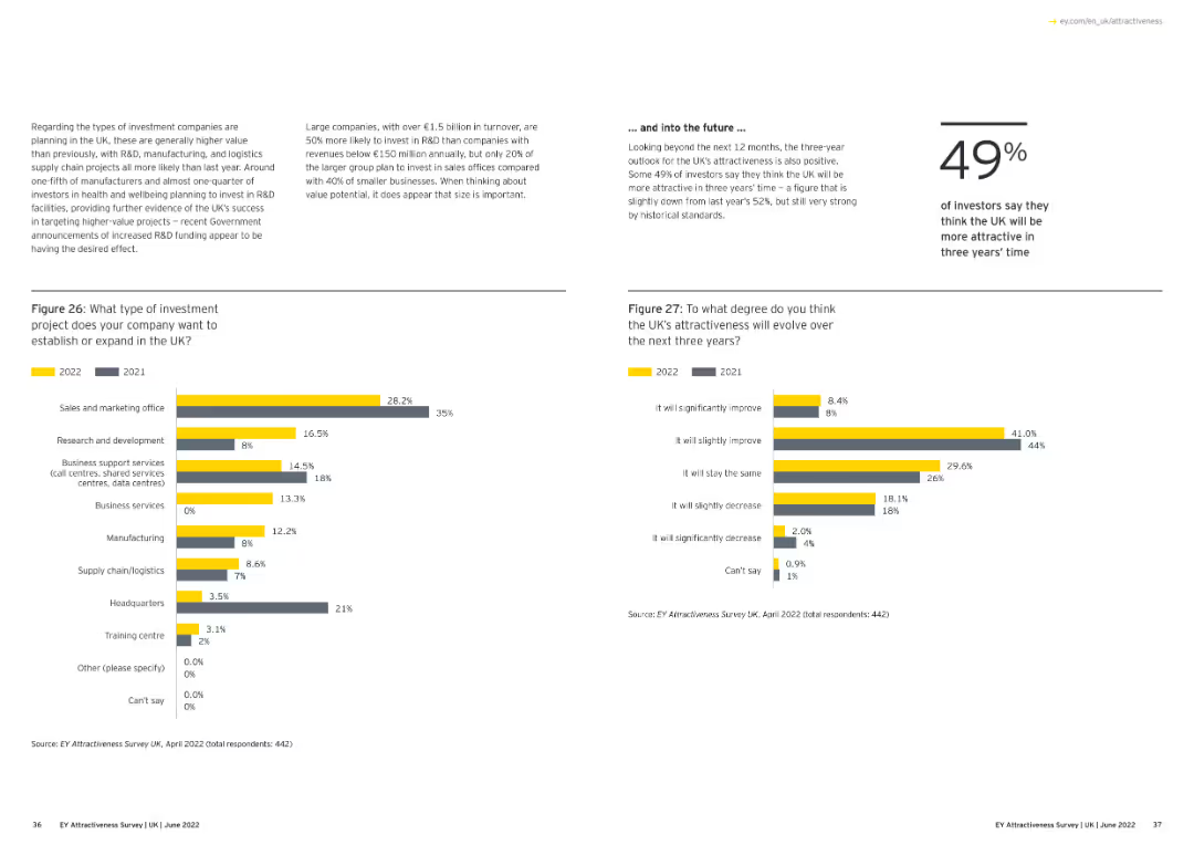
The slide features a combination of column charts and text blocks. On the left, a column chart shows investment project types in 2022 and 2021, with different colored bars. On the right, another column chart shows the projected attractiveness of the UK over three years.
Market Analysis and Trends
Financial Services
This slide shows survey data on the types of investment projects companies plan to establish or expand in the UK and their views on the UK's attractiveness over the next three years.
Investment projects, UK attractiveness, column charts, financial services, market analysis
Multiple Chart
EY
Saved
Features column chart with blue and grey colors illustrating derivatives and financial impacts. Clear layout with key points.
Risk Assessment and Management
Financial Services
Evaluates the impacts of netting and collateral on derivatives for risk reduction in financial reporting.
Derivatives, IFRS, financial risk, collateral, netting, financial reporting, asset management
Mixed Chart
Deutsche Bank
Saved
Three column charts, showing projected use of coal, oil, and gas from 2015 to 2050 under different climate policy scenarios.
Market Analysis and Trends
Energy & Utilities
Analysis of future fossil fuel usage under various global warming scenarios, highlighting potential declines or growth in coal, oil, and gas usage depending on environmental policies.
fossil fuels, coal, oil, gas, climate policies
Multiple Chart
BCG
Saved
The slide presents a column chart showing the number of employees involved in using/building DCRs, with categories ranging from none to 11+ employees, along with a quote from a C-suite executive.
Technology and Digital Transformation
Technology & Software
The slide emphasizes the need for significant human talent to manage and operate data clean rooms (DCRs), highlighting the various roles and expertise required for effective implementation.
DCR investment, human talent, privacy, data engineers
Mixed Chart
IPSOS
Saved
The slide uses two side-by-side graphs: one for Brent price forecasts and the other for WTI. Each graph compares bank/broker and consultant price estimates, using different shades of yellow for distinction. Text details the forecast ranges.
Market Analysis and Trends
Energy & Utilities
This slide provides forecasts for Brent and WTI oil prices, comparing the estimates of banks, brokers, and consultants. It discusses the factors influencing these estimates and the projected average prices for 2026.
Brent, WTI, oil price forecasts, bank/broker, consultants
Multiple Chart
EY
Saved
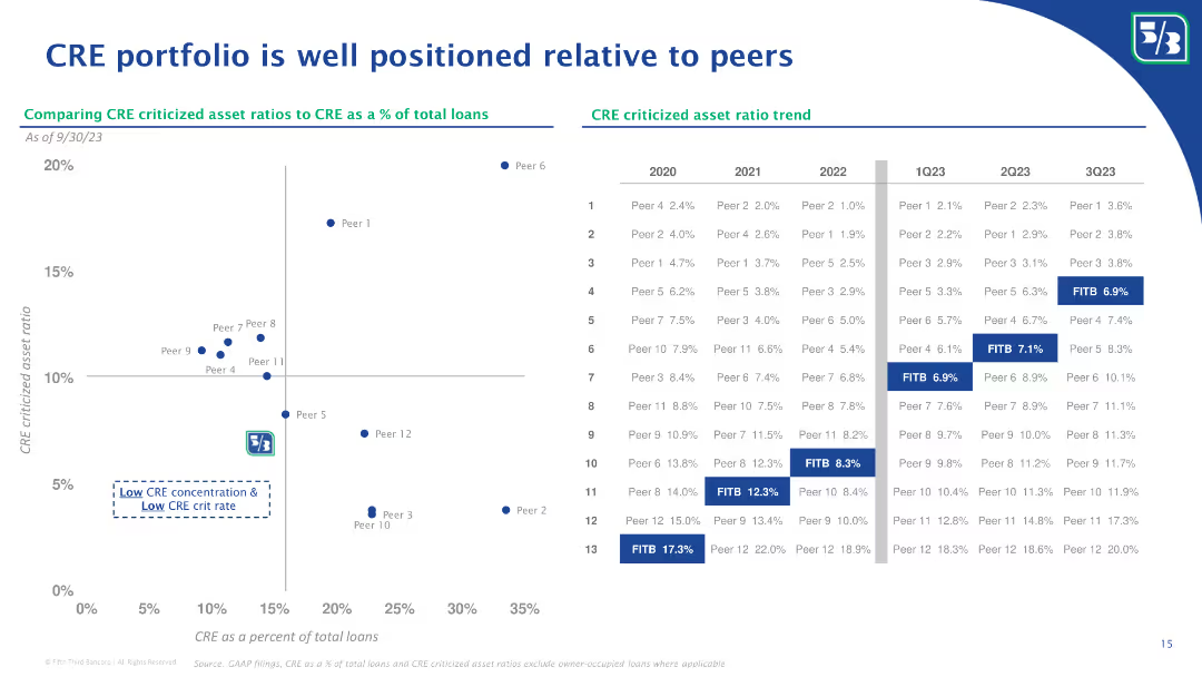
A scatter plot chart comparing CRE criticized asset ratios to CRE as a percentage of total loans. Includes a table detailing asset ratios over time.
Market Analysis and Trends
Real Estate & Construction
The slide compares the criticized asset ratios of CRE portfolios relative to peers, showing trends over several quarters.
CRE, criticized asset ratio, peer comparison, scatter plot, market analysis, asset ratio trend, real estate
Mixed Chart
Goldman Sachs
Saved
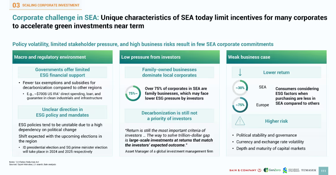
Three-column layout with colored headers categorizing issues into macro/regulatory, investor pressure, and business case, using icons, percentages, and text boxes
Strategic Planning
Environmental Services & Sustainability
Highlights the structural barriers to accelerating green investment in Southeast Asia (SEA), including limited government ESG support, low investor pressure (particularly in family-owned businesses), and weak business cases due to low consumer ESG awareness and high risks
ESG, SEA, investor pressure, policy risk, low return, sustainability barriers, green investment, governance
Mixed Chart
Bain
Saved
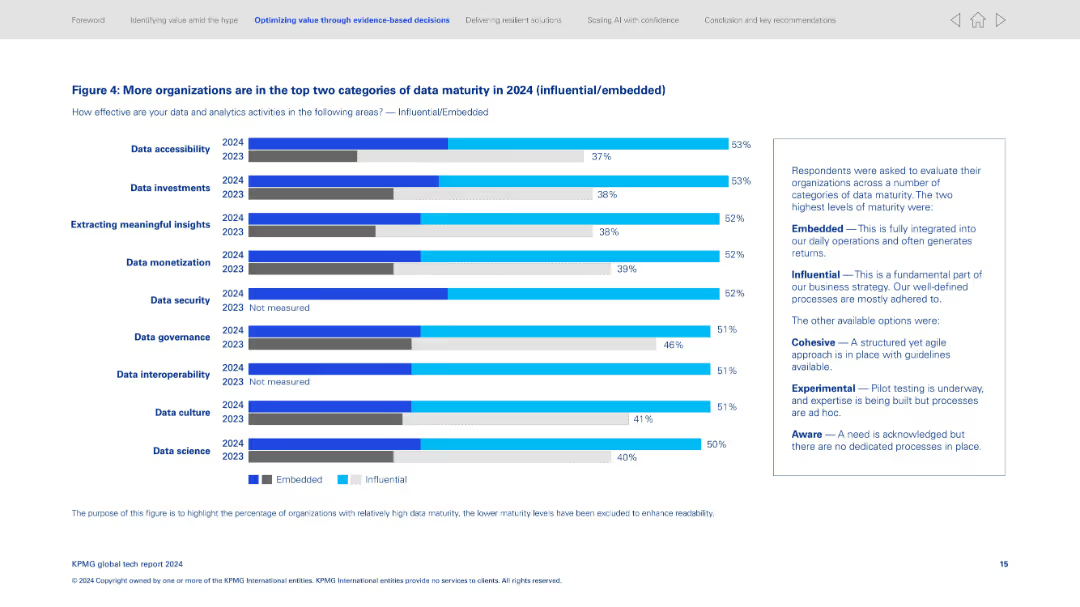
Bar chart-heavy slide; shows comparison between 2023 and 2024 across various data-related categories; explanation box on the right.
Performance Metrics and KPIs
Technology & Software
Demonstrates the rise in data maturity with more organizations achieving influential or embedded levels. Lists categories like data accessibility, investments, and insights. Accompanying text defines the maturity categories and contextualizes improvements.
Data maturity, embedded systems, influential processes, data governance, analytics improvement, benchmarks, comparison chart, data evaluation
Mixed Chart
KPMG
Saved
This slide uses a timeline format to detail significant events in Tyson's sustainability efforts, marked by circular nodes. The visual arrangement is clear and orderly, using colors to differentiate dates and events, which enhances readability.
Regulatory and Compliance
Environmental Services & Sustainability
Outlines key milestones in Tyson's sustainability journey, including appointments, program rollouts, and strategic partnerships. This slide is likely aimed at stakeholders interested in corporate responsibility, providing a concise overview of Tyson's commitment to environmental and social initiatives.
Sustainability, Tyson, Corporate Responsibility, Milestones, Timeline
Linear Flow
Barclays
Saved
Shows a scatter plot diagrams and timelines illustrating the potential increase in emissions coverage with new tax credits.
Regulatory and Compliance
Environmental Services & Sustainability
Explores the impact of increased tax credits on emissions reductions across sectors, valuable for environmental policy making.
tax credits, emissions reductions, environmental policy, sustainability, sector analysis, climate change
Multiple Chart
BCG
Saved
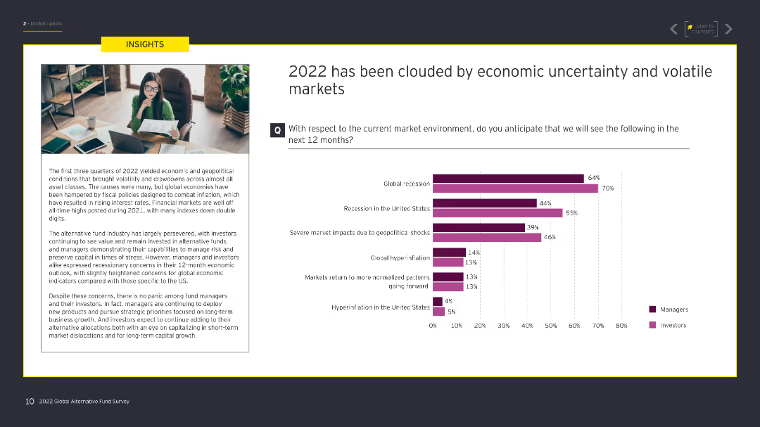
The slide contains a text box on the left detailing economic conditions, and on the right, a column chart with data comparing managers' and investors' expectations for various economic scenarios.
Risk Assessment and Management
Financial Services
This slide discusses the economic uncertainty and volatility in 2022, including expectations for recession, geopolitical shocks, and market normalization, segmented by managers and investors.
economic uncertainty, volatility, recession, market, managers, investors
Mixed Chart
EY
Saved
Previous
Next
If nothing, comes up, please save your slides first
Create a FREE account to continue browsing
Receive Instant Access to 1,000+ slides from companies like McKinsey, Google, and Goldman Sachs
First Name
Last Name
Email
Password
I agree to all
Terms & Privacy Policy
Thank you! Your submission has been received!
Oops! Something went wrong while submitting the form.
Have an account?
Sign in
Column Chart
Heatmap
Chevron
Org Chart
Infographic
Callouts
Timeline
List
Graphic
Picture
Process Flow
Diagram
Paragraph
Map
Table
Framework
Subtitle
Takeaway Box
Icon
Other Chart
Radar Chart
Waterfall Chart
Mekko Chart
Pie Chart
Scatter Plot
Line Chart
Bar chart
Bullet points