Create a FREE Account
Instant access to 1,000+ real slides from top companies like McKinsey, BCG, Goldman Sachs, Google and many more!
First Name
Last Name
Email
Password
I agree to all
Terms & Privacy Policy
Thank you! Your submission has been received!
Oops! Something went wrong while submitting the form.
Have an account?
Sign in
Library
Templates
Courses
Pricing
My Account
My Slides
My Templates
✦ AI
AI Prompt Library
AI Search
Sign in
Start Here
Logout
My Saved Slides
A column chart compares avoided CO2 emissions and abatement costs versus coal turbines for various grid utilizations (wind, solar, grid wind, grid solar) by 2030.
Market Analysis and Trends
Energy & Utilities
The slide evaluates the CO2 emissions reduction potential and costs of converting coal turbines to P2P systems coupled with renewable energy sources.
CO2 emissions, abatement cost, coal, turbines, P2P, renewable, grid, wind, solar
Multiple Chart
Kearney
Saved
Contains a bar chart comparing ownership rates of various smart entertainment and smart home devices over two years.
Market Analysis and Trends
Telecommunications
Analyzes consumer engagement with smart home and entertainment devices, showing growth and preferences over time.
smart home, smart entertainment, device adoption, consumer trends, technology growth
Single Chart
Deloitte
Saved
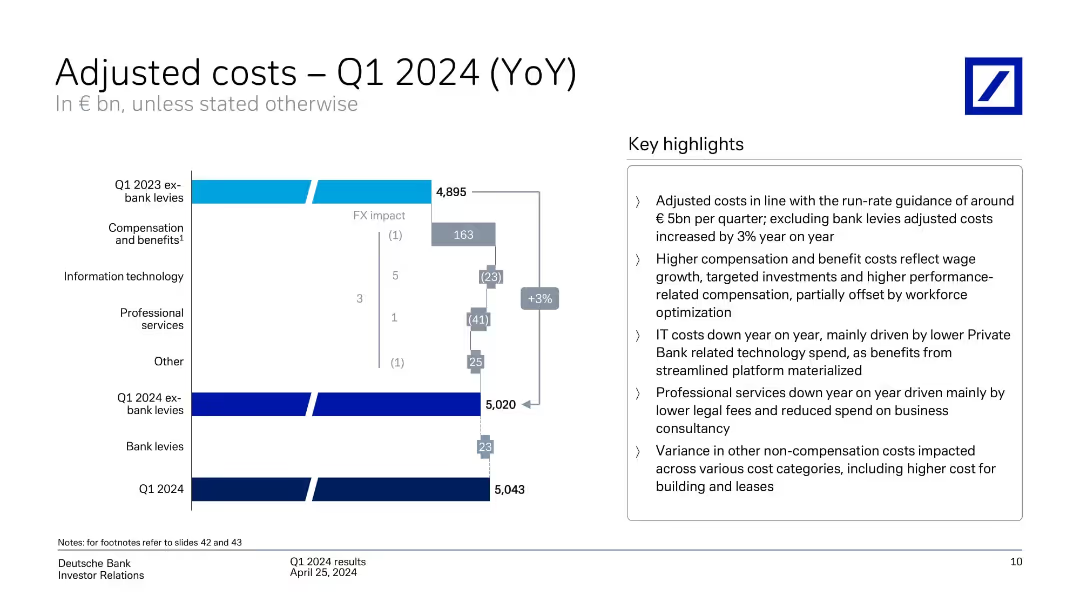
Waterfall chart comparing YoY cost components with annotations and summary text. Highlights major cost drivers and FX effects.
Performance Metrics and KPIs
Financial Services
Breaks down cost evolution from Q1 2023 to Q1 2024. Despite 3% YoY increase in adjusted costs (excluding bank levies), overall expenses remain aligned with guidance. Identifies compensation, IT, and professional service trends impacting cost structure.
adjusted costs, YoY, compensation, IT, cost drivers, bank levies
Mixed Chart
Deutsche Bank
Saved
The slide shows three different growth trajectory graphs, each with a distinct shape (S-shaped, Trendline, and U-shaped), and is accompanied by descriptive text. The design uses grey tones with blue highlights. It's cleanly structured, presenting the information in an easily digestible format.
Strategic Planning
Technology & Software
This slide illustrates the post-pandemic growth trajectories of SEA's digital sectors, which can inform strategic decisions. It differentiates between sustained growth, a return to trendline, and U-shaped recovery, offering a nuanced view of market dynamics that can guide investment and operational planning.
growth trajectories, digital sectors, SEA, post-pandemic, strategic planning, market dynamics, recovery
Multiple Chart
Bain
Saved
This slide includes comparative lists and block diagrams detailing the benefits of onsite and remote work, as well as levers for successful smart work like office space usage and policies. It features a green and gray color scheme and includes a pie chart for visual data representation.
Operational Efficiency
Professional Services
Discusses benefits of onsite versus remote work including cost savings, safety, productivity, and effectiveness with examples from an insurance company. Explores strategies to make smart work effective using various levers like technology infrastructure.
Smart work, Remote work, Onsite benefits, Productivity, Cost savings
Header Vertical
BCG
Saved
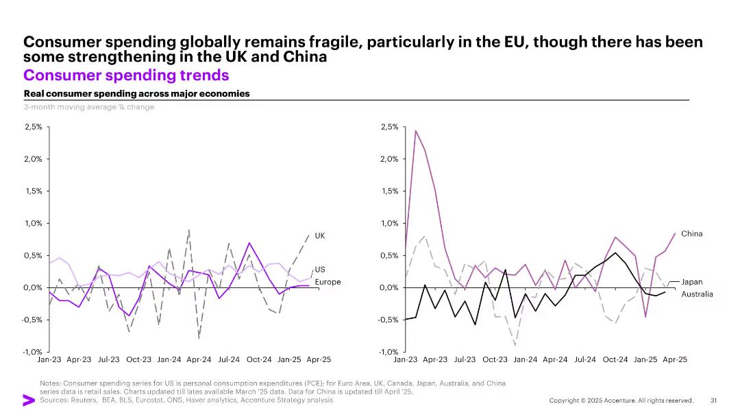
Dual line graphs showing real consumer spending trends for major economies, segmented into Western (left) and APAC (right) regions.
Market Analysis and Trends
Consumer Goods
Real consumer spending trends show fragility in the EU and US, with some rebound in the UK and China. The graphs track 3-month moving average % changes across countries like UK, US, China, and others from Jan 2023 to Apr 2025.
consumer spending, global trends, UK, China, US, retail, APAC, EU, fragility, economic activity
Multiple Chart
Accenture
Saved
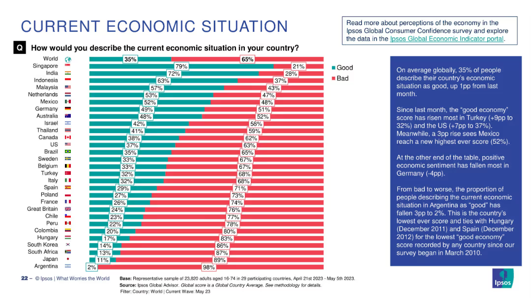
Stacked horizontal bar chart showing “Good” vs “Bad” economic sentiment per country; global average is shown first.
Strategic Planning
Financial Services
The chart compares perceptions of national economic situations. Singapore leads in positive sentiment (79%), while Argentina is lowest (2%). The red-green contrast highlights optimism vs pessimism. Commentary calls out notable shifts in Mexico (+3pp) and Germany (-4pp).
economy, public sentiment, Ipsos, global survey, good vs bad, economic perception, strategic insight, Argentina, Mexico
Single Chart
IPSOS
Saved
Slide contains column charts, text, and bullet points with a clear visual hierarchy in blue, gray, and white colors. It's data-rich and detailed.
Operational Efficiency
Financial Services
This slide covers financial results and net revenue in consumer and wealth management, useful for operational reviews and financial analysis.
Consumer, Wealth, Management, Financial, Results, Net Revenue, Operational, Review, Analysis, Efficiency
Mixed Chart
Goldman Sachs
Saved
Includes a pie chart and a sectioned content layout with headers and bullet points. Text sections cover key findings and broad overviews.
Operational Efficiency
Financial Services
This slide outlines the limited involvement of tax functions in ERP and software deployment within companies. It details the survey percentages and discusses the necessity for greater integration of tax operations into ERP systems.
tax, ERP, software, deployment, involvement, financial services, pie chart
Mixed Chart
PwC/Strategy&
Saved
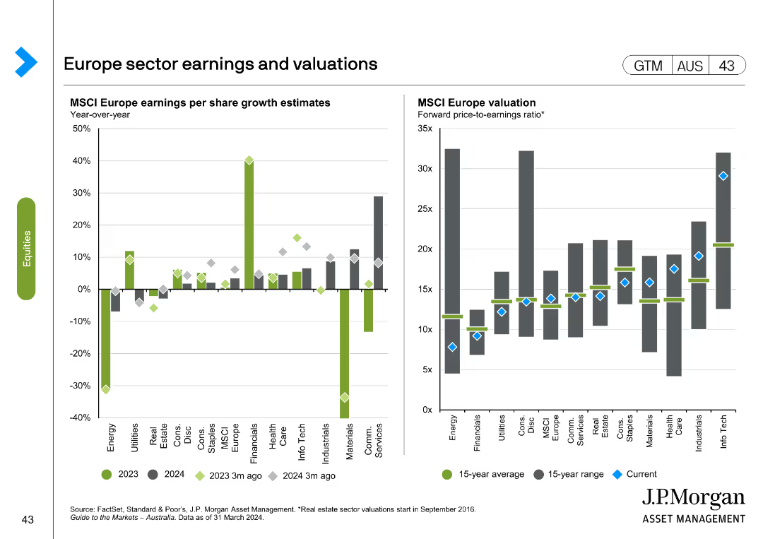
The slide includes two charts: a column chart on MSCI Europe earnings per share growth estimates, and a line chart on MSCI Europe valuation forward price-to-earnings ratio.
Financial Performance
Financial Services
Analyzes sector earnings and valuations in Europe, focusing on MSCI Europe growth estimates and P/E ratios, useful for financial performance analysis.
Europe, sector earnings, valuations, MSCI Europe, growth estimates
Multiple Chart
JP Morgan
Saved
Slide includes three column charts showing the financial models for school coverage, titled by different government and commercial involvement scenarios. Colors used: blue, green, and red.
Market Analysis and Trends
Education & Training
The slide analyzes three funding models for schools in Java, Bali, and Sumatra, comparing costs, reductions, and gaps in funding, highlighting government involvement's necessity.
financial models, school funding, government involvement, Java, Bali, Sumatra, cost analysis, revenue sharing, subsidy, budget gap
Multiple Chart
BCG
Saved
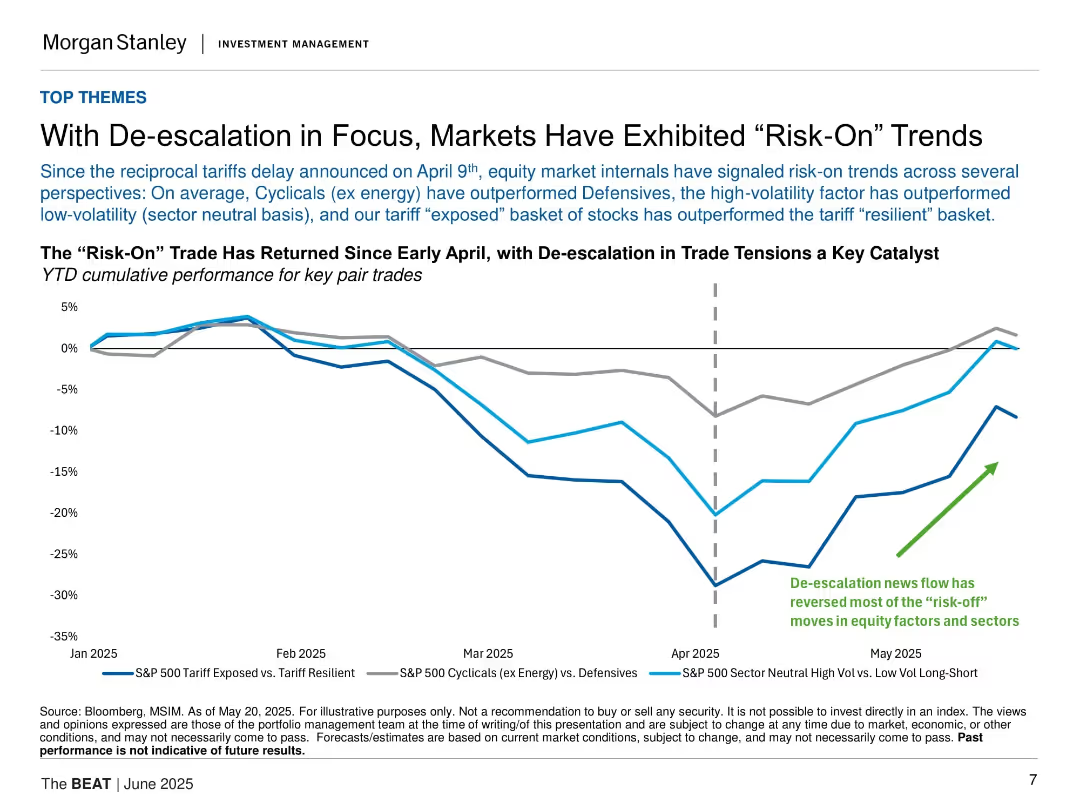
Line chart tracking three equity pair trade performances YTD; annotated with vertical line for April tariff delay; includes labeled color-coded lines.
Market Analysis and Trends
Financial Services
Shows return of “risk-on” market behavior following April tariff de-escalation. Cyclicals, high-volatility, and tariff-exposed equities outperformed their defensive or resilient counterparts. Suggests sentiment shift linked to improved trade outlook.
risk-on, equities, tariffs, market trends, volatility
Single Chart
Morgan Stanley
Saved
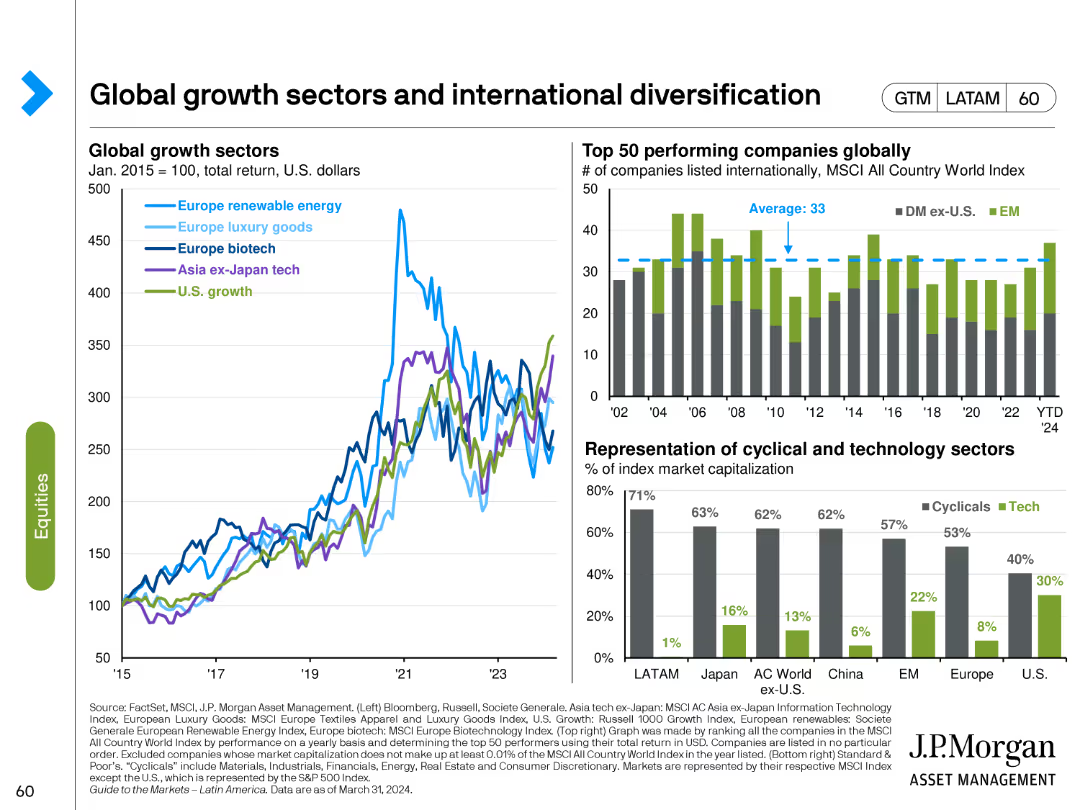
The slide includes a line chart comparing global growth sectors and a bar chart showing the top 50 performing companies globally. Another bar chart depicts the representation of cyclical and technology sectors.
Market Analysis and Trends
Financial Services
This slide discusses the performance of various global growth sectors and the diversification of investments across different regions, highlighting top-performing companies and sectors.
global growth, international diversification, sectors, performance, top companies
Multiple Chart
JP Morgan
Saved
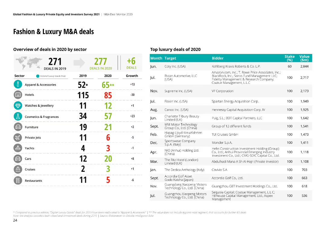
The slide has a table listing M&A deals by sector with a bar chart comparing the number of deals in 2019 and 2020.
Mergers and Acquisitions
Consumer Goods
It provides an overview of M&A deals in the fashion and luxury sector, highlighting growth and decline across various sectors.
M&A, Deals, Fashion, Luxury, Sectors, 2020, 2019
Header Horizontal
Deloitte
Saved
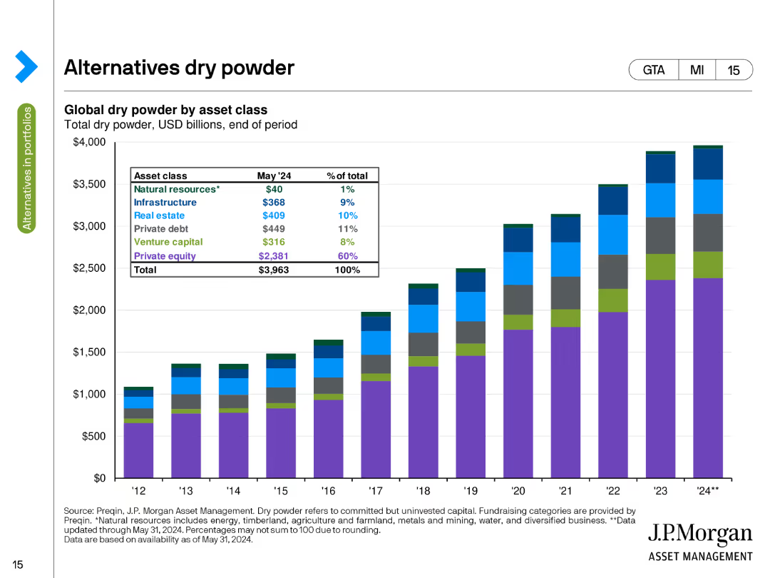
The slide presents a stacked column chart showing global dry powder by asset class in USD billions as of the end of May 2024. The chart uses different colors to depict natural resources, infrastructure, private equity, and other categories.
Investment Analysis
Financial Services
This slide details the amount of uninvested capital (dry powder) available in various asset classes, such as natural resources, infrastructure, and private equity, highlighting the total capital ready for deployment at the end of May 2024.
Dry Powder, Asset Classes, Uninvested Capital, USD Billions, Deployment
Single Chart
JP Morgan
Saved
The slide features a series of scatter plots representing contracting activity for different types of drilling units in various environments. Each plot is labeled and uses differently sized bubbles to indicate contract duration, with trend lines showing rate changes over time. The design is minimalistic but effective, with clear labels and a legend explaining the symbols used. The visual hierarchy is well managed to guide the viewer through the data.
Market Analysis and Trends
Energy & Utilities
This slide analyzes contracting activity within the oil drilling sector, specifically looking at day rates and contract durations for harsh and benign environment floaters, as well as premium jack-ups. It's designed to help stakeholders understand market conditions and the profitability of deploying specific drilling units under current economic conditions. This data is crucial for strategic decisions regarding fleet deployment and investment in new technologies or markets.
contracting activity, drilling units, scatter plots, market analysis, day rates, trend analysis, oil drilling, environment, profitability, strategic decisions
Multiple Chart
Barclays
Saved
A pie chart shows 91% 'Yes' in a bold orange color, alongside a bar chart detailing percentages per sector like Financial Services and Manufacturing, indicating the presence of formal HR functions.
Market Analysis and Trends
Professional Services
Discusses the prevalence of formal HR functions across various sectors, useful for analyzing organizational maturity and HR management practices across industries.
HR, functions, organization, sectors, management, analysis, prevalence
Multiple Chart
PwC/Strategy&
Saved
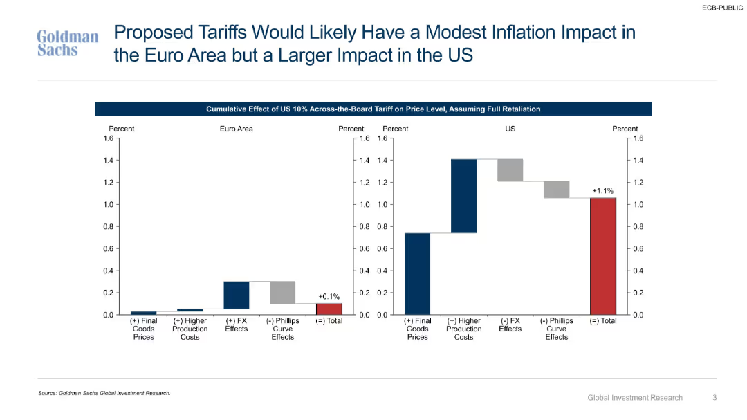
Bar charts comparing inflationary effects of tariffs across economic channels (goods prices, FX, production costs).
Market Analysis and Trends
Government & Public Sector
Evaluates cumulative inflation impacts of a 10% U.S. across-the-board tariff under full retaliation. Projects larger price increases in the U.S. due to higher production costs and weaker FX offsets.
inflation, tariffs, price effects, Euro Area, U.S., retaliation, production costs, final goods, exchange rate
Multiple Chart
Goldman Sachs
Saved
Two-column layout with a table on the left detailing equity and net debt and a column chart on the right showing gross debt maturity profile.
Financial Performance
Financial Services
Provides an overview of the balance sheet and liquidity position as of June 2023, including equity, net debt, gearing ratios, and liquidity with debt maturity projections.
balance sheet, liquidity, equity, debt, financials
Mixed Chart
IPSOS
Saved
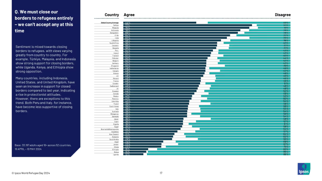
Full-width horizontal bar chart with country-wise breakdown from highest to lowest agreement
Market Analysis and Trends
Government & Public Sector
This slide presents a ranked list of countries based on public agreement with fully closing borders to refugees. Türkiye, Malaysia, and Indonesia show strong agreement, while Uganda, Kenya, and Ethiopia show the least. It reflects global protectionist sentiment shifts.
border policy, protectionism, refugee sentiment, Ipsos, country comparison, closure support, migration, attitudes
Mixed Chart
IPSOS
Saved
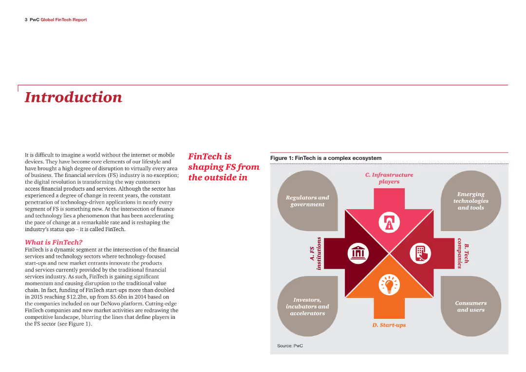
Introduction slide with text explaining the FinTech industry's impact on financial services. Includes an infographic showing the FinTech ecosystem, consisting of FS institutions, tech companies, start-ups, regulators, and government.
Industry Overview
Financial Services
This slide introduces the report on the FinTech industry's influence on financial services. It defines FinTech and highlights its role in transforming the industry through digital applications and technology-driven innovations, setting the stage for detailed analysis in the report.
FinTech, financial services, introduction, industry impact, digital transformation, ecosystem
Diagram
PwC/Strategy&
Saved
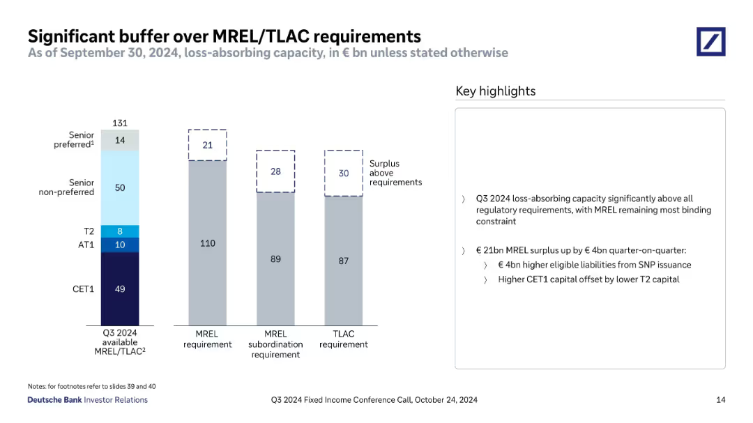
Vertical bar chart comparing Q3 2024 available MREL/TLAC with MREL, subordination, and TLAC requirements; key highlights in a text box to the right.
Regulatory and Compliance
Financial Services
The slide shows Deutsche Bank's substantial capital buffer exceeding MREL and TLAC regulatory requirements as of Q3 2024, highlighting €21bn, €28bn, and €30bn surpluses. It attributes the MREL surplus increase to €4bn from senior non-preferred issuance and offsetting capital shifts.
MREL, TLAC, capital buffer, CET1, regulatory, surplus, Deutsche Bank, Q3 2024
Mixed Chart
Deutsche Bank
Saved
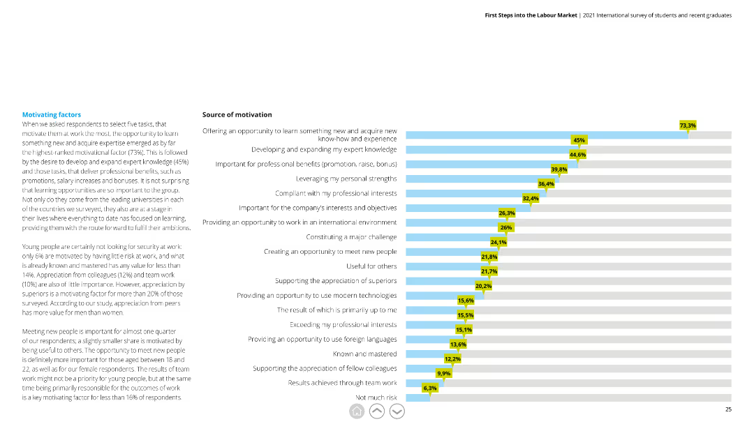
Horizontal bar chart depicting different motivating factors with percentages, alongside detailed text explaining the significance of each factor.
Human Resources and Talent Management
Education & Training
This slide highlights key factors that motivate young professionals, emphasizing learning opportunities, professional development, and appreciation from peers.
motivation, learning, professional development, appreciation, young professionals
Mixed Chart
Deloitte
Saved
A vertical column chart showing hydrogen consumption by category. The categories include oil refining, ammonia production, steel production, methanol production, and others.
Market Analysis and Trends
Energy & Utilities
The slide highlights the hydrogen consumption by different industries, with a focus on chemicals, oil refining, and steel industries, presenting data from 2018.
hydrogen, consumption, industry, chemicals, oil refining, steel, market analysis, data, column chart
Single Chart
Kearney
Saved
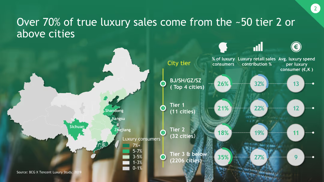
The slide includes a map of China highlighting tiered cities and their contribution to luxury sales, along with circular graphs representing consumer percentages and average spend.
Market Analysis and Trends
Consumer Goods
This slide shows that the majority of luxury sales come from approximately 50 tier 2 or above cities in China, with detailed data on consumer contributions and spending.
Luxury Sales, Tier Cities, Market Contribution, China, Consumer Data
Multiple Chart
BCG
Saved
Previous
Next
If nothing, comes up, please save your slides first
Create a FREE account to continue browsing
Receive Instant Access to 1,000+ slides from companies like McKinsey, Google, and Goldman Sachs
First Name
Last Name
Email
Password
I agree to all
Terms & Privacy Policy
Thank you! Your submission has been received!
Oops! Something went wrong while submitting the form.
Have an account?
Sign in
Column Chart
Heatmap
Chevron
Org Chart
Infographic
Callouts
Timeline
List
Graphic
Picture
Process Flow
Diagram
Paragraph
Map
Table
Framework
Subtitle
Takeaway Box
Icon
Other Chart
Radar Chart
Waterfall Chart
Mekko Chart
Pie Chart
Scatter Plot
Line Chart
Bar chart
Bullet points