Create a FREE Account
Instant access to 1,000+ real slides from top companies like McKinsey, BCG, Goldman Sachs, Google and many more!
First Name
Last Name
Email
Password
I agree to all
Terms & Privacy Policy
Thank you! Your submission has been received!
Oops! Something went wrong while submitting the form.
Have an account?
Sign in
Library
Templates
Courses
Pricing
My Account
My Slides
My Templates
✦ AI
AI Prompt Library
AI Search
Sign in
Start Here
Logout
My Saved Slides
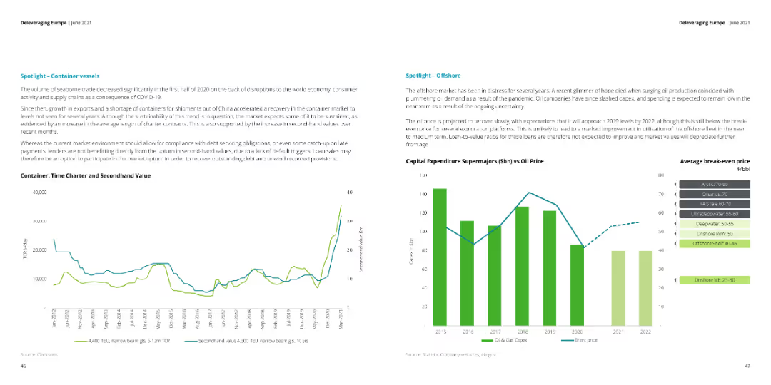
The slide contains two line charts: one for container vessel time charter and secondhand value, and another comparing capital expenditure for supermajors with oil prices.
Market Analysis and Trends
Transportation & Logistics
This slide examines the container vessel market and offshore industry trends, highlighting the recovery in container shipping and the impact of oil price fluctuations on capital expenditures for supermajors.
container vessels, offshore, oil prices, trends
Multiple Chart
Deloitte
Saved
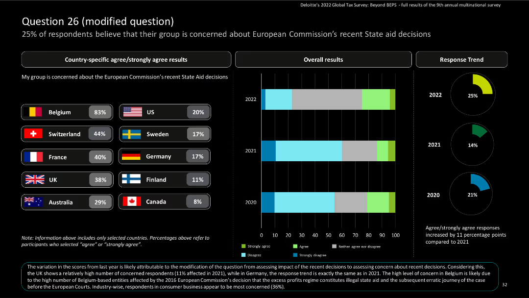
Slide displays bar charts for country-specific results and column charts for overall results on concerns about EU state aid decisions.
Market Analysis and Trends
Financial Services
The slide captures the level of concern among respondents about European Commission's state aid decisions, with data trends from 2020 to 2022.
survey, column chart, state aid, European Commission
Multiple Chart
Deloitte
Saved
The slide features a column chart showing the ratio of direct to distributed traffic according to the Nielsen & Fletcher approach, which excludes subsequent visits. Detailed annotations explain the methodology and findings.
Market Analysis and Trends
Media & Entertainment
This slide presents the Nielsen & Fletcher approach to measuring the ratio of direct to distributed traffic, focusing on the last step before reaching news articles, excluding subsequent visits, and providing insights into traffic sources.
Nielsen & Fletcher, Direct Traffic, Distributed Traffic, Column Chart, Traffic Analysis
Single Chart
IPSOS
Saved
Features a self-assessment of company capabilities in areas like supply chain and risk management, illustrated with bar graphs and a color-coded rating system.
Operational Efficiency
Financial Services
Evaluates organizational capabilities in handling uncertainties, identifying areas like supply chain resilience and digital sales as needing improvement, and suggesting potential strategic actions to enhance these capabilities.
capabilities assessment, supply chain resilience, risk management, strategic actions
Table
BCG
Saved
This slide displays various financial sectors with corresponding assets and rankings, using blue-toned boxes and clear text hierarchy.
Investment Analysis
Financial Services
It provides a comprehensive view of a firm's investment platform across different financial sectors, showcasing global scale and diversity.
Investment, Global Scale, Financial Sectors, Assets, Rankings, Liquidity, Equity, Alternatives, Brokerage
Table
Goldman Sachs
Saved
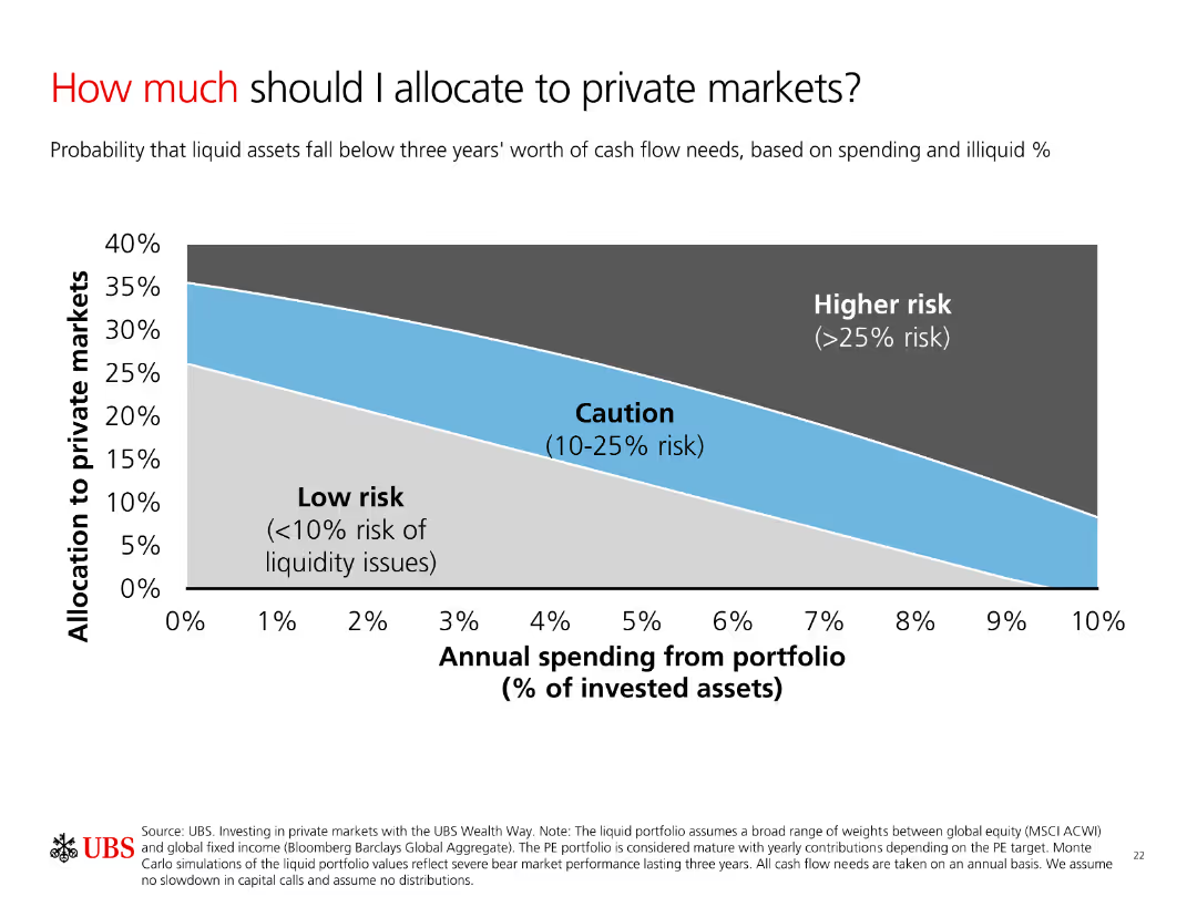
A column chart showing allocation to private markets based on risk levels. The chart categorizes risks into Low risk, Caution, and Higher risk with a smooth gradient background.
Investment Analysis
Financial Services
The slide explains the allocation of investments to private markets based on annual spending and risk levels. It helps investors understand potential liquidity risks.
Allocation, Risk, Private Markets, Spending, Liquidity
Single Chart
UBS
Saved
This slide compares cold storage capacities per 1000 urban residents in several countries using column charts, showing Nigeria's low capacity relative to others. It includes a statistic on the loss percentage due to inadequate storage.
Strategic Planning
Agriculture & Food Production
The slide exposes the critical gaps in cold storage infrastructure in Nigeria compared to other countries, linking these deficiencies to high food loss rates. It underscores the necessity for investing in enhanced cold storage solutions to support food security initiatives.
Cold Storage, Capacity, Nigeria, Challenges, Comparison
Mixed Chart
BCG
Saved
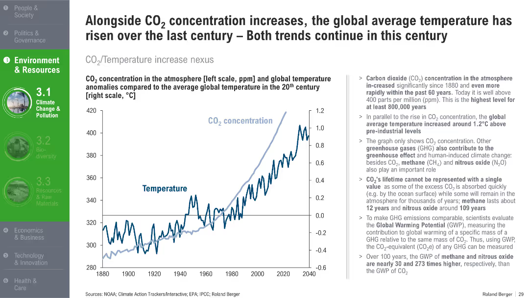
Dual-axis line chart comparing CO₂ levels with temperature anomalies from 1880 to 2040. Summary of scientific implications on the right.
Risk Assessment and Management
Environmental Services & Sustainability
This slide shows the direct correlation between rising CO₂ concentrations and global temperature increases. It explains greenhouse gas contributions and their long-term environmental impact.
CO2 emissions, global warming, greenhouse gases, temperature rise, climate science, sustainability
Mixed Chart
Roland Berger
Saved
Column charts depicting the number of BEVs and PHEVs in use and the number of charging points per 100 vehicles across different regions, from 2015 to 2022.
Market Analysis and Trends
Energy & Utilities
This slide shows the growth of battery electric vehicles (BEVs) and plug-in hybrid electric vehicles (PHEVs) in use from 2015 to 2022 and their corresponding charging points.
BEVs, PHEVs, charging points, growth, regions
Multiple Chart
JP Morgan
Saved
The slide includes a line chart comparing cost estimates for long-distance CO2 transport using various methods.
Financial Performance
Energy & Utilities
This slide presents cost estimates for transporting CO2 over long distances by ship, offshore pipeline, and onshore pipeline.
CO2 transport, costs, long-distance, pipeline, ship
Single Chart
Kearney
Saved
Depicts a column chart of perceptions regarding the French start-up ecosystem's support for digital transformation, with quotes from industry professionals.
Market Analysis and Trends
Technology & Software
Reviews the impact of the French start-up ecosystem on digital transformation, noting the positive perception among stakeholders about its role in fostering innovation.
start-ups, digital transformation, France, innovation, ecosystem
Mixed Chart
Bain
Saved
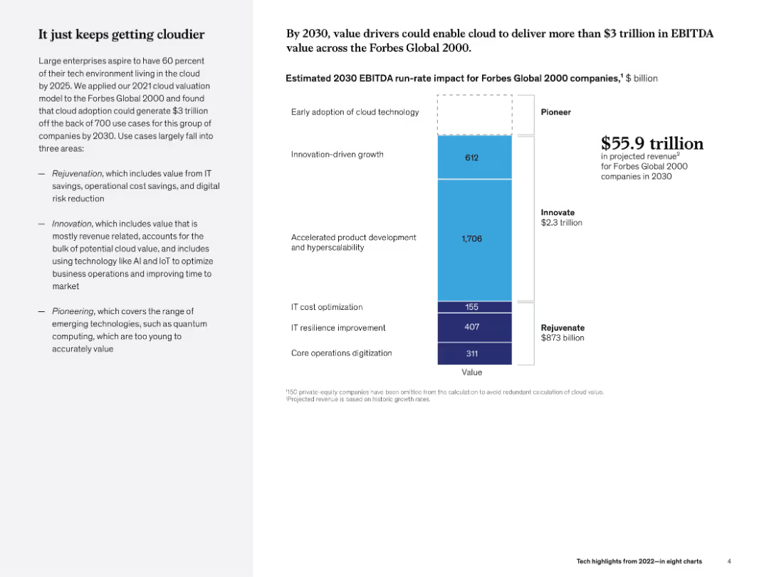
Left narrative and right stacked bar chart showing cloud value drivers by segment. Subtle gradient theme.
Strategic Planning
Technology & Software
The slide projects $3 trillion in EBITDA value from cloud adoption by 2030 among Forbes Global 2000 companies. It categorizes drivers into rejuvenation, innovation, and pioneering, highlighting accelerated product development's role.
cloud, EBITDA, 2030, innovation, hyperscalability, McKinsey, strategic value, digital infrastructure
Mixed Chart
McKinsey
Saved
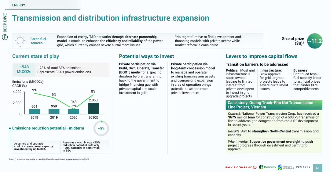
Consistent block design with emission graphs, investment options, challenges, and green-shaded case study section. Blue and green color scheme emphasizing energy and infrastructure.
Strategic Planning
Energy & Utilities
Discusses the critical need to expand SEA's energy transmission and distribution to improve reliability and accommodate renewable energy. Midterm emissions reduction is ~5%. Investment paths include private participation via BOOT and concession models. The Vietnam-based case study illustrates a $675M loan to expand transmission infrastructure to reduce grid congestion.
transmission, grid, energy, BOOT, investment, Vietnam, infrastructure, emissions
Multiple Chart
Bain
Saved
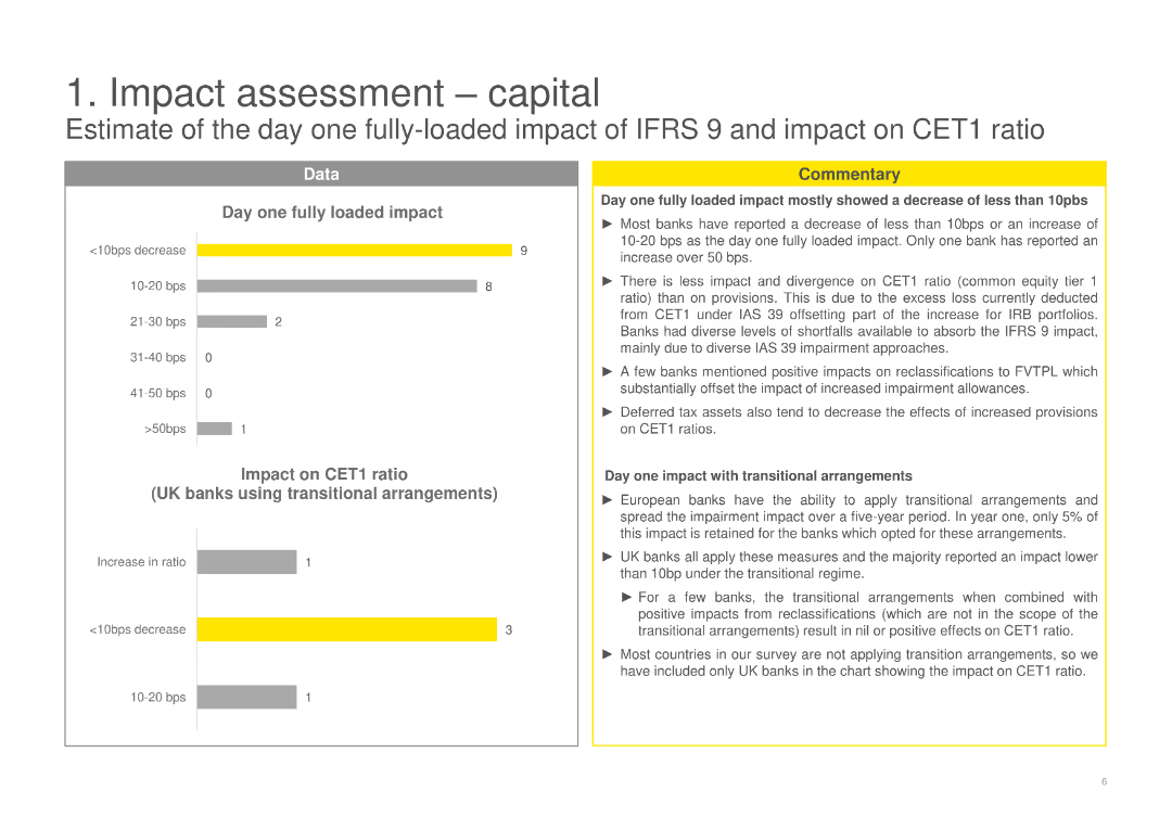
The slide shows various bar charts and detailed commentary on the impact on CET1 ratio and day one fully loaded impact of IFRS 9.
Financial Performance
Financial Services
Evaluates the day one fully loaded impact of IFRS 9 on capital, specifically the CET1 ratio for UK banks.
capital impact, CET1 ratio, IFRS 9, financial performance, day one impact, bar charts
Multiple Chart
EY
Saved
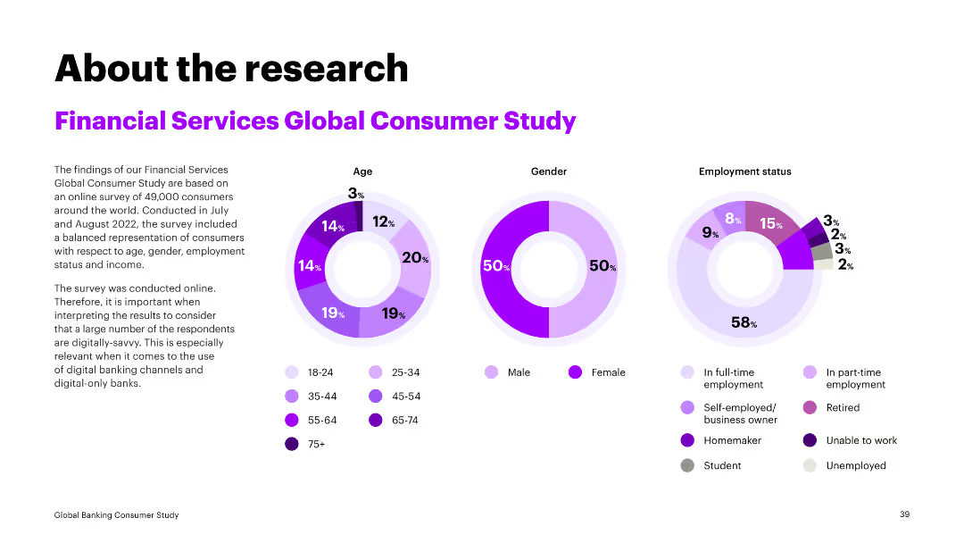
The slide contains three circular charts depicting age, gender, and employment status distributions from a global consumer study. Text explains the study's methodology and demographic representation.
Market Analysis and Trends
Financial Services
This slide summarizes key demographics from a global consumer study, highlighting age, gender, and employment status. It provides context for understanding consumer behavior in financial services.
consumer study, demographics, financial services, market analysis, global survey
Multiple Chart
Accenture
Saved
This slide contains a column chart showing the trend in cost/income ratio over several fiscal years, paired with a bullet list of key achievements related to cost reduction and operational efficiencies.
Operational Efficiency
Financial Services
Details the bank’s efforts in reducing the cost/income ratio over time and lists operational achievements that have contributed to this financial metric, suitable for understanding cost management strategies.
cost, income, reduction, financial, efficiency, operational, fiscal, CIR, management, performance
Mixed Chart
Deutsche Bank
Saved
This slide presents a bar chart comparing average minutes per week spent on practical ICT classes in various countries, highlighting the low figures for Nigeria both before and after solar adoption relative to other countries.
Strategic Planning
Education & Training
This slide offers an international perspective on ICT teaching hours, showing Nigeria's position relative to other countries and the impact of solar power adoption on improving these metrics. It suggests a need for continued efforts to enhance ICT infrastructure.
ICT, Global Comparison, Nigeria, Education, Solar Power
Single Chart
BCG
Saved
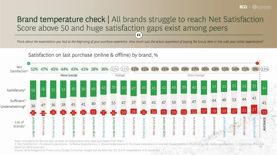
Stacked bar chart showing satisfaction levels by brand with net satisfaction scores above each. Organized by large, mid, and small-size brands.
Performance Metrics and KPIs
Consumer Goods
Benchmarks net satisfaction across brands based on purchase experiences. Shows variation in customer perception of experience quality, with most brands scoring under 50. Highlights that underwhelming experiences are frequent and satisfaction gaps persist across brand tiers.
satisfaction score, brand comparison, net promoter score, expectations, consumer evaluation
Single Chart
BCG
Saved
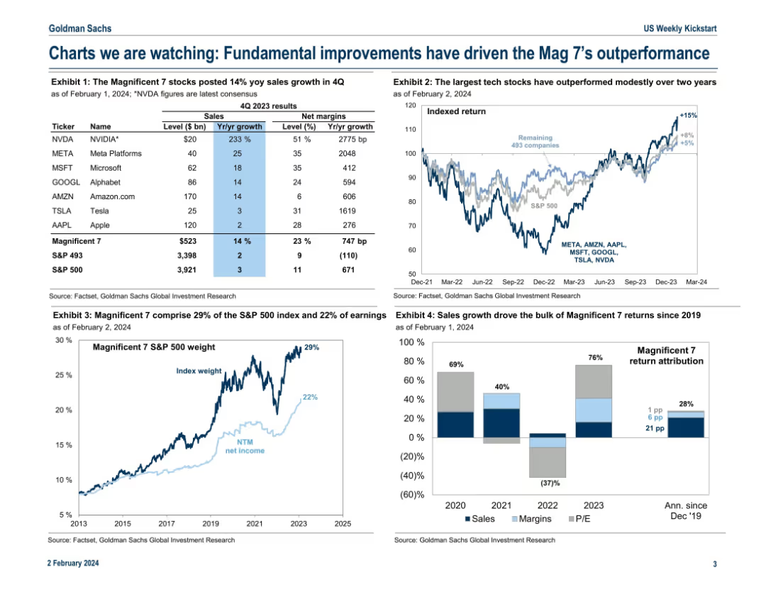
Grid layout of four exhibits; includes tables, line charts, and stacked bar charts to highlight performance and earnings contribution of the “Magnificent 7”.
Performance Metrics and KPIs
Technology & Software
The slide analyzes the top 7 tech-driven companies in the S&P 500, showing their sales growth, net margins, stock returns, and contribution to index weight and earnings. It emphasizes their outperformance and attributes it to fundamentals like revenue growth, with comparisons to the broader index.
Magnificent 7, sales growth, net margins, S&P 500, tech stocks, index weight, earnings, performance
Multiple Chart
Goldman Sachs
Saved
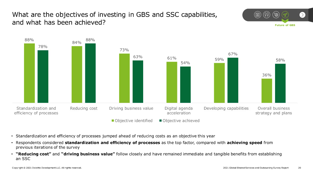
The slide includes a series of column charts displaying objectives and achievements in GBS and SSC investments, such as standardization, cost reduction, and driving business value. Additional text highlights key takeaways.
Strategic Planning
Professional Services
The slide reviews the objectives of investing in GBS and SSC capabilities, such as standardization and efficiency, cost reduction, and driving business value, along with the extent to which these objectives have been achieved.
GBS, SSC, investment objectives, cost reduction, business value
Mixed Chart
Deloitte
Saved
The slide presents commuting habits of three consumer clusters (EV owners, EV prospects, EV sceptics) using column charts and text boxes. It includes data on commuting days, distance, car tenure, and multimodal transport usage.
Customer and Market Segmentation
Consumer Goods
The slide analyzes commuting habits among EV owners, prospects, and sceptics, detailing the frequency of car usage, combination with other transport means, daily commuting distance, and typical car tenure. It provides insights into transportation preferences and behaviors of each cluster.
Consumer Survey, Commuting Habits, EV Owners, EV Prospects, EV Sceptics, Transportation, Multimodal Transport, Distance
Multiple Chart
PwC/Strategy&
Saved
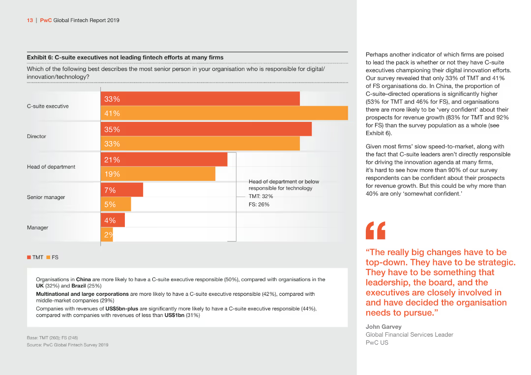
The slide features a bar chart displaying the distribution of responsibility for digital innovation/technology among different roles within organizations. Colors are orange and gray.
Strategic Planning
Financial Services
Highlights the distribution of responsibility for digital innovation/technology among C-suite executives, directors, and other roles, comparing TMT and FS sectors.
C-suite, digital innovation, TMT, FS, responsibility
Mixed Chart
PwC/Strategy&
Saved
Depicts a stacked column chart showing international arrivals by destination with Europe highlighted against the rest of the world.
Market Analysis and Trends
Hospitality & Tourism
Highlights Europe's dominant position in global tourism, showing the distribution of international arrivals with specific emphasis on top European destinations.
Tourism, Europe, Global arrivals, Market analysis, Travel industry
Multiple Chart
Bain
Saved
Detailed diagrams and calculations explaining the methodology to estimate economic impact of COVID-19 by combining sectoral data with expected duration of crisis measures.
Strategic Planning
Financial Services
Explores the methodology to estimate economic impacts of COVID-19, combining industry-specific data with projected lengths of lockdowns and restrictions.
COVID-19, economic impact, sectoral analysis, lockdown duration, crisis measures, economic methodology
Multiple Chart
BCG
Saved
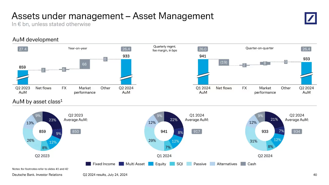
Mixed layout: stacked bar showing year-on-year AuM movement; pie charts show asset class composition across three periods.
Performance Metrics and KPIs
Financial Services
This slide shows the development of Asset Management’s AuM, which grew from €859bn in Q2 2023 to €933bn in Q2 2024. It identifies key drivers such as market performance and FX. The asset composition is visualized by class, with noticeable growth in passive and SQI categories, reflecting investor preference shifts.
asset management, AuM, asset classes, FX impact, market performance
Multiple Chart
Deutsche Bank
Saved
Previous
Next
If nothing, comes up, please save your slides first
Create a FREE account to continue browsing
Receive Instant Access to 1,000+ slides from companies like McKinsey, Google, and Goldman Sachs
First Name
Last Name
Email
Password
I agree to all
Terms & Privacy Policy
Thank you! Your submission has been received!
Oops! Something went wrong while submitting the form.
Have an account?
Sign in
Column Chart
Heatmap
Chevron
Org Chart
Infographic
Callouts
Timeline
List
Graphic
Picture
Process Flow
Diagram
Paragraph
Map
Table
Framework
Subtitle
Takeaway Box
Icon
Other Chart
Radar Chart
Waterfall Chart
Mekko Chart
Pie Chart
Scatter Plot
Line Chart
Bar chart
Bullet points