Create a FREE Account
Instant access to 1,000+ real slides from top companies like McKinsey, BCG, Goldman Sachs, Google and many more!
First Name
Last Name
Email
Password
I agree to all
Terms & Privacy Policy
Thank you! Your submission has been received!
Oops! Something went wrong while submitting the form.
Have an account?
Sign in
Library
Templates
Courses
Pricing
My Account
My Slides
My Templates
✦ AI
AI Prompt Library
AI Search
Sign in
Start Here
Logout
My Saved Slides
The slide shows two main sections: "Funds" with a column indicating up to 900 million euros, and "Usage" with various allocations such as acquisitions and CAPEX. The design is structured and clear, with color-coded segments.
Strategic Planning
Financial Services
The slide details Ipsos' growth plan for 2025, outlining cash allocation strategies including acquisitions, investment in CAPEX, dividends, and share buybacks, aimed at maximizing financial growth and shareholder value.
growth plan, cash allocation, acquisitions, CAPEX, dividends
Multiple Chart
IPSOS
Saved
Gartner Hype Cycle diagram for the digital workplace in 2020, showing different stages from innovation trigger to plateau of productivity.
Technology and Digital Transformation
Technology & Software
The slide presents the Gartner Hype Cycle for the digital workplace, illustrating the impact of the pandemic on accelerating digitalization. It highlights the various stages of workplace technologies and the future expectations for innovations that could enhance productivity and collaboration.
Digital Workplace, Pandemic, Hype Cycle
Mixed Chart
Roland Berger
Saved
Diagram of SP platform showing different functions like product development, trading, and risk management, with related text boxes.
Product and Service Analysis
Financial Services
Overview of the Securitized Products platform, highlighting its integrated approach to product development, trading, and risk management.
SP platform, product development, trading, risk management, integrated approach
Mixed Chart
Credit Suisse
Saved
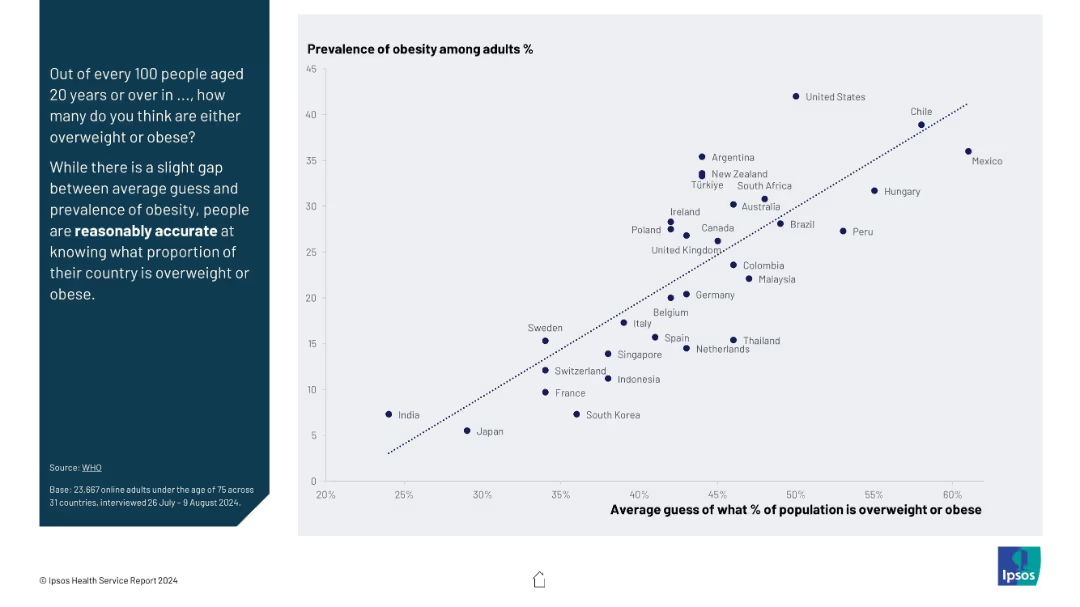
Scatter plot comparing average public guesses vs actual obesity prevalence; includes diagonal trend line for accuracy.
Market Analysis and Trends
Healthcare & Pharmaceuticals
The slide shows a correlation between the actual obesity rates and public estimates across countries. Despite minor gaps, it suggests people are reasonably accurate in estimating national obesity rates, indicating awareness of public health issues.
obesity, public perception, health awareness, statistical comparison, accuracy, health trend, overweight population
Mixed Chart
IPSOS
Saved
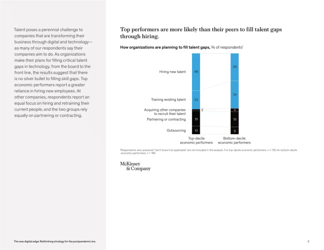
Split-page layout: left side features a paragraph in light gray background, right side shows a vertical stacked bar chart with labels and legend. Simple, clean design.
Human Resources and Talent Management
Technology & Software
The slide compares how top-decile vs. bottom-decile economic performers plan to address talent gaps. It reveals that top performers rely more heavily on hiring new talent, while others focus more on retraining or maintaining existing talent. Both groups use similar levels of partnering and outsourcing.
talent strategy, hiring, retraining, outsourcing, partnering, skill gaps, economic performers, workforce planning, McKinsey, tech skills
Mixed Chart
McKinsey
Saved
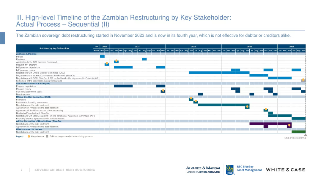
Gantt-style timeline tracking actions by Zambian authorities, IMF, OCC, bondholders, etc., from 2020–2024. Includes milestones and activity bars.
Regulatory and Compliance
Government & Public Sector
Outlines the chronological sequence of Zambia’s sovereign debt restructuring process. Highlights prolonged negotiations and inefficiencies. Visual tracks progress across multiple stakeholders. Notes the lack of effective resolution four years into the process.
Zambia, debt restructuring, IMF, OCC, timeline, sovereign debt, negotiation delays
Table
Alvarez & Marsal
Saved
Five icons representing different areas of focus for implementing relief with brief descriptive texts.
Strategic Planning
Government & Public Sector
Suggests key areas of focus for state governments in implementing federal relief and recovery efforts from COVID-19.
federal relief, COVID-19, strategy, government, recovery, implementation
Header Horizontal
McKinsey
Saved
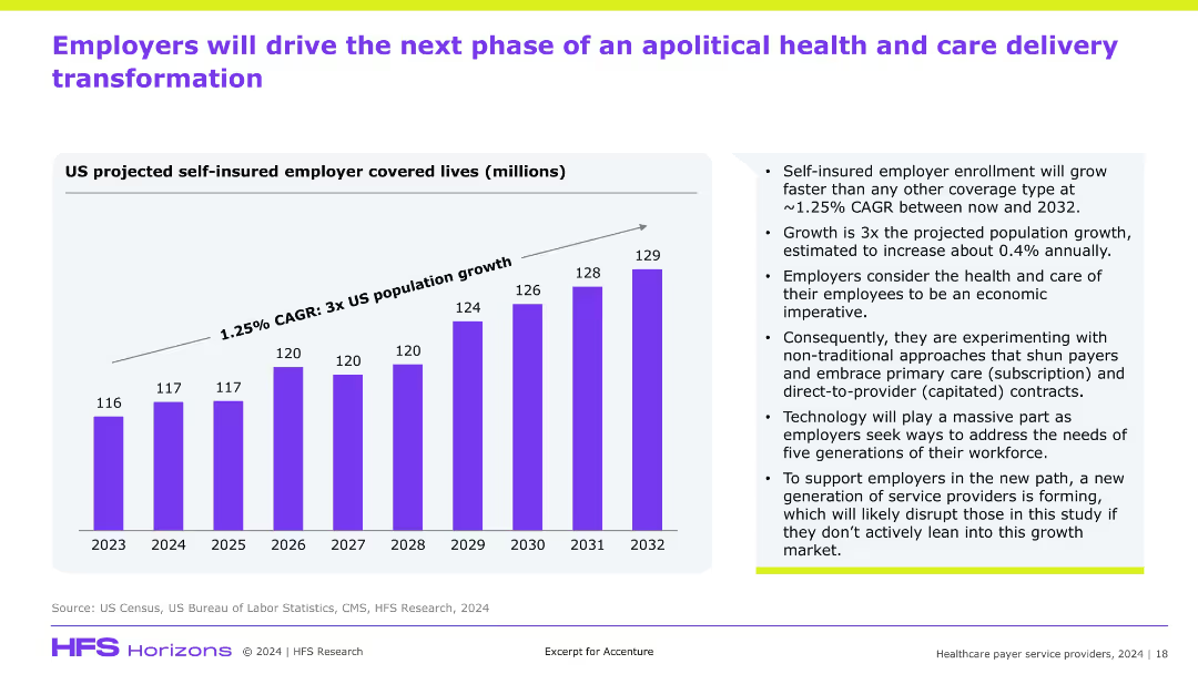
Bar graph on left showing self-insured employer lives from 2023–2032; right side features supporting bullet points; clean, modern style with purple graph and gradient background.
Market Analysis and Trends
Healthcare & Pharmaceuticals
This slide projects a rise in self-insured employer coverage through 2032, growing faster than the general population. It emphasizes employer-led transformation in healthcare through new care models (e.g., subscription, capitated), driven by economic imperatives and supported by technology, suggesting disruption opportunities for service providers.
self-insured, employers, healthcare transformation, subscription, capitated, disruption
Mixed Chart
Accenture
Saved
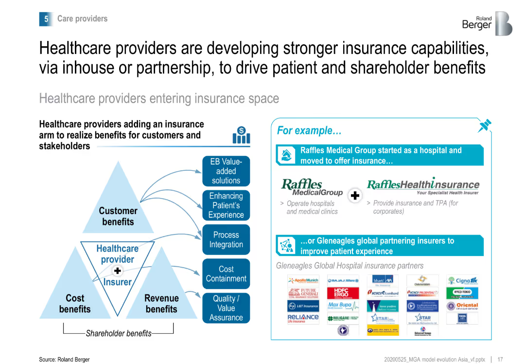
Pyramid diagram showing the benefits of healthcare providers entering the insurance space, with examples like Raffles Medical Group and Gleneagles Global partnering with insurers.
Strategic Planning
Healthcare & Pharmaceuticals
Highlights how healthcare providers are adding insurance capabilities to realize benefits for customers and shareholders, improving patient experience and cost management.
healthcare, insurance, strategic planning, partnerships
Diagram
Roland Berger
Saved
The slide includes a bar chart comparing the LCOH evolution for blue, green, and brown hydrogen technologies from 2019 to 2030.
Market Analysis and Trends
Energy & Utilities
The slide forecasts that the costs of blue and green hydrogen will decline, closing the gap with brown hydrogen by 2030, as shown in the bar chart.
blue hydrogen, green hydrogen, LCOH, cost trends, 2030 forecast
Multiple Chart
Kearney
Saved
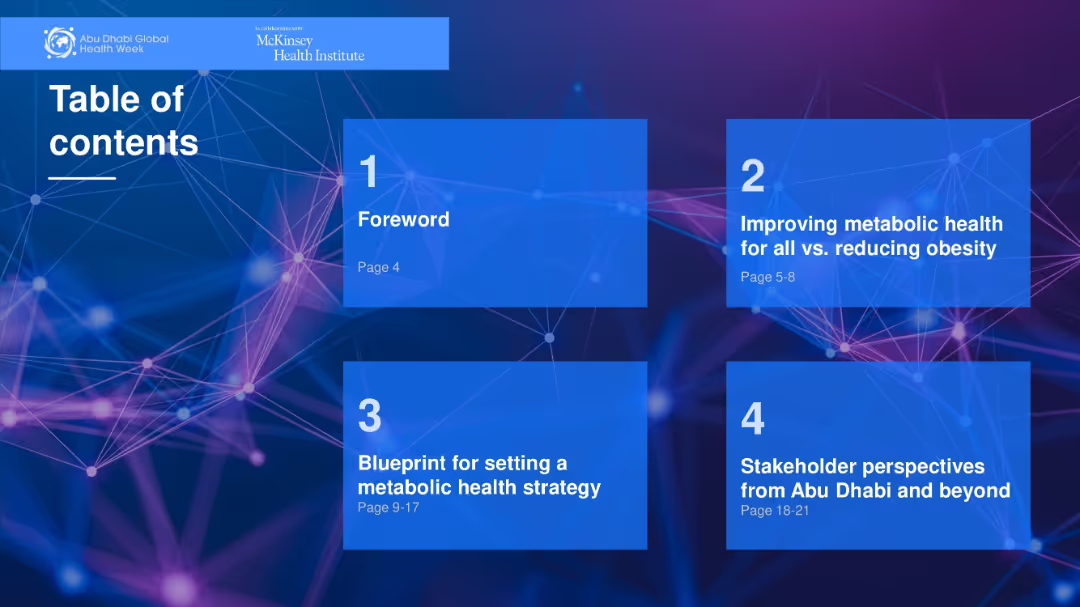
Visually segmented grid layout with four numbered blocks on a digital-tech style background.
Organizational Structure and Change
Healthcare & Pharmaceuticals
Lists four main sections of a report related to metabolic health and strategic planning. Each box provides section title and page range. Provides a clear overview for navigating the document.
table of contents, strategy, healthcare, metabolic health, report
Agenda
McKinsey
Saved
Column chart displaying issuances and redemptions, followed by a table listing details of 9M23 issuances such as ISIN, instrument, currency, and more.
Financial Performance
Financial Services
Provides detailed information on bond issuances by UBS in the first nine months of 2023, including specific data for analysis.
Issuances, Bonds, Financial Data, UBS, 2023
Mixed Chart
UBS
Saved
The slide features a combination of pie charts and column charts. Pie charts show percentages of Gen Zs and Millennials who agree on mental health focus and comfort speaking about mental health challenges, with column charts on reasons for time off.
Market Analysis and Trends
Healthcare & Pharmaceuticals
The slide provides insights into Gen Z and Millennial perspectives on their organizations' focus on mental health. It compares perceptions of organizational efforts with the actual comfort levels in discussing mental health challenges and reasons for taking time off work.
Mental health, organizations, Gen Z, Millennials, comfort, time off
Multiple Chart
Deloitte
Saved
The column chart is dominant, with a pie chart on the left showing online/offline time split, bar graphs on the right detailing time spent on various activities, and a circular flow design connecting the two.
Customer and Market Segmentation
Telecommunications
The slide breaks down the hours saved per year by nbn users and how they allocate this time towards different activities, emphasizing connection with family and friends.
time savings, nbn network, family and friends, activities, broadband impact, usage data, connectivity, offline online balance
Multiple Chart
Accenture
Saved
This slide presents a bar chart showing net interest income trends along with key financial metrics and expectations for future quarters. It uses a combination of graphical and textual data.
Financial Performance
Financial Services
It analyzes the net interest income trends, detailing the drivers behind the changes and providing expectations for future financial performance.
net interest income, financial trends, metrics, future expectations, 3Q22
Mixed Chart
UBS
Saved
Features a column chart depicting JPMC's total client asset flows over time with an accompanying dot matrix that breaks down asset class by product, channel, and region. Another section compares 5-year total client asset flows against peers.
Market Analysis and Trends
Financial Services
Analyzes JPMC's diversified platform, showcasing robust asset flow growth across various classes and markets over a decade, comparing favorably with industry peers in market share.
asset flows, diversification, financial services, JPMC, market analysis, investment, regional distribution, product breakdown
Multiple Chart
JP Morgan
Saved
The slide has text, an image of a person, and column charts showing the use of mental health support tools among Gen Zs and millennials.
Risk Assessment and Management
Healthcare & Pharmaceuticals
This slide highlights the ongoing focus on mental health, acknowledging progress but noting the persistent stigma and under-utilization of mental health resources.
mental health, stigma, support tools, Gen Z, millennials, workplace wellness, mental health apps
Multiple Chart
Deloitte
Saved
A split-content layout with a column chart, line items, and text boxes to describe reinvestment in business.
Financial Performance
Financial Services
Illustrates how changes in the rate environment impacted revenue and the strategy for reinvestment.
Revenue growth, investment expense, net interest income, non-interest revenue, business reinvestment
Multiple Chart
JP Morgan
Saved
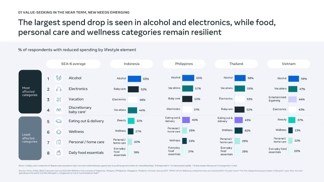
Comparative bar chart matrix by country and category; well-structured visual layout with icons for clarity.
Market Analysis and Trends
Consumer Goods
The slide details which lifestyle categories have seen the most spending reductions across Southeast Asian countries, with alcohol and electronics hit hardest. Food and wellness-related categories have remained relatively stable.
lifestyle spending, SEA-6, electronics, alcohol, consumer cuts, discretionary categories, personal care, resilience, category analysis, wellness
Single Chart
Bain
Saved
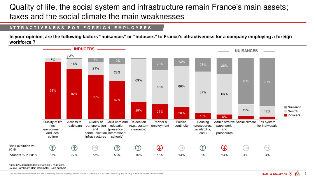
Column chart showing factors considered as "Inducers" or "Nuisances" by foreign employees regarding France's attractiveness for a foreign workforce.
Market Analysis and Trends
Professional Services
This slide analyzes the factors that make France attractive or unattractive to foreign employees, emphasizing quality of life and infrastructure as strengths, and taxes as weaknesses.
quality of life, social system, infrastructure, attractiveness, foreign workforce, taxes
Single Chart
Bain
Saved
This slide contains multiple bar graphs and tables presenting data on potential export markets in Asia for Australian battery products. It features countries like Japan, South Korea, India, and Thailand with details on import percentages, partnerships, and vehicle manufacturing statistics. The visual layout is dense with color-coded elements distinguishing different countries and data points.
Competitive Landscape
Energy & Utilities
Discusses how Australia can leverage its reliability and strategic partnerships to boost exports of battery materials to Asian markets, particularly focusing on nations with strong EV growth projections.
exports, Australia, Asia, batteries, materials, EV adoption, market opportunities, partnerships, trade strategy, economic growth
Multiple Chart
Accenture
Saved
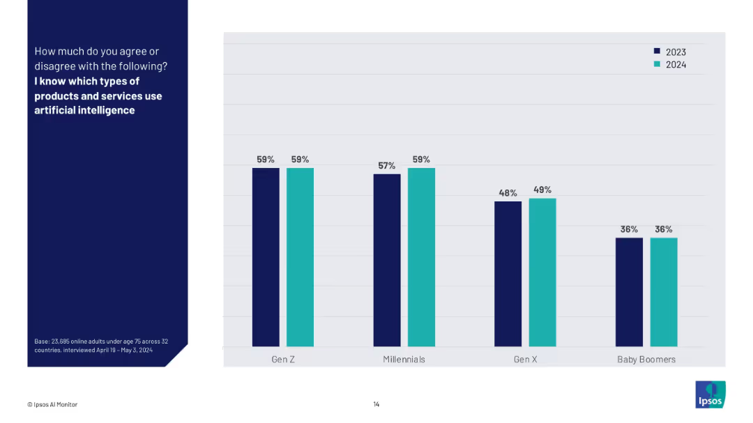
Vertical bar chart showing generational comparison on knowledge of AI-enabled products (2023 vs 2024).
Technology and Digital Transformation
Artificial Intelligence
This slide compares generational awareness of AI-enabled products between 2023 and 2024. Gen Z and Millennials consistently report the highest levels of awareness, while Baby Boomers show the lowest and most stagnant understanding.
generational awareness, AI products, survey results, year comparison, Gen Z, Millennials, Ipsos, AI understanding, tech knowledge
Mixed Chart
IPSOS
Saved
A line graph depicts the digital adoption curve over time, contrasting metropolitan areas with tier 2 and 3 cities, alongside descriptive texts.
Strategic Planning
Technology & Software
The slide predicts the digital adoption trends in Indonesia, with tier 2 and 3 cities catching up to the digital habits of tier 1 cities within the next five years.
digital adoption, trend analysis, metropolitan areas, tier cities, Indonesia, technology use
Mixed Chart
Kearney
Saved
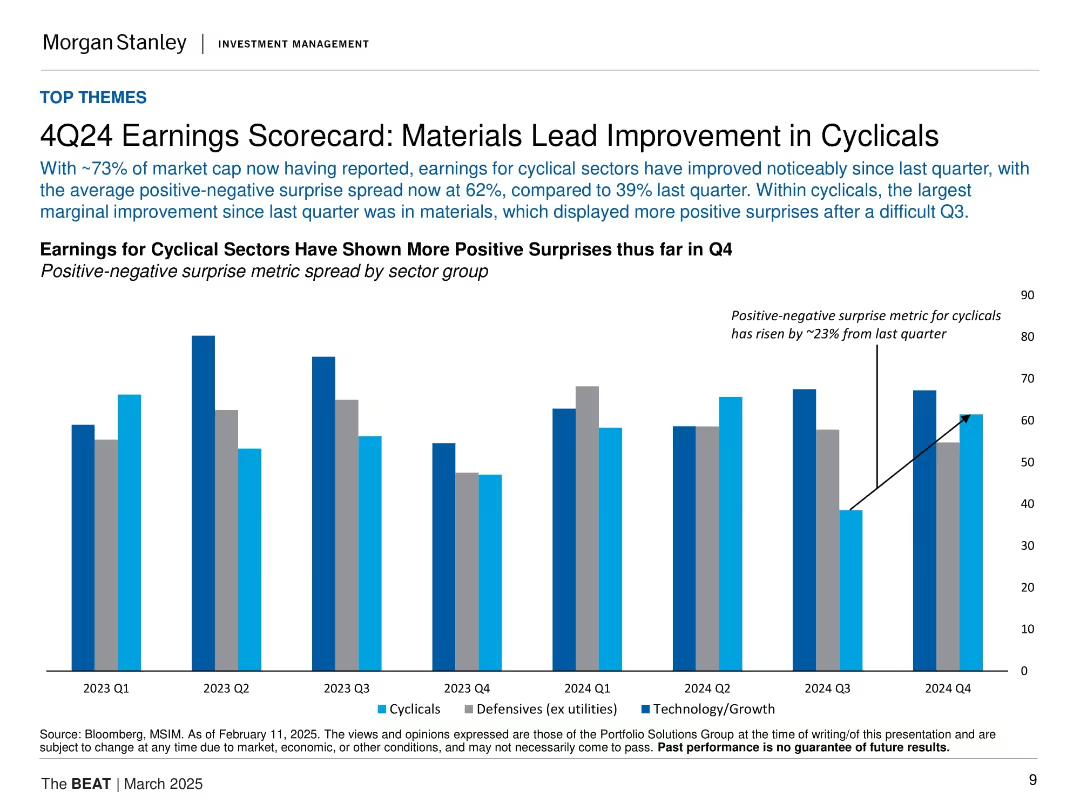
Vertical bar chart comparing cyclical, defensive, and tech earnings surprises by quarter. Blue tones for different sectors.
Financial Performance
Financial Services
The slide details Q4 2024 earnings, showing a notable rise in positive earnings surprises, particularly in cyclical sectors like materials. The spread between positive and negative earnings surprises has widened significantly from the previous quarter.
earnings, Q4, cyclical sectors, materials, positive surprise, defensives, technology, growth
Single Chart
Morgan Stanley
Saved
Featuring a line and bar graph, this slide compares the number of venture investing deals between technology and other sectors, noting the decline and its relation to the sector's deal share.
Investment Analysis
Technology & Software
Analyzing the venture market, this slide presents the overall decline in the number of deals, particularly within the technology sector, while also highlighting that the sector's share of deals remains within historical norms. It suggests that this decline does not impact the market's overall health and provides insights into investment trends and preferences.
tech sector, venture deals, market trends, investment analysis, sector comparison
Mixed Chart
Oliver Wyman
Saved
Previous
Next
If nothing, comes up, please save your slides first
Create a FREE account to continue browsing
Receive Instant Access to 1,000+ slides from companies like McKinsey, Google, and Goldman Sachs
First Name
Last Name
Email
Password
I agree to all
Terms & Privacy Policy
Thank you! Your submission has been received!
Oops! Something went wrong while submitting the form.
Have an account?
Sign in
Column Chart
Heatmap
Chevron
Org Chart
Infographic
Callouts
Timeline
List
Graphic
Picture
Process Flow
Diagram
Paragraph
Map
Table
Framework
Subtitle
Takeaway Box
Icon
Other Chart
Radar Chart
Waterfall Chart
Mekko Chart
Pie Chart
Scatter Plot
Line Chart
Bar chart
Bullet points