Create a FREE Account
Instant access to 1,000+ real slides from top companies like McKinsey, BCG, Goldman Sachs, Google and many more!
First Name
Last Name
Email
Password
I agree to all
Terms & Privacy Policy
Thank you! Your submission has been received!
Oops! Something went wrong while submitting the form.
Have an account?
Sign in
Library
Templates
Courses
Pricing
My Account
My Slides
My Templates
✦ AI
AI Prompt Library
AI Search
Sign in
Start Here
Logout
My Saved Slides
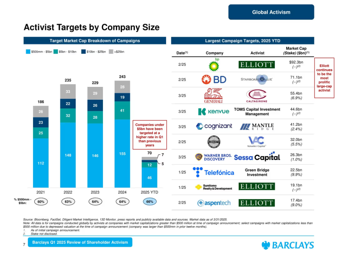
Left: stacked bar chart showing market cap breakdown (2019–2025); Right: list of largest YTD 2025 campaign targets.
Market Analysis and Trends
Financial Services
Analyzes activist campaign targets by market cap, showing increased focus on companies under $5bn in Q1 2025 (66%). Lists largest campaign targets including BP and BD. Elliott highlighted as a key repeat activist. Offers a view into activist targeting preferences.
activist targets, company size, market cap, Elliott, campaign trends, Barclays, Q1 2025
Mixed Chart
Barclays
Saved
Slide includes a column chart representing interest repayments over time as a percentage of Namibia's expense budget from 2017/18 to 2024/25. Each year is represented by a bar, with a line graph overlay showing the trend of interest payments and borrowing-related charges as a percentage.
Financial Performance
Government & Public Sector
Discusses trends in Namibia's interest repayments, analyzing their impact on the overall budget. Useful for financial planning and assessing fiscal sustainability in the public sector.
Interest Payments, Fiscal Planning, Debt Management, Namibia, Budget Analysis
Single Chart
PwC/Strategy&
Saved
Contains bar charts comparing cost management maturity levels across different regions including the Nordics.
Risk Assessment and Management
Professional Services
Explores the maturity levels of cost management practices globally, emphasizing that Nordic regions report lower maturity compared to the global average, and discusses potential areas for improvement.
Cost Management, Maturity Levels, Nordic, Global Comparison, Improvement
Mixed Chart
Deloitte
Saved
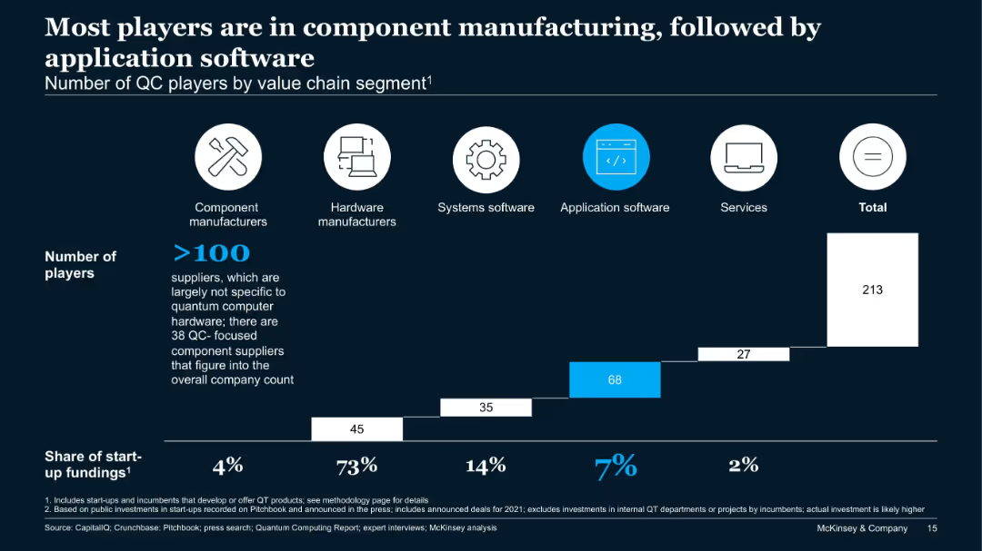
Bar chart showing number of players across five QC value chain segments and their share of start-up funding.
Product and Service Analysis
Technology & Software
This slide analyzes over 213 QC companies by value chain. Component manufacturers dominate in number, while application software sees the second-highest number of firms. However, hardware receives 73% of start-up funding, showing a funding-activity imbalance.
QC players, value chain, hardware, components, application software, start-up funding
Single Chart
McKinsey
Saved
Utilizes a series of column charts to compare objectives identified in 2021 with those achieved by 2023 across various strategic areas like cost reduction and risk management.
Strategic Planning
Professional Services
Evaluates the success of GBS initiatives in achieving strategic objectives over time, highlighting areas of strength and opportunity.
GBS, objectives, strategic planning, cost reduction, risk management
Mixed Chart
Deloitte
Saved
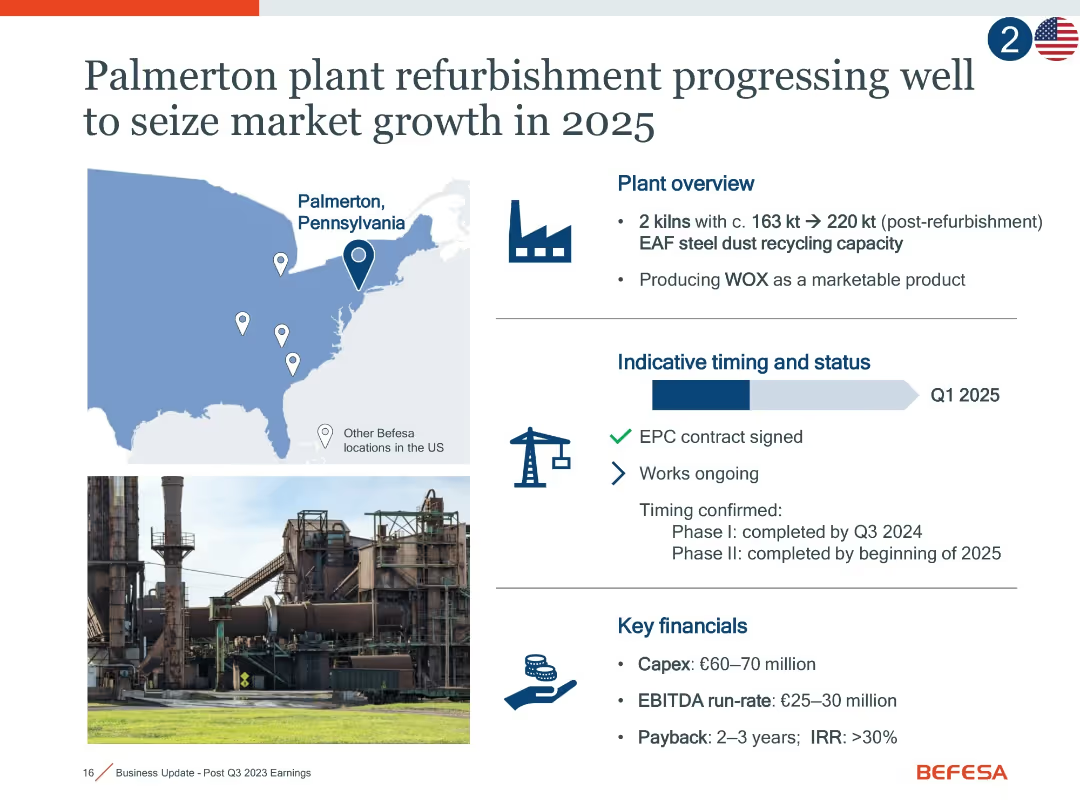
Combination of map, timeline, and financial infographic; includes icons for progress, a photo of the plant, and milestone details.
Operational Efficiency
Industrial & Manufacturing
This slide details the Palmerton, PA plant refurbishment, highlighting expanded capacity, project timing (Q1 2025), signed contracts, and projected returns. It emphasizes growth potential and efficiency improvements with expected EBITDA of €25–30m and IRR >30%.
Palmerton, refurbishment, EAF, WOX, EBITDA, market growth, capacity
Mixed Chart
Goldman Sachs
Saved
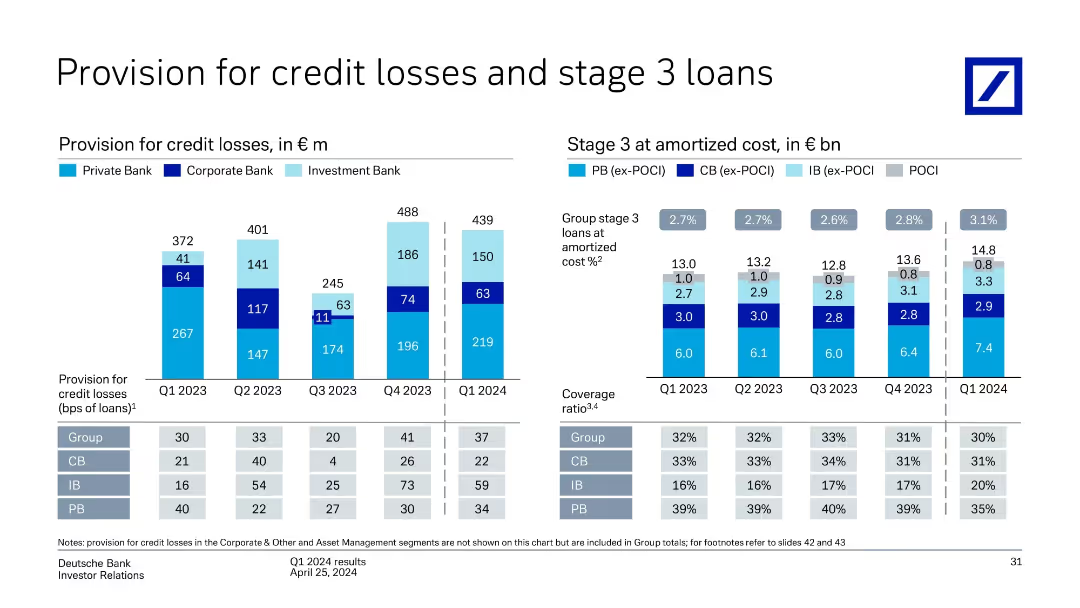
Two sets of bar charts: Left – quarterly provisions for credit losses by unit; Right – stage 3 loan volumes at amortized cost and related coverage ratios.
Risk Assessment and Management
Financial Services
Depicts Deutsche Bank’s credit risk provisioning trends and stage 3 loans from Q1 2023 to Q1 2024. Credit losses peaked in Q4 2023 and declined slightly in Q1 2024. Coverage ratios and stage 3 loan volumes are tracked, showing increasing risk in Private Bank segment.
credit losses, stage 3 loans, provisioning, risk coverage, amortized cost, Deutsche Bank
Multiple Chart
Deutsche Bank
Saved
Line chart comparing alternative sites of care being pursued by hospitals in developed and developing markets.
Strategic Planning
Healthcare & Pharmaceuticals
This slide illustrates the alternative care sites hospitals plan to establish to improve healthcare access in the next three years.
alternative care, hospitals, healthcare, APAC, planning
Mixed Chart
LEK
Saved
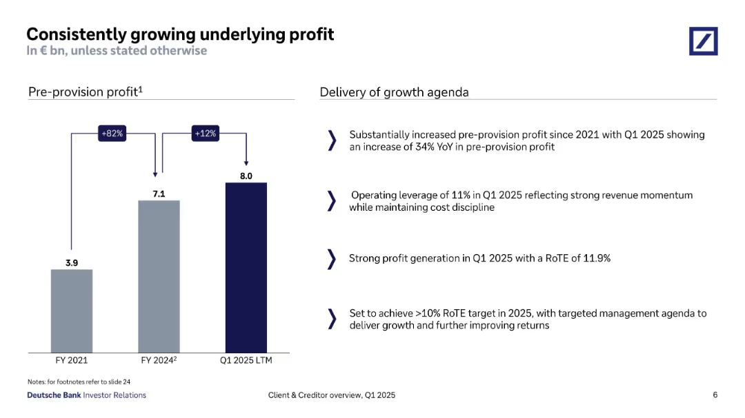
Bar chart showing pre-provision profit from FY2021 to Q1 2025; right side includes bullet-point analysis.
Financial Performance
Financial Services
Deutsche Bank demonstrates substantial pre-provision profit growth, from €3.9bn in FY2021 to €8bn in Q1 2025 LTM. Key contributors include operational leverage and a strong RoTE of 11.9%, with strategic intent to surpass the 10% RoTE target in FY2025.
profit growth, RoTE, operational leverage, pre-provision, revenue momentum, Q1 2025, cost control
Mixed Chart
Deutsche Bank
Saved
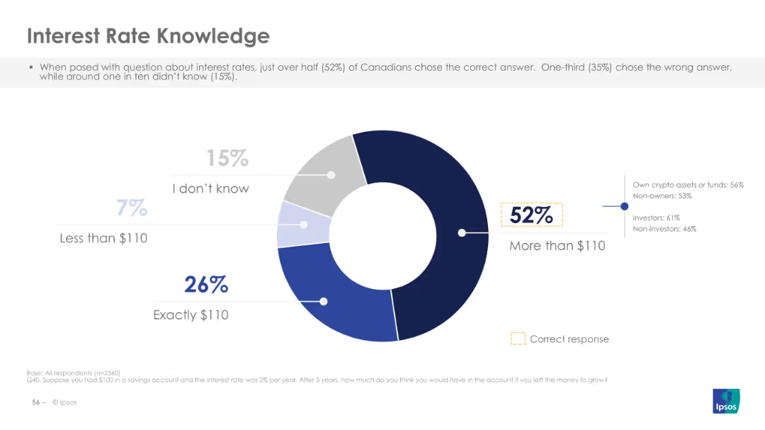
The slide features a donut chart displaying responses to a question about interest rates, with a breakdown of correct and incorrect answers on the left. The layout is moderately complex.
Performance Metrics and KPIs
Financial Services
This slide assesses Canadians' knowledge about interest rates, revealing that 52% answered correctly. It aims to gauge the public's understanding of financial concepts, specifically interest rates.
interest, rate, knowledge, financial, Canadians
Single Chart
IPSOS
Saved
The slide includes a line chart illustrating the relationship between the number of channels used and effectiveness. Data points show award scores for varying numbers of channels used by entrants, finalists, and winners.
Market Analysis and Trends
Media & Entertainment
This slide examines the trend that using more channels leads to more effective marketing work, supported by data from Effie awards entries over several years.
channels, effectiveness, line chart, marketing, Effie awards
Single Chart
IPSOS
Saved
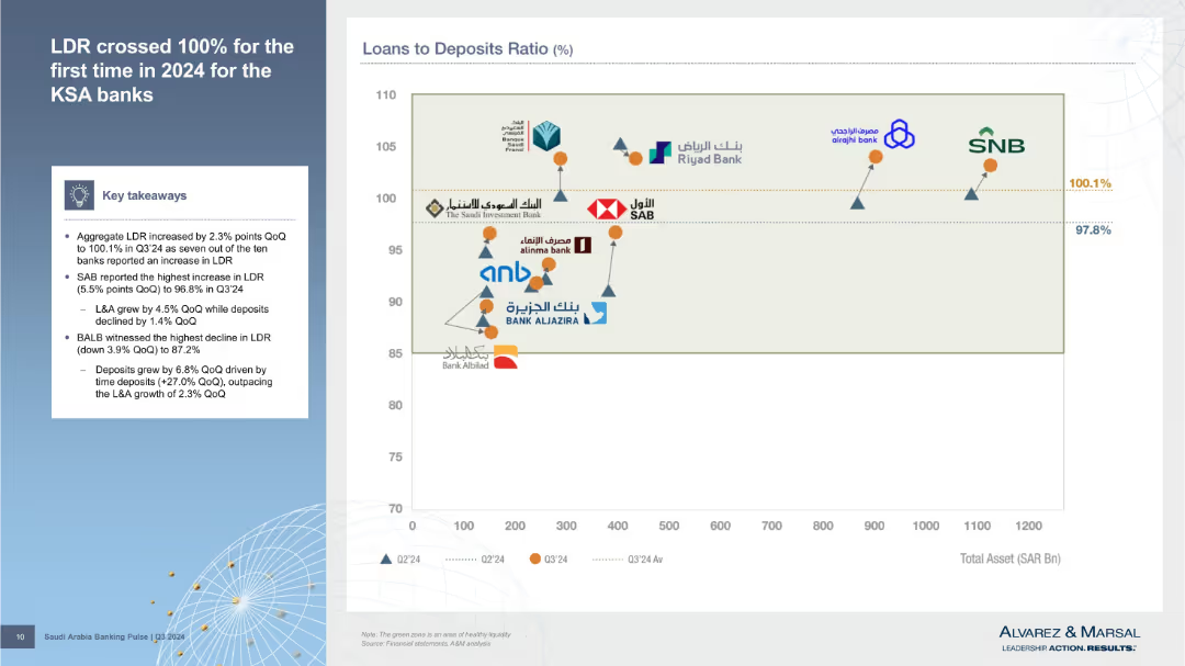
Left column outlines findings; right is a scatter plot comparing total assets vs. loan-to-deposit ratio for banks, with performance markers.
Risk Assessment and Management
Financial Services
Details Q3’24 increase in Loan-to-Deposit Ratio (LDR), crossing 100%. Visual comparison of banks’ asset sizes and LDR positions shows liquidity strength or risk exposure.
LDR, liquidity risk, total assets, Q3’24, KSA banks, deposit ratio, financial stress, risk indicators, balance sheet
Mixed Chart
Alvarez & Marsal
Saved
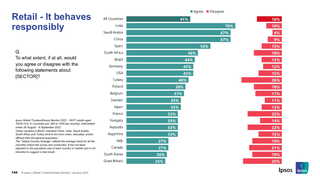
Horizontal bar chart with green/red bars per country; structured by agreement level.
Market Analysis and Trends
Retail & E-commerce
Highlights public opinion on whether the retail sector behaves responsibly. India, Saudi Arabia, and China again top the agreement rankings, while many countries show mixed views.
responsibility, ethics, retail, global, Ipsos, survey, public perception, countries
Mixed Chart
IPSOS
Saved
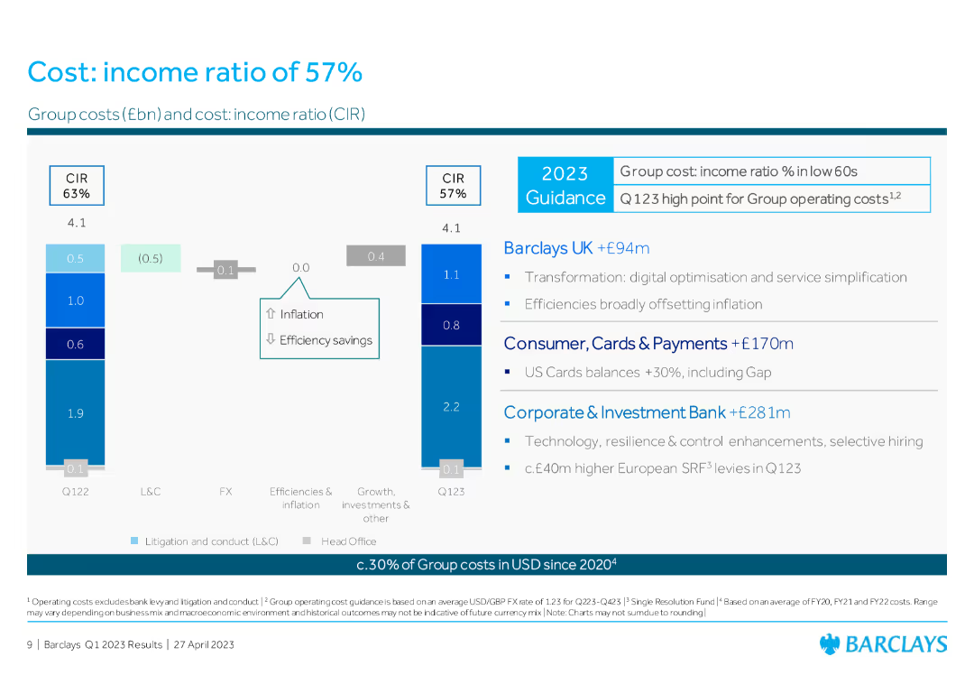
Column chart comparing group costs and cost: income ratio (CIR) between Q1 2022 and Q1 2023, with text boxes summarizing contributions from Barclays UK, Consumer, and CIB.
Operational Efficiency
Financial Services
The slide presents the cost: income ratio of Barclays, illustrating the changes in group costs and highlighting efficiencies and inflation impacts.
cost: income ratio, group costs, operational efficiency, Barclays UK, Consumer, CIB
Multiple Chart
Barclays
Saved
The slide displays bar charts and column charts to show the various sources of information used by Canadians to research crypto assets before purchase, comparing data from 2023 and 2022.
Market Analysis and Trends
Financial Services
This slide identifies the different sources of information used by Canadians to research crypto assets before making a purchase, highlighting trends and changes in source usage from 2022 to 2023.
research sources, crypto assets, purchase, information, comparison
Multiple Chart
IPSOS
Saved
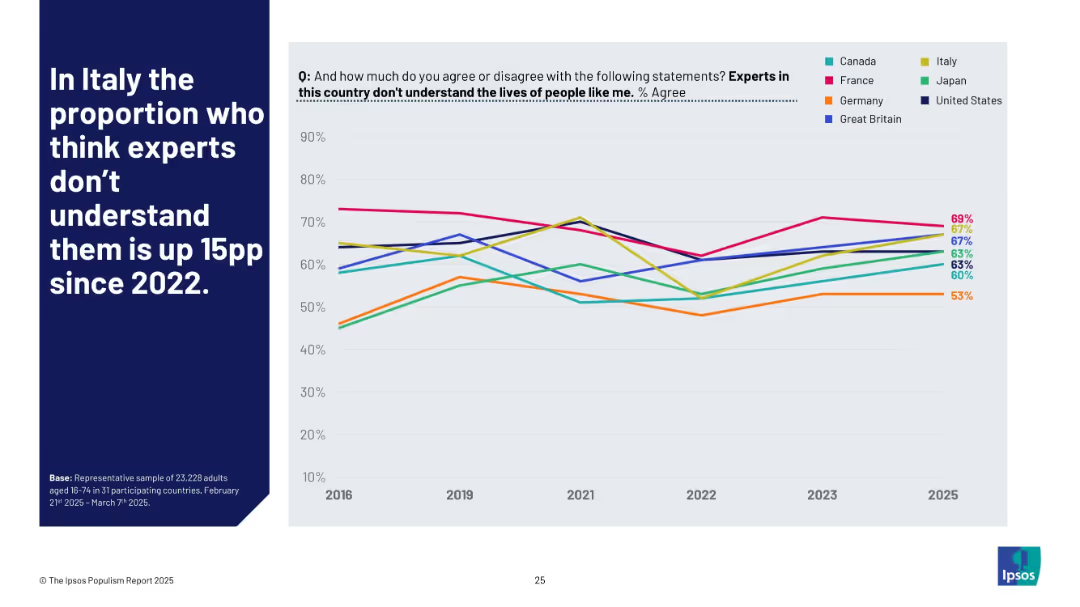
Left-aligned title on blue; right side has a multi-country line chart visualizing agreement with the expert disconnect statement from 2016–2025.
Market Analysis and Trends
Government & Public Sector
This slide tracks how various populations perceive experts’ understanding of citizens' lives. Italy shows a 15 percentage point increase since 2022, signaling a rise in expert distrust or disconnect perception.
Italy, experts, disconnect, opinion trends, 2025, Ipsos, populism, global sentiment, distrust, perception shift
Mixed Chart
IPSOS
Saved
The slide includes pie charts showing the development of self-confidence, presentation skills, and business networking skills among participants.
Strategic Planning
Education & Training
The slide describes the Your Future program, focusing on supporting young people in transitioning from school to work through training and coaching.
Your Future, self-confidence, training, coaching
Multiple Chart
EY
Saved
Multiple column charts showing broadband connections by type over years with a legend indicating nbn and non-nbn technologies.
Operational Efficiency
Telecommunications
Analyzes the growth and distribution of nbn broadband connections in Australia since 2011, showing significant infrastructure expansion.
nbn, broadband, Australia, infrastructure, rollout, internet, connectivity, growth
Single Chart
Accenture
Saved
Two line charts depicting Eurozone real investment and investment confidence on the left, and Eurozone credit conditions on the right. Key indicators include non-residential investment, lending standards tightening, and more.
Investment Analysis
Financial Services
This slide compares Eurozone real investment growth and investment confidence with Eurozone credit conditions, showing trends over time and their impact on businesses and consumers.
investment, credit conditions, Eurozone, lending standards, business confidence
Multiple Chart
JP Morgan
Saved
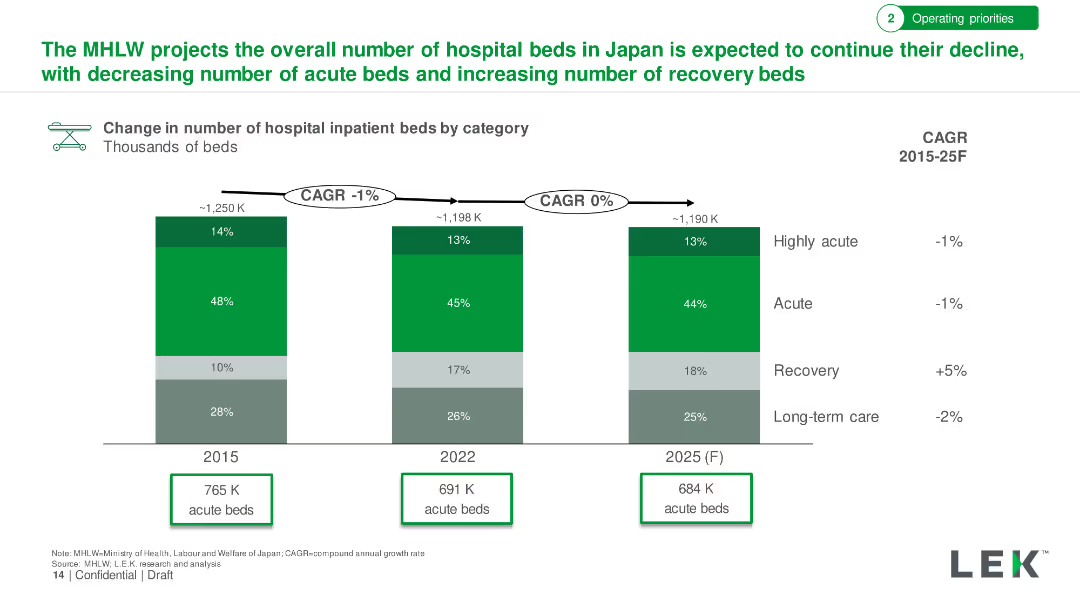
Bar chart showing change in the number of hospital inpatient beds by category from 2015 to 2025. Detailed with bed type categories and CAGR.
Market Analysis and Trends
Healthcare & Pharmaceuticals
Projection of hospital bed trends in Japan, showing a decline in acute beds and an increase in recovery beds through 2025.
Hospital Beds, Japan, Acute Beds, Recovery Beds, Projection
Single Chart
LEK
Saved
The slide presents a donut chart and a gauge chart showing the extent of managerial engagement in developing team engagement plans. Both charts use vibrant colors to differentiate levels of agreement and disagreement.
Human Resources and Talent Management
Professional Services
Focuses on how actively managers engage in team development, crucial for HR training sessions or leadership workshops to enhance managerial effectiveness.
managerial engagement, HR, development
Multiple Chart
PwC/Strategy&
Saved
A table and a graph showing digital asset engagement in various countries. Highlighting data points and percentages.
Market Analysis and Trends
Financial Services
Analyzes global engagement with digital assets, detailing percentages of adults involved in digital assets across multiple countries, with future engagement predictions. Useful for market analysis presentations.
Digital Assets, Global, Engagement, Market Analysis, Trends, Predictions, Countries
Boxed
McKinsey
Saved
Slide features column charts with annotations.
Performance Metrics and KPIs
Financial Services
Displays financial performance indicators for FY 2023.
KPIs, financial, performance, FY2023
Multiple Chart
Deutsche Bank
Saved
Scatter plot, color-coded data, geographical references.
Risk Assessment and Management
Environmental Services & Sustainability
Compares companies' preparedness for climate change risk against natural hazard exposure.
Climate, risk, companies, preparedness, hazards, exposure, environment, strategy
Single Chart
PwC/Strategy&
Saved
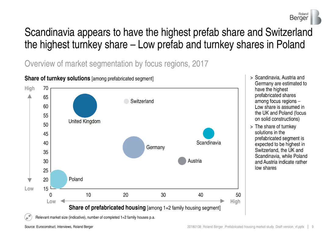
Bubble chart showing turnkey vs. prefab housing shares across European regions, with supporting bullet points on the right.
Market Analysis and Trends
Real Estate & Construction
This slide visualizes the share of turnkey solutions vs. prefabricated housing among various regions, highlighting Scandinavia and Switzerland. It emphasizes regional differences and infers market preferences and structural focuses (e.g., solid vs. prefab constructions).
prefabricated housing, turnkey solutions, regional segmentation, market share, construction methods, Scandinavia, Switzerland, bubble chart
Mixed Chart
Roland Berger
Saved
Previous
Next
If nothing, comes up, please save your slides first
Create a FREE account to continue browsing
Receive Instant Access to 1,000+ slides from companies like McKinsey, Google, and Goldman Sachs
First Name
Last Name
Email
Password
I agree to all
Terms & Privacy Policy
Thank you! Your submission has been received!
Oops! Something went wrong while submitting the form.
Have an account?
Sign in
Column Chart
Heatmap
Chevron
Org Chart
Infographic
Callouts
Timeline
List
Graphic
Picture
Process Flow
Diagram
Paragraph
Map
Table
Framework
Subtitle
Takeaway Box
Icon
Other Chart
Radar Chart
Waterfall Chart
Mekko Chart
Pie Chart
Scatter Plot
Line Chart
Bar chart
Bullet points