Create a FREE Account
Instant access to 1,000+ real slides from top companies like McKinsey, BCG, Goldman Sachs, Google and many more!
First Name
Last Name
Email
Password
I agree to all
Terms & Privacy Policy
Thank you! Your submission has been received!
Oops! Something went wrong while submitting the form.
Have an account?
Sign in
Library
Templates
Courses
Pricing
My Account
My Slides
My Templates
✦ AI
AI Prompt Library
AI Search
Sign in
Start Here
Logout
My Saved Slides
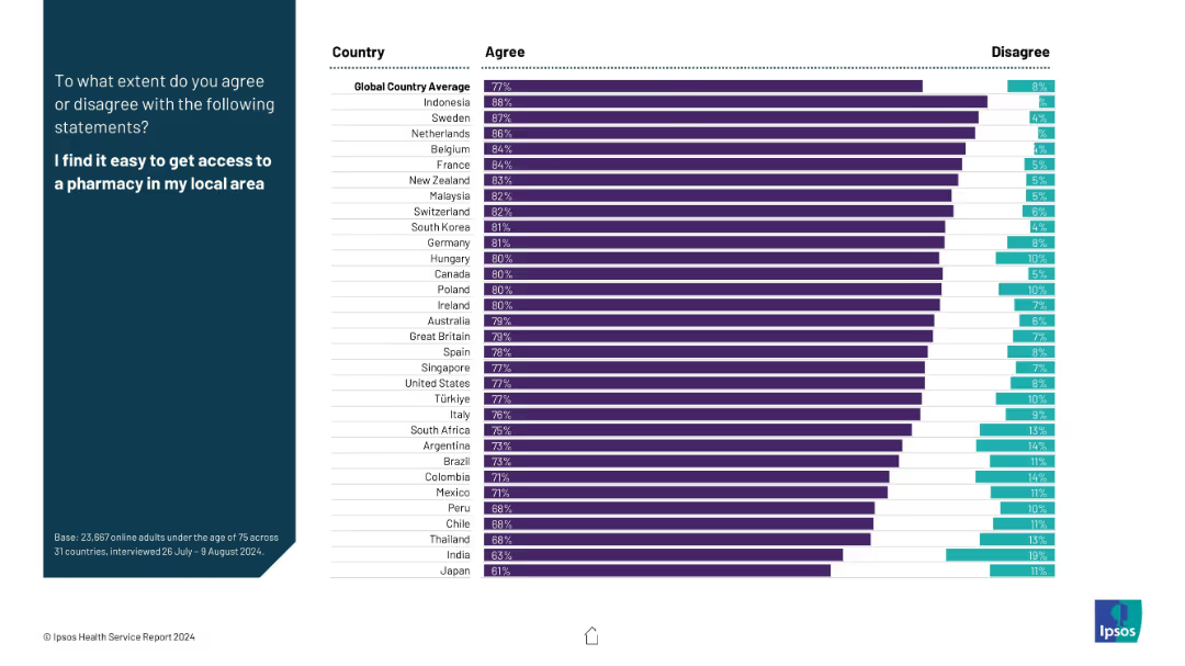
The layout includes agreement and disagreement percentages in horizontal bar format; global and country-specific values are displayed in a two-color bar chart.
Performance Metrics and KPIs
Healthcare & Pharmaceuticals
This slide assesses the ease of pharmacy access. Most countries show high agreement rates (e.g., Indonesia, Sweden), with global average agreement at 77%. Disagreement percentages are also highlighted.
pharmacy access, satisfaction, healthcare infrastructure, patient experience, availability, global survey, healthcare KPIs
Mixed Chart
IPSOS
Saved
The slide contrasts the adoption rates of EdTech tools pre and during COVID-19 with two circle diagrams and a side text block. The color palette includes grey for pre-COVID and blue for the current state.
Market Analysis and Trends
Education & Training
The slide illustrates the explosive growth in EdTech tool adoption during the pandemic, with a significant increase in app installations, signaling a pivot in educational practices in Southeast Asia.
EdTech, Adoption, Growth, COVID-19, App Installations, Pivot, Educational Practices, SEA, Tools, Increase
Single Chart
Bain
Saved
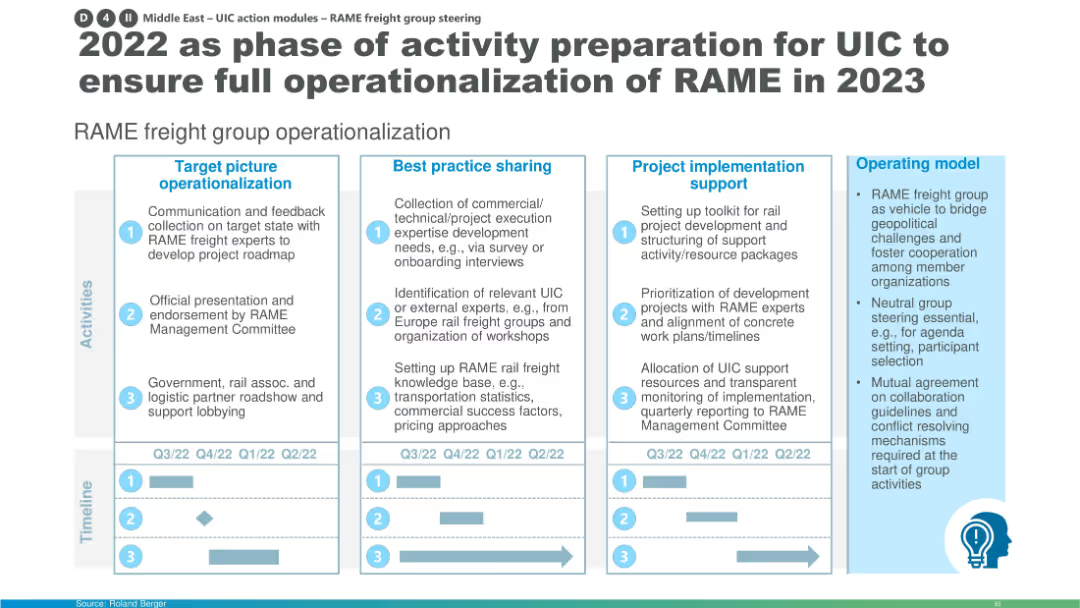
Structured flowchart of activities across four columns: operationalization, best practice sharing, support, and model. Includes timeline.
Organizational Structure and Change
Transportation & Logistics
This slide outlines 2022 activities to prepare for RAME’s full launch in 2023, focusing on stakeholder engagement, expert onboarding, best practice setup, and operational toolkit development. The timeline at the bottom maps progress across quarters.
RAME, UIC, freight group, operationalization, activity roadmap, stakeholder onboarding, expert workshops, rail freight
Mixed Chart
Roland Berger
Saved
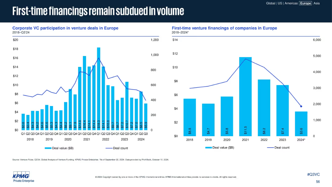
Two bar and line charts: Left (corporate VC participation), Right (first-time financings)
Investment Analysis
Financial Services
This slide compares corporate VC involvement and first-time venture financings. Both metrics peaked in 2021 but have declined steadily, suggesting reduced risk appetite and fewer new startups entering the ecosystem.
corporate VC, first-time financing, deal count, investment decline
Multiple Chart
KPMG
Saved
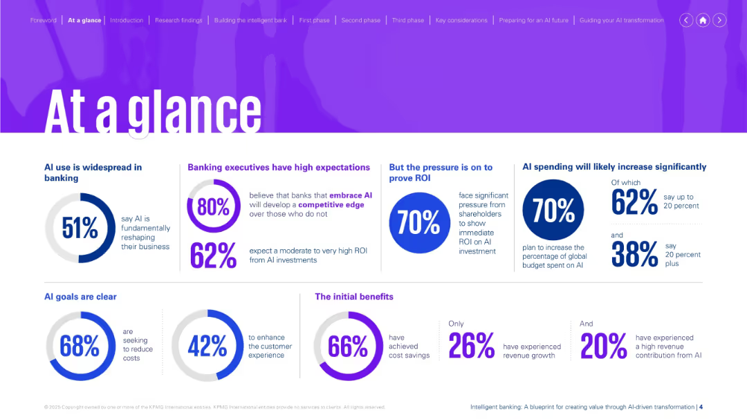
Bright purple theme with multiple infographic elements (pie charts, percent stats, segment boxes).
Strategic Planning
Financial Services
Provides a snapshot of AI's growing role in banking—expectations, spending trends, ROI pressure, and benefits. Highlights that AI is reshaping the sector, with clear goals around cost reduction and customer experience.
AI banking, ROI pressure, spending, cost reduction, customer experience, digital transformation
Single Chart
KPMG
Saved
This slide presents a bar chart comparing local authorities by the number of high-growth companies, paired with a table showing total investment received.
Market Analysis and Trends
Government & Public Sector
Focuses on the distribution of high-growth companies and investment across UK local authorities, highlighting areas with significant economic activity like Edinburgh and Manchester.
local authorities, high-growth companies, economic development, investment received, regional comparison, economic hubs, UK cities, business clustering
Multiple Chart
Barclays
Saved
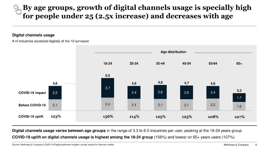
Bar chart comparing digital channel usage across age groups pre- and post-COVID-19. Includes uplift % by segment.
Customer and Market Segmentation
Technology & Software
Breaks down digital channel usage growth by age. Young users (18–24) show the largest increase, while older age groups show lower but still notable growth. Indicates digital behavioral shifts by demographic.
age segmentation, digital usage, COVID-19, consumer trends, digital growth
Single Chart
McKinsey
Saved
Featuring a detailed line chart with multiple data series, the slide visually represents the perceived maturity of I&D efforts across different stages, highlighted by color coding and distinct markers.
Strategic Planning
Professional Services
Discusses the perception of I&D initiative maturity by US respondents, noting a gap in achieving targets.
US, I&D, line chart, progress evaluation, maturity stages, diversity targets, gap analysis
Single Chart
Accenture
Saved
A central hexagon labeled "Engineering-centric organization" with arrows pointing to roles like CTO, CPO.
Organizational Structure and Change
Financial Services
Describes the roles and responsibilities within an engineering-centric organization, emphasizing transformation and execution.
organizational structure, transformation, engineering, roles, responsibilities
Diagram
Credit Suisse
Saved
This slide contains a column chart showing cement production and imports over time, along with bullet points summarizing key trends and statistics.
Market Analysis and Trends
Industrial & Manufacturing
Provides an analysis of the Australian cement industry's reliance on imports. Highlights trends in production and import levels, the impact of infrastructure projects, and future market growth projections.
Cement, imports, production, market trends, Australia
Mixed Chart
LEK
Saved
Depicts Lenovo's evolution with a central graphic highlighting core modernization areas and financial milestones, complemented by a clear layout with purple and white design elements.
Market Analysis and Trends
Technology & Software
This slide reflects on Lenovo's transformation through continuous innovation in technology and processes. It illustrates Lenovo's journey from a hardware-centric company to an intelligent solutions provider, highlighting strategic areas such as supply chain and IT transformation.
Lenovo, core modernization, enterprise reinvestment, market penetration, intelligent solutions, ERP overhaul, IT model redesign, supply chain, finance transformation
Diagram
Accenture
Saved
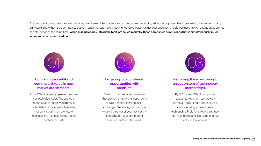
The slide is divided into three sections with circular icons, each section discussing a different strategic focus for new market assessments.
Market Analysis and Trends
Consumer Goods
The slide emphasizes the importance of combining societal and commercial value, targeting location-based opportunities, and leveraging technology partnerships for new market growth.
market assessment, societal value, commercial value, location-based, technology partnerships, consumer goods
Linear Flow
Accenture
Saved
This slide features a large green circle graph comparing digital economy projections for 2022, 2025, and 2030 with bullet point annotations.
Financial Performance
Technology & Software
It illustrates SEA’s digital economy growth potential up to $1T GMV by 2030 and stresses the need for sustainable development.
digital economy, SEA, GMV, growth potential, sustainable
Mixed Chart
Bain
Saved
The slide features a pie chart with nine segments, each numbered and labeled with different business strategies such as "Develop tech-enabled advisors" and "Recalibrate pricing and business models". The background is dark with section headers like "RESEARCH BACKGROUND" in lighter text.
Strategic Planning
Technology & Software
This slide visually presents nine strategic actions aimed at enhancing business performance and adaptation in a tech-driven market, suitable for discussions on corporate strategy in finance and tech sectors.
strategy, technology, finance, innovation, pie chart, business model, digital transformation, market adaptation, tech advisors, pricing
Vertical Flow
Deloitte
Saved
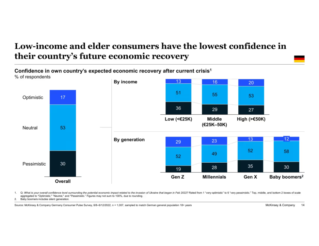
Vertical stacked bar chart showing Germany’s overall optimism by income and generation. Three confidence levels visualized for each group. Left column shows national average, followed by columns split by income level and age cohort.
Customer and Market Segmentation
Financial Services
This slide highlights disparities in economic recovery confidence among different German demographic groups. Low-income and Baby Boomer respondents are most pessimistic, whereas higher-income and younger generations express relatively greater optimism about future recovery.
consumer confidence, demographics, Germany, income groups, generations, Gen Z, Baby Boomers, pessimism, optimism
Single Chart
McKinsey
Saved
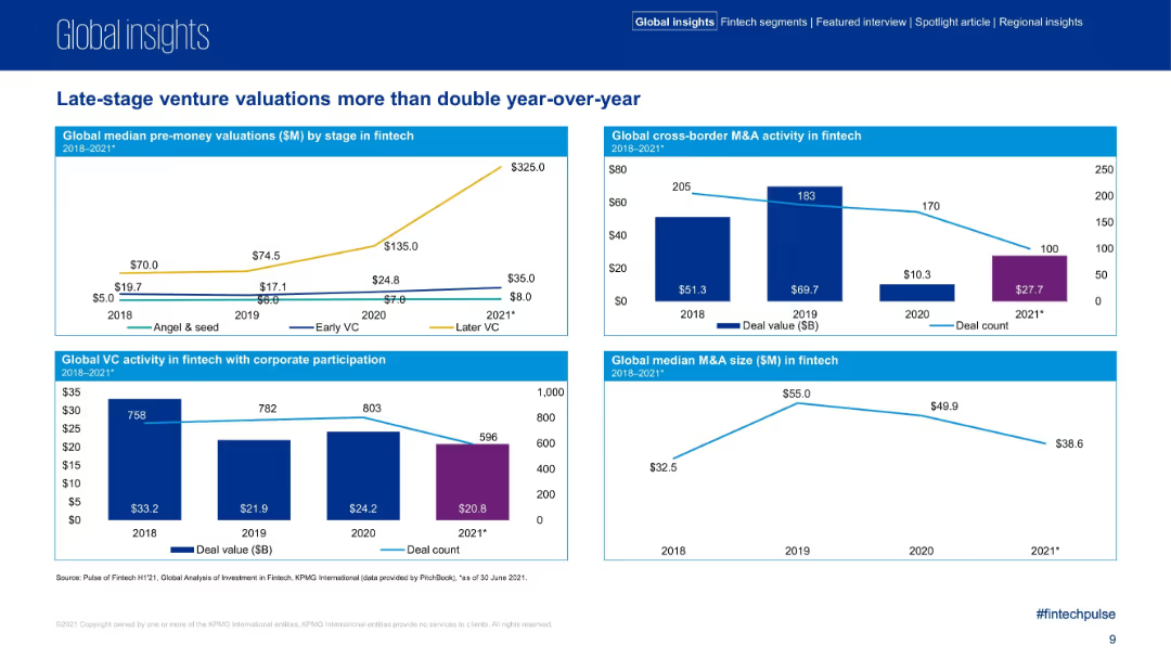
Four mini chart sections comparing pre-money valuations, M&A activity, VC corporate participation, and median M&A sizes.
Investment Analysis
Financial Services
The slide captures dramatic growth in later-stage fintech valuations in 2021 and a comparative drop in deal counts. It includes breakdowns by funding stage, cross-border M&A activity, and M&A deal sizes, signaling shifts in fintech investment behavior.
valuations, M&A, venture capital, fintech, corporate participation, investment activity
Multiple Chart
KPMG
Saved
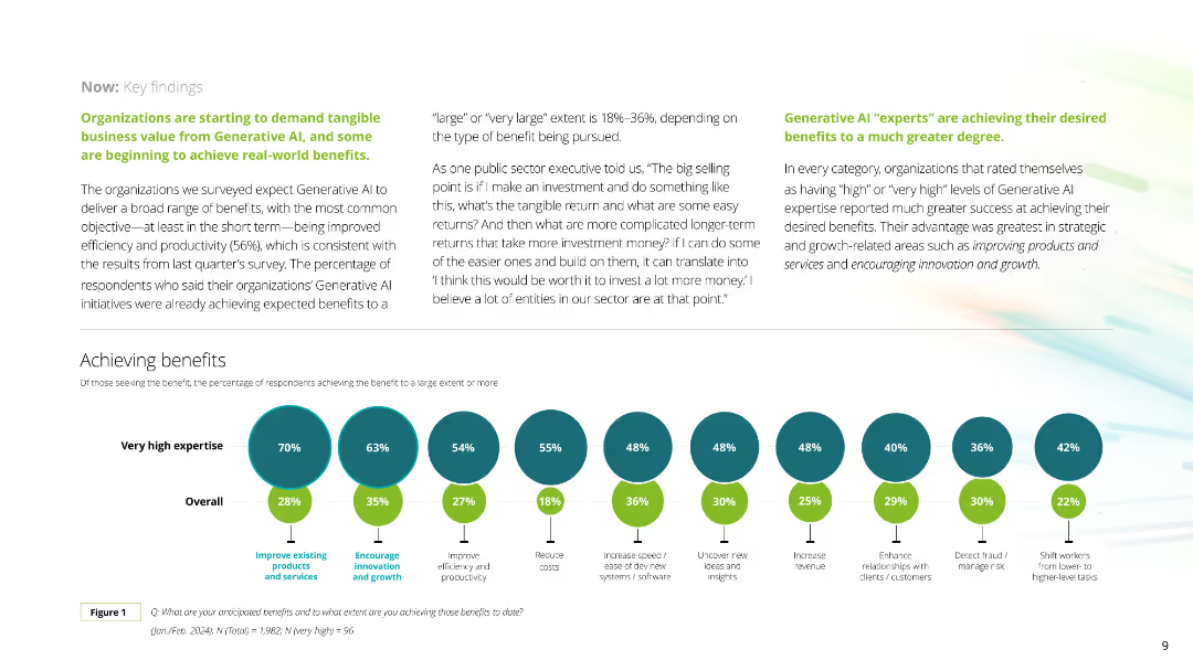
This slide includes a series of circular diagrams showing percentages of benefits achieved by companies with varying levels of expertise in Generative AI. The layout is clean with distinct colors for each expertise level.
Technology and Digital Transformation
Technology & Software
The slide details the benefits companies are achieving from Generative AI, such as improved products and services, innovation, productivity, cost reduction, and new revenue streams, categorized by expertise levels.
Generative AI, benefits, expertise, improvement, productivity
Mixed Chart
Deloitte
Saved
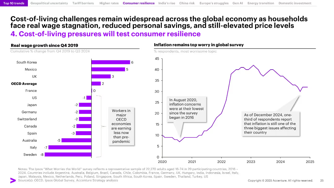
Dual-panel slide with bar chart of wage growth across countries and line chart of global inflation concern trends; uses purple for emphasis.
Strategic Planning
Consumer Goods
The slide examines declining real wages in OECD countries since 2019 and high global inflation concerns. Despite nominal growth in some regions, many major economies are experiencing wage stagnation, fueling consumer anxiety. It highlights inflation as a persistent concern and a significant test of consumer resilience.
real wages, cost of living, inflation, OECD, consumer resilience, income stagnation, savings decline, global concern, wage growth, economic pressure
Multiple Chart
Accenture
Saved
The slide includes several column charts comparing revenue, net income, capital, ROE, and overhead ratio from 2011 to 2021 across various banking sectors. It also features demographic data and global presence details.
Financial Performance
Financial Services
This slide showcases JP Morgan's growth in financial metrics like revenue, net income, and capital, alongside ROE and overhead ratios over ten years. It illustrates the expansion and market dominance of the CIB franchise globally, highlighting their extensive reach and efficiency in serving top global businesses.
revenue, capital, global, ROE, banking
Multiple Chart
JP Morgan
Saved
Features a column chart depicting net interest income and margins across different business sectors for FY23, providing insights into trends and projections for future financial guidance excluding certain business segments.
Financial Performance
Financial Services
Provides a detailed analysis of net interest income for FY23, highlighting performance across different business sectors, with a focus on year-over-year growth and the strategic implications for future financial planning.
NII, FY23, financial analysis, business sectors, financial planning
Mixed Chart
Barclays
Saved
Displays a central emblem for Michelin's One Care Program, surrounded by text detailing the program's coverage and objectives.
Human Resources and Talent Management
Industrial & Manufacturing
Michelin's social protection initiatives under the One Care Program are highlighted, with an emphasis on employee coverage for health, family protection, and leave policies.
Social Protection, Michelin, One Care Program, Employee Benefits, Health Program, Maternity Leave, Talent Management, CSR, Family Protection, Coverage Goals
Framework
Morgan Stanley
Saved
The slide features a column chart comparing the ratio of direct to distributed traffic for various news article webpages. It includes detailed annotations explaining the variations in traffic ratios among different news outlets.
Market Analysis and Trends
Media & Entertainment
This slide analyzes the ratio of direct to distributed traffic to news article webpages, highlighting the variations among different news outlets and providing insights into traffic patterns and sources.
Direct Traffic, Distributed Traffic, News Articles, Column Chart, Traffic Ratio
Mixed Chart
IPSOS
Saved
A large pie chart on the left and a bar graph on the right against a purple background with descriptive text boxes.
Strategic Planning
Telecommunications
Examines how the nbn™ network aligns with user values, indicating a significant agreement on its positive impact on their lives.
user values, nbn network, life impact, agreement percentage, life goals, value alignment, network benefits, survey data
Multiple Chart
Accenture
Saved
Title at top, large segmented circular graphic in the center divided into strategic and operational parts, various text annotations.
Strategic Planning
Professional Services
Explains the integration of platform strategies and operational capabilities within a digital ecosystem, emphasizing the need for a "platform mindset" and collaboration.
platform strategies, operational capabilities, digital ecosystem, collaboration
Diagram
Accenture
Saved
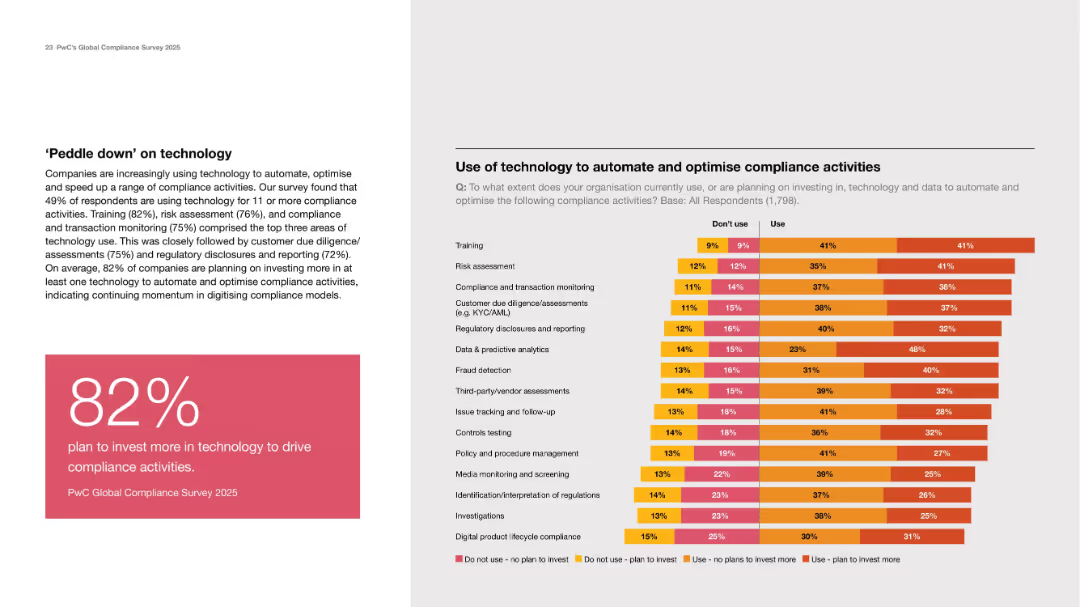
Left text and stat box; right side stacked bar chart on tech use in compliance by activity type.
Technology and Digital Transformation
Technology & Software
Emphasizes increasing tech investment in compliance, with 82% planning more investment. Training, risk assessment, and monitoring are most common use cases. The chart shows current and planned adoption levels.
automation, compliance tech, investment, risk, reporting, AI
Mixed Chart
PwC/Strategy&
Saved
Previous
Next
If nothing, comes up, please save your slides first
Create a FREE account to continue browsing
Receive Instant Access to 1,000+ slides from companies like McKinsey, Google, and Goldman Sachs
First Name
Last Name
Email
Password
I agree to all
Terms & Privacy Policy
Thank you! Your submission has been received!
Oops! Something went wrong while submitting the form.
Have an account?
Sign in
Column Chart
Heatmap
Chevron
Org Chart
Infographic
Callouts
Timeline
List
Graphic
Picture
Process Flow
Diagram
Paragraph
Map
Table
Framework
Subtitle
Takeaway Box
Icon
Other Chart
Radar Chart
Waterfall Chart
Mekko Chart
Pie Chart
Scatter Plot
Line Chart
Bar chart
Bullet points