Create a FREE Account
Instant access to 1,000+ real slides from top companies like McKinsey, BCG, Goldman Sachs, Google and many more!
First Name
Last Name
Email
Password
I agree to all
Terms & Privacy Policy
Thank you! Your submission has been received!
Oops! Something went wrong while submitting the form.
Have an account?
Sign in
Library
Templates
Courses
Pricing
My Account
My Slides
My Templates
✦ AI
AI Prompt Library
AI Search
Sign in
Start Here
Logout
My Saved Slides
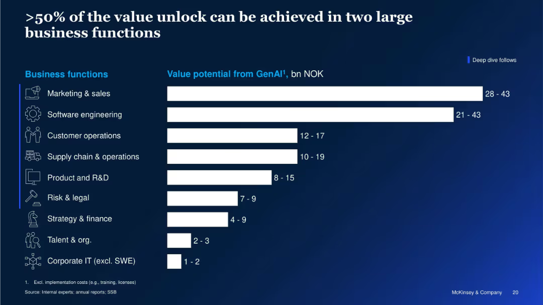
Horizontal bar chart showing GenAI value potential (in NOK) by business function. Icons accompany each function.
Strategic Planning
Artificial Intelligence
This slide shows that more than half of the GenAI value potential is concentrated in Marketing & Sales and Software Engineering. It quantifies value potential across various business functions, emphasizing where investments may yield the greatest returns.
GenAI Value, Business Functions, Marketing, Software Engineering, Strategic Value, Productivity, NOK Gains, McKinsey
Single Chart
McKinsey
Saved
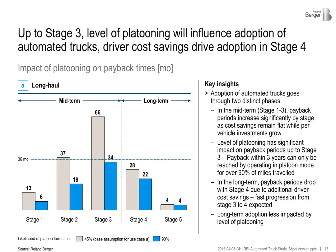
Bar chart with two color-coded bars per stage (45% and 90% platooning), timeline split into mid- and long-term, with insights
Investment Analysis
Transportation & Logistics
The slide outlines the impact of platooning on payback times for automated trucks, indicating faster payback with higher platooning. Key insights emphasize two adoption phases and cost savings.
Platooning, automated trucks, payback time, cost savings, adoption stages, investment, long-haul, automation, ROI
Mixed Chart
Roland Berger
Saved
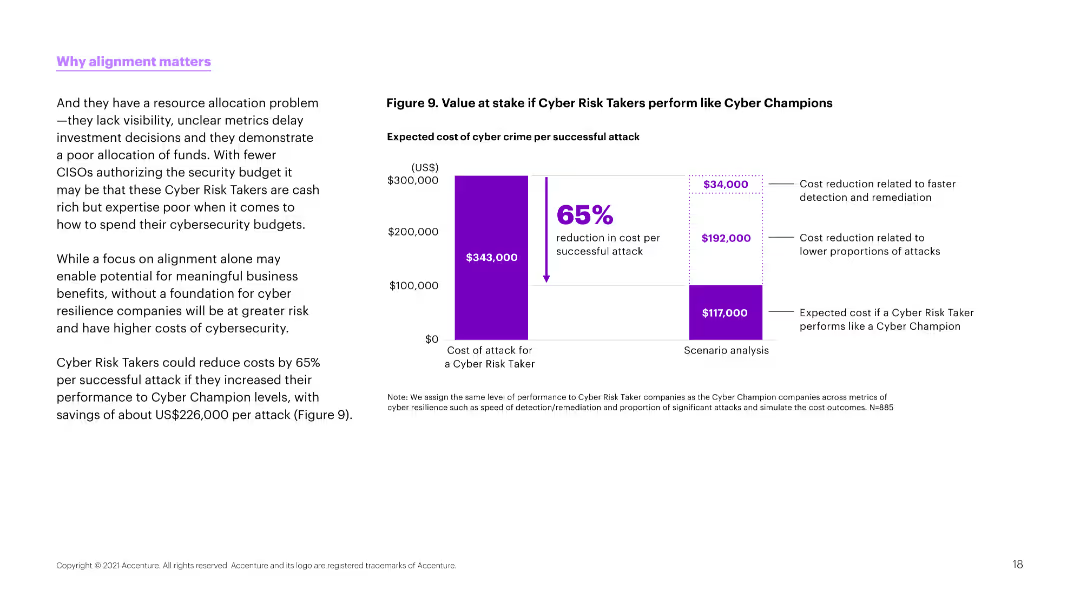
The slide features a column chart on the right side showing the value at stake if cyber risk takers perform like cyber champions. The left side contains detailed explanatory text.
Risk Assessment and Management
Technology & Software
This slide presents a cost analysis, showing a potential 65% reduction in cyber crime costs if cyber risk takers improved their performance to match cyber champions.
Cyber risk, cost reduction, performance, cyber crime, budget, resilience, security, alignment, business
Mixed Chart
Accenture
Saved
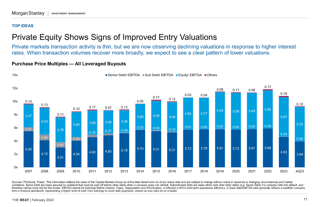
Column chart showing purchase price multiples for all leveraged buyouts over several years, highlighting senior and sub debt/EBITDA ratios.
Investment Analysis
Financial Services
This slide indicates improved entry valuations in private equity, with declining valuations due to higher interest rates, and compares historical purchase price multiples.
private equity, entry valuations, leveraged buyouts, purchase price multiples, investment analysis
Single Chart
Morgan Stanley
Saved
The slide features two graphs and a quote. The first graph showcases the growth of digital payments in tier 2 and tier 3 markets, and the second depicts the expected market size.
Market Analysis and Trends
Financial Services
This slide provides a graphical representation of the growth trajectory in digital payments and market size projections. It includes customer commentary on the ease of use, suggesting a shift towards mainstream digital payment acceptance. It's used for analyzing trends in cashless payment adoption and regulatory impact.
Digital Payments, Market Size, Growth, Cashless, Consumer Experience, Regulation
Mixed Chart
Kearney
Saved
The slide features two column charts assessing the impact of the Ukrainian crisis on companies and the measures planned in response. The charts use various colors to denote the levels of impact and response. Text explanations are provided at the bottom.
Risk Assessment and Management
Energy & Utilities
This slide evaluates the impact of the war in Ukraine on companies, focusing on supply costs, revenue decrease, and supply chain disorganization. It also outlines measures African CEOs plan to take, including investment delays and diversification of sources.
Ukraine crisis, impact, supply chain, response, measures
Multiple Chart
Deloitte
Saved
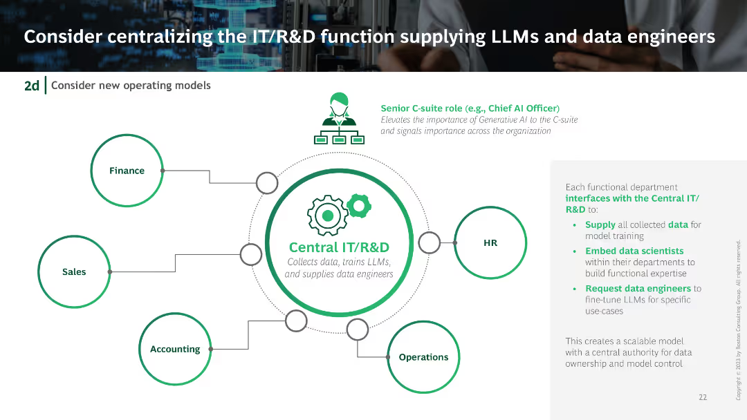
Centralized IT/R&D unit diagram with connections to different departments like Finance, HR, Sales, and Operations. Includes icons and flow lines illustrating the centralized structure.
Organizational Structure and Change
Technology & Software
Suggests centralizing the IT/R&D function to efficiently manage LLMs and data engineers, showing how this structure would interface with various departments.
IT centralization, R&D, LLMs, data engineers, organizational structure
Diagram
BCG
Saved
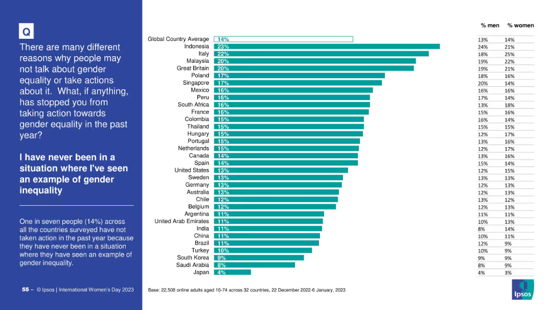
Horizontally ranked bar chart; global average marked at 14%; left-side text explaining data; right-hand gender split table.
Market Analysis and Trends
Government & Public Sector
This slide shows that 14% of global respondents did not take action on gender equality because they’ve never personally witnessed inequality. Indonesia and Italy rank highest. Gender breakdown indicates a relatively balanced perception.
gender awareness, exposure, inequality, personal experience, Ipsos, barriers
Mixed Chart
IPSOS
Saved
The slide is text-heavy with a series of bullet points on the left, complemented by labeled graphs on the right. The design is minimalist with a white background and uses contrasting black and blue text for emphasis.
Risk Assessment and Management
Financial Services
Outlines potential economic scenarios resulting from COVID-19's spread, public health responses, and policy decisions. It's a tool for assessing risks and planning for various outcomes in the financial sector.
Economic Scenarios, COVID-19, Health Response
Table
McKinsey
Saved
The slide features a column chart displaying satisfaction levels (percentage very/somewhat satisfied) with various technologies like identity solutions, DCRs, CMPs, etc.
Technology and Digital Transformation
Technology & Software
The slide compares user satisfaction across different privacy-preserving technologies, indicating that satisfaction with DCRs is comparable to more established solutions.
satisfaction, DCRs, privacy technologies, comparison
Mixed Chart
IPSOS
Saved
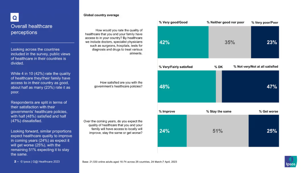
Three bar charts (stacked) with global averages for healthcare quality, policy satisfaction, outlook
Market Analysis and Trends
Healthcare & Pharmaceuticals
This slide provides global perceptions of healthcare based on three questions: quality of healthcare (42% good), satisfaction with policies (48%), and future outlook (24% expect improvement). Views are fairly divided on all metrics.
Healthcare, public opinion, global average, satisfaction, policy, healthcare quality, future outlook, survey
Mixed Chart
IPSOS
Saved
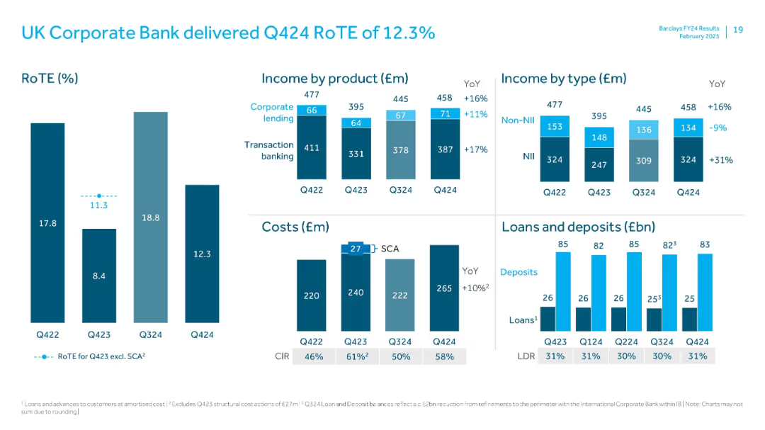
Mixed layout: bar charts for RoTE and income; waterfall and cost analysis; loans/deposits side-by-side bar comparison
Financial Performance
Financial Services
Focuses on UK Corporate Bank's Q424 financial performance. Showcases stable RoTE with YoY income growth led by transaction banking. Loan-deposit ratio and CIR analysis accompany commentary on cost trends and income types.
UK Corporate Bank, RoTE, transaction banking, loans, deposits, CIR, costs, Q424
Multiple Chart
Barclays
Saved
The slide features a dark background with two line charts and one column chart displaying budget deficits and total revenues/expenses over several years. Key data points are highlighted in yellow and red.
Regulatory and Compliance
Government & Public Sector
This slide presents historical and projected data on budget balance, showing actuals, estimates, and budget figures for revenues and expenses. It's used to assess financial health and planning.
budget, finance, government, revenue, expenses, deficit, projection, financial health, analysis, planning
Single Chart
PwC/Strategy&
Saved
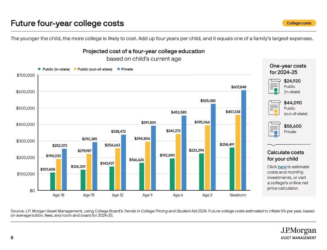
Multi-bar chart displaying projected college costs by child’s current age and institution type. Sidebar includes one-year cost summary.
Strategic Planning
Education & Training
This slide presents the projected cost of four-year college education, showing how costs increase for younger children. It breaks down expenses by public in-state, public out-of-state, and private institutions, with estimates through college entry age.
college projections, education savings, tuition planning, cost forecast, child age, public vs private, higher education cost, inflation, future planning
Mixed Chart
JP Morgan
Saved
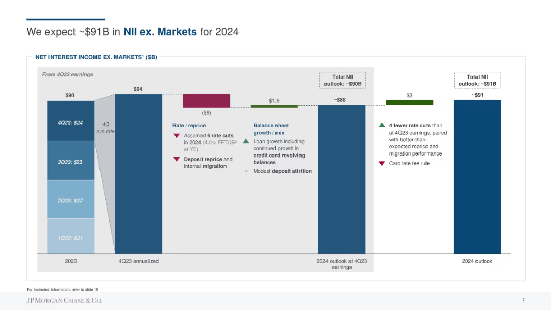
Column chart showing net interest income (NII) outlook, with factors affecting rate, repricing, balance sheet growth, and deposit migration.
Financial Performance
Financial Services
Forecasts the net interest income excluding markets for 2024, detailing rate and repricing assumptions, balance sheet growth, and migration impacts.
NII, forecasting, net interest income, rate, repricing, balance sheet growth, deposits
Single Chart
JP Morgan
Saved
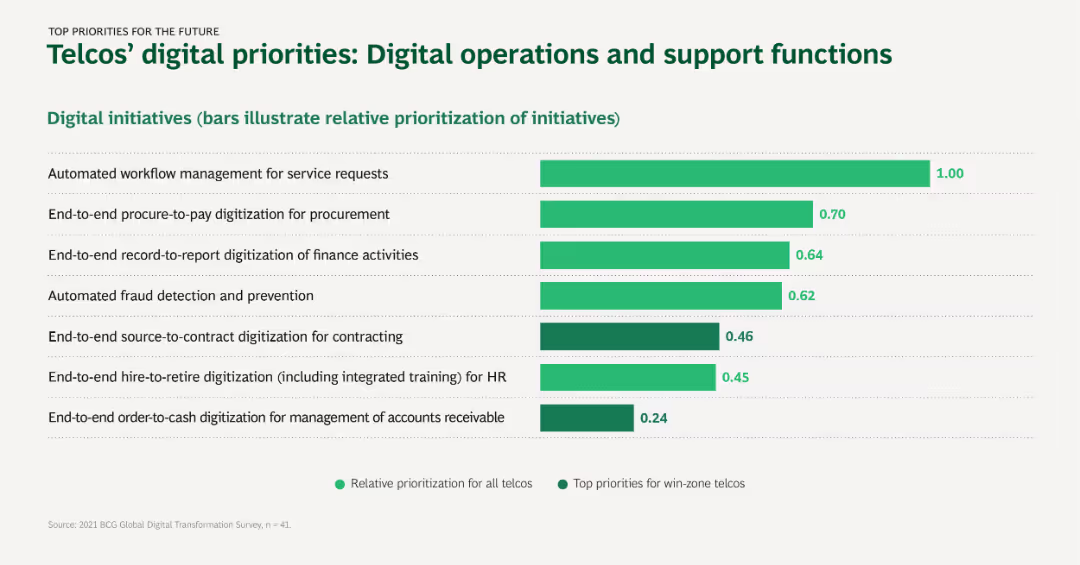
Horizontal bar chart depicting digital initiatives for improving operations and support functions, with bars showing relative prioritization and top priorities.
Operational Efficiency
Telecommunications
This slide showcases the key digital initiatives for telcos in enhancing operational efficiency and support functions, such as workflow management and fraud detection.
Workflow management, Procurement, Fraud detection, Digitization, Operational efficiency
Single Chart
BCG
Saved
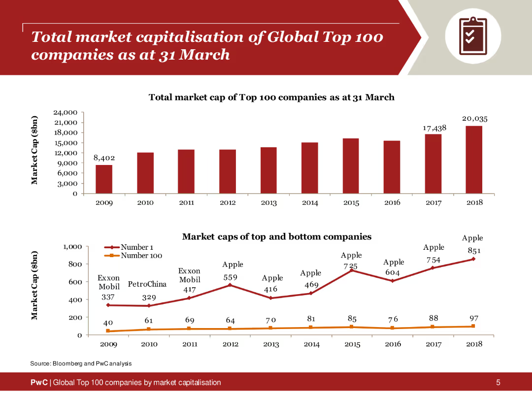
The slide displays two column charts: one showing the total market cap of the top 100 companies from 2009 to 2018, and another comparing the market caps of the top and bottom companies within this group. A red color scheme is used for the charts, with clear labels and data points for each year.
Market Analysis and Trends
Financial Services
This slide presents a detailed analysis of the total market capitalization of the global top 100 companies over a decade. It highlights the growth in market cap and compares the top and bottom companies within this group, providing insights into market trends and the distribution of company values.
Market capitalization, top 100 companies, financial analysis, market trends, column charts
Multiple Chart
PwC/Strategy&
Saved
Features a column chart tracking the dividend per share over several years with special highlights on loyalty bonuses and recent increases, depicted in pink and red hues.
Financial Performance
Consumer Goods
Showcases the growth of L'Oréal's dividends over time, emphasizing the loyalty bonus for long-term shareholders, reflecting shareholder value and financial stability.
dividends, shareholder value, loyalty bonus, L'Oréal
Single Chart
Deutsche Bank
Saved
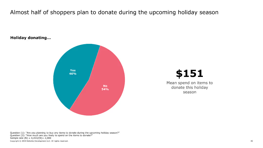
This slide includes a pie chart showing the percentage of shoppers planning to donate during the holiday season, accompanied by text indicating the mean spend on donations.
Market Analysis and Trends
Retail & E-commerce
It presents data on the proportion of shoppers intending to donate during the holiday season and the average amount they plan to spend on donations.
donations, holiday, shoppers, spend, mean
Mixed Chart
Deloitte
Saved
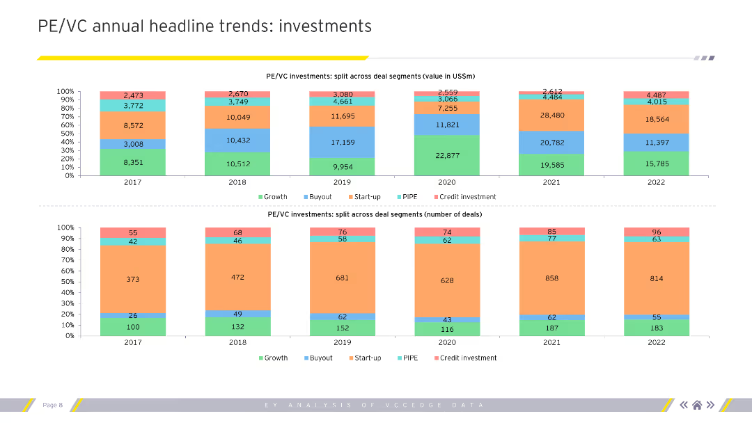
Column charts showing PE/VC investment splits by value and number of deals across deal segments for 2017-2022.
Investment Analysis
Financial Services
Analyzes annual trends in private equity and venture capital investments, focusing on value and number of deals.
PE/VC, investments, trends, deals, growth
Multiple Chart
EY
Saved
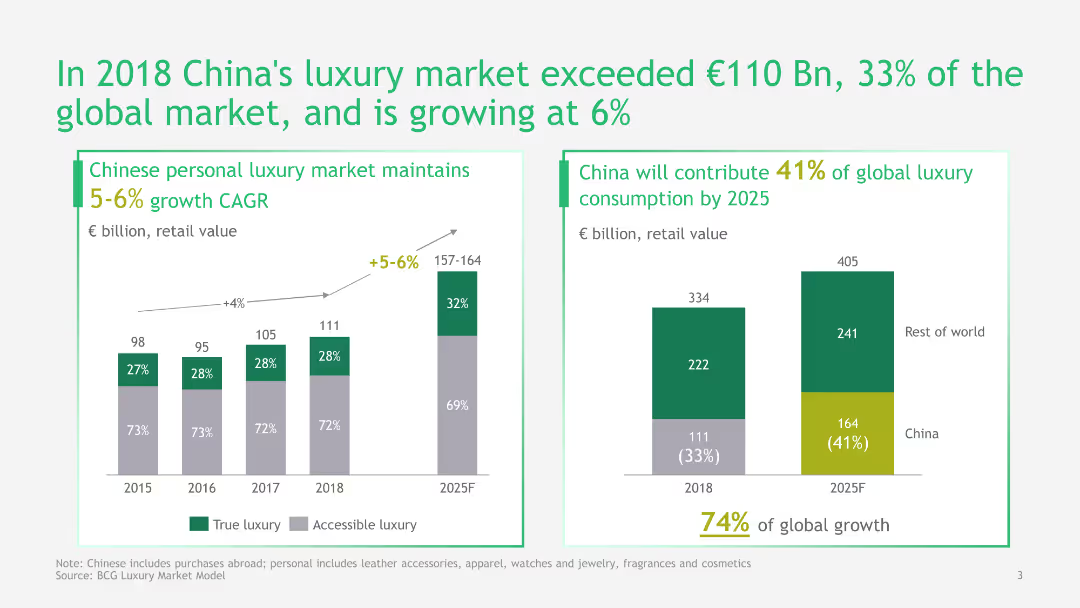
This slide features a column chart and a pie chart to illustrate China's growth in the luxury market. It uses green and gray colors and includes detailed data points and projections.
Market Analysis and Trends
Consumer Goods
The slide provides an analysis of China's luxury market growth, its contribution to the global market, and future projections, highlighting significant market trends and growth rates.
Luxury Market, China, Growth, Global Market, Projections, Data, Analysis, Trends, Retail
Multiple Chart
BCG
Saved
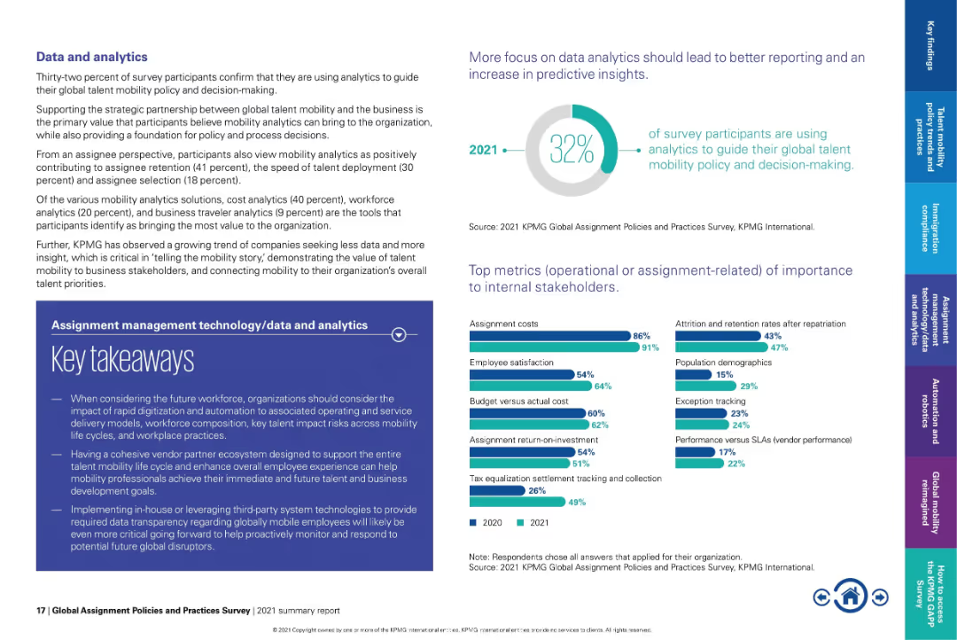
Text-heavy layout with pie chart on top right and bar graphs at bottom.
Performance Metrics and KPIs
Technology & Software
Emphasizes how only 32% of organizations currently use analytics in mobility decision-making. Lists top metrics such as assignment costs and employee satisfaction. Underscores the need for better data transparency and strategic alignment with business goals.
analytics, mobility KPIs, assignment cost, employee satisfaction, talent insights, strategic mobility
Multiple Chart
KPMG
Saved
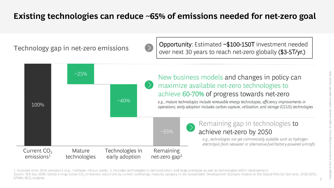
The slide includes a column chart and a text box detailing the technology gap in achieving net-zero emissions. It uses a gradient color scheme to show the progress and remaining gap, with additional explanatory text on the side.
Technology and Digital Transformation
Environmental Services & Sustainability
The slide presents the role of existing technologies in achieving about 65% of the emissions reduction required for the net-zero goal. It highlights investment opportunities and the need for new business models and policy changes.
net-zero, emissions reduction, technology, investment, policy
Mixed Chart
BCG
Saved
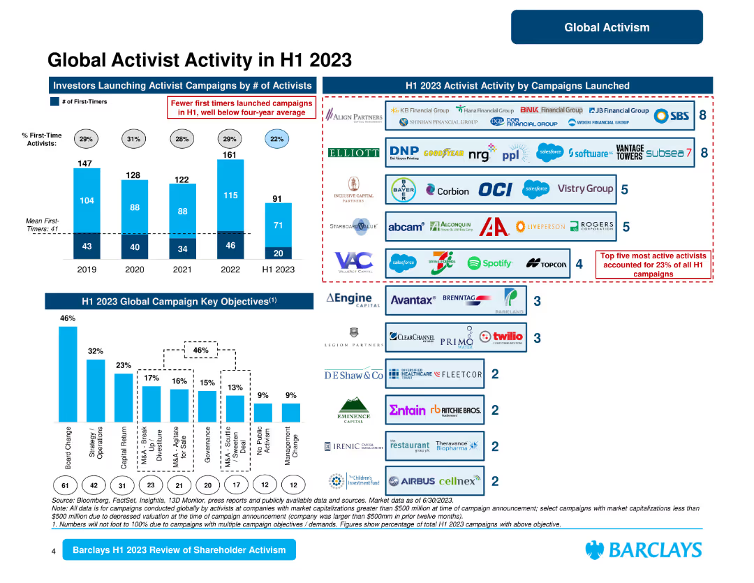
This slide contains several column charts and logos of companies involved in activist campaigns. It visually depicts the number of campaigns, key objectives, and prominent activists.
Competitive Landscape
Financial Services
Provides detailed insights into global activist activities in the first half of 2023, highlighting key objectives, campaign launches, and the most active activists.
activist activity, H1 2023, campaigns, key objectives, global
Multiple Chart
Barclays
Saved
The slide uses a stark background image of a tree under a starry sky with a circular diagram overlaid, illustrating fiscal challenges faced by the government. The design is simple yet impactful, with contrasting blue and white colors.
Risk Assessment and Management
Government & Public Sector
Provides an overview of the fiscal challenges faced by the government, such as budget deficit, public debt, and fiscal weakness, arranged in a circular flow diagram. It is useful for understanding the complexities and risks associated with government financial management.
fiscal challenges, government, budget deficit, public debt, risk management
Diagram
PwC/Strategy&
Saved
Previous
Next
If nothing, comes up, please save your slides first
Create a FREE account to continue browsing
Receive Instant Access to 1,000+ slides from companies like McKinsey, Google, and Goldman Sachs
First Name
Last Name
Email
Password
I agree to all
Terms & Privacy Policy
Thank you! Your submission has been received!
Oops! Something went wrong while submitting the form.
Have an account?
Sign in
Column Chart
Heatmap
Chevron
Org Chart
Infographic
Callouts
Timeline
List
Graphic
Picture
Process Flow
Diagram
Paragraph
Map
Table
Framework
Subtitle
Takeaway Box
Icon
Other Chart
Radar Chart
Waterfall Chart
Mekko Chart
Pie Chart
Scatter Plot
Line Chart
Bar chart
Bullet points